Swiss Typefaces crafts a warmer, friendlier custom font for Swiss Post
Creating a typeface for Switzerland's postal service took three years, and it came with many challenges.
When it comes to custom typefaces, designers are often faced with a dilemma. When clients have commissioned something for a lot of money, there's often a desire, whether it be conscious or subconscious, to make a splash. In other words, people seek a design that's distinctive, ownable, and noticeable.
However, there's an argument that, much of the time, a typeface is there to get out of the way. Its main aims should be clarity and legibility, not to draw attention to itself.
In practice, custom typefaces usually end up somewhere between the two extremes. But in the case of Swiss Typefaces's commission from Swiss Post, the brief was clear indeed: make a new font that nobody would notice at all.
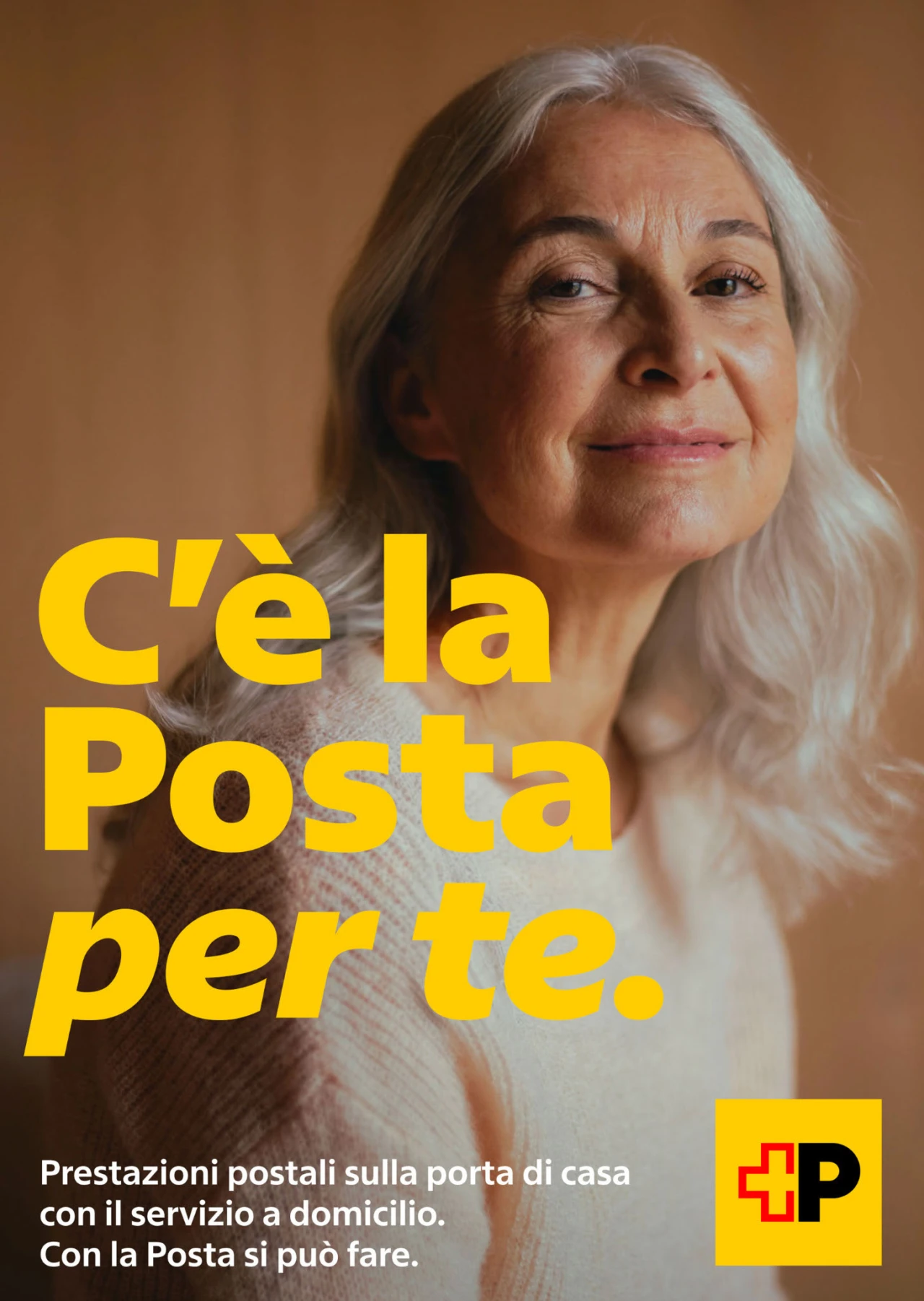
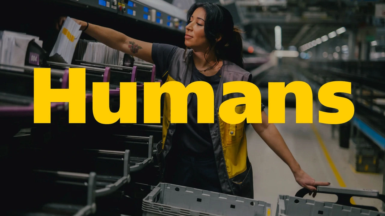
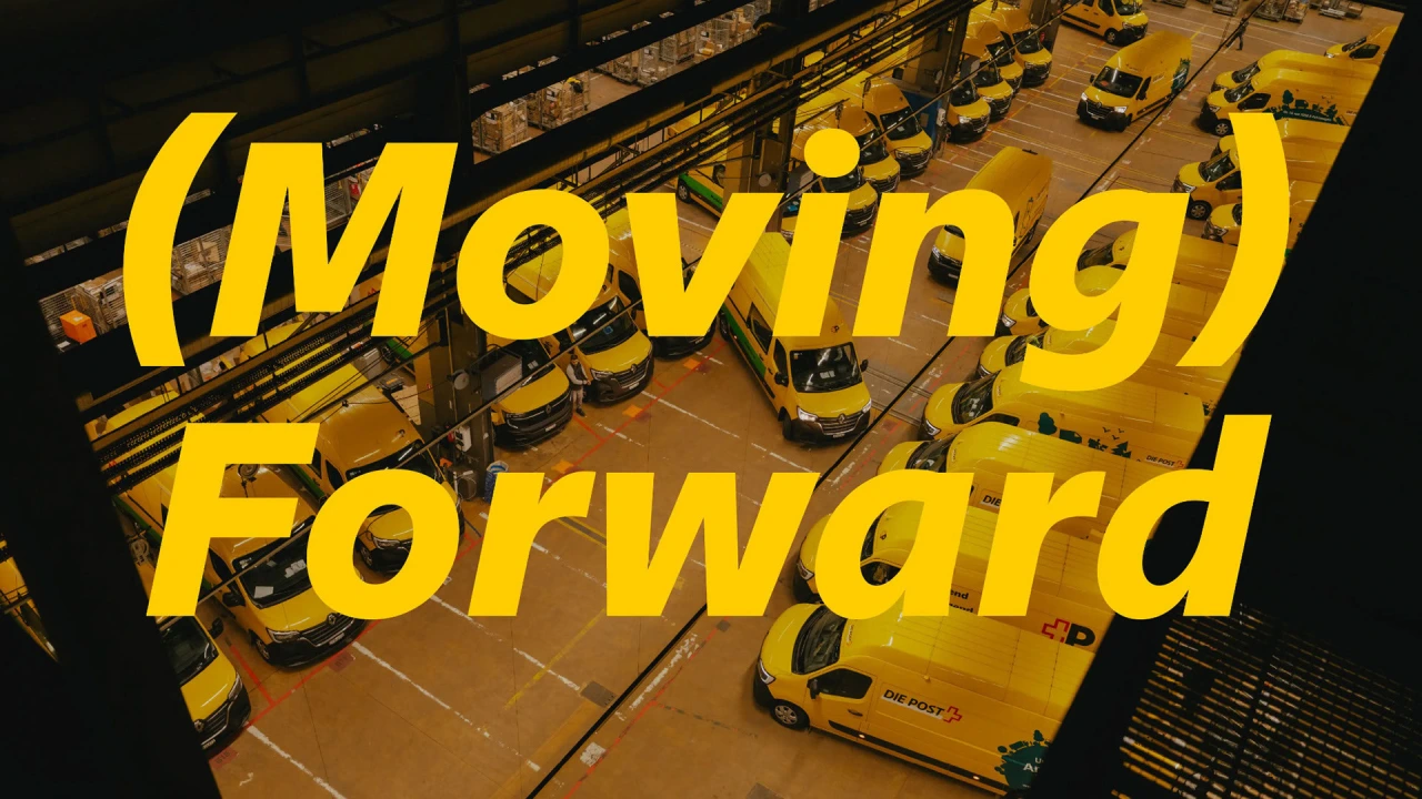
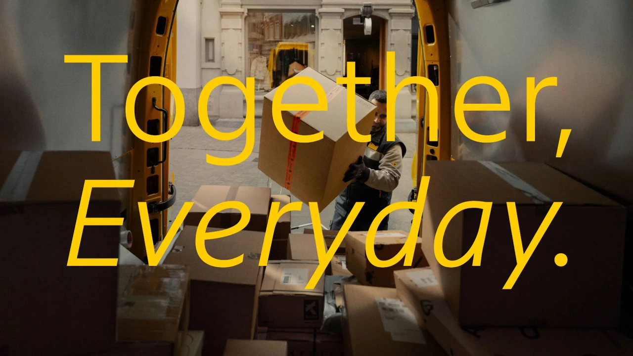
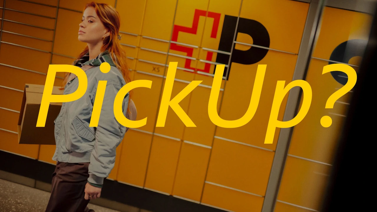
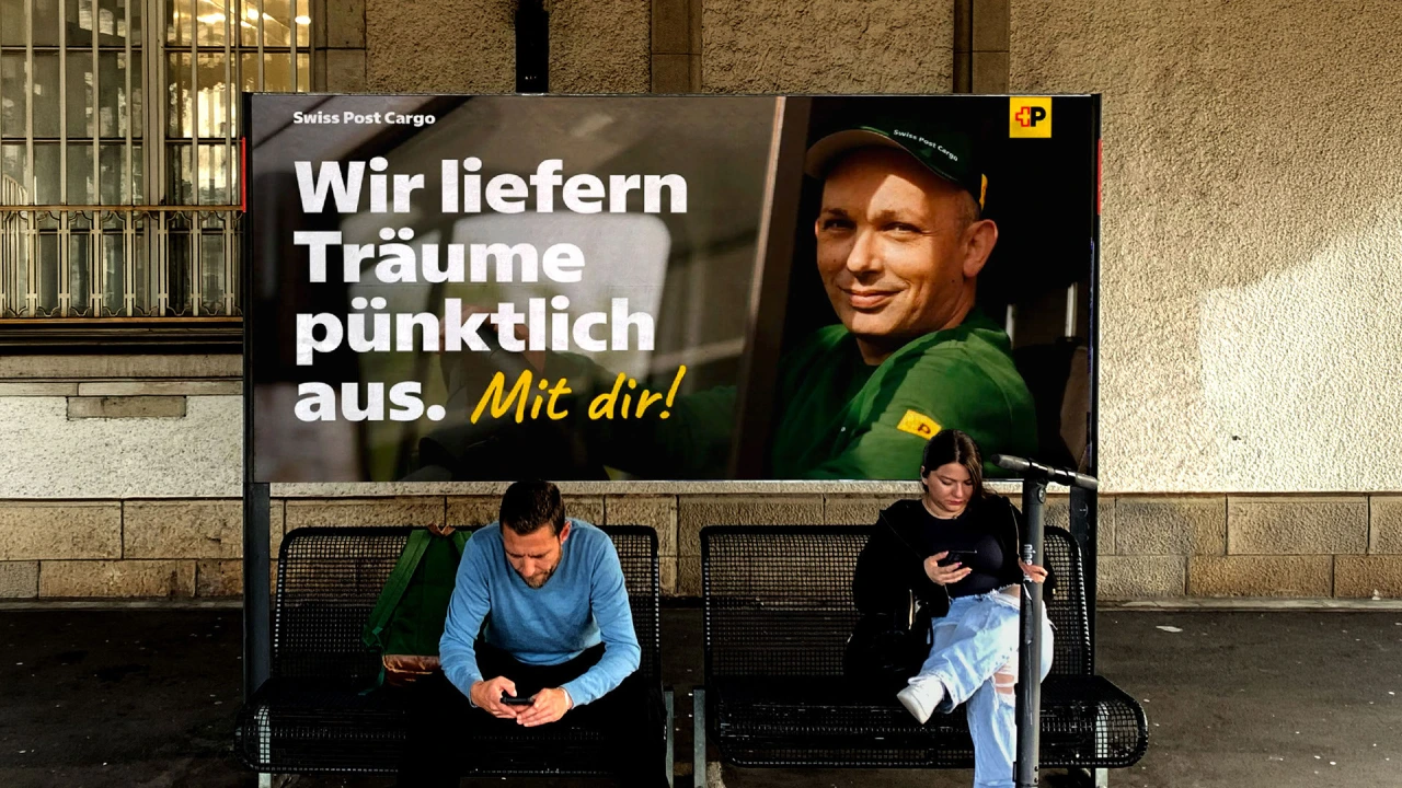
The result is Swiss Post Sans, which took more than three years to develop. That might sound like a lot, but when you're working for a national institution that's part of daily life for millions, you need to take responsibility and put in the effort. And so that's exactly what Swiss Typefaces did.
Big challenges
The project had two phases. First, the team tackled upright styles, then the italics. Developing the former came with a major constraint.
The new typeface needed to let the previous one be replaced with a simple swap of font files, without requiring any adjustment to the designs or layouts. To do that, we had to strictly maintain the original font's overall typographic volume.
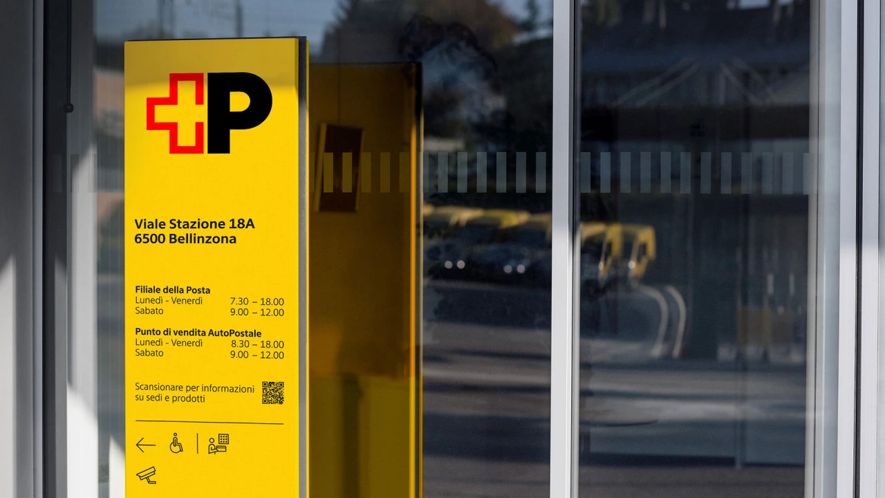
If you think that sounds tough, then consider this: communications needed to be produced in all four official languages of Switzerland: German, French, Italian, and Romansh. That meant every accent and less common glyph had to behave.
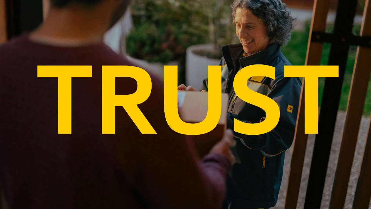
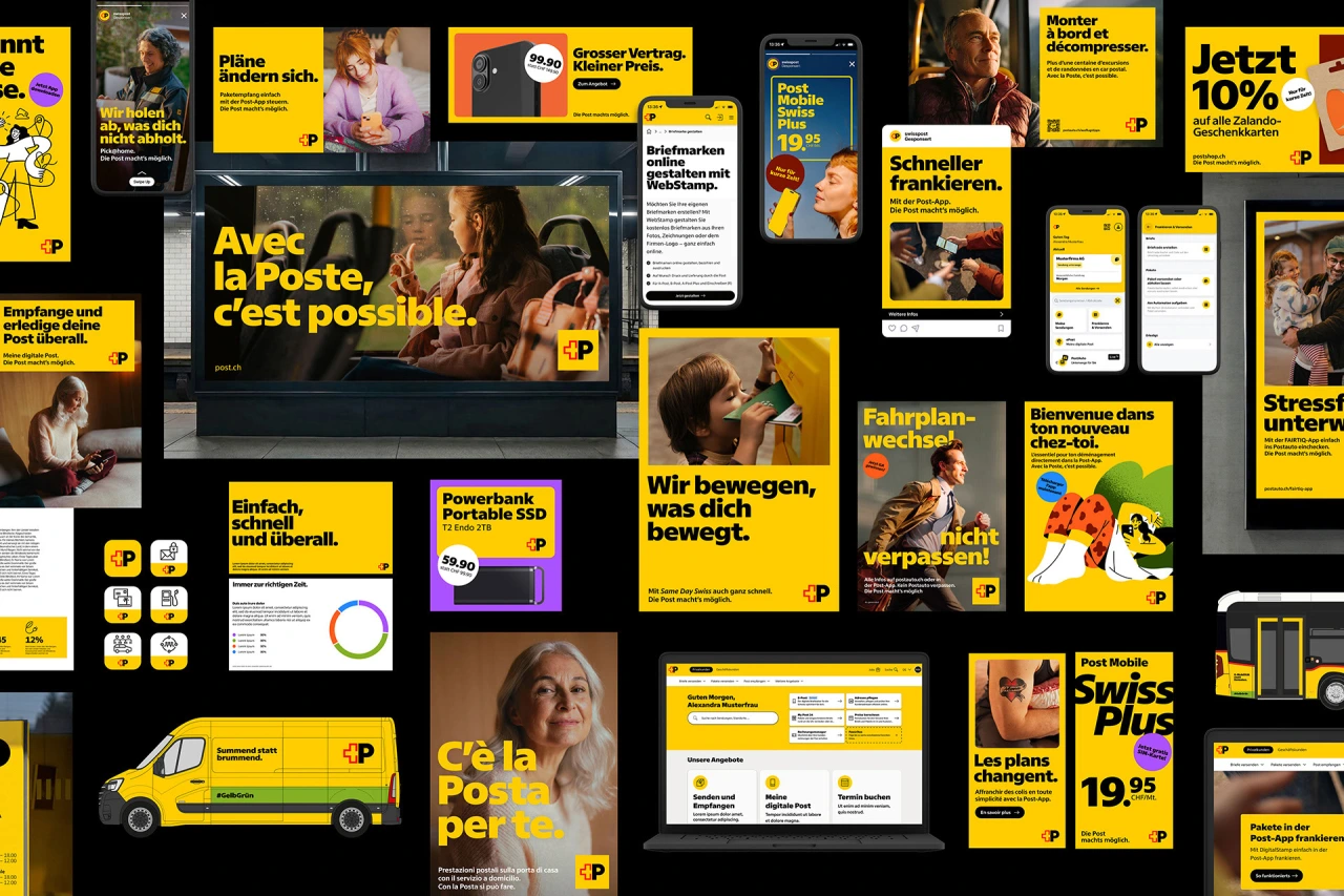
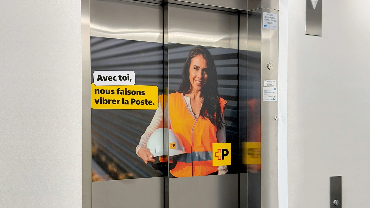
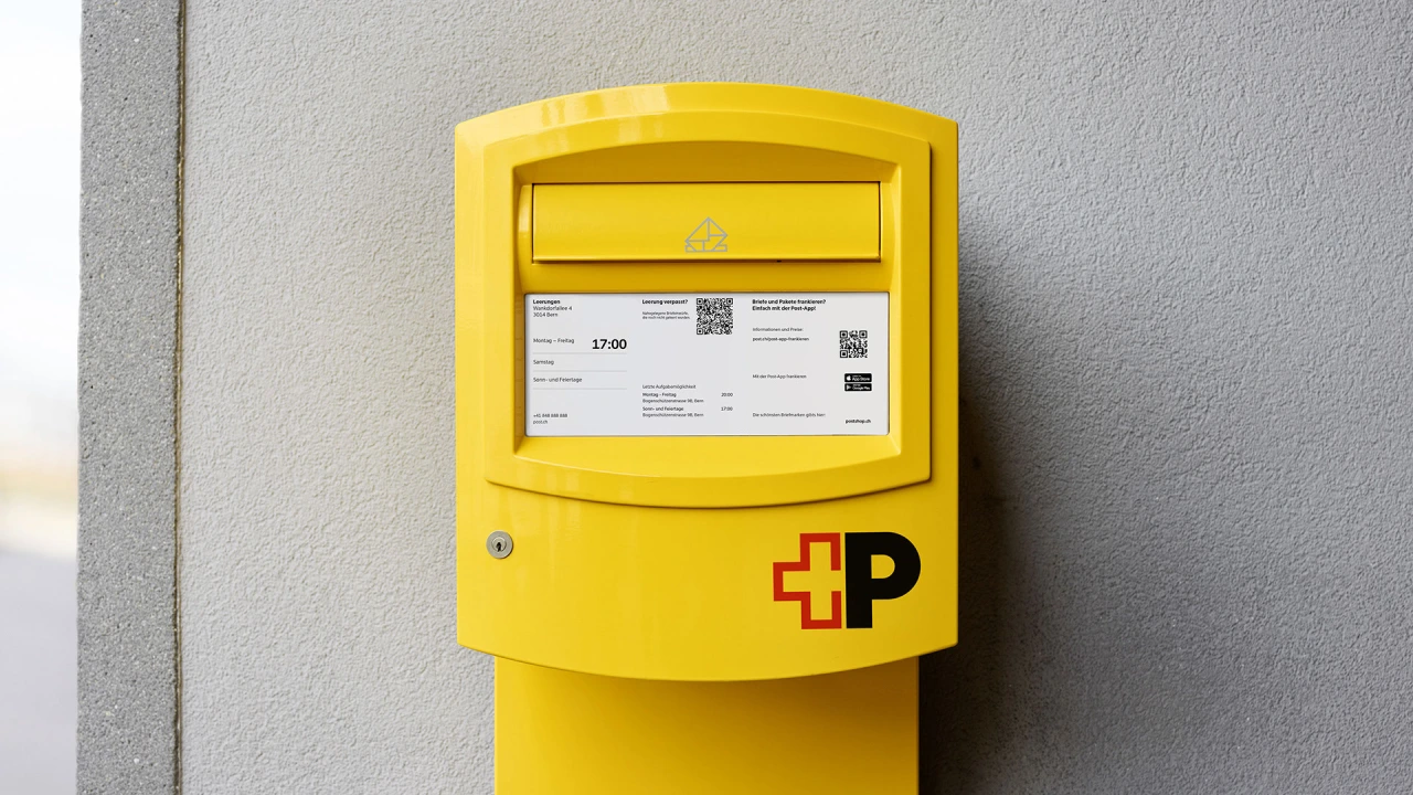
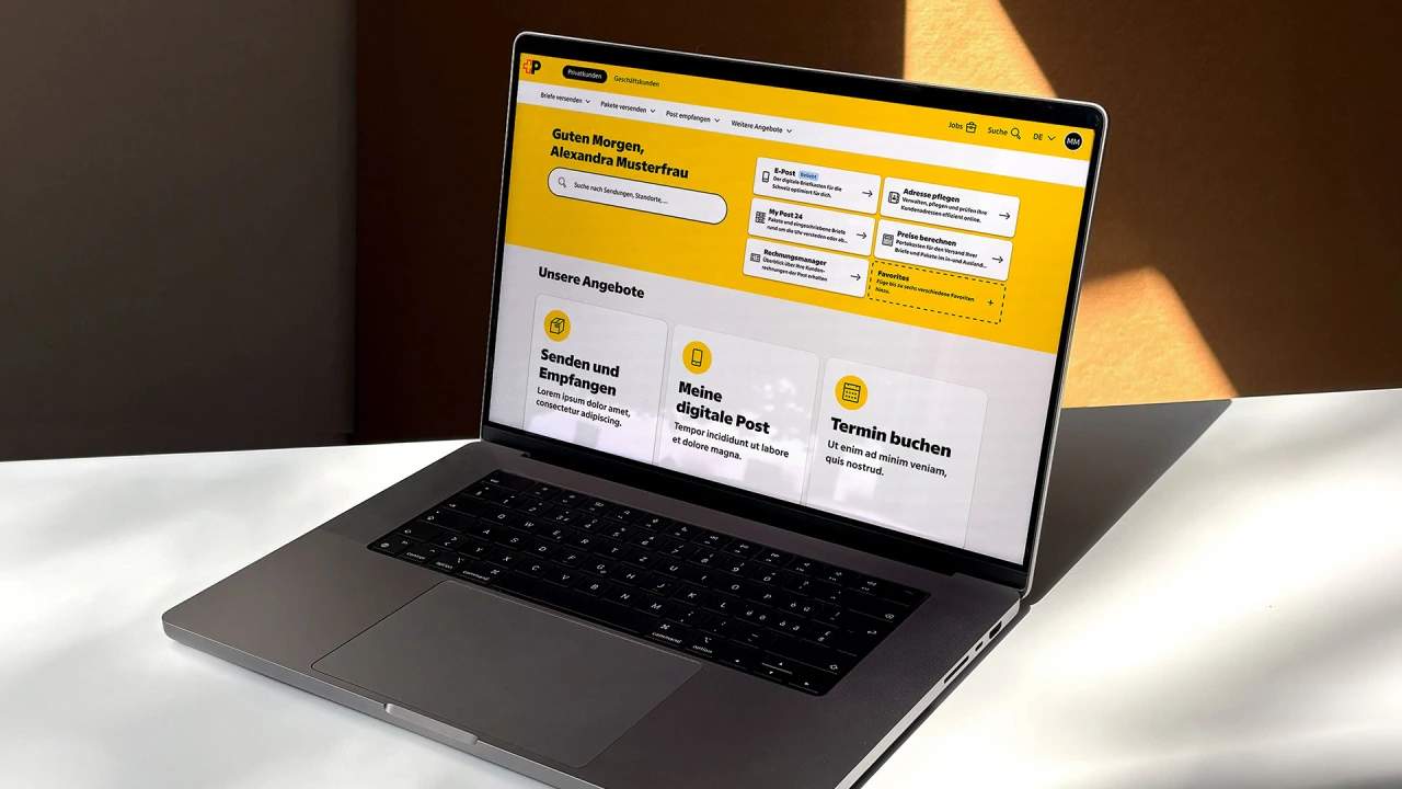
Oh, and one more thing: because so much of what Swiss Post publishes involves prices and timetables, the numerals needed to be tabular by default, so that figures would line up neatly in columns. To make this work, Swiss Post got access to beta files unusually early and tested them in real-life conditions with the help of a group of experts.
As the typeface was expected to last decades rather than years, Swiss Post used the opportunity to soften its tone. This involved giving it some humanist characteristics, making it warmer and more inviting than its predecessor, while steering well clear of anything quirky. One noticeable change came at the client's request: the square dots on letters like 'i' and 'j' have become round ones.
Creative freedom
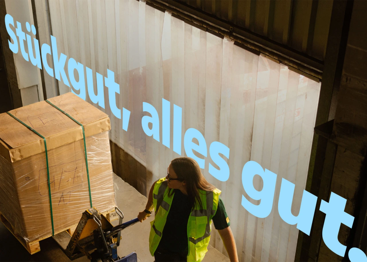
If the uprights were an exercise in restraint, the italics were the opposite. They didn't have to match anything from the old typeface, giving the studio welcome creative freedom.
Some history is useful here. Swiss Post's old logo was set in uppercase italics, suggesting movement and speed. But now that the logo has been redesigned around a steady, bold, upright 'P', the italics can take on a new role within the brand.
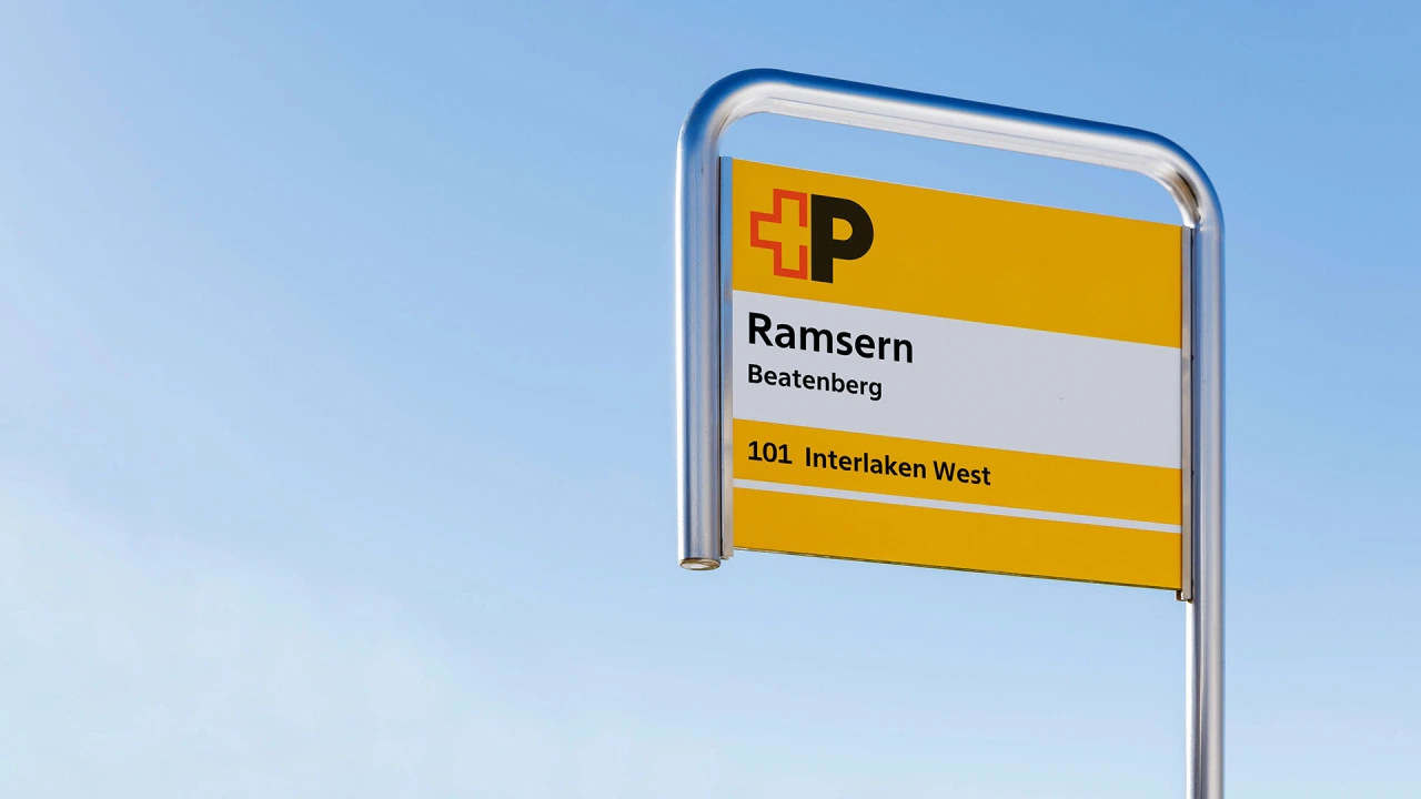
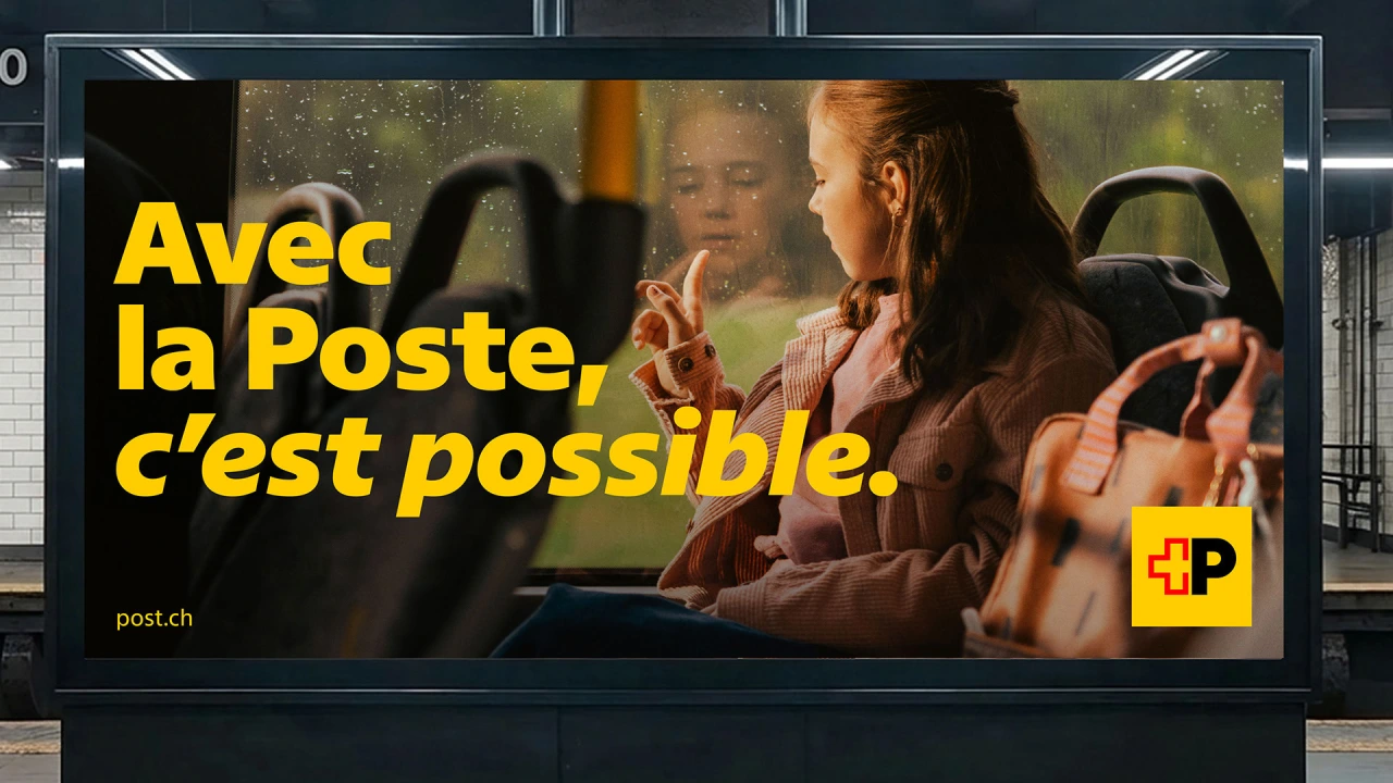
Rather than just slanting the uprights, Swiss Typefaces took a hybrid approach, building in cursive qualities on letters such as 'a', 'b', 'e' and 'g'. Curves meet sharp, straight endings throughout; the lowercase 'f', for instance, drops below the baseline like calligraphy but ends in a crisp cut rather than a traditional return stroke.
The italics now work as a signature element in their own right, appearing at headline and XXL signage sizes as well as in running text. Because italics are largely absent from web design, that gives Swiss Post a distinctive typographic voice.
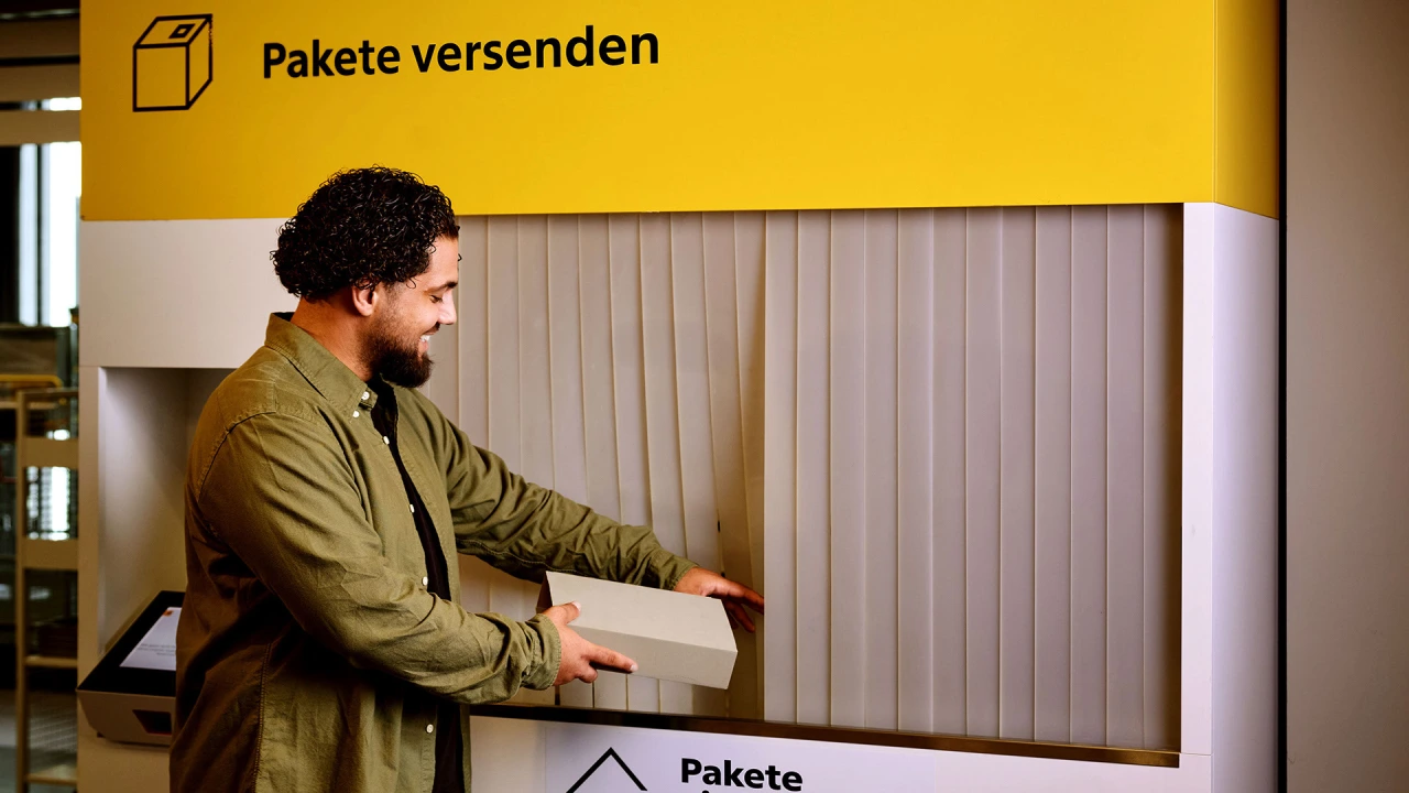
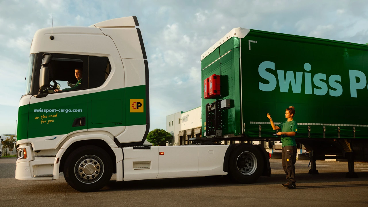
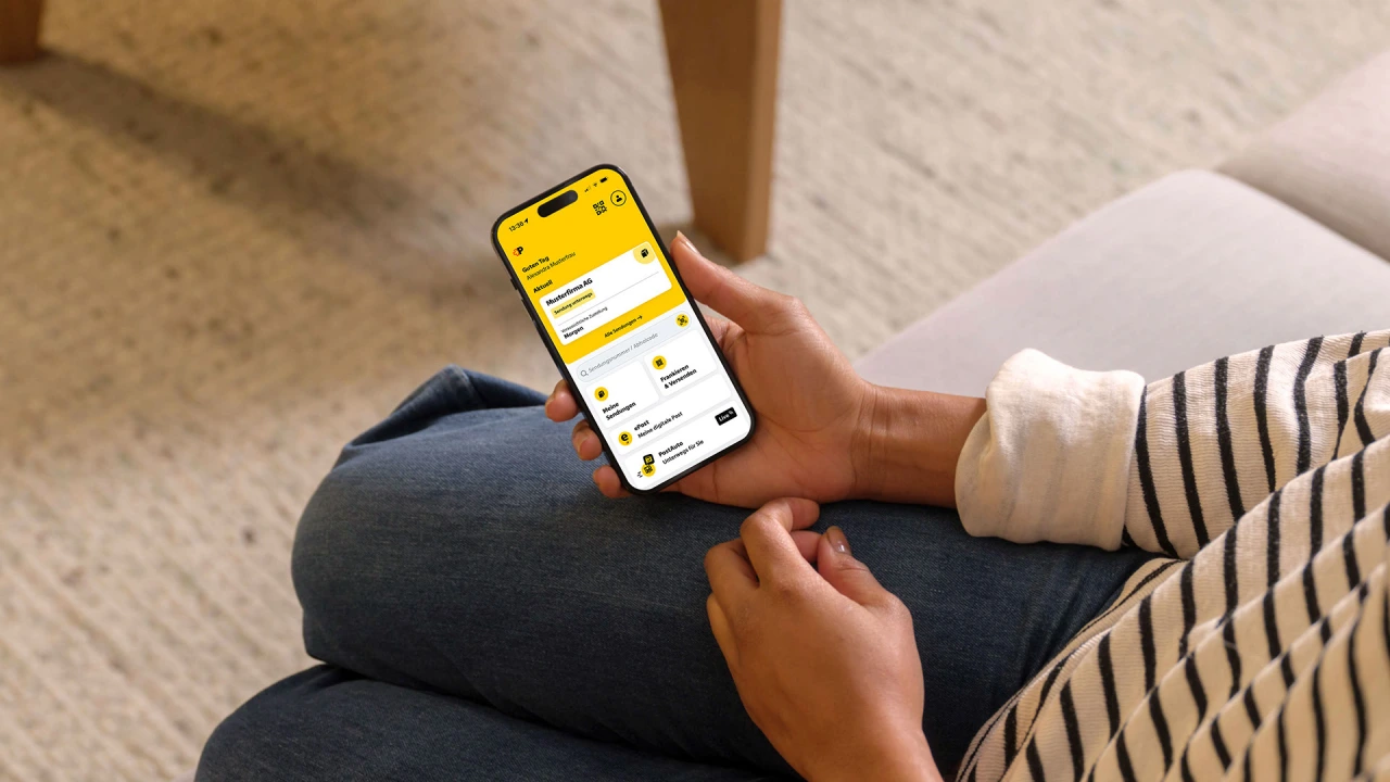
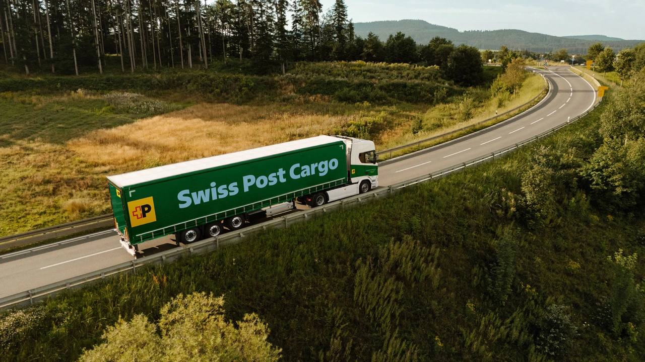
The new type family is now being used everywhere you can imagine: on street adverts, signage, trains, trucks, bus stops, pamphlets, stamps, mailboxes, websites, apps… the list goes on. And to my mind, what's lovely about it is that it doesn't rely on gimmicks. Its unique character simply comes from solving practical problems well.

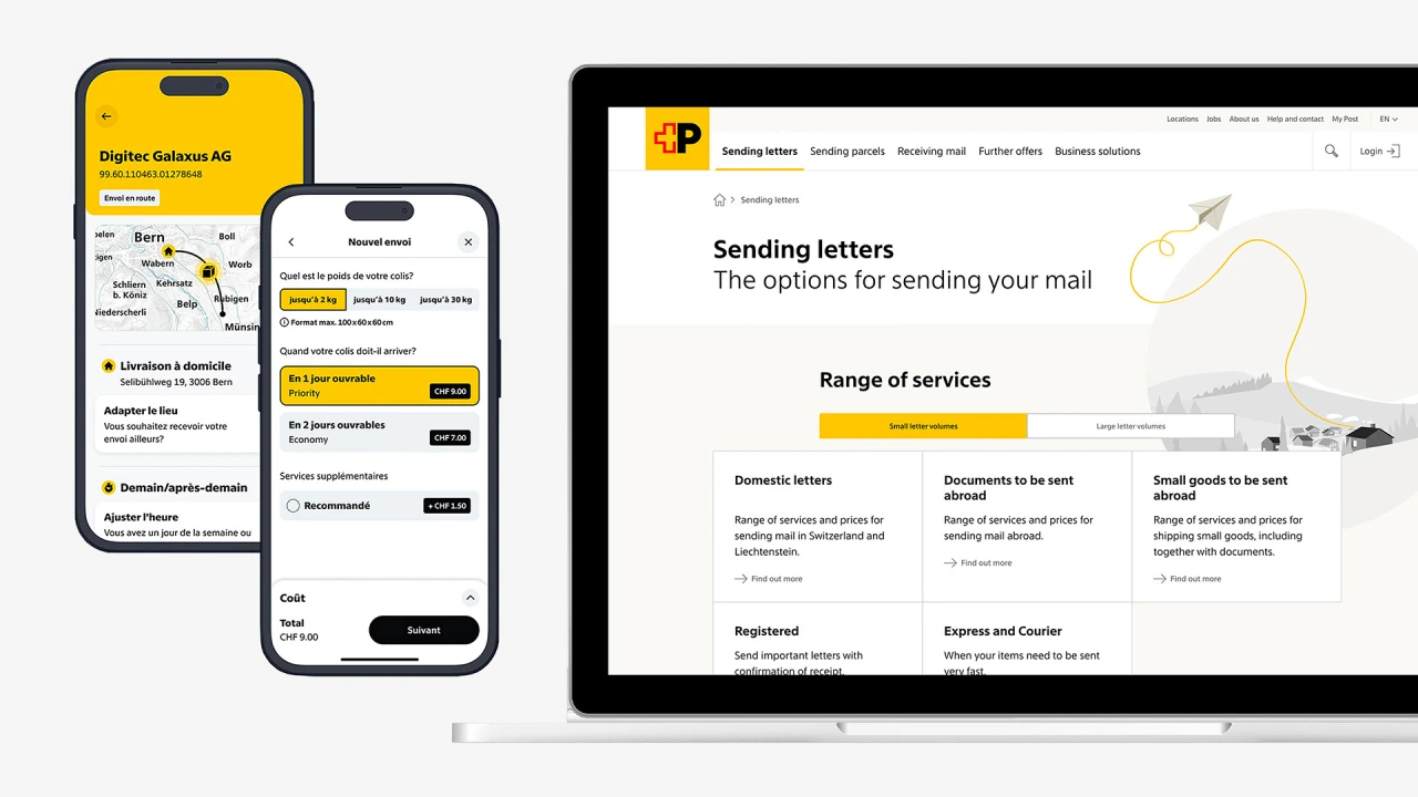
In the team's own words: "It showed how a contemporary interpretation of typographic legacy can remain true to its roots while still feeling fresh, flexible and forward-looking."
Or, as Emmanuel Rey, executive creative director at Swiss Typefaces, puts it: "Swiss Post Sans is Swiss by nature, not only by design.

Editor's Picks




Trending

Latest Jobs
Manager, Visual Design Art - TFT at Riot Games
Full-time·Los Angeles·$166,600 – $232,800
Graphic Design Intern at Ace & Tate
Full-time·Amsterdam·€500 a month
Senior Project Manager at Engage
Full-time·Leeds·£42,000 – £52,000
Content Writer at Loom Digital
Full-time·Bristol·£27,000 – £30,000
Midweight Designer at Pentagram
Full-time·London·£40,000 – £50,000
Midweight Designer at Cake Agency
Full-time·Birmingham·£30,000 – £35,000