Boxal by The Northern Block
April, then. The days are longer, and the light is better, although the world remains, broadly speaking, a mess. In that context, it's pleasing that this month's type releases feel unusually anchored. In craft traditions, in historical sources, in the quiet discipline of making something well and making it last.
The past is doing significant work here. Matthew Carter revisits a Dwiggins Scotch Roman originally adapted for Time magazine. Richard Lipton draws on Dwiggins' hand-lettered book designs. Kyiv Type Foundry recovers lettering from its city's own Metro stations. Midwest Type finds inspiration in Victorian-stencilled machinery from rural Ohio.
Alongside these archival retrievals, a different energy is also present. Maximiliano Sproviero presents a script born from a vintage pinball machine. Mark Davis builds a variable font around an axis no one thought to name before. And In-House International arrives from Austin with a typeface that cuts through in more ways than one.
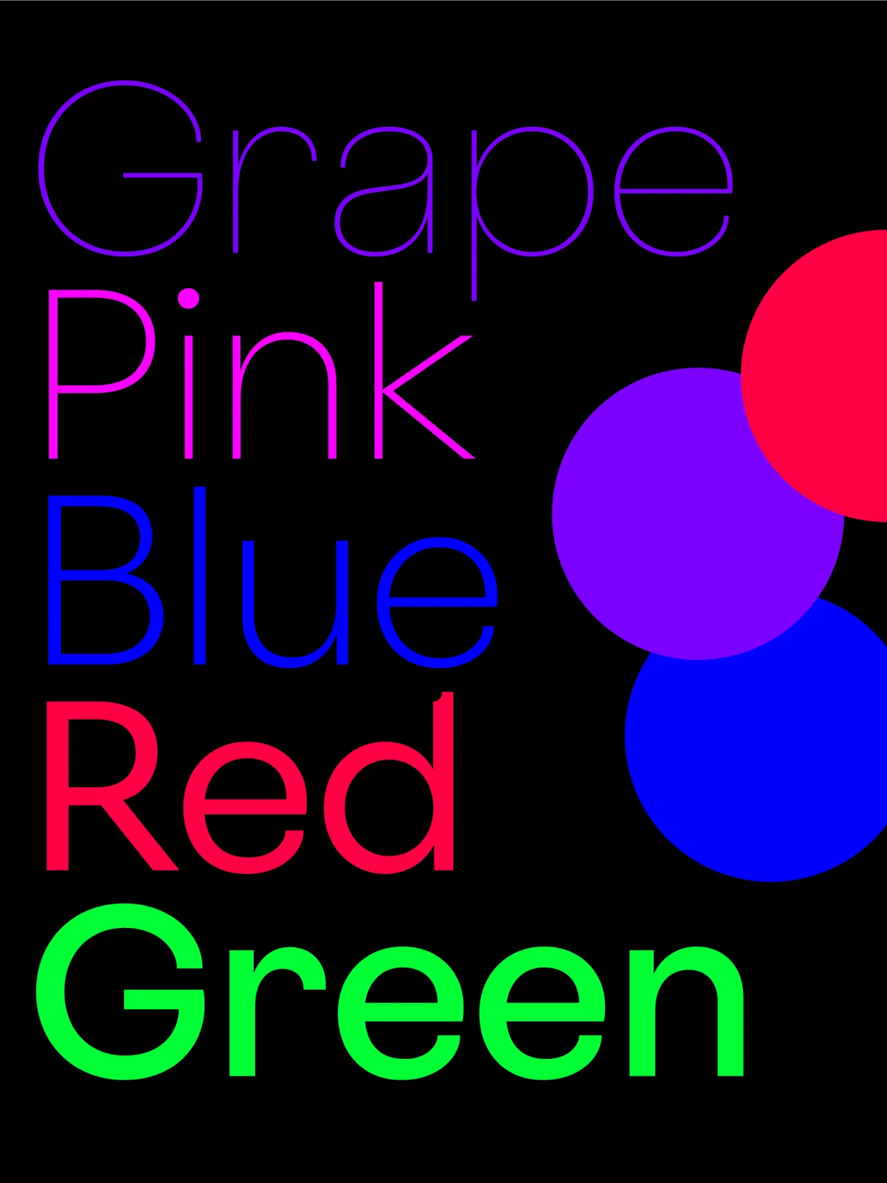
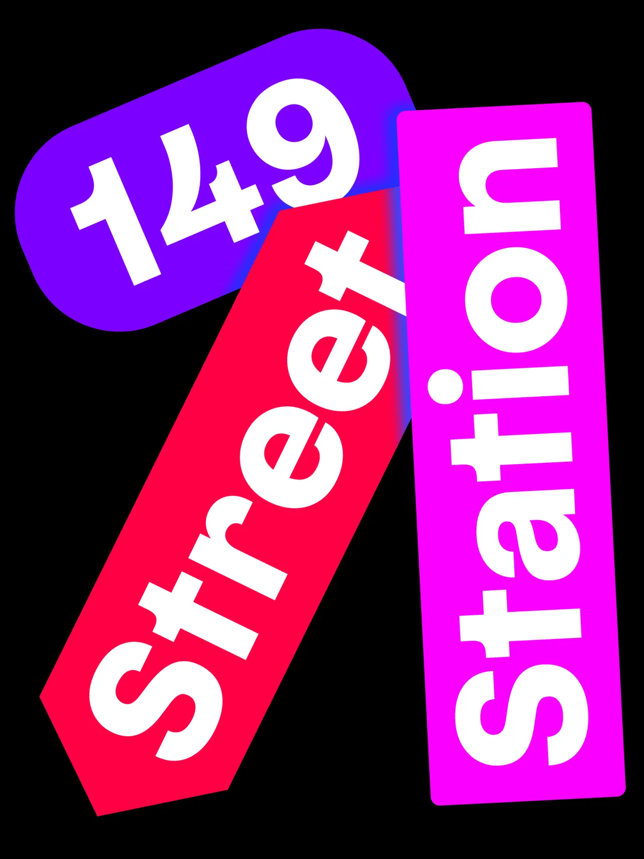
1. KTF Roman by Yevgen Anfalov and Anna Kovalenko
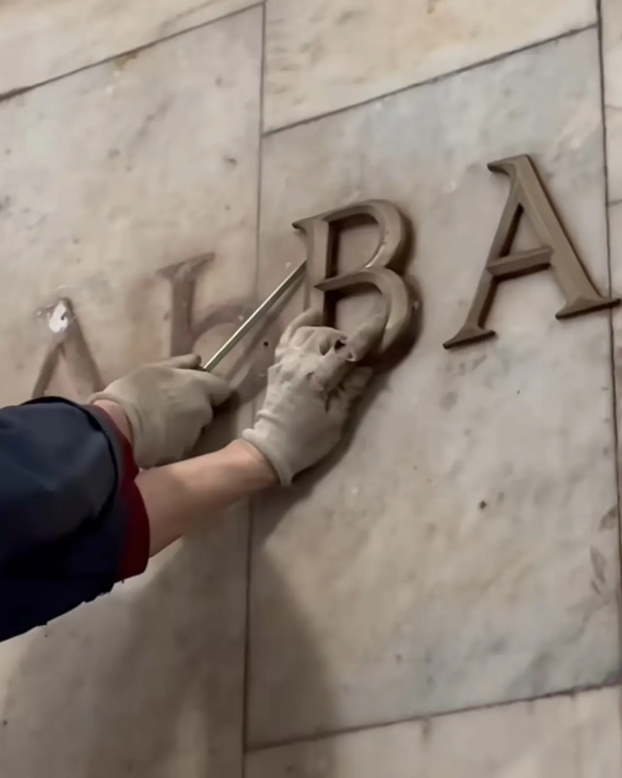
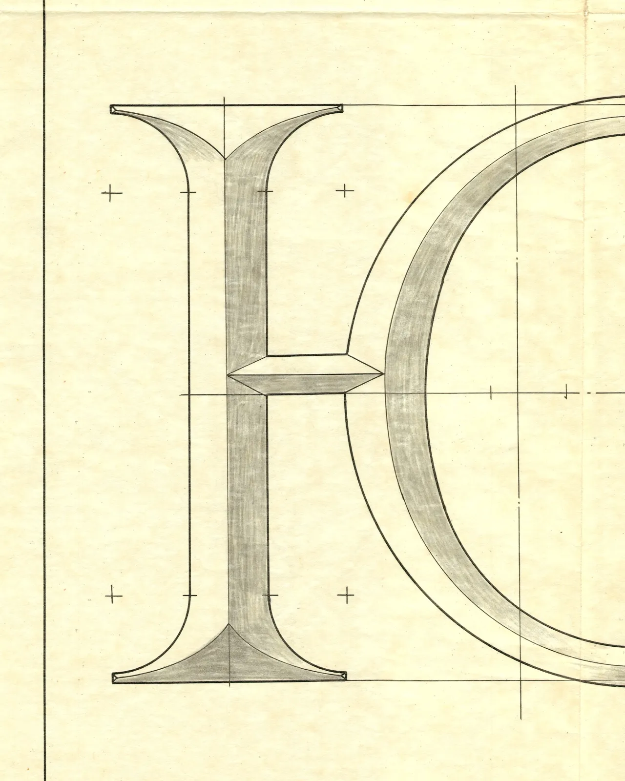
Kyiv Type Foundry's KTF Roman revives the lettering installed in the Ukrainian capital's Metro stations during the 1960s—cast-metal forms designed by an architect whose name was never recorded. It is dedicated, explicitly and movingly, to that unknown maker.
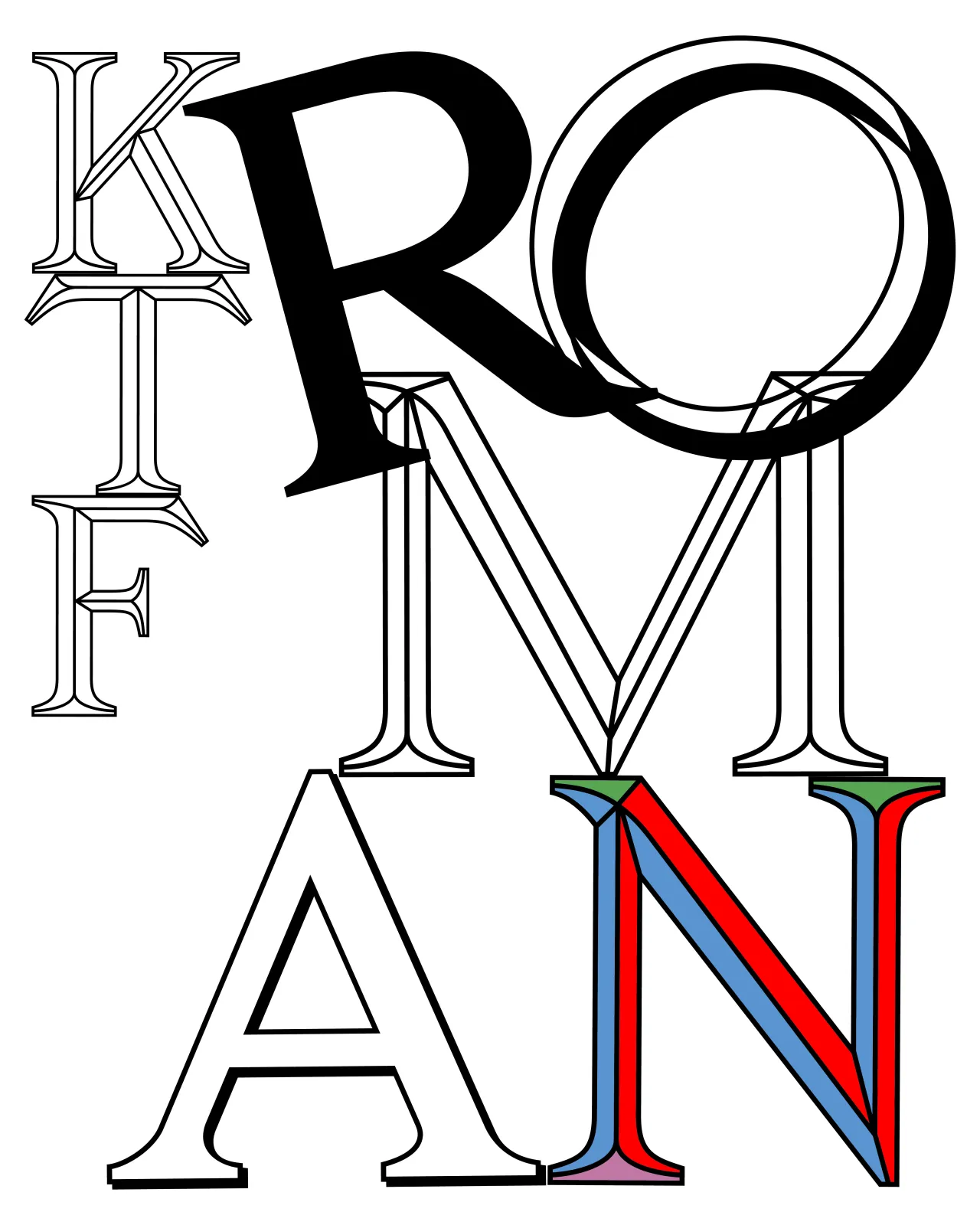
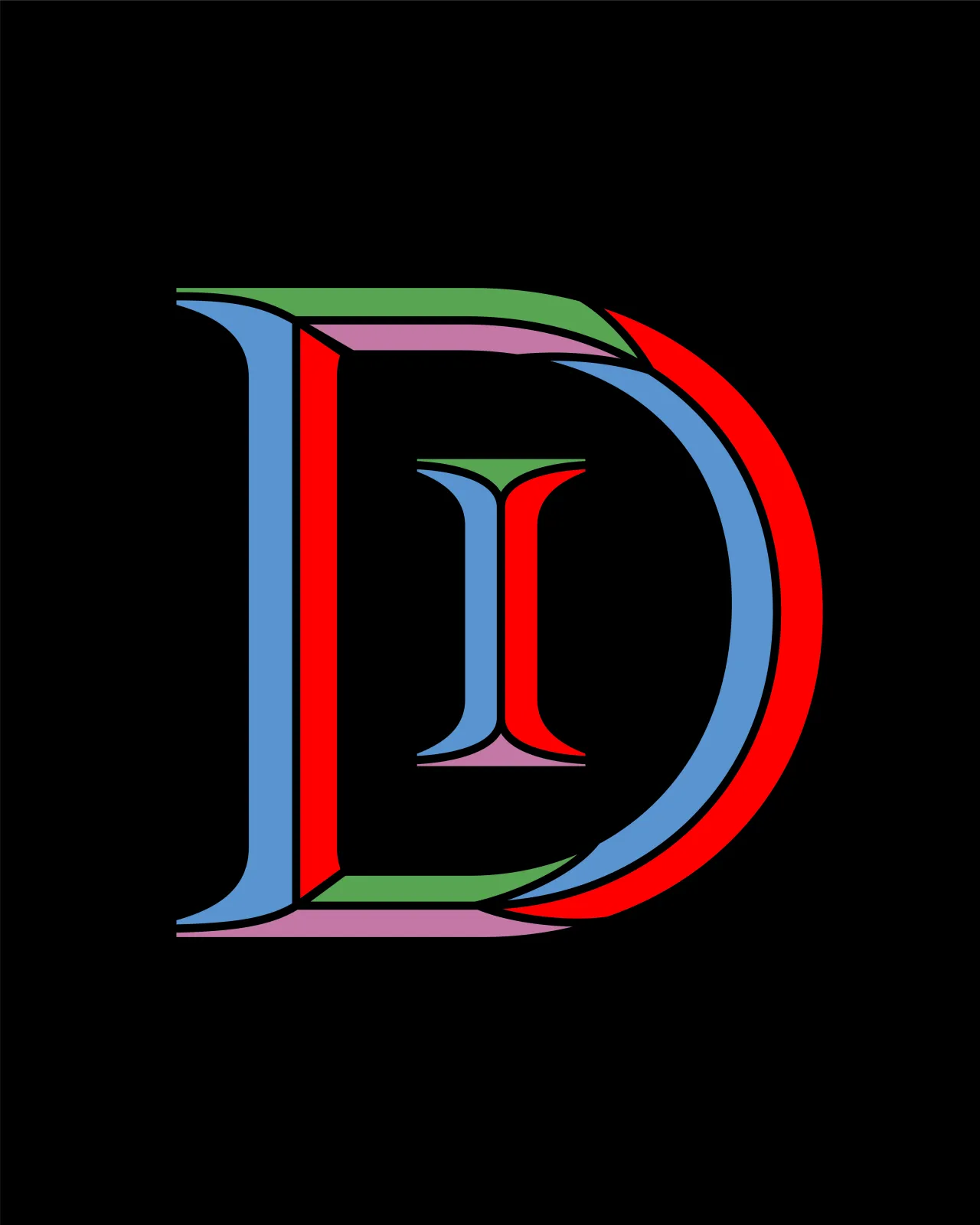
Working from archival technical drawings and period photographs, the font's two designers translated the original flat forms into a full type family of five styles. Each reveals the same letterforms differently. Outline lays bare their structural logic; BlackWhite divides each letter into illuminated and shadowed planes; Shadow presents solid forms with sharp cast shadows; and Colour—the foundry's first colour font—applies vibrant contrasts to create what the designers describe as a patchwork-like play of surfaces.
An extensive ligature set, inspired by engraved memorial plaques and architectural inscriptions, completes this act of typographic recovery, which doubles as a small piece of cultural preservation.
2. Caledonia CC by Matthew Carter
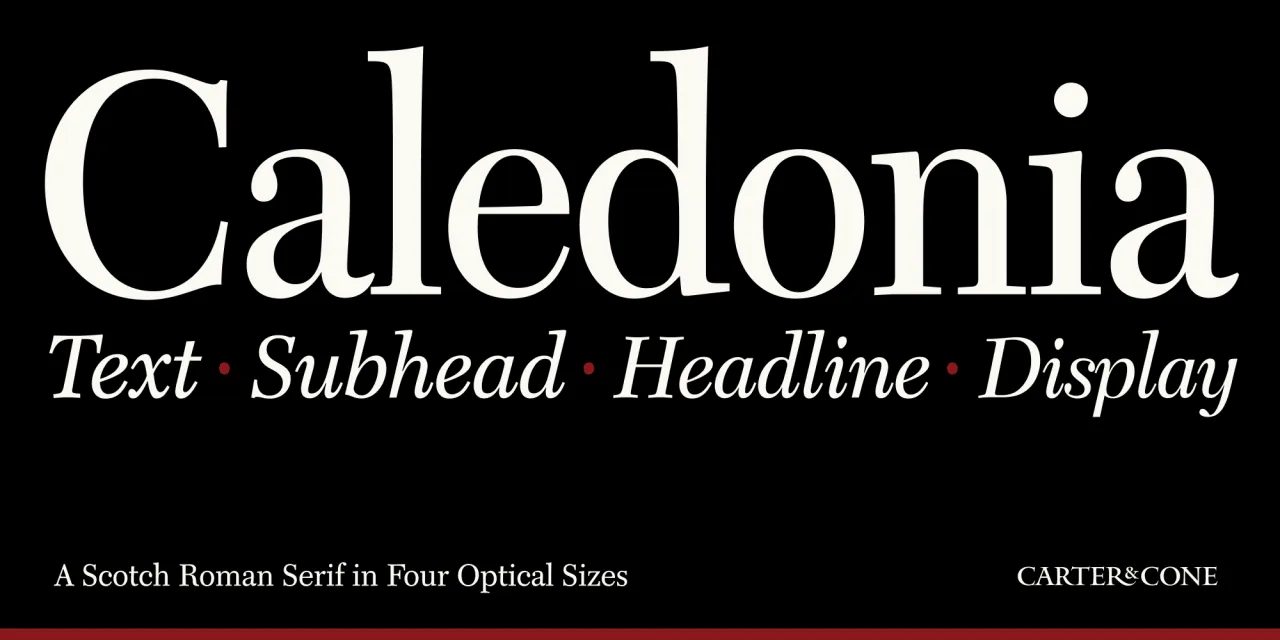
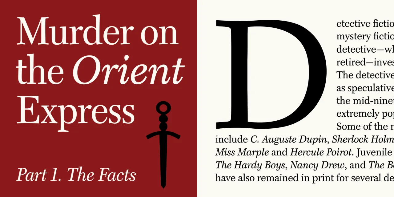
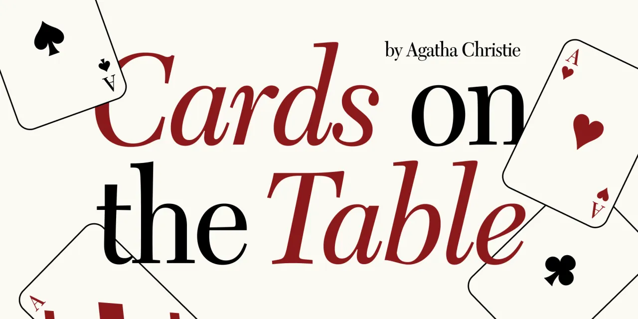
Matthew Carter's rendition of Dwiggins' Caledonia was originally adapted for Time magazine from Linotype's 9-point drawings, and that editorial provenance shapes everything about its performance. Four optical sizes (Display, Headline, Subhead and Text) preserve the refined details, sturdy rhythm and typographic clarity that made the original so effective across decades of magazine publishing.
Available in Regular and Italic, Caledonia CC is perhaps the most technically conservative release on this list, and all the better for it. There is a certain confidence required to release a typeface that asks nothing of the reader and places craft entirely in service of legibility. Carter & Cone earns that confidence through pedigree, precision, and a thorough understanding of what Dwiggins achieved and why it still matters.
3. Boundt by Panca Ahmadi Hasan
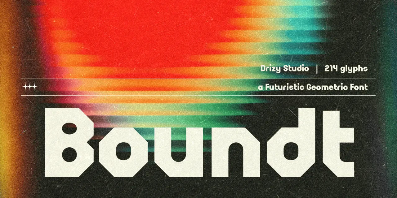
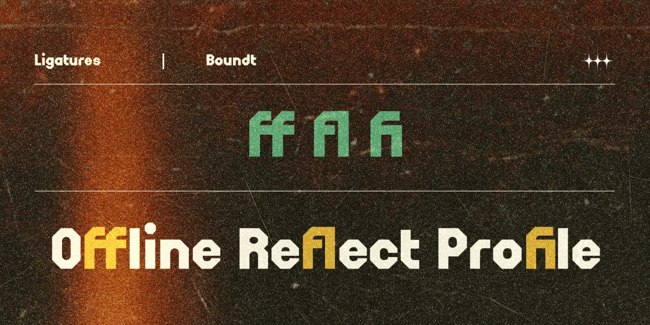
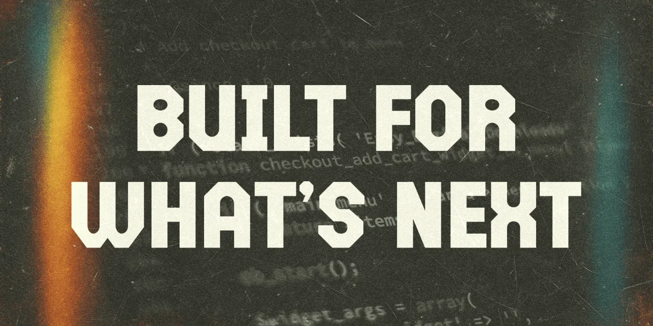
Boundt arrives from Drizy Font with a clear visual proposition: bold, architectural geometry at display scale, informed by mechanical bolt-and-nut structures and the graphic language of vintage broadcast design. The mechanical metaphor gives the letterforms a coherence that purely decorative display faces often lack: a sense that the same underlying system generated them all.
The vintage broadcast influence, meanwhile, stops the design from feeling purely industrial, adding a retro warmth that softens the harder geometric edges. With multilingual support, ligatures, and both OTF and TTF formats, it's designed for strong visibility across digital media, advertising and contemporary branding.
At its best (large, in high-contrast settings), Boundt functions as something between a typeface and a graphic element.
4. Reckham by Max Phillips
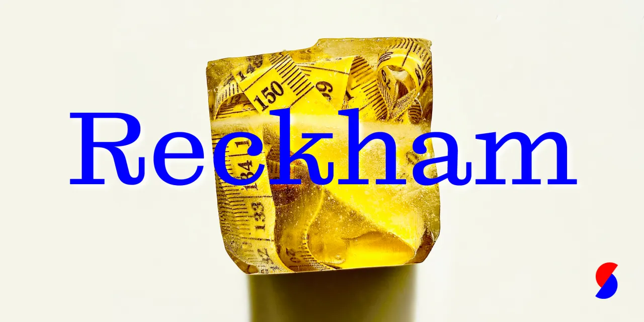
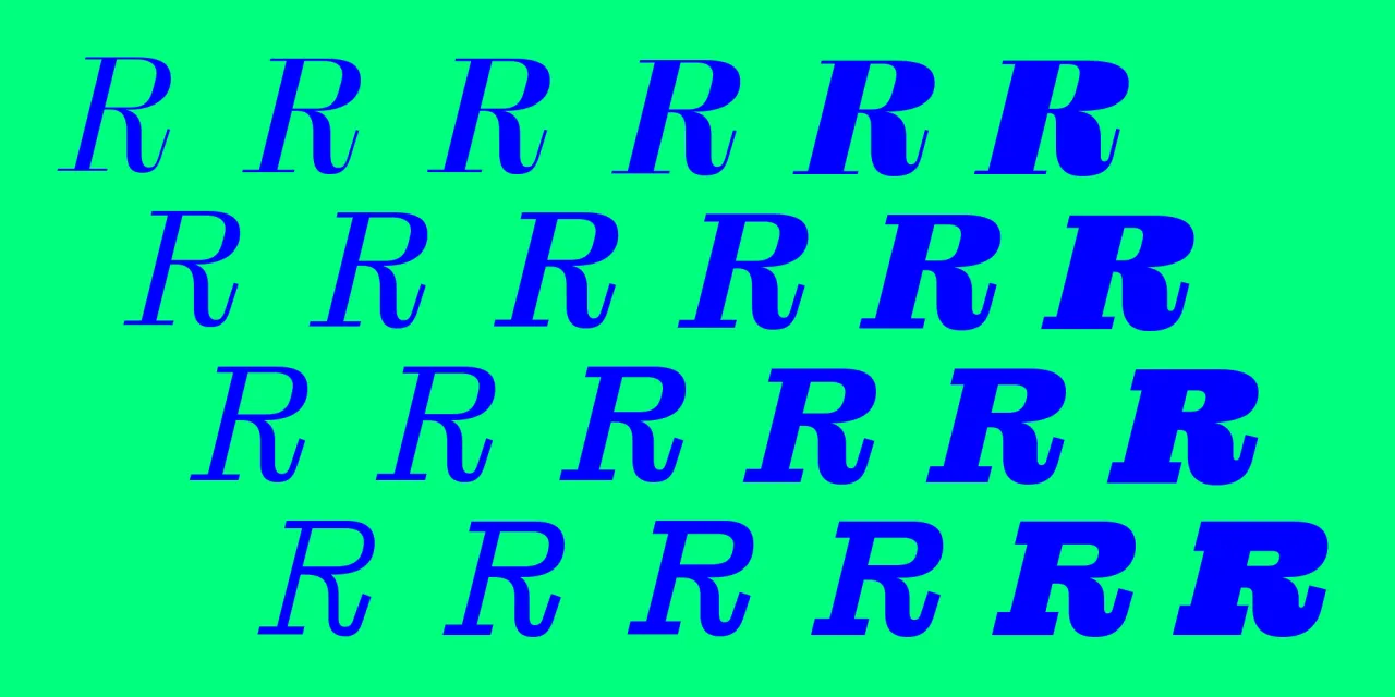
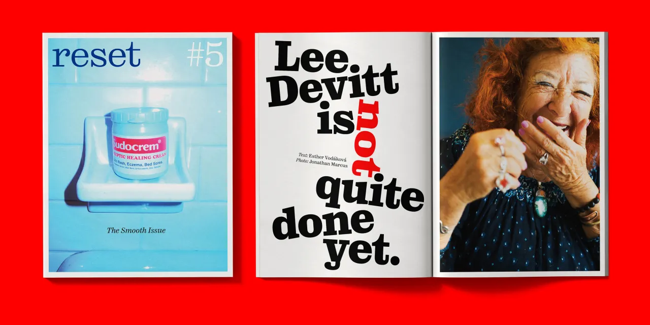
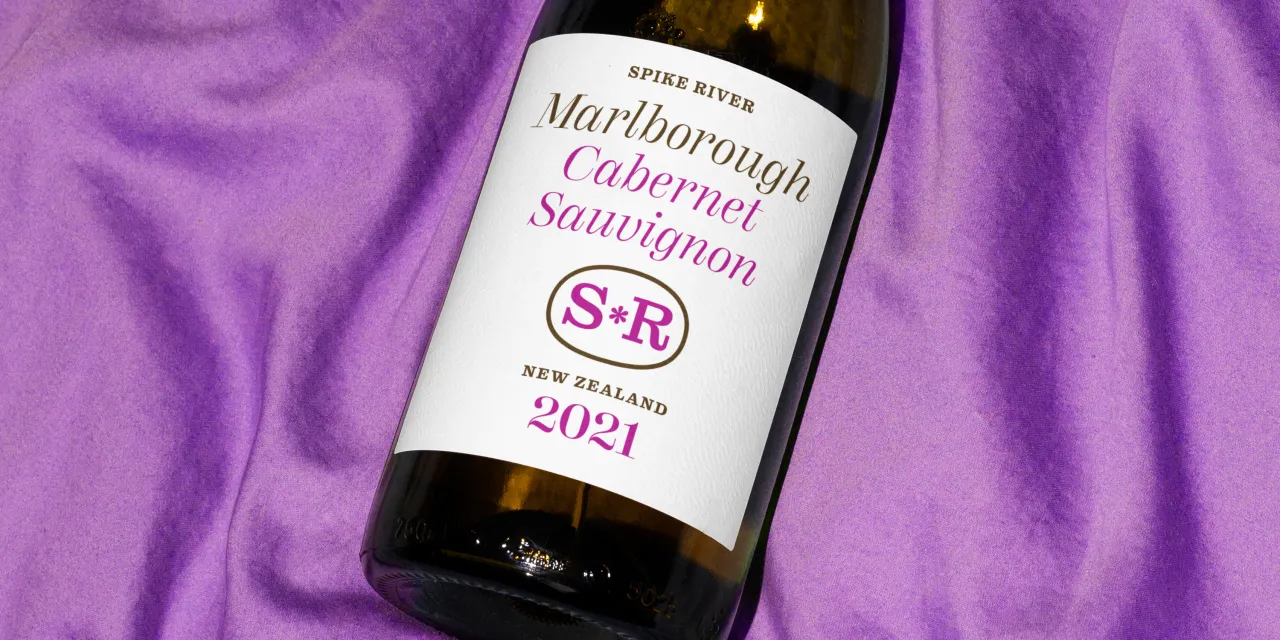
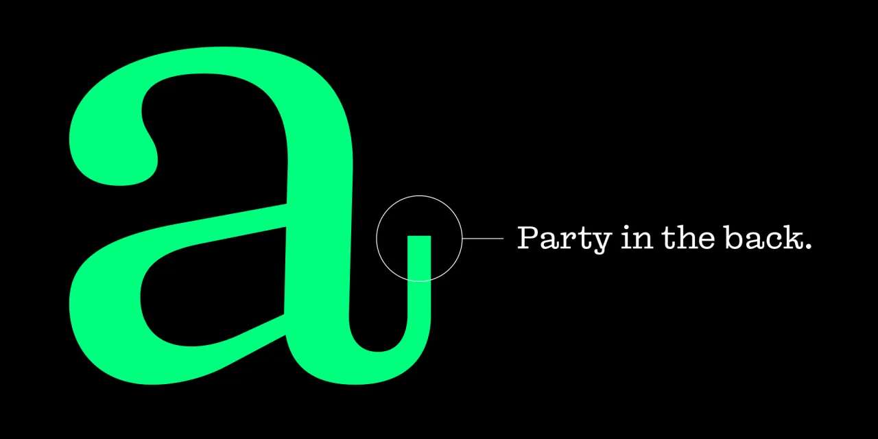
Max Phillips of Signal Type Foundry describes Reckham with characteristic candour. It started as a Century Expanded, intended to turn into a Clarendon as it got bolder. But the serifs came unbracketed, and the ideals of clarity had to make room for eccentric details. Then they couldn't decide on a degree of contrast, so they went with all of them. The resulting four contrast series (from near-Didone to near-Egyptian), across six weights with matching italics, produces 48 styles, with variable fonts allowing fine-tuned control over weight and contrast.
Most families achieve coherence by constraining variation; Reckham makes variation the explicit subject of the design. The result isn't what Phillips expected, but, as he puts it, "it must have been what we wanted."
5. MWT Sheller Stencil by Jesse R. Ewing
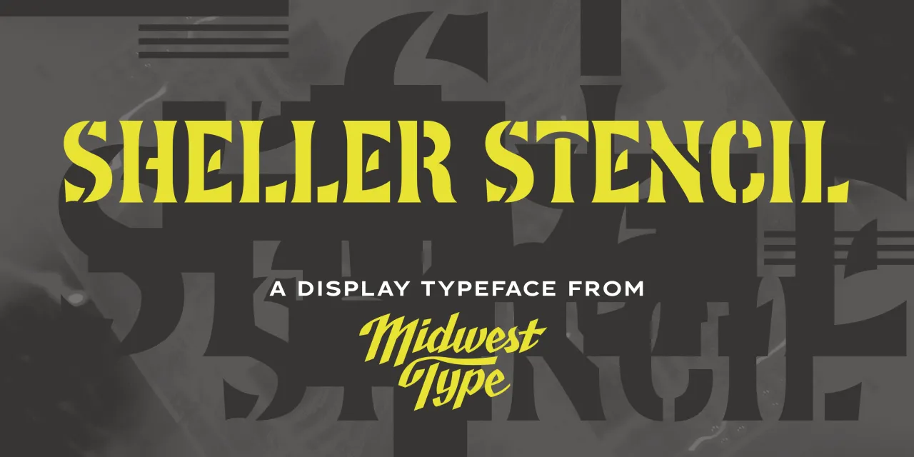
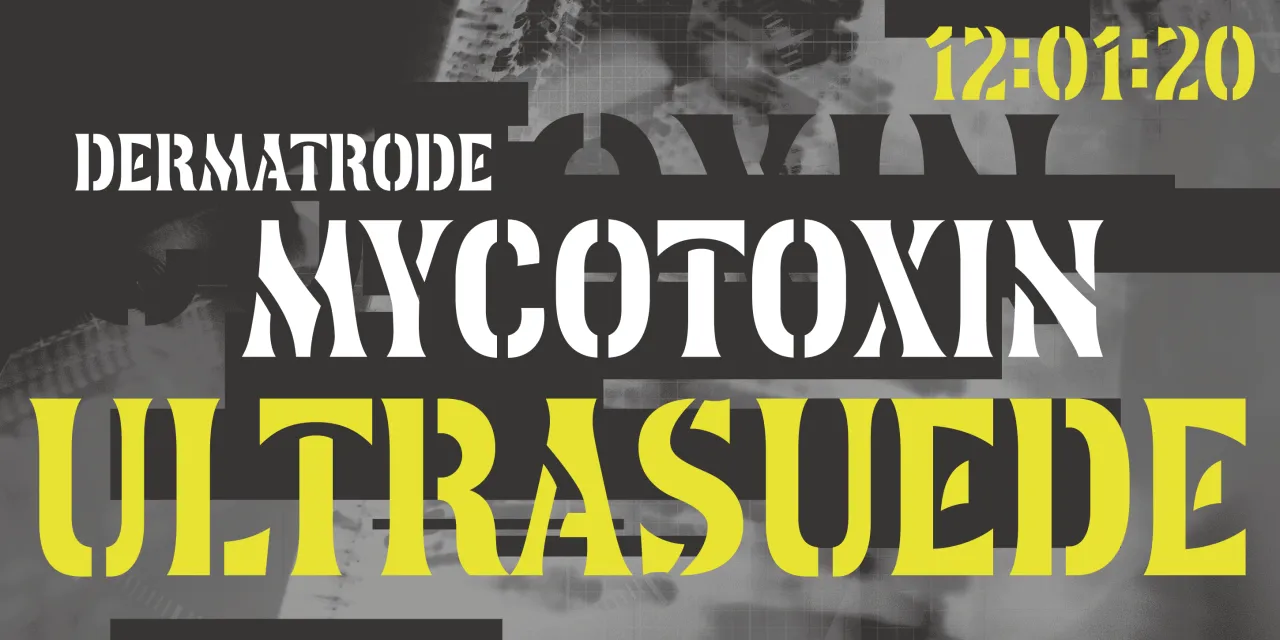
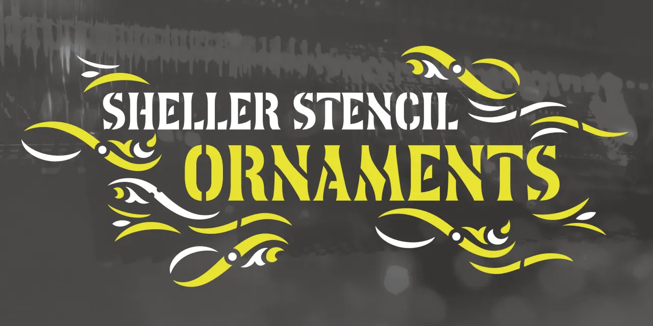
Jesse R. Ewing built Midwest Type around an archival attention to the industrial and agricultural visual culture of the American heartland, a tradition largely overlooked by type historians. Sheller Stencil originates in the stencilled lettering found on agricultural machinery from Tiffin, Ohio, in the late 19th century: anonymous commercial graphics that, on close examination, turn out to be genuinely inventive.
Some characters split at right angles; others follow curvilinear breaks that track the Art Nouveau-inflected letterforms rather than cutting across them mechanically. The result reads as antique but carries enough formal authority for contemporary packaging, editorial work and heritage-positioned branding.
6. Sets Grotesk by José Solé
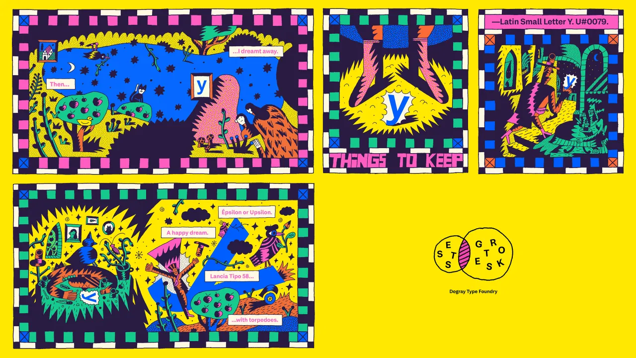
Sets Grotesk began with a brief from Sahar Afshar: "a not too quirky Grotesk." Solé found room for interpretation. The result is a four-optical-size system, with nine weights each and 36 styles in total, in which scale carries its own proportional logic: larger intended use means taller x-height, shorter ascenders and descenders, larger dots, and wider characters.
The inspiration is 1960s and 70s type design, but the approach is historical without being historicist; each optical size functions as a window into a different era of 20th-century Grotesque, though not in chronological order. In the Large size, tails on the a, g, l and y are removed for a clean, rational compactness; though they remain recoverable through stylistic sets. A confident debut from a new foundry with an impressive range.
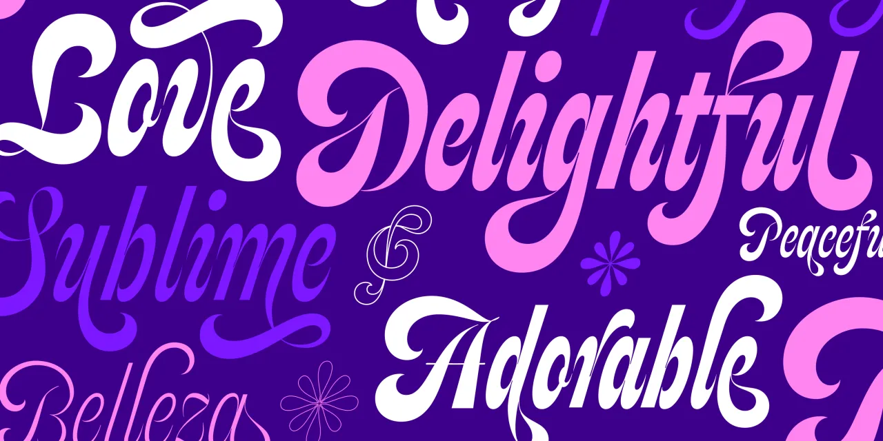
7. SPT Feline by Maximiliano Sproviero
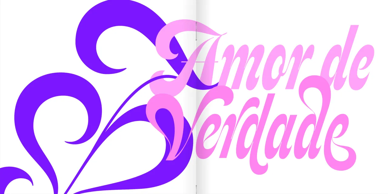
The origin of Feline is exactly the kind of detail that distinguishes observant type designers. Maximiliano Sproviero noticed lettering on a vintage pinball machine and, from that encounter, developed a script typeface that this year received a Communication Arts Typography Award of Excellence. What Feline captures from its source is the liquid, groovy quality of 1960s psychedelic script lettering: exaggerated swashes, sinuous movement, expressive forms.
The significant twist is structural: the letters rarely connect, giving Feline a sculptural, three-dimensional quality rather than the flowing continuity most scripts pursue. Available in six weights from Thin to Extra Black, in Soft and Sharp styles, or as a two-axis variable font, it offers a genuine range beneath its exuberant surface.
8. LLD Panta Display by Richard Lipton
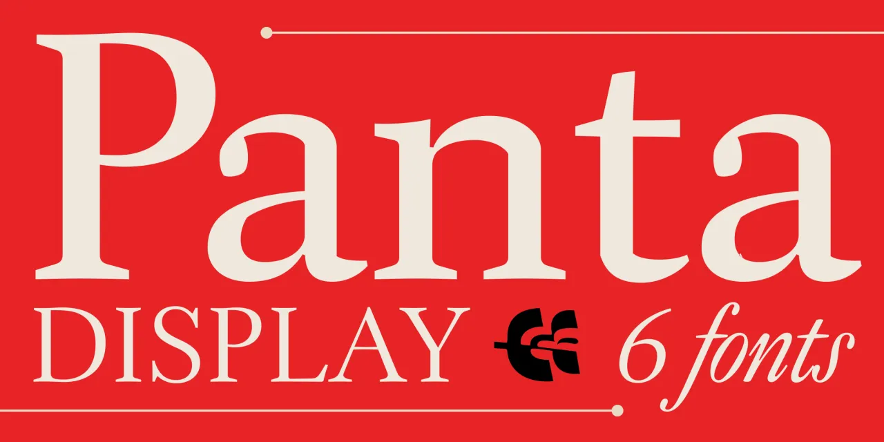
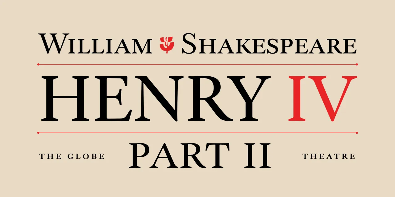
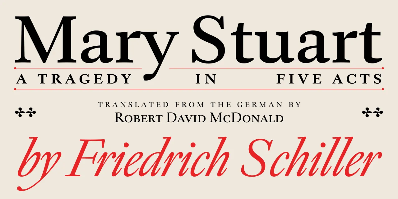
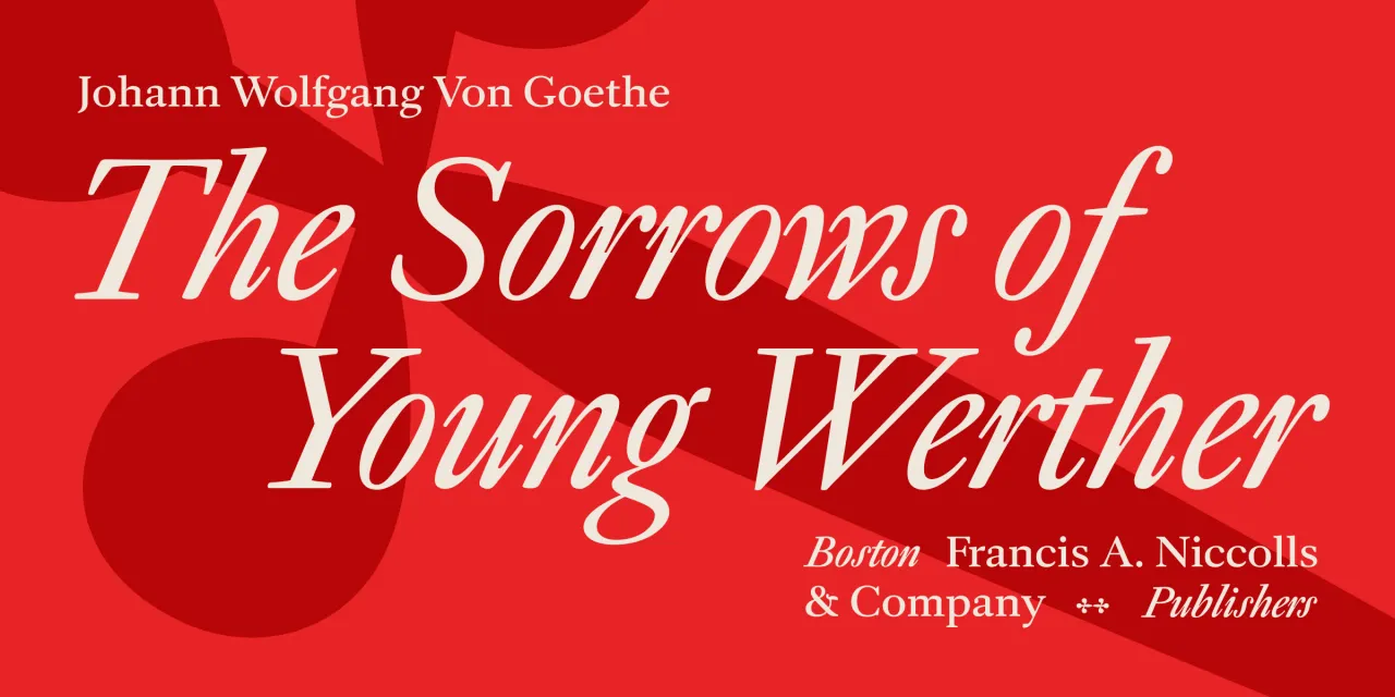
Richard Lipton's Panta Display draws not on Dwiggins' typefaces but on his hand-lettered book design for Gargantua & Pantagruel; a distinction that gives the result a warmth and literary specificity that more formal revivals can miss. Lipton brings more than 40 years of calligraphic practice to the project, and it shows: the subtle asymmetries and lively curves are the residue of a hand-based discipline, of letterforms that emerged from the body rather than geometry.
Small caps, old-style and lining figures, and dramatic italics complete a family with a warm, literary, confident mid-century spirit. It's comfortable in long-form books, but has sufficient editorial personality for magazine work, too. For designers who find contemporary text serifs too neutralised and too reluctant to carry a typographic voice of their own, Panta is a substantive alternative.
9. Best Grotesk by Ignacio Casco Guijarro
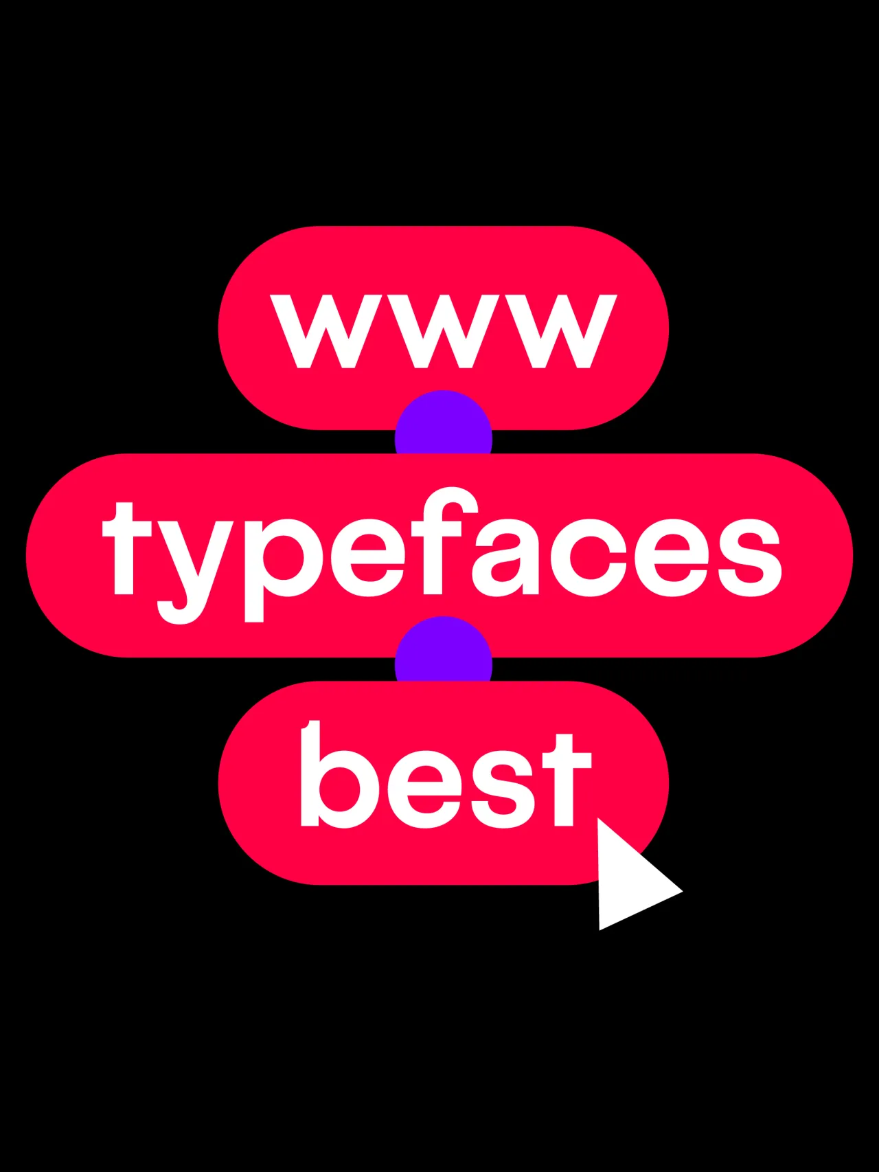
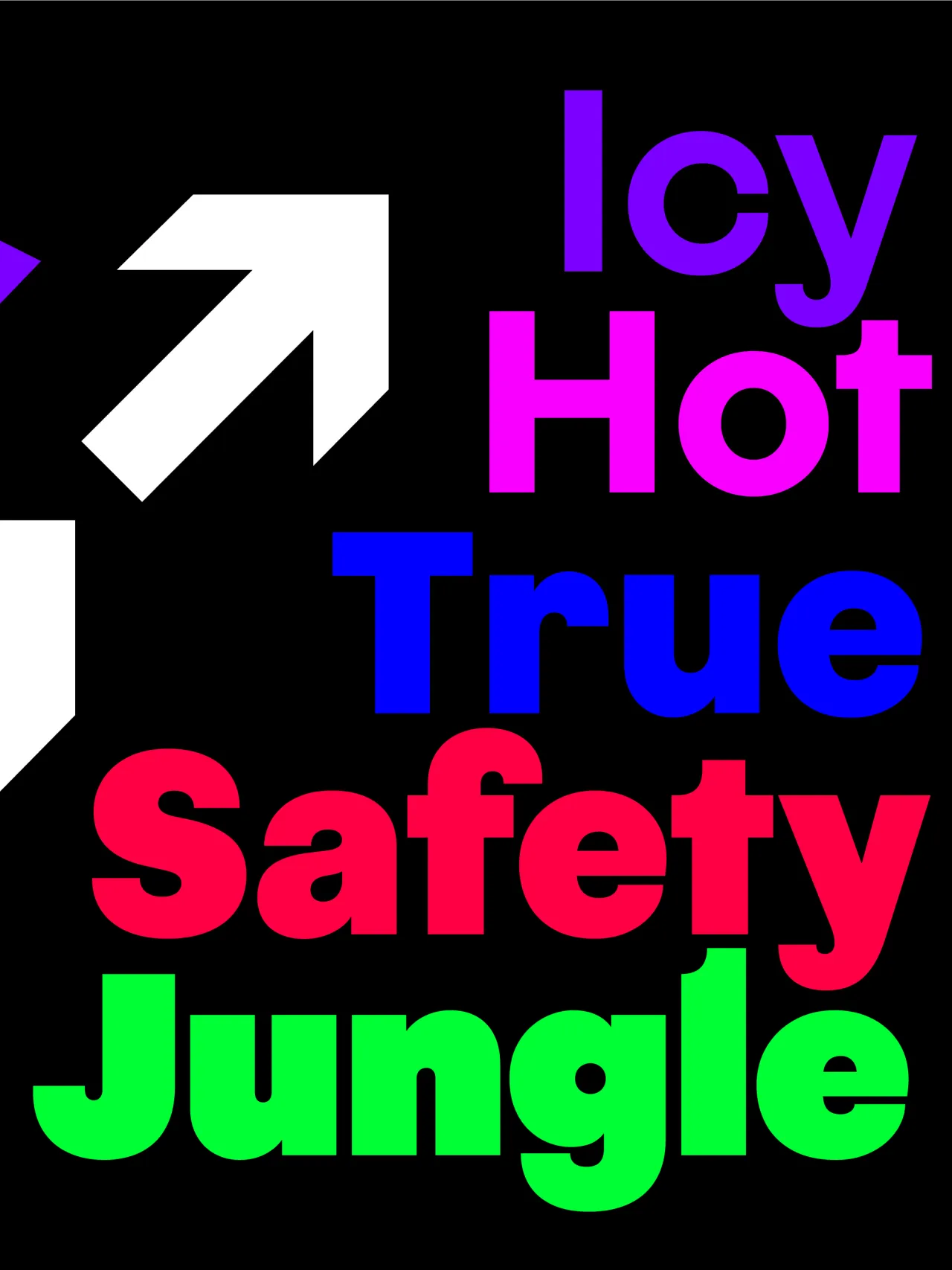
Best Grotesk identifies itself through a single structural decision: rounded ascender cuts. It's a detail that's easy to overlook but immediately apparent in use, giving the letterforms a quality that genuinely sets them apart from the usual sans serifs. It comes in ten weights, from Air to Poster, with matching italics at a sharp 14-degree slant, and supports over 400 languages using the Latin script.
The combination of clean geometric shapes, grotesk influences and considered contrast creates a family well-suited to headlines, logotypes and display work; contexts where the distinctive ascender treatment can do its most effective work.
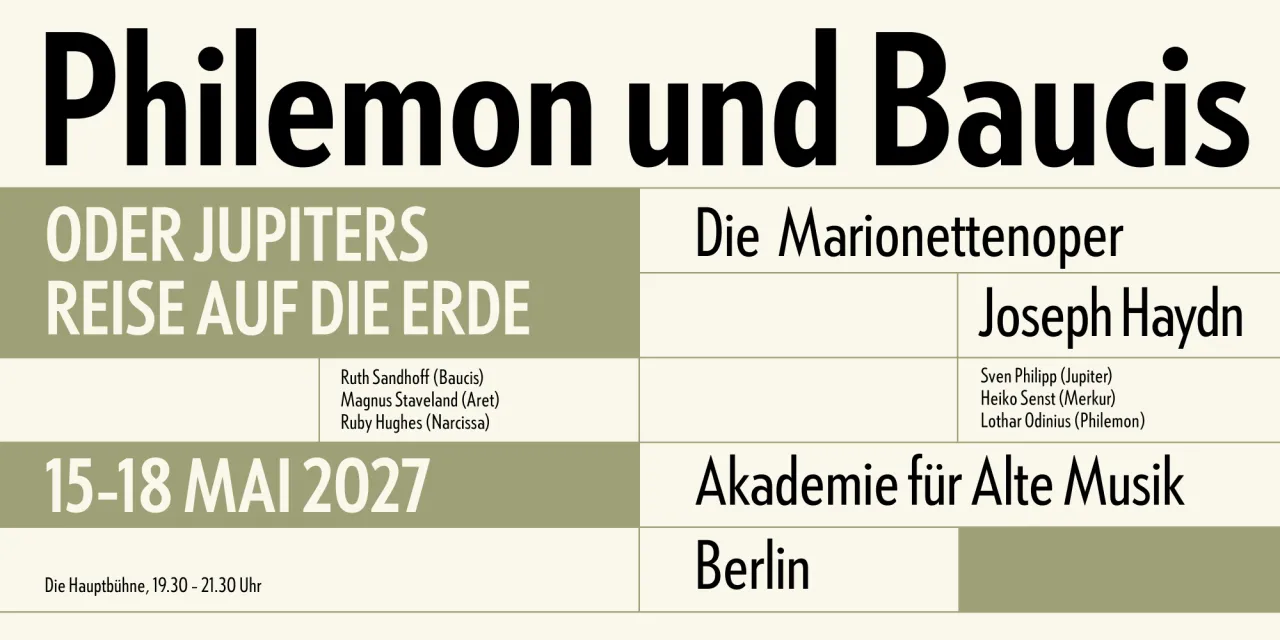
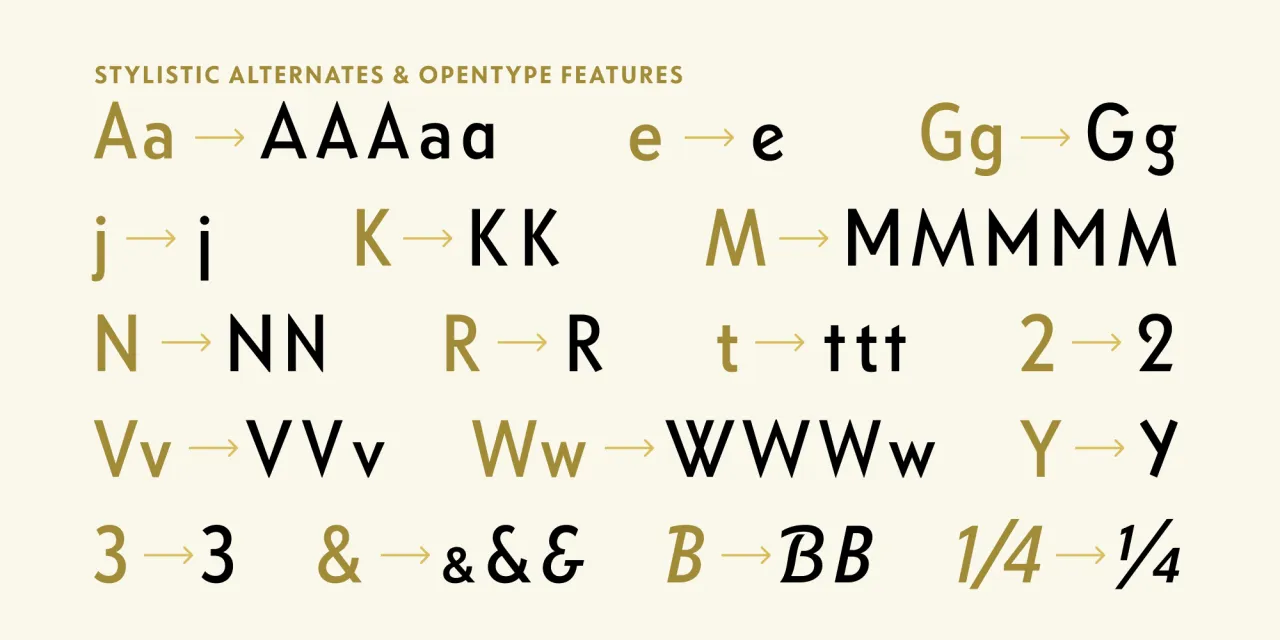
10. LTF Tempo by R. Hunter Middleton et al.
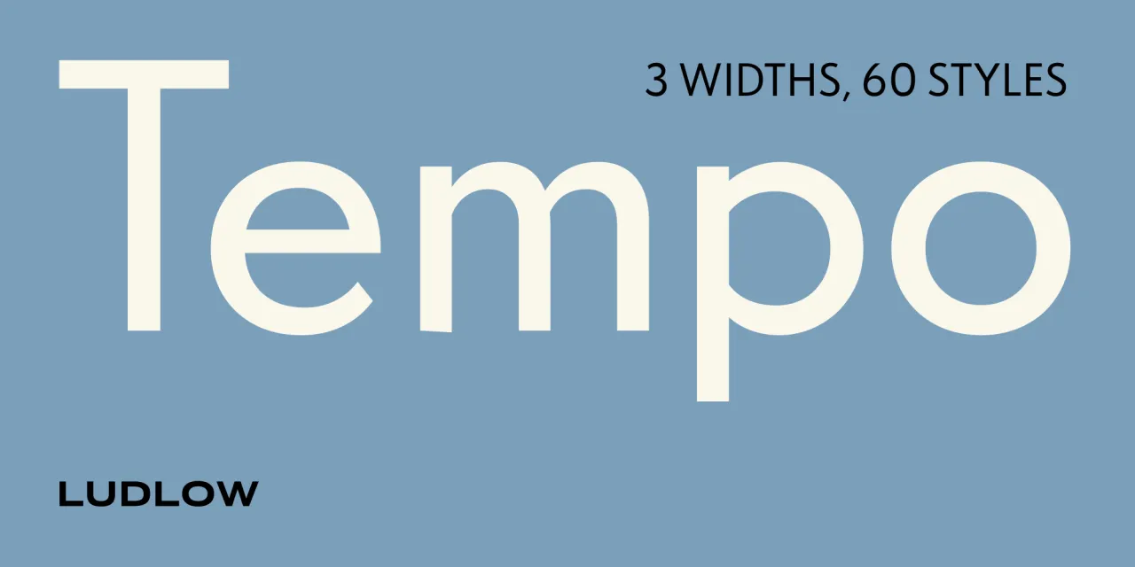
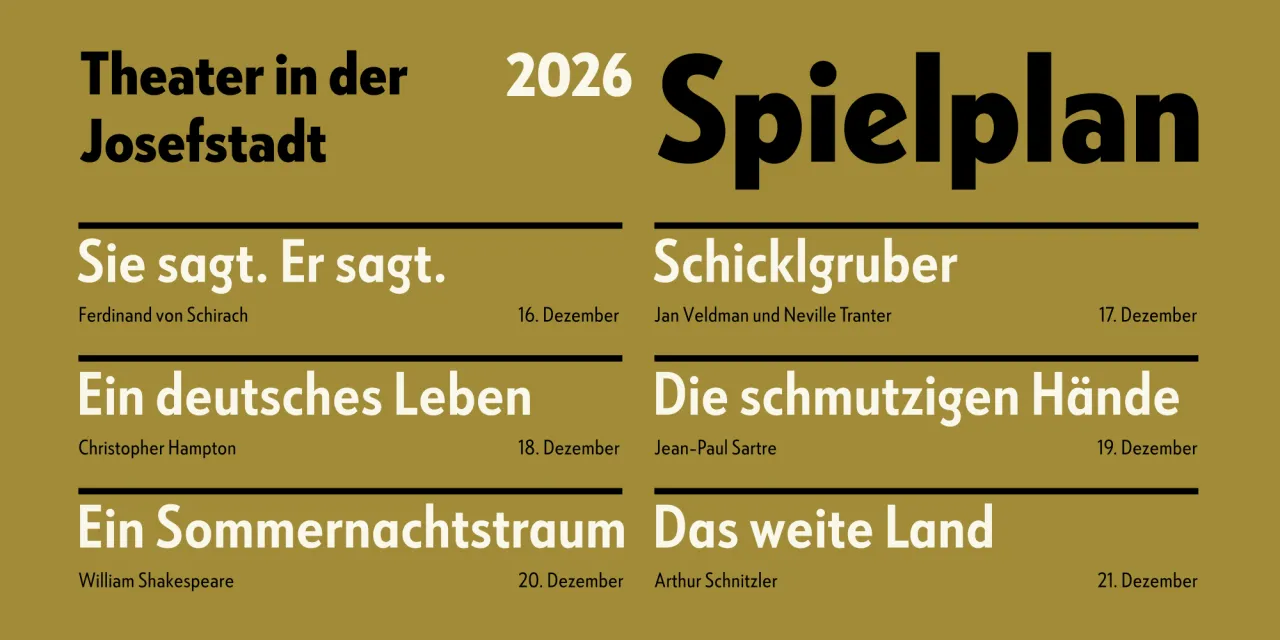
R. Hunter Middleton's original Tempo was designed for the Ludlow Typograph, a hand-setting machine built primarily for attention-grabbing headlines. This new rendition, developed by Joana Correia, Rob Keller and Jill Pichotta, respects those origins whilst expanding the design into three widths, ten weights and true italics: 60 styles in total.
The swash italics are a particular asset for display and magazine work, extending the family's expressive range considerably. A comprehensive set of alternates allows further tonal variation. For designers working in editorial contexts that value mid-century American typographic tradition, or who simply need a geometric sans with genuine historical backbone, Tempo offers both the lineage and the scope.
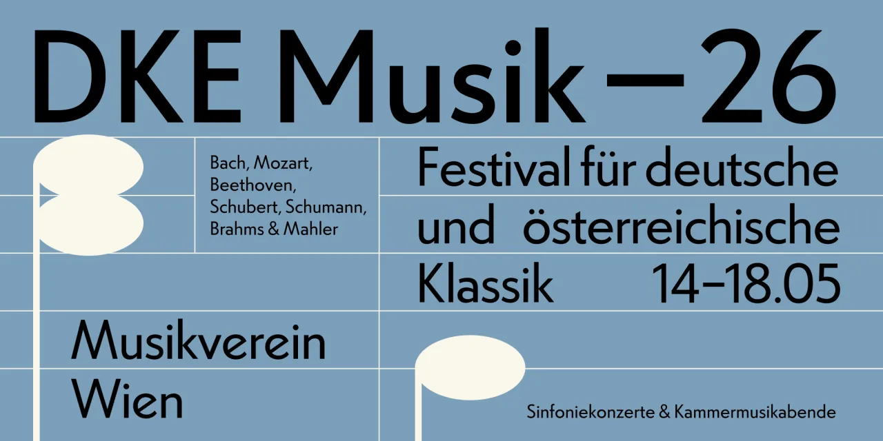
11. Cal Sans UI by Mark Davis
Originally commissioned by Cal.com to replace Inter in their interface, Cal Sans UI was engineered to match the type metrics of the industry's default UI fonts, so it slots into existing design systems without triggering layout changes.
The central innovation is the GEOM axis: a variable dimension sliding between humanist warmth and geometric rigour. At GEOM 0, the default is soft and readable; at GEOM 100, it nods toward Futura, calibrated for screen performance at small sizes.
Cal Sans UI is available under the Open Font Licence on GitHub, with distribution via Google Fonts and Adobe Fonts forthcoming. Overall, this is a family built with a clear user in mind, that turns out to have something to offer the wider design community as well.
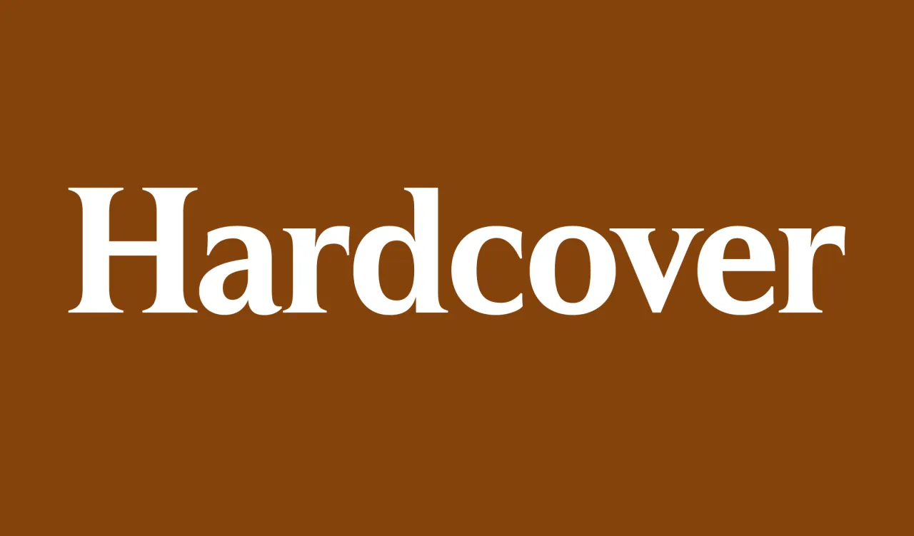
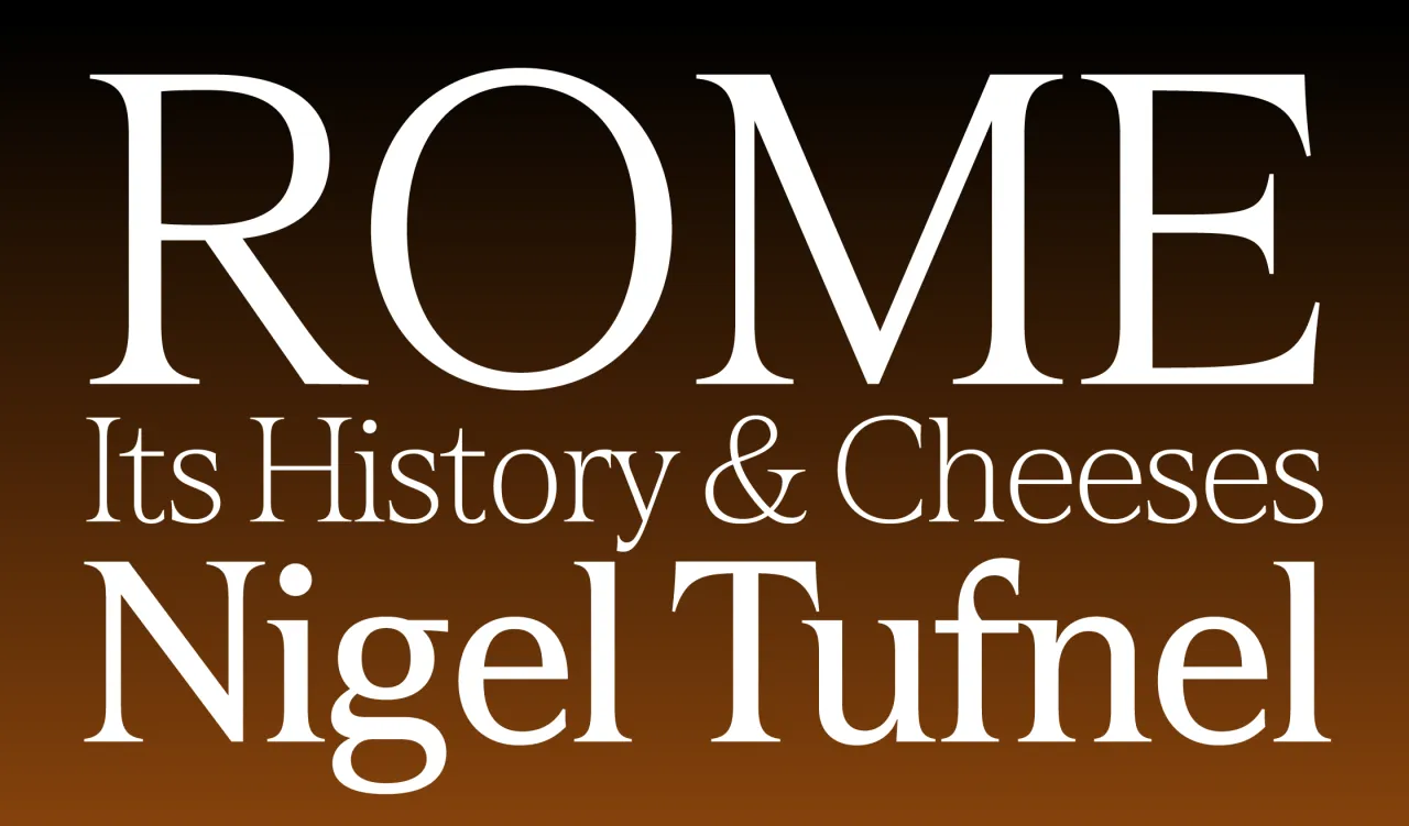
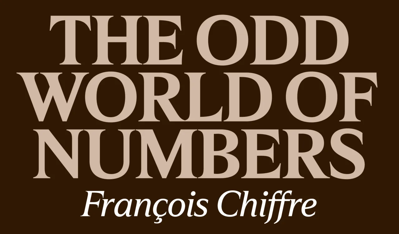
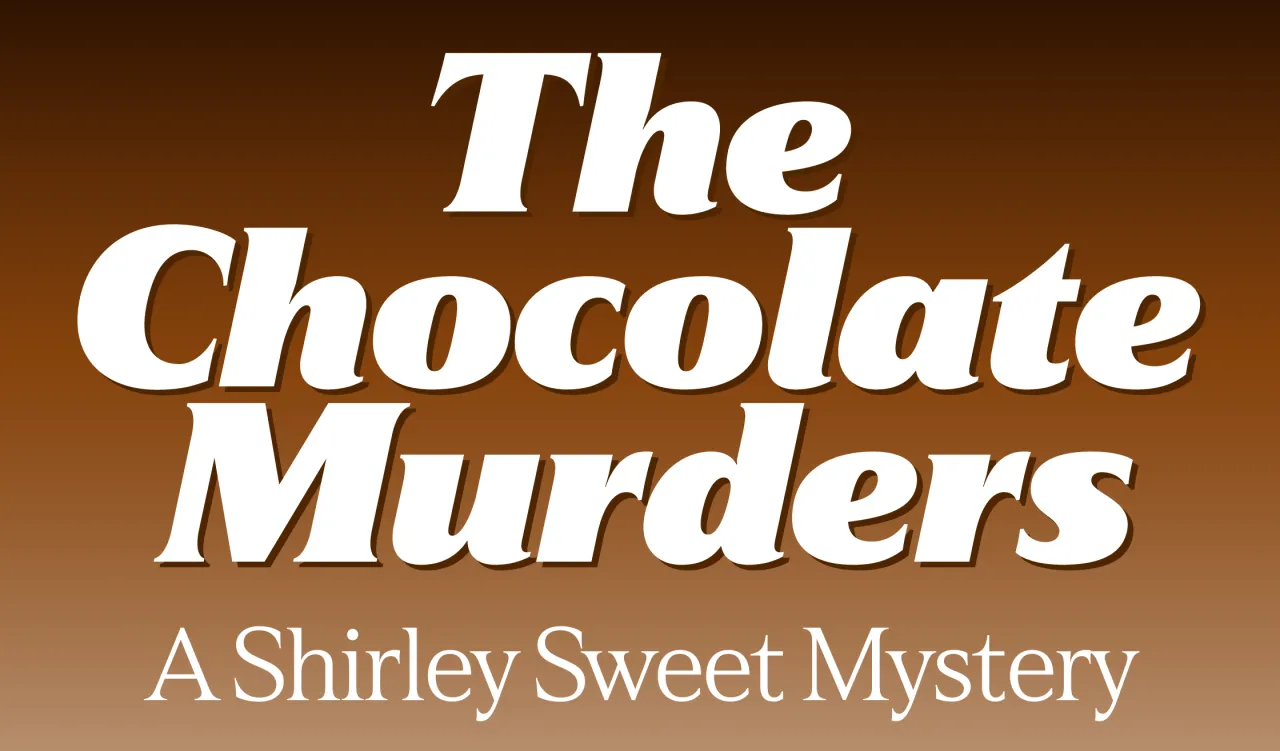
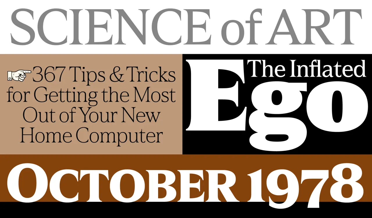
12. Hardcover by Mark Simonson
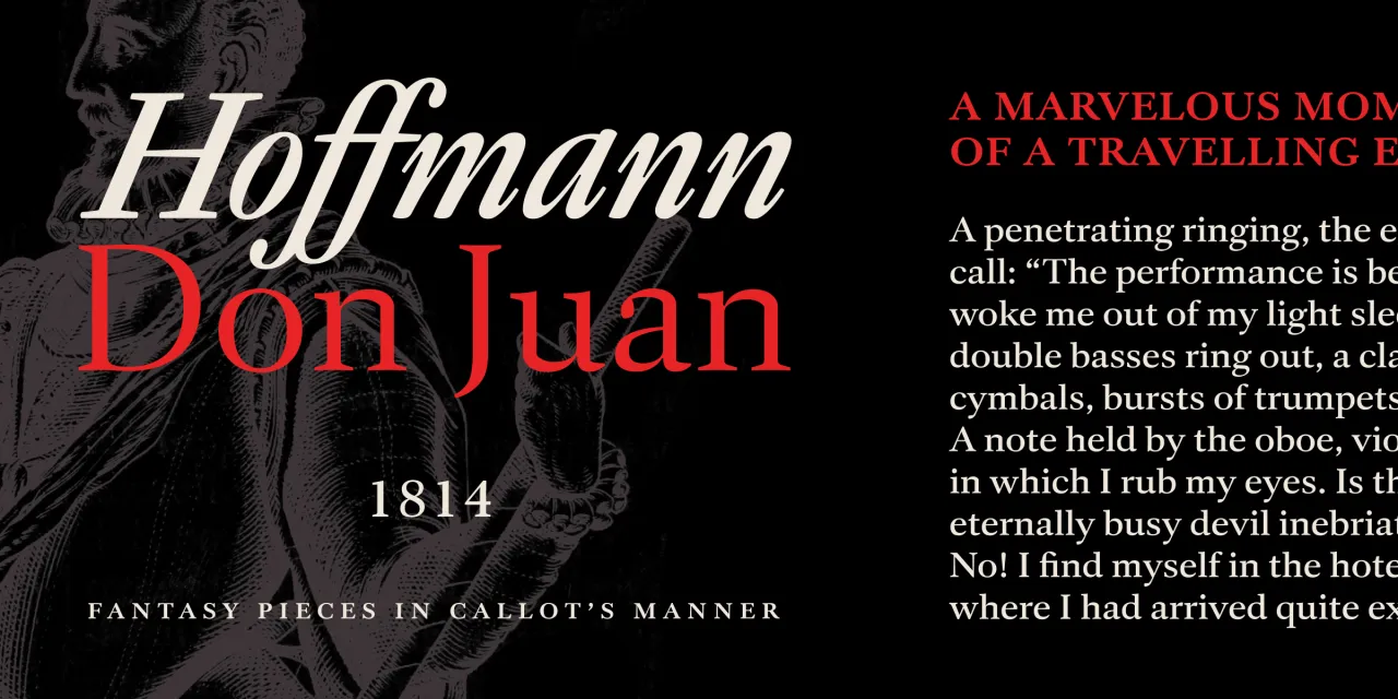
Hardcover began as a sketch made in 1978, inspired by the slick, confident lettering on book covers of the era. The observation designer Mark Simonson made then was a good one: that those covers had developed a display serif idiom of their own: classical in its roman proportions, but simplified in its details, oriented toward impact.
Capitals follow a classic Roman model but with more modern forms; lowercase and figures are constructed more consistently with the capitals than is typical, avoiding ball terminals and angled serifs.
The result looks best large, as Simonson directly states. Matching italics, small caps and dingbats complete a thoroughly considered family that has been, in some sense, nearly five decades in the making.
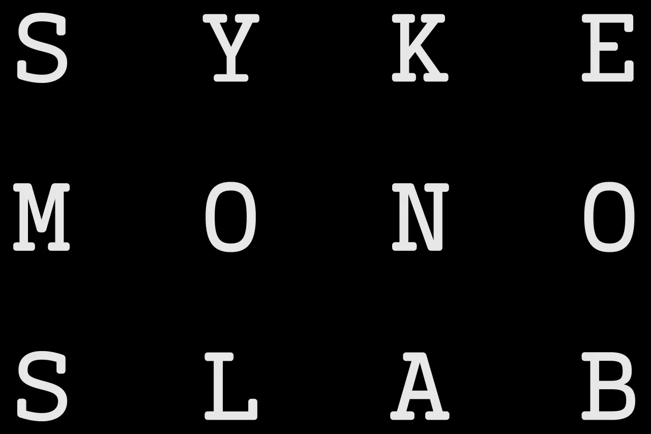
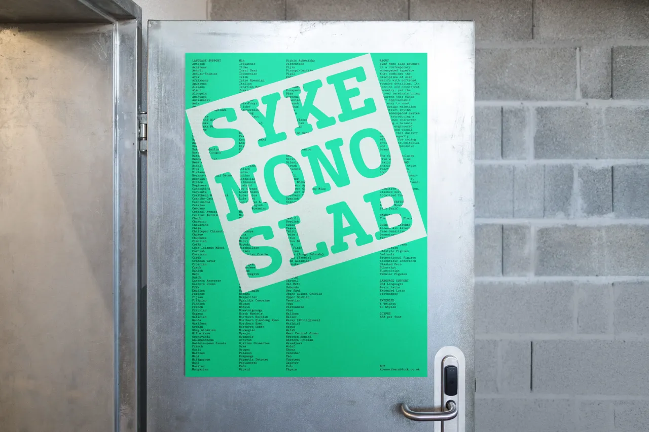
13. Syke Mono Slab Rounded by Jonathan Hill
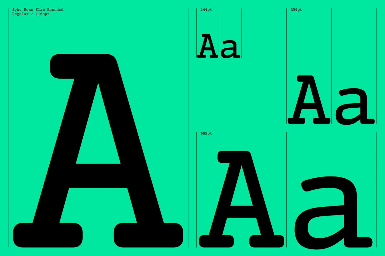
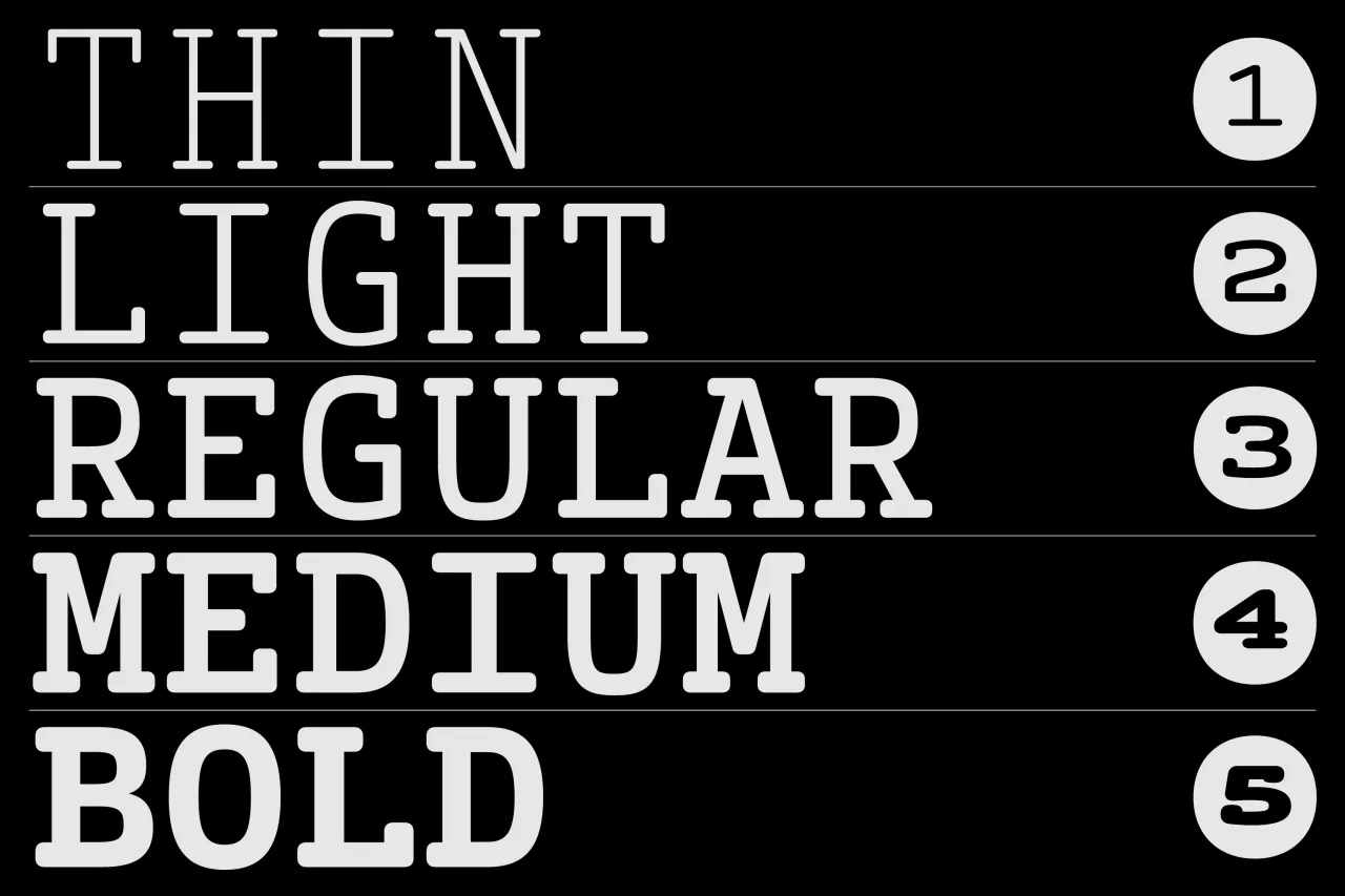
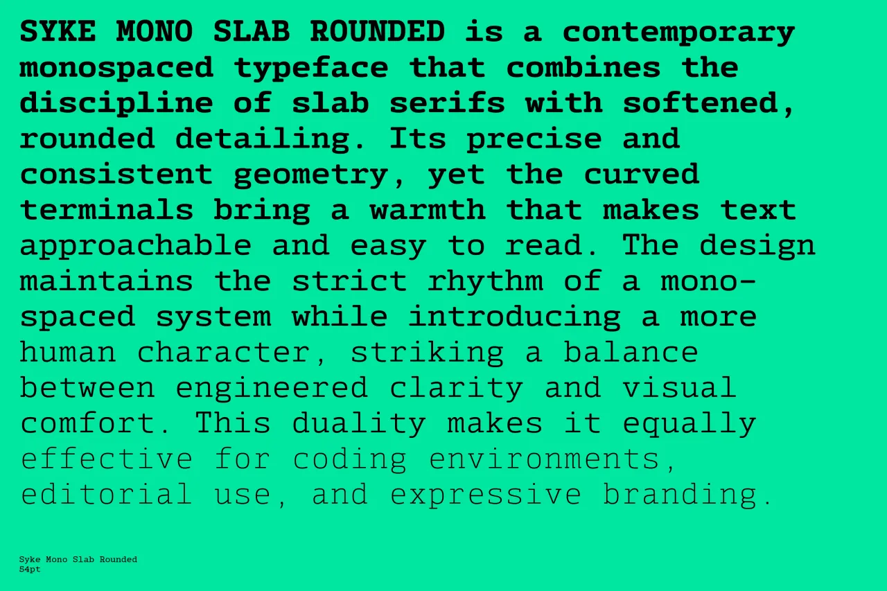
Syke Mono Slab Rounded occupies the intersection of engineering discipline and human warmth, easy to describe but difficult to achieve. The slab serif tradition brings weight and structural clarity to the fixed-width format; the rounded terminals introduce approachability without sacrificing the precision that makes monospace useful.
Hill maintains the strict rhythm of the monospaced system throughout; what changes is the emotional register. The utility of this combination is broader than it might appear: coding environments, editorial applications and expressive branding all benefit from the balance.
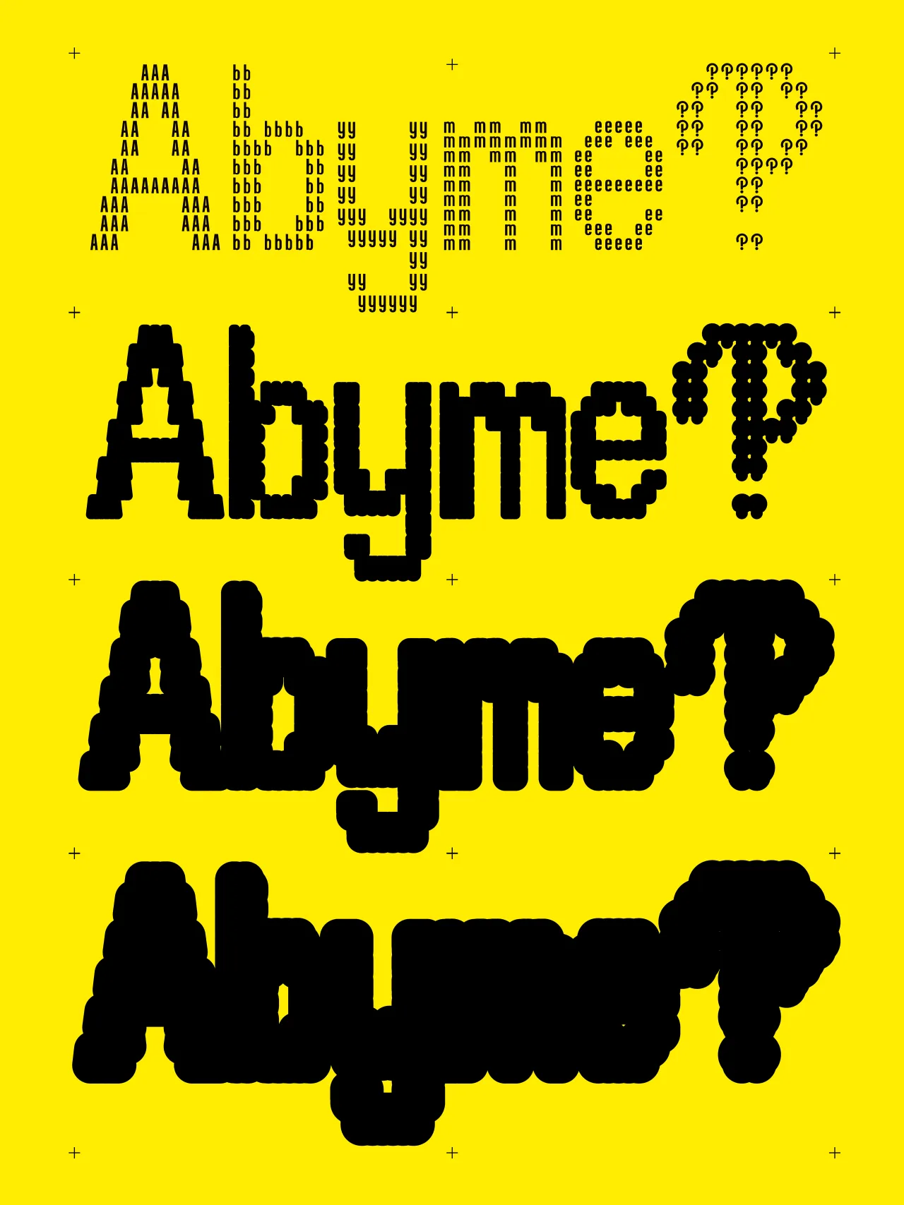
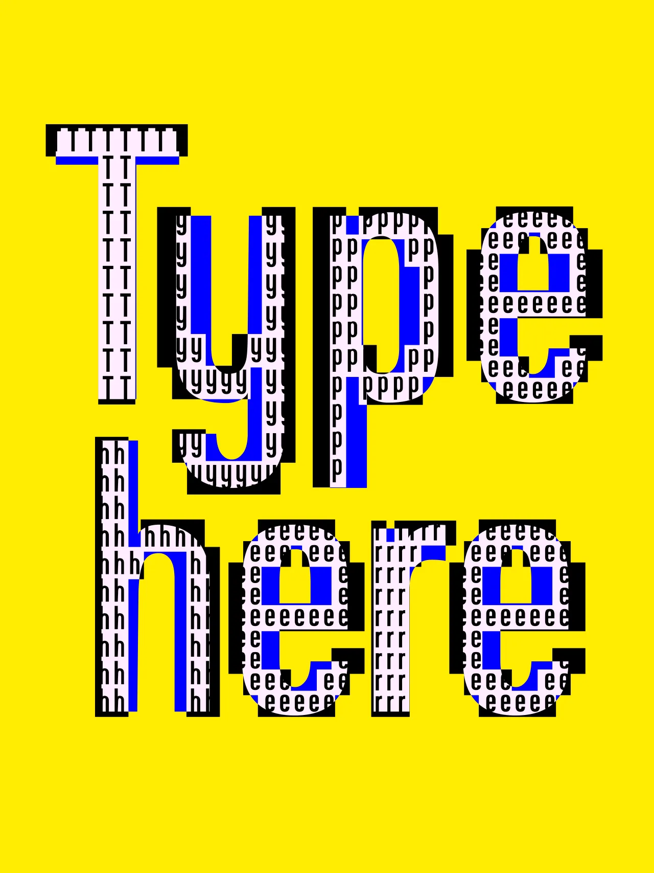
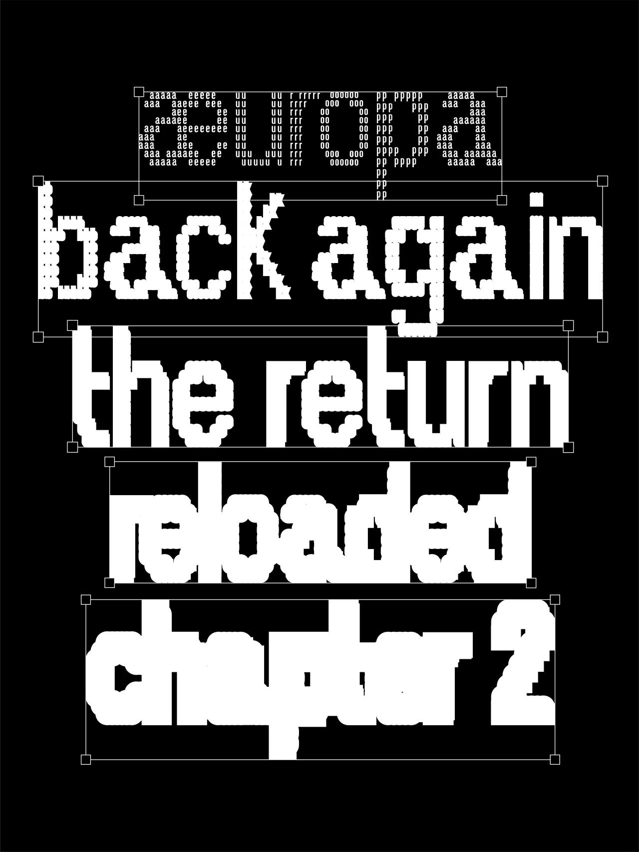
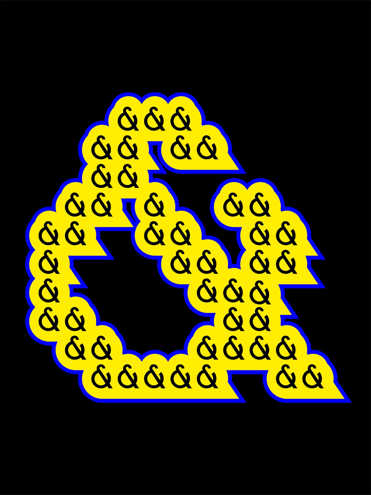
14. Abyme by 6TM Magazine
Abyme takes its name and its logic from the concept of mise en abyme: the technique in which a work contains a smaller version of itself, creating a self-referential loop (the painting within the painting, the story within the story). It applies that structural idea to letterform design, producing characters built from nested or mirrored versions of their own forms. The results are as visually intense as that description implies.
Released by 6TM Magazine and based on their existing ÆUROPA typeface, Abyme is unambiguously a display proposition: a typeface for graphic compositions and maximalist experimentation rather than running text. Its 77 glyphs cover uppercase, lowercase, numerals and punctuation, available in OTF and TTF formats with web formats included in the extended licence.
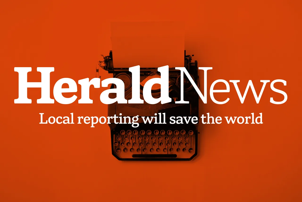
15. Herald News by Kevin Foley
The story behind Herald News is a personal one. Kevin Foley grew up with the Fall River Herald News (delivered it as a paperboy, absorbed its typography over years of handling), and later found himself scanning its pages to find his daughter's name in the results after track meets. That very human relationship with a newspaper's visual character is precisely the kind of deep familiarity from which good type design grows.
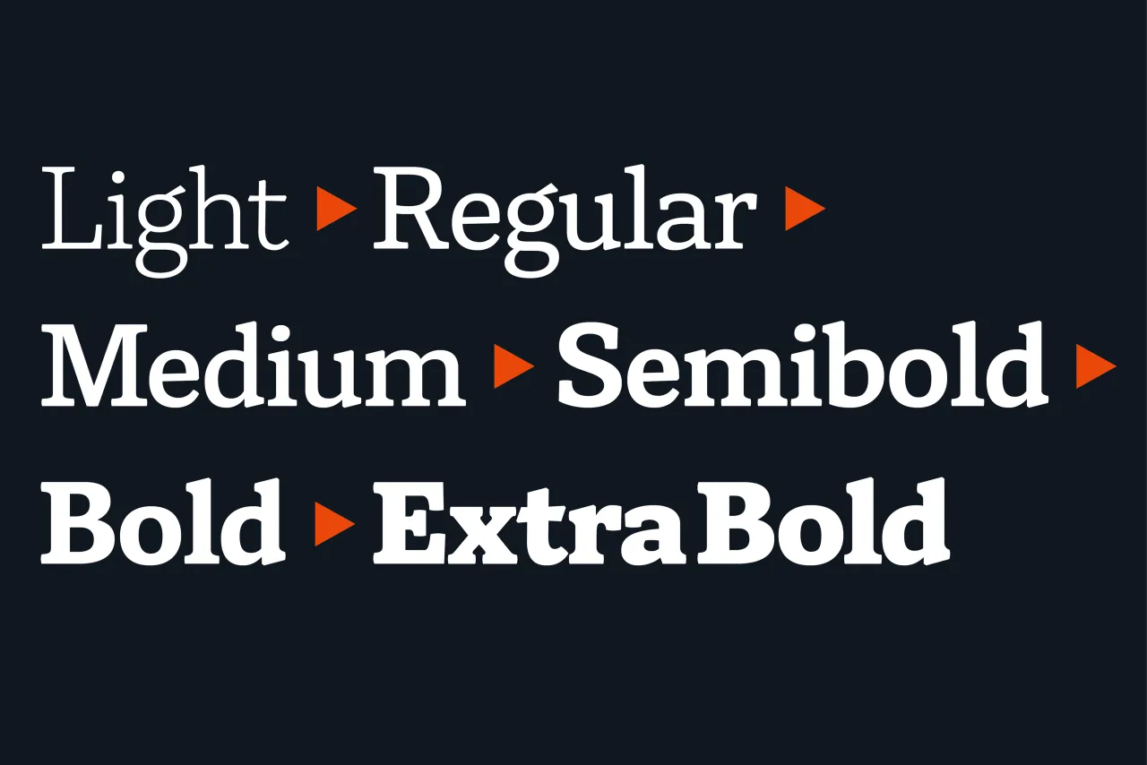
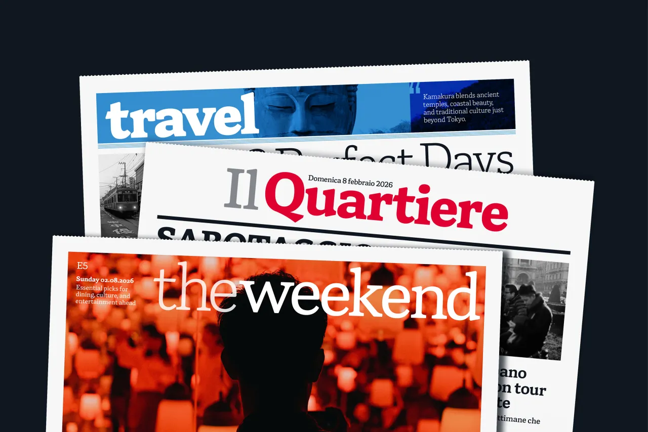
As you'd expect, this is a serif text family built for editorial work. It features low contrast, sturdy serifs, rounded terminals for readability at small sizes, and six weights that carry confidently up to headline scale. More broadly, the design balances a serious news-driven tone with the warmth appropriate to community stories: the full emotional range of local journalism in a single family.
OpenType features include multiple figure styles, fractions and case-sensitive punctuation, covering the practical demands of real publication work across an extensive range of supported languages. This is a typeface with a clear purpose, a clear origin, and the craft to back both up.
16. Autêntica Sans by Sofia Mohr
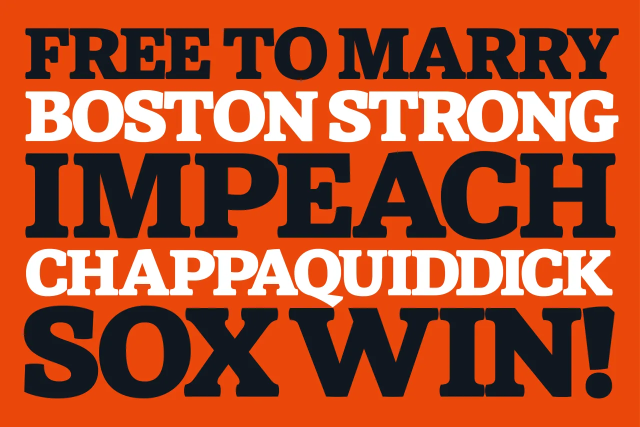
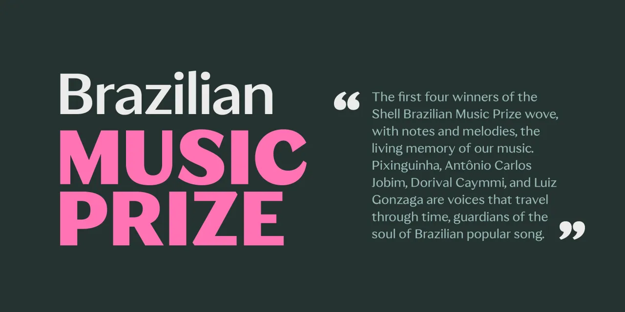
Brazilian type designer Sofia Mohr's Autêntica Sans announces its intentions in its name: this is not a typeface trying to fit in. Built with subtle contrast and organic modulation, its strokes gently expand and contract across the letterforms, creating rhythm and movement without sacrificing structural clarity. Diagonal cuts introduce a contemporary directional quality, breaking strict predictability and giving the family a dynamic presence that sits somewhere between expressive display and confident text use.
Designed between 2024 and 2025, Autêntica Sans spans weights from Regular to Black and is intended for display contexts. However, its underlying clarity extends its range further than many expressively modulated faces can claim.
This is the first release in a larger planned type family that will expand into Serif, Slab, Classic and Rounded variants. It's a system still in early stages, but one whose first instalment already demonstrates a clear and coherent design intelligence.
17. IH Serrucho by In-House International / In-House Foundry
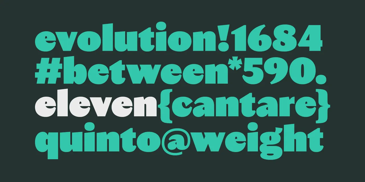
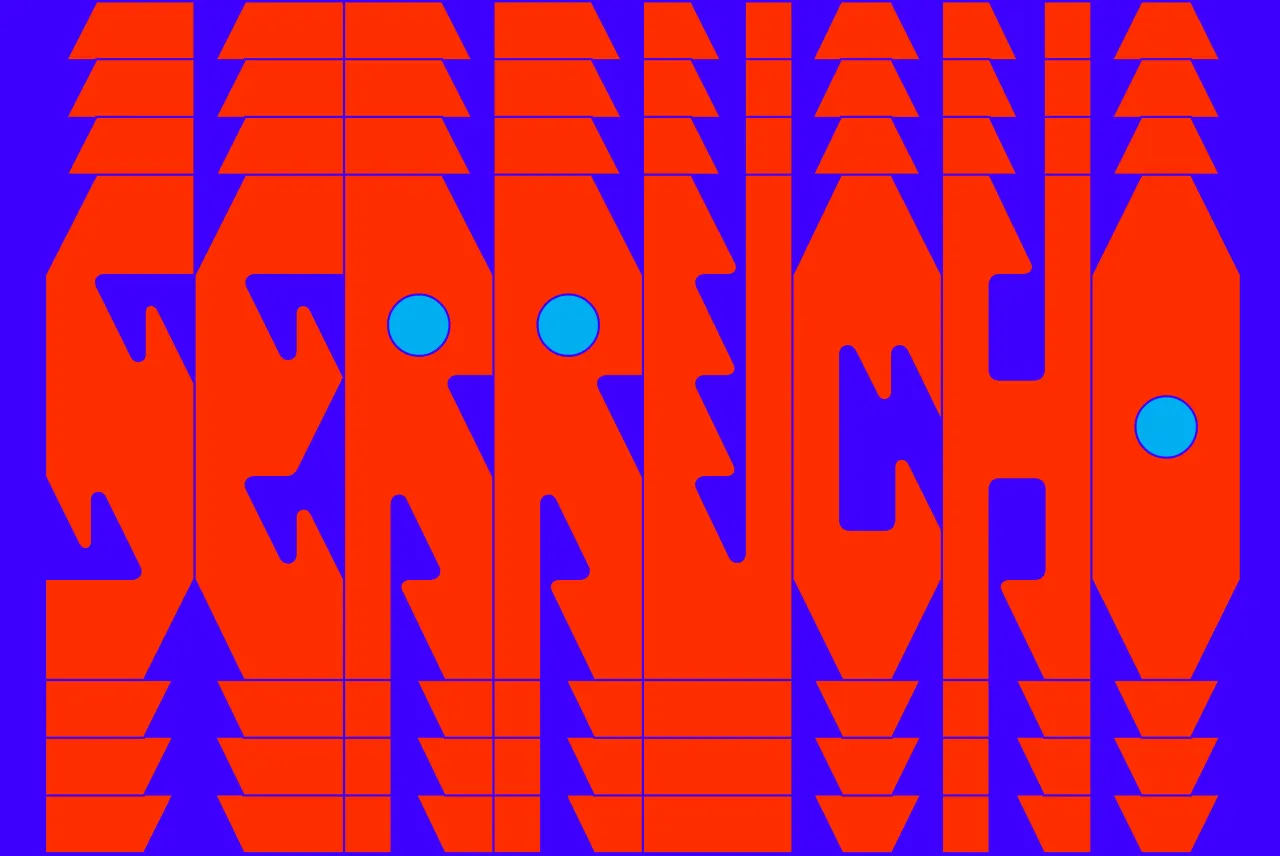
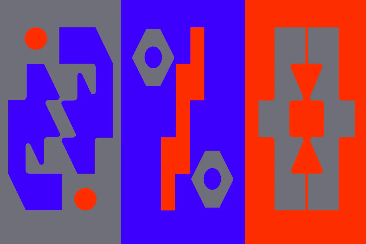
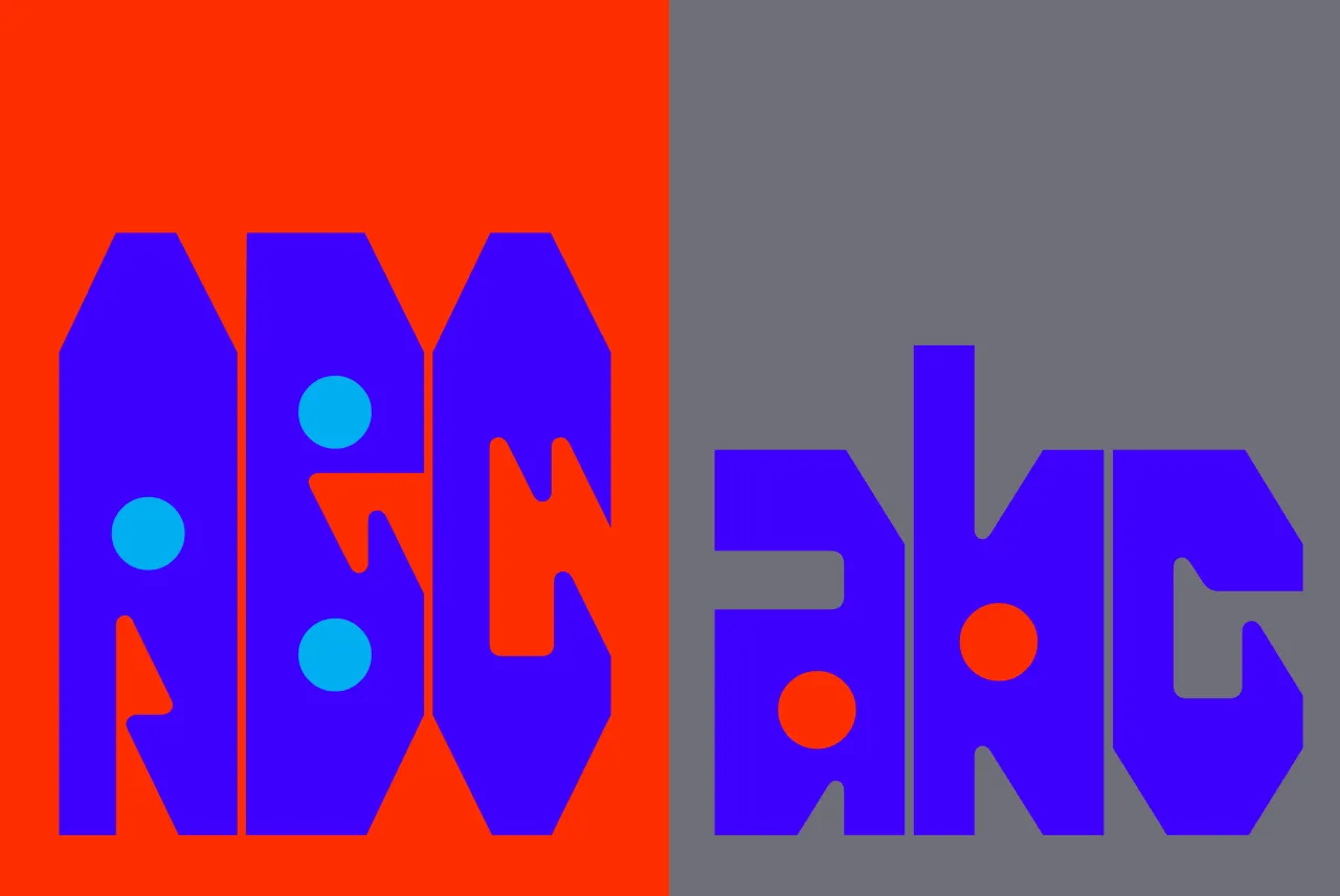
Named after the Spanish word for handsaw, IH Serrucho is a variable display typeface that cuts through the noise. Across eight weights, it transforms from controlled, angular authority at the lighter end to unleashed, spike-edged intensity at the heaviest. The flat version reads bold and uncompromising; as the variable axis increases, those edges multiply into something that designer Alexander Wright describes as simultaneously mechanical and feral.
Its lineage is explicit: punk flyers, hardcore logos, protest graphics, the visual culture of underground communication where urgency mattered more than polish. Repeating vertical forms create rhythm and forward motion; circular counters read as drill holes or punch marks.
Developed by Rodrigo Fuenzalida at FragType for Austin-based studio and foundry In-House International, Serrucho includes a complete character set with extended Latin support, available as a variable font or in individual weights. It is, the foundry states, built for projects where "safe" is the wrong answer and "loud" is just the starting point.
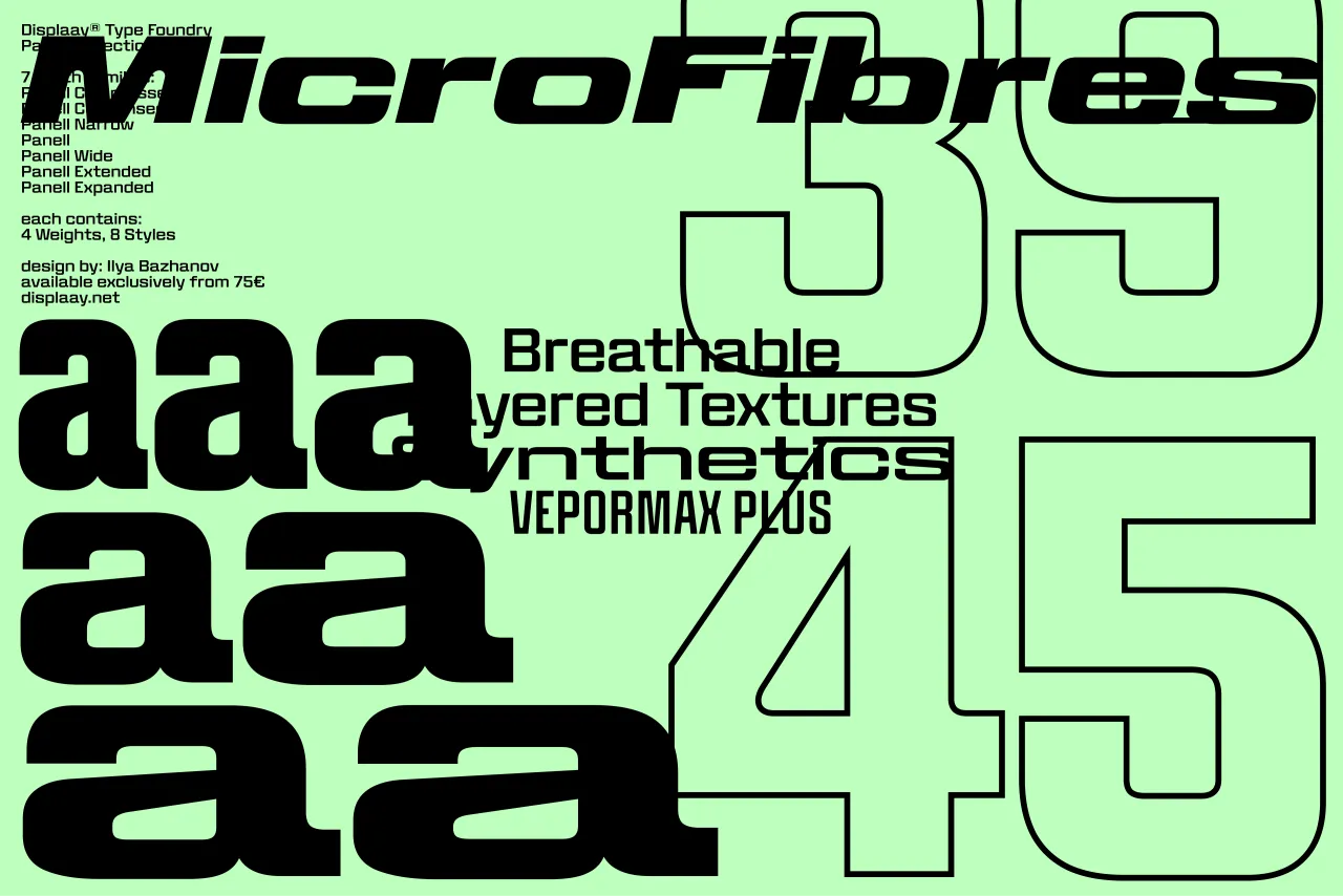
18. Panell by Ilya Bazhanov
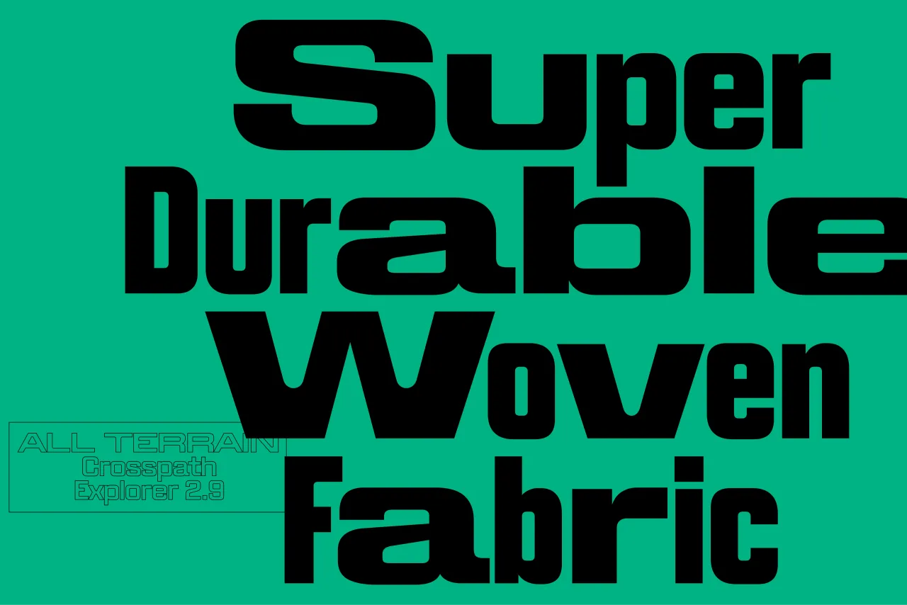
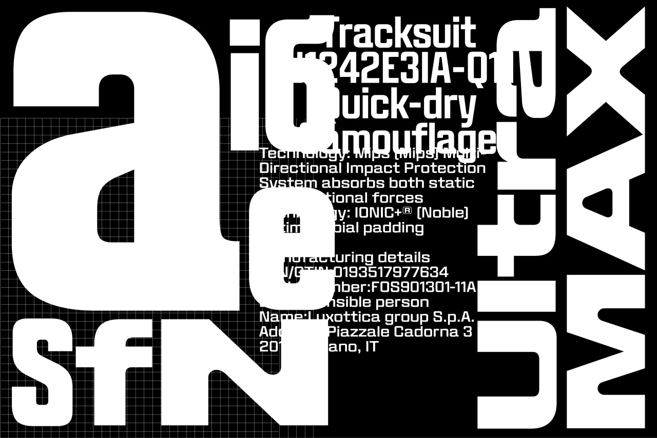
In 2021, Ilya Bazhanov was working on a student documentary about the South Moravia tornado, and his first sketches were a direct visual response to the footage. A year later, an architecture studio commissioned him to design an identity for a conference exploring the intersection of architecture and ceramics, and he returned to those sketches, expanding them into a full family. The result is an unusual accumulation of origins: emotional response, spatial logic, and the influence of Brutalist housing blocks, all translated into type.
The letter 'o' has an asymmetric construction, one diagonal sharper than the other, creating a subtle forward tension that drives the typeface's momentum. Rounded corners appear only at specific structural moments, producing a push-pull between warmth and precision. Sporty, forward-leaning italics complete a collection spanning seven widths, four weights and 56 styles across three variable axes.
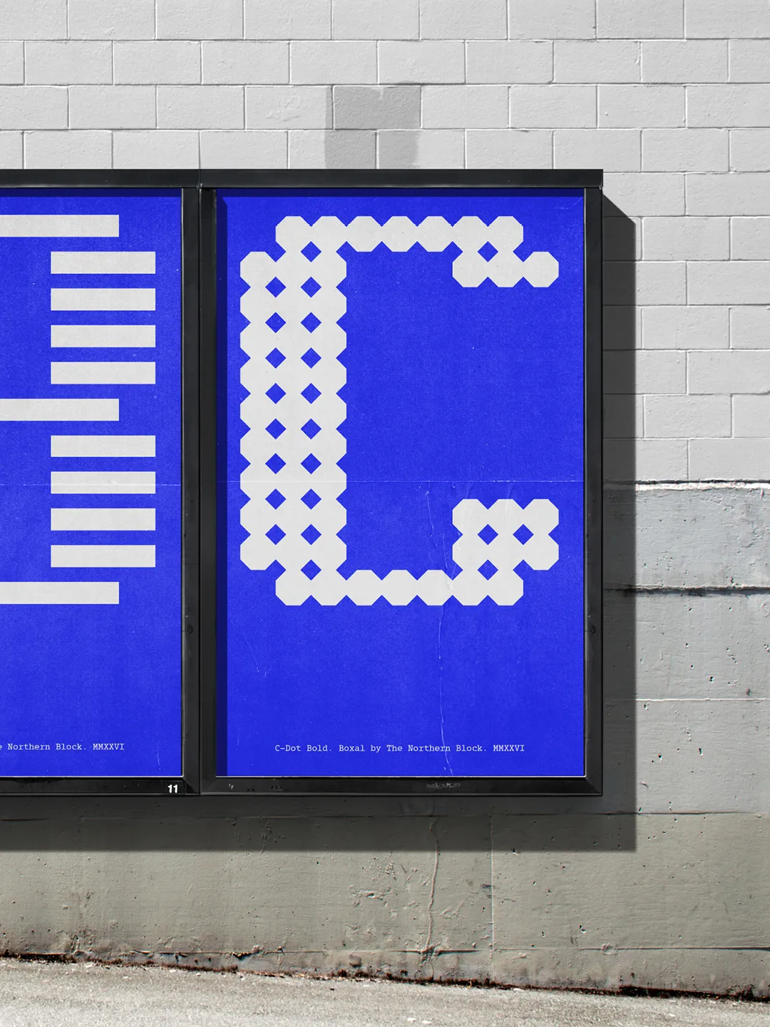
19. Boxal by The Northern Block
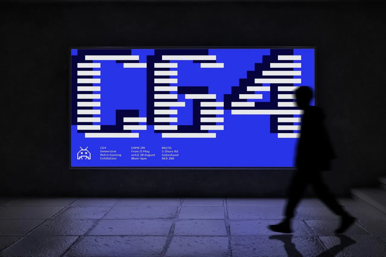
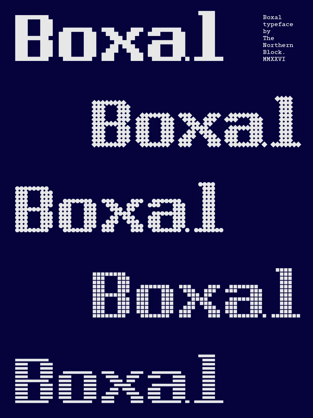
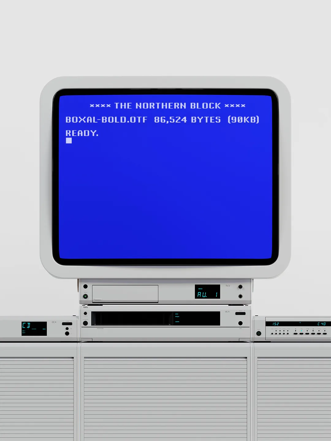
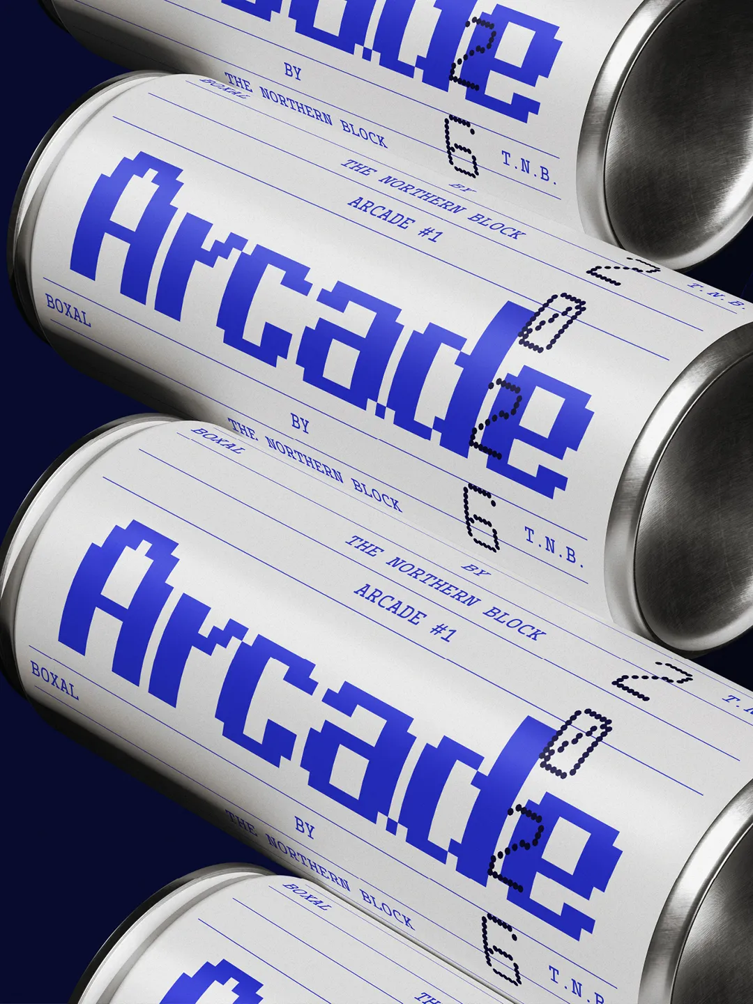
Boxal is The Northern Block's newest typeface – a meticulously crafted, retro-inspired pixel font that captures the nostalgic charm of classic arcade gaming while delivering modern precision and versatility. With the personal design history of founder and type designer Jonathan Hill very much in mind, Boxal draws on the pixel artistry of iconic titles like Zelda, Shinobi, and Cops and Robbers, and represents a cultural homecoming for the studio.
It informed the design thinking behind their work on major game titles such as Mafia III and Tom Clancy's The Division, and its name reflects the modular, grid-based logic that underpinned early video game graphics. You know the ones... those blocky letterforms that slowly loaded, one pixel at a time, onto the screens of a generation.
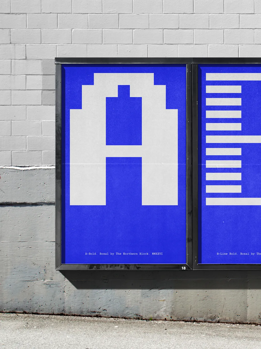
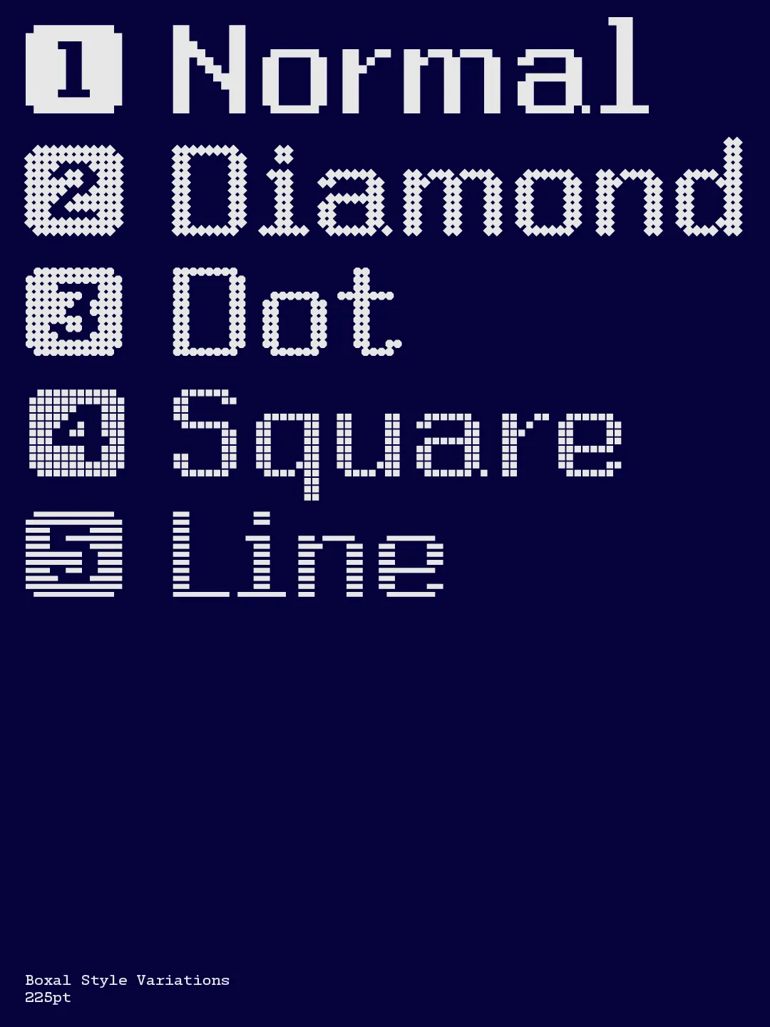
What sets Boxal apart from other pixel fonts is its proportional spacing, which breaks from the monospaced norm, offering greater readability and creative flexibility. It comes in five distinctive styles: Normal, Diamond, Dot, Square, and Line. Far from being nostalgic, pixel typography remains everywhere in modern life, from kitchen appliances to outer space displays, and Boxal is built to thrive in that landscape. It's a classy, playful tribute to an era of pure, uncomplicated joy. One that invites designers, gamers, and creatives alike to play, experiment, and reconnect with the pixelated wonder of the past.
Editor's Picks





Trending






Latest Jobs
Design Director at Koto
Full-time·London·£72k-£90k
Creative Social Content Producer at Bompas & Parr
Contract·London·£32k–£40k
Paid Media Executive at Munro Agency
Full-time·Glasgow·From £27,000
Design Director at Human After All
Full-time·London·£66k–£88k
Junior Project Coordinator at Colorido Studios
Full-time·Twickenham·£28k–£32k
Midweight Designer at All Purpose
Full-time·London·£30k–38k