Placeholder’s mid-century inspired typeface for furniture brand Burrow
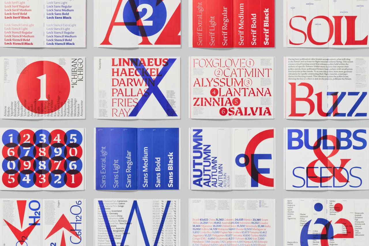
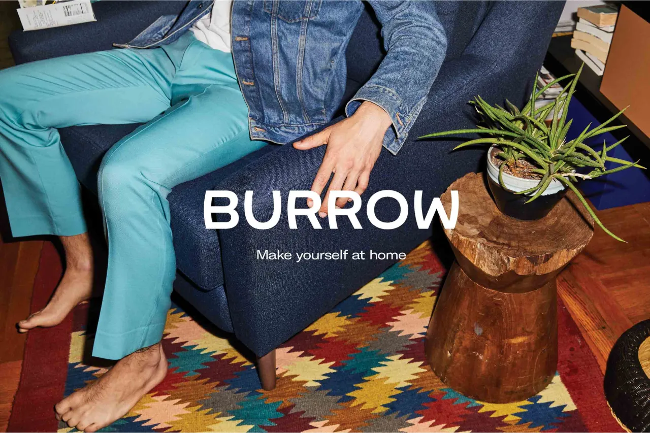
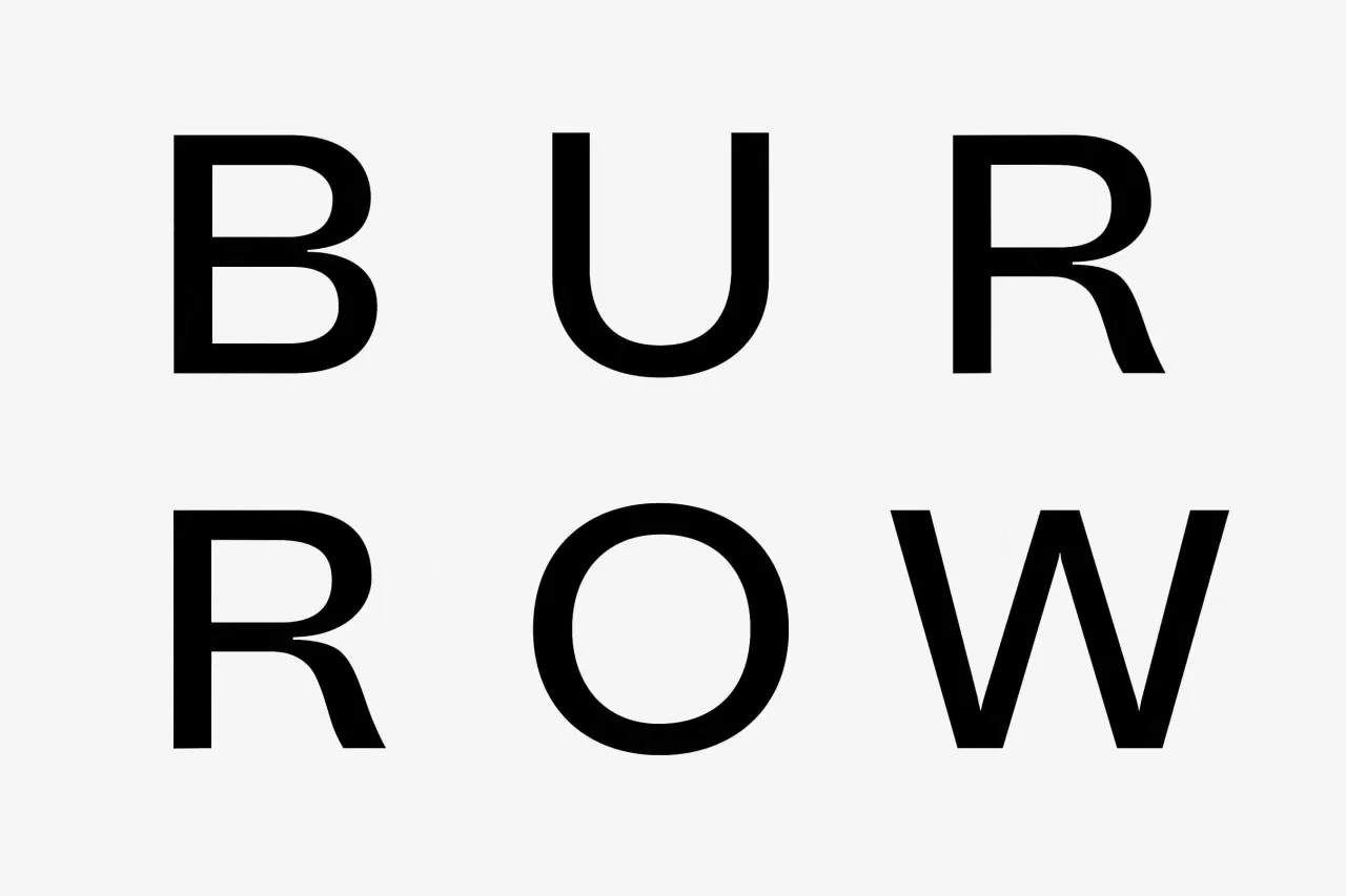
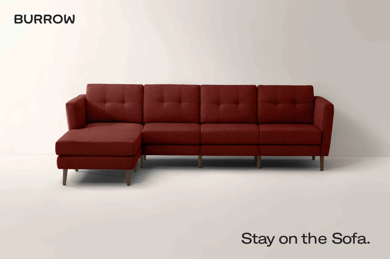
New York design studio Placeholder has created a bespoke typeface for furniture brand Burrow that references the mid-century period of the design movement.
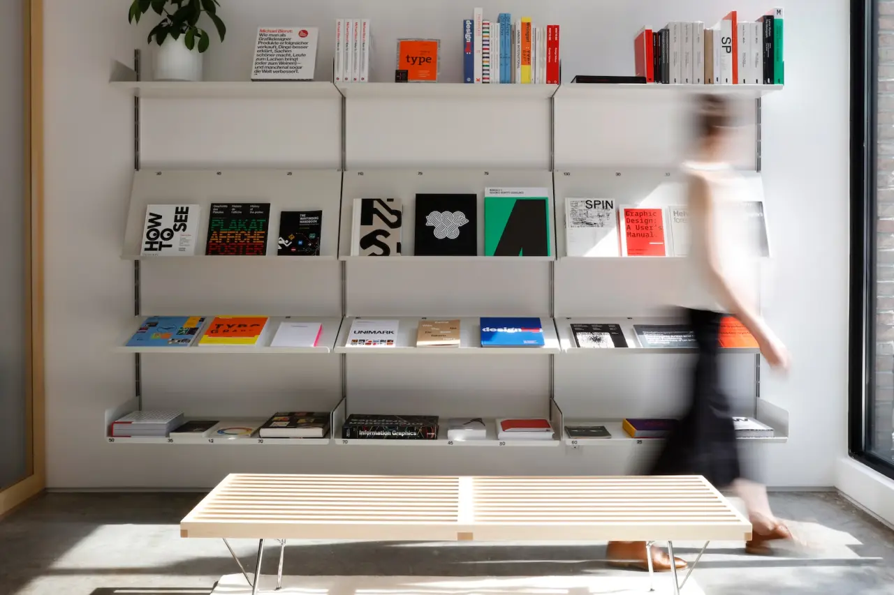
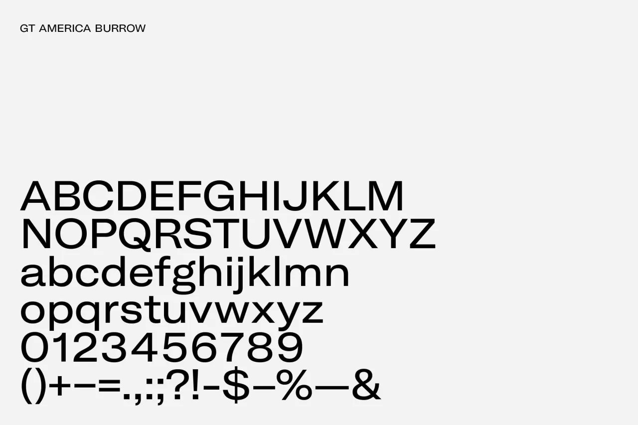
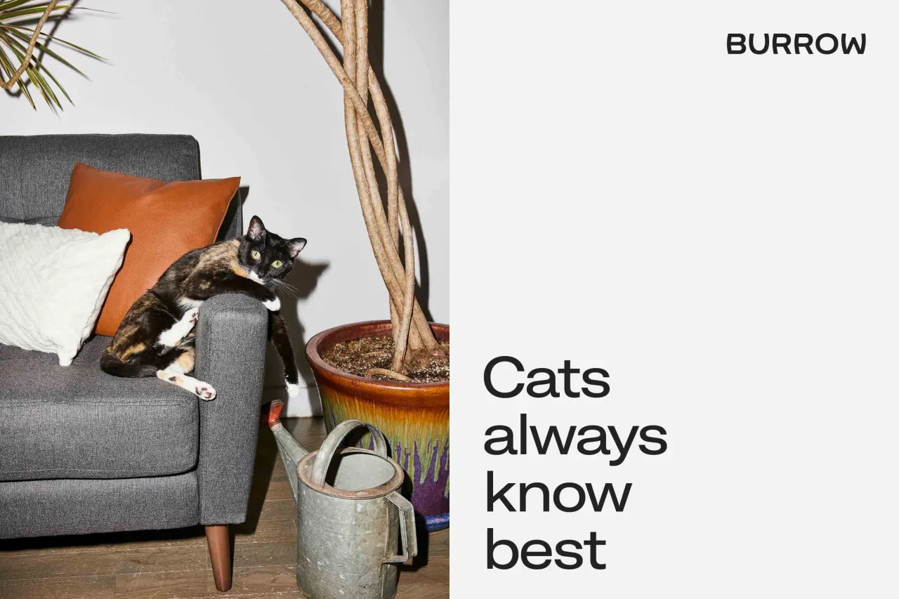
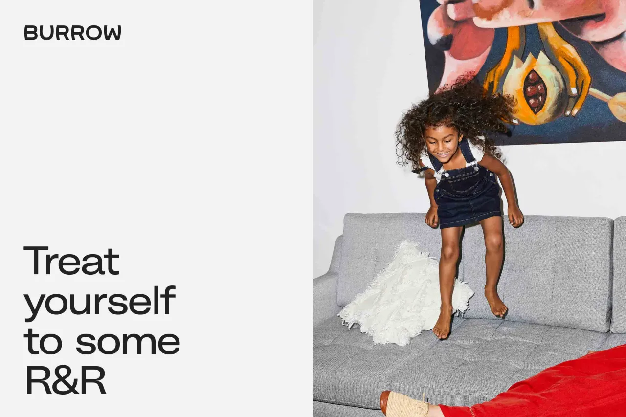
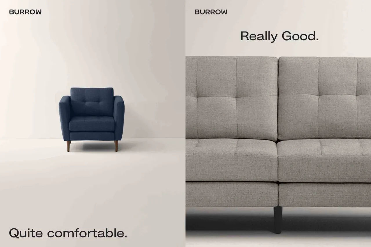
With much of Burrow’s furniture collection influenced by the period, Placeholder partnered with Swiss type-foundry Grillitype, to come up with GT America Burrow, a nod to 1950s modernist typefaces.
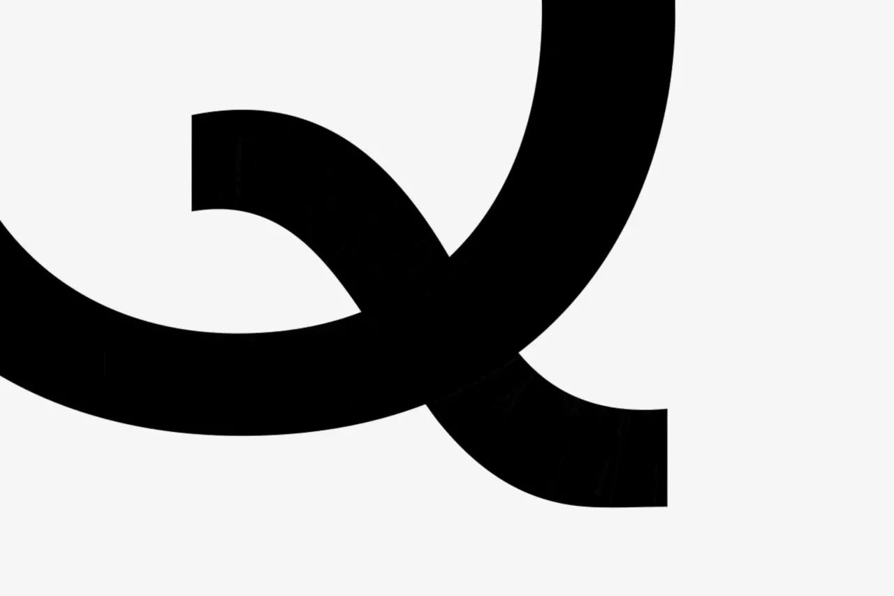
Inspired by GT America Extended Regular, but with a more narrow width and heavier weight, it has a wide san serif type and horizontal stroke endings.
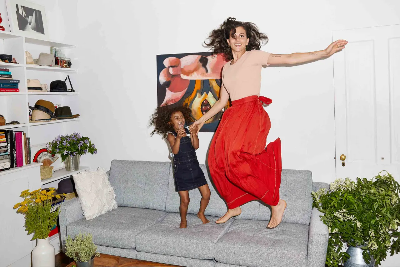
At the same time, Placeholder also art directed the brand’s ‘make yourself at home’ campaign, a candid series of photographs using real New Yorkers in their own apartments.
Placeholder was founded by New York-based Japanese artist Sho Shibuya, whose beautifully created ‘Katakana’ Japanese letterforms use different materials and techniques, from painting to paper cuts. His Instagram is a real joy to follow, take a look!


Editor's Picks





Trending






Latest Jobs
Client Success & Growth Director at Revolution Growth
Full-time·Manchester·£60k-£70k
Brand Strategist at DNCO
Full-time·London·£45k-£60k
Senior Digital Designer at 3800
Full-time·Sheffield·£40k-60k
Senior Designer at Jubba
Full-time·London·£50k-£60k
Creative Director at Koto
Full-time·London·£95k-£130k
Senior Front End Developer at Crown Creative
Full-time·Belfast·£50k–£60k