New Chicago park identity reflects the rich history and culture of the city’s South Side
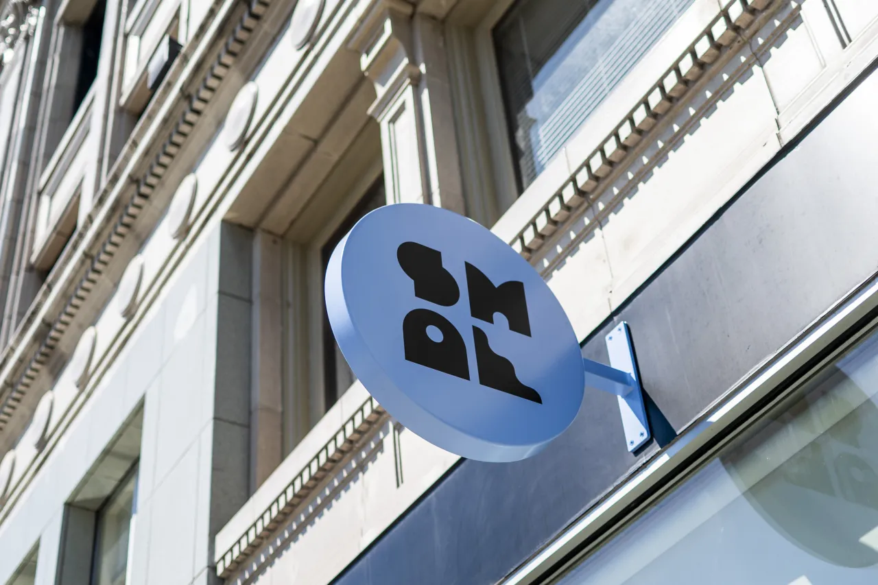
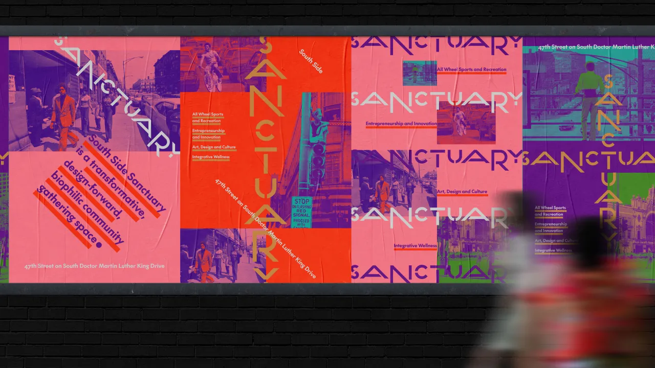
Designed by local studio Span, the identity features a custom logotype inspired by the park's topography as well as a public bench.
Chicago-based design studio Span has unveiled its latest place branding project, an identity for a new public park in the Bronzeville area of its home city. Although Bronzeville was known for its vibrant cultural scene in the first half of the 20th century, decades of race-based economic policies resulted in massive disinvestment in the neighbourhood.
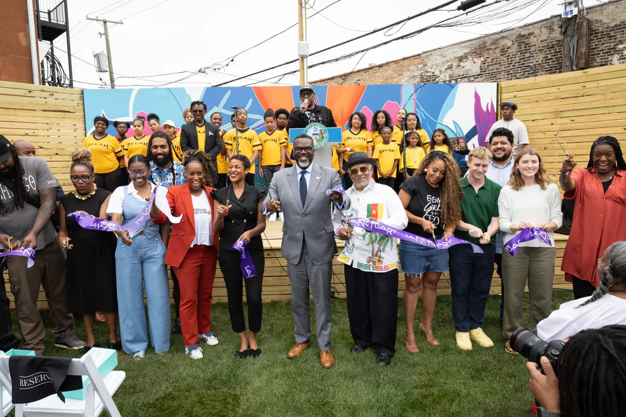
But today, the area is experiencing a much-needed renaissance and has been awarded funding by Chicago Mayor Brandon Johnson's Public Outdoor Plaza program. Part of this funding went to the development of South Side Sanctuary Park, a project led by The Nascent Group and the non-profit Black Girls Shred.
Located on 47th and South Martin Luther King Dr., the space was previously a vacant lot. However, it has been transformed into a place for sports and recreation, notably skateboarding (which is illegal in much of Chicago).
Span became involved in the project through a personal connection with their associate partner and design director, Nick Adam, who lived next door to the park's founder, Cecilia Cuff, around 20 years ago.
Adam says: "When Cecilia began planning this park two years ago, she shared her vision of transforming a lot that had been vacant for decades into a vibrant space filled with opportunity and experiences.
"She mentioned wanting a logo that could serve as a beacon and harmonize with both the architecture and the neighbourhood, and I was immediately on board."
Shifting the narrative around Chicago's South Side was a core aim of the project, as the North Side has historically been favoured when it comes to new developments and investment. Having grown up in the area and living there today, Adam was honoured to be able to work on such a project.
"I firmly believe in investing in the community where you live, and I admire those who do the same," he says, describing the project as an opportunity to play "a small but meaningful role in a larger effort to create a lasting asset for the community".
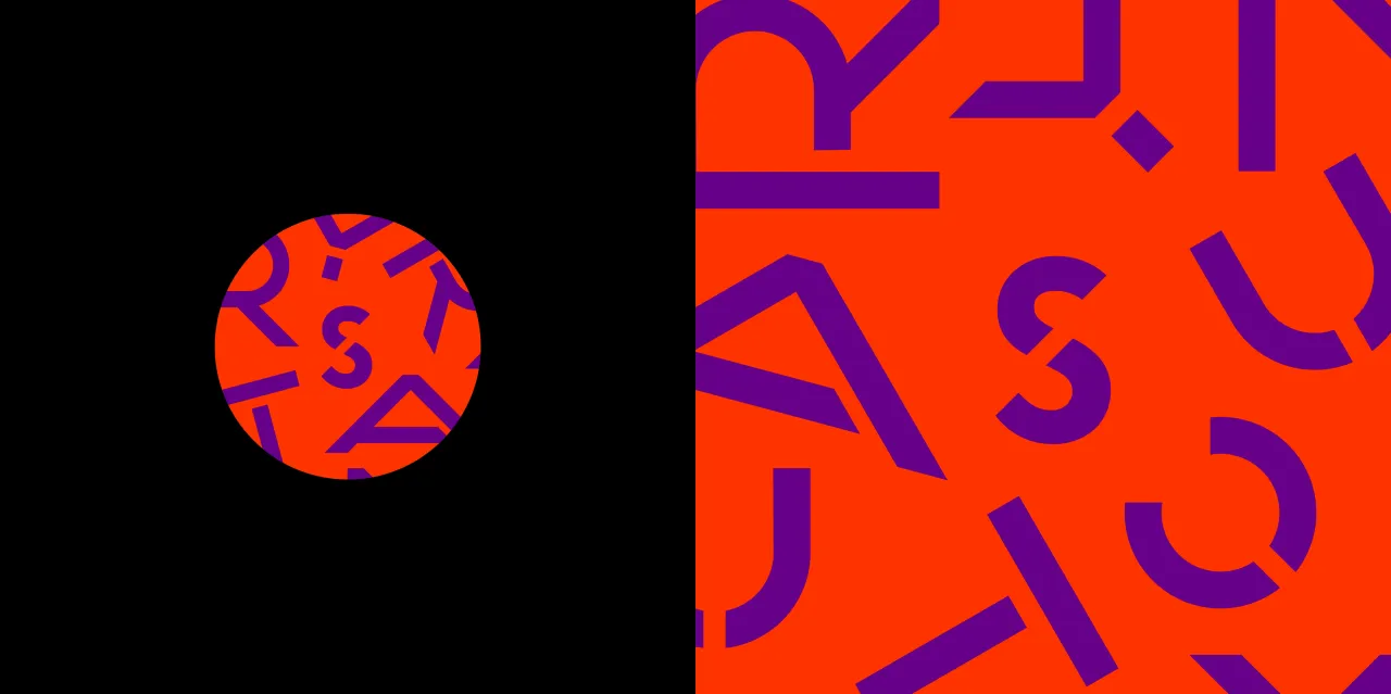
Adam's deep knowledge of the area meant he understood what locals would respond to. "Designing this identity required cultural competency, as it needed to speak in a visual language that would be familiar and accepted", he explains.
It was also important that the story behind the park's creation informed the strategy for the identity design, as South Side Sanctuary is actually very unique in its origins. Span developed the visual identity over a year before the park's completion, and early deliverables included community engagement materials and philanthropic fundraising assets.
This enabled the Sanctuary team to engage with the community from the start and raise the funds needed to make the park a success.
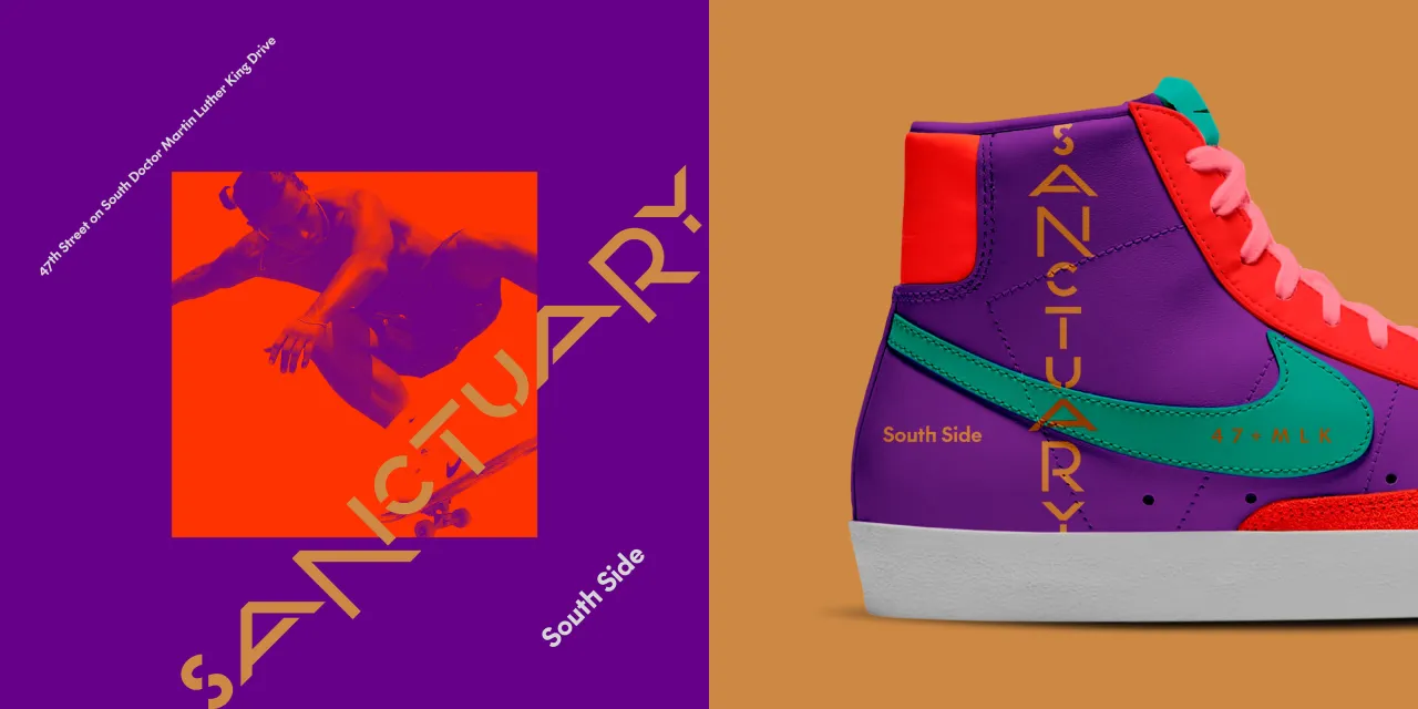
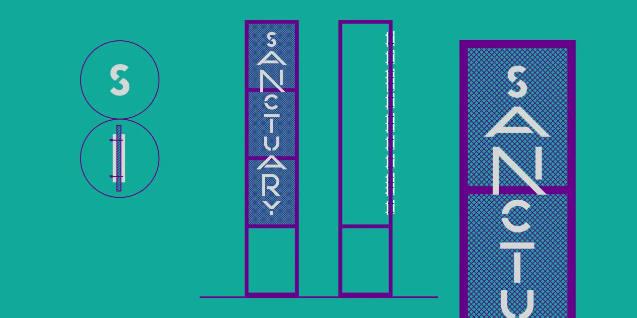
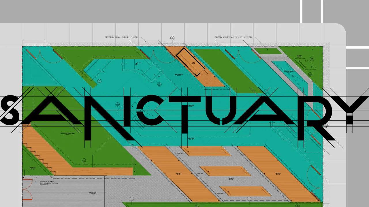
When designing the visuals, Span only had to look to Bronzeville's rich history and creativity for inspiration, including legendary residents like Gwendolyn Brooks, Louis Armstrong, Quincy Jones, Herbie Hancock, Ida B. Wells, and Jesse Owens. According to Adam, the neighbourhood is also "a mecca for Blues, Jazz, Gospel, and civil rights", so the South Side Sanctuary logotype was designed to embody "a sense of confidence and creativity".
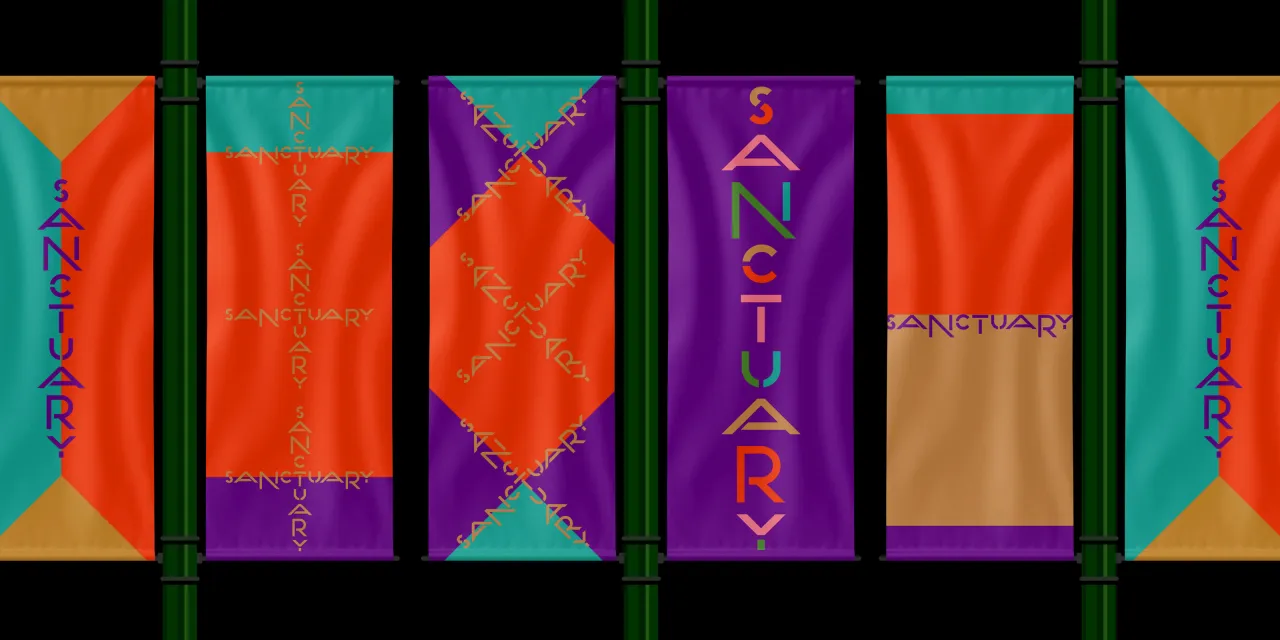
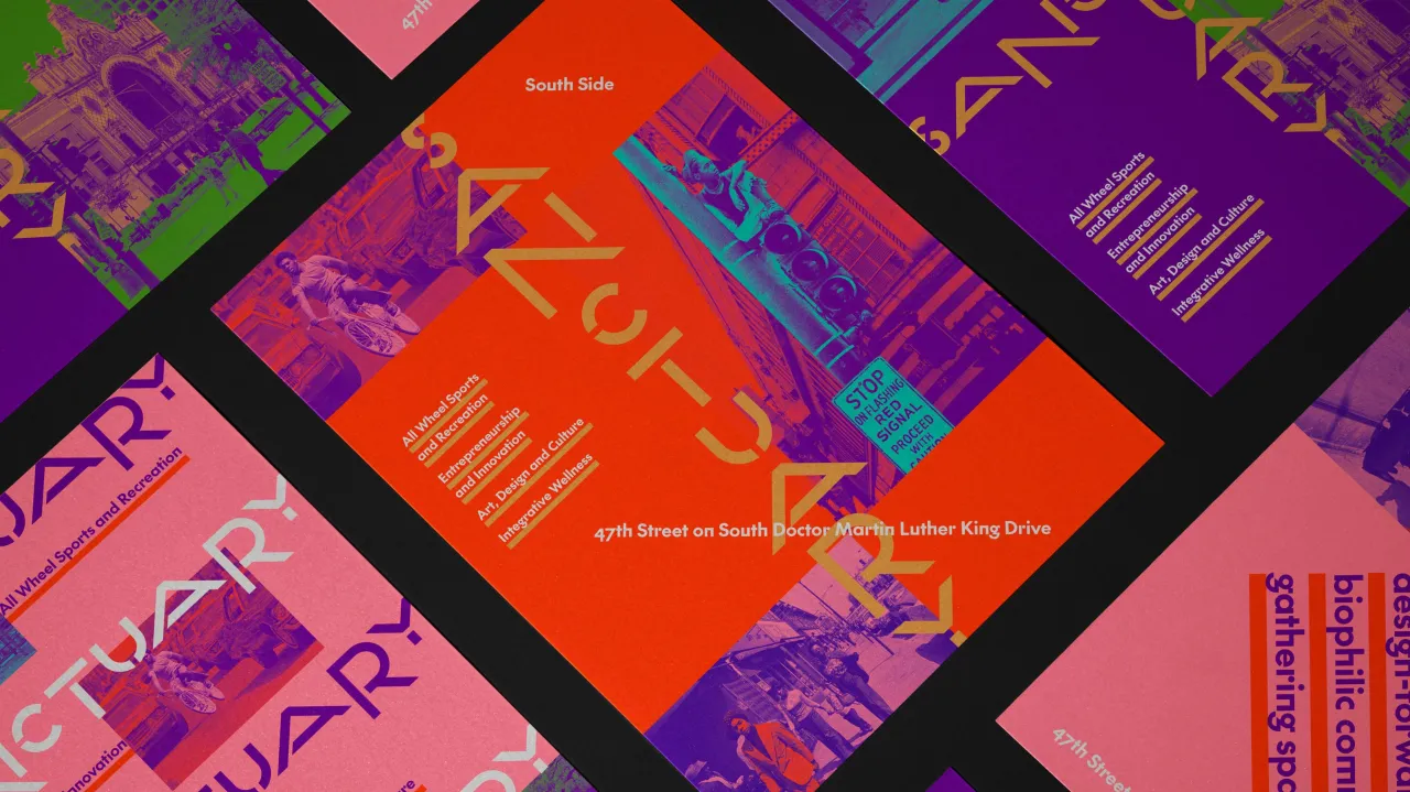
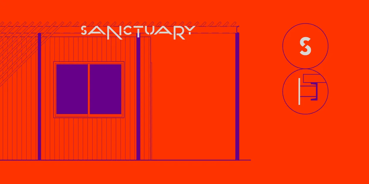
The park's custom uppercase stencil letters with descenders nod to a Bronzeville public bench designed by local artist Apache Wakefield, who also teaches in local schools. These unique letterforms were chosen to pay homage to the park's topography, which includes surfaces for skating and sitting.
Every element of the logotype was carefully considered, including the geometry of the letterforms, which is directly inspired by FutureFirm's architectural site plan for the park. In this plan, 45° diagonals inform every detail, including a shortcut to the Green Line L-station.
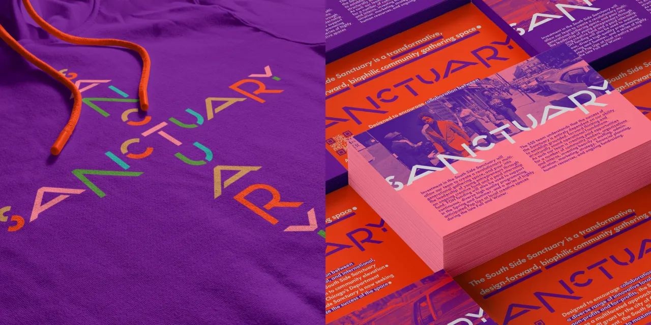
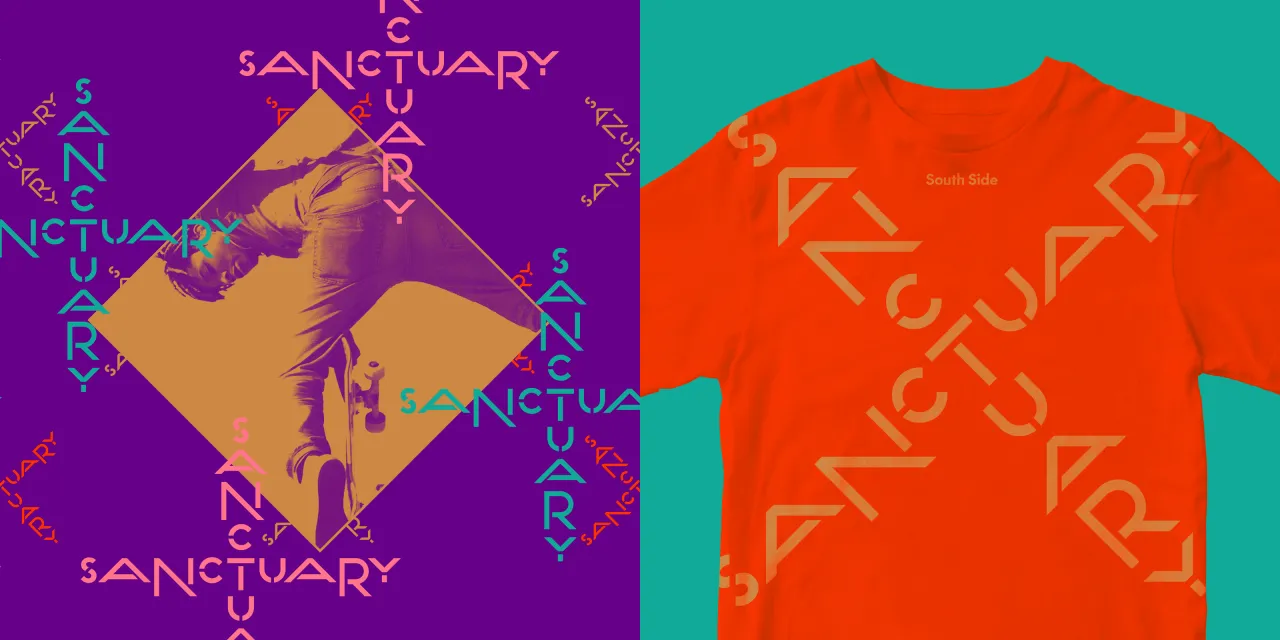
Cuff also expressed a desire for the logo to serve as "a beacon" pointing in the direction of the space. In response, Span ensured it was adaptable for vertical, horizontal, and diagonal orientations while maintaining legibility.
Adam says: "This versatility ensures the identity feels dynamic and integrated with the park, rather than just a static brand."
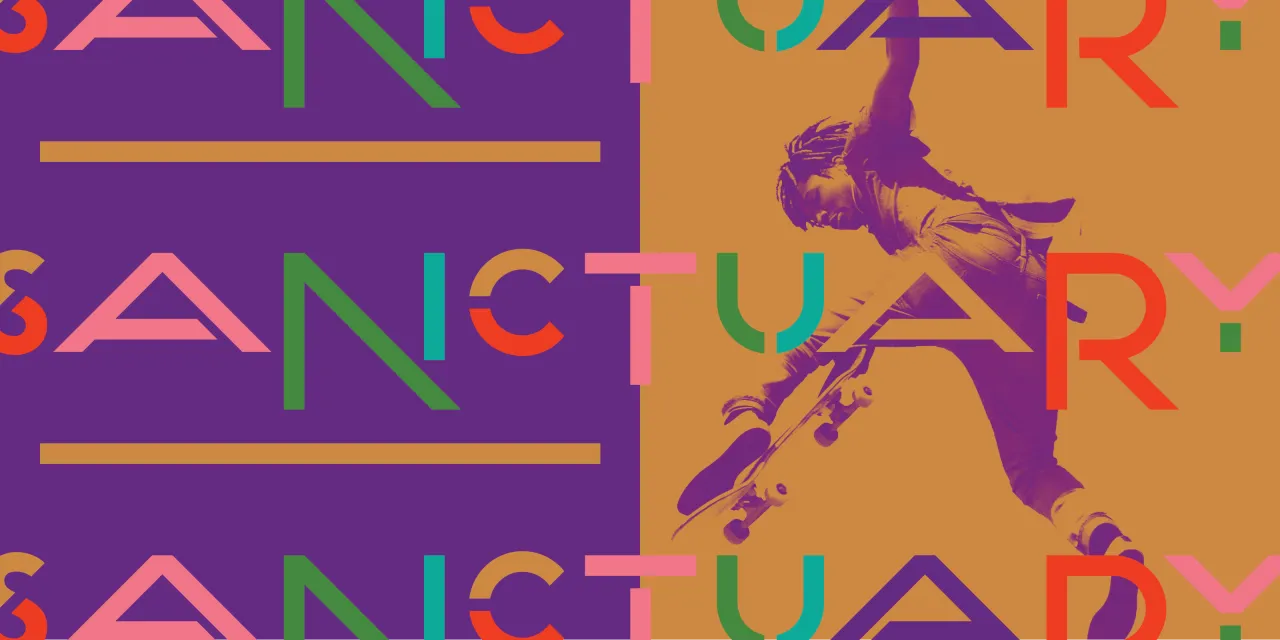
A few years ago, when Adam was leading another project at Span, artist Amanda Williams introduced him to the concept of relational colour theory. This theory suggests that "colour gains meaning based on lived experiences and the context of one's environment", which resonated with what he wanted to achieve for South Side Sanctuary.
This theory then guided the creation of the colour palette, which is intentionally connected to the park's surroundings. Purple and green hues reflect the native-plant landscaping, while pink and teal are inspired by nearby businesses. The additional bronze tone is drawn from the four statues nearby that designate Bronzeville as the heart of Chicago's Blues District.
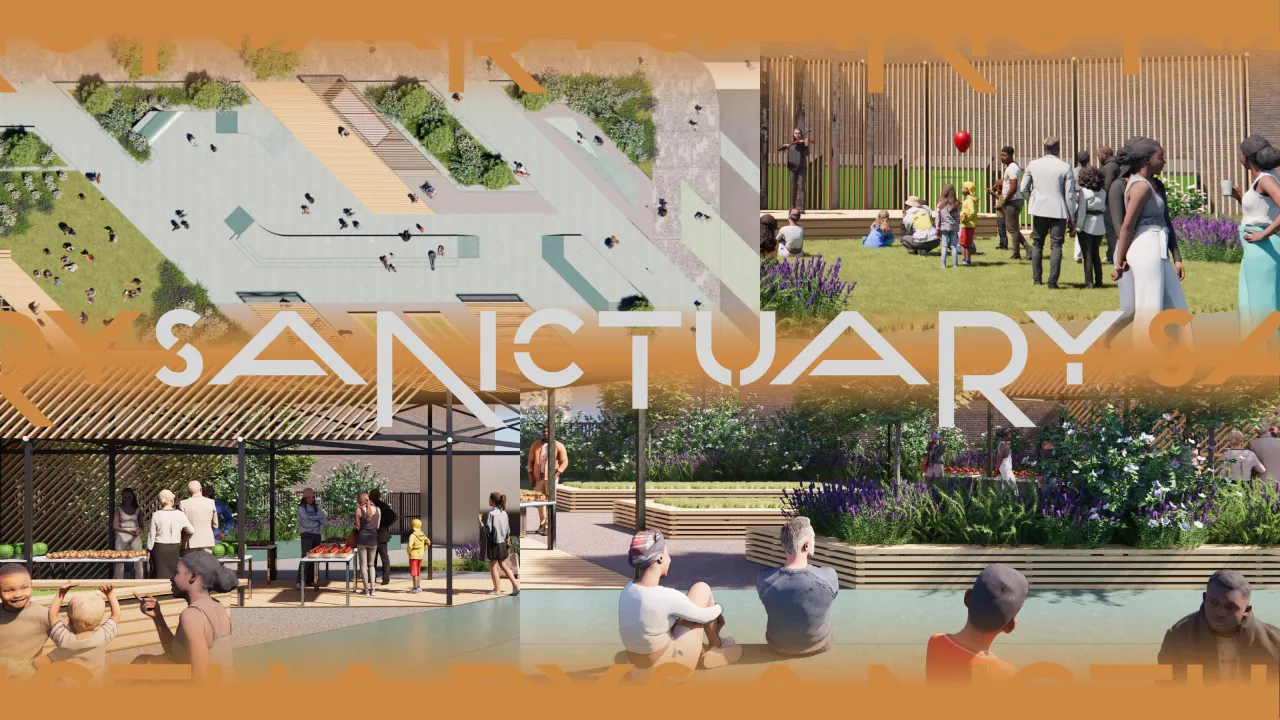
Span's diverse client base has led them to a variety of projects, from place identities to consumer businesses and even the branding of a fish. When asked about the nuances of each project and how they compare to each other in terms of approach, Adam says, "I have strong feelings about the distinction between visual 'brand' and visual 'identity'.
"The term 'brand' historically refers to marking ownership, with connotations that can be problematic, while 'identity' speaks to an expression of self and liveliness."
Adam reveals that Span takes a similar approach when designing visual identities for businesses, organizations, movements, or public spaces, although "each entity has its own micro-culture and aspirations".
He believes that "by welcoming the individuals of the microculture in, understanding and respecting the microcultures traits, a designer can create an identity that reflects the entity", ensuring the results are true to purpose. "At Span, we didn't brand a park; we reflected outwardly its identity."
Editor's Picks





Trending






Latest Jobs
Senior Designer at Definition
Contract·London·£45k–£50k
Senior Creative Lead at Random Studio
Full-time·Amsterdam / Paris·€90k-€110k
Account Director at How&How
Full-time·London·£73k-£79k
Midweight Full Stack Developer at Bureau for Visual Affairs
Full-time·London (Open to remote)·£35k–£50k
Midweight Designer at All Purpose
Full-time·London·£30k–38k
Senior Operations Manager at BIG Partnership
Full-time·Glasgow·£45k–£50k