Wonderhood Design walks the line between church and charm in Sacred Ground’s identity
For the pro-bono project, the studio designed a logotype that is both "ornate and classic" and has a "contemporary setting" for the new coffee shop, which is opposite Soho's St Anne's Church.
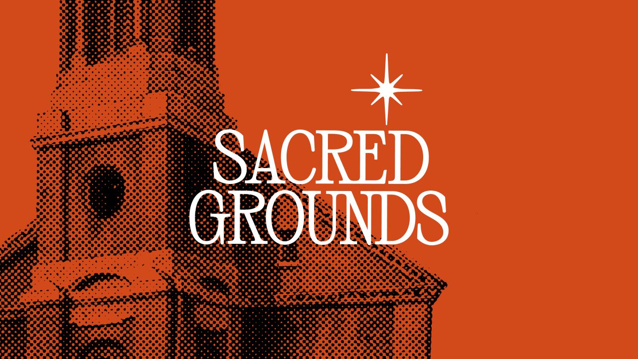
Wonderhood Design has created an identity for new Soho coffee shop Sacred Grounds, including its name, witty brand voice and a logotype that walks the line between traditional and contemporary.
The work was part of the studio's Neighbourly Fund, an annual project aimed at supporting local Soho businesses for which Wonderhood offers its expertise in branding and identity for free.
When the Soho Business Alliance shared the initiative on their forum, St Anne's Church got in touch as it had recently re-acquired the lease on an adjacent building and planned to turn it into a coffee shop. Following research into the category and competition, Wonderhood developed a brand strategy, tone of voice, name, and identity, including the logo, bespoke fonts, and colour palette, and advised interior and exterior design.
Although the coffee shop is connected to St Anne's, the brand was designed to be evocative of the church without being too religious and not to exclude non-religious people. Sacred Ground's affiliation with St Anne's Church is part of its unique offering. While the brand had to have an "inclusive, community element", Wonderhood Design co-founder Roy Barker says the studio also had to adhere to other "boundaries and sensitivities" to avoid offending those belonging to the Church.

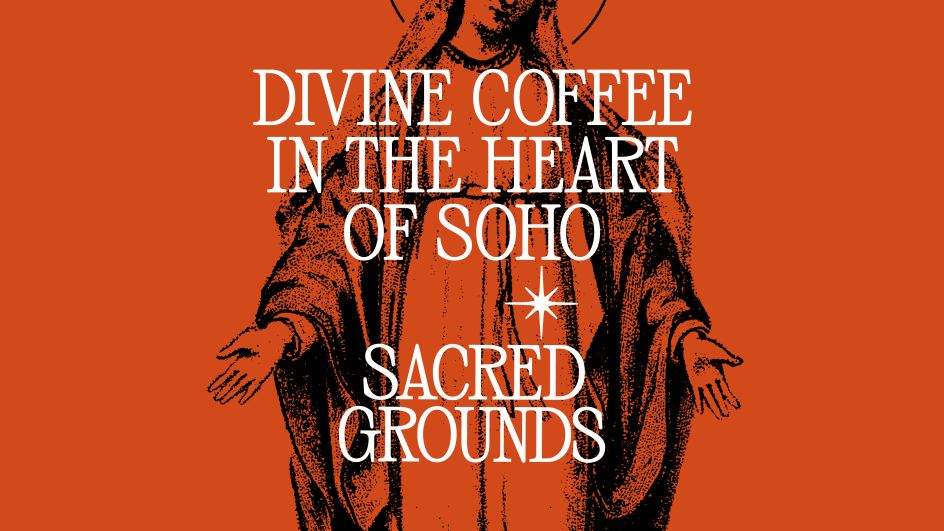
The process of devising the name was reflective of this balancing act, as Barker feels that it "alludes to the religious aspect without making it all about the church". The play on words also aligned with the overall knowing tone of voice that Wonderhood developed for the brand, which is perhaps one of its most surprising aspects.
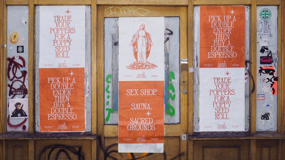
Like the name, Sacred Ground's leading phrase – 'Divine coffee in the heart of soho' – subtly alludes to the church affiliation while bolder phrases like 'Pick up a double ender then a double espresso' adorn fly posters in the area. This "cheeky, knowing tone of voice" is a nod to Soho's rich cultural history", says Barker.
He adds: "It must have worked, because we've had the council asking us to take the posters down, and even people coming in and asking where the sauna is".
Both the verbal and visual identities were designed to stand out and be distinctive in a world of "cookie-cutter, minimalistic coffee shops", according to Wonderhood co-founder Simon Elvins.
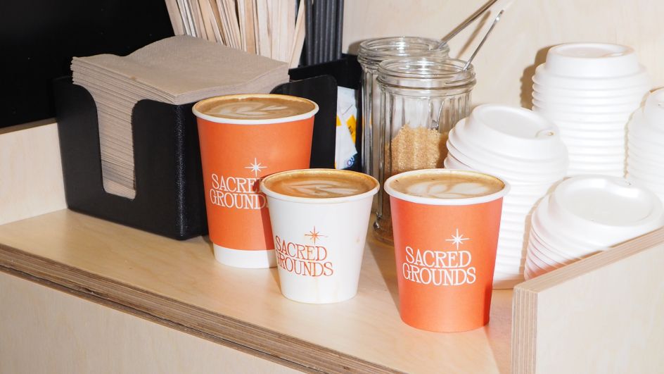
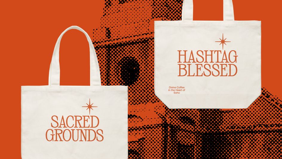
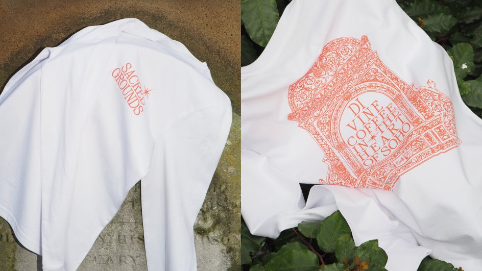
Sacred Ground's logotype merges more traditional and decorative detail – in homage to the church – with a contemporary, condensed type. Traditional cues of religious iconography are more visible through the brand's merchandise.
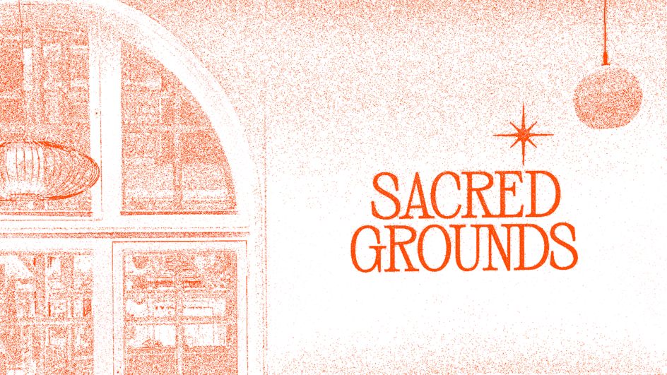
Warmth and vibrancy are key qualities of the brand, differentiating it from the multitude of monochromatic café brands in Soho. Wonderhood opted for a signifying orange hue that pairs well with the style of the font we thought it paired perfectly with the font, which Elvins describes as "ornate and classic" with a "contemporary setting".
Legibility was just as important as aesthetics when it came to the font and colours, as St Anne's wanted the brand to be as inclusive as possible.
Wonderhood Design went the extra mile on this project, going beyond branding to advise on the interior and exterior design, working with St Anne's parishioner and operations manager Jake Lee's vision. Fortunately, the previous leaseholders had left behind "bits and pieces worth incorporating", says Elvins.
Due to a limited budget, Lee had the final say, but the studio consulted and guided him throughout the process he had the final say. This resulted in "a peaceful, thoughtful space which is not too cluttered or too loud, retaining a simple design aesthetic", according to Elvins.
Sacred Ground is also due to open a secret garden in the next couple of months, ready for the summer season.
Editor's Picks


Trending


Podcasts


Editor's Picks
Further Reading