Angel & Anchor crafts playfully ironic identity for new Belfast takeaway
Lucky Duck is a quirky twist on the classic UK Chinese restaurant, blending traditional elements with tongue-in-cheek charm.
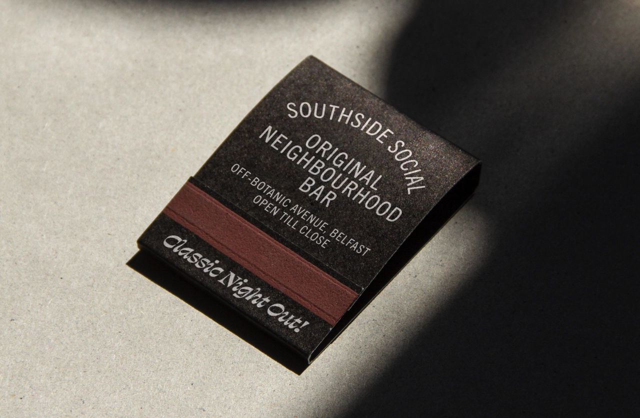
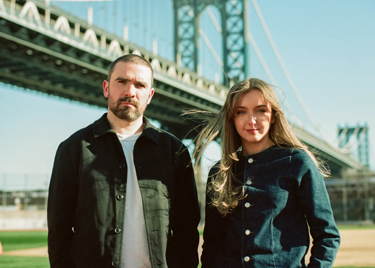
At Creative Boom, we're big fans of the work of Angel & Anchor, who describe themselves as "a ballsy branding studio based in Belfast; we work hard, we listen, we give a shit." And so back in March, we reported on their work crafting a visual identity for a stylish New York-esque cocktail bar in the city called Southside Social.
Well, it turns out that was only the half of it. In parallel with developing the Southside Social brand, the studio has been working on creating a sister brand. Angel & Anchor, known for their work in the eating and drinking space, describes Lucky Duck as "an authentic Belfast Chinese restaurant, nestled in the centre of Southside Social".
Name, logo and colours
Naming the restaurant was at the top of the list when creating the brand and setting the tone for its personality going forward. Taking inspiration from Chinese culture, cuisine, and its many 'good fortune' traditions, the brand follows the naming convention for Chinese restaurants in the UK and Ireland.
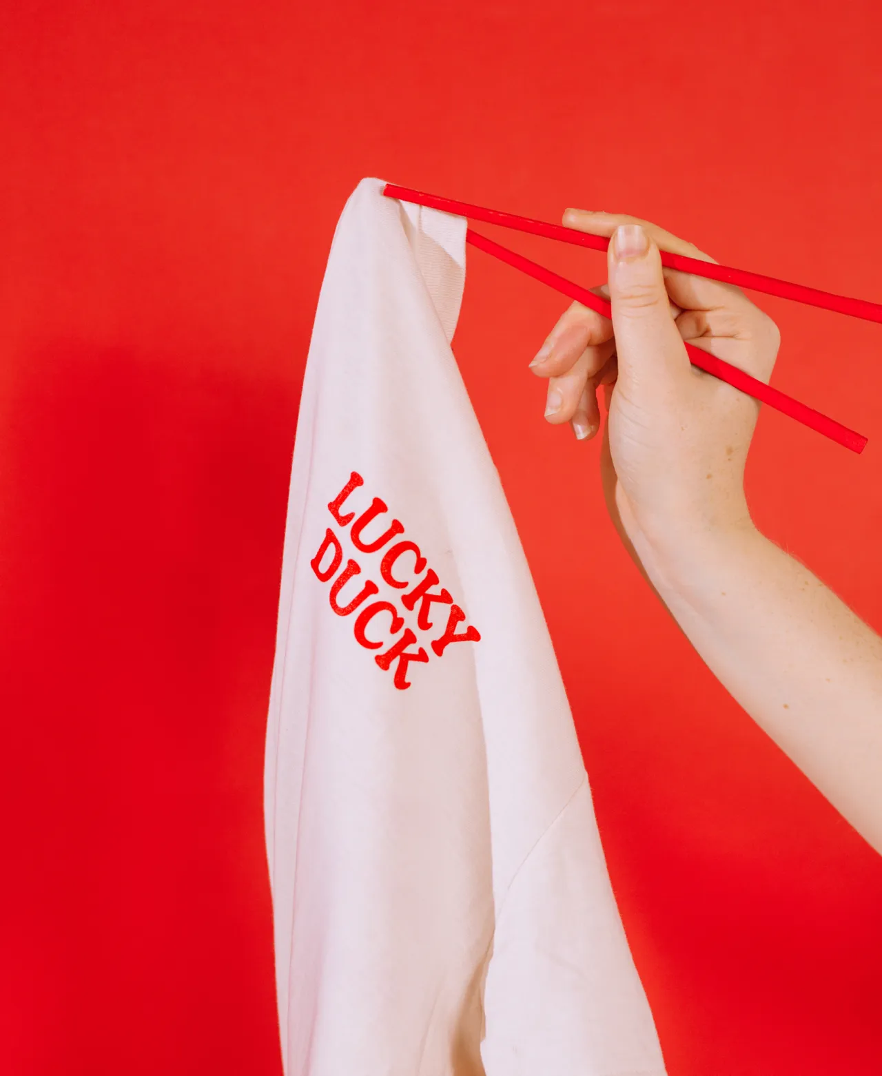
It also plays on the English phrase "you lucky duck", giving a nod to both of the takeaway's "cultural parents".
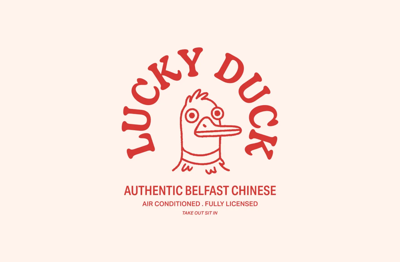
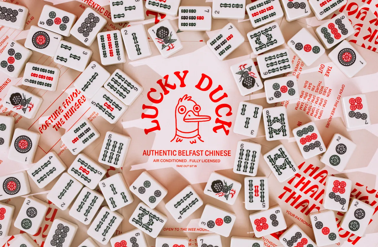
Visually, the brand identity comes to life through a personality-driven logotype and an illustrated core mark. The logotype is built from Decoy Medium. This serif typeface has distinctive flicks and curves in its uppercase letters, which combine with the quirky character mark to embody an ironically playful tone. Meanwhile, the logo mark is the Lucky Duck itself, an illustrated mascot with ruffled feathers and staring eyes.
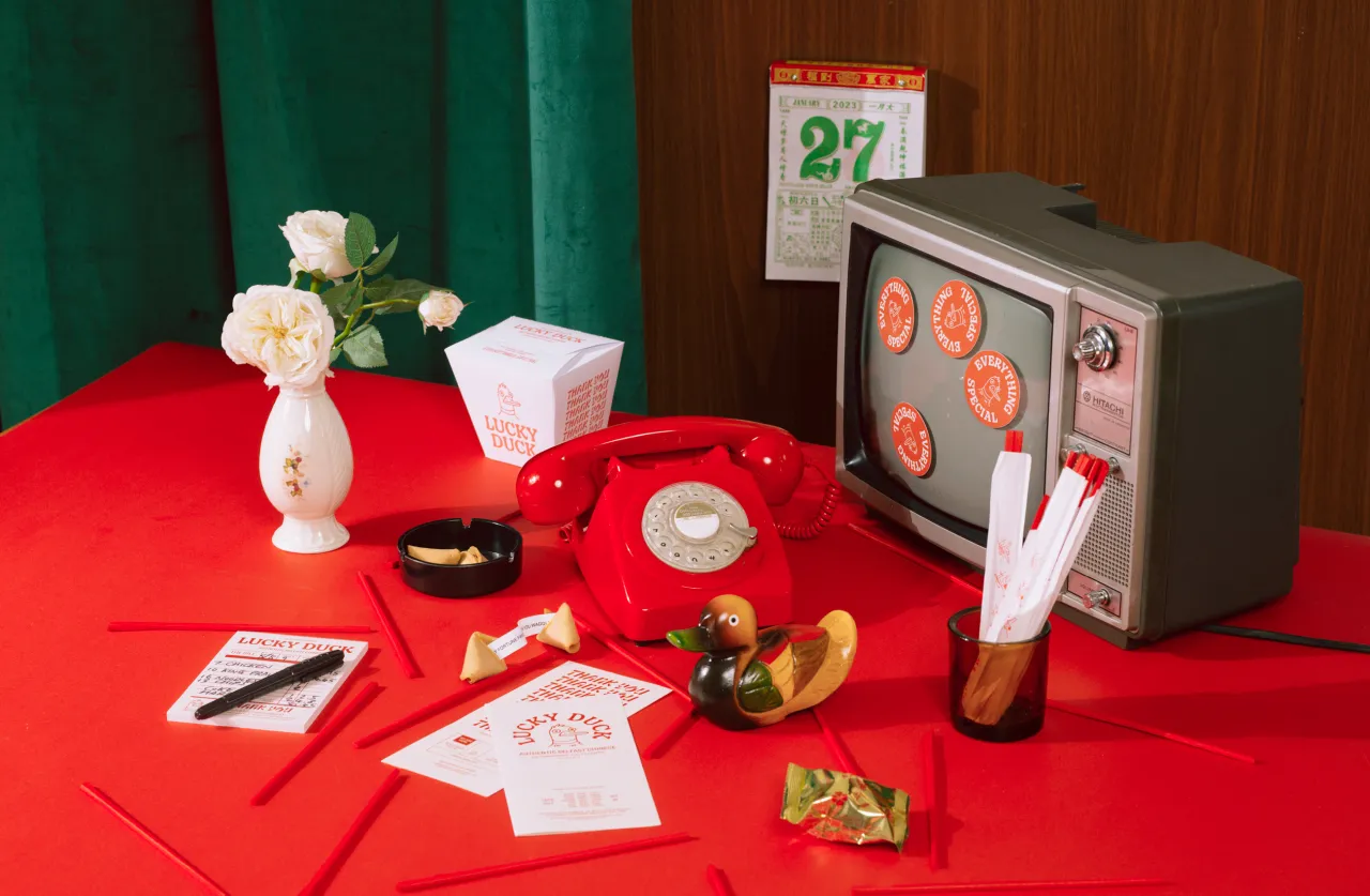
Lucky Duck's palette of colours borrows from traditional Chinese decor to add some retro kitsch to the takeaway. As you'd expect then, a classic rich red dominates menus, signage and packaging, with contrasting pops of Prawn Cracker Pink and Yellow Duck in the interior decor and digital assets.
Brand language and interior
Inspired by the mismatched language and unique syntax habits of traditional UK Chinese takeaways, Lucky Ducks' language oozes an ironic personality.
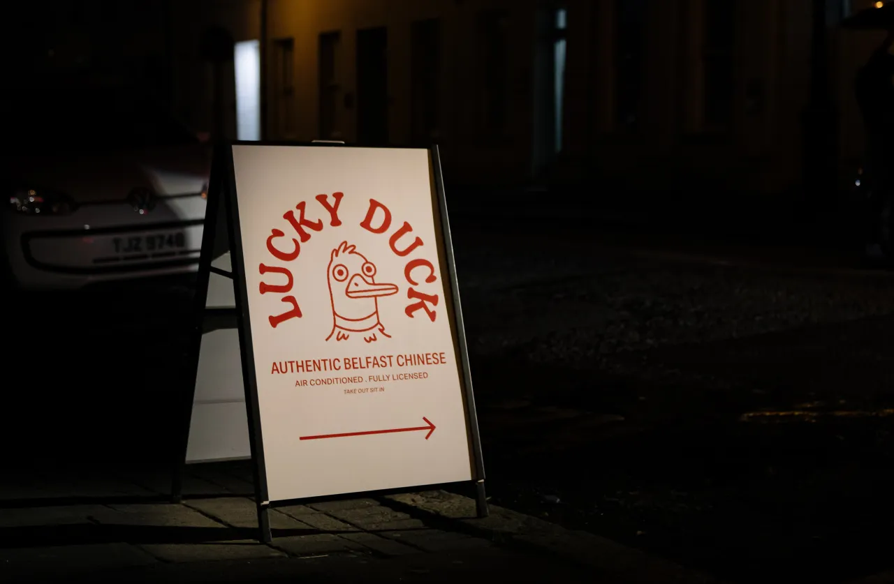
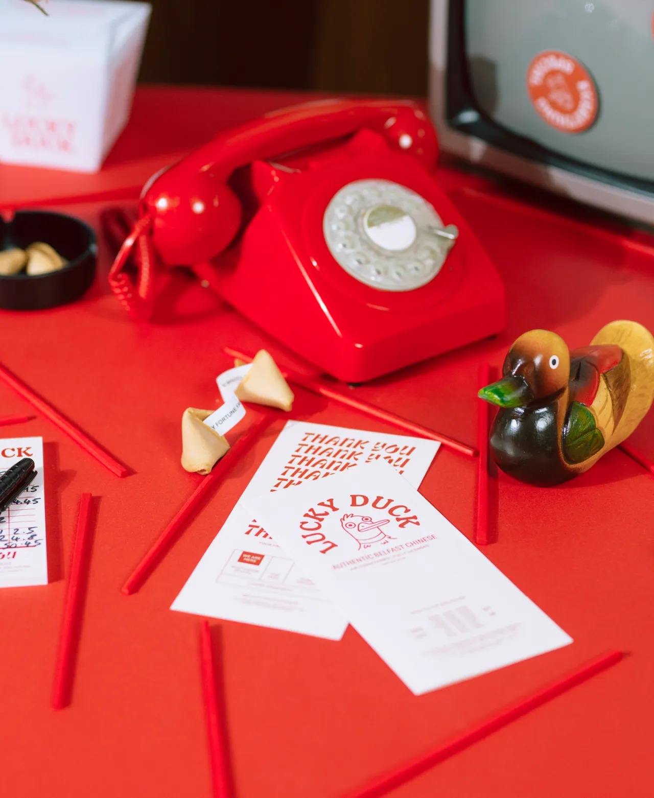
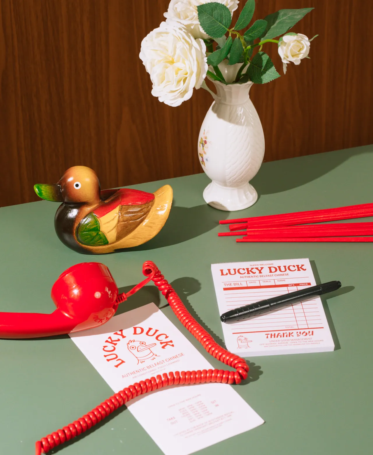
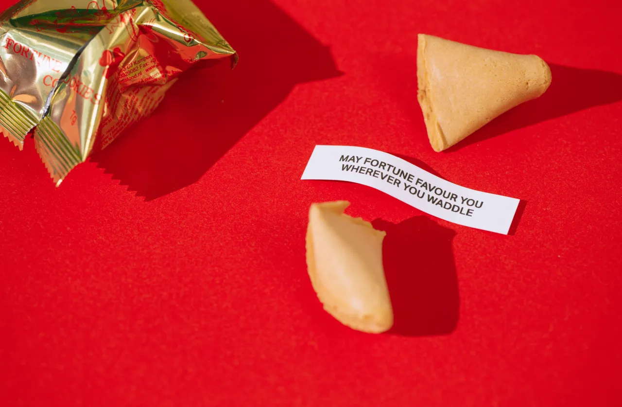
Establishing itself as an "Authentic Belfast Chinese", it draws on instantly recognisable phrases such as "under good management" and "Little House of Big Flavour". Taking reference from Chinese sign painting with thick, tapering brush strokes, the fun typeface Ohno Casual infuses each phrase with a little extra flavour.
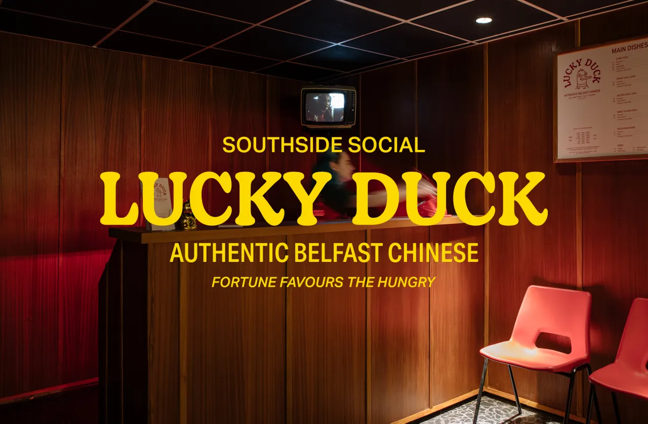
The studio also developed art direction to guide the interior space: a curated fit-out that aims to create a quirky but familiar experience. Brought to life with the help of Hong Kong-based interior design and architecture studio A.D.O. and joinery specialists at Carter's Workshop, the theme of the space is a Wes Anderson-like environment.
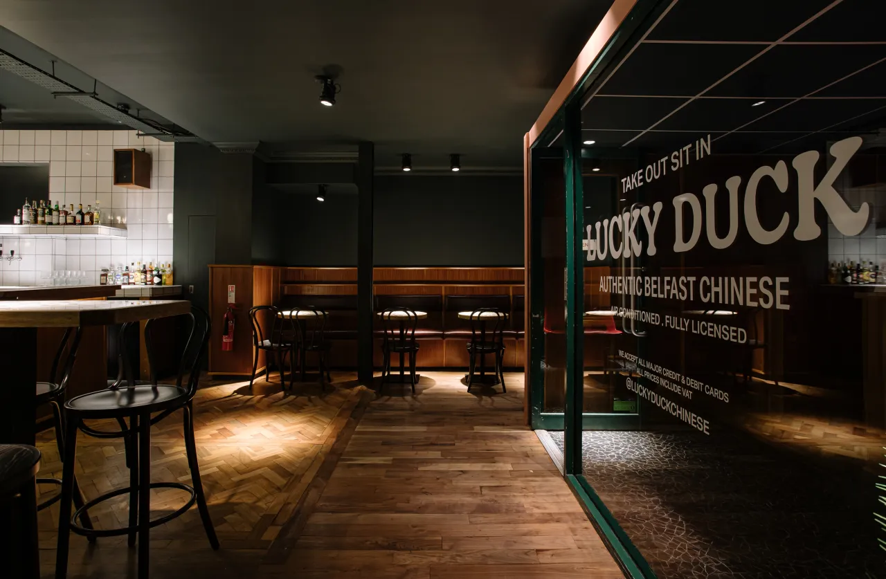
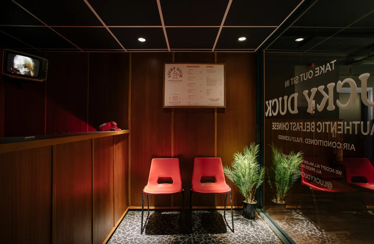
As customers place their orders, staff take notes in a retro-style receipt book surrounded by ephemera, such as a static-filled '90s TV and a waving cat ornament on the countertop.
With its tongue-in-cheek branding, nostalgic interior, and fusion of cultural influences, Lucky Duck stands out as a fresh take on the classic Chinese takeaway experience. As Lucky Duck takes its place alongside Southside Social, this creative agency is helping to shape a new era of dining experiences in Belfast, one quirky concept at a time.
Editor's Picks





Trending






Latest Jobs
Creative Director at Koto
Full-time·London·£95k-£130k
Graphic & Motion Designer at The SHARP Agency
Full-time·Leeds·£26k–£33k
Marketing Copywriter at ustwo
Full-time·London·£40k-£50k
Senior Brand Designer at Analogue
Full-time·Leeds·£38k-£45k
Senior Digital Designer at Red Antler
Full-time·New York·$95k-$130k
Senior 2D Motion Designer at Art&Graft
Full-time·London·£50k-£65k