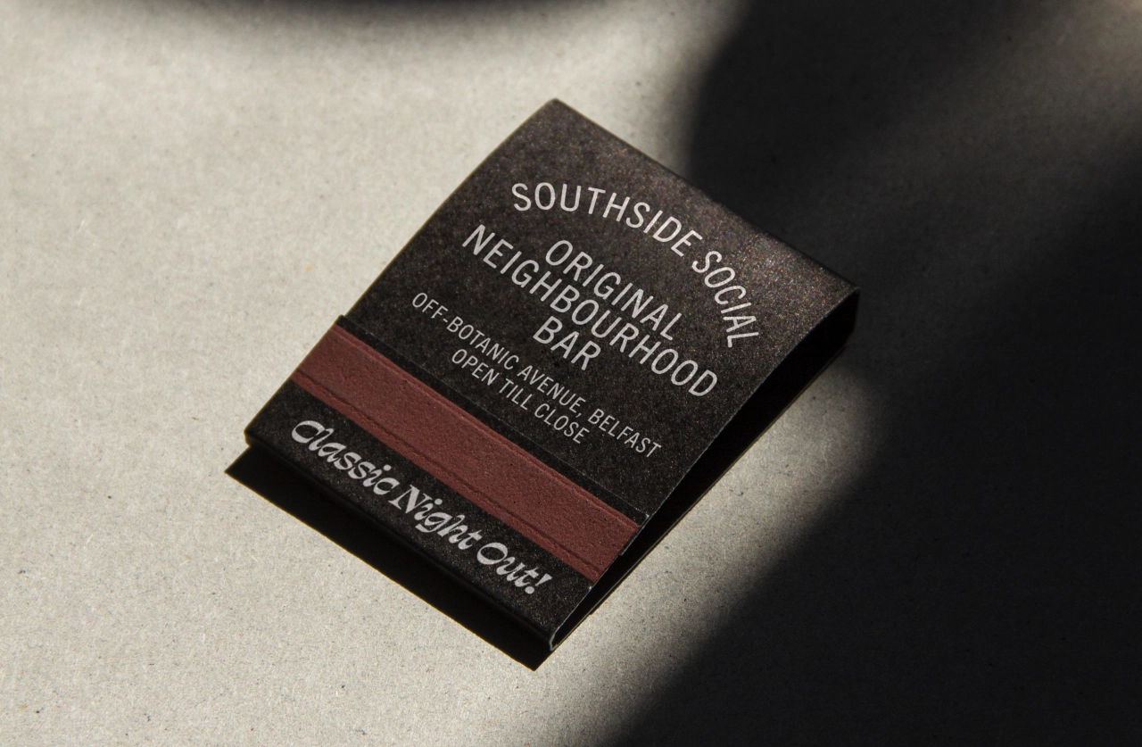
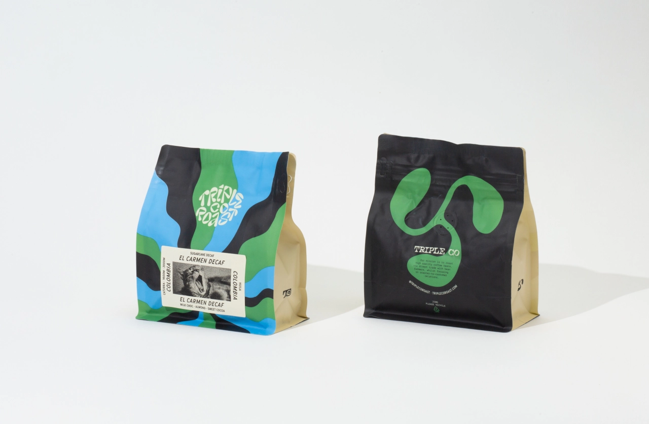
A refreshed brand identity for a Northern Ireland cafe that's inspired by the coast
If you're looking for a decent coffee in Northern Ireland, you can't go far wrong with Lost & Found, a brew bar and eatery that's been established on the north coast since 2014. Local studio Angel & Anchor was recently appointed to refresh its brand, one that would build on its continued success and celebrate its inspired location.
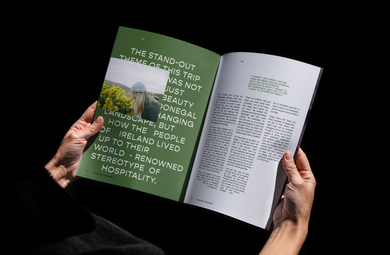
"It was clear they already had a strong and positive personality," says Ben Connolly, founder of Angel & Anchor, on approaching the initial brief. "Quite simply, Lost & Found is as much the coast as the coast is Lost & Found. Authenticity and creativity lie at the heart of what the cafe does, with a mission to create a space for its 'tribe' to connect and celebrate simple, fine food."
With this in mind, Ben and his team set out to bring more of that personality to life across the brand and its two locations. "It was our job to help define who they are through a strategic process which would lead to a new identity, tone of voice and language that was influenced by the local landscape as much as their ethos," he says.
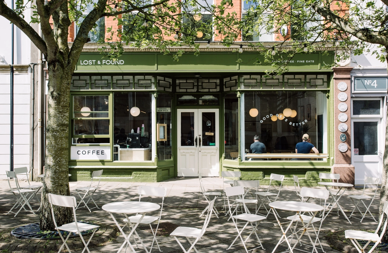
After establishing its tone, key audiences and core values, the messaging was developed. Angel & Anchor created playful slogans and phrases, giving Lost & Found a new suite of language to better communicate who it is and the region it's so proud of. It's all inspired and centred around the brand's main slogan, 'Good Gets Better' – one that Ben says has "brought its passion for quality craft to the forefront of messaging".
Other lines like, 'Get Lost' and 'Keep It Simple' emphasise its easygoing attitude and love of nature. While 'Find Your Tribe' and 'North Coast Made' are further examples of secondary phrases that help to connect customers to each other and to Lost & Found's location.
The core identity was influenced by traditional mark-making such as wood and stone carving. "In these simple processes, lines and shapes that are organic and human can be found, a feeling we aimed to capture for Lost & Found's identity," adds Ben.
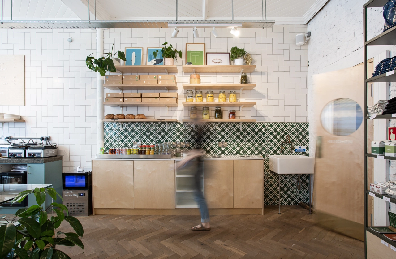
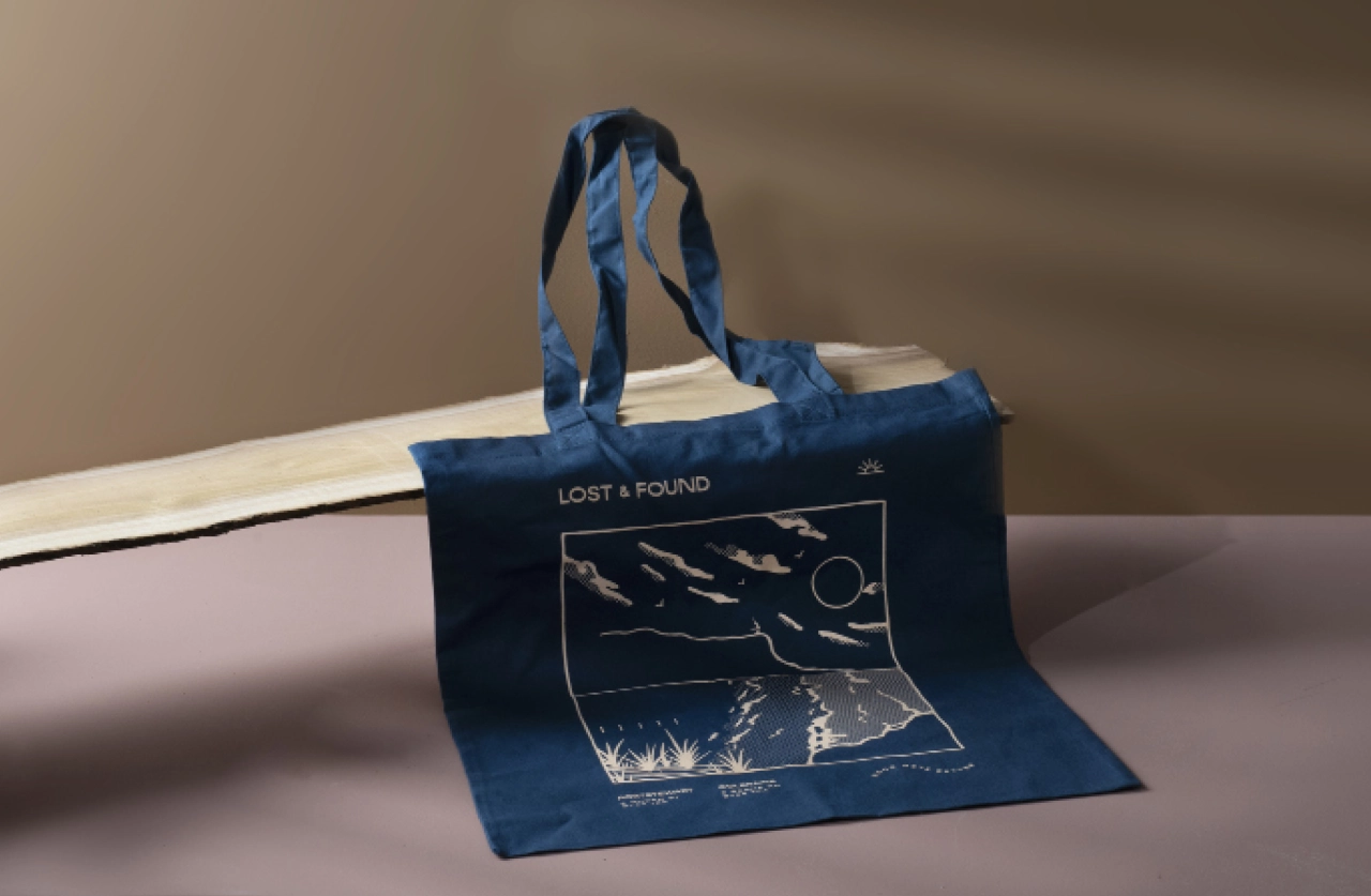
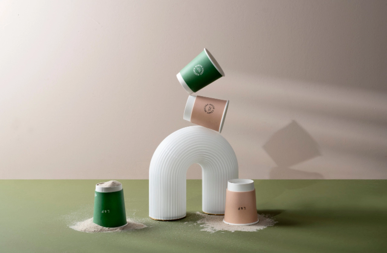
Made up of multiple hand-illustrated marks, the system reflects the rugged nature of the coastline and lends the brand an honest character. "Waves, dunes and landscape references integrate nature throughout, reinforcing the indisputable relationship between the brand and the coast," says Ben.
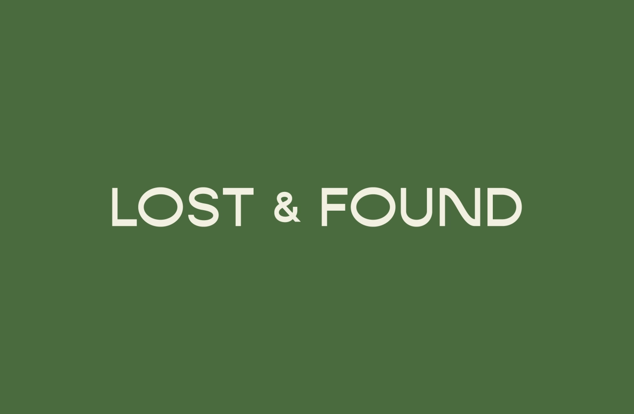
Elsewhere, the typography is minimal yet playful and aims to "bring transparency to Lost & Found's spirit of adventure". The Gopher typeface – with its "quirky reversed" serif gives a clean but inherently fun expression of the brand's personality. While a dune-adaptation to the 'N' character and extension of 'O' conveys this spirit even further. Ben concludes: "This leading typeface, fun alternatives and vast multi-mark system help to create a visual identity that truly represents the personality and ethos that its customers had been so familiar with each day."
Editor's Picks





Trending






Latest Jobs
Creative Director at Koto
Full-time·London·£95k-£130k
Senior Copywriter at Human After All
Full-time·London·£48k–£66k
Growth and Client Development Director at 3800
Part-time·Sheffield·£60k-80k
Account Manager at Moxie and Mettle
Full-time·Cheltenham·Up to £35k
Marketing Copywriter at ustwo
Full-time·London·£40k-£50k
Midweight Graphic Designer at We Are Your Friends
Full-time·London·£36k–£44k