How LULACREATES designed baby skincare brand Smoosh to look at home on a beauty shelf
The Birmingham studio has given the baby skincare newcomer a soft, fluid identity with rounded lowercase type and an ochre-yellow palette, built to feel credible and aspirational at once. We find out more.
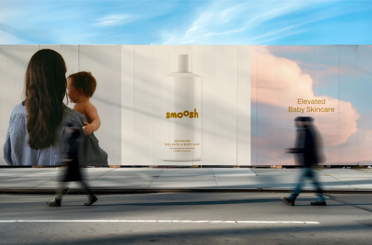
The baby care aisle isn't somewhere I venture, but if I do stumble upon it, I tend to find one of two things: heritage clinical brands that look like medicine, or cartoon-led products drowning in bright colours and nauseating characters. Mercifully, Smoosh, a new premium baby skincare brand, does neither, thanks to female-led studio LULACREATES.
Founded by Sophie and Victoria, both former Boots and babycare specialists, Smoosh launches with naturally derived, sensitive-skin formulations and a digital-first approach to branding and community.
LULACREATES created the full identity, including its logo, packaging system, brand guidelines, and the visual language to position Smoosh as a serious brand challenger.
Founder Louise O'Kane says it all came down to spotting a genuine gap. "Modern parents are more ingredient-conscious than ever," she says. "They'll spend hours researching formulations, reading reviews and investing in products that genuinely work, but visually, the category hasn't evolved at the same pace."
When Louise looked closely at the category, she discovered the same thing: trust earned from opposite ends of the aisle. Almost nobody was treating baby skincare as something you'd actively want on display in your home.
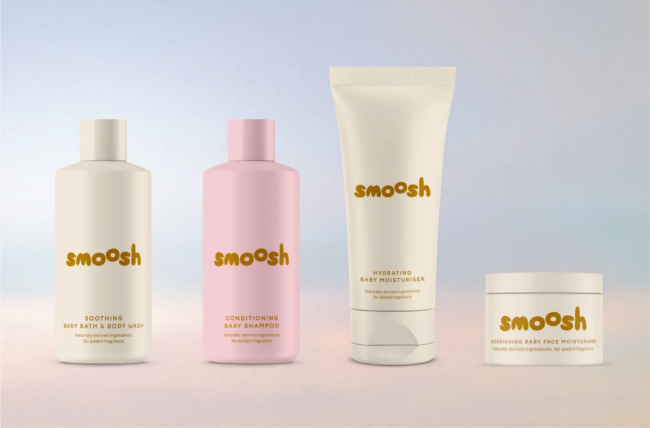
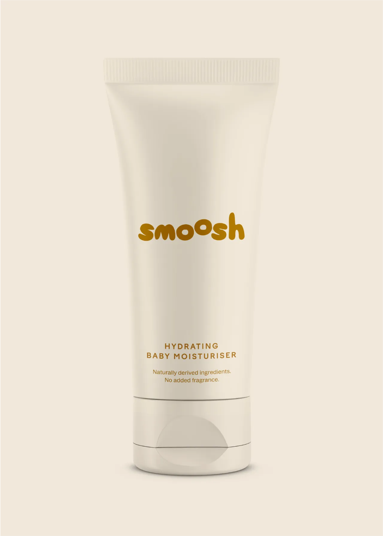
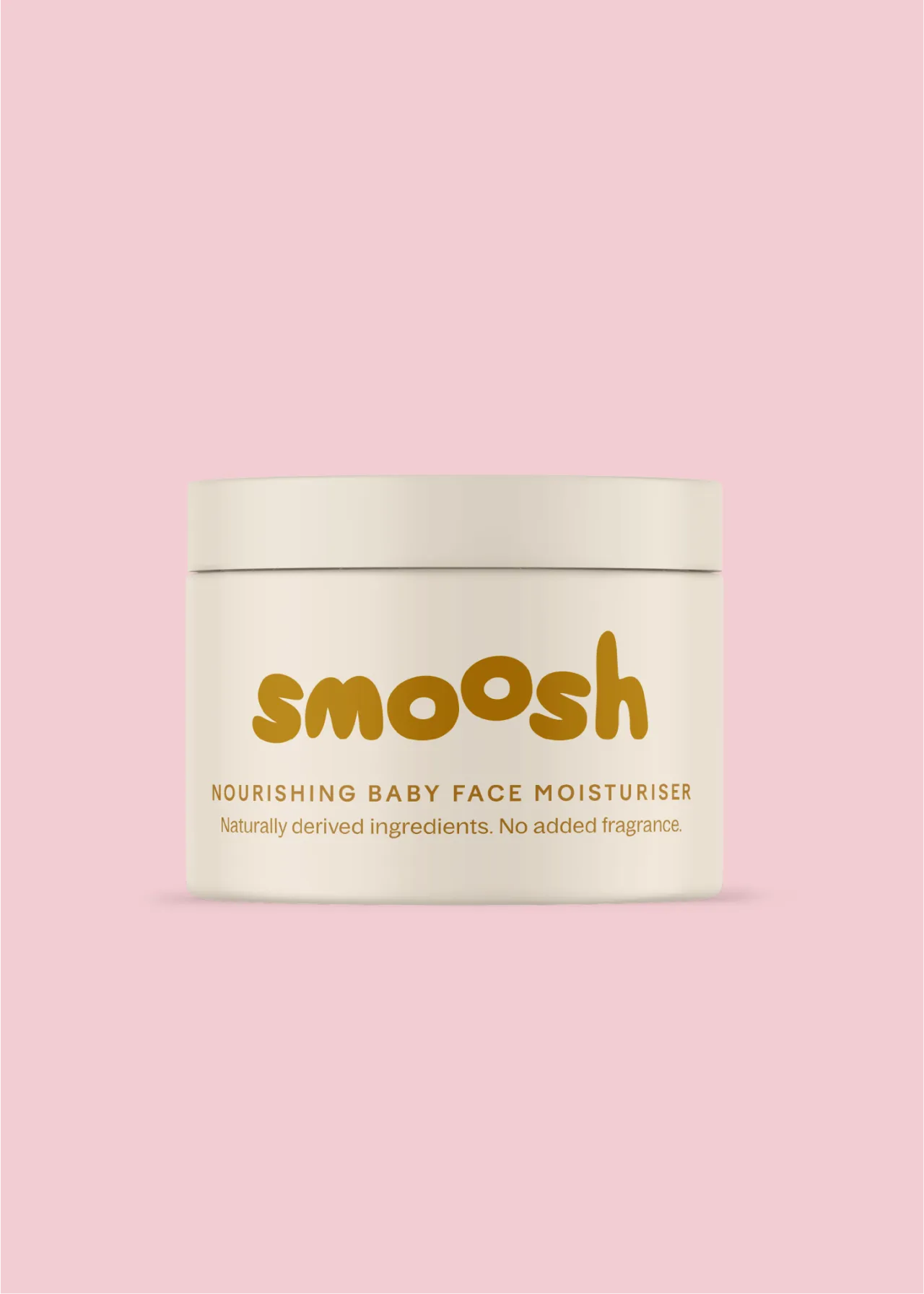
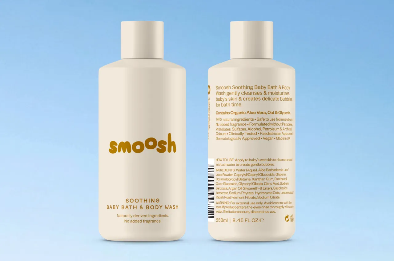
To help Smoosh feel both credible and aspirational, Louise created a soft, fluid identity with a custom-drawn logo that pairs rounded lowercase type with a floating 'o', giving a nod to bubbles, movement and the softness of baby skin. She added organic curves and gentle distortions to keep things light. And there's room left over for motion and digital work in future.
The other challenge was working within tight production limits, which meant a controlled palette and few print colours. So Louise built the system around an ochre-yellow accent and softer complementary tones, changing the packaging colour from product to product so parents can grab the right bottle in the middle of bath time chaos.
Look at it as a whole, and the references are clearly premium skincare and beauty: products that have to feel both trustworthy and desirable. "Consumers are becoming hyper-aware of ingredients and formulations, so aesthetic value needs to also signal trust," Louise explains. "We wanted to create something worthy of a beautifully curated bathroom shelf while still feeling authentic to the realities of parenthood."
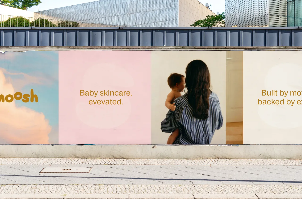
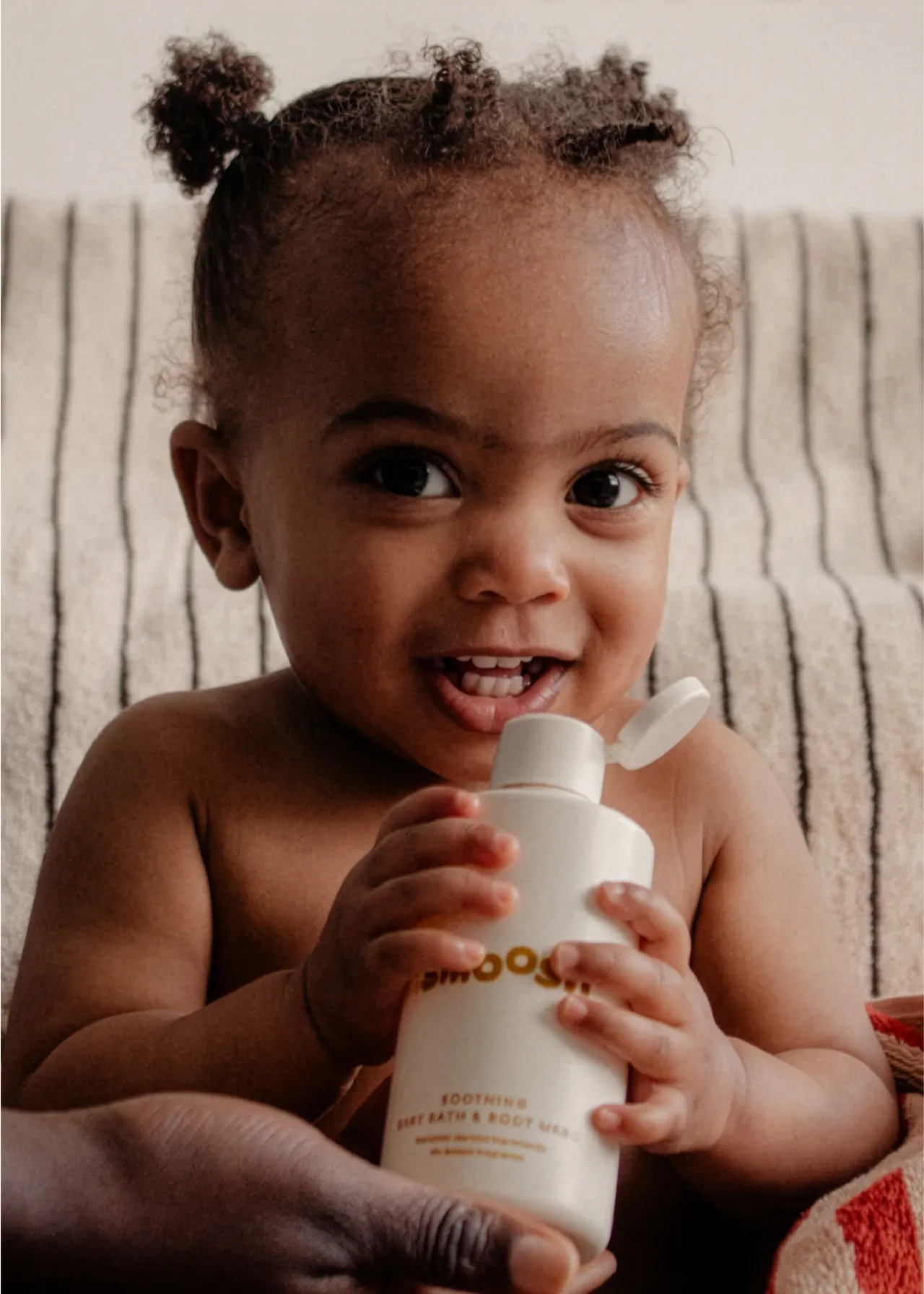
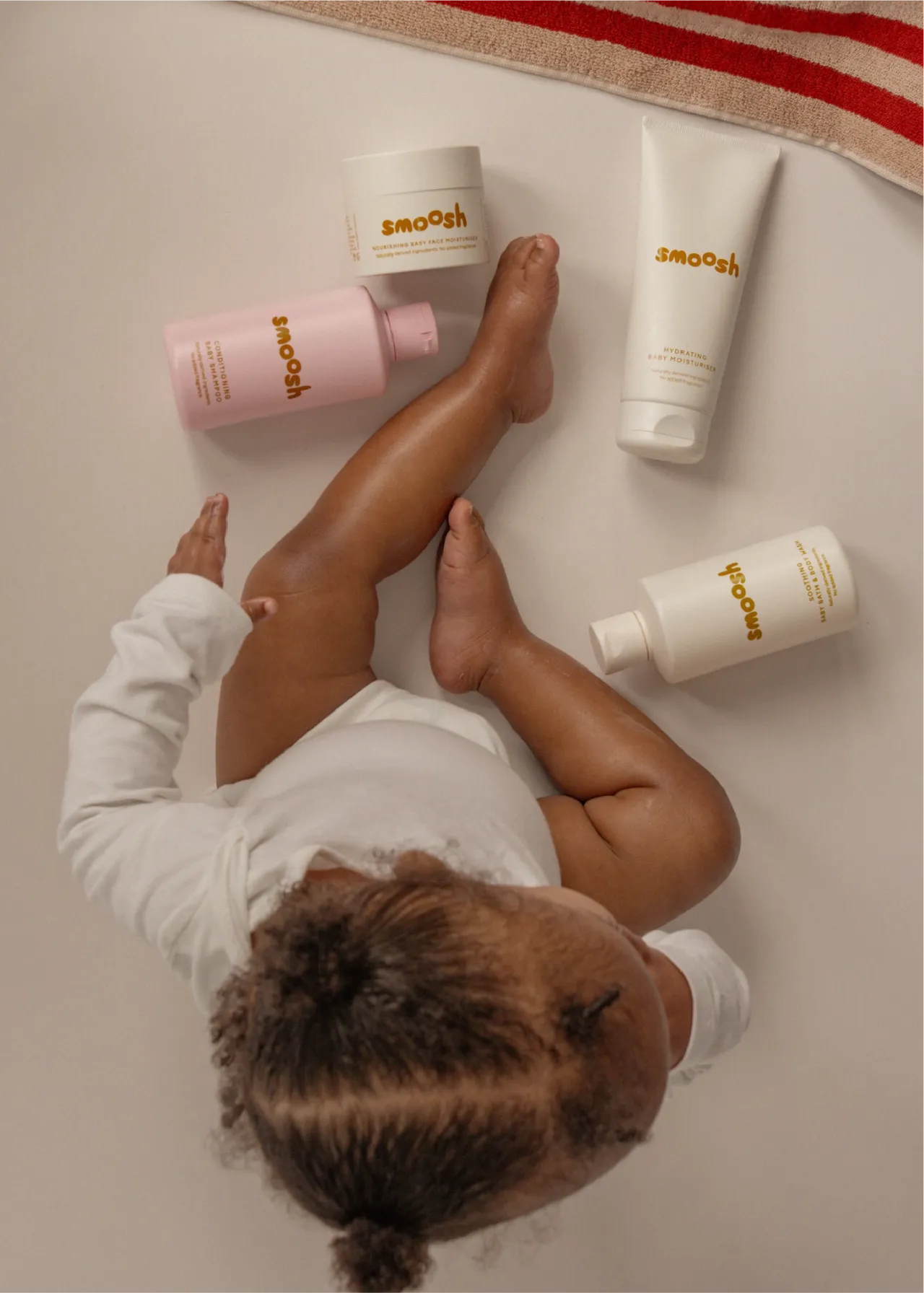
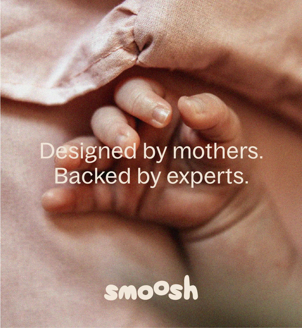
Social mattered from the start. As a digital-first business, Smoosh needed an identity that could work on shelves and in the feeds of creators, parents, and online communities. "There are very few baby skincare brands that feel native to today's digital culture," says Louise. "This had to be tactile, shareable and instantly recognisable online as well as in retail."
And it seems to be working. Whatever happens next, I think it deserves that place on the shelf.
Editor's Picks





Trending






Latest Jobs
Designer at New Genre
Full-time·London·£36k–£48k
Creative Content Executive at Cognition
Full-time·Birmingham·£28k–£35k
Account Manager at Moxie and Mettle
Full-time·Cheltenham·Up to £35k
Senior Designer at Jubba
Full-time·London·£50k-£60k
Creative Project Manager at Analogue
Full-time·Leeds·£28k–£35k
Design Director at Human After All
Full-time·London·£66k–£88k