Ancient rituals meet modern science in Kind Atoms skincare debut designed by Run For The Hills
Run For The Hills has crafted a refined visual identity and packaging for Kind Atoms, a new beauty brand that blends South Asian heritage with science-backed skincare and delivers high-end aesthetics at an accessible price point.
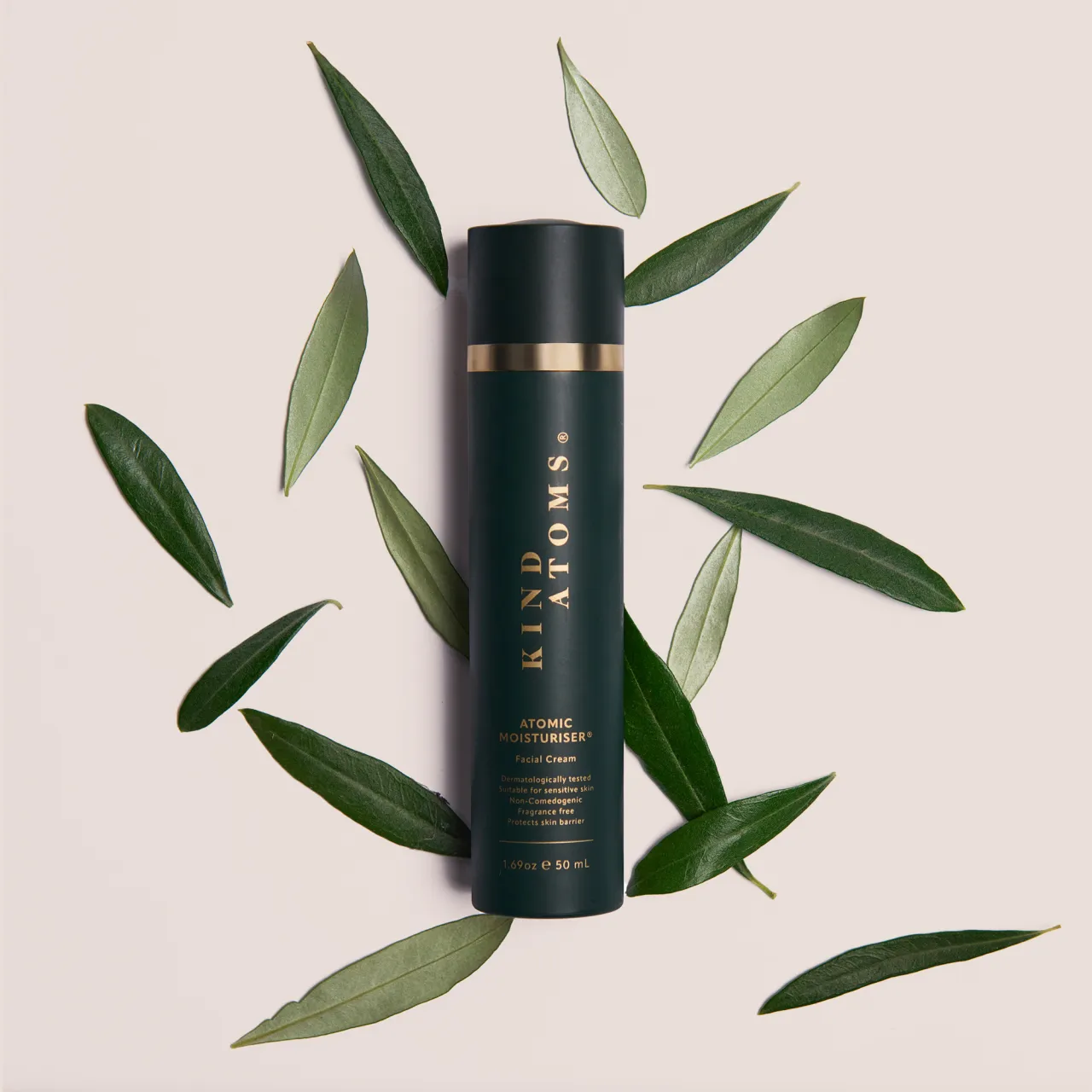
In a saturated beauty market where "clean" and "science-led" are often tossed around as buzzwords, new skincare brand Kind Atoms stands out by actually delivering on both. London design studio Run For The Hills was brought on to bring the brand's story, identity and debut product to life, and the results are nothing short of stunning.
Rooted in tradition and realised with scientific rigour, Kind Atoms draws inspiration from its founders' South Asian heritage. Disheartened by the lack of effective yet gentle skincare for sensitive skin, the team looked inward (and backwards) to childhood memories of natural remedies: turmeric, saffron, amla, and honey passed down through generations.
Blending these time-honoured rituals with cutting-edge cosmetic chemistry, the founders – who also happen to be trained scientists – have created a brand that doesn't just trade on nostalgia. It builds on it. The result is a skincare brand that's kind in every sense of the word.
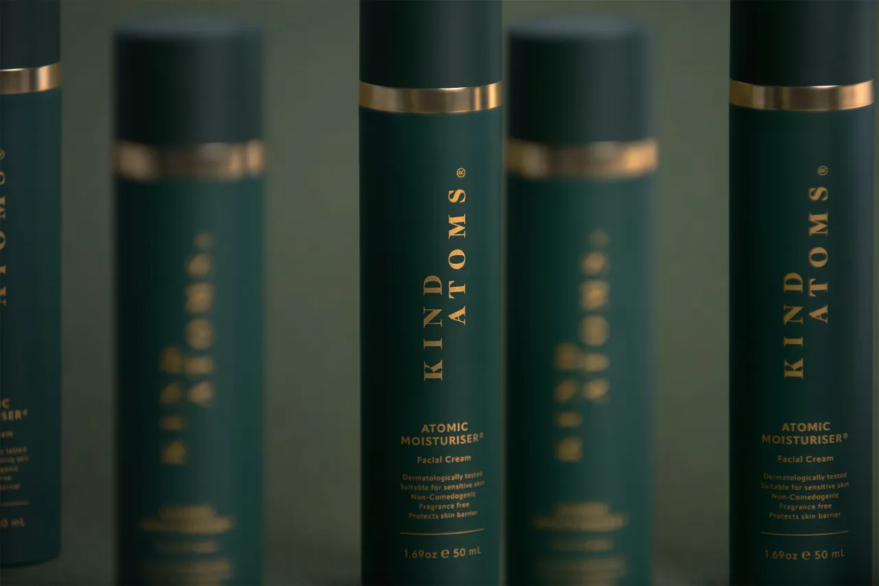
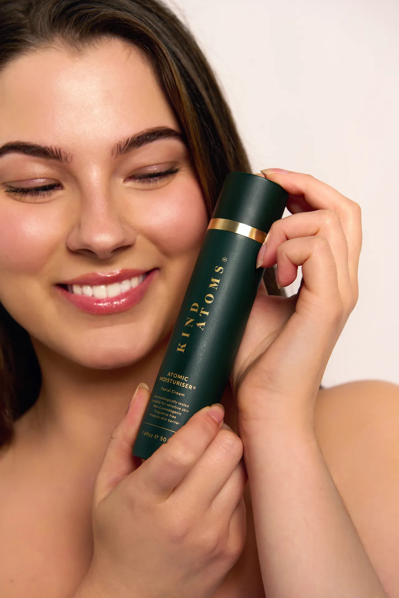
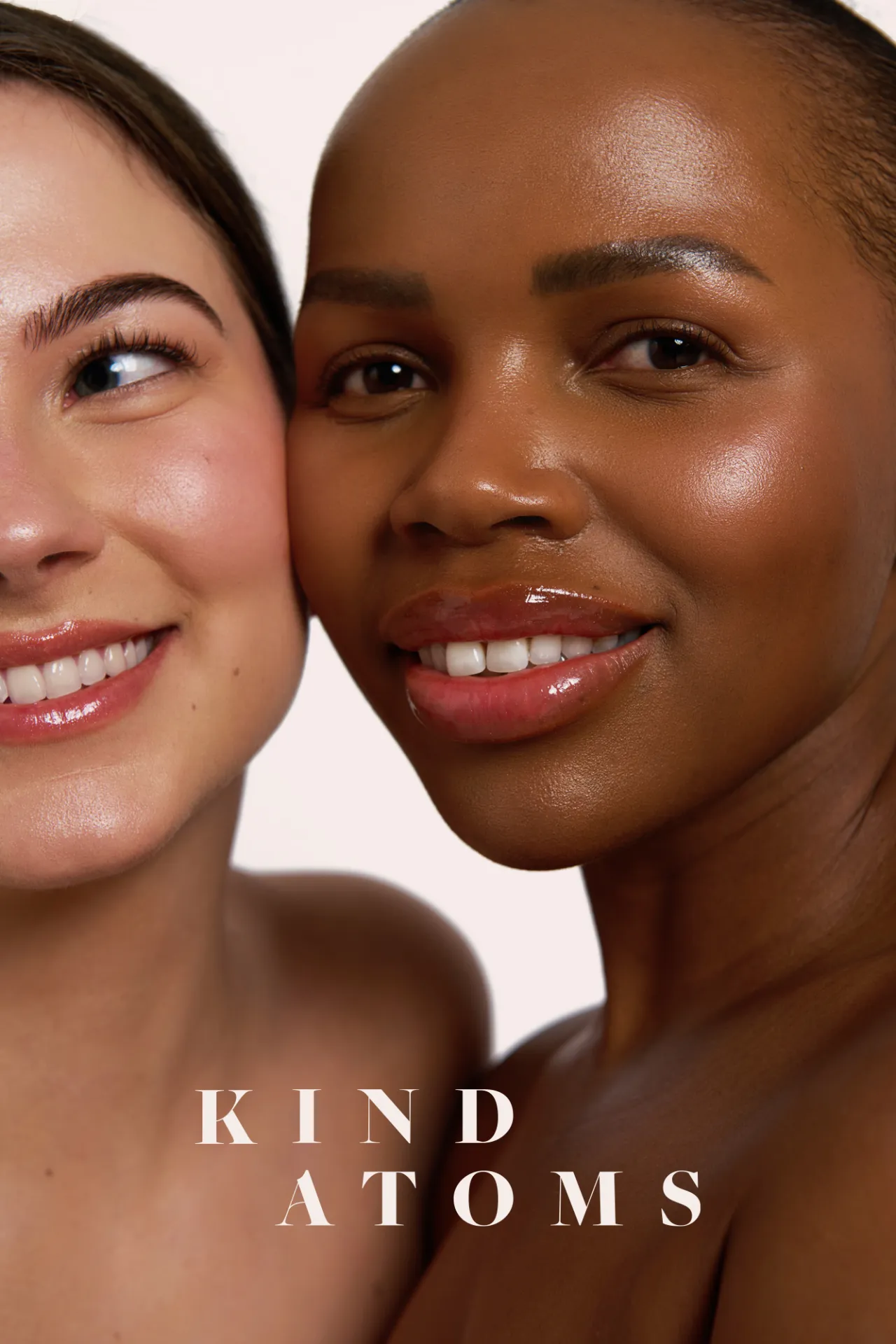
To help bring their vision to life, the team tapped creative studio Run For The Hills, known for its work across branding, interiors and art direction. Co-founder and creative lead Chris Trotman steered the creative direction, designing a visual identity that balances the old with the new, the natural with the technical.
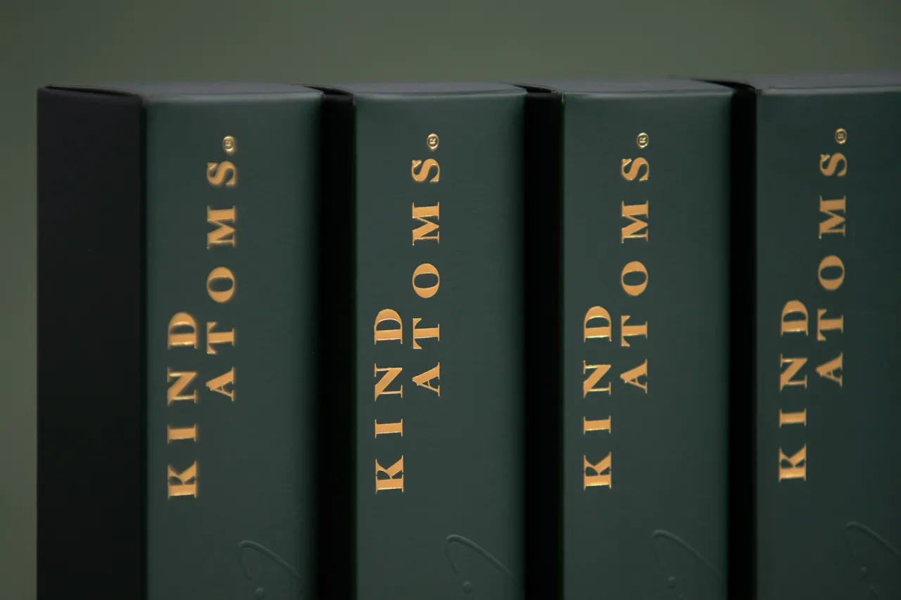
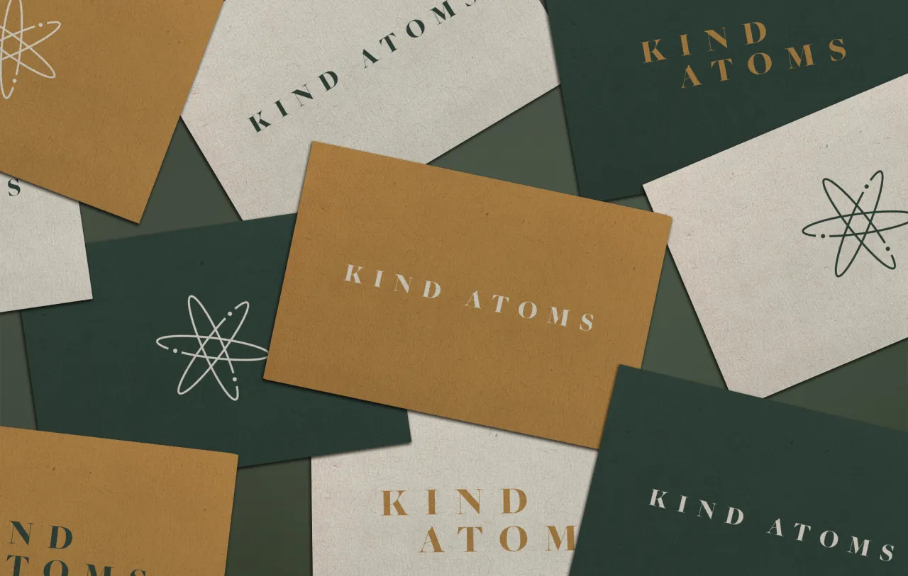
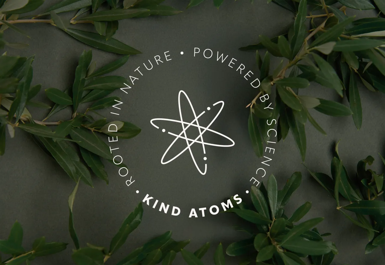
At the heart of the branding is a bespoke serif logotype and an elliptical atomic logomark, nodding to the fusion of science and nature. "We designed the logo to be timeless and elegant," Chris explains. "Intentionally to feel more premium than the product's price point might suggest, offering skincare lovers a pleasantly unexpected touch of luxury."
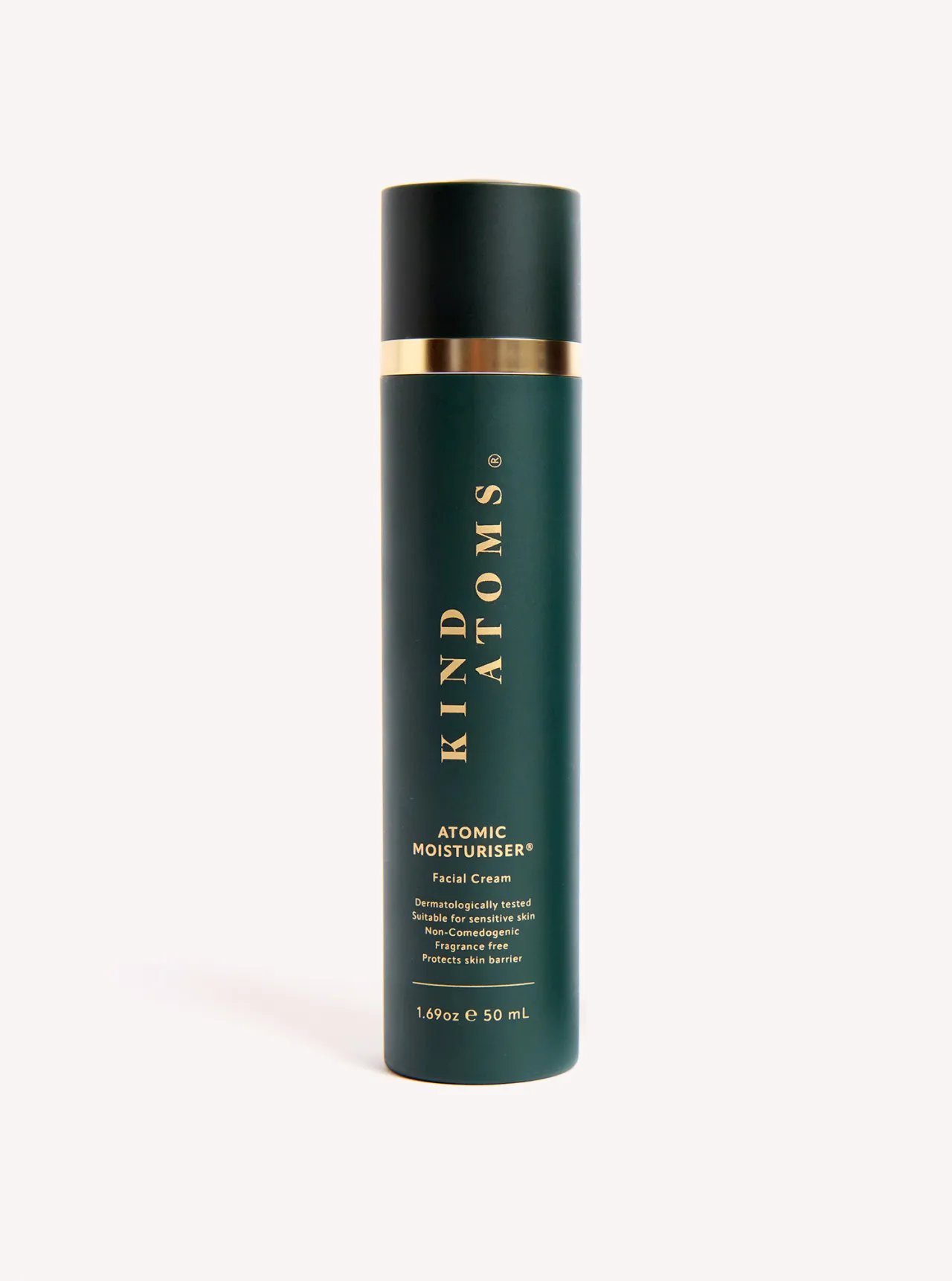
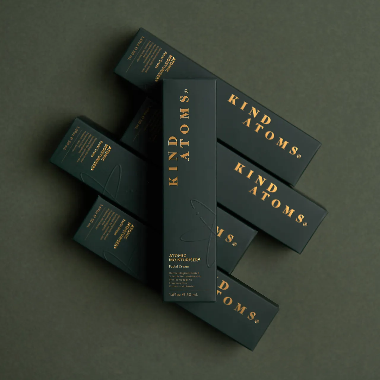
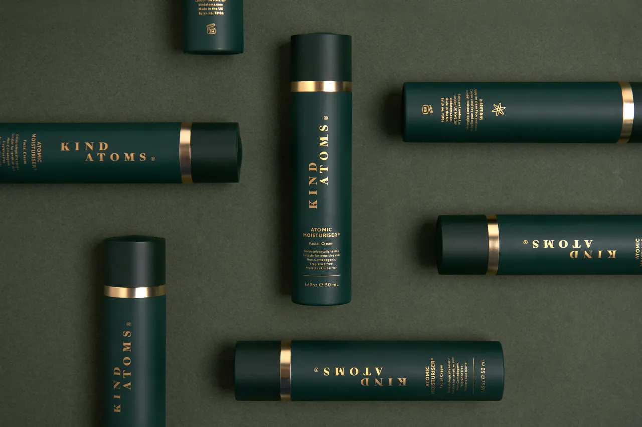
The same approach carries through to the packaging design. The brand's first product, The Atomic Moisturiser, comes in a sleek matte green bottle, embossed with delicate gold lettering and topped with a satisfying twist mechanism. Housed in a matching green box finished with gold typography, it's designed to feel luxurious but never exclusionary.
True to its name, Kind Atoms aims to make high-quality skincare more accessible. The debut product is priced fairly, ensuring that the tactile unboxing experience and elevated visuals don't come at the cost of inclusivity. It's a clever balance, delivering aesthetic polish without drifting into elitism.
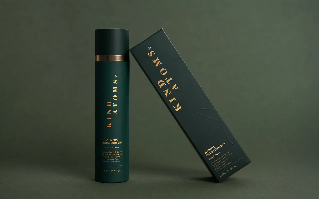
The visual identity leans into earthy tones, like mustard yellow, deep green, cream, and charcoal black, offering warmth and grounded sophistication. "Every element from the bespoke logotype to the rich, earthy colour palette reflects our ethos of fusing nature with science," say co-founders Jusna Ali and Roxanna Maani. "Run For The Hills instinctively understood our vision, translating it into a design language that feels both timeless and modern."
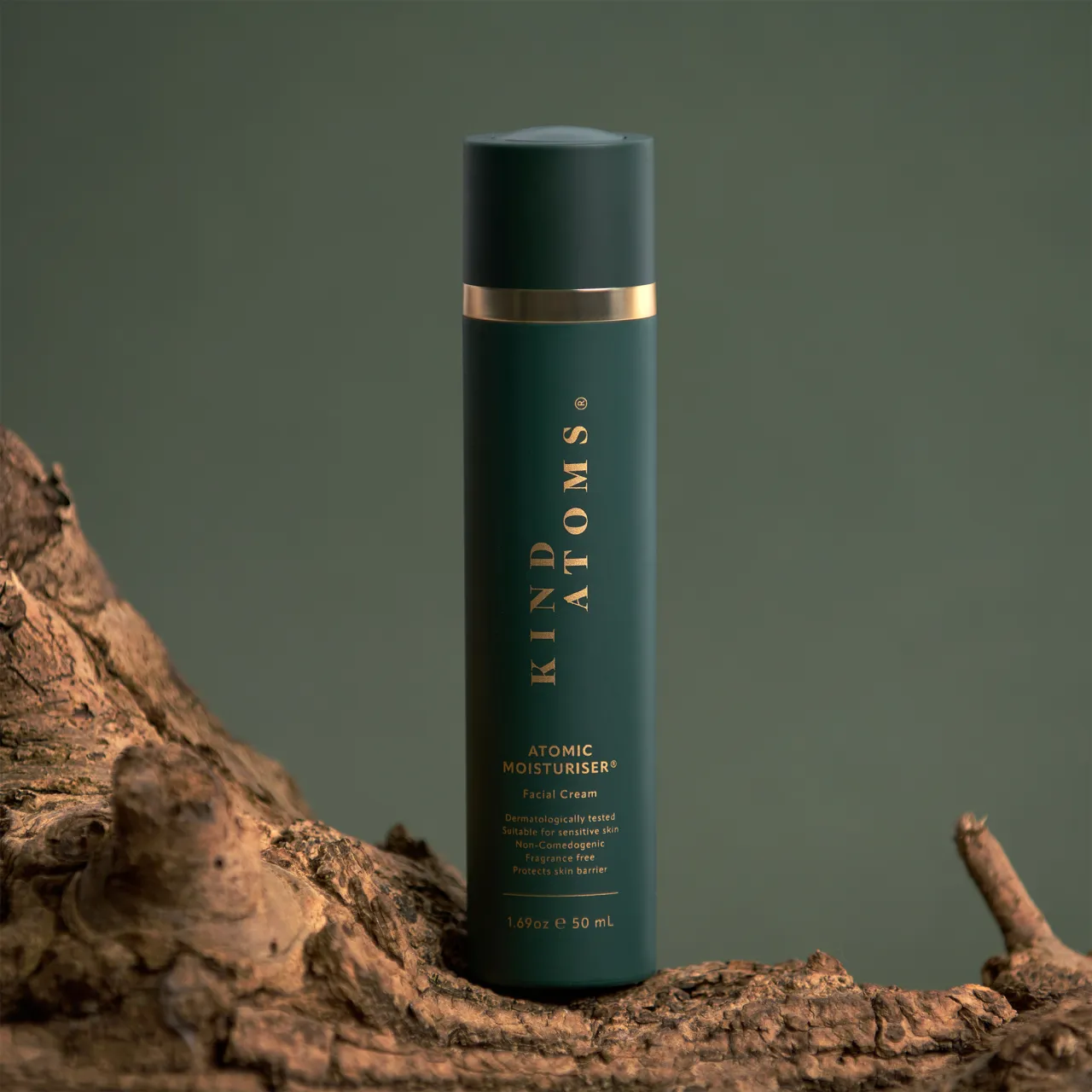
That clarity of vision extended into the launch campaign, which Run For The Hills art directed. The brand photography avoids overly stylised gloss in favour of an organic, tactile feel. Products were shot against softly coloured paper backdrops and paired with natural props like bark and olive branches foraged from local parks and gardens.
"For the product shoot, we wanted to fully embrace the brand's deep connection to nature," says Chris. "We gathered props straight from our surroundings – wood stumps and bark from the park, olive branches from our garden – to bring an organic, authentic feel to the imagery."
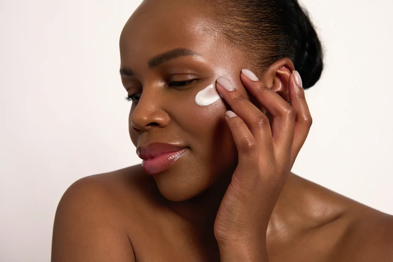
Real women—friends of the founders—were used as models, adding an extra layer of authenticity to the visuals. The brand's aesthetic is natural and elegant, one that feels deliberate and thoughtful without trying too hard.
To complete the launch, Run For The Hills also designed and developed Kind Atoms' Shopify-powered website. A clean, scrollable layout allows for immersive storytelling, layering parallax visuals with generous negative space. The result is a minimalist yet engaging digital experience that foregrounds the brand's values: calm, clarity, and care.
The Atomic Moisturiser may be the first product, but it sets the tone for a brand that promises to expand with care. While rooted in personal experience and cultural memory, Kind Atoms is looking ahead, creating products that are not only scientifically sound but also beautifully considered.
In a category often dominated by extremes, with clinical minimalism on one end and chaotic maximalism on the other, Kind Atoms occupies a quietly confident middle ground. It doesn't shout, doesn't posture and shows what's possible when you take the time to do things properly.
Editor's Picks





Trending


Latest Jobs
Lead 3D Designer at The British Museum
Full-time·London·£51,623 per annum
Senior Designer at Definition
Contract·London·£45k–£50k
Graphic Designer at Crux Product Design
Full-time·Bristol·Up to £36k
Marketing Manager at University of Birmingham
Full-time·Birmingham·£36,636 to £46,049
Multidisciplinary Designer at Formation Games
Full-time·London·£40k–£50k
Client Director at Koto
Full-time·Berlin·€70k-€85k