Everland applies 'candid and rugged aesthetic' to skincare brand Raw Perfection
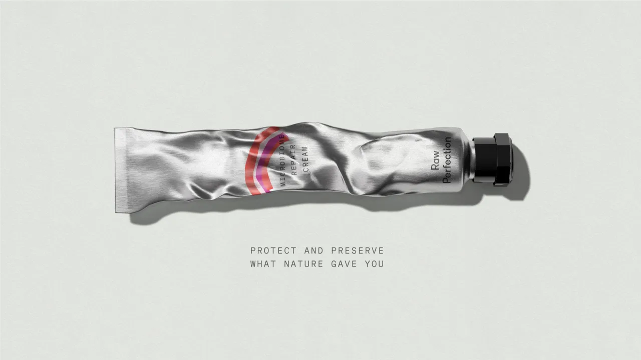
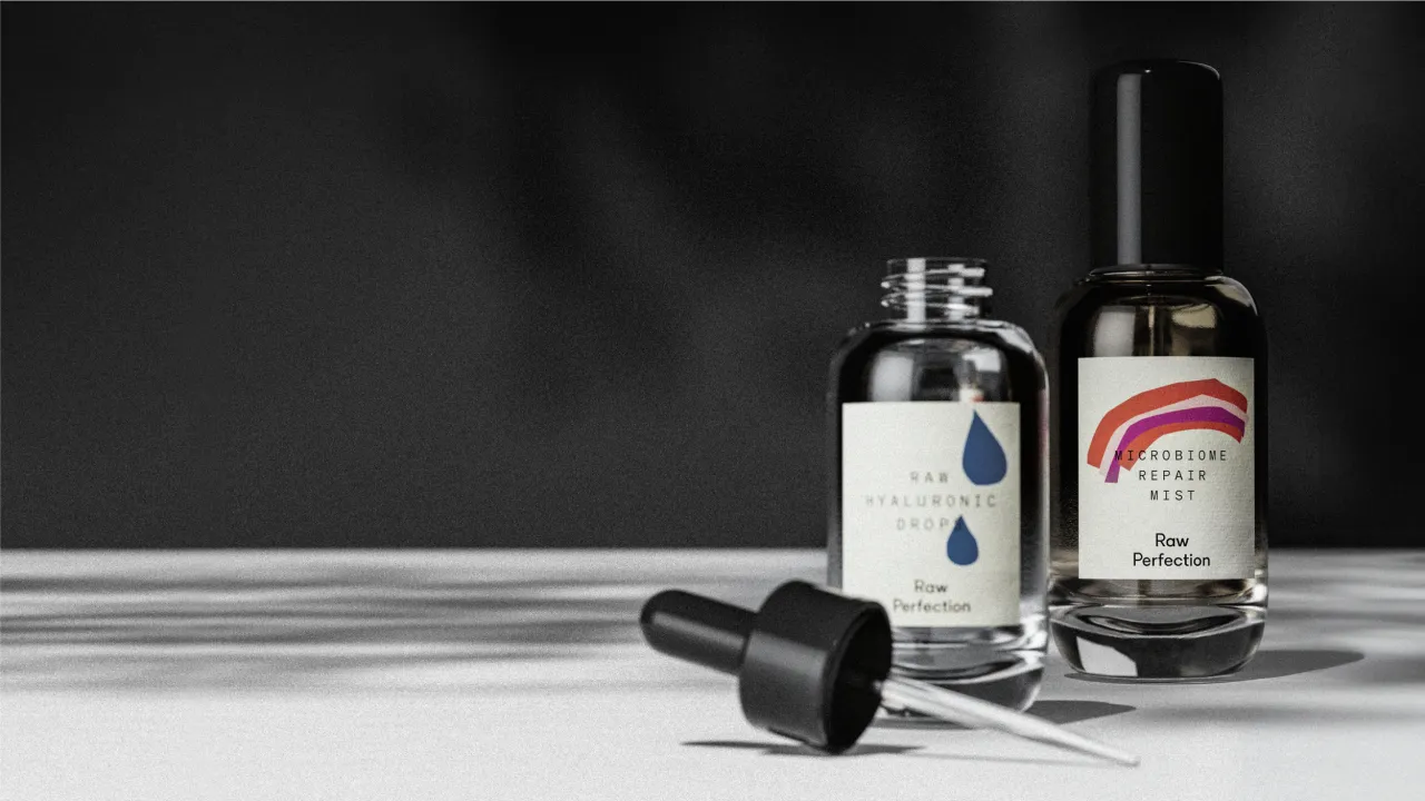
Raw Perfections' identity features a logotype that conveys the rigorous testing process its ingredients undergo, as well as intentionally imperfect illustrations that guide users through the skincare routine.
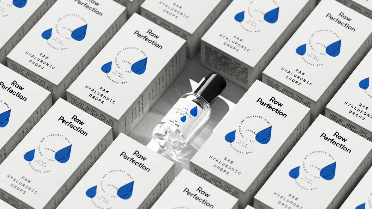
"You deserve to be comfortable and proud in your own skin". That's the message that vegan and cruelty-free skincare brand Raw Perfection drives through its new identity, designed by Scandinavian consumer brand and design agency Everland.
The Swedish skincare brand is on a mission to revolutionise the beauty industry, so it approached Everland to design its new brand identity, packaging, brand name, and communication platform. Known for its sustainable practices and quality products, Raw Perfection has long empowered consumers to embrace their natural beauty, but under a different brand called deCure.
Since it was starting fresh with a new name, Raw Perfection needed help with everything from strategy to visual and verbal expression. "We helped establish a strong foundation for Raw Perfection's growth with a brand platform, a clear essence, and an honest and relevant story," says Everland executive creative director Carl Larsson.
The studio had collaborated with the brand's founder, Peter Ternström, on a previous project. It was during this collaboration that Everland laid the foundation for what would eventually evolve into Raw Perfection.
According to Larsson, three things drew the design team to the project: "super-high ambitions, a passionate founder, and exceptionally high-quality products." The project also aligned with Everland's internal strategy to build experience and gain an edge in the beauty sector.
Larsson describes the beauty category as "a design-intense category featuring a sea of minimalist designs mixed with beautiful flamboyant solutions"." Considering this, creating something distinctive and unique was the main challenge for Everland.
"We aimed to craft something both unique and beautiful while effectively conveying the right story in a balanced manner", Larsson explains.
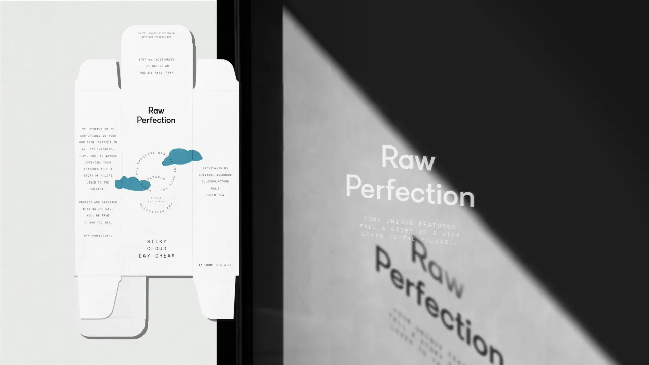
Raw Perfections logotype is Laurenz Brunner's LL Circular, a universally appealing geometric sans-serif. Larsson says the studio chose this typeface because "it mirrors the meticulous process and conveys the essence of the recipes used for the products", as all of Raw Perfection's skincare goes through rigorous scientific testing.
The second brand typeface Lab, designed by Letters from Sweden and Stockholm Design Lab (the font was originally for the latter), also instils a sense of "trustworthiness and precision" that complements Raw Perfection's verbal communication and illustrations.
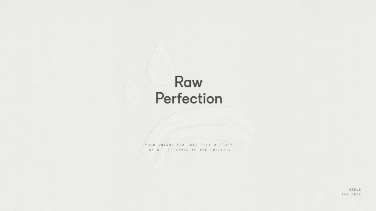
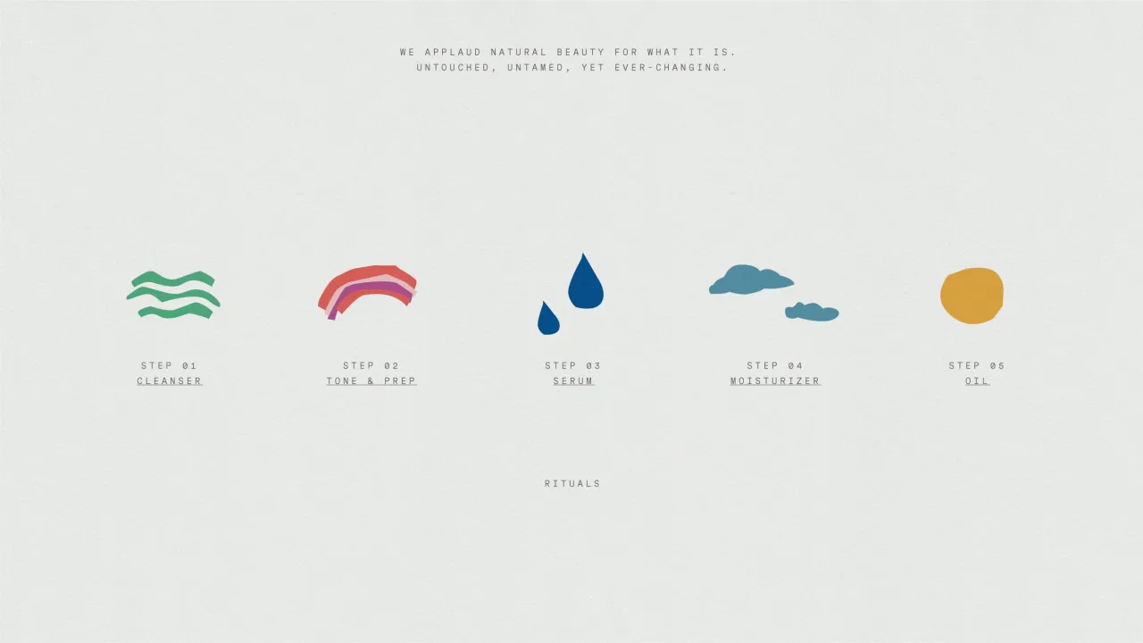
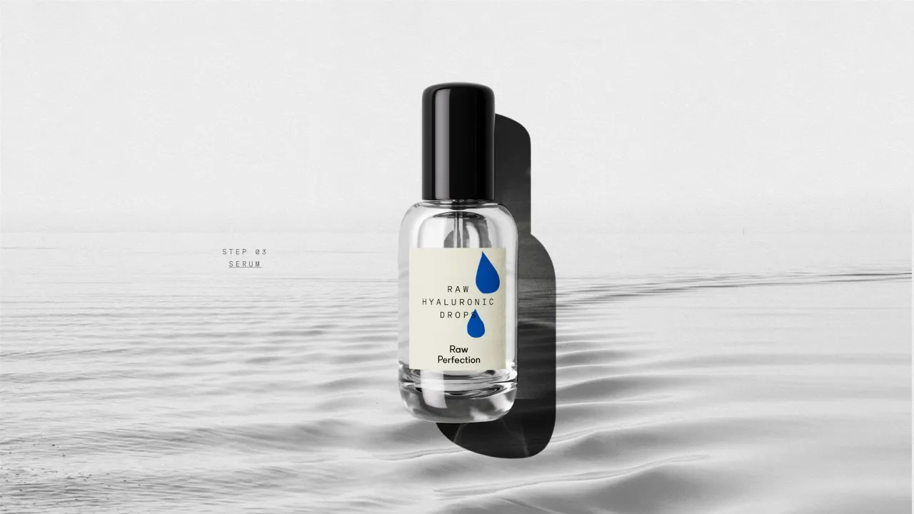
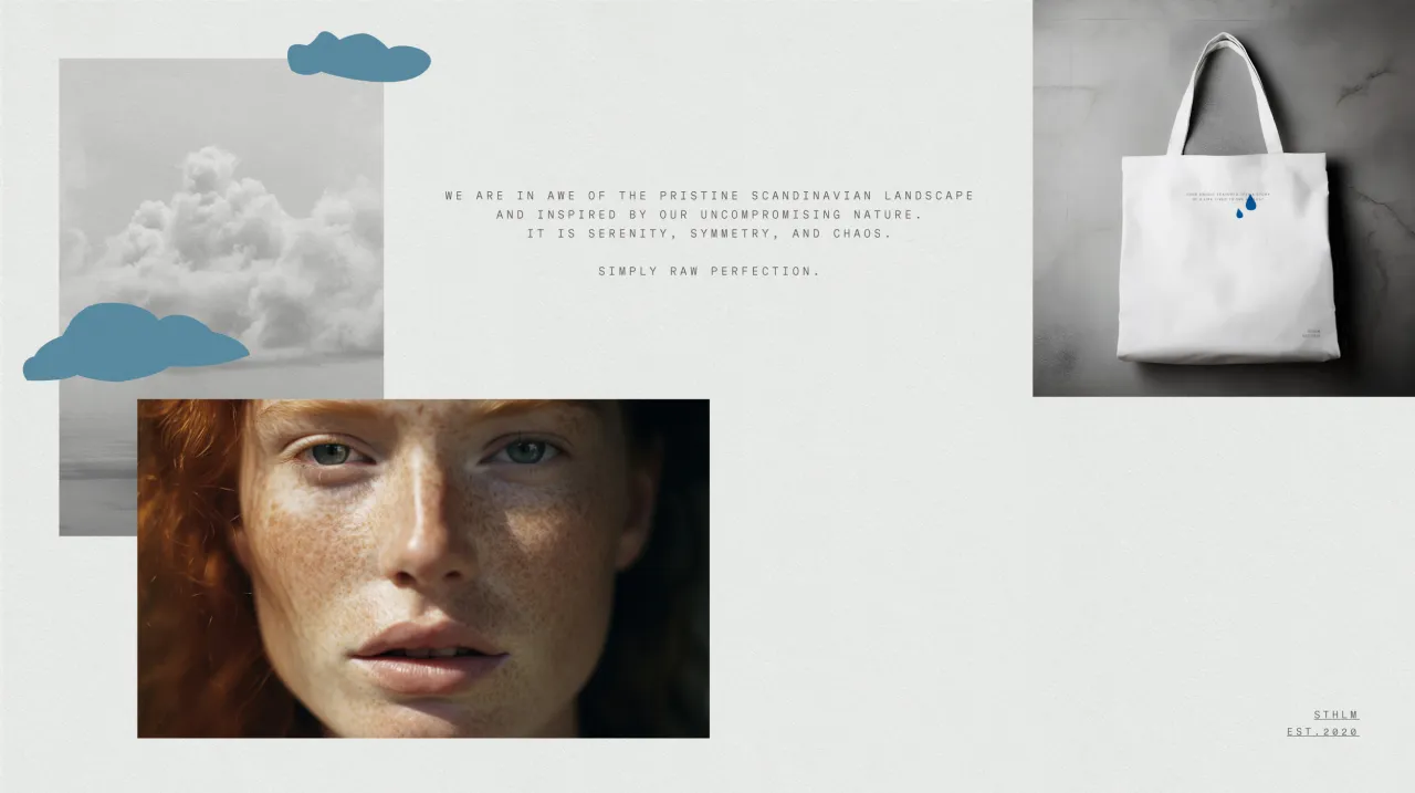
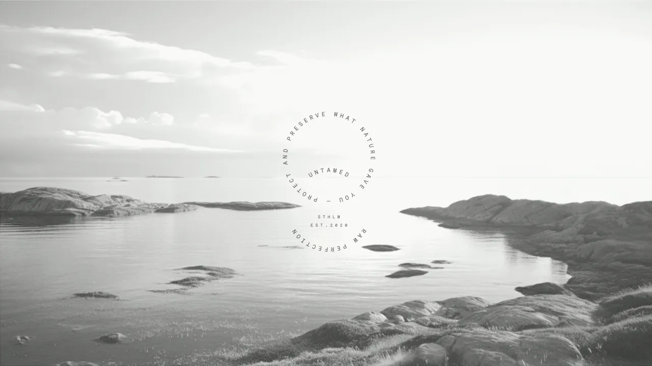
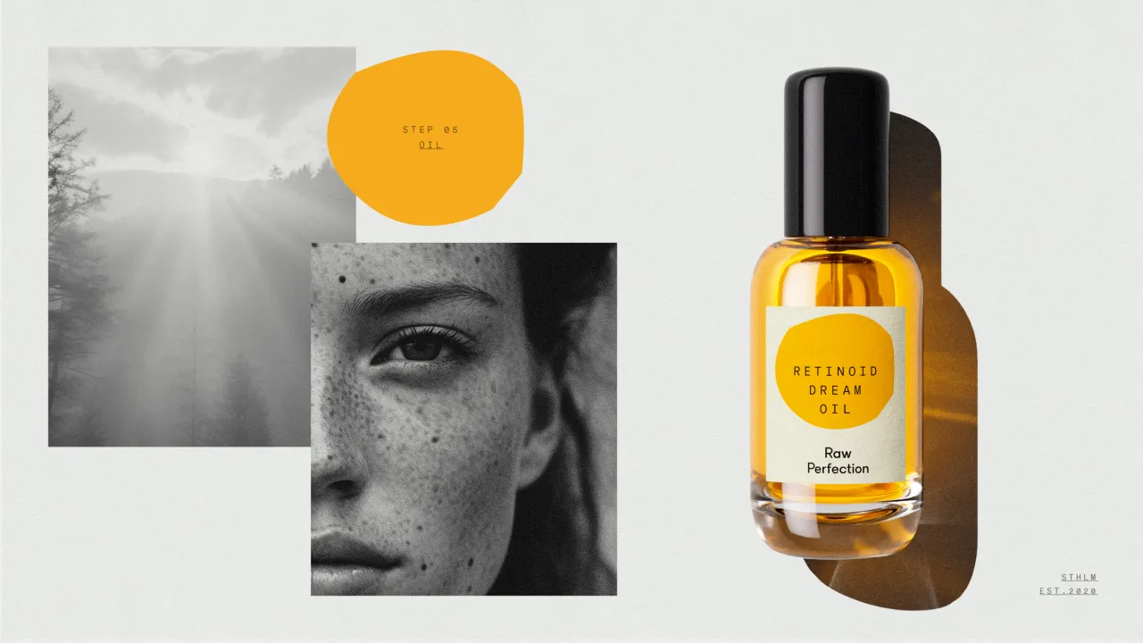
Everland opted for an intentionally imperfect illustration style that resonates with the Raw Perfection brand. The graphics convey the brand's message of "celebrating the beauty found within imperfection" and reflect the brand's heritage in the Swedish archipelago, which involves being intimately connected to the elements and weather.
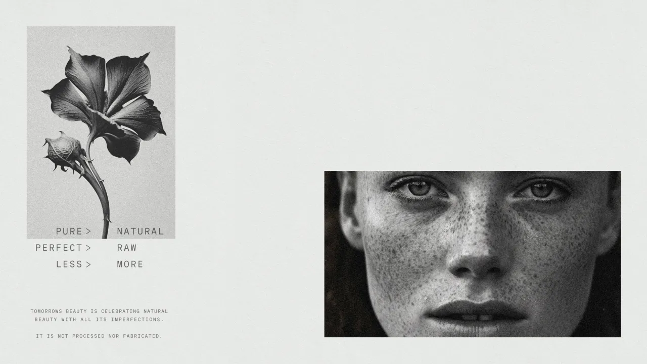
"This unique style sets Raw Perfection apart from more refined and polished beauty brands; it embraces a more candid and rugged aesthetic", says Larsson. "We employed these illustrations to disrupt the perfection typically associated with typography and the precise use of white space, layout, and information."
On a functional level, the illustrations help to guide users through the Raw Perfection skincare regime, as each symbol is numbered and abstractly represents the desired outcomes. They also serve as "distinctive assets that draw attention on store shelves and leave a lasting impression", Larsson adds.
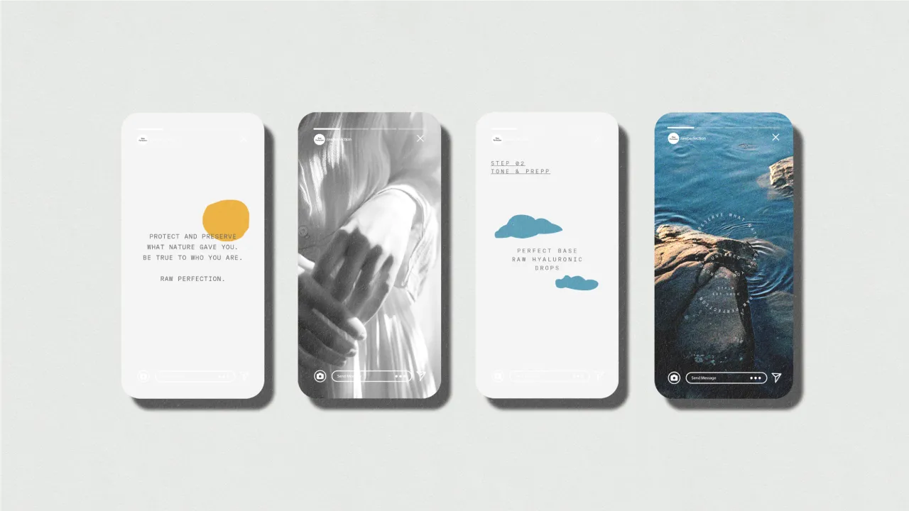
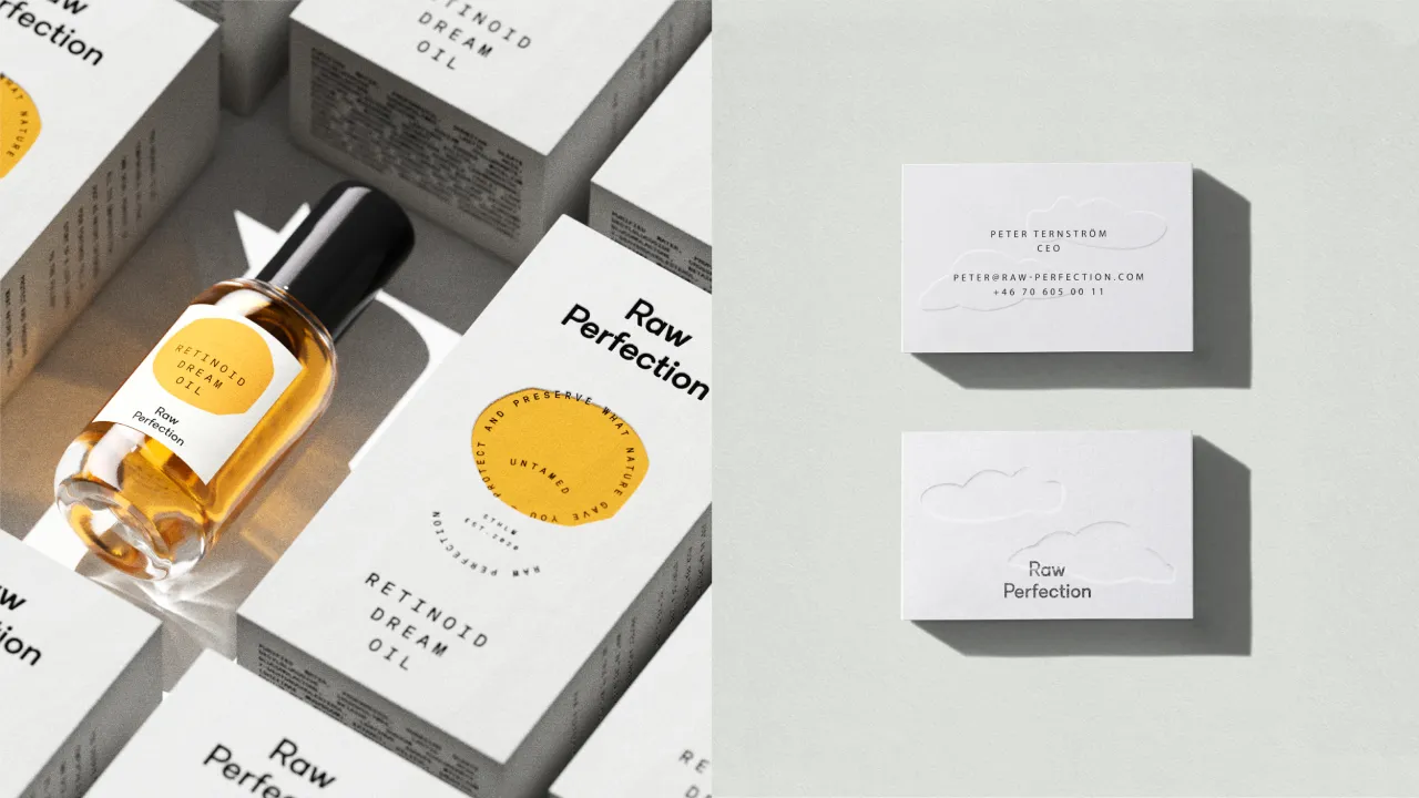
Circular text patterns feature across the identity, representing the brand's values and beliefs, acting as a "stamp of approval", and signalling the products' quality.
All of Raw Perfection's packaging – designed by Everland – is made of natural materials, such as glass or aluminium, while the small plastic parts used in pumps and caps comprise recyclable materials. The outer packaging is made from FCS-certified and 100% recycled paper.
"On the product side, all formulations are consciously designed not only with the skin and health in mind but also with the environment," says Larsson. For example, all formulations are free from silicones, which research has shown to be bioaccumulative.
Editor's Picks





Trending






Latest Jobs
Senior Digital Designer at 3800
Full-time·Sheffield·£40k-60k
Midweight Graphic Designer at We Are Your Friends
Full-time·London·£36k–£44k
Account Director at How&How
Full-time·London·£73k-£79k
Talent Agent & Producer at The Jacky Winter Group
Full-time·Los Angeles·$70k-$85k
Senior Brand Designer at Analogue
Full-time·Leeds·£38k-£45k
Client Success & Growth Director at Revolution Growth
Full-time·Manchester·£60k-£70k