Norwex unveils first-ever rebrand as eco pioneer evolves from cleaning cloths to premium personal care
The Norwegian, family-owned brand has revealed its first full rebrand in more than 30 years, working with London consultancy The Workroom to breathe new life into its Nordic heritage and purpose-led foundations.

Norwex is a direct-selling company best known for its chemical-free cleaning cloths, but it had ambitions to expand beyond home care into personal care and skincare, all while sharpening its sustainability credentials. So, naturally, the family-owned business underwent its first full rebrand in its 30-year history, led by London-based consultancy The Workroom, to prepare for this significant shift in direction.
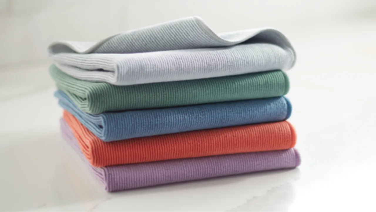
Founded on the success of its pioneering Envirocloth, Norwex built a global following by promising effective cleaning with nothing more than cloth and water. At the time, eliminating chemicals and paper waste from everyday cleaning was genuinely radical. Three decades on, however, the market has caught up. As the brand's product range grew to more than 300 SKUs across home, family and personal care, its visual identity and messaging began to fragment.
What started as a packaging refresh quickly became something much bigger. The Workroom was brought in to help Norwex clarify its positioning, strengthen trust across its consultant network and evolve the brand without losing the values that made it successful in the first place.
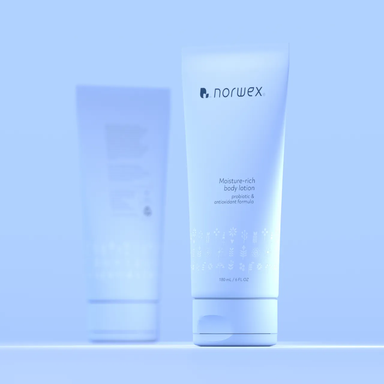
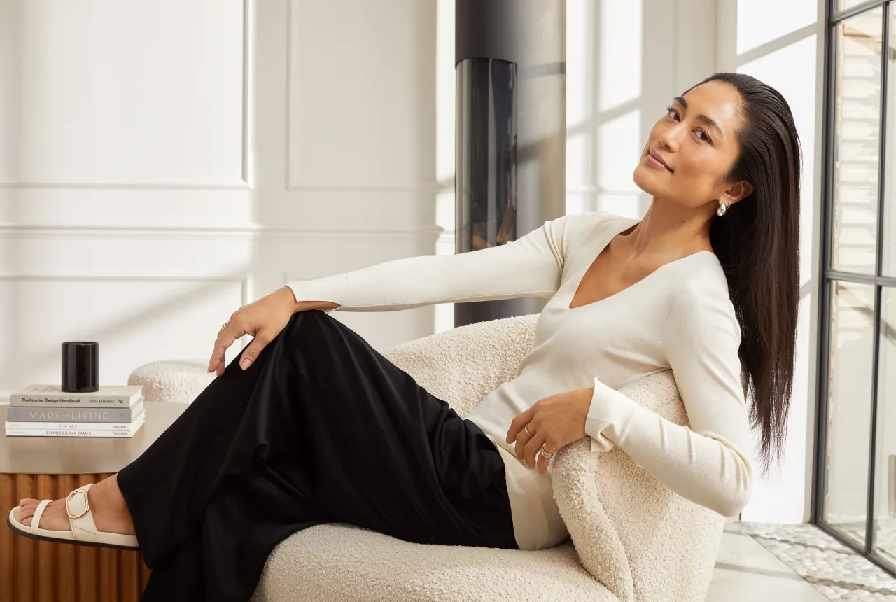
Norwex's products are sold primarily through a vast network of independent consultants, many of them full-time mothers working from home across North America and Canada. Empowering this community was central to the brief, and so Workroom needed to deliver an identity that felt premium and contemporary, but still warm and human.
Brigid McMullen, founder of The Workroom, explains: "Norwex already had a rock-solid belief system. Our job was to help express it more concisely, distinctively and memorably – not only in words, but in how it would be experienced and felt across every product and platform."
To achieve that clarity, the consultancy led an extensive, inclusive process of workshops, focus groups, and consumer research. The conclusion was that Norwex did not need to reinvent its mission; it needed to articulate it better. The brand had always seen itself more as a campaigning movement than a business selling a product, since everything it does is about sharing healthier ways of living.
This thinking led to a strategic shift in language and tone. Norwex's former mission statement, which focused on "radically reducing chemicals", was powerful but polarising. The updated mission reframes that ambition more openly as "sharing a cleaner, safer way of living by reducing harmful chemicals in everyday lives." From this came a new strapline, "Live cleaner, safer, better", designed to stretch the brand beyond cleaning and into broader lifestyle and personal care categories.




Norwex CEO Beate Hjeltnes sees the change as much more than a cosmetic update. "The rebrand signals to our consultants, consumers and team that we are making a fundamental change in how we elevate and grow our business," she says.
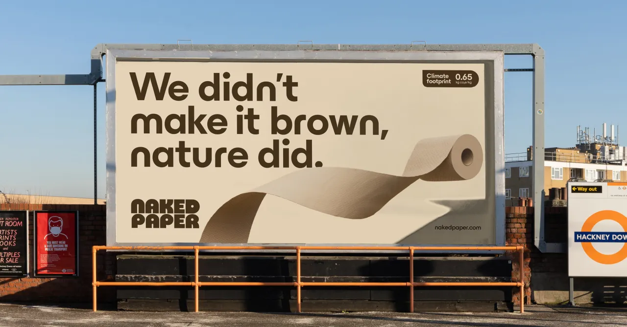
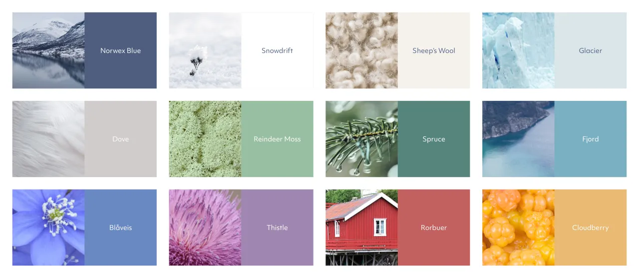
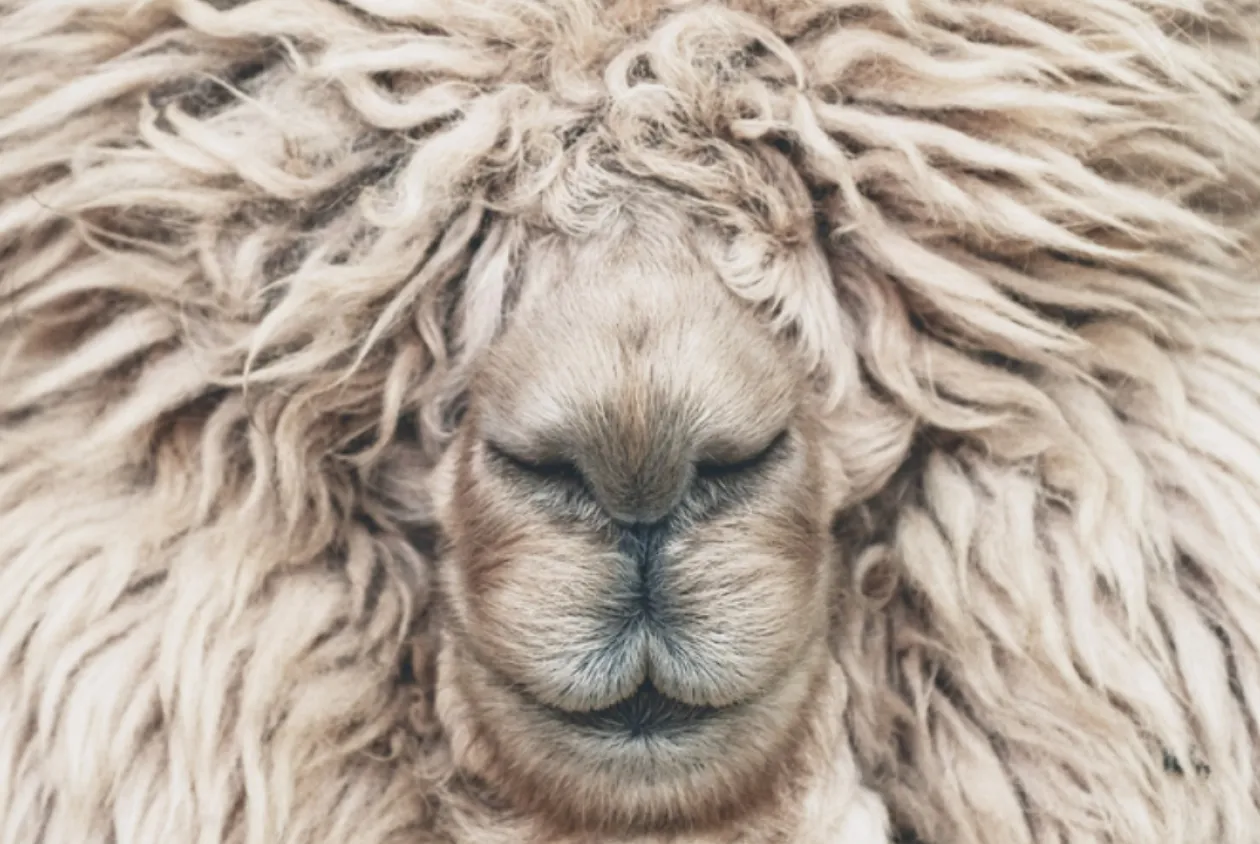
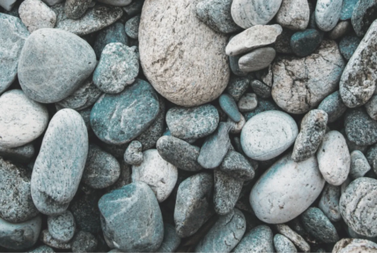
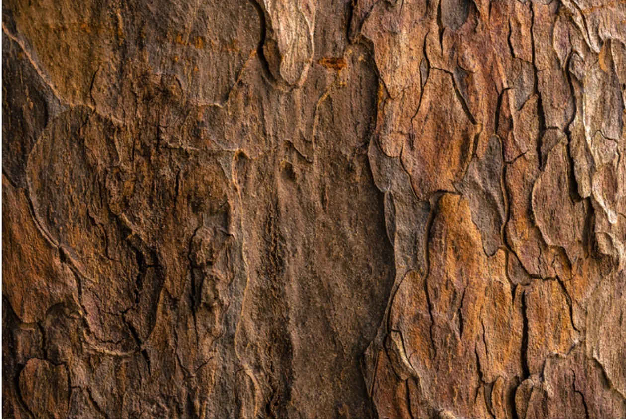
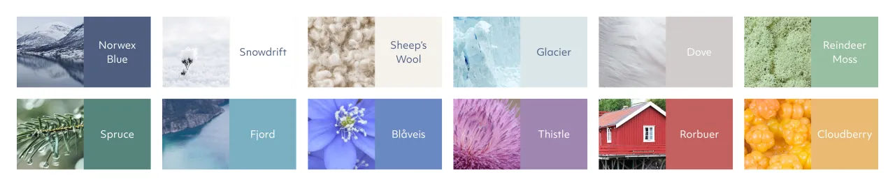
A major part of that elevation involved reconnecting the brand with its Norwegian roots – and no, we don't mean clichéd minimalism. The Workroom explored what Nordic design really means in practice and, in response, created an identity grounded in balance, functionality and restraint. The team describes it as 'the art of just enough', characterised by muted, nature-derived colours and a warm, modern typeface.
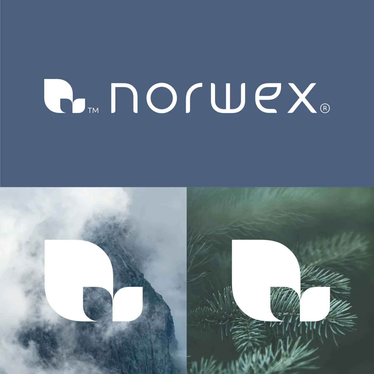
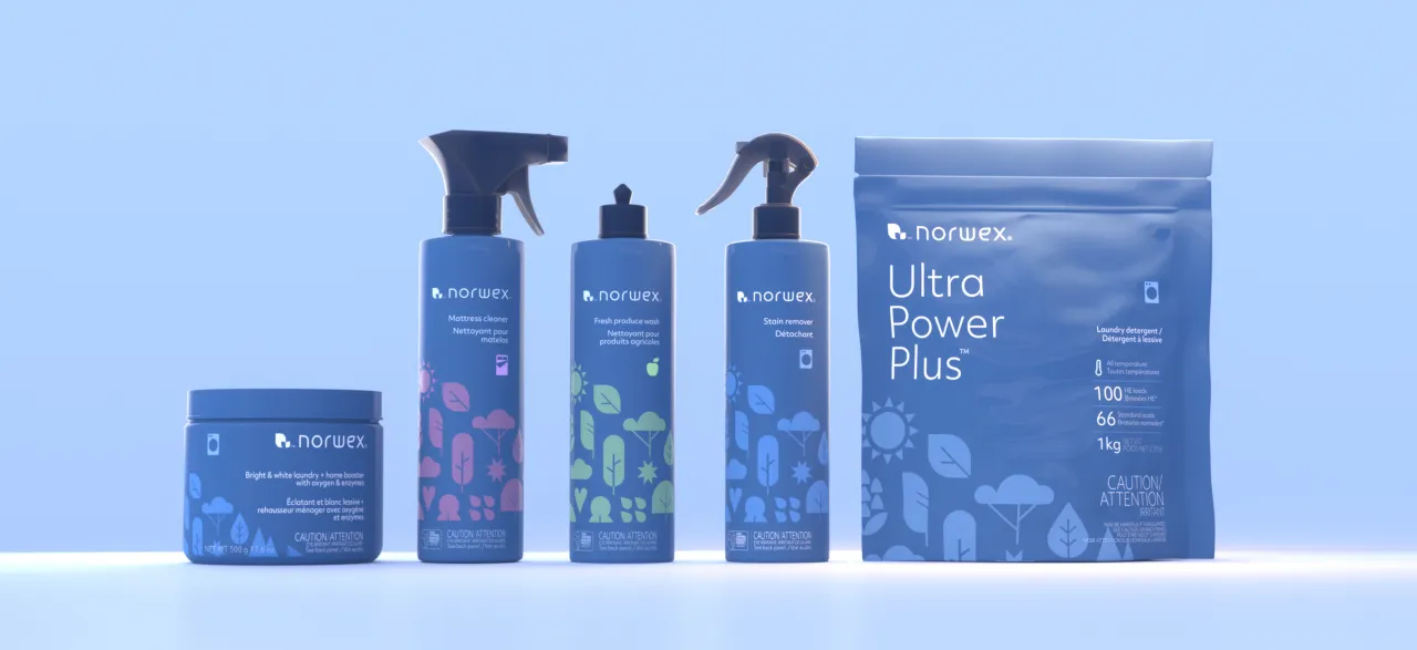
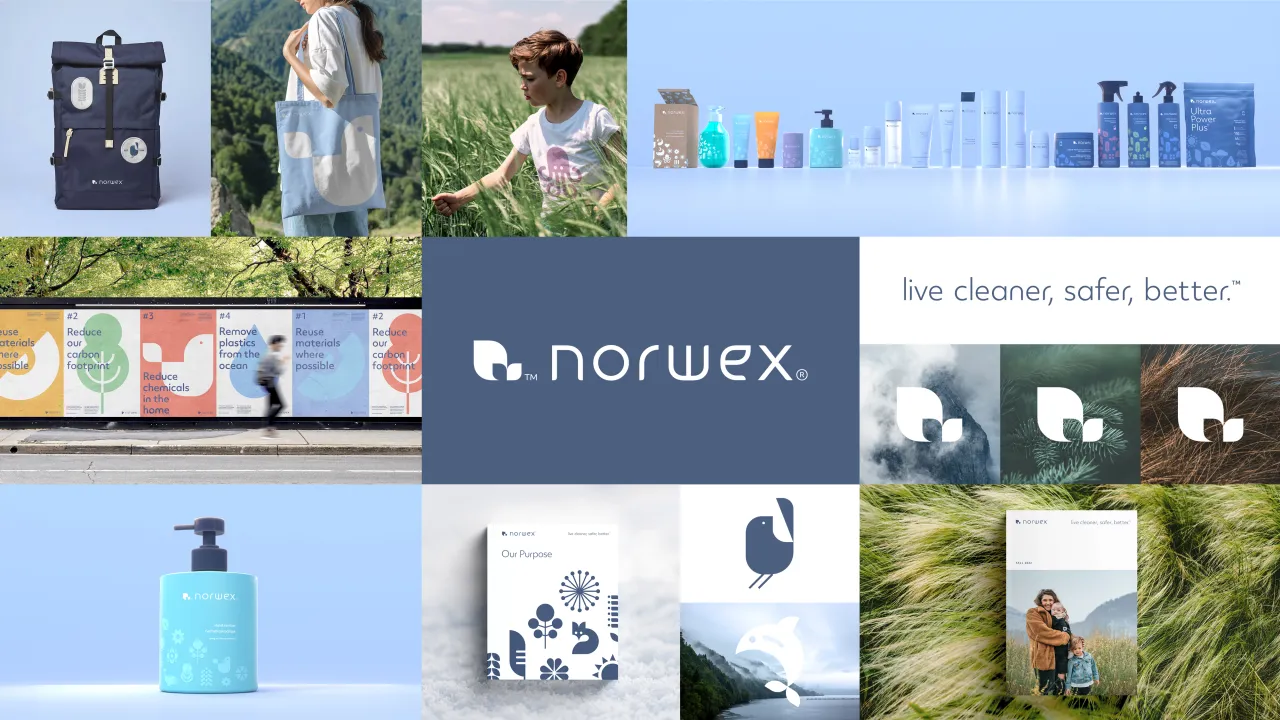
The new logo takes inspiration from the organic curves of a leaf, with the wordmark subtly referencing nature, growth and renewal. An intentionally ambiguous icon – variously read as a leaf, a bird or a doorway – is the foundation of a flexible illustration and icon system inspired by Nordic flora and fauna.
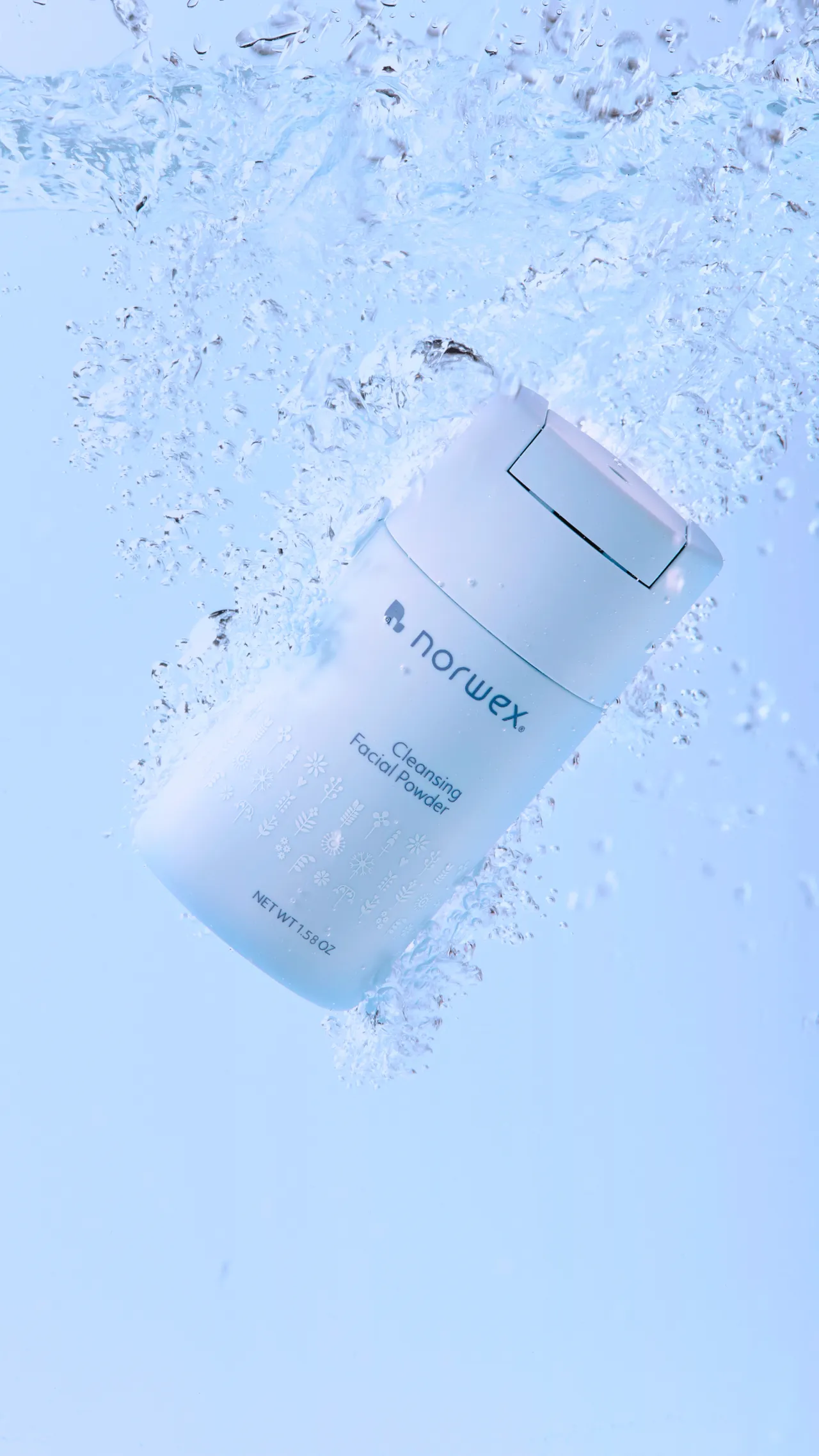
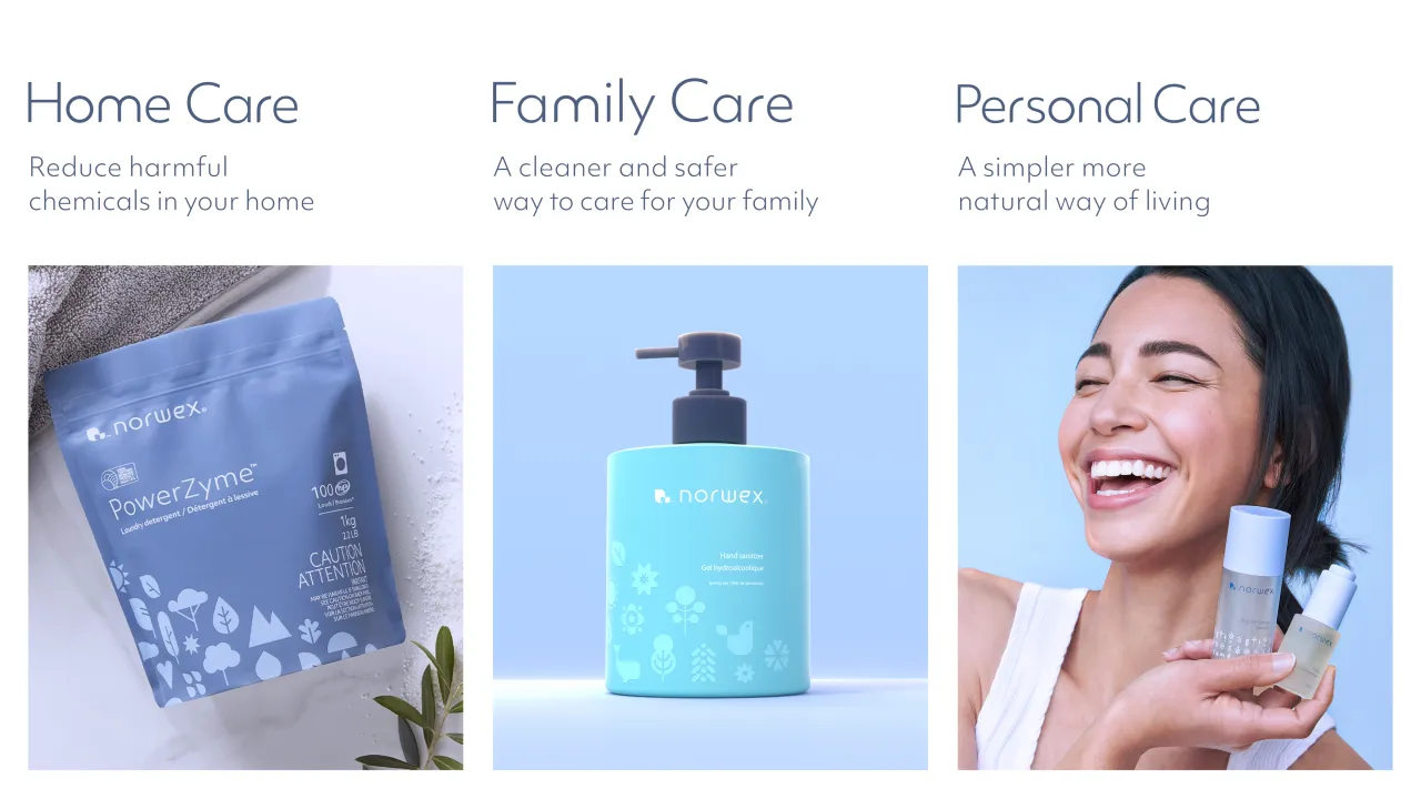
This visual language allowed Norwex to radically simplify its brand architecture. What had previously been a complex, overlapping portfolio is now organised into three clear pillars: Home Care, Family Care and Personal Care. The structure makes it easier for consultants to navigate and explain the range, while supporting future category expansion.



Defining "premium" was another key challenge. Research revealed it was less about luxury and more about consistency, care and longevity, with that thinking informing everything from packaging materials to tone of voice. As Brigid notes, "The slogan enables you to stretch the brand beyond just cleaning… right across those very different categories from family through to personal care."
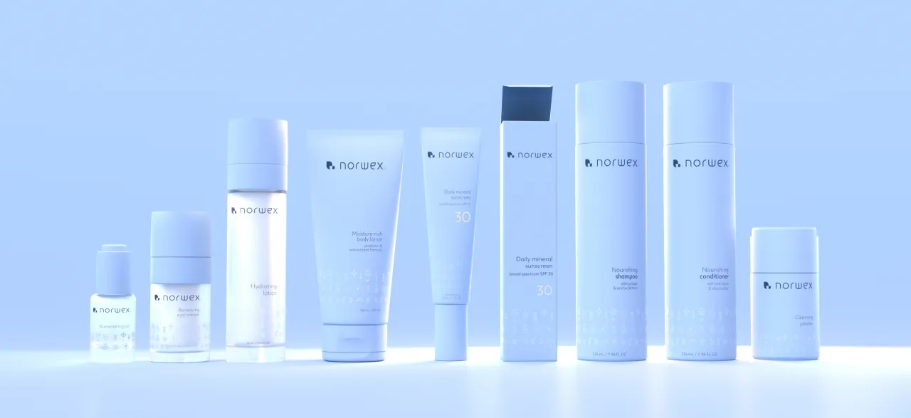
Sometimes with identity projects, you have to wait a while to see the ROI, but here the results were fast and tangible. Within six months, Norwex launched its transformed identity alongside its first-ever skincare range, a move that would have been unthinkable at such speed just a few years earlier.
Engagement followed, and social media impressions rose by more than 50%, comments increased by 29%, and average time spent on the website jumped from 25 seconds to nearly 4 minutes. Internally, consultants reported renewed pride and confidence in how they present the brand.
For a company that bans more than 2,500 substances from its products and operates in a direct-selling sector forecast to grow by around 6% annually, the rebrand demonstrates how heritage businesses can evolve without losing credibility. The new identity successfully connects product, place and people, proving that sustainability, premium design and commercial momentum do not have to be at odds.
As the brand's new mantra puts it, this is about more than what you buy. It is about how you live.

Editor's Picks





Trending



Latest Jobs
Senior Producer, Marcom at Code and Theory
Full-time·New York·$100,000 – $130,000
Junior Graphic Designer at GIG Health
Full-time·Farringdon, London·£27,000 – £32,000
Senior Designer at BKC
Full-time·£50,000 – £60,000
Junior Motion Designer at Project Slingshot
Full-time·Remote·£30,000 – £35,000
Copywriter at David&Goliath
Full-time·Los Angeles·$75,000 – $95,000
Senior Creative Artworker at Forward Associates
Full-time·London·£30,000 – £40,000