Robot Food's identity for beauty brand Postcard invites us to slow down
The Singapore-based, sustainable beauty brand has a fresh look and strategy based on the idea of simple joy.
Much like its fashion sibling, the beauty industry often feels like it's trying to push us into being something we're not. It offers us images of unattainable attractiveness, urges us to invest in overly expensive products, and subtly hints that our lives will be better if we only look more like an airbrushed model than our real selves.
Postcard, though, offers something quite different. Formerly known as Oasis Beauty Kitchen, this sustainable self-care brand began as a humble kitchen enterprise when its founder, Hildra Gwee, developed a skin condition. Rather than aiming at perfection, it's more about the simple joys of treating yourself and feeling good. The brand has quickly gained recognition across Singapore for its eco-friendly, organic haircare, skincare, and lifestyle products.
Recently, Postcard partnered with UK creative agency Robot Food to revitalise its visual and verbal identity. The collaboration encompasses a comprehensive rebrand, including a new brand strategy, tone of voice, naming, brand world, packaging and website.
The brief
With ambitions to expand beyond its home market, Postcard sought a brand identity that would resonate with consumers globally. Martin Widdowfield, creative director at Robot Food, outlines their challenges.
"We needed to develop a brand identity that maintained the authenticity of Postcard's sustainable roots without straying into classic eco-friendly tropes," he explains.
Brand concept
The new identity encourages consumers to rewrite their self-care rituals by inviting them to slow down and indulge in the simple joys of life. In developing this new strategy, Robot Food focused on reframing indulgence as something that doesn't have to be wasteful and tapped into the growing desire for 'life with less pressure' by celebrating environments, both at home and in nature.
The rebrand positions Postcard as a destination for essential self-care supplies, with a mission to foster mindful consumption, reduce waste, and ease the pressures of everyday life.
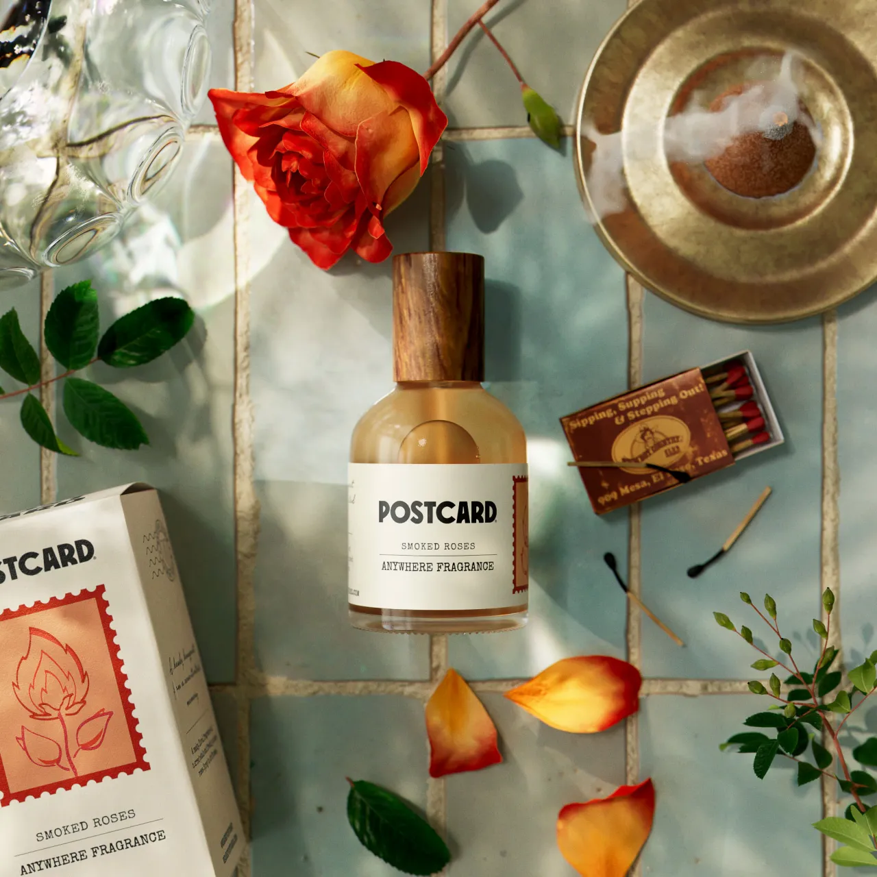
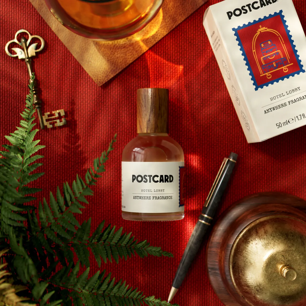
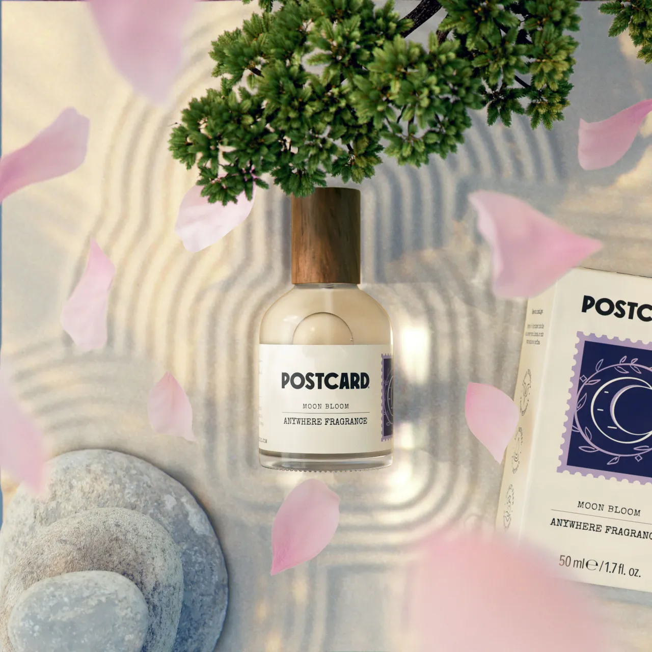
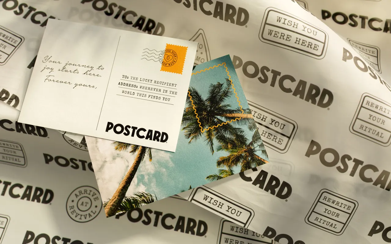
It achieves this through a creative platform titled 'Wish you were here'. This envisions the brand as an inviting space where worries wash away and indulging in less becomes an aspirational lifestyle.
"Hildra really resonates with her consumers in Singapore by creating self care products that soothe, calm and connect on a personal level," explains Libby Goodyear, senior account manager at Robot Food. "We knew this compassion and emotional connection would resonate with a more global audience."
Logo and illustrations
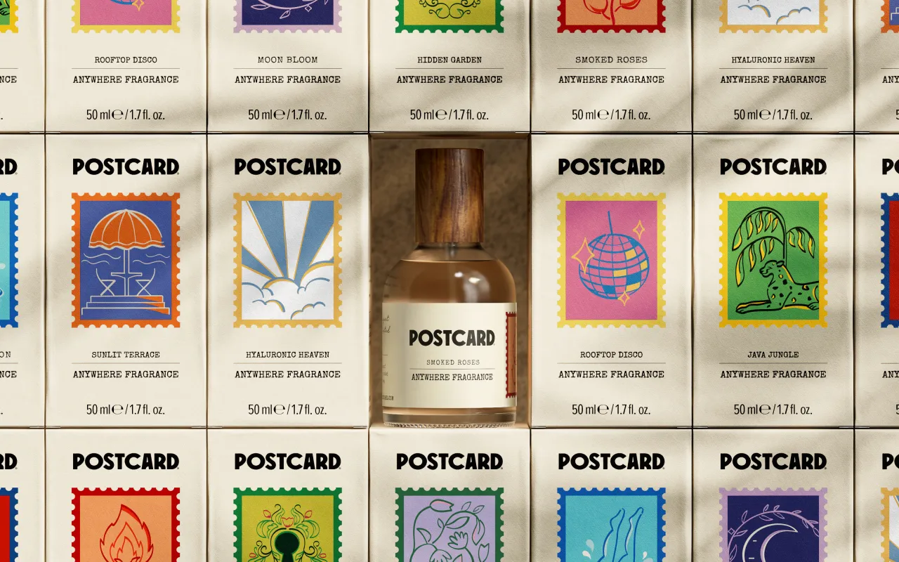
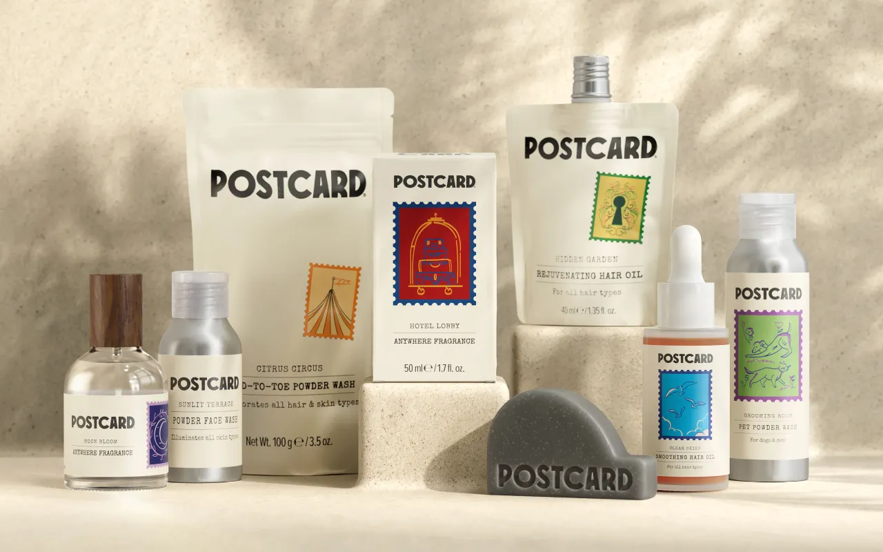
The visual system is based on the concept of 'Postcards': a collection of beauty products designed to emotionally transport consumers to different places and moments through evocative scents and textures. Inviting packaging design and product names such as 'Clear Skies' and 'Icy Peaks' reflect serene places in nature.
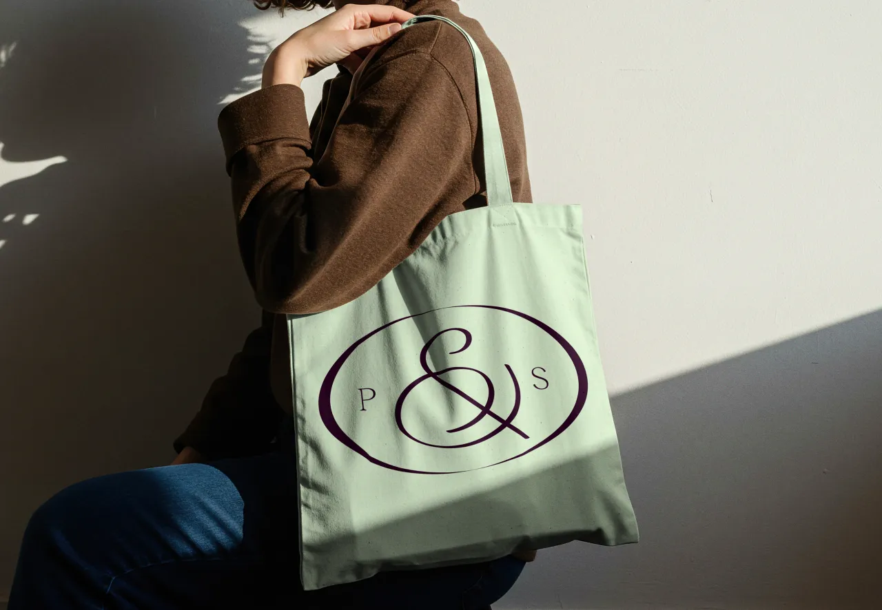
Robot Food created a new logo for Postcard, which features organic quirks inspired by vintage store signage. Its textured look and feel mimics hand-printing techniques, like stamps, creating an imperfect effect that reflects the brand's artisanal roots.
They also created illustrations to bring out the personality of each product, designed as postal stamps from around the world. These are intentionally simple, as though they were sketches capturing moments from the locations they represent.
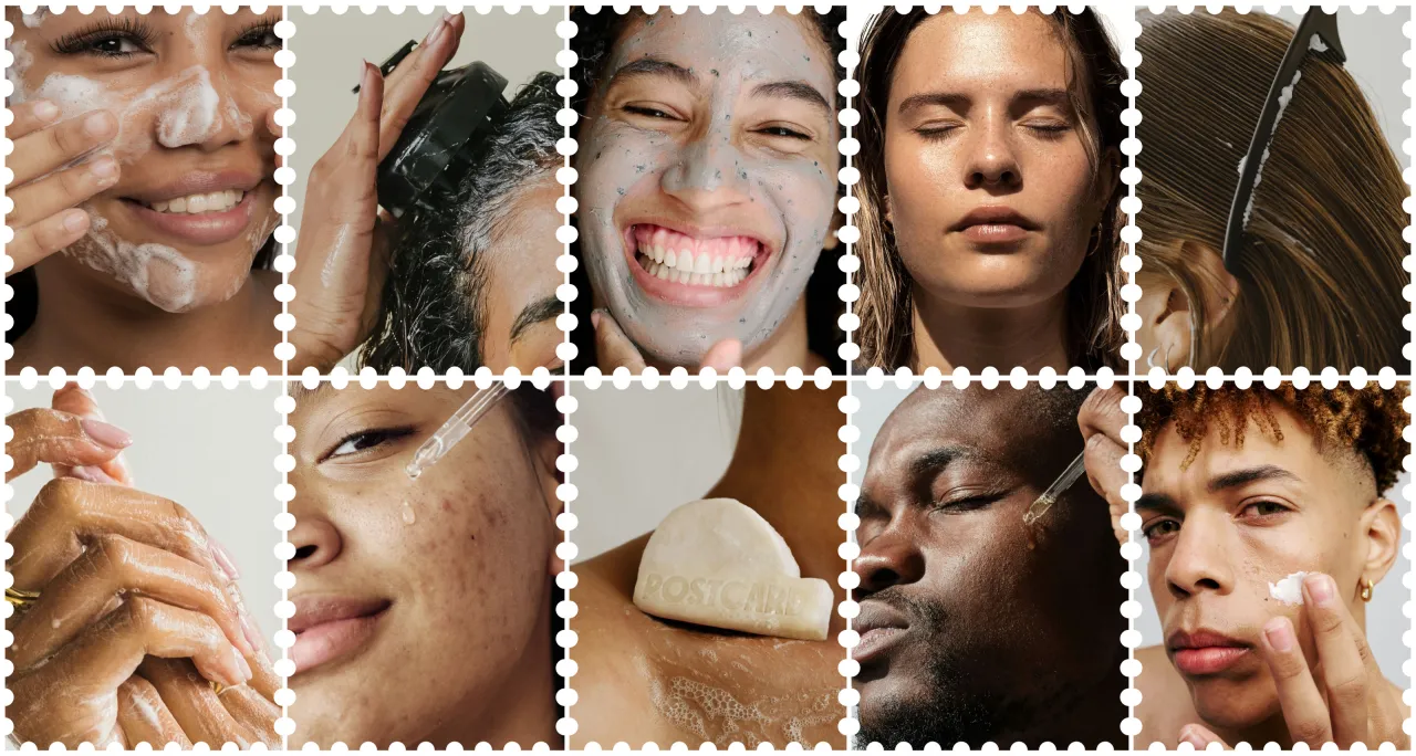
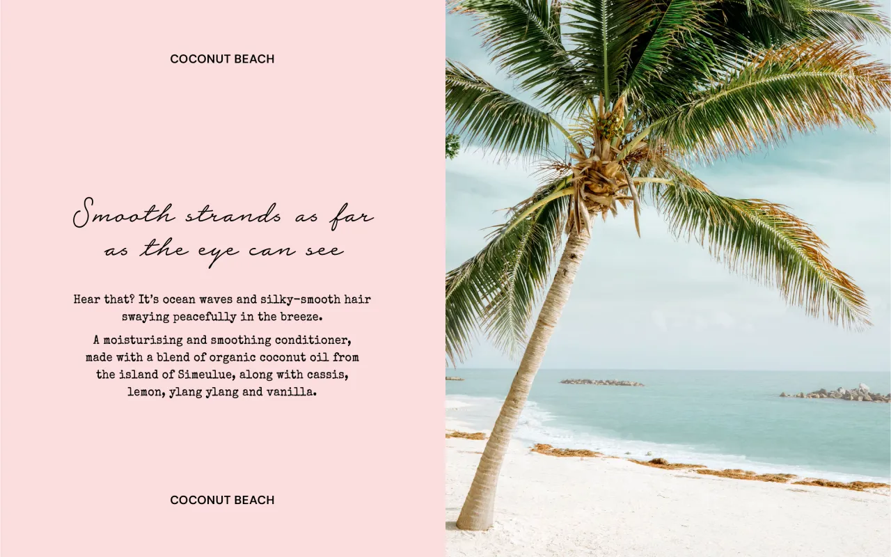
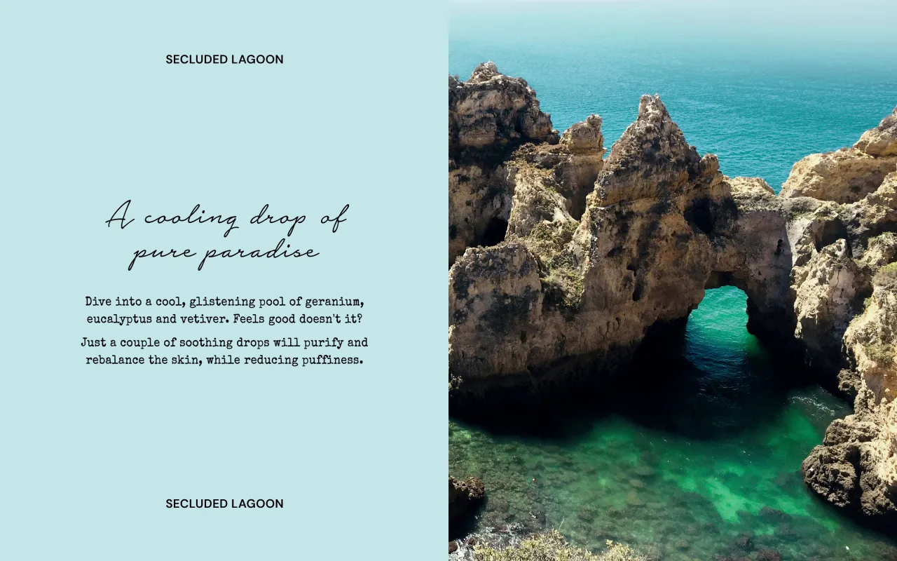
"From the logo and illustrations to the typography and wider brand assets, every element of the design lives and breathes the concept of Postcard," explains Craig Lindsay, senior designer at Robot Food. "By viewing every detail, however big or small, through this lens of transportation and discovery, we've created an immersive experience consumers can't wait to be a part of."
Tone of voice and digital
Robot Food has curated a tone of voice for Postcard that balances sensorial, romantic language with unexpected twists. The aim is to surprise consumers with an experience that defies typical beauty stereotypes.
As senior copywriter Lizzie de Jong says, "The voice is all about transporting the reader to another time or place or simply encouraging them to experience the current moment a little differently. It's a perfect recipe of emotion and fantasy."
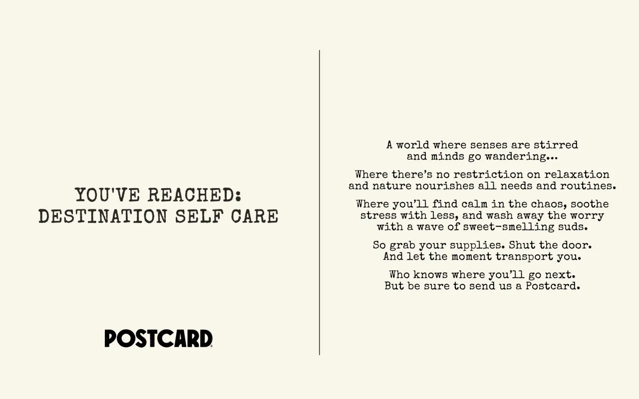
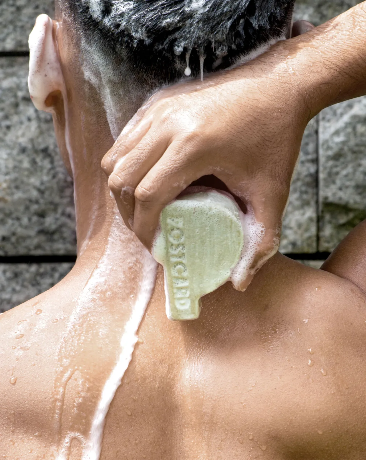
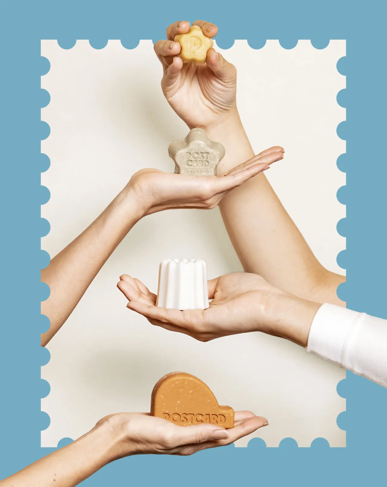
To bring the brand to life in the wider world, Robot Food tapped into consumers' interest in beauty tourism and the multicultural vibrancy of Singapore to create experiential physical and digital spaces. They redesigned the brand's website in collaboration with Hungry Sandwich Club, as well as translating the new identity across social media, in-store displays and home delivery.
Overall, the rebrand positions Postcard as more than just a sustainable beauty and lifestyle brand: it becomes a thoughtful, aspirational choice for consumers seeking deeper connections in their self-care routines. As Hildra Gwee, co-founder at Postcard, says: "In a world where sustainable and natural brands all look and sound the same, we wanted to create a brand that embodies an aspirational lifestyle: demonstrating that sustainability can be both desirable and intentional, not just a guilt-driven choice."
Editor's Picks





Trending
Latest Jobs
Marketing & CRM Manager at Unity Theatre
Full-time·Liverpool·£30,000
Sr. Project Manager at Known
Full-time·Los Angeles·$85 per hour
Associate Creative Director, Earned Marketing at The New York Times
Full-time·New York·$85 – $97 per hour
Deputy Head of Stage at Factory International
Full-time·Manchester·£35,015
Junior Creative at Northstar
Full-time·London·£24,000 – £28,000
Mobile Apps Marketing Executive at Future
Full-time·Bath·£26,500 – £29,000