Citrus brand Jaffa ripens its identity with Earthling Studio
Each asset has been transformed to better communicate the brand's quality, including a new wordmark inspired by a version from the archives.
Household brand Jaffa has launched a new identity designed by Earthling Studio as it moves into a new era of expansion and looks to enhance its digital presence.
For decades, Jaffa has been a recognised name in the citrus industry but has recently expanded into other fruity offerings, such as grapes, melons, and pineapples. The question was: How could they amplify the quality and natural goodness of their products while also staying true to their heritage?
While Jaffa's original brief asked for "a close evolution" of its current brand, Earthling Studio creative partner Stephen McDavid says that further conversations unearthed "an appetite to move towards something bolder and more transformational." Once it was decided that the brand needed revolution over evolution – which the studio recommended – the Jaffa team never looked back.
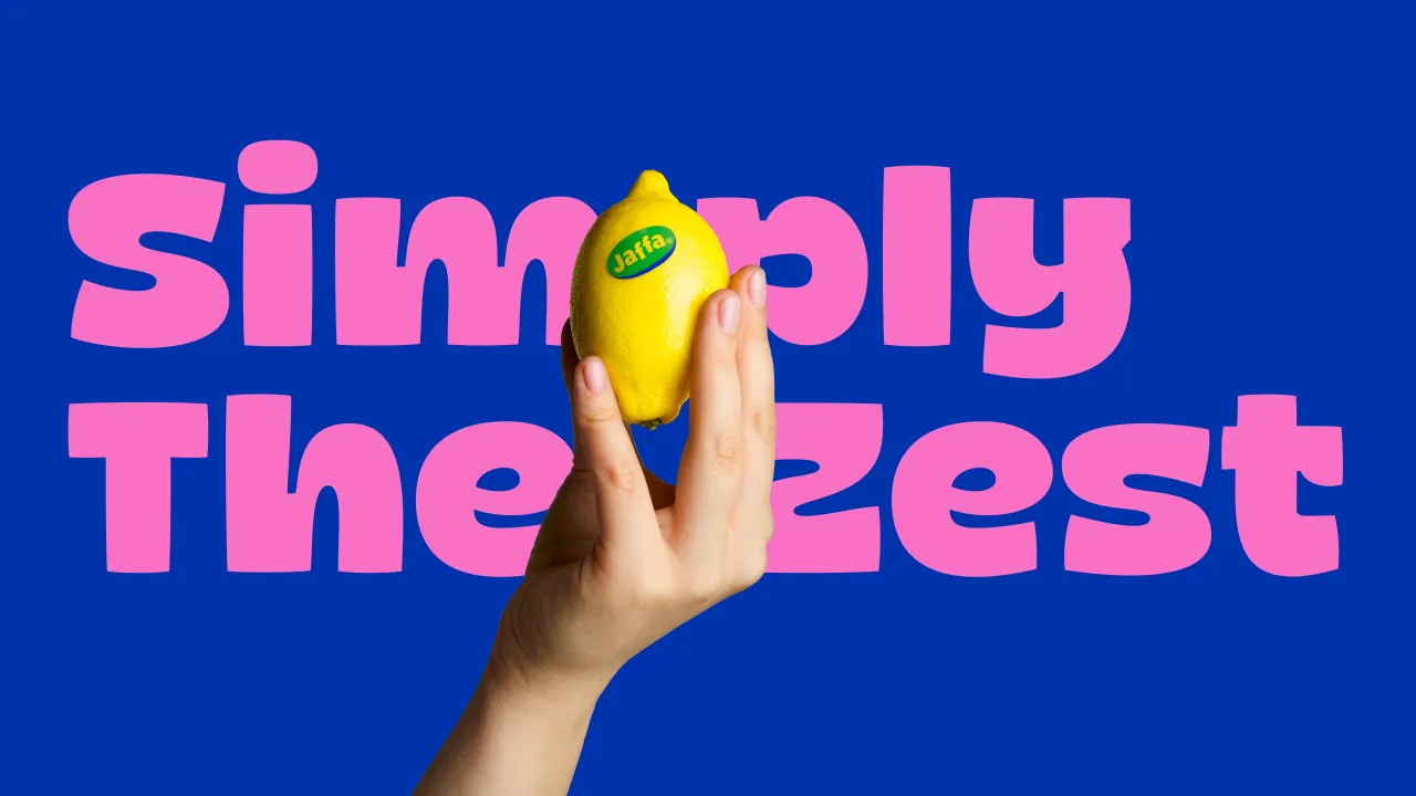
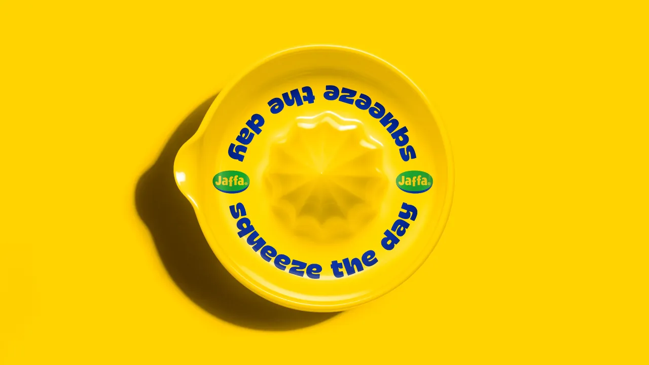
"Jaffa has been a recognised name in the citrus industry for decades," says McDavid, "but as they plan to expand their portfolio beyond citrus, the time was ripe (excuse the pun) for a redesign. One of the main drawbacks of the previous identity, created around five years ago, was that it didn't provide enough flexibility to support the brand's expansion and held it back when it came to creating engaging content across digital platforms.
McDavid admits that changing the logo of a household brand is no easy feat, as there are multiple stakeholders across several countries to consider. However, when Earthling delved into Jaffa's rich heritage during the early design phase, the team discovered a timeless, simple, and playful expression of the logo and supported the UK Jaffa team in selling this to the brand owners.
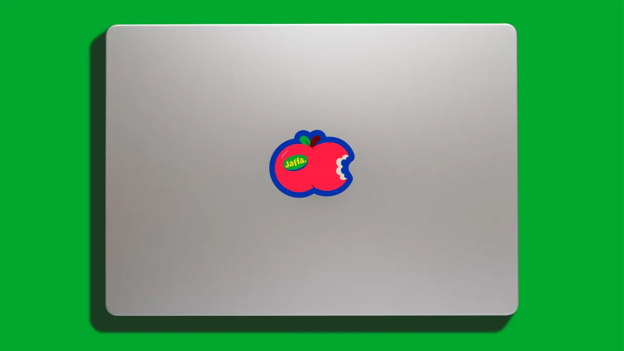
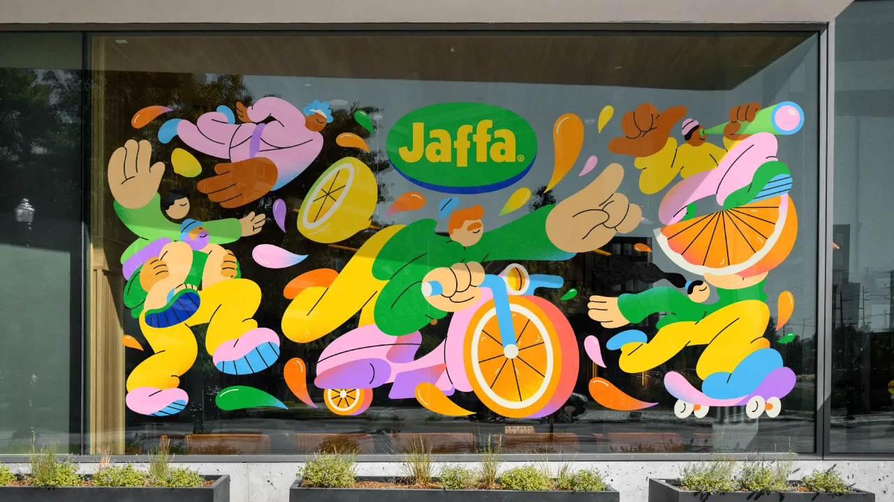
This version aligned perfectly with the brief to make Jaffa synonymous with "naturalness, quality and joy", says McDavid, adding that "a slither of Jaffa brand blue" was incorporated into the logo's roundel as "a subtle nod to its fruit sticker heritage". Though a heritage wordmark inspired the logo, it was redrawn and refined in collaboration with type designer and lettering artist Rob Clarke to enhance its stand-out qualities and ensure clarity across its digital applications.
When explaining the new brand strategy, McDavid notes that "Jaffa has an undisputed reputation for producing the juiciest fruit", which is a clear signal of quality. "This single-minded insight fuelled us to create an unquestionably juicy brand identity packed with as much personality and zest as the products themselves," he adds.
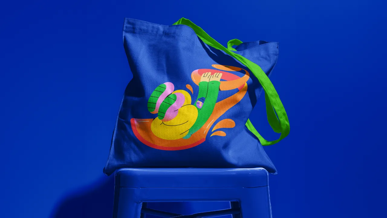
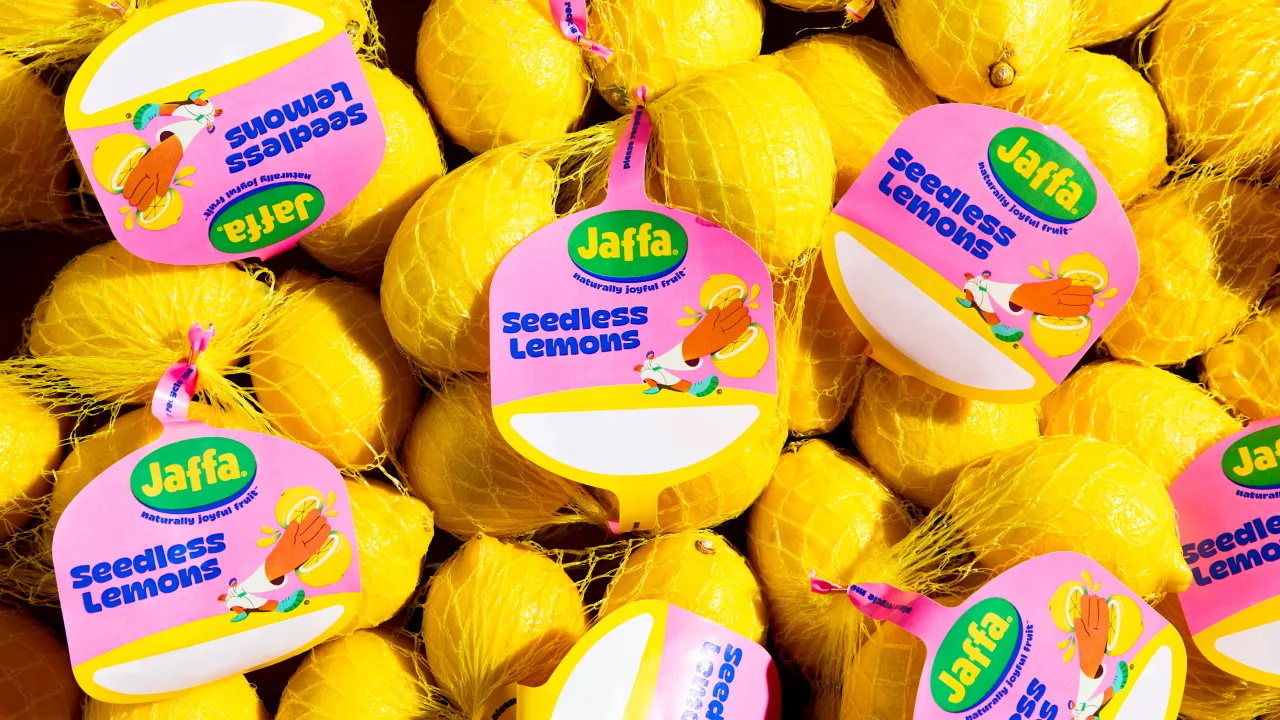
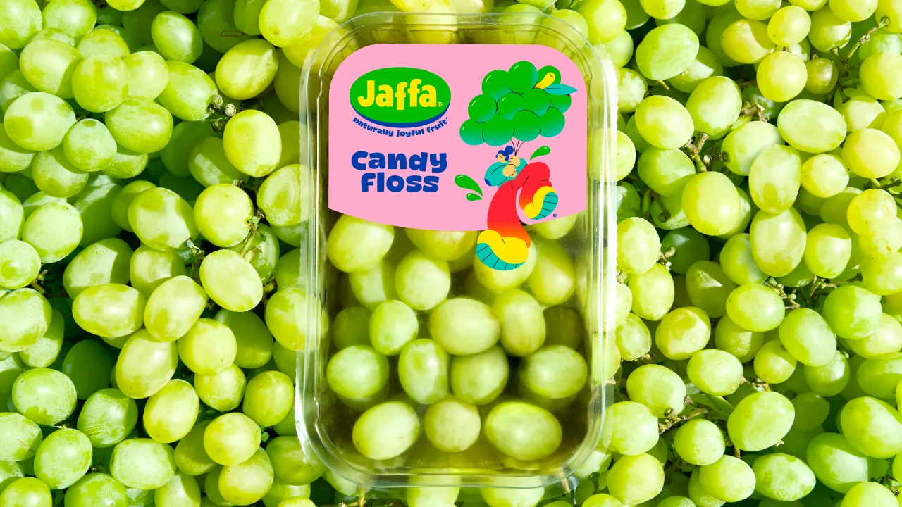
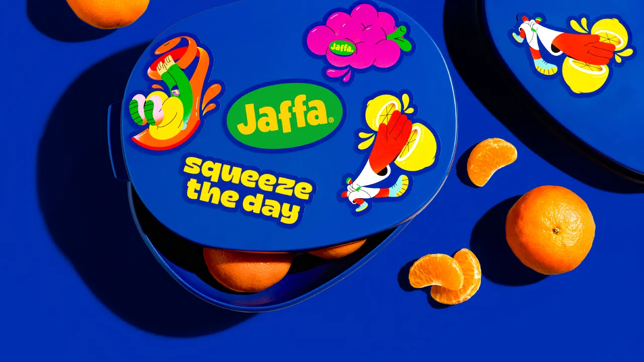
Another upgraded element in Jaffa's new identity is The Juice Crew characters, which can be seen playfully interacting with fruit. Despite being present in the previous design, Earthling found a way to push them further by giving them a contemporary refresh.
For this element of the project, the studio worked with Brooklyn illustrator Spencer Gabor. "We considered several potential collaborators for the project, but Spencer was finally selected due to the juicy shapes and dynamic angles in his work," says McDavid.
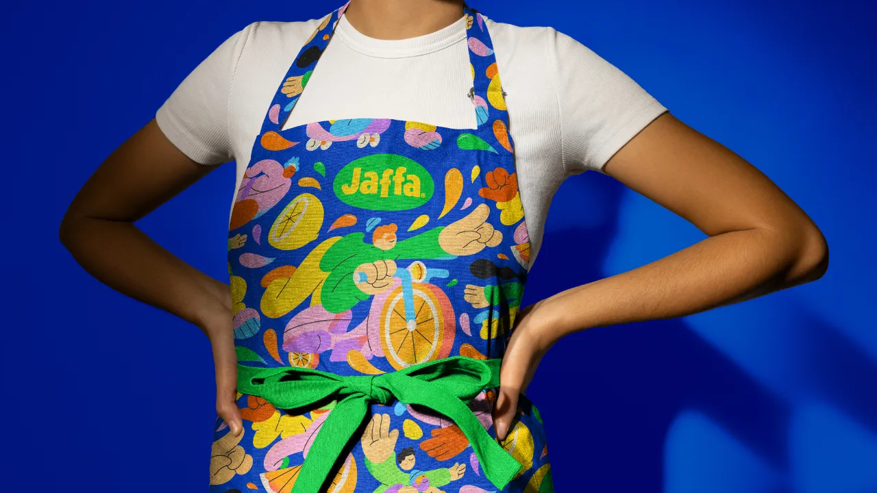
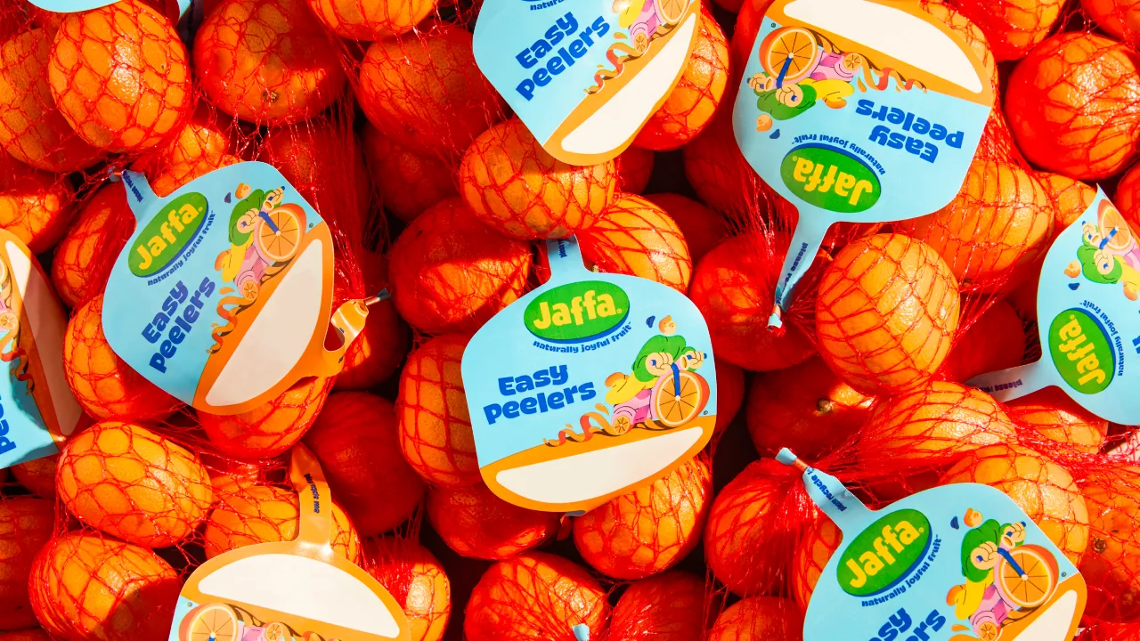
Jaffa's brand colours have also been amplified and revitalised to look more contemporary. The yellow, green and blue hues are now brighter and bolder to help increase brand recognition.
Earthling Studio took the same approach to the entire portfolio, lighting up the colour for each variety to make it more prominent on the shelf.
New fonts have also been added to the Jaffa brand, chosen for their juicy characteristics. McDavid says, "The choice of font can make or break an identity, so we searched high and low for an existing typeface that felt fresh, distinctively Jaffa, and worked harmoniously with the other assets in the identity."
The new and improved Jaffa brand will be featured throughout Tesco stores nationwide and has been applied to packaging, merchandise, the website, digital OOH, and social media content.
"To ensure the brand shows up consistently across the entire brand world, we created a brand guideline with easy-to-follow best-in-class application examples and onboarded other creative partners," says McDavid.
Editor's Picks





Trending


Latest Jobs
Junior Designer, Men's Footwear at Tecovas
Full-time·Austin·$65,000 – $70,000
Senior Designer at Code and Theory
Full-time·New York·$90,000 – $115,000
Executive Producer, Brand Creative at Mercury
Full-time·San Francisco·$189,400 – $236,700
Growth Marketing Lead at Anthropic
Full-time·San Francisco·$320,000 – $400,000
eCommerce Web Designer at on/Sight
Full-time·$75,000 – $95,000
Mobile Apps Marketing Executive at Future
Full-time·Bath·£26,500 – £29,000