Collage, courage and craft: Ionut Radulescu on identity, imperfection and the power of visual storytelling
Brooklyn-based Romanian designer, illustrator, and art director Ionut Radulescu weaves collage, type, and emotional vulnerability into work that resonates across personal and commercial spheres, from Dipsea and The New York Times to his award-winning visual diaries.
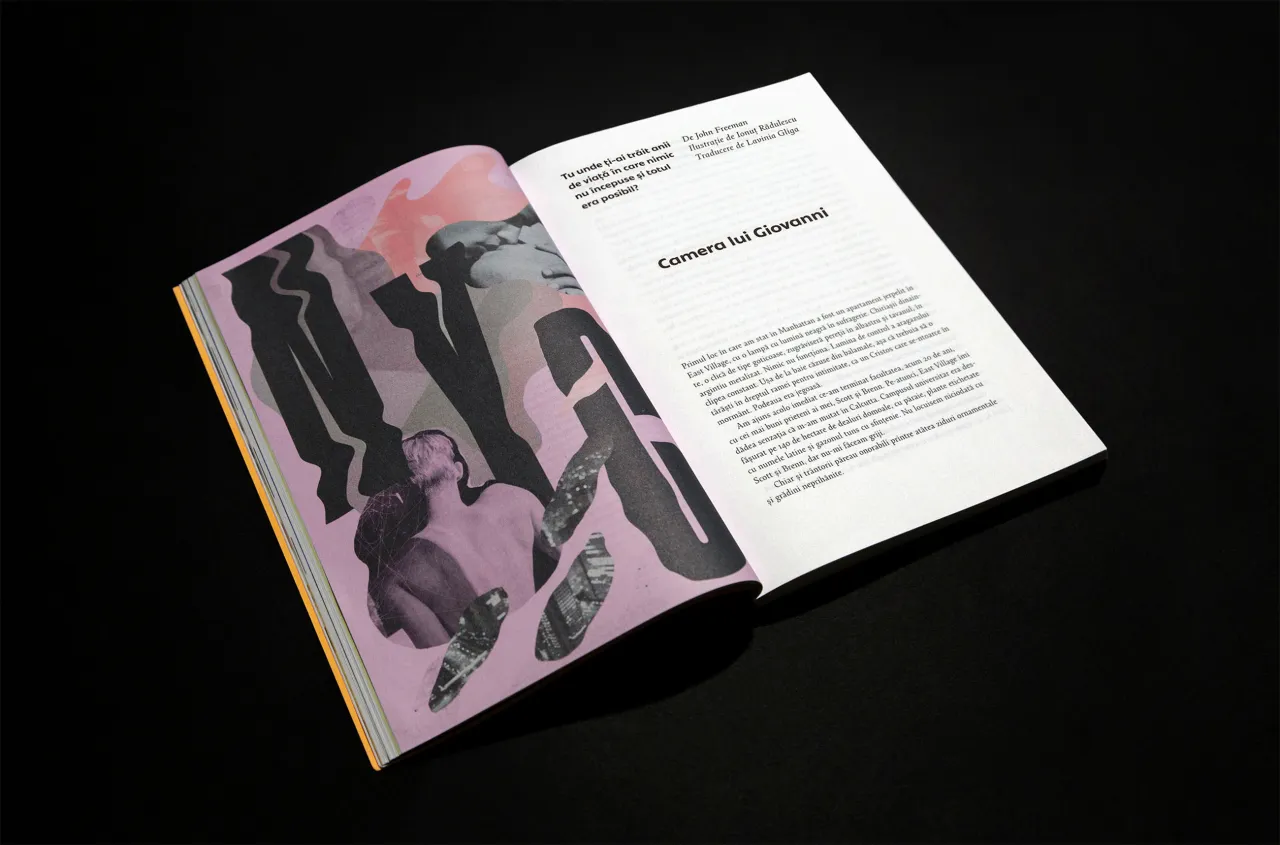
What does it mean to design from the inside out? For Ionut Radulescu, the answer lies in work that's unapologetically personal, often intimate, sometimes raw, and always resonant.
Whether crafting bold editorial collages, expressive lettering or hand-drawn brand campaigns, the Romanian-born, Brooklyn-based designer and illustrator builds visual worlds with heart. "I think there's a certain power in being vulnerable, raw, authentic," he says. "And people can feel that – they can resonate and react to these visual messages."
Ionut's creative language spans illustration, type, print and digital, often sitting at the intersection of identity and motivation. His clients include The New York Times, Peloton, Converse, Teen Vogue, Pepsi, and Dipsea, but his visual voice first gained traction through personal projects. Posted to Instagram like visual diary entries, these self-initiated pieces soon caught the attention of like-minded brands seeking a similar honesty and intensity.
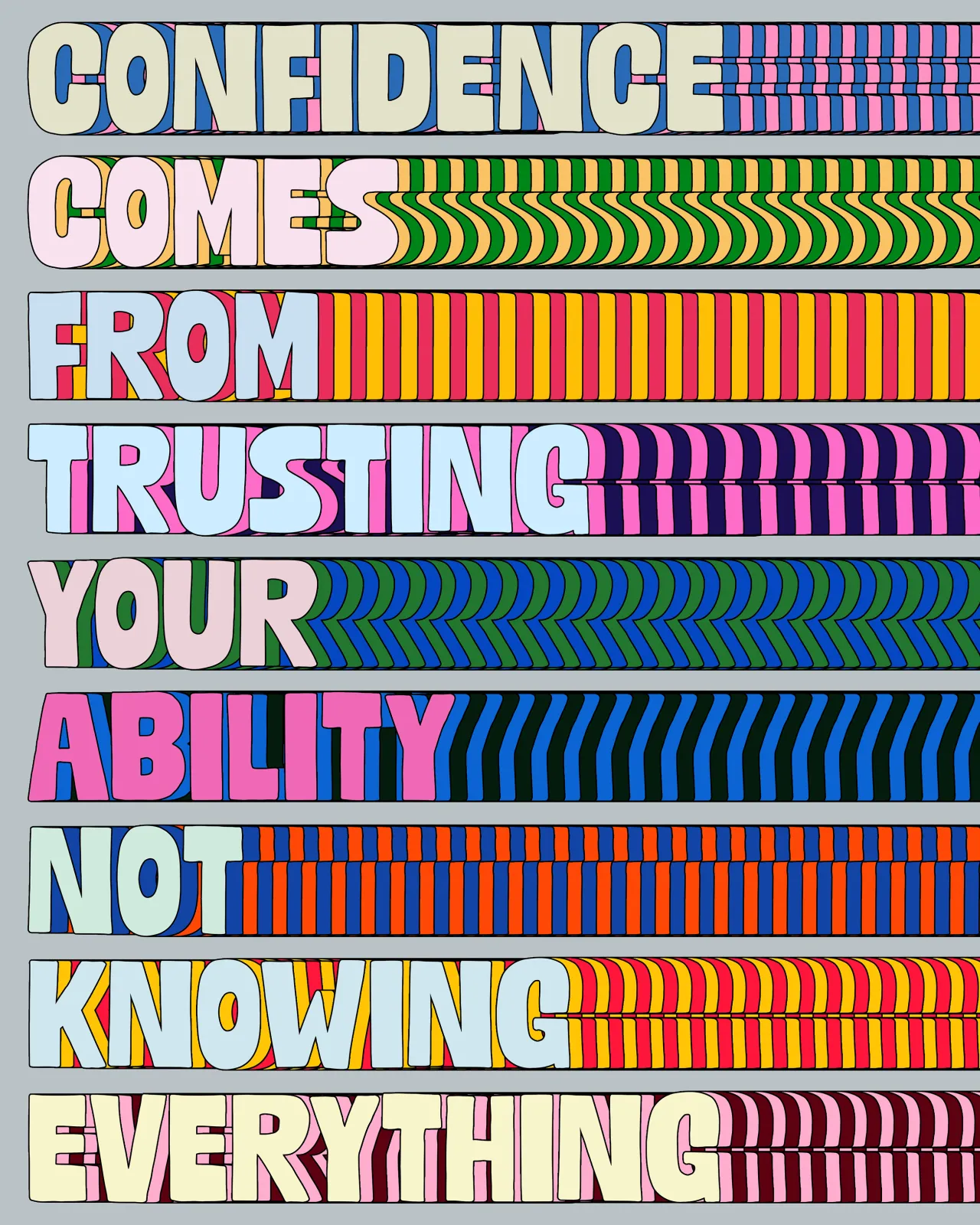
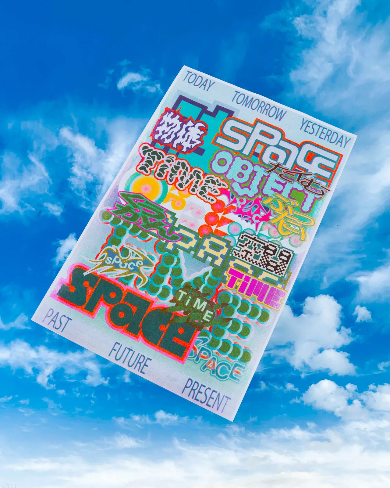
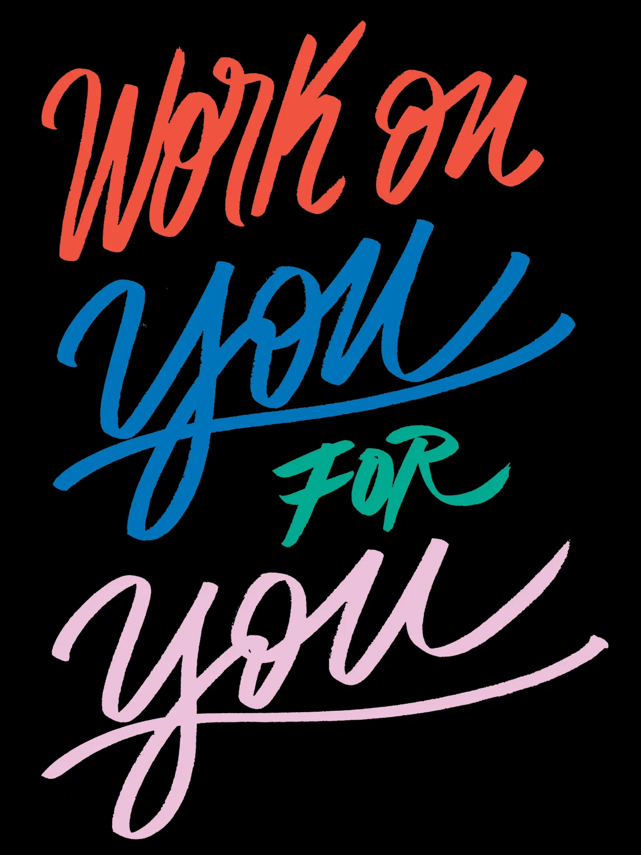
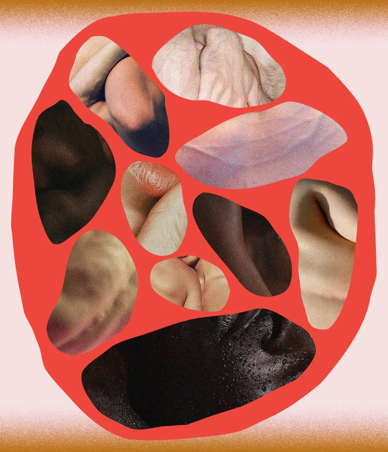
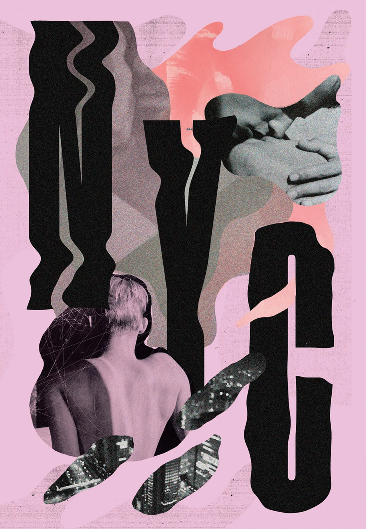
"The series Shapes and Flesh, these collages, shapes, sometimes mixed with type, were inspired by my queer life. I wanted to translate those experiences into abstract visuals," he explains. "The same goes for my Words Are Images typographical quotes. Words have a strong visual impact, and I wanted to explore that."
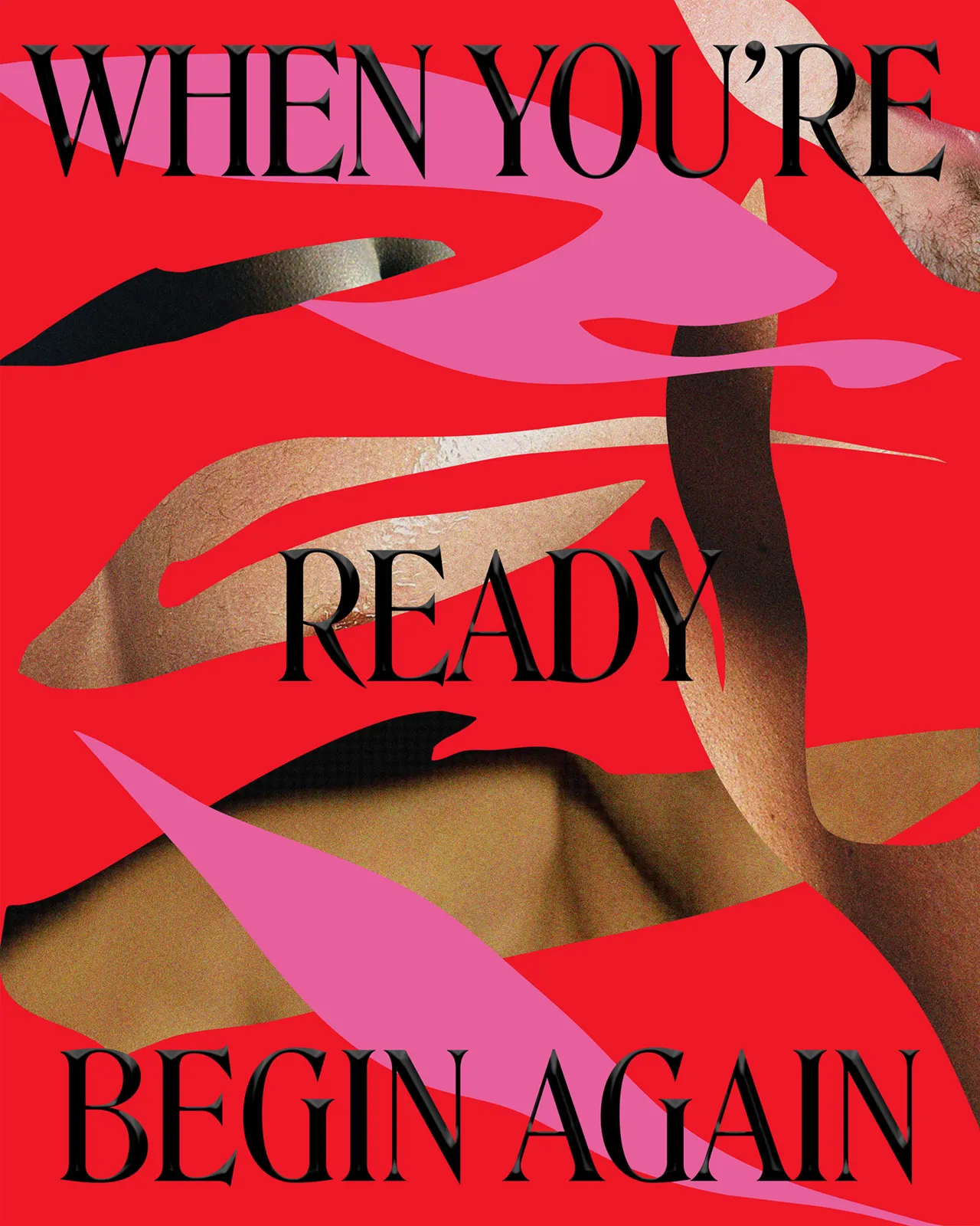
Ionut's is an instinctive, emotion-led approach shaped by more than a decade of exploration. Originally trained in industrial design at the Marin Sorescu Art High School in Craiova, Ionut later studied graphic arts at the National Art and Design University in Bucharest, where he would go on to co-teach illustration and lettering classes alongside professor Stela Lie. The two remain close collaborators through Romania's Illustrator's Club, which is a creative community from which Ionut still draws inspiration.
"Europe and Romania have a more experimental approach to visual culture in general. There are a lot of indie artistic festivals and platforms that play more and explore interesting ways of storytelling," he says. "I'm part of the Illustrator's Club Romania, and we have members in there with very unique, experimental voices."
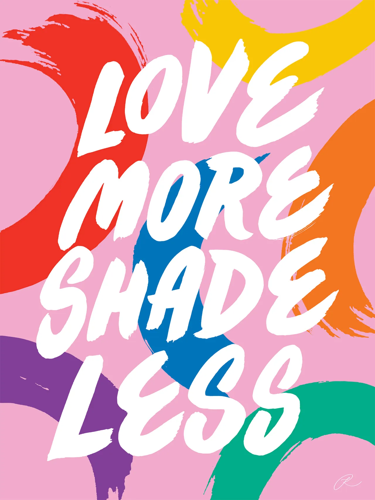
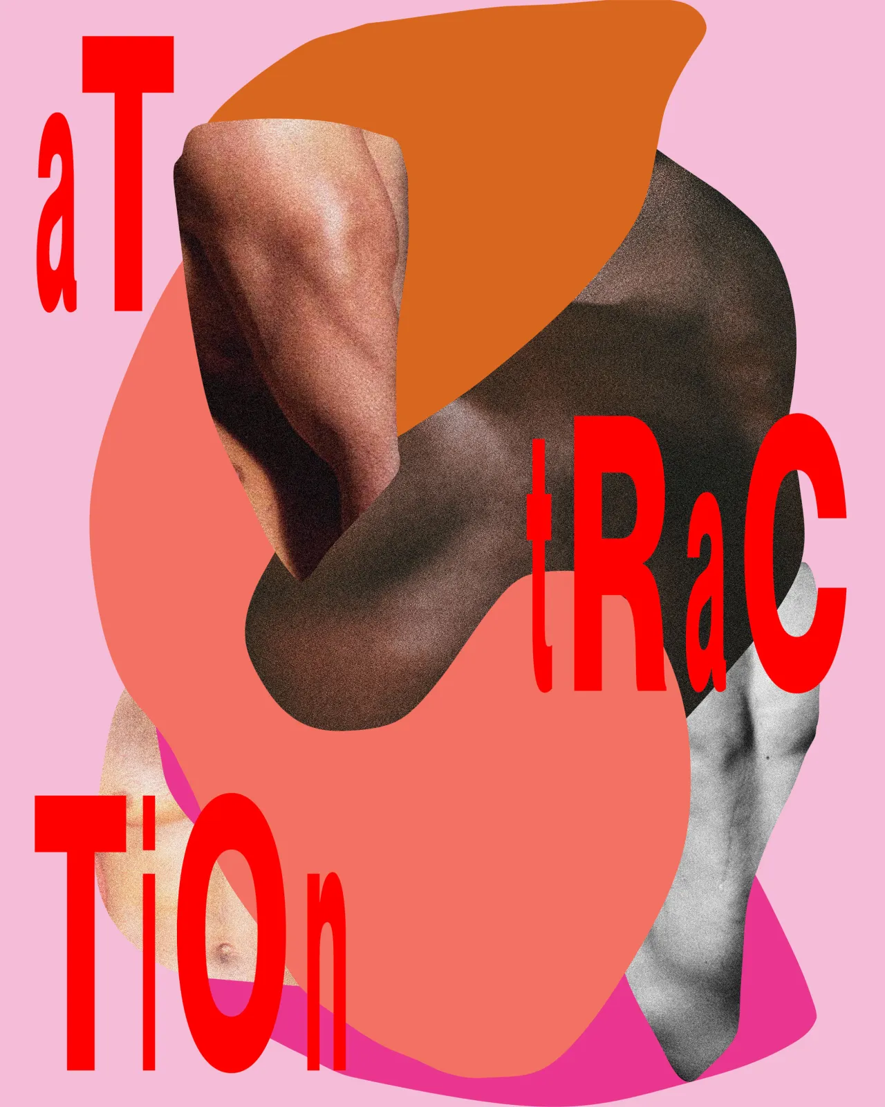
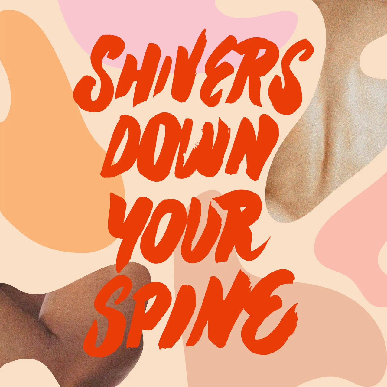
While his early influences included British illustrators Marion Deuchars and Sara Fanelli, a move to New York helped sharpen Ionut's visual style, stripping it back and simplifying the language but dialling up the emotional directness. Bold colour, graphic forms, and a preference for hand-crafted imperfection became key to his work, whether for print, editorial, or branding.
"It's important to me that you can feel the human touch. Even if it's a final digital piece, I want it to have that emotion," he says. For a Dipsea cover, for instance, the ink-drawn type was sketched on large sheets of paper before being digitised. "The computer can't always capture the spontaneity, the energy, the roughness. I like seeing that imperfection."
It's a philosophy that shaped his recent award-winning work, too. His recent American Illustration win celebrated a collage and type piece that plays with balance, boldness and visual rhythm – a kind of structured chaos that invites interpretation. This blend of freedom and form is what makes Ionut's output feel both striking and sincere.
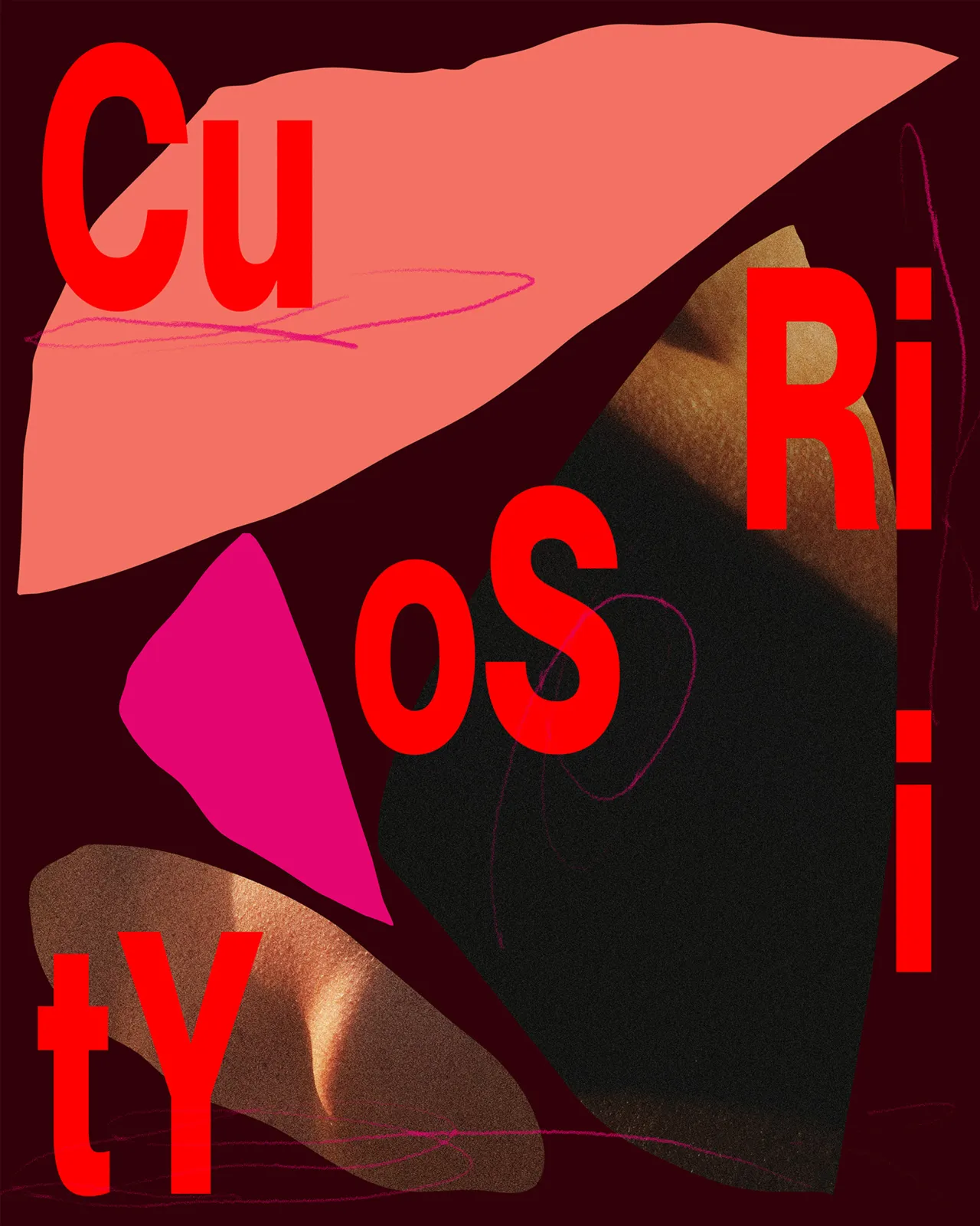
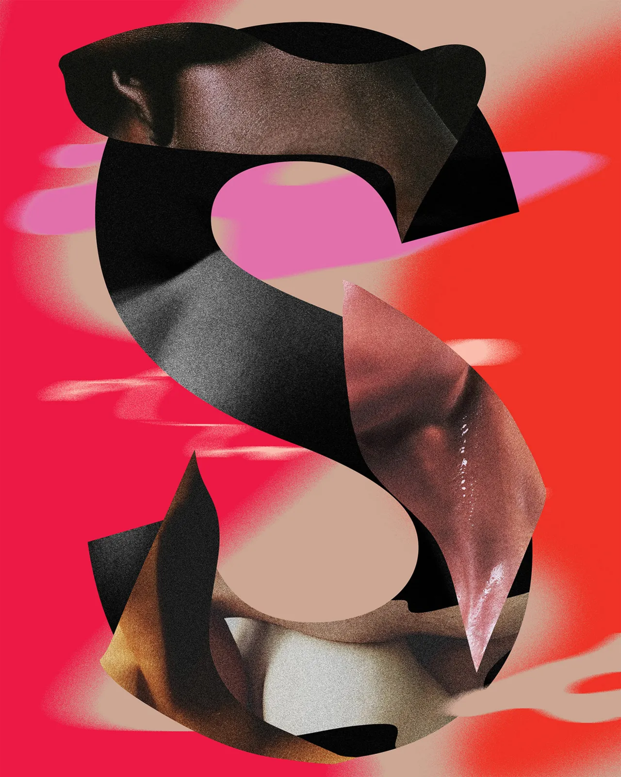
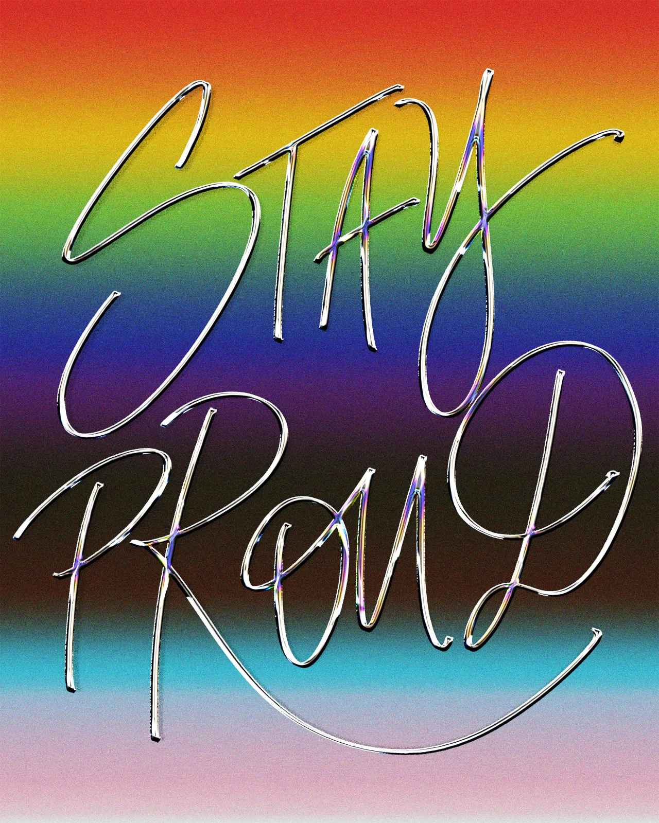
Beyond the craft, it's the message that always matters most for Ionut. From collages on queer identity to affirming typographic statements on confidence and self-worth, his illustrations often speak directly to viewers' emotional states. That connection is part of the goal.
"I want to inspire and motivate people," he says. "I want them to feel, react, reflect and stay with the artwork for a bit, even if it's just a short moment. That makes me happy. That means the message came across."
He recalls messages from strangers who've seen his work and felt lifted or comforted by the sentiment. "It goes beyond aesthetics and creative craft," he adds. "Sometimes we just need to hear something or see it in order to feel better."
That personal resonance translates into his commercial work, too. Ionut's ability to channel emotional and cultural themes has led to collaborations with brands that value not just good design but meaningful storytelling. From feminist and sex-positive narratives at Thinx and Dipsea to identity-affirming work for Hello Mr. magazine, the thread between personal and professional remains strong.
"Queer themes, identity, sexuality, feminism, motivation — these are important to the clients I've worked with, and I was fortunate to be able to come in and express those things to a wider audience," he says.
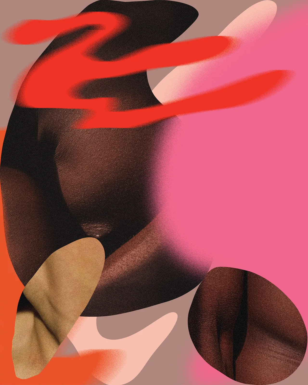
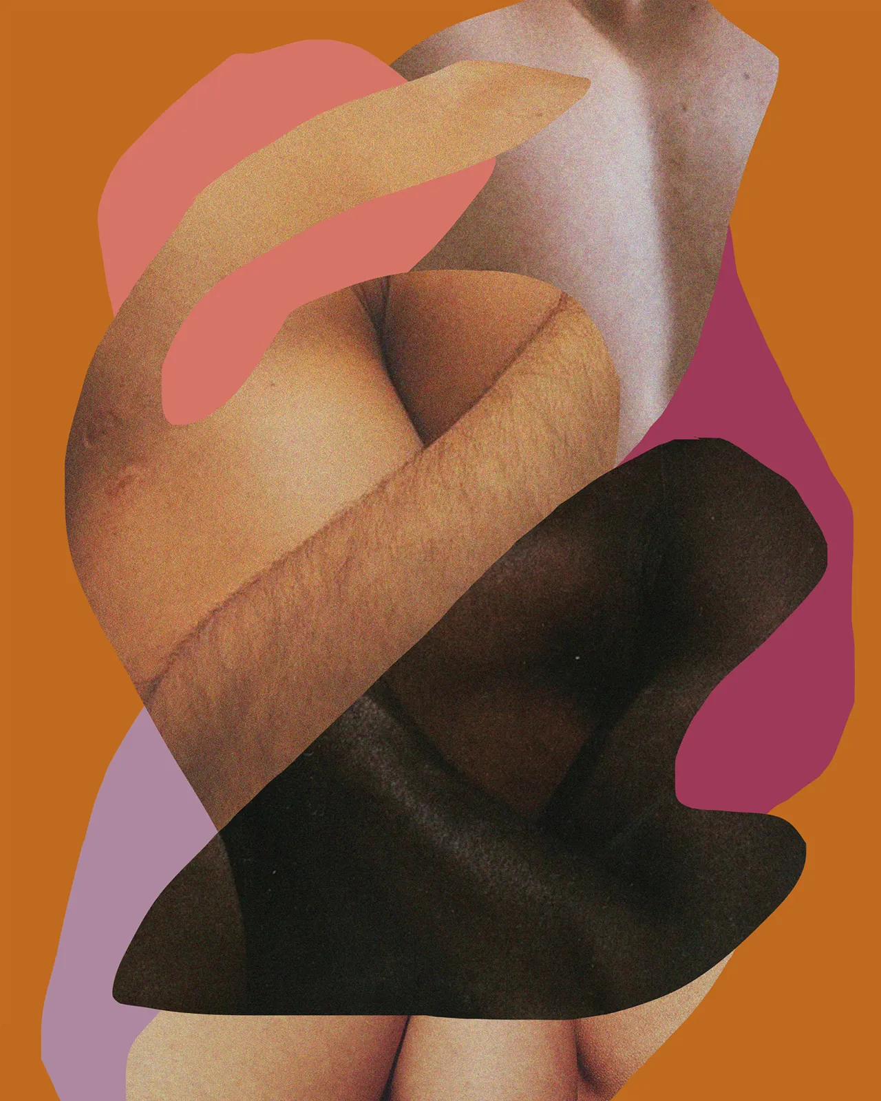
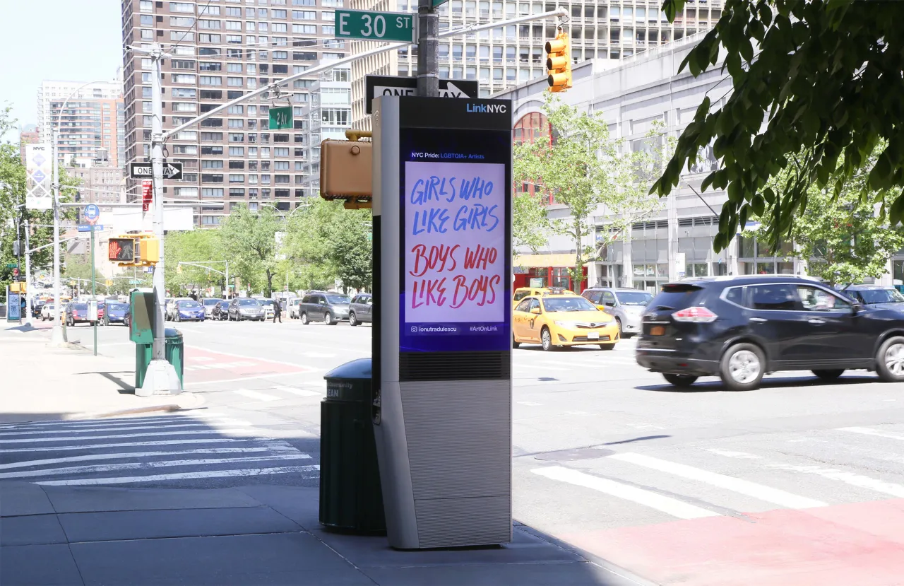
Of course, Ionut's process can differ with each project. Editorial and personal projects might be led by instinct and reflection, but campaigns and branding briefs often require strategic alignment, mood boards, deck presentations, and collaborative iteration. Still, Ionut welcomes the structure, especially when it allows space for meaning.
"I've learned to enjoy the creative journey," he says. "The most important thing is working with a good team toward a common goal: to make something great and meaningful that makes you feel, that makes you react."
Outside of client work, Ionut has also been active as a mentor, educator, and awards judge, most recently for global platforms like The One Club. Teaching, he says, is a way to give back and keep learning.
"I think we live in exciting but challenging times. Technology is moving fast, so I try to ground students to ask the right questions and think beyond trends," he says. "It made me really happy to see some using analogue mediums in really experimental ways. There's still so much potential in that."
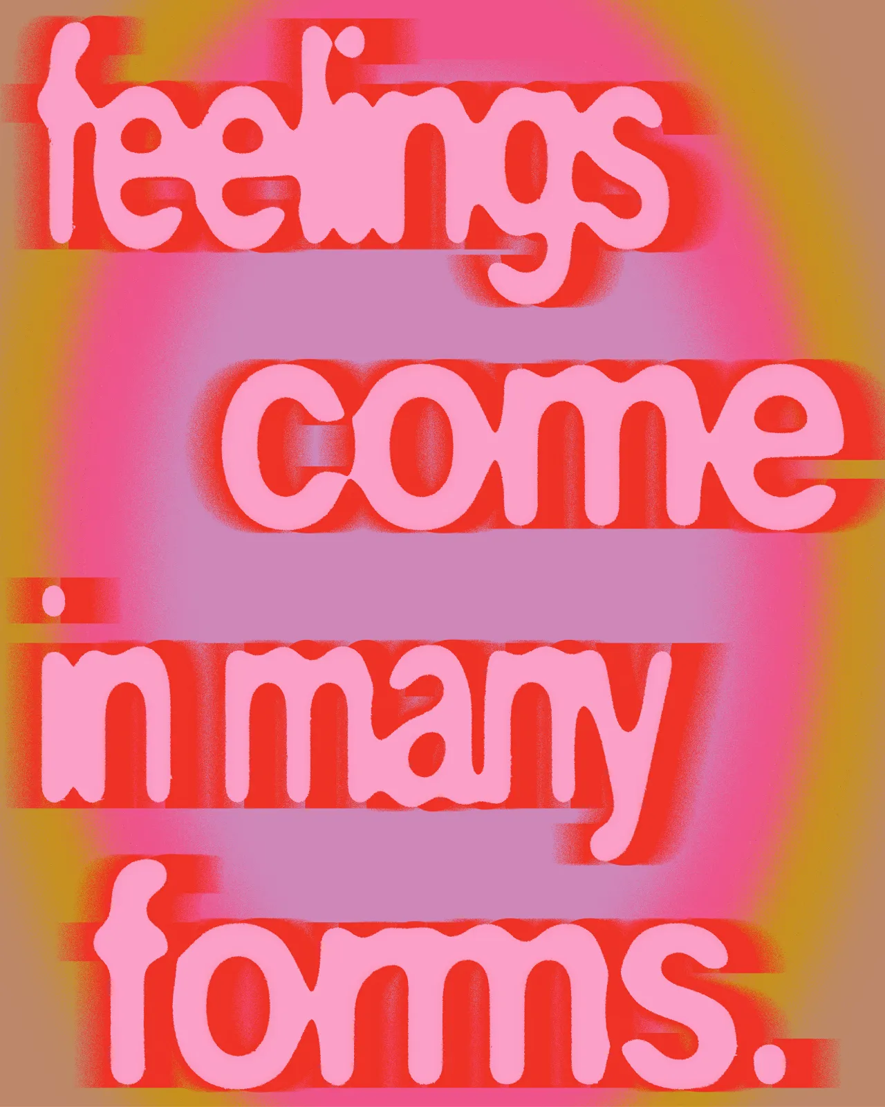
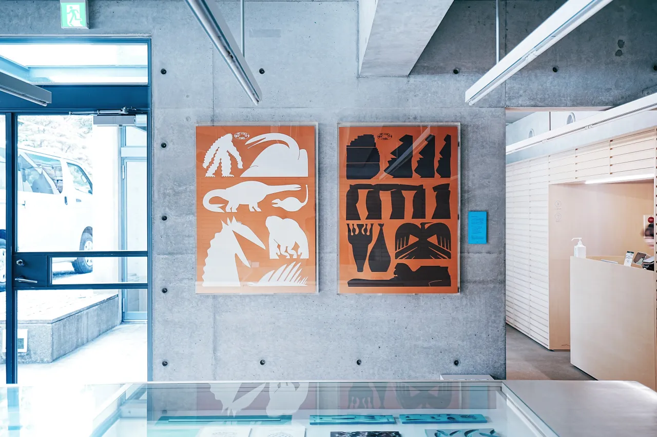
For someone who began his creative life before touching a computer, print remains a powerful medium. His limited-edition screen prints for Print Club London speak to that love: tactile, imperfect, handmade. "Print has tactility," he says. "You can touch it, hold it, experience it in a way digital can't replicate."
Yet he isn't precious about tools. While Ionut still favours hand-drawn elements and lo-fi media, he's curious about technology's role, including animation and, tentatively, AI.
"I want to animate my lettering, type and illustration pieces more and maybe explore sound," he says. "I've experimented a bit with Blender while keeping that handmade feeling. And I've used AI in subtle ways to enhance images or speed up production."
But for Ionut, the tools are secondary. "Ultimately, it's just that – tools. What matters is the craft and the voice. That took me years to build, and I'm still evolving."
As for what's next, Ionut is pretty open. "I want to let myself be surprised," he says. "I want to work with great people, be excited about the process, and be part of a community. Keep learning, keep exploring."
That sense of curiosity and openness runs through all of Ionut's work. Whether working with global brands or drawing for himself, he returns to a simple, striking idea: creativity as self-expression, crafted with care and shared without shame.
Editor's Picks





Trending






Latest Jobs
Senior Digital Designer at 3800
Full-time·Sheffield·£40k-60k
Brand Designer, Product Launches at Figma
Full-time·New York·$127k–$269k
Senior Designer at Creative Spark
Full-time·Manchester·£35k-£50k
Client Success & Growth Director at Revolution Growth
Full-time·Manchester·£60k-£70k
Art Director at SPOKE
Full-time·London·£55k-65k
Marketing Copywriter at ustwo
Full-time·London·£40k-£50k