Tyler Spangler turned punk shows and a psychology degree into candy-coloured chaos
The Southern California designer on dropping out of art school, working for Gucci and the UN without dulling his vibe, and why making thousands of pieces for nobody but himself is kind of the whole point.
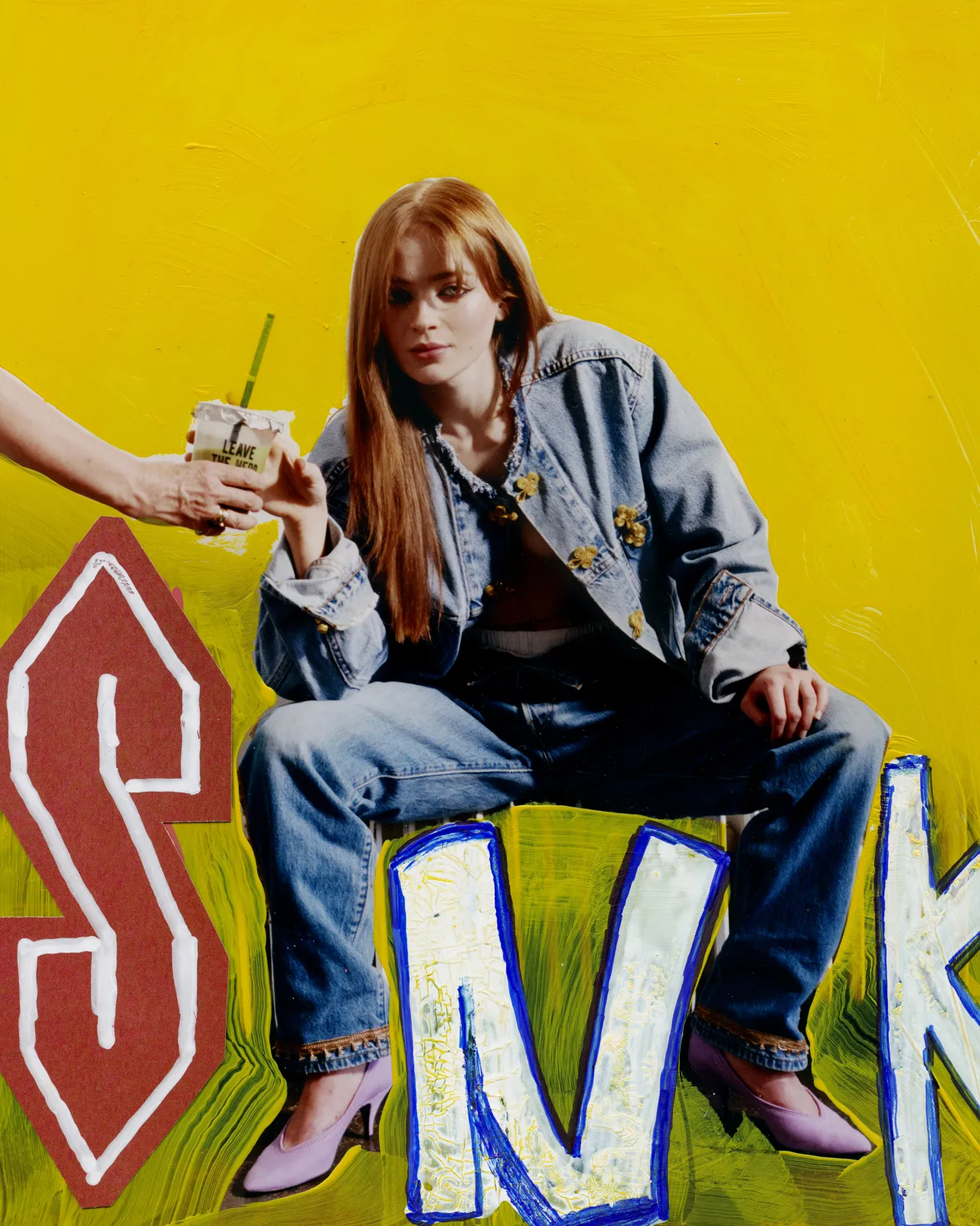
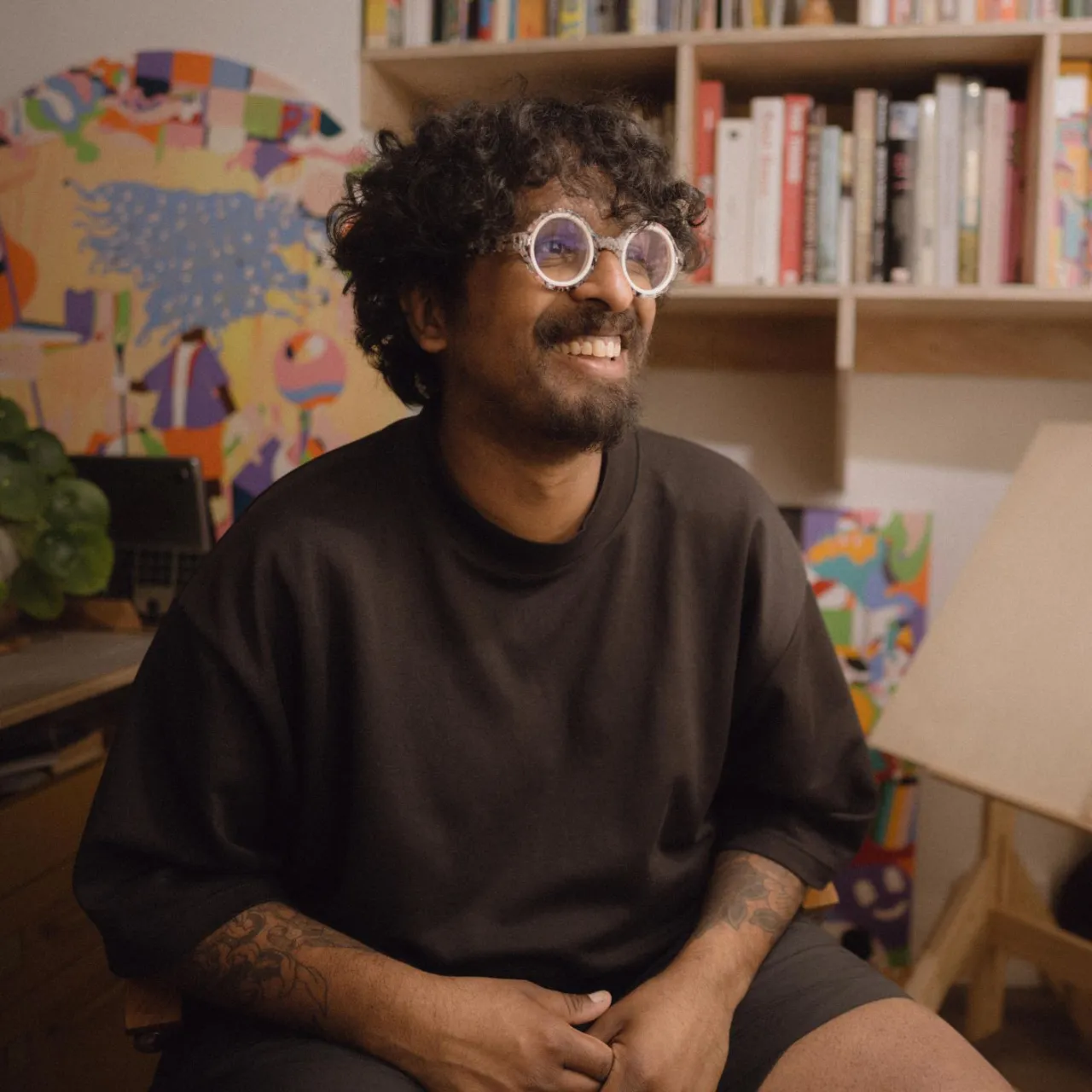
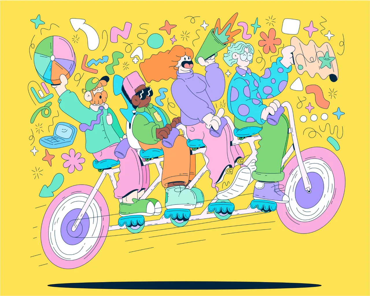
Tyler Spangler describes his own work as "like a rainbow-flavoured popsicle dipped in the ocean and placed on a rock to melt". The Southern California designer makes maximal, candy-coloured digital collages that are loud, fun and a little bit unhinged, and they have carried him from booking punk shows in his own rented warehouse to a client list that today includes Gucci, Hermès, Nike, Chanel and the United Nations. It's a route that skipped the usual path entirely.
A "shy kid" with a bachelor's degree in psychology from California State University, Tyler later studied at ArtCenter College of Design before dropping out to start his own design studio. Art, he says, has been the constant through every phase of his life. "No matter what I was focusing on, I was making art in some form." When he started booking punk shows, he made the flyers for them, and the bands' album covers, too. ArtCenter came next, but it didn't last. "Honestly, I got jaded and also couldn't really afford it, so I dropped out with the intention of starting my own freelance business," he says. He realised he could turn the DIY approach he used during his punk days into an actual design career. "I figured I should probably prioritise the one thing that I have been consistently doing for pleasure as a career."
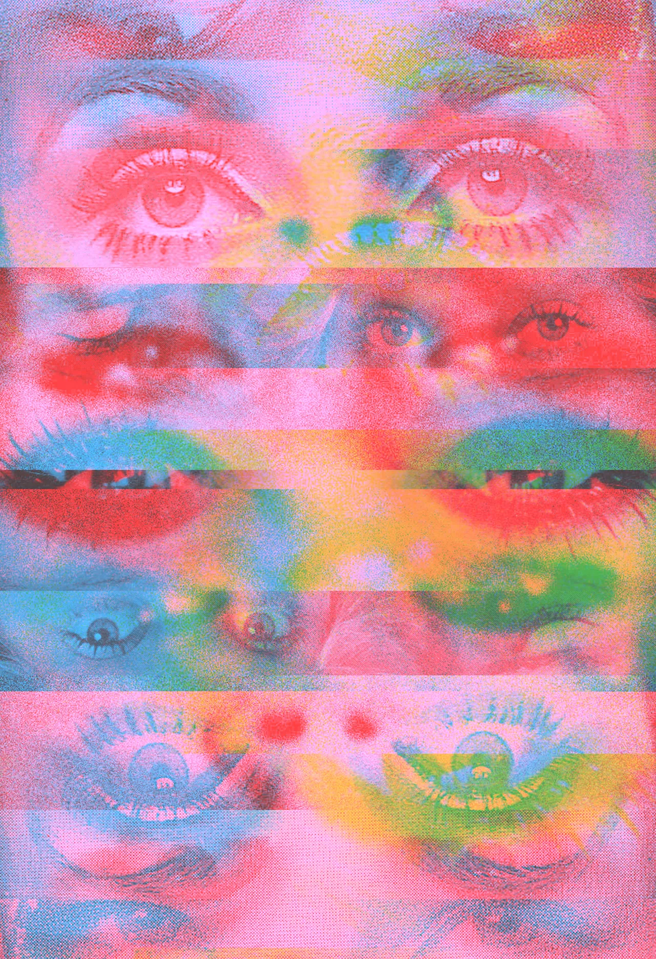
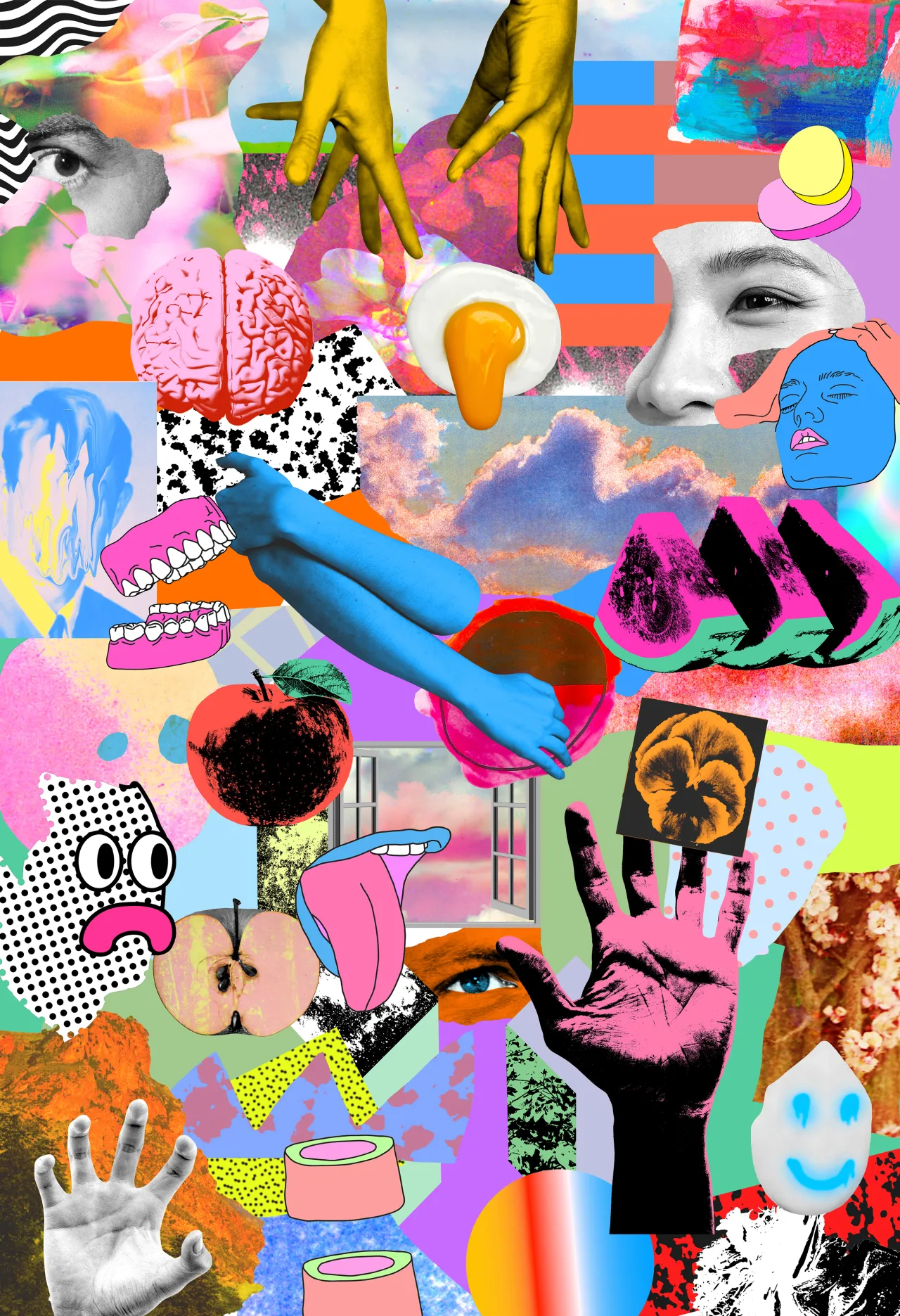
The look that makes his work uniquely his was established early. He grew up in Orange County in the '90s with a dad who surfed a lot, immersed in a surf culture that was, in his words, "brash and loud", alongside video games and cartoons like The Simpsons and Nickelodeon. "The abrasive patterns and neon colours of that era just soaked right into me," he says. He started making traditional paper collages, then moved into digital when he could use bright, candy-coloured material to talk about any subject, even heavier ones. The punk flyers and album covers of the 1970s and '80s remain a touchstone for him: he loves the energy and raw messaging.
Collage became his way of exploring deep, meaningful ideas long before he had the language for them: that an image changes depending on what surrounds it. The spark came from surf magazines, surf and skate videos, and eventually punk culture. "I noticed this when I was young, and I would listen to different songs while I was checking the surf," he says. "Depending on the style of music I was listening to, the feeling and intention of the waves changed." The lesson stuck. "Images aren't static. It's really cool to explore all the different moods and meanings a single image can transform into simply by changing what it's sitting next to."
Doing things his own way traces back to his early twenties, when Tyler took his savings, rented a warehouse space, bought a cheap PA and threw 13 punk shows before it got shut down. The era taught him what he calls the core lesson of punk: "doing what you want without asking for permission or caring what anyone else thinks". With no traditional artist role models to follow, he took that rebellious confidence into freelance life. Chasing an audience, he reckons, is a trap. "It's really hard to know what an audience actually wants, and trying to figure that out will strip away the uniqueness of anything you are trying to do as an artist; it will turn you into a marketing department."
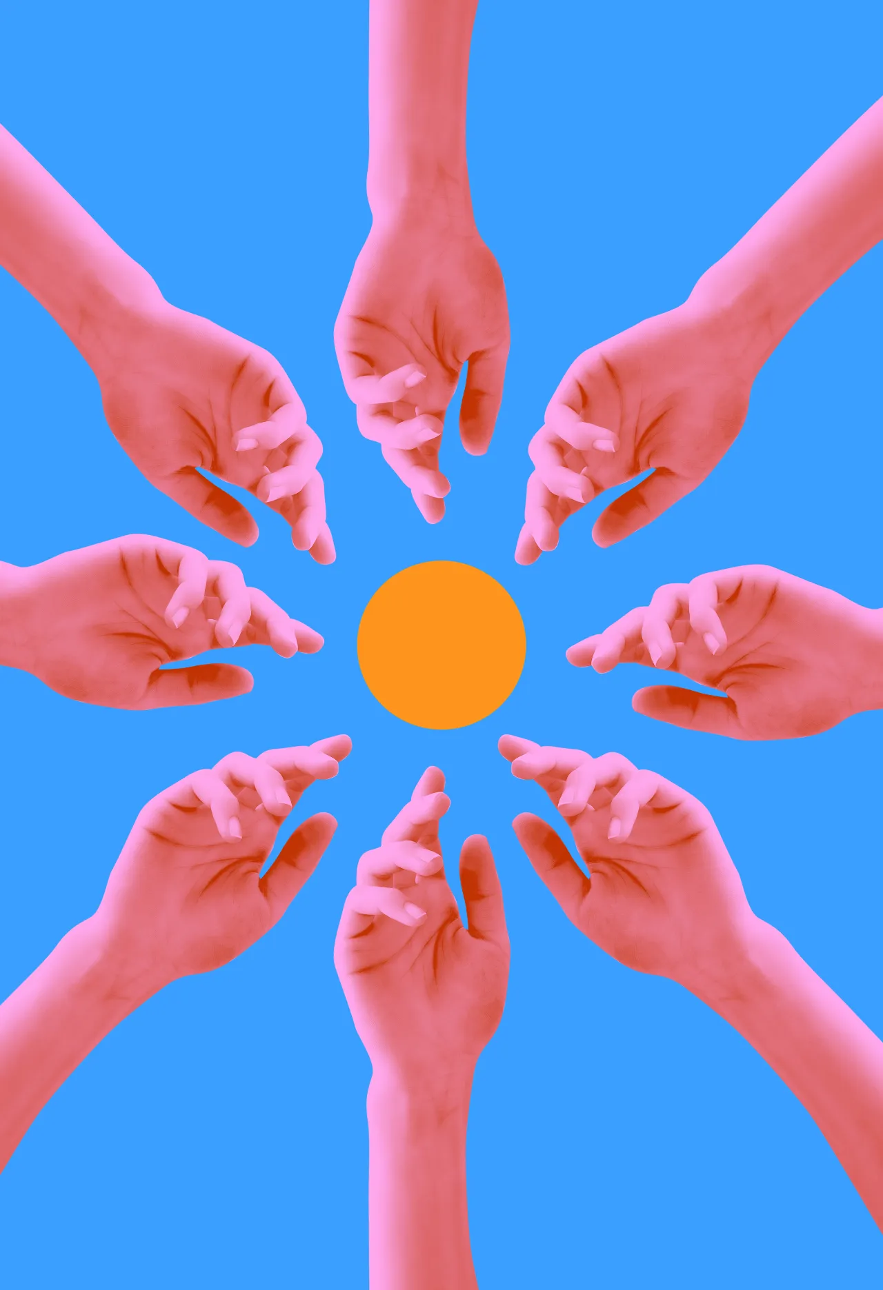
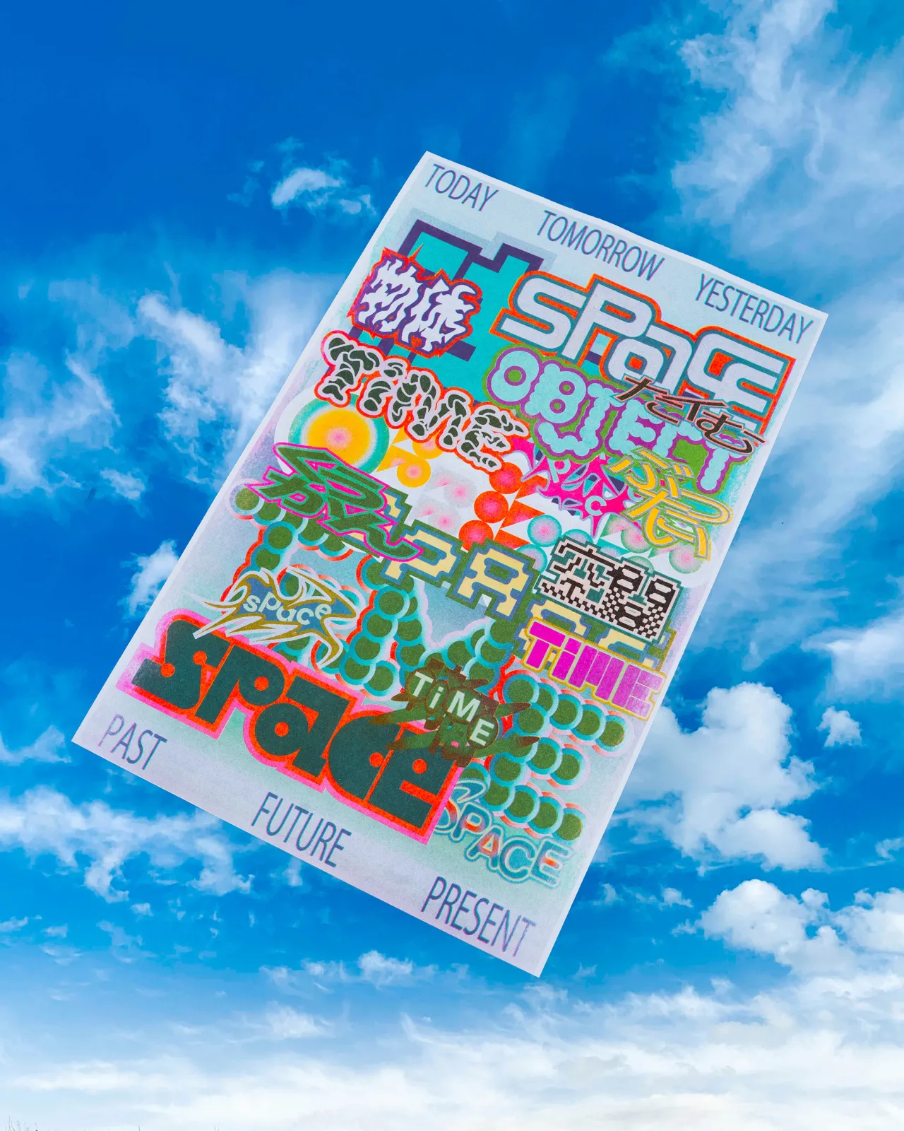
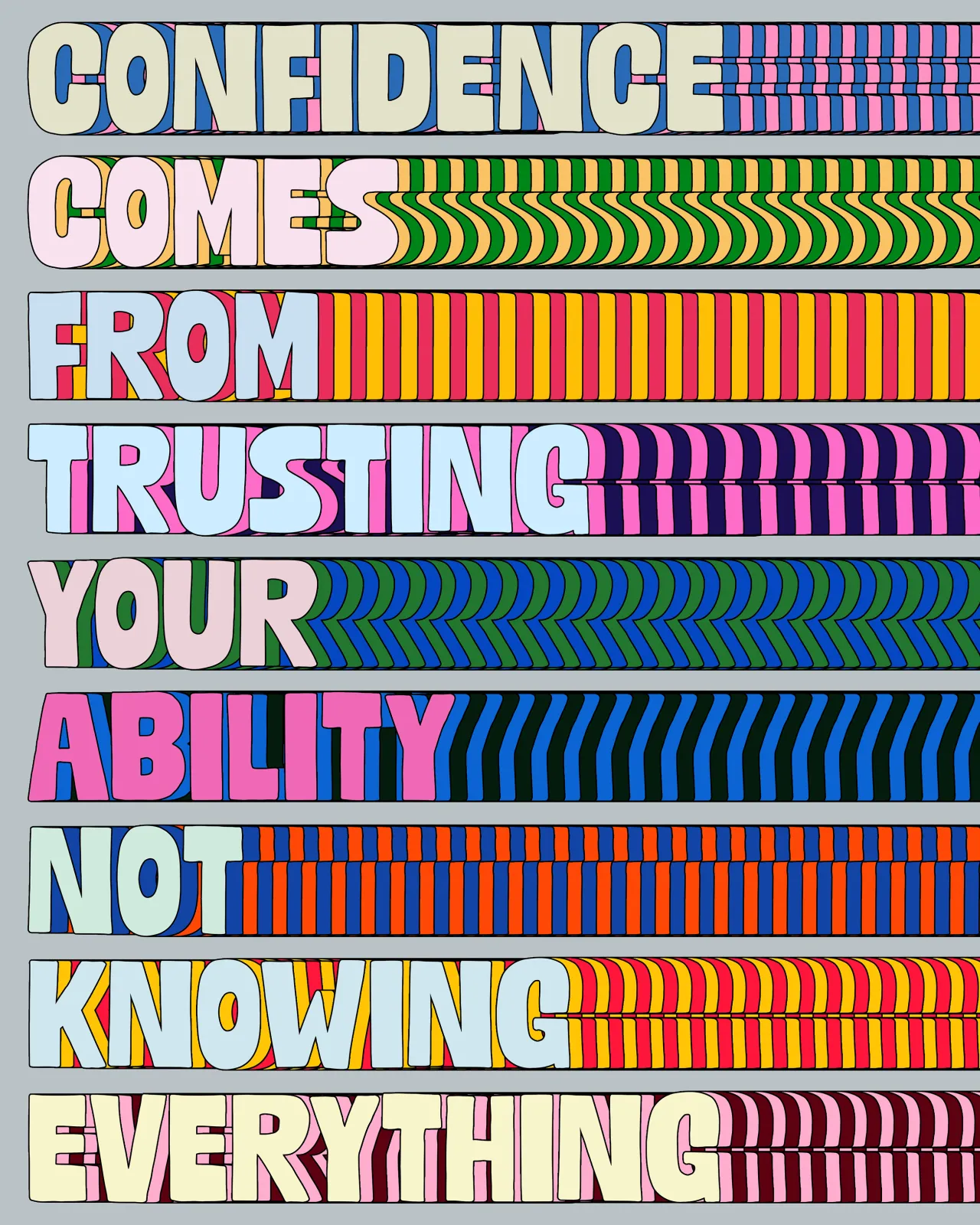
Collage isn't the whole story, though. Alongside it, Tyler makes grand graphic statements – bold typographic pieces that draw on his psychology degree and hint at his own self-awareness. He didn't set out to put the degree to work, but he can see it threaded through everything, especially these text-based works. "It feels like I'm channelling my psychology background into accessible ways to translate thoughts and behaviours," he says. They began as a way to process his own panic attacks. "I figured if I styled my phone notes to look visually appealing, it might help other people relate to and cope with their own anxieties, too."
His work has attracted the likes of Gucci, Hermès, Nike, and the UN, and he hasn't watered anything down because, he says, the brief works the other way round. "I just have to remember that they're coming to me because of what I do. If you align with brands that get your vibe, the connection is natural." His style has shifted over the years, but the "colourful, chaotic and peaceful, curious" is always there.

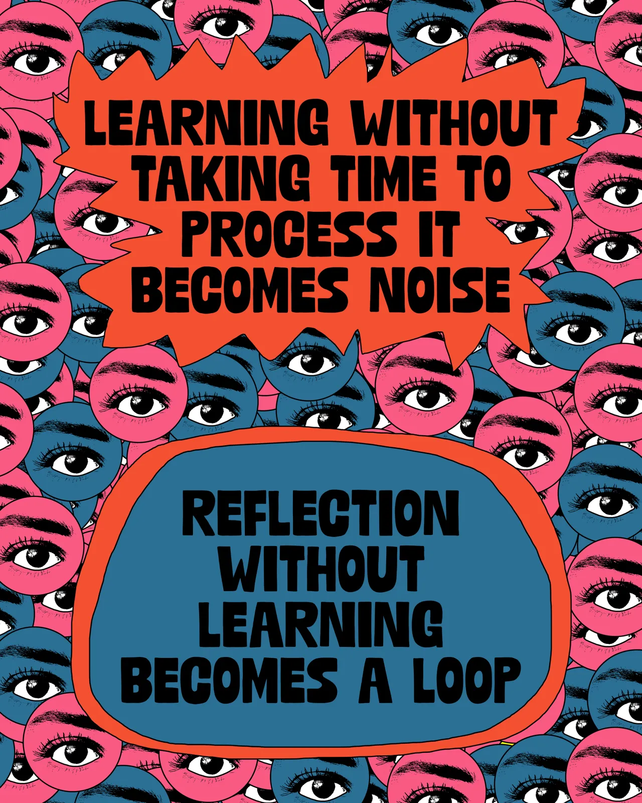
Tyler is adamant that the personal work matters most. "It's infinitely more important," he says. He likens it to sport: "Each artwork is a punch practised, a mile run, a lap swum. You have no idea what kind of art you are capable of unless you methodically peel back the layers of your thoughts." He's made thousands of pieces simply because doing it is a daily, relaxing therapy. It's also where the paid work comes from. "My archive of personal work is exactly what major clients see. If you make the stuff you want to see in the world, the paid work for that exact style will naturally follow."
After working on his own terms for so long, his hardest-won lesson is to stop looking sideways. Social media, he warns, can homogenise design alarmingly fast. "You really have to put your head down, embrace your own weirdness, and just keep pushing through the saturation," he says. "Some of your work will suck, and some will be gems, and you can't plan for that; you just have to keep pulling information out of your brain and translating it into art."
As for what's next, he's in no hurry. "I just view this whole journey as an ongoing experiment that hopefully never finds an answer," he says.
Editor's Picks





Trending






Latest Jobs
Brand Copywriter at Origin
Full-time·Porthleven, Cornwall·£35k–£40k
Frontend Developer at Northern Artillery
Full-time·Leeds·£35k–£45k
Account Director at How&How
Full-time·London·£73k-£79k
Senior Designer at BKC
Full-time·£50k-£60k
Senior Designer at Creative Spark
Full-time·Manchester·£35k-£50k
Midweight Full Stack Developer at Bureau for Visual Affairs
Full-time·London (Open to remote)·£35k–£50k