Branding for Swedish junk food joint Dirty Vegan is deliciously playful
This inventive restaurant branding reimagines the idea of a vegan eatery in a refreshing and enticing way.
Across the course of the 21st century, the image of veganism has quickly gone from 'cranky and weird' to 'mainstream and cool'. Nowadays, you can find vegan options in most bars and restaurants. And that's all to the good, whether you're a vegan or just appreciate more healthy options on the menu that are kinder to the planet.
But vegan restaurants specifically still suffer from the perception of being overly worthy and health-obsessed: not somewhere you'd naturally head for a rip-roaring night out.
It means we're delighted to see graphic designer Jens Nilsson present us with this fun branding for a vegan junk food joint that offers an entirely different image.
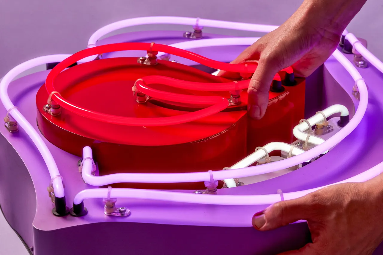
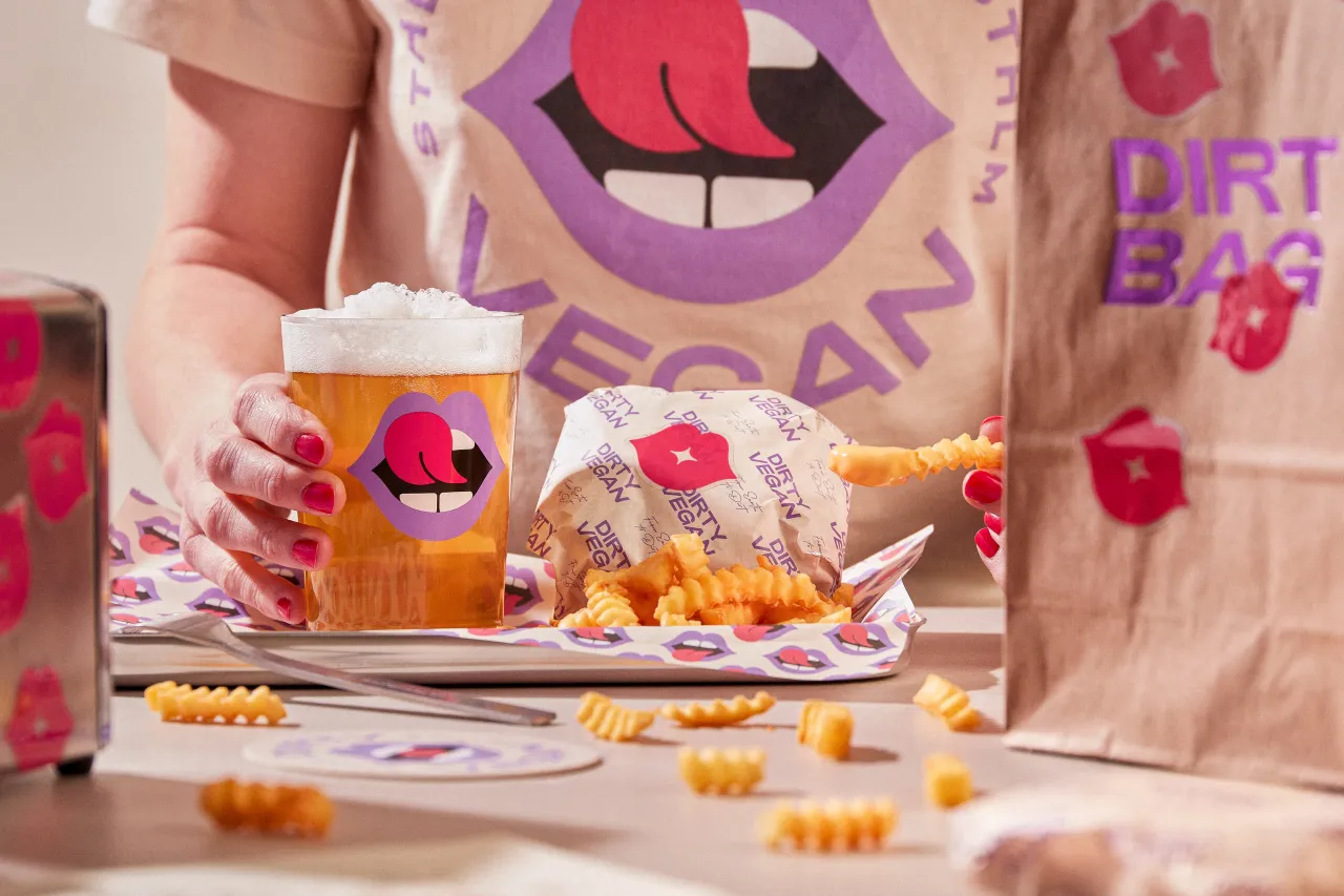
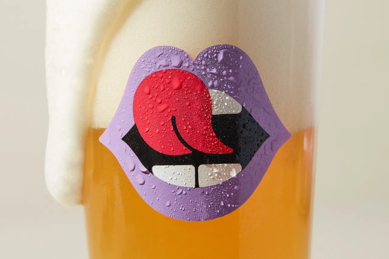
"Dirty Vegan, a Swedish restaurant and bar concept entirely devoted to vegan fare, specialises in unhealthy junk food such as burgers and craft beers," Jens explains. "The idea of the restaurant's identity, with its lip-licking mouth symbol, draws inspiration from a questionable nightclub vibe rather than conforming to the conventional image of a traditional all-green, health-centric vegan culture."
We absolutely love these designs, which had our mouths drooling at first sight. So, we were keen to chat more with Jens about how they came about.
Logo and design system
"The business founders, Laura and Tyronne, wanted to create a different kind of vegan place," Jens begins. "They aimed to move away from an uptight, health-focused vibe and instead embrace classic fast food and craft beers with a more laid-back, 'divy' feel."
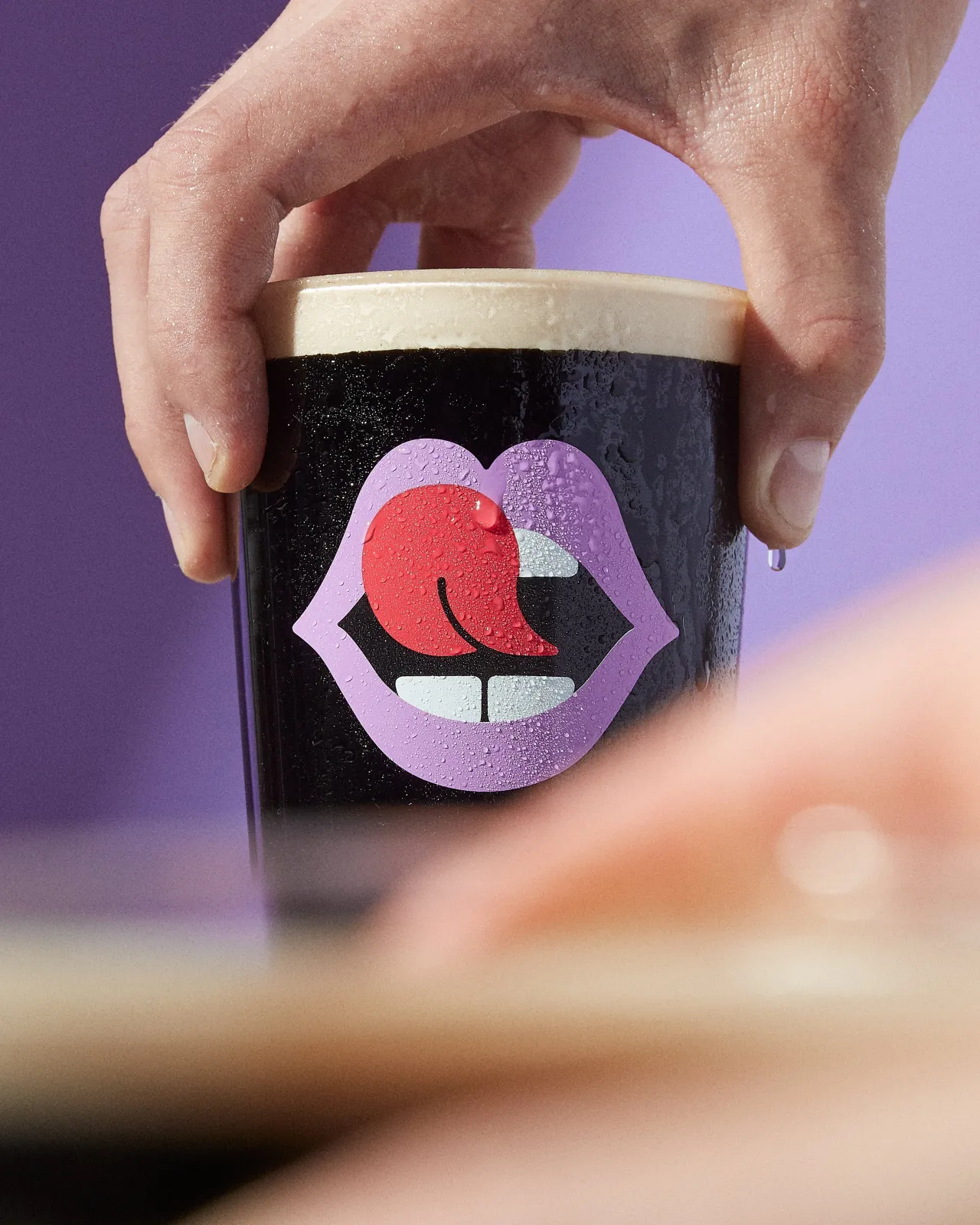
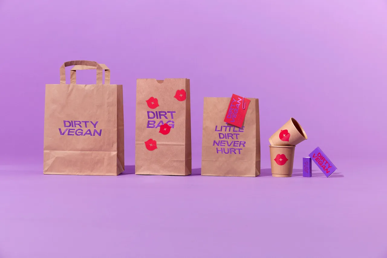
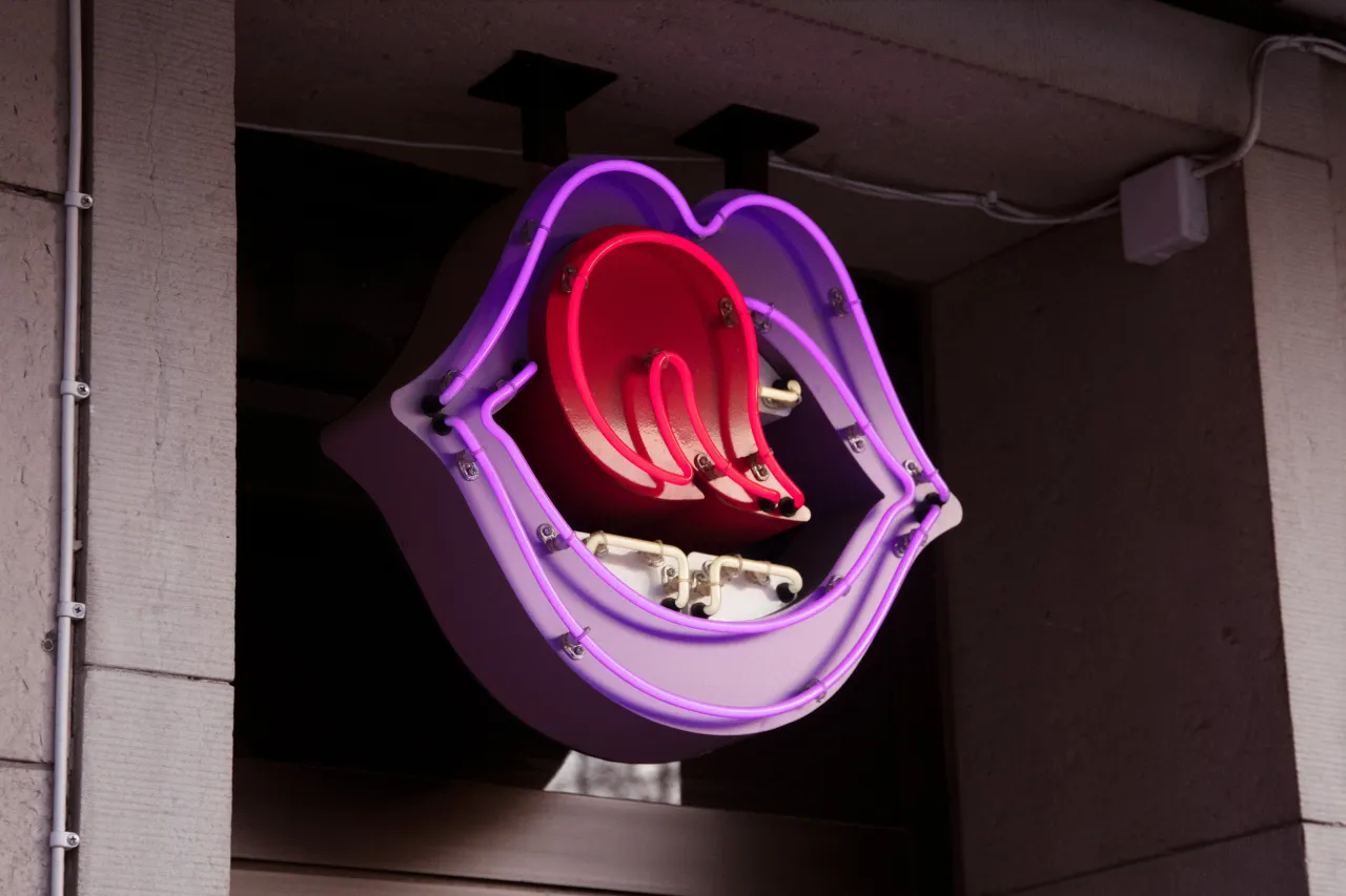
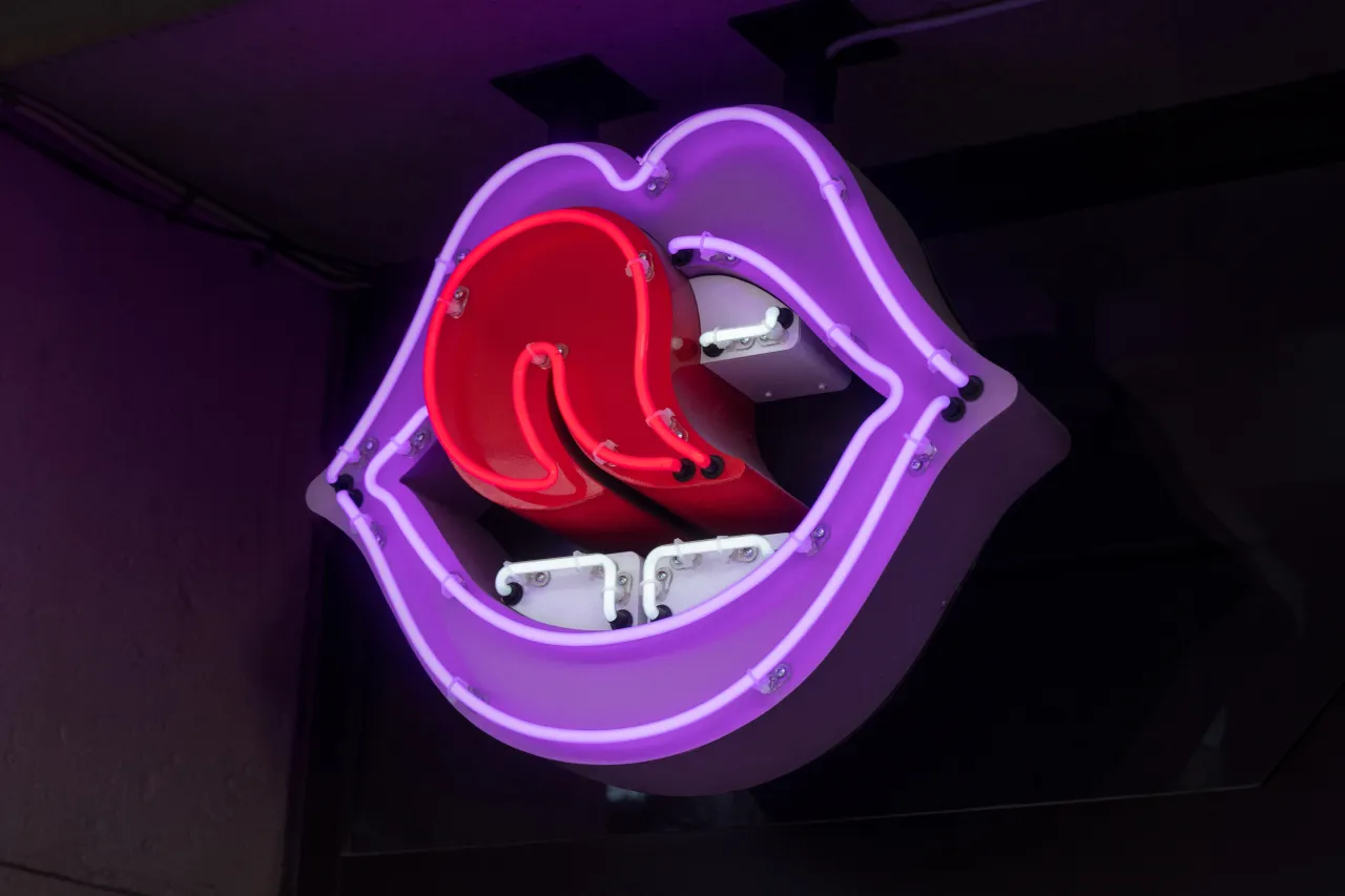
Consequently, the mouth-licking symbol is obviously the key component of the whole identity. "I think it perfectly captures the feeling of yummy food while adding an edgy nightclub vibe without going overboard," says Jens.
And the mouth is a great starting point for creating a wider design system, allowing the lips to take on different dynamic expressions. "From the original lip-licking mouth to the kissing mouth and drink-related expressions for the coasters, the possibilities are sort of endless."
In designing it, Jens was mindful of all the potential outcomes and executions. "I aimed for a less corporate, more illustrative feel while ensuring it remained clean and functional," he explains. "This way, it could easily be produced as a layered neon sign, work for smaller prints as pins, multicoloured screen prints on beer glasses, and more."
Colours and typeface
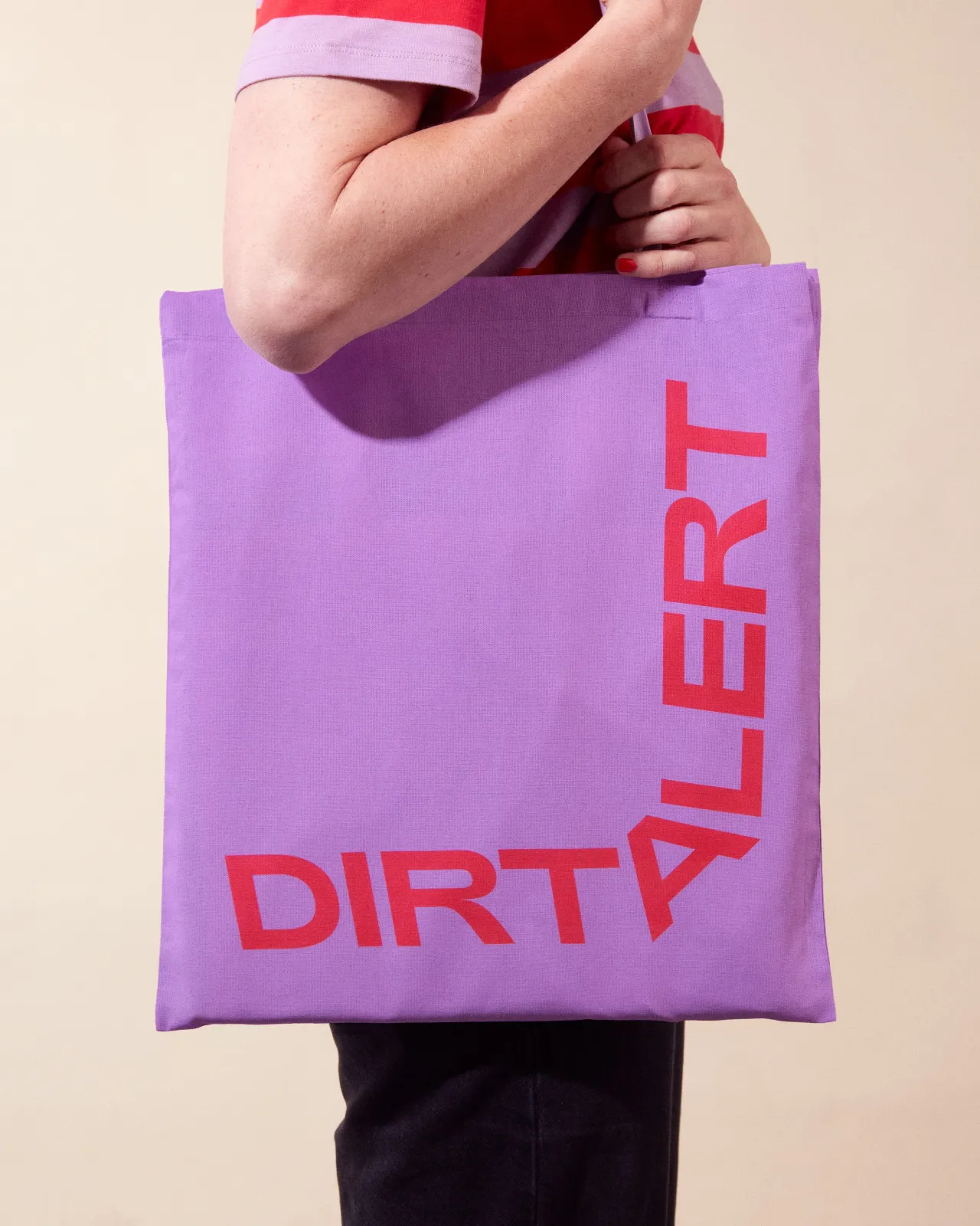
When it came to colours, his main goal was to move away from the typical eco-friendly green that has been wildly overused in this sector. "Red and purple were chosen to really set us apart, but also logically match the colours of lips and a tongue," says Jens.
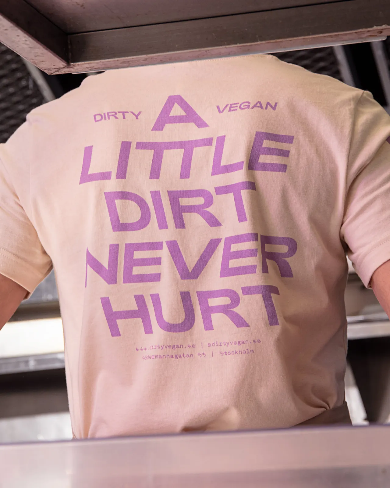
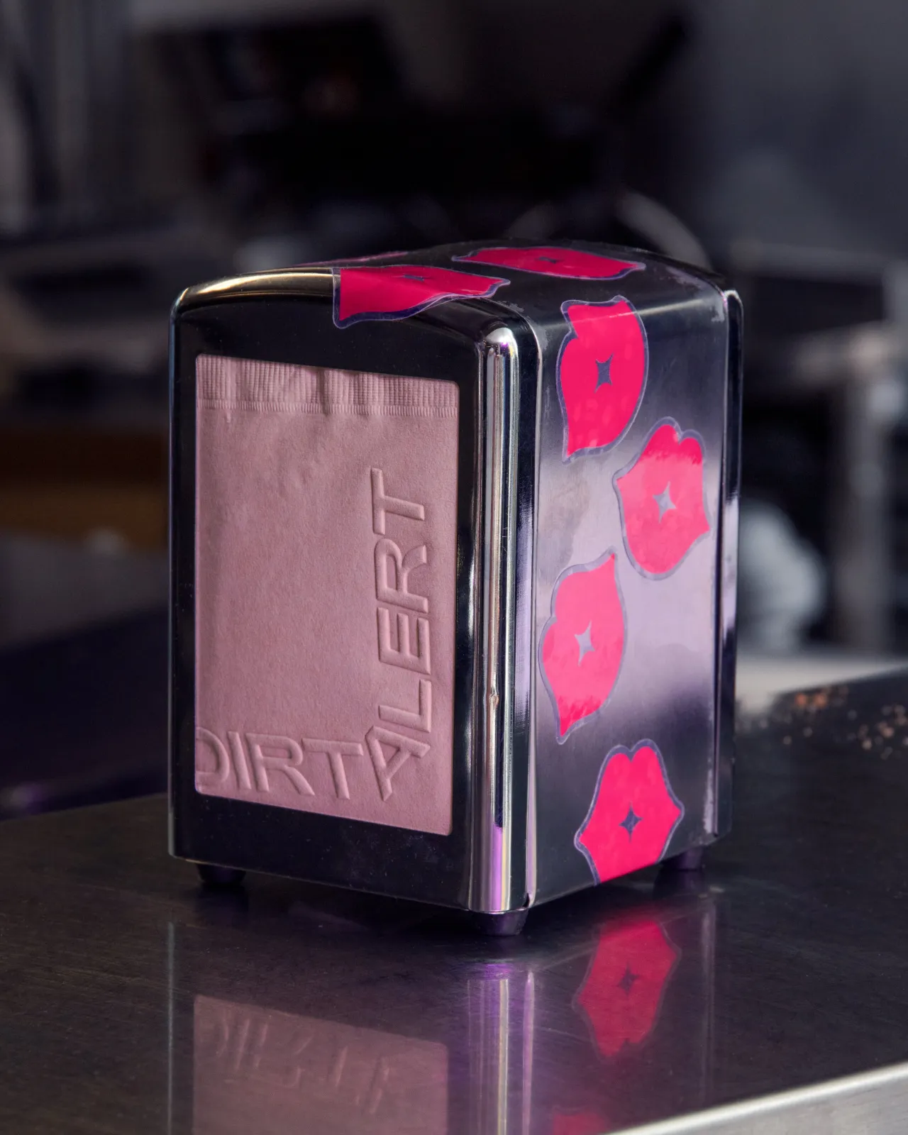
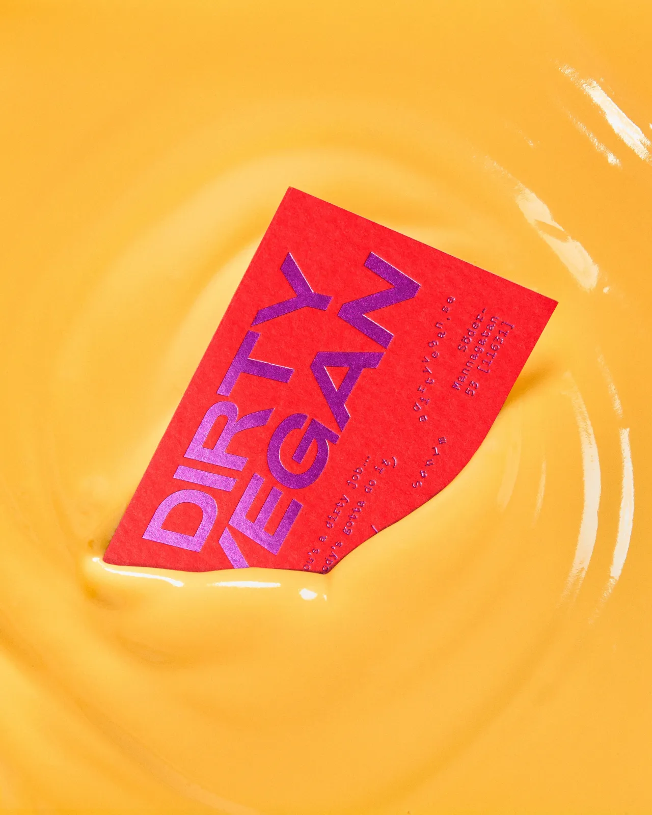
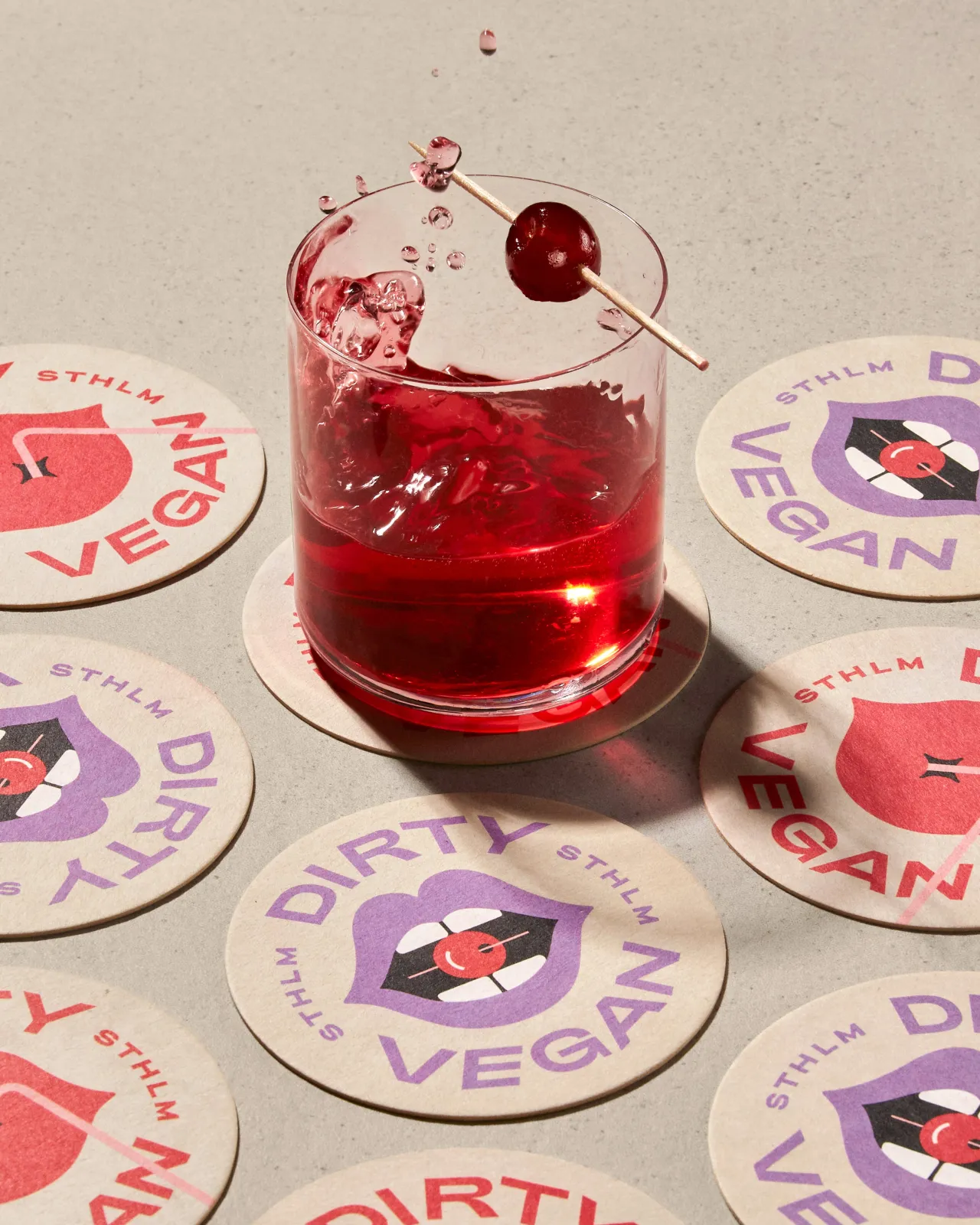
"I also liked the bold combination of strong red and warm purple. The forbidden, low-contrast look felt like a perfect fit for this project."
For the main typeface, meanwhile, he chose Adieu by Good Type Foundry. "Looking at other similar burger joints and their current trends, it seemed like everyone was moving towards a 'Burger King' style with soft, retro-styled serifs," Jens reflects.
"While I love Cooper Black, it felt similar to the green colour that is overused in this context. So, I decided to go with a more contemporary sans serif to create an interesting contrast with the mouth symbol and the use of brown paper."
Photography and printing
As for photography, Jens pushed things as far as I could. "While thinking of the storytelling and the red thread of it all, I also wanted every image to feel like 'hit'," he recalls. "Like something really worth saving or pinning.
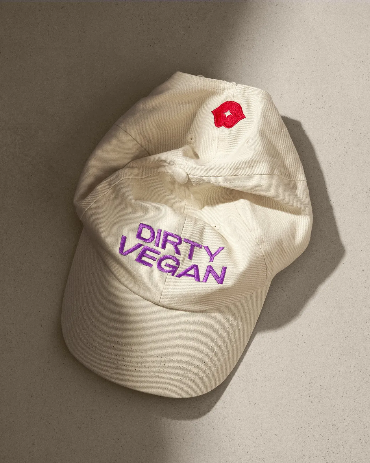
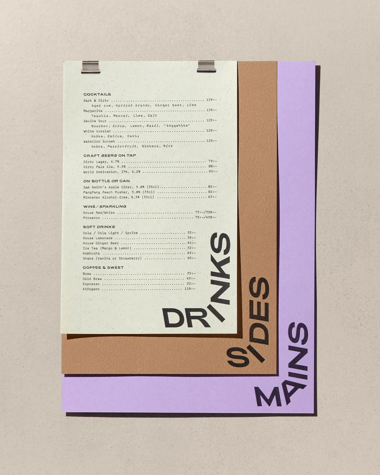
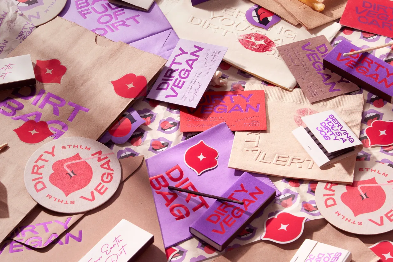
"I actually counted, and it took me 5894 RAW files, months of photography sessions and retouching, and around 1,2 terabytes of disk space to complete around 40 images."
As such, when he sent the final print files of the sign to the signage producer, he got quite nervous about the outcome. "Did I get the depth of all the parts right? Is the size perfect? I ended up staying up late that night, making a 1:1 scale paper prototype of the sign just to make sure I got it all right."
Combined with animation, created in partnership with Brikk Studios, it all adds up to a strong, confident visual identity that knows what message it wants to send and does it in style. Unfortunately, the restaurant itself, which has mixed reviews on Tripadvisor, is currently closed but plans to reopen in a new location soon.
Editor's Picks





Trending






Latest Jobs
Creative Project Manager at Analogue
Full-time·Leeds·£28k–£35k
Account Manager at BUILDHOLLYWOOD
Full-time·London·£34k–£38k
Midweight Designer at Catalyst Creative
Full-time·London·£32k-£36k
Senior Operations Manager at BIG Partnership
Full-time·Glasgow·£45k–£50k
Midweight Designer at All Purpose
Full-time·London·£30k–38k
Growth Strategist (Ecommerce) at Tribe
Full-time·Exeter / London·£50k + Bonuses