Free The Birds revamps skincare behemoth, Bepanthen
Following the stunning refresh of the Bepanthen portfolio for global life sciences company Bayer, creative agency Free The Birds has created the new designs for dry-skin brand Bepanthen Derma.
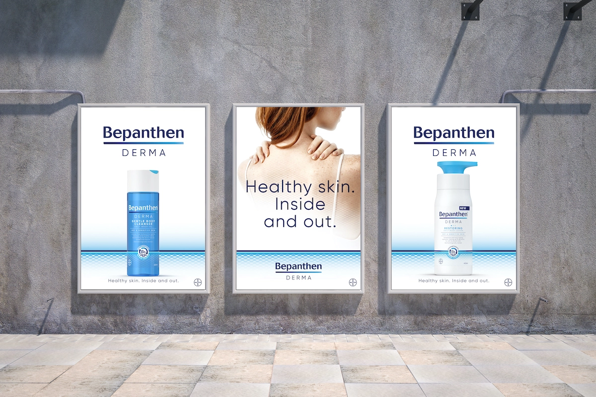
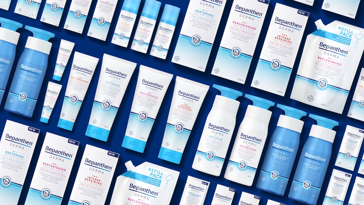
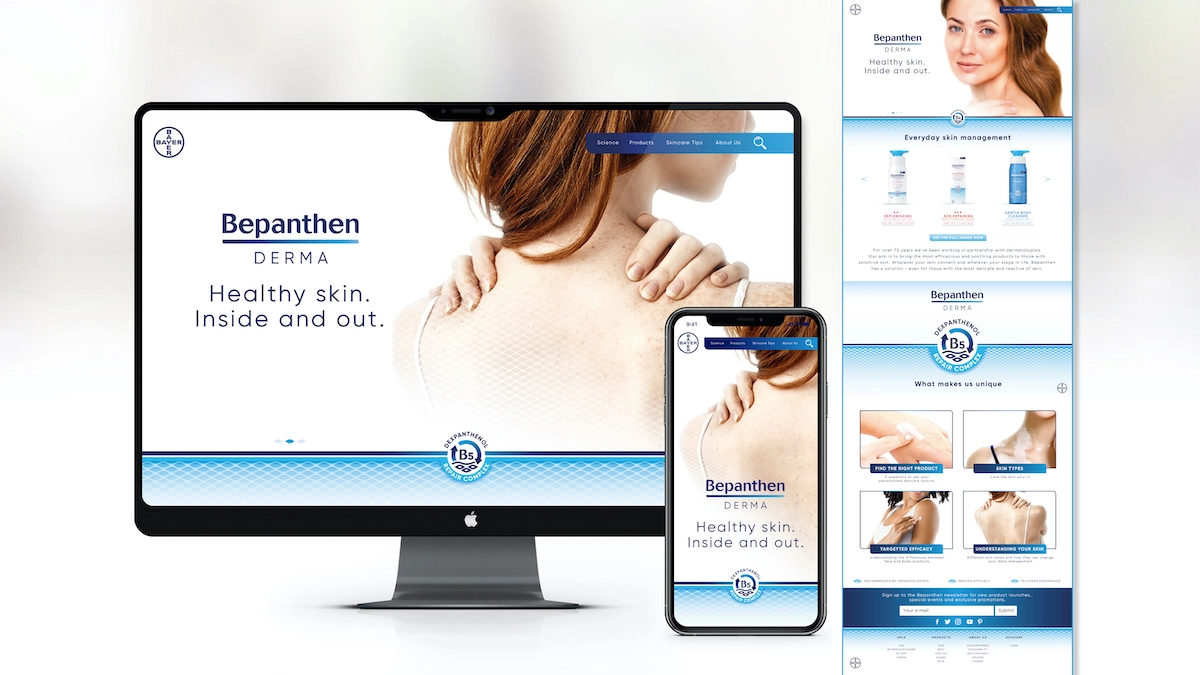
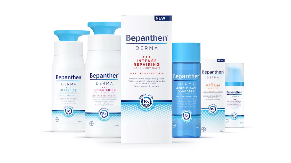
Free The Birds created new branding, 2D and 3D packaging designs, typography, illustration, tone of voice and photography for Bepanthen Derma, "bringing together Bepanthen's 75-year heritage and proven efficacy with familiar category codes and semiotics from the cosmetics space," according to the team.
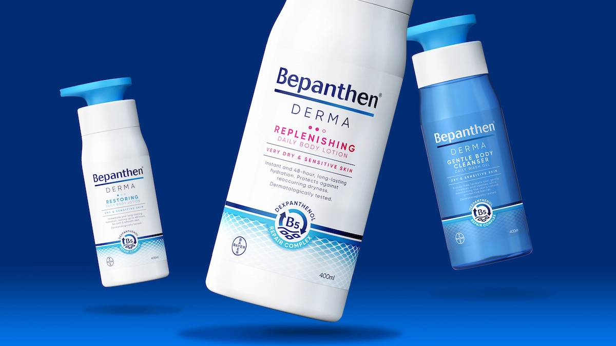
Free The Birds created a new graphic depicting the skin's surface and cells layered over a gentle gradient in the brand's core colours of blue and white, aiming to communicate a sense of action, efficacy and skin barrier repair. This graphic is used consistently both on the packaging and on other applications.
On the packaging, the graphic is paired with a 'B5 icon' to signpost Bepanthen's signature ingredient, while the typography was designed to clearly and directly communicate the product's benefits in an "empathetic" tone of voice that moves it on from its clinical origins. A new logo lock-up looks to convey a sense of trust, heritage, and expertise by using the blue gradient in the underline referencing the healing process.
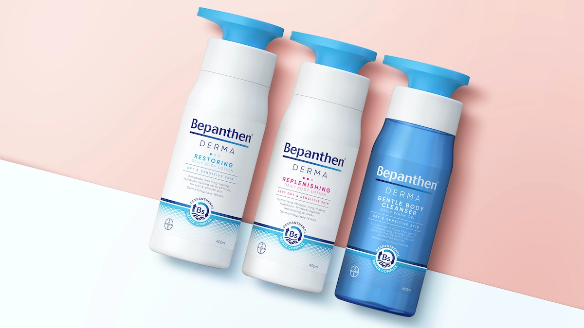
For Bepanthen Derma, a secondary colour palette of bold orange, red, magenta and purple is set against the brand's blue and white.
The agency also created on-pack copy and was involved in naming the different variants in the range to help engage consumers looking for daily skincare products, such as Restoring, Replenishing, Repairing and Regenerating.
"The brand felt very clinical and pharmaceutical-orientated, which limited consumers' perceptions of it to a medical treatment, rather than a product they might select as part of their daily skincare regime," says Sara Jones, partner and client services director at Free The Birds. "Our challenge was to build on Bepanthen's established positioning and develop the design for a new, everyday skincare product by balancing its trusted science and medical expertise with the familiar visual cues seen across the cosmetics category."
Free The Birds also collaborated to design the new 3D pump structures for Bepanthen Derma's wash and cream products with product design consultancy PENSA.
The new branding and packaging global rollout follows Free The Birds' previous work, refreshing and consolidating the entire Bepanthen design portfolio, which also includes wounded skin, baby skincare, and medicated skincare ranges.
Editor's Picks





Trending






Latest Jobs
Paid Media Executive at Munro Agency
Full-time·Glasgow·From £27,000
Client Partner at Halo
Full-time·Bristol·£30k–£36k
Art Director at SPOKE
Full-time·London·£55k-65k
Frontend Developer at Northern Artillery
Full-time·Leeds·£35k–£45k
Talent Agent & Producer at The Jacky Winter Group
Full-time·Los Angeles·$70k-$85k
Senior Digital Designer at 3800
Full-time·Sheffield·£40k-60k