Free The Birds launches a refreshed visual identity with new shorthand logo
The London agency specialising in beauty, health, and homecare has rebranded itself for a new era dominated by AI.

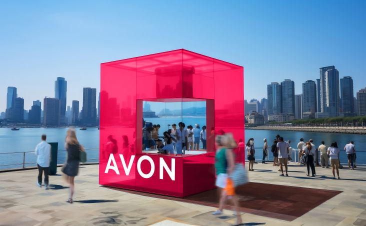
The name Free The Birds should be a familiar one to regular Creative Boom readers. Launched in 2018 and based in London, the agency specialises in beauty, health, and home care, and has quickly become known for its award-winning work for big names such as Boots No. 7 and Bepanthen Derma, as well as challenger brands like inclusive men's grooming brand The Fellowship. Other household-name clients have included Bayer, Erno Laszlo, Coty, Hello Day, P&G, Sunday Riley and Sanofi.
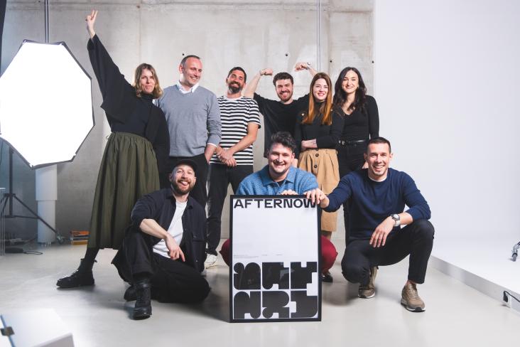
Now Free The Birds, which describes itself as an "independent brand elevation agency", has turned their design talents inward and developed a new visual identity for themselves, the first since their launch.
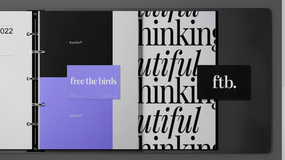
The new identity aims to reflect Free the Birds' core value, which they call 'Beautiful Thinking'. In their own words, the idea is to "elevate clients' brands above the everyday, injecting soul into every element of a visual identity to build stronger connections".
The rebrand celebrates the story behind the agency's unusual name: when famed artist Leonardo da Vinci would see a caged bird for sale in the Florentine markets, he would purchase them simply for the pleasure of liberating them.
Their new identity follows a pivotal year which included a global rebrand of heritage beauty brand Avon, as well as the launch of Free The Birds' own award-winning product, Beautiful Thinking.
This functional room fragrance, awarded at the Pure Beauty and Pentawards in 2023, is designed to work on a mental and olfactory level to enhance imagination and focus. Free The Birds donates all sales to Create, a charity that empowers young people via the creative arts.
Visual elements
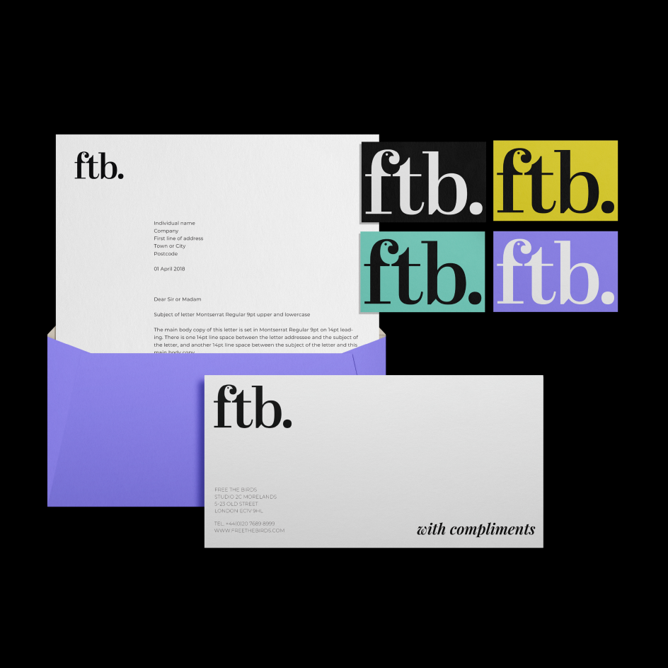
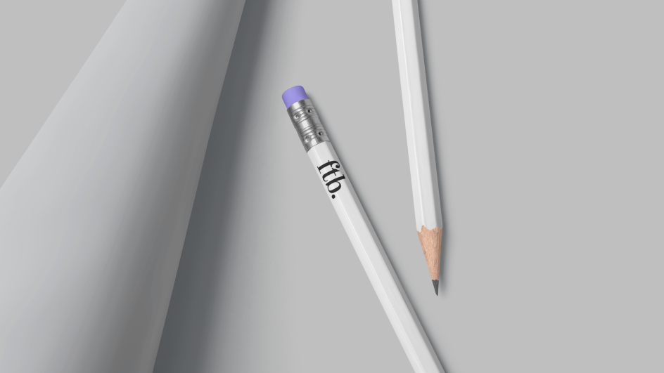
The refreshed visuals include a new shorthand logo based on its initials. This design is seen as a natural progression for the agency as it passes half a decade in existence. Rather than replacing the business's full name, this abbreviated logo is designed to speak to the confidence, authority, and boldness with which the agency moves forward. The full stop adds further weighting.
"Over the years, our growing relationships with our fantastic clients have seen the shorthand FTB become more regularly used," explains managing partner Nick Vaus. "So it was a natural progression that our own visual identity brings this shorthand to life. Something succinct for our team and clients to keep engaging with without losing any authority, confidence, or boldness that we infuse in our work. The design of our new logo reminds me of editorials; it is modern but has a traditional feel. Timeless."
The agency's motto, Attitude, not Age, also plays an important role in the new visuals. The bold type speaks to confidence and a desire to "make this attitude beautiful; to bring a smile to the mind". The team of designers endeavoured to create something that feels conversational and informed but without arrogance. "It is a conversation which you want to be a part of. It might be a bold sans serif, but it is softened to ensure it is approachable."
Nick adds: "It has been an incredible few years for the team as we champion our ethos of bringing Beautiful Thinking to life in the work we create for our clients daily. It was only fitting that we welcome the new year and new possibilities of what we can achieve as a team, with a new look and feel that speaks to our desire to be bold."
Influence of AI
Partner and creative strategy director Paul Domenet adds that the new identity reflects how generative AI is changing how design agencies work. "It means our clients are seeking support in turning a project around, from start to finish, with greater speed, whilst losing none of the impact," he explains. "This is a challenge we accept with open arms, an environment we thrive in. The value of the original idea cannot be diminished by the speed at which we can and should be working today. We're excited for this new chapter."
He continues: "We are currently facing a time that simultaneously presents a wealth of opportunities and challenges. While many creatives feel the threat of AI looming, others advocate for its ability to visualise the response to a brief in previously impossible ways. What we stress to ourselves and our team is that AI is to be celebrated and utilised. However, it cannot replace the ability to conceptualise and deliver unique ideas. For this reason, there will always be a place for the creative mind in the design process."
Nick adds: "The refreshed visual identity comes at a pivotal time not just for the agency but for creative industries as a whole. With developments such as AI on the minds of every agency across the globe, Free The Birds champions the potential of this new era with deliverables that have grown and accelerated. It marks an exciting period for the business, which champions the opportunity to boost its capabilities and expedite the time in which it can deliver work for new and existing clients."
Editor's Picks


Trending


](https://www.creativeboom.com/upload/articles/90/908fdb6378db1e95d12595416f54e6336d5e80b8_732.jpg)
Podcasts


Editor's Picks
Further Reading