Free The Birds reinvents global cosmetics brand Avon for the world of 2023
One of the world's biggest beauty brands needed a more consistent identity across all its global platforms. We explore how London studio Free The Birds made it happen.
For those aged 50 and up, the word 'Avon' instantly summons the advertising catchphrase 'Ding-dong, Avon calling!' Those of a younger vintage, though, may be unaware that the cosmetics brand, originally founded in 1867, was a huge name throughout the 20th century, known for selling its make-up door-to-door.
Yet, while it may no longer be on everyone's cultural radar, Avon is still very much active today around the globe. The second largest multi-level marketing enterprise in the world, after Amway, it recorded annual sales of $9.1 billion worldwide in 2020.
More recently, the company partnered with London-based design studio Free The Birds to develop a global rebrand as part of a long-term strategic brand refresh. It's now unveiled a new visual identity, which better reflects the brand's new 'Embrace your Power' positioning, which was developed by Wunderman Thompson and launched this January.
Free The Birds, which was founded in 1997, has a strong heritage in the beauty, homecare and health and wellness sectors, as well as food and drink, with clients including Bayer, Coty, Lindt and P&G.
Brief and scope
Initially, the brief for Free The Birds was simply to reinvigorate Avon's packaging design. However, the agency conducted a deeper audit into the current positioning of Avon globally and discovered that its identity had been diluted over time and had become inconsistent across platforms.
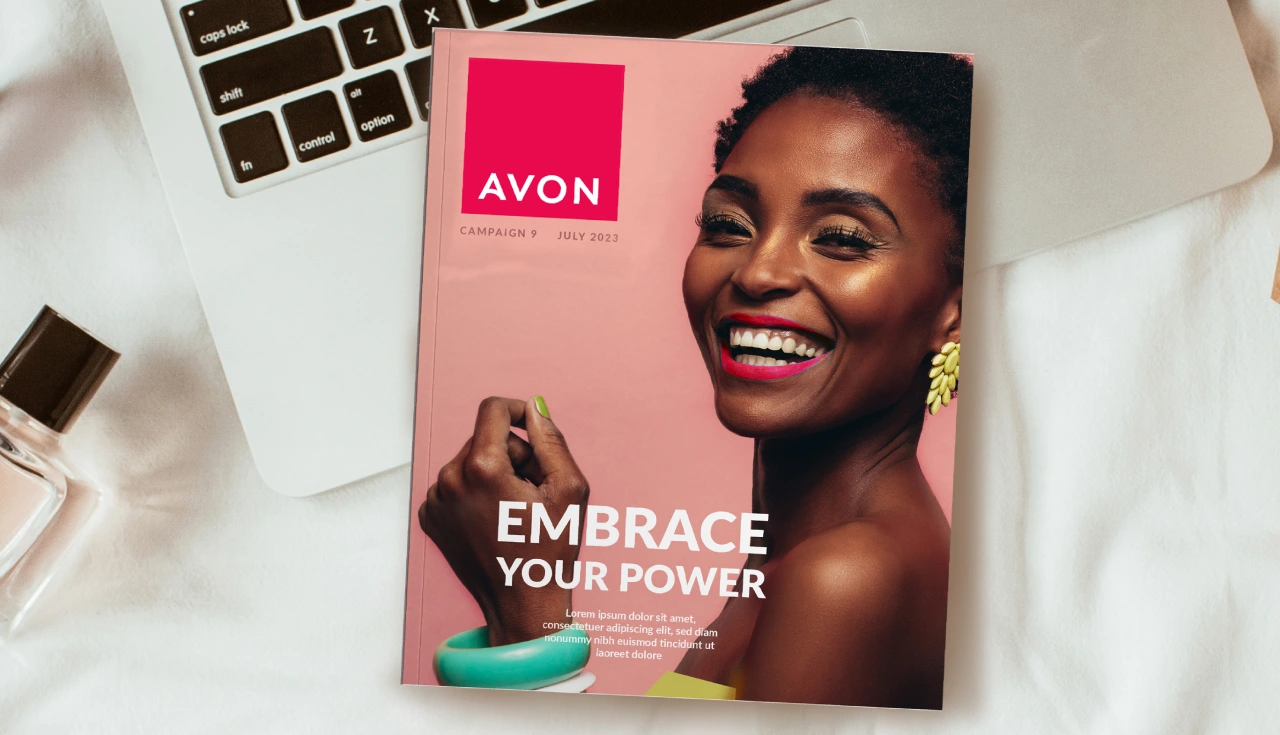
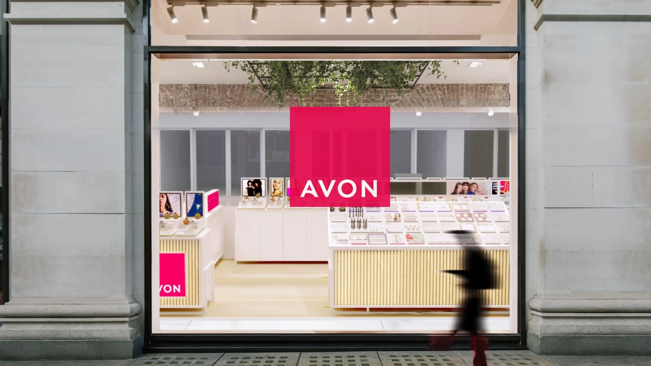
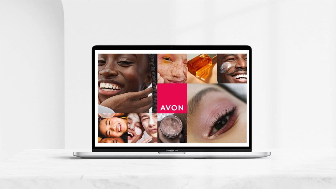
Consequently, they worked with Avon to develop a branded house approach: one cohesive strategy with a new visual identity for all brand channels and applications.
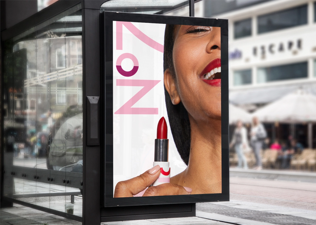
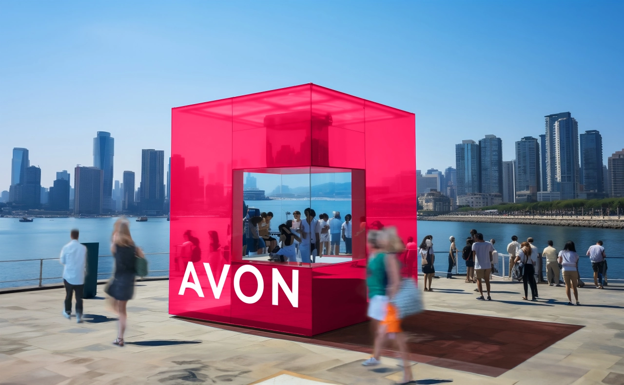
The re-energised brand world spans across visual and verbal identity, including a new hallmark logo, packaging design, website and social media assets. Brand equities include brand colour, primary typography, and other elements, including photography style, advertising layouts, brand guidelines, and brand visual personality.
These elements reflect Avon's new 'Embrace Your Power' brand positioning. The result is a new visual identity which celebrates the brand's belief that "every woman is born with her own unique power".
Logo and typeface
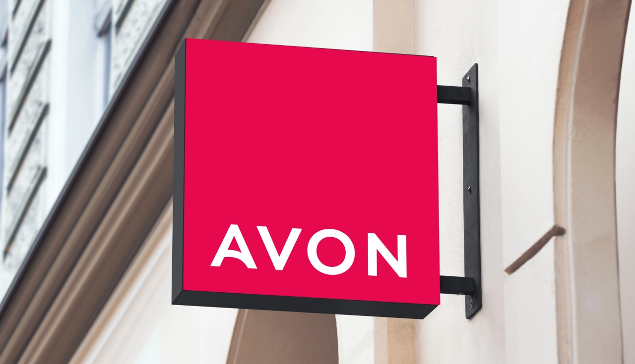
Free The Birds housed the hallmark in a strong plinth shape with a strong colour. The impactful use of 'power pink' is optimistic, bold and mobilising and also reflects the brand's values, such as the brand's longstanding commitment to fighting breast cancer.
As well as using new brand colours to reflect Avon's new positioning, Free The Birds partnered with Dalton Maag to evolve the typeface for Avon, remaining true to the original to ensure brand recognition, but refining the font to create more balanced letterforms.
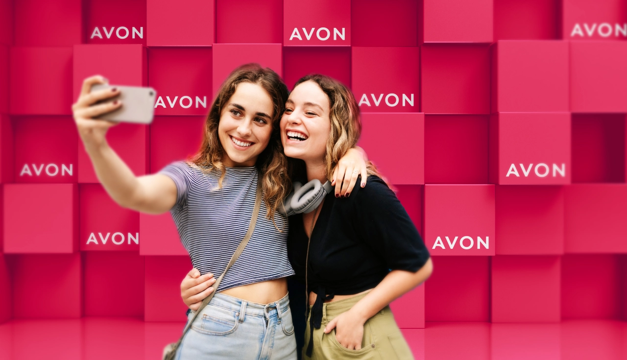
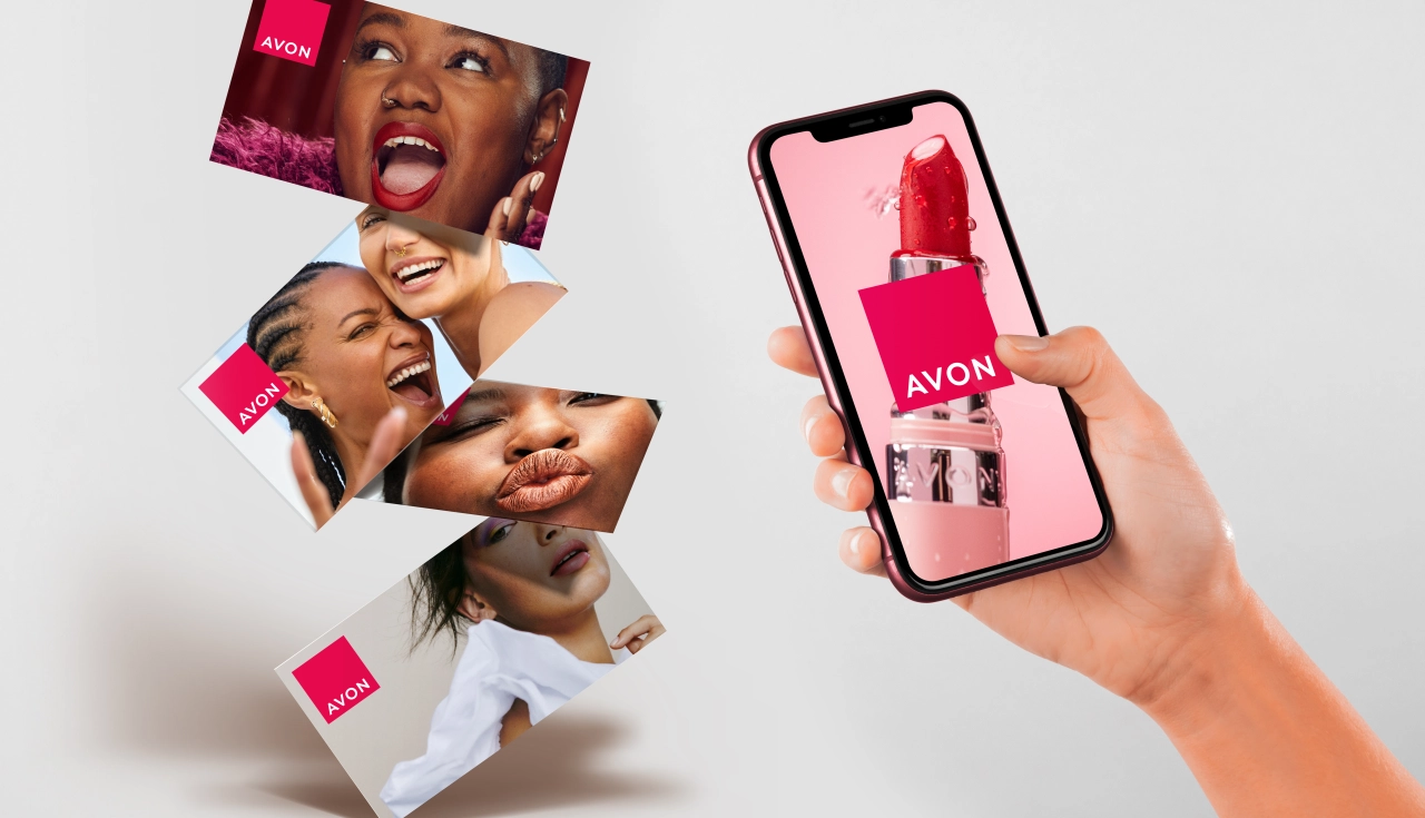
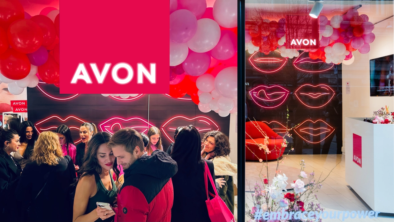
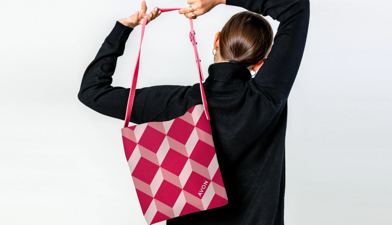
The rebranding campaign is rolling out across Europe, the Middle East & Africa, South Latin America, North Latin America and Asia-Pacific territories.
"Avon is an iconic beauty brand with true purpose on a global scale," says Nick Vaus, partner and creative director at Free The Birds. "But like all heritage brands, it must stay relevant, which requires purposeful transformation.
"It became very obvious very quickly the power and potential a total brand identity refresh would unlock. Partnering with the team at Avon to engage with this new look and feel has been a truly wonderful experience."
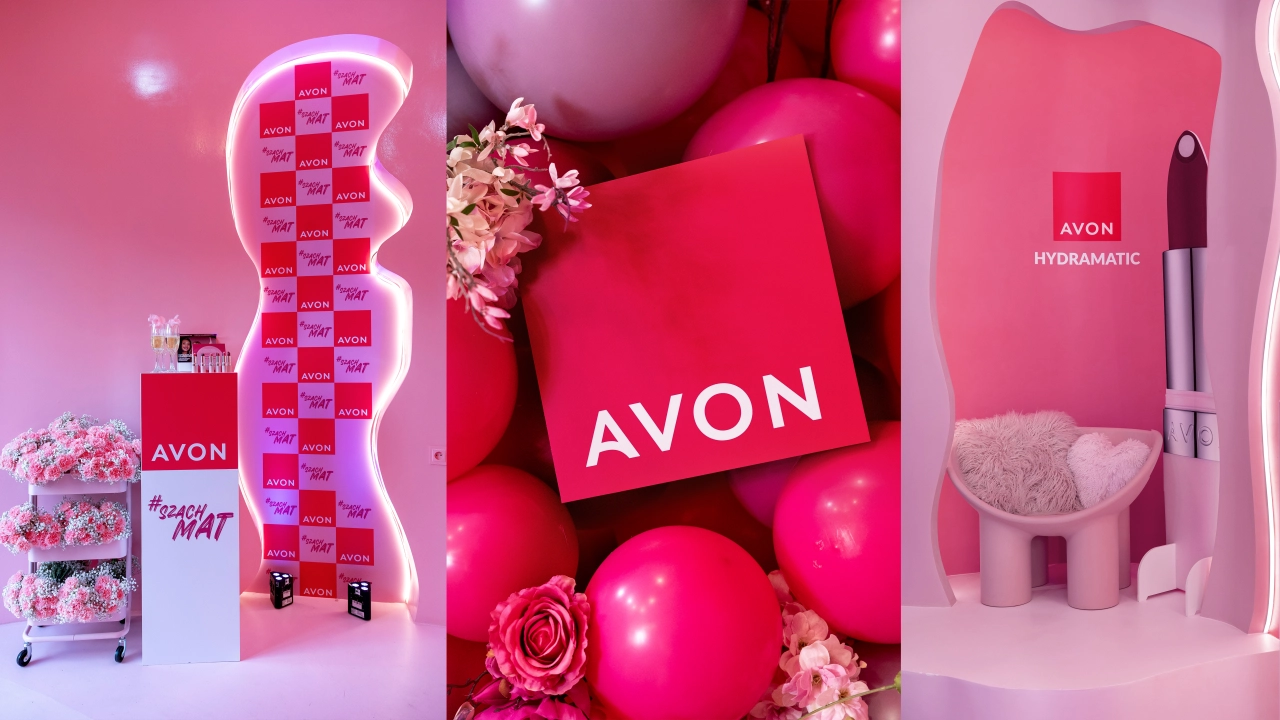
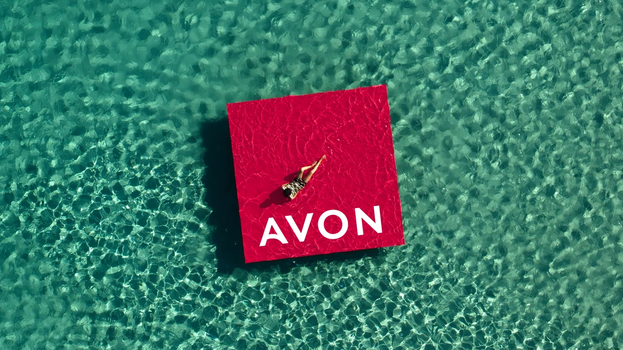
Kristof Neirynck, CMO at Avon, adds: "Our unique value proposition for customers is the personalised beauty services and advice by someone in their community who really knows and understands their needs. This rebrand aimed to celebrate Avon's USP in the market, which has always focussed on creating products that help our customers feel the best version of themselves.
"Working with Free The Birds allowed us to bring the Avon brand in line with this bold level of multi-channel transformation, and we're thrilled with the outcome of the collaboration on this project. The brand now matches the energy and empowerment that Avon brings to our employees, Representatives and our customers."
Editor's Picks





Trending
Latest Jobs
Manager, Visual Design Art - TFT at Riot Games
Full-time·Los Angeles·$166,600 – $232,800
Sr. Project Manager at Known
Full-time·Los Angeles·$85 per hour
Senior Consultant, Strategy at Interbrand
Full-time·New York·$100,000 – $125,000
Content Designer at Shelter Scotland
Full-time·Edinburgh·£35,582
Growth Marketing Lead at Anthropic
Full-time·San Francisco·$320,000 – $400,000
Staff Brand Designer at Mercury
Full-time·San Francisco·$189,400 – $236,700