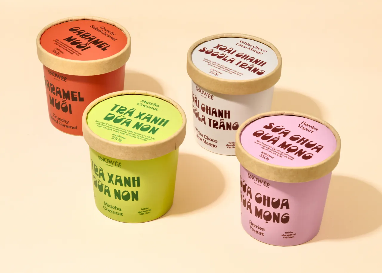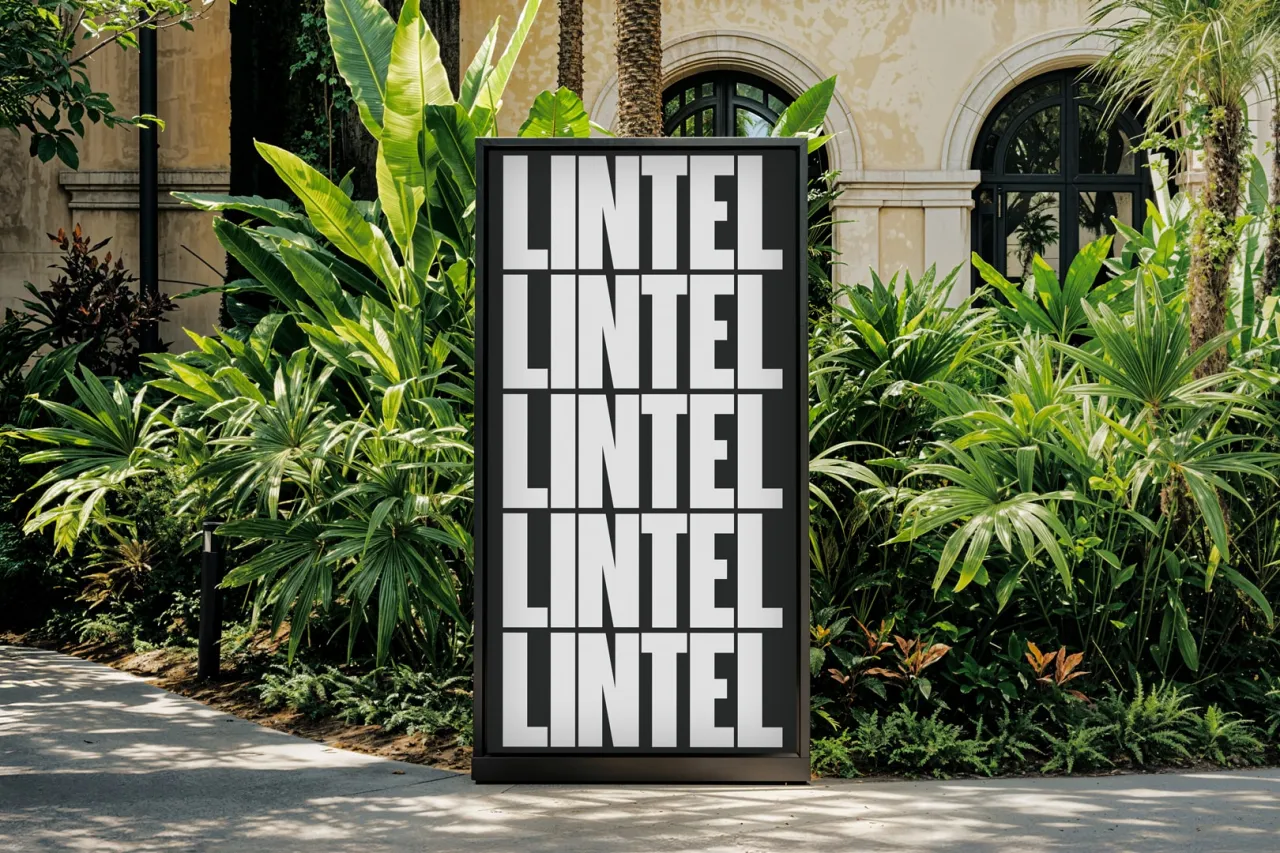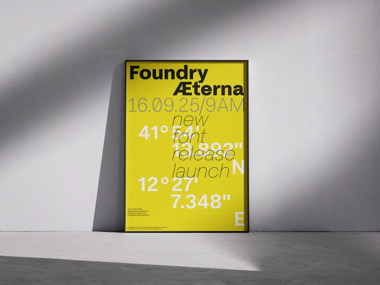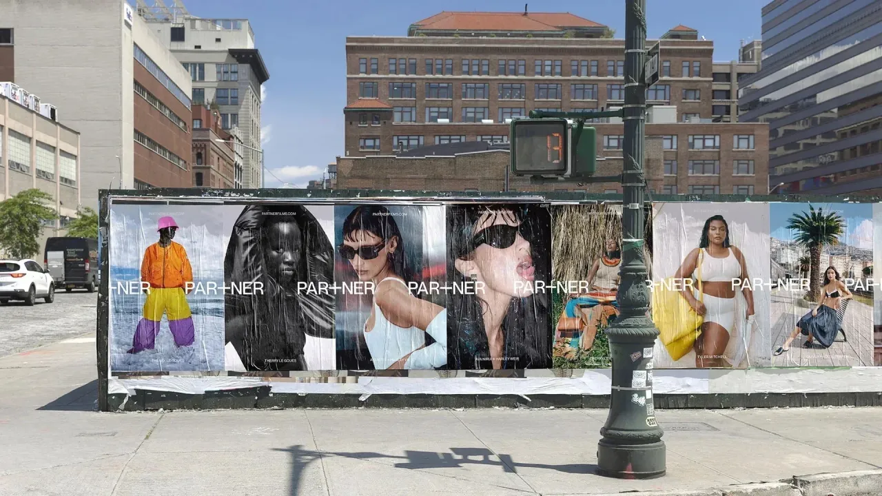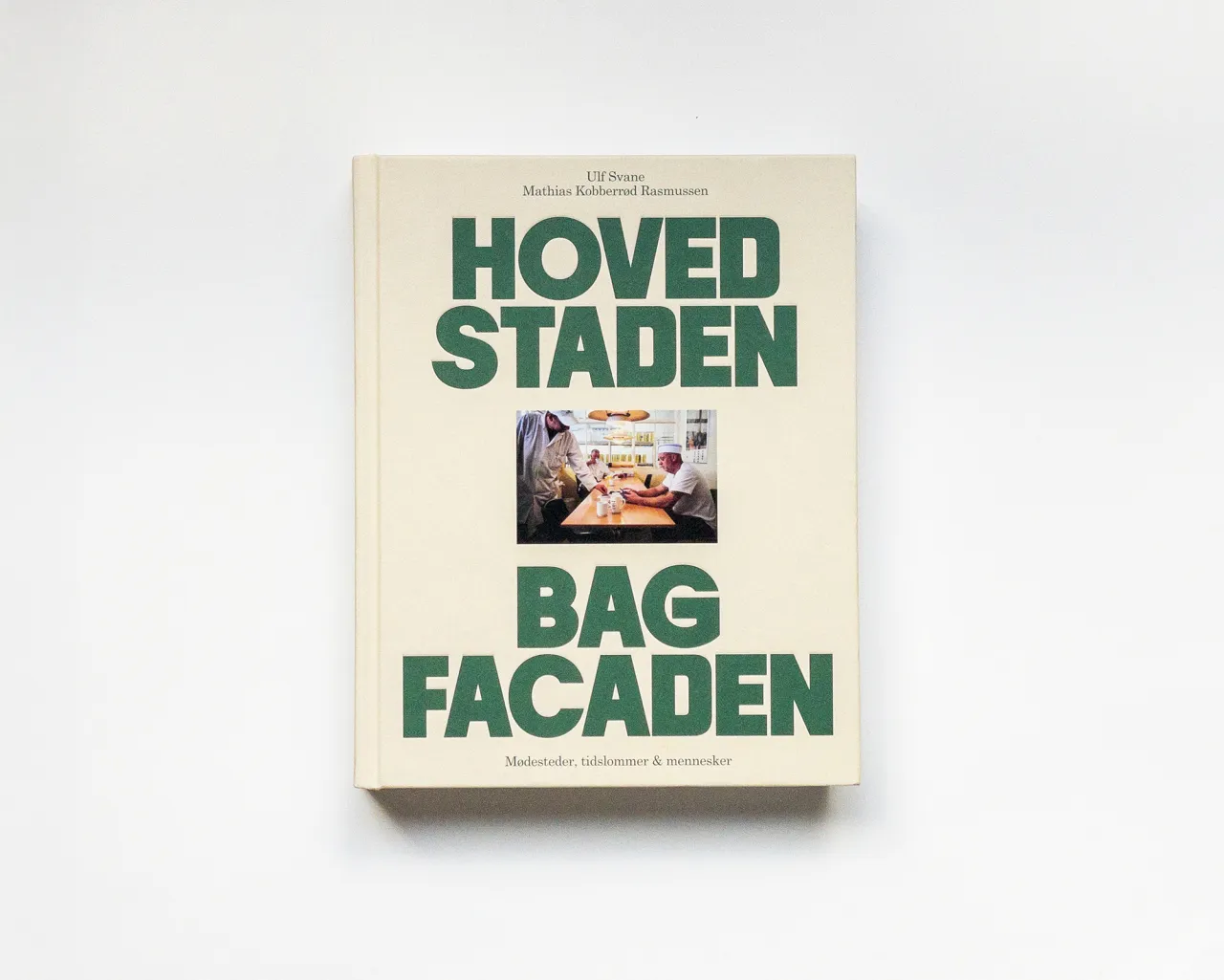
Fonts in Use: Spine Studio – Hovedstaden, using Malamocco and Century Schoolbook via Formagari
Hooray, winter is ending, and spring is on the way! And the third month of 2025 brings a captivating collection of typefaces that showcase the immense creativity and technical innovation driving contemporary type design.
This month's selection spans an extraordinary range of approaches, from Damien Gautier's poetic exploration of urban landscapes in Naancy to Applied Design's transformative accessibility work with Atkinson Hyperlegible Next.
So read on as we present six of the most compelling font releases of March 2025. Each offers a unique perspective on how typography can communicate, solve design challenges and reflect cultural nuances.
1. Naancy by Damien Gautier
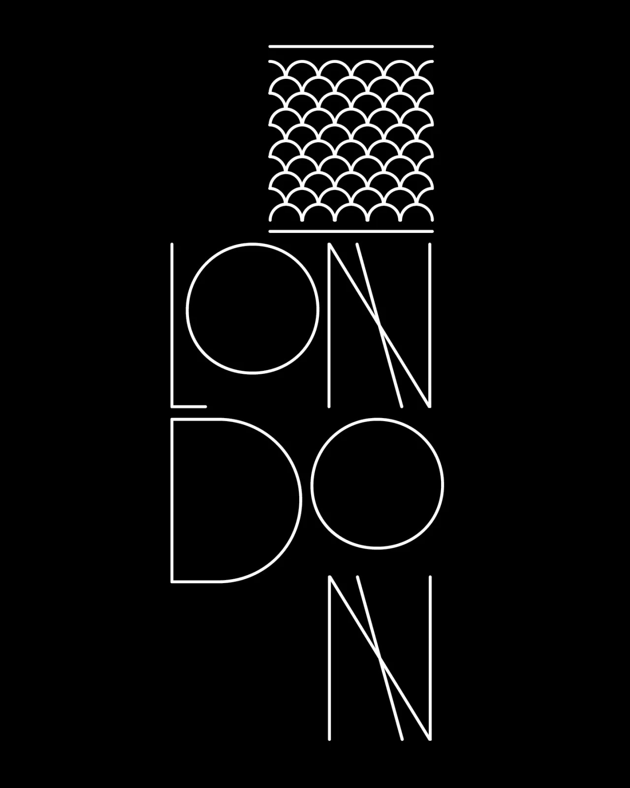
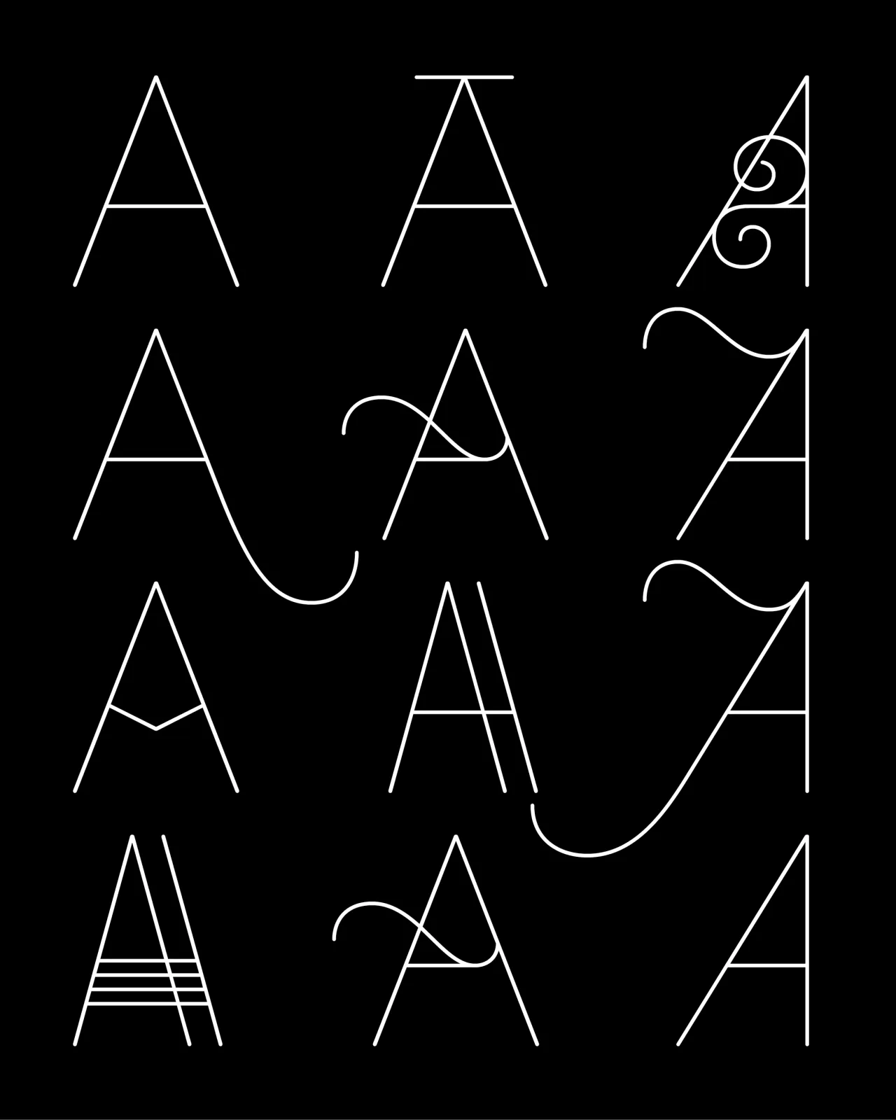
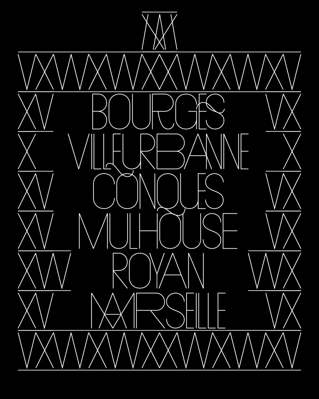
Naancy is as a multifaceted typeface born from five years of careful observation and design. Inspired by the French city of Nancy and its rich art and design heritage, the font beautifully synthesises Art Nouveau's organic curves with precise digital typography.
Drawing from architectural rhythms and natural forms, Damien Gautier has created a typeface that transforms dynamically. Initially appearing as a tight, geometric titling font, Naancy evolves through intricate ligatures and decorative letters, revealing a remarkable versatility. The design reflects Gautier's keen eye for urban landscapes, drawing parallels between typeface construction and the meticulous craft of metalwork.
2. Yet Grotesk by Emmanuel Besse
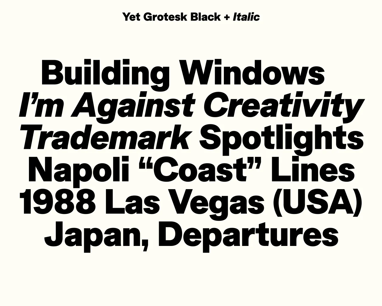
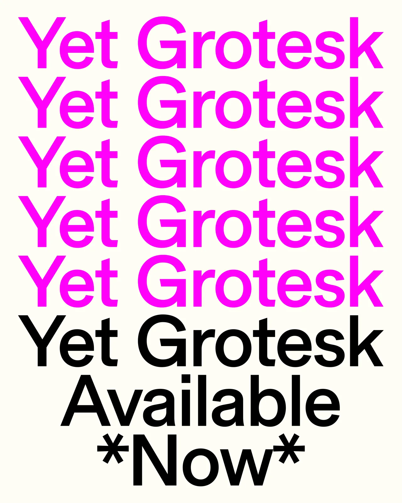
Yet Grotesk represents a thoughtful reimagining of the ubiquitous sans serif genre. Designed by Emmanuel Besse with assistance from Hugues Gentile, this 18-style typeface offers a nuanced take on a design classic, balancing familiarity with distinctive character.
Inspired by legendary grotesks like Akzidenz Grotesk and contemporary forms like Arial, Yet Grotesk aims to be a versatile, functional typeface. Its wide capitals, tight spacing and robust text blocks make it ideal for branding and editorial design, proving that even the most common typographic form can be reinvented with care and insight.

3. Atkinson Hyperlegible Next by Applied Design
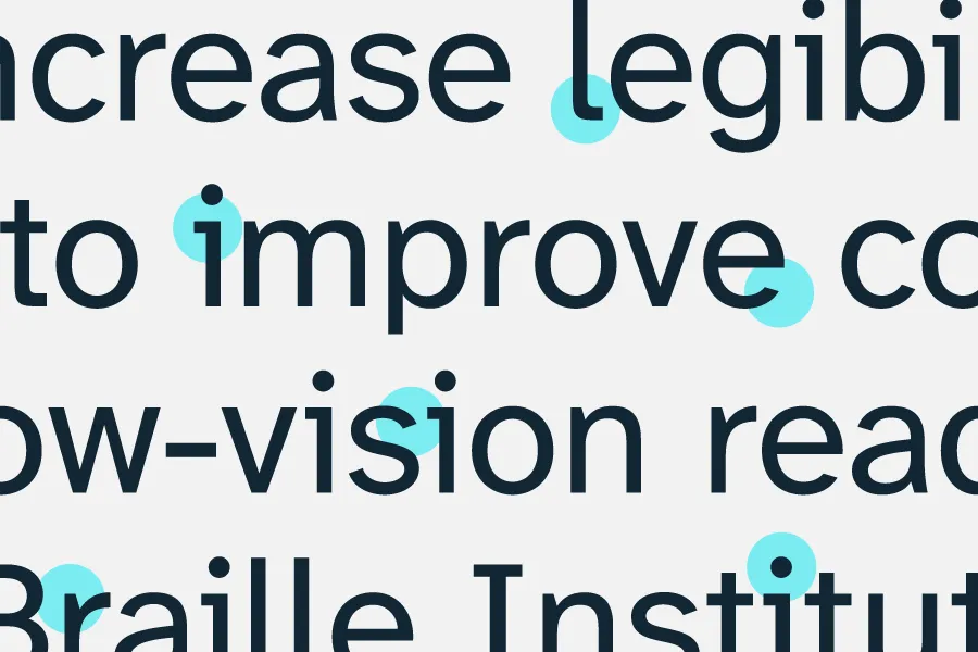
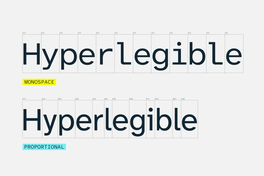
Atkinson Hyperlegible Next marks a groundbreaking advancement in accessible typography. Originally crafted in 2019 to enhance readability for people with low vision, it has now been expanded from two to seven weights, plus language support has been boosted from 27 to over 150. As such, the typeface addresses the needs of 285 million people worldwide living with vision impairment.
In short, with 4,464 characters per font and a new variable format, Atkinson Hyperlegible Next is not just a typeface but a powerful tool for global communication. Developed in partnership with the Braille Institute, this enhanced version of the award-winning typeface represents a profound commitment to inclusive design.
4. Fraise by Dalton Maag
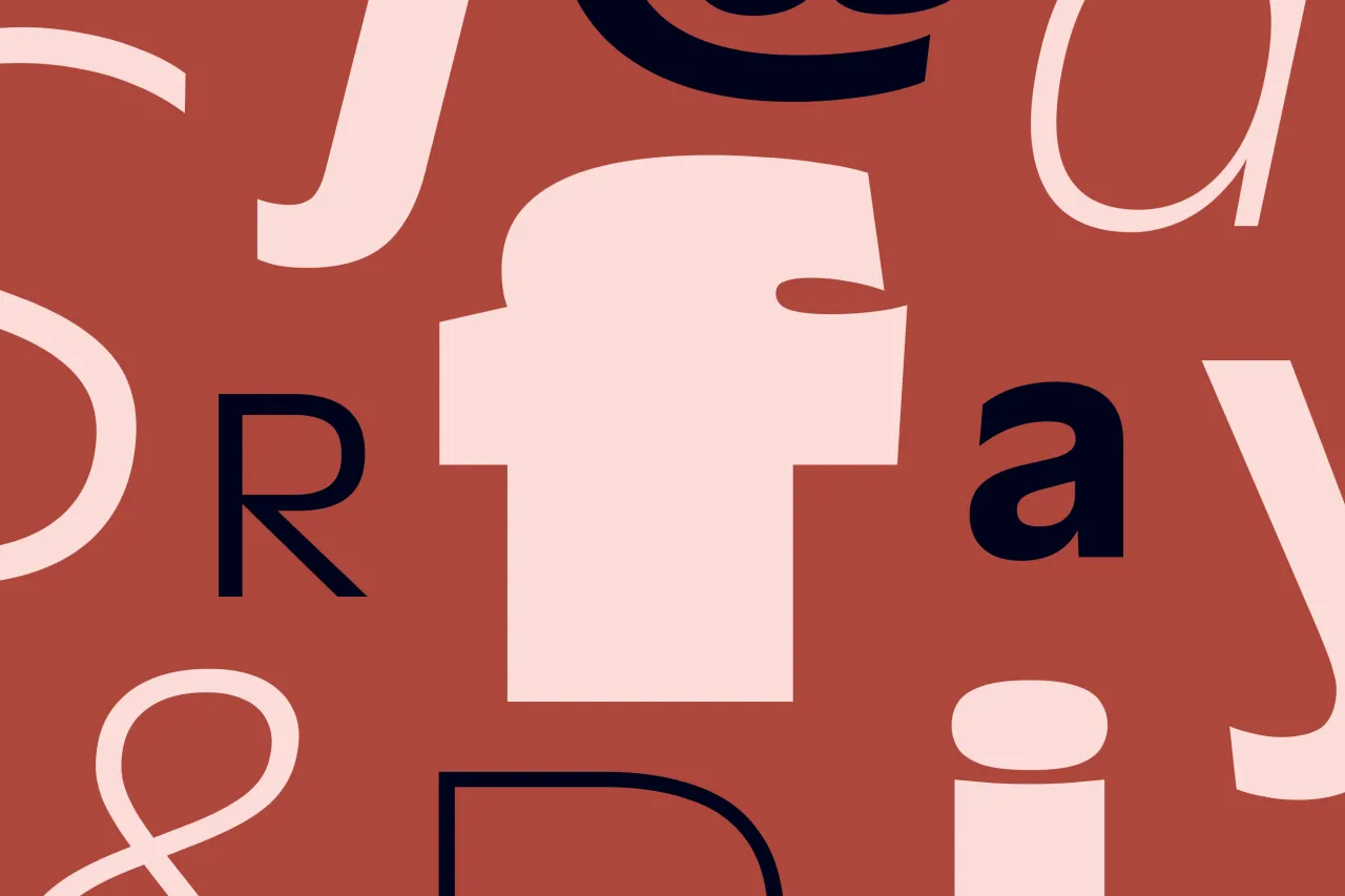
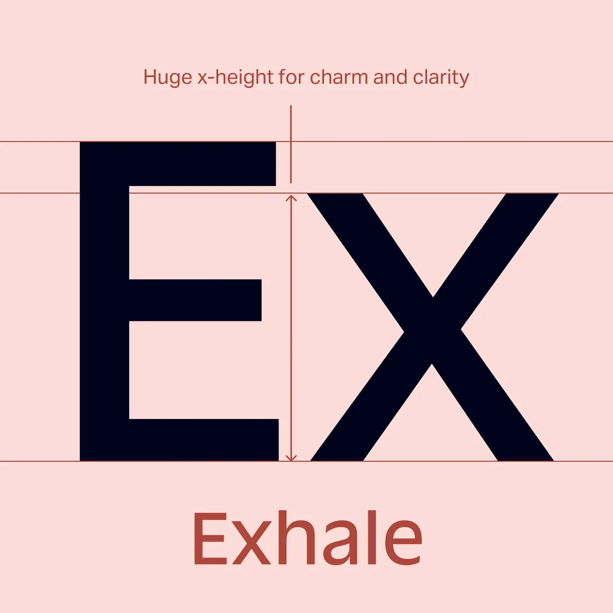
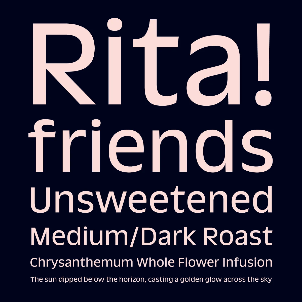
Fraise brings a fresh and fruity approach to the humanist sans serif genre. Inspired by the work of French typeface designer Roger Excoffon (1910-1983), this typeface features a tall x-height and distinctive round shapes that provide exceptional versatility across design and branding applications.
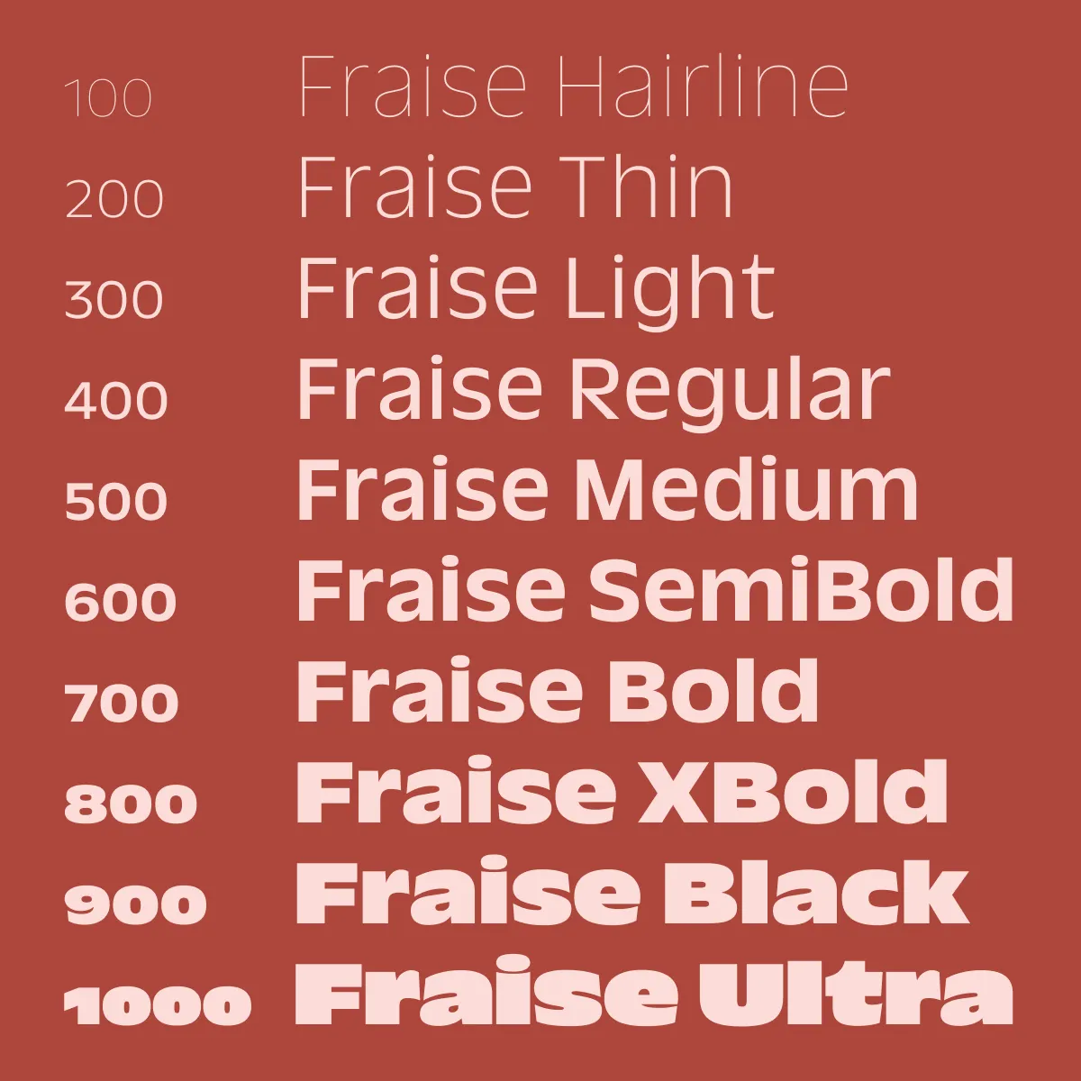
With support for over 790 languages and an extensive weight axis, Fraise demonstrates how contemporary type design can simultaneously honour historical influences and meet the needs of modern global communications.
5. Autoscape by LLineto
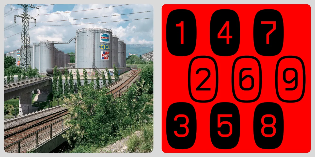
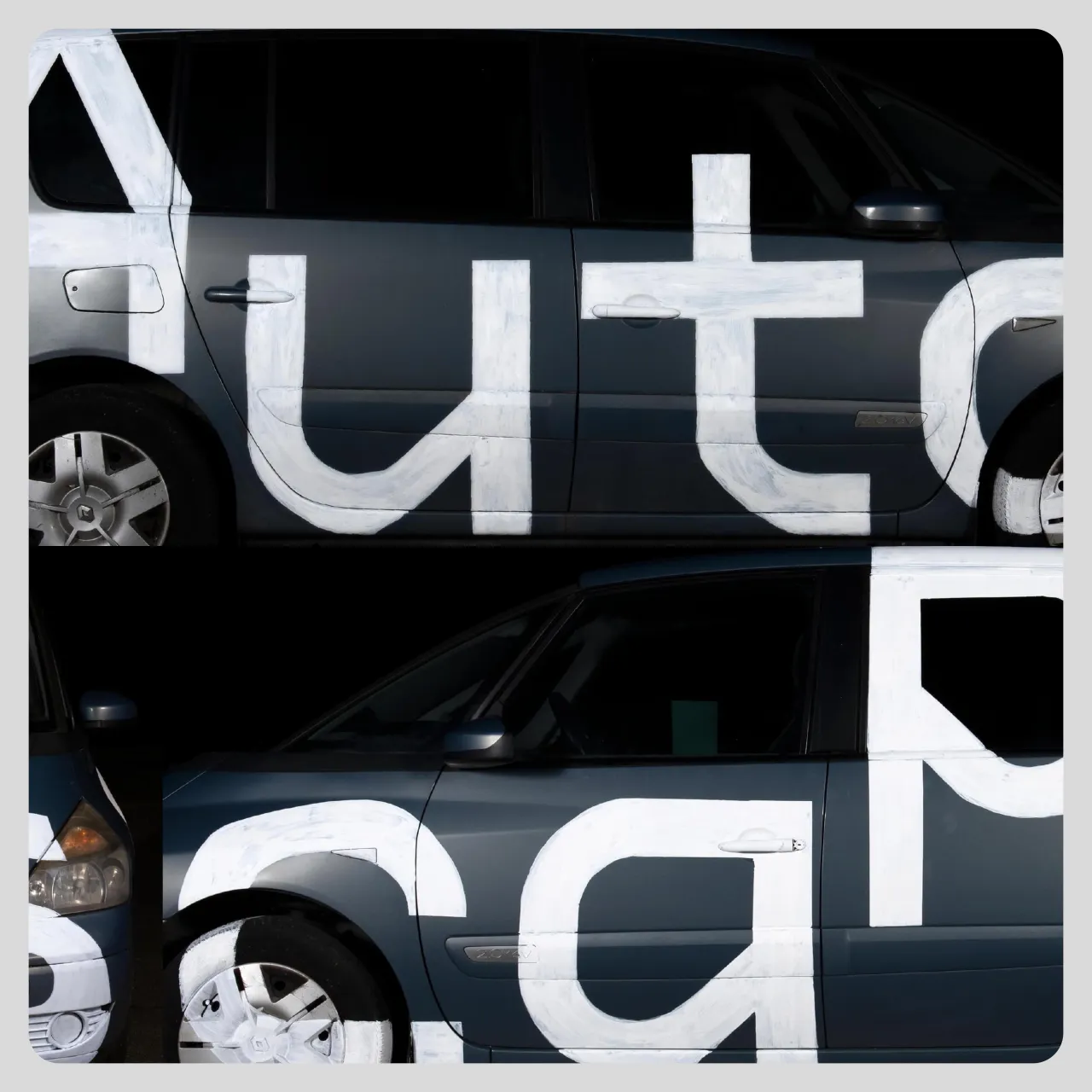
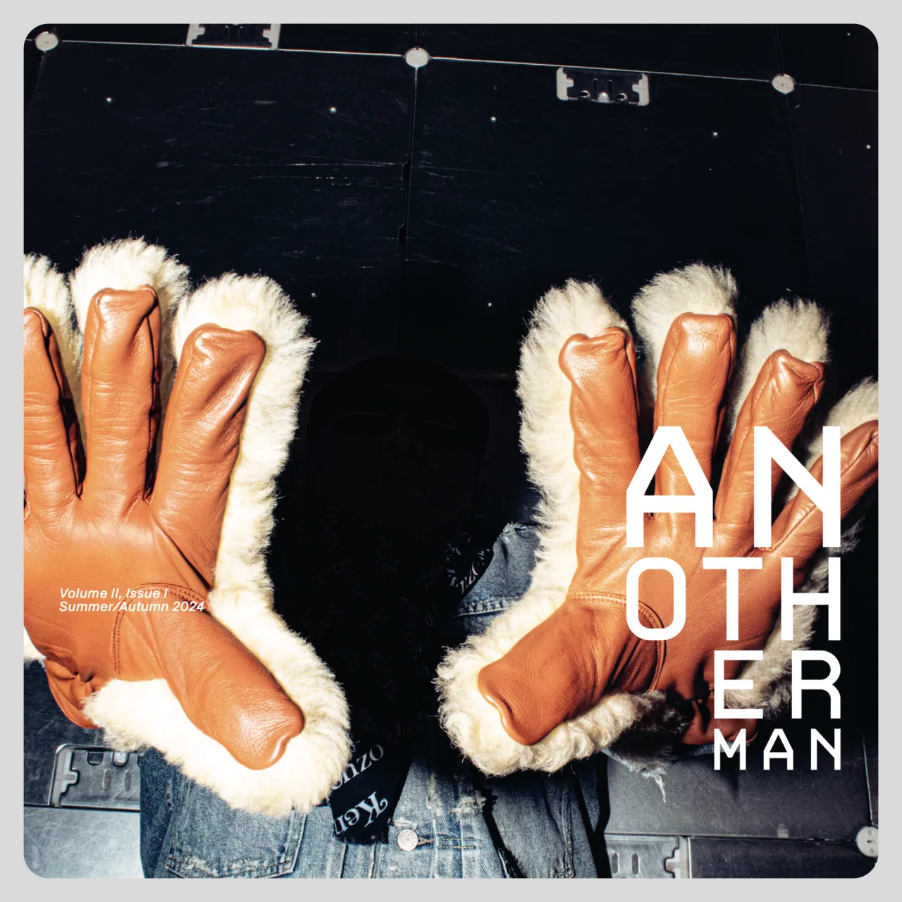
LL Autoscape has been on a fascinating typographic journey, transforming from a 1980s computer font to a sophisticated contemporary typeface. Now redesigned by Minjong Kim, who joined Lineto in late 2023, the font maintains its mechanical roots while introducing subtle optical refinements that enhance readability.
With both angular and rounded versions, Autoscape offers a variable range that makes it suitable for everything from coding environments to creative design projects. It embodies the evolving nature of digital typography.
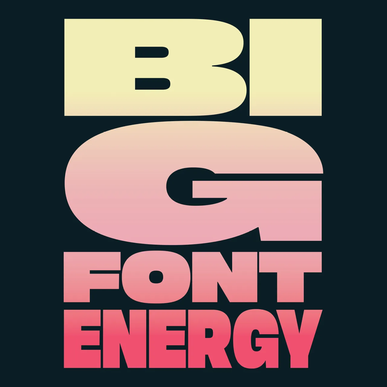
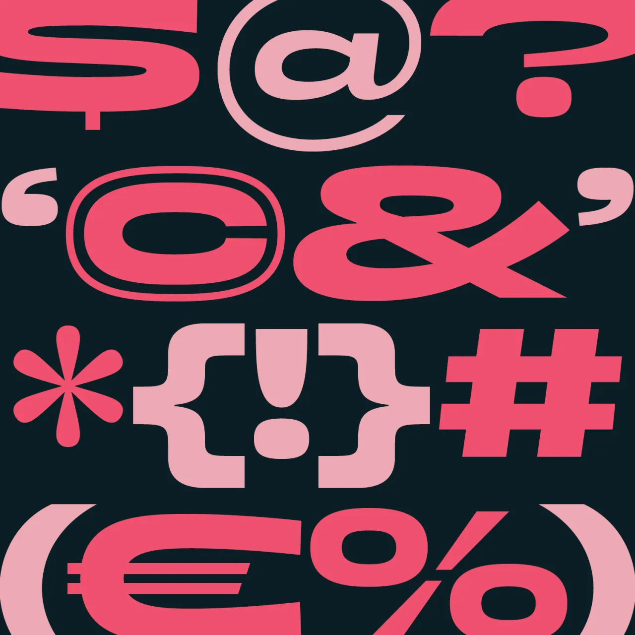
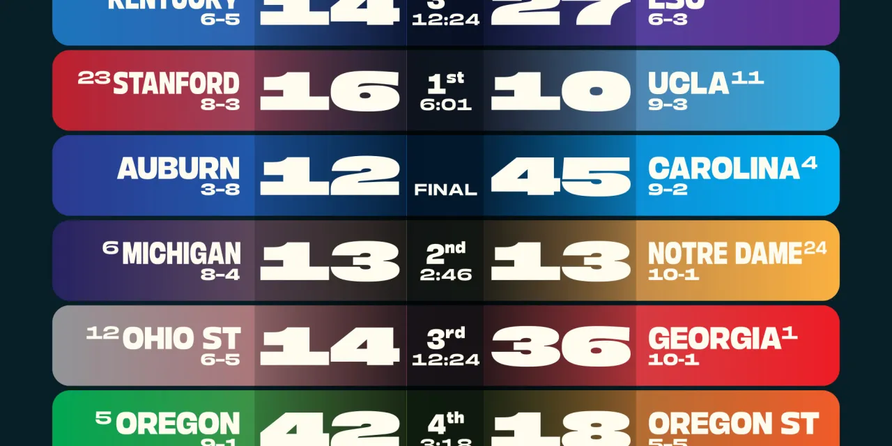
6. Boom Sans by Positype
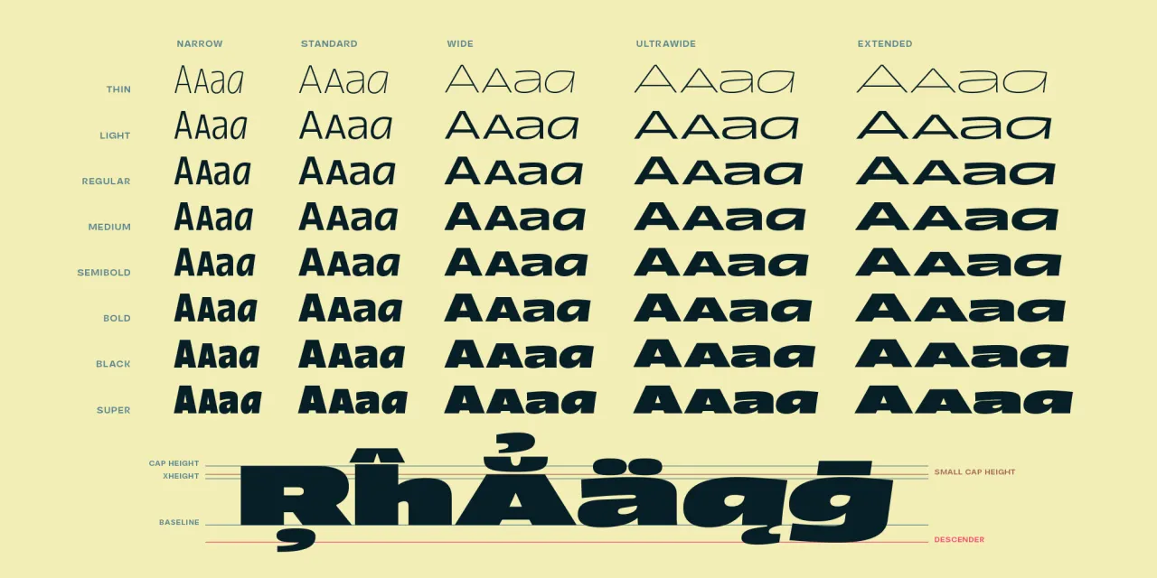
Designed to ensure messages stand out, Boom Sans is the perfect way to make a bold statement with your design. Available in five widths, eight weights, and matching italics, this expressive sans-serif features balanced curves and smooth transitions that command attention across various design contexts.
With its comprehensive range and confident design, Boom Sans exemplifies how contemporary type families can provide designers with unprecedented creative flexibility.
Editor's Picks





Trending






Latest Jobs
Brand Copywriter at Origin
Full-time·Porthleven, Cornwall·£35k–£40k
Marketing Copywriter at ustwo
Full-time·London·£40k-£50k
Senior Operations Manager at BIG Partnership
Full-time·Glasgow·£45k–£50k
Client Success & Growth Director at Revolution Growth
Full-time·Manchester·£60k-£70k
Head of design at Cog Design
Full-time·London·£55K
Midweight Designer at All Purpose
Full-time·London·£30k–38k