Pata Slab is a funky new font 'built to save us'
We're always excited to see things land in our inbox and write about all your wonderful creations. But today, as we somewhat crawl (perhaps drag ourselves) towards Christmas, we were more than happy to discover Pata Slab, a new font by In-House International, designed by Alexander Wright in collaboration with Rodrigo Fuenzalida.

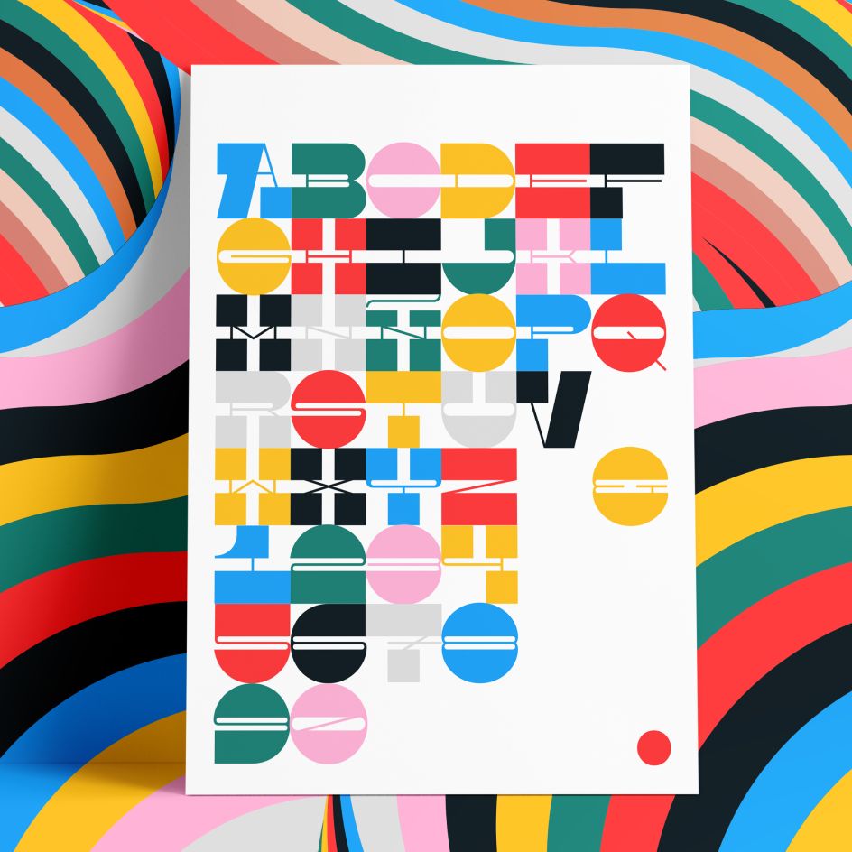
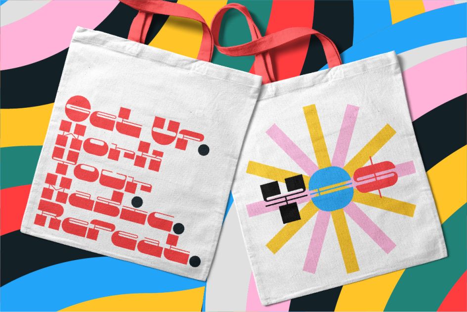
Assertive, funky and more than a little sexy, it's named after a colloquialism for 'feet', and features ultra-heavy slabs and contrasting hairline centres that rise from its chunky footprint. The resulting, retro-inspired vertiginous curves add instant attitude to any design. "It's built for what we need at the end of 2020," says Michu Benaim Steiner, creative chief at the Austin, Texas agency. "No descenders and all upside; as all characters grow upward from the baseline."
Uppercase characters were drawn to fit precisely inside a square, so they're all the same width and height. Despite all that confinement, Pata was born for "DIY ligatures", as In-House puts it. It sports standard-height terminals that connect seamlessly to each other. The upshot of all this meticulous "quarantinkering" is that laying out, customising and stacking text is effortless.
Sound like your kind of thing? Pata Slab will be available later this week via YWFT and MyFonts.