Hot new fonts by independent type foundries and designers this September
This month, give your designs a fresh twist with these top new typefaces from our favourite designers and foundries.
Flake by Gummi Type
It's nearly September. There's a back-to-school feeling in the air, and many of us are finding some renewed energy after a summer of warm, hazy days and quieter spells. And that means we're eager to get stuck into new projects, happily serving our clients. With typefaces no doubt being at the top of your list, we've scoured some of the most exciting foundries and type offerings to inspire you.
From serifs and sans-serifs to display options and stencil typefaces, there's something to suit everyone this autumn thanks to Colophon, Order, Lineto, Playtype, TypeMates, and many more excellent designers.
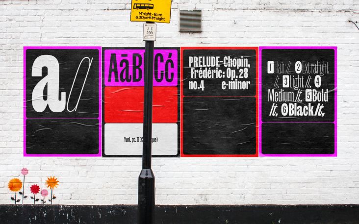
1. Apta by Colophon
Designed by Hugh Morse, Apta is a sans-serif that takes inspiration from the mono-linear humanist approach of Johnston and the geometric rigour of Futura. It's structured with Roman proportions with a mono-linear build and distinguished by consistent vertically cut terminals. This gives the typeface an engineered quality, while the recurring open apertures allow for an open and even flow. Apta is available in six weights, with corresponding semi-true italics.
2. Etude by Order Type Foundry
Etude is a stencil typeface inspired by the study of type design and experimental music techniques. The name comes from the French verb 'étudier' (to study). The design evokes a broad nib pen, the history of handwritten music notation, and the influence of Jean-Pierre Rousselet's constructed stencil forms. It's available in three distinct weights, and as the family cascades from Light to Bold, these become a crescendo, as soft and delicate turns to loud and more prominent on the page.
Etude by Order Type Foundry
3. Ruder Plakat by Lineto
Emil Ruder (1914-70) was an iconic typographer of the Swiss Style who originally developed Ruder Plakat as wooden letters with the help of students at Allgemeine Gewerbeschule Basel (AGS) in the early 1950s. In the 21st century, typography teacher Hans-Christian Pulver pulled the designs from the archive and began to develop them digitally. At Lineto, Pulver's drawings were further reworked and expanded by Arve Båtevik, adhering to contemporary principles of type design.
4. System by Frost
System is a modernist, neo-Grotesk sans family influenced by wayfinding infographics in European and US art galleries. Exploring the concept of neo-Grotesk vs Grotesk, the idea was to create two sub-families, Blank and Grotesk: one transparent and another exuding more character. Set in a wide range of weights, this font's optically balanced forms allow it to be used in various places, from logotypes to very small body text.
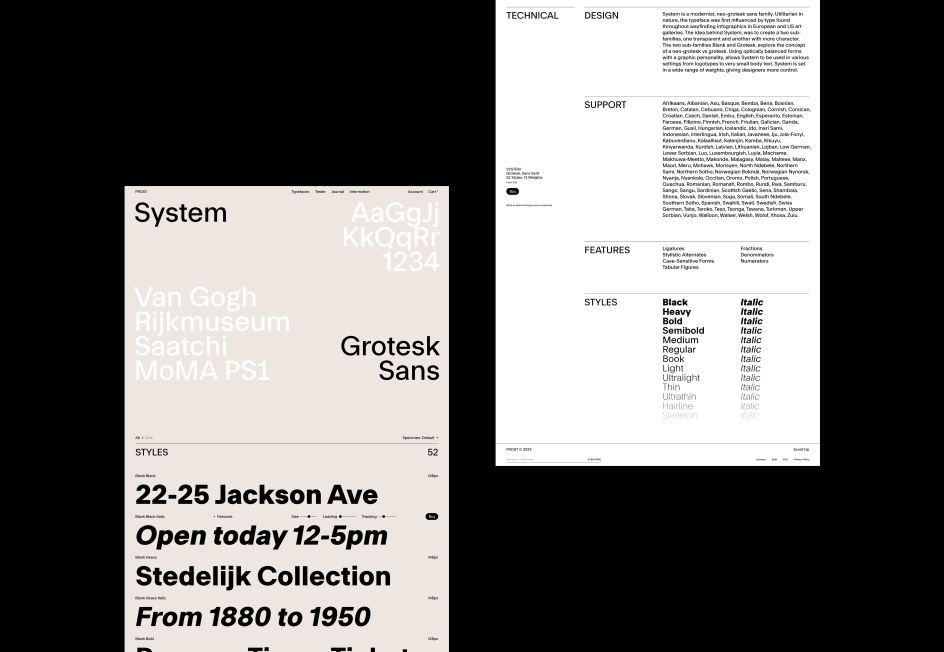
System by Frost
5. Und by Playtype
Und is a playful, colourful font designed by Jeppe Pendrup, who was inspired by the psychedelia styles of the Sixties. It was originally made as a quick uppercase-only display typeface for a Danish fashion brand. But the typeface was so fun to work on, Pendrup decided to develop it further, reworking most of the uppercase, adding round corners, and refining and re-evaluating shapes.
6. Queering by Adam Naccarato
Queering is designed by Adam Naccarato to promote queerness and inclusivity. This open source, bold display font comes with a stylistic set of Unicode emojis and queer-themed iconography, available as glyphs to add in-line. It's free to download on a pay-what-you-want basis, with all proceeds benefiting the Ali Forney LGBT+ Center in Harlem, which provides life-saving housing for Queer Youth, among other great services.
Queering by Adam Naccarato
7. Binate by Bruno Mello
Designed by Bruno Mello, Binate combines the characteristics of a workhorse sans serif with an elegant brush-inspired display style. With its vast range of weights, from Hairline to Black, Binate is as comfortable in the tiny details on packaging as it is in large formats like billboards and posters. Its apertures present a crisp and rigid style that evokes a utilitarian look, while experimenting with some of Binate's lower hooks can give your designs an approachable and friendly feel.
8. Rumiko Sans by TypeMates
Rumiko Sans lures readers to linger on text. Clear, warm and practical, this typeface highlights the fact that readability and personality need not fight each other but can work hand in hand. Its design evolves friendliness and flows: for example, 'a' and 'y' have simple, relaxed forms, while in the 'K', 'R' and 'u', fluid outstrokes lead the eye. Rumiko Sans comes in six weights.
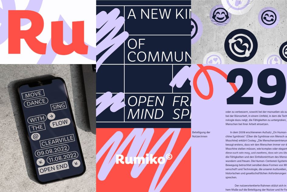
Rumiko Sans by TypeMates
9. FF DIN Slab by Albert-Jan Pool, Antonia Cornelius and Achaz Reuss
FF DIN Slab is a revival of DIN 1451, a German typeface first published in 1931 and widely used in traffic, administrative and technical applications. Designed by Albert-Jan Pool, Antonia Cornelius and Achaz Reuss, FF DIN Slab's serifs are assertive, sturdy and balanced. This typeface has been engineered to emphasise a strong horizontal flow through text, a grounded utility and assurance in headlines. As you'd expect, it harmonises beautifully with other FF DIN styles.
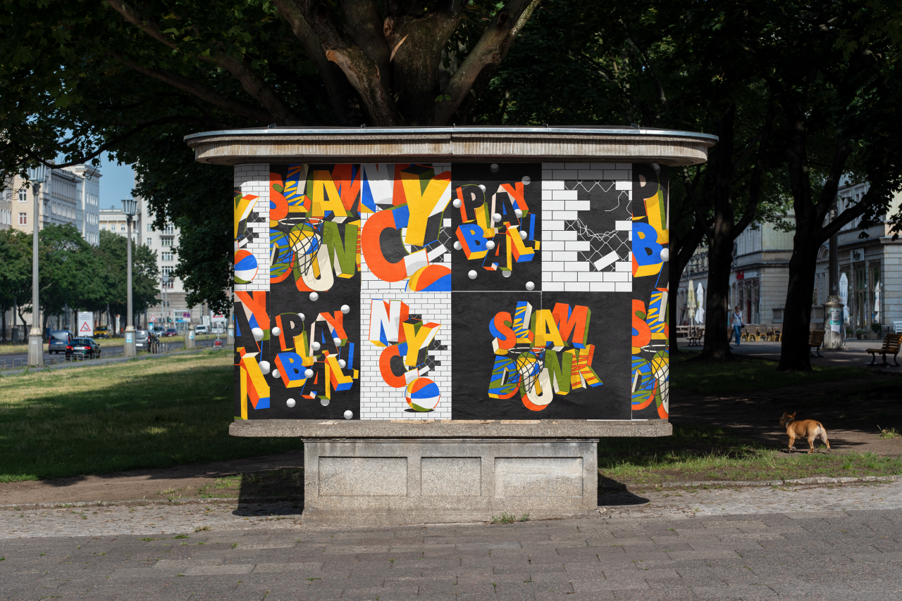
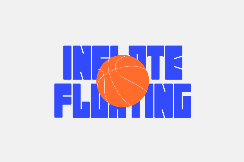
10. Flake by Gummi Type
Designed by Nicolaas Kotzé of Studio Gummi, Flake is a modular display typeface that can be used to create art installations or sculptures out of words or letters pieced together. It's inspired by '60s and '70s design aesthetics and takes inspiration from educational building toys. Flake has a semi-mono, uppercase character set and numerals, as well as basic punctuation.
Flake by Gummi Type
11. GT Planar by Grillitype
Looking for a super-large italic range? Look no further. Testing the limits of a 90-degree range, GT Planar transitions smoothly from -45° Retalic to +45° Italic while retaining its integrity. Designed by Dominik Huber, this font combines Retalic, Upright, and Italic styles into one continuous design space. Eminently functional, no matter the length, size, or angle, it's available in 42 styles.
12. Power Grotesque by Power Type
Power Grotesk is a sans serif with strong legibility and good contrast between black and white, making it suitable for different sizes. Its geometric shapes and structures take their inspiration and influence from medieval typography and combine them with contemporary details. The typeface has a special feature that aids in reading and reproducing, trapping the right-sized ink for the text to work.
13. NB Television Pro by NBL
NB Television Pro pays tribute to popular typefaces of the cathode ray tube era and translates them for the digital age. With a focus on detail and reference to the CRT grid, Stefan Gandl of Neubau has designed each glyph with pixel-perfect precision. This evokes a warmness when used in small sizes versus a crisp, pixel-dominated modern neo-grotesque at large. NB Television Pro includes six typesets: Regular, 2D, 3D, Mono, Mono 2D and Mono 3D.