36 fonts that will be popular with designers in 2022
It's been a crazy two years. We've been so caught up in how the pandemic's affected the way we work and our lives in general, it's easy to have missed some of the smaller stuff, like how typography has evolved quite dramatically.
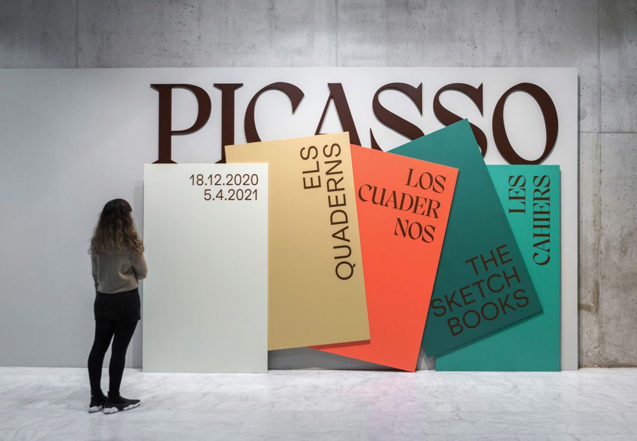
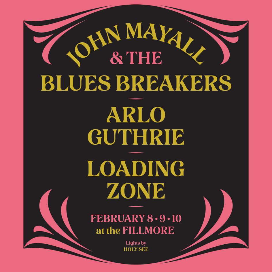
Work by Ara Estudio for Museu Picasso using Pangram Pangram's Migra
We're now seeing sharp and exaggerated characters everywhere, alongside an ongoing return to the comfort and familiarity of retro fonts, such as 1970s serifs. Besides that, there have been lots of fun new font releases to help take our minds off recent world events.
But now, as we emerge from lockdown, what's the next step for typography in 2021?
Right now, maximalism and creativity are being pushed to their limits. And we're expecting retro styles to continue to play their part, alongside a growing art nouveau trend and a resurgence of 1990s fonts. But as we try to forget the misery of the last two years, we expect a lot of future-facing, groundbreaking type designs to be coming our way too.
Font trends for 2022
Environmental concerns will be frontline, certainly. "I'd like to think there'll be more awareness of fonts that save ink and therefore carbon like Ryman's Eco font in print," says designer Berenice Smith. She's also hoping for "more rounded sans to improve legibility; a less is more digital approach, again to reduce effort and therefore carbon load."
There's also growing awareness for accessibility, which means that hopefully, typography will focus more on more making legibility and readability a priority.
"One of the biggest drives in graphic design for next year and beyond will be inclusivity," believes Christy Davies, design director at Echo. "An example in typography is how a classic font such as Futura had adapted its form, making it more accessible and usable as Futura Now.
"With our ageing population and their degrading eyesight, we need to act now," she adds. "Fonts selected will need to be legible for those with sight issues, particularly when considering how packaging can be seen from the shop shelf."
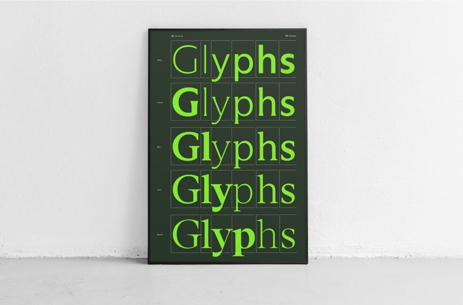
Glyphs by Mucca
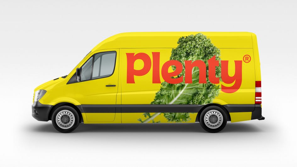
Plenty by &Walsh
The rise of custom fonts
More broadly, Matteo Bologna, founder and president at Mucca, believes custom fonts will be big news in 2022.
"More and more brands are discovering that a custom font can communicate as powerfully and effectively as other visual tools," he says. "Each font speaks with a certain tone of voice and communicates specific values, and a custom font can express nuances that an off-the-shelf font cannot while serving to differentiate a brand in a crowded marketplace.
"Companies like Plenty, a vertical farming brand designed by &Walsh, has a custom font with an approachable, organic sensibility, while Footlocker recently introduced Foot Locker Sans by F37 to build on the equity of its heritage."
Software innovation is also driving this trend. Newly launched font design software Glyphs 3 (recently rebranded by Matteo Bologna and Andrea Trabucco-Campos) makes designing custom fonts more intuitive and accessible for designers who haven't created fonts before.
"The power of the software is also driving another design trend: variable fonts," Matteo adds. "Now designers aren't limited to sans or serif, condensed or extended. They can use a single typeface with all these characteristics to create richer, more customised experiences. In fact, the website for Glyphs was designed with a newly launched variable typeface Arizona, by ABC Dinamo, that showcases both the functionality of the software and the versatility of the font."
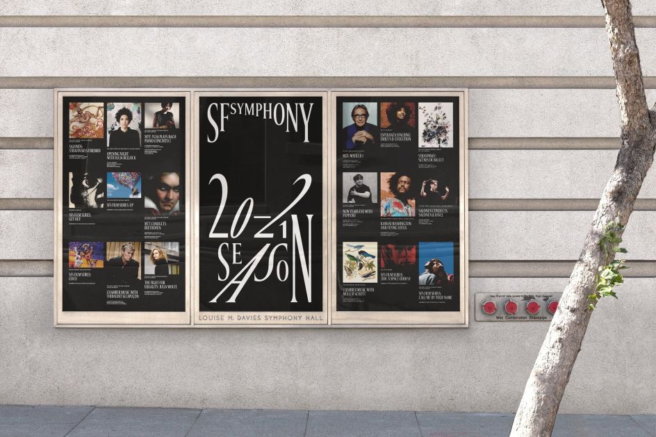
A customised Arizona by ABC Dinamo for COLLINS / San Francisco Symphony
Dialling down the crazy
That said, Samantha Barbagiovani, design director at ThoughtMatter, believes that some of the wilder type designs of the 2020s so far will start to take a back seat.
"The experimental and almost non-designed-designed letterforms we've seen over the past two years – in part thanks to Gen-Z and in part living a surreal life facilitated through screens – will simmer down," she predicts. "We'll see typefaces with solid foundations and purposeful optimisations support brands: think Muoto or CoFo Sans [number 7 on our list below]".
So with all that in mind, here are 36 fonts we'd recommend checking out for 2022. These top typefaces will help you future-proof your designs and help you stay bang on-trend.
Sans Serif fonts
1. Axiforma
Axiforma is a geometric sans-serif font family designed and published by Galin Kastelov. Based on a robust sans-serif typeface, it comes in 20 weights plus matching Italics for each weight. It includes numerous OpenType features such as old-style numbers, fractions, case sensitive alternates, localised forms, stylistic sets. Recommended for branding, posters, headlines, display, presentation materials, websites and logotypes, Axiforma is a paid-for font and should not be confused with the similarly named Axiforma Free Font.
2. Bison
Bison is a sophisticated and strong family of sans serif fonts, designed by Ellen Luff, recommended for branding, logos, magazines and films. Bison's sturdy, uncompromising style is felt through controlled letterforms and modern touches. With a balance of hard lines and smooth curves, each font in the family is dynamic and authoritative in its own right.
3. TT Norms Pro
The third version of the popular geometric sans serif, TT Norms Pro, was designed by Ivan Gladkikh, TypeType Team and Pavel Emelyanov. It's intended for a wide range of applications and works well both in large text arrays or headlines and on the web. It's available in 67 styles, including 33 upright, 33 italics, and one variable font with three axes of variability.
4. FS Me
FS Me is designed specifically to improve legibility for people with learning disabilities. The font was researched and developed with – and endorsed by – Mencap, the UK's leading charity and voice for those with learning disabilities. Every letter of FS Me was tested for its appeal and readability with a range of learning disability groups across the UK. Mencap receives a donation for each font license purchased.
5. Pangram Sans
"Matt and the team at Pangram Pangram are producing some brilliantly useful type, with a great balance of creativity and distinctiveness," enthuse the folks at Ogre Studio. Case in point: Pangram Sans is a powerful and extensive geometric workhorse, as bold and intense as it is subtle and flexible. Developers Mat Desjardins and Valerio Monopoli have taken this free-to-try geometric sans to a whole new level with a fully variable slanting, from Reclined to Italic. It also includes support for the Cyrillic Alphabet.
6. Rapor
Rapor is built from a combination of sans serifs with strong geometric foundations such as Futura and grotesque fonts based on the equal-width system. It's slightly softened, evenly converging diagonal corners add distinctiveness to it. Designed by Oğuzhan Cengiz, it has ten weights ranging from Thin to Black and consists of twenty styles with matching italics.
7. CoFo Sans
CoFo Sans is based on the idea of harmony between rationality and emotion and between Latin and Cyrillic. In short, it's the perfect balance between simplicity and personality. Designed by Maria Doreuli, it comes in four weights and is perfect for anyone looking for clarity and adaptability without sacrificing character.
8. Alfreda
Alfreda is not just another grotesque typeface. Its morphology mixes modulated and unmodulated strokes and natural and reverse contrast, all with a humanistic touch and subtle ink traps. Designed by Santi Rey, Alfreda comes in six weights. It boasts open type features, more than 400 glyphs and 18 stylistic sets.
9. Graphik
Designer Christian Schwartz was inspired to create Graphik by his early exposure to Modernist graphic design, particularly mid-twentieth century posters. Its purposeful, elegant plainness and wide range of widths allow its use as both a central design element and playing a supporting role in editorial design, corporate branding, video and broadcast design, websites, apps, and UIs.
10. Boke!
The creation of Skep studio, Boke! is possibly the world's first truly limited edition typeface: it will only ever be in the hands of 50 designers or studios. A condensed, bold, sans serif typeface, it was inspired by a box of old classic woodblock type lying dusty in the studio. It's shipped on a USB stick with a unique stock number, and once they're all gone, that's it.
Axiforma by Galin Kastelov
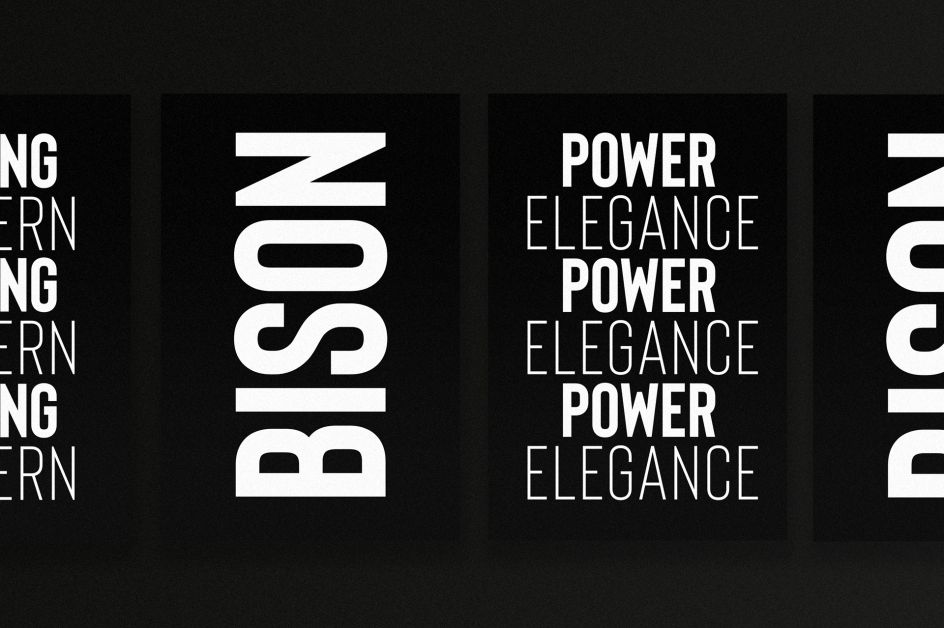
Bison by Ellen Luff
Serif fonts
11. Cotford
Cotford is a personal project undertaken by Tom Foley of Monotype during lockdown. His idea, which he'd first had in 2014, was to design a soulful, elegant contemporary serif typeface with all the versatility that today's designers need. It was the sudden restrictions of March 2020 that provided him with an unexpected opportunity to bring his idea to life.
The design started by taking broad nib calligraphy and lettering sketches and working them into more rational typographic shapes. The challenge was to keep the warmth of those original sketches while crafting them into a unique typeface. The resulting font embodies quality, consistency, and efficient performance in all formats, including variable.
12. Lovechild
Designed by Simon Walker, Lovechild is a display font in the Jugendstil style. It boasts 485 total glyphs, including a wide range of foreign characters, making it compatible with dozens of foreign languages.
13. New Paris
Rooted in the tradition of the 18th-19th century French typefaces, NewParis is distinguished by high contrast between thick and thin strokes. However, it is not a direct revival but a contemporary interpretation of the genre, designed to meet the requirements of today. Designed by Ian Party, the family includes NewParis Text (for sturdier hairlines and sizes below 18pt), NewParis Headline (for elegant headings, titles or big quotes) and NewParis KingSize (for text sizes above 36pt).
14. FS Ostro
FS Ostro is a typeface from Monotype that's imbued with balanced and sophisticated elegance. Named after a southerly wind that blows over the Mediterranean Sea, it's a warmer interpretation of letterforms with their roots in colder, stark Modern typefaces.
15. Larken
Crafted by Ellen Luff, Larken is designed to reflect nature and evoke a sense of natural softness and expressiveness. The family melds organic curves and gentle repetition into powerful and harmonious type. The character set also incorporates additional symbols, stylistic alternates, unique ligatures and case sensitive punctuation.
16. Gazpacho
Santi Rey was inspired to create Gazpacho by the serif typefaces used in editorial media in the 70s and 80s. The morphology of the letterforms makes it ideal for logos, while its large x-height makes it great for headlines with tight leading. Its high contrast and very simple and recognisable shapes also make it highly readable on small, long texts.
17. Diastema
Diastema is a modern ligature serif typeface with joining ligatures that give it a unique style. Designed by Issam Boufelja, it's a good choice for branding, logos, invitations and watermarks. It comes with regular, italic, bold and bold italic font styles; uppercase and lowercase letters; numbers, punctuation, ligatures, and alternates; and multilingual support.
18. Roman Grotesque
The origin of Roman Grotesque comes from the visual identity created for the National School of Architecture Paris-Belleville, whose driving concept was (and is) to "put the human being at the heart of construction". Fusing the structured design of sans serifs with the calligraphic heritage of serifs, it's an intriguing font that can be used at both micro and macro levels. It's available in eight weights with their italic equivalents.
19. FS Renaissance
"With recent lack of human connection and lack of touch, there is an inevitable desire for more human fonts," says Julius Colwyn, associate director of Space Doctors. Case in point: FS Renaissance, where each letter is handcrafted by the artist Craig Black and Pedro Arilla, in collaboration with Monotype, and set together as a coherent typeface. Julius points to the "subtle breaks in the stencil style lettering and a sense of movement in the serifs, linking the different letters together through movement. It feels light, expressive, full of movement, and a balance between functionality and human craft."
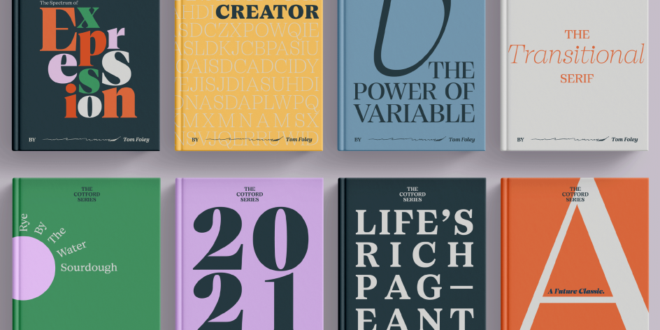
Cotford by Tom Foley of Monotype
Lovechild by Simon Walker
Larken by EllenLuff
Slab Serif fonts
20. Adelle
Designed by Veronika Burian and José Scaglione, Adelle is a slab serif typeface that was originally crafted for intensive editorial use in newspapers, magazines, and online. However, its personality and flexibility, along with superior screen rendering and cross-platform consistency, have made it a popular web font for a wide range of purposes. There's also a sister font, Adelle Sans.
21. Sagona
Sagona by Rene Bieder is a contemporary slab serif building on the Clarendon/ionic model dating back to the 19th century. It features strong serifs and a variable stroke contrast, making it great for both headlines and small text sizes. The family comes in nine weights with matching true italics.
22. TT Hoves
TT Hoves is a technological-style geometric sans-serif with a distinct character. Designed by Ivan Gladkikh and Pavel Emelyanov, it comes with 23 styles, 1,358 glyphs in each style (except outline styles) and support for more than 210 languages.
23. FS Clerkenwell
Crafted by Fontsmith, FS Clerkenwell is based on influences from this part of London, which has a rich tradition of printing and design. The typeface mixes tradition with new-school trends, and its quirky, contemporary character lends an edge to headlines, logotypes and any large-size text.
24 TT Travels Next
TT Travels Next is an alternative, and more radical version of the TT Travels family that emerged at the Mail.ru Design Conf x Dribbble Meetup in 2020 in Moscow. Designed by Kseniya Karataeva, it's a trendy and modern wide display sans serif for use in different sets, be they print or web. The font has very wide proportions and characters that almost do not get narrower as you move from the bold styles to a light one. It also has an exaggerated closed aperture, low contrast, noticeable visual compensators, and a harmonic combination of soft and sharp shapes.
Adelle by TypeTogether
Sagona by Rene Bieder
Display fonts
25. Dahlia
"Modern takes on Art Nouveau typography seems to be gaining traction right now," says graphic designer James van Kriedt. "This is largely being led by VJ Type." And here's a great example. Dahlia is inspired by 1910s Italian lake posters and Art Nouveau. Designed in 2021 by Jérémy Schneider, this display serif typeface is useful for headlines or short to medium-length texts. Its atypical curves and refined details create a sense of rhythm and timeless elegance, and its counter forms are highly expressive.
26. Kalice
Kalice is a revival of an Elzévir Anglais by the Turlot Foundry, designed by Margot Lévêque in 2018. A display typeface covering a majority of the European languages, it comes in the standard file formats and is available in one weight and one style.
27. Beale
Beale is a funky retro serif display font inspired by Memphis. It was designed by Amy Hood, who was inspired by the lettering on Blues and Rock' N' Roll records from local pillars, Sun Studio and Stax Records. This display font comes with tons of additional fun characters and glyphs.
28. TNT Battenberg
TNT Battenberg is an uppercase display typeface built from the starting point of four parallel lines. With its dynamic, playful feel, it offers excellent opportunities to create a strong impact in packaging and branding settings. It's also very flexible and would pair beautifully with more neutral sans faces in typographic layouts and stand-out logotypes.
29. Timmons NY
Designed by Matt Willey, Timmons NY is a bold, compressed, caps-only headline font in one weight with multiple glyph alternates. Money raised for its sale will go to the 'BuyFontsSaveLives' campaign, honouring Matt's father Nick, who was taken by cancer in 2011.
30. Bebas Neue
Bebas Neue is a free Google font: a display family suitable for headlines, captions, and packaging that boasts an extended character set and OpenType features. It was designed by Ryoichi Tsunekawa, based on the original Bebas typeface.
31. Marsha
This typeface is inspired by the vertical sign that once hung outside of The Stonewall Inn, a pivotal site in the history of gay liberation, and named after Marsha P. Johnson, an African-American transgender woman who was one of the most prominent figures in the Stonewall uprising of 1969. It's this kind of inspiration that Wednesday Krus, design director at ThoughtMatter, expects to see more of next year. "In 2022, there will be more space for black and trans stories to be told," she predicts. Designers will be focused on creating experiences that are a user or viewer's ally."
32. Westiva
Westiva is a serif font family with an elegant and classy look focused on natural and beautiful curves. Designed by Bayu Noor Witarsa, it's recommended for projects such as luxury brand logos, journals, business cards, titles, products, social media posts and web.

Beale by Amy Hood
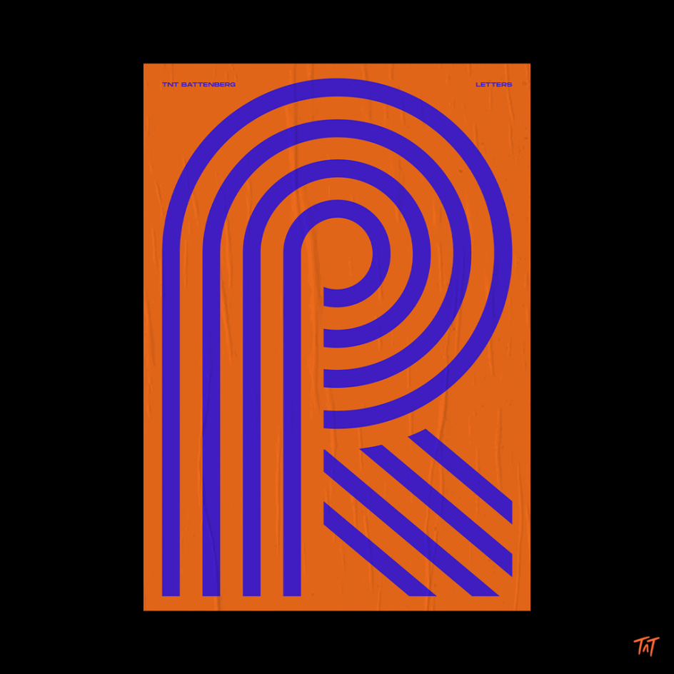
TNT Battenberg by Type 'n' Tings
Variable fonts
33. GT Ultra
GT Ultra draws from the chunky serifs of the 1970s and '80s, taking cues from their decorative aesthetic to craft something new; a humanist flare sans. Both calligraphic and constructive, and drawing on both the traditions of both serifs and sans, it challenges the idea that humanist flares can't be sans
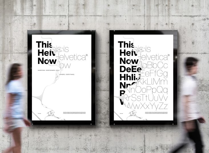
34. Helvetica Now Variable
Helvetica Now Variable builds on the groundbreaking work of 2019's Helvetica Now release - which updated the clarity, simplicity and neutrality of classic Helvetica for modern times. And, as you might have guessed, it transforms it into a variable font, with all the optical sizing, stylistic alternates, and extended character set a modern design might want.
35. Flexible
Inspired by late 19th century's gothic typefaces from broadsides, Flexible by Art Grootfontein is a versatile uppercase typeface available in eight widths and eight heights. Plus, it uses variable font technology to allow designers to play with each letter height and width easily.
36. Inter
Inter was born as a sans reinterpretation of Rockwell. This new geometric sans with soft curves and generous counterforms is a friendly font that communicates sincerity. Designed by Alfonso García, Inter is well-suited for web use, apps, corporate use and short text (publishing). It contains 439 glyphs and supports over 200 languages that use the Latin alphabet.
Flexible by Art Grootfontein


. In use by [Garbett](https://garbett.com.au/) for Career Trackers](https://www.creativeboom.com/upload/articles/0f/0f4e193ba9164073646e67421eb37b4b26986c67_732.png)
 using <a href="https://www.ohnotype.co/fonts/obviously" target="_blank">Obviously</a> by Oh No Type Co., Art Director, Brand & Creative—Spotify](https://www.creativeboom.com/upload/articles/6e/6ed31eddc26fa563f213fc76d6993dab9231ffe4_732.jpg)
](https://www.creativeboom.com/upload/articles/7a/7a527d53fefe4f354e8489365e89db422567f281_732.jpg)
 by Tüpokompanii](https://www.creativeboom.com/upload/articles/58/58684538770fb5b428dc1882f7a732f153500153_732.jpg)