New typeface from Order is composed of forms inspired by music notation
This week has seen the launch of a new type design from Brooklyn-based design studio, Order. Named Etude, the original stencil typeface is a harmonious symphony of forms inspired by handwritten music notation.
Designed by Emily Atwood and mastered by Alphabet Type, Etude joins the ranks of typefaces at Order, a specialist design agency set up by Jesse Reed and Hamish Smyth. Taking its name from the French verb 'étudier', which is rooted in the meaning of 'study', Etude is influenced by broad nib pen marks and the work of French illustrator and scribe Jean-Pierre Rousselet.
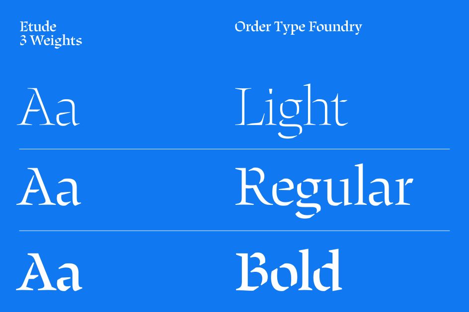
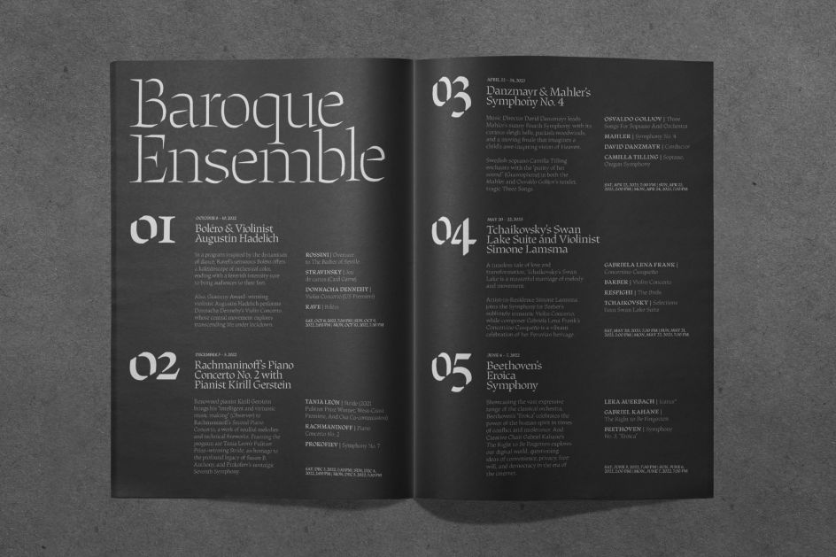
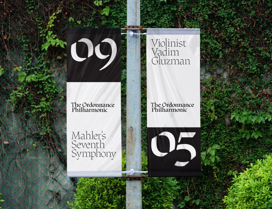
This inspiration manifests itself across three distinct weights in the Etude type family. Cascading from Light through to bold, Etude crescendos from soft and delicate forms to loud and more prominent strokes on the page.
Emily explains that Etude started with the design of a translation contrast text typeface for sheet music notation. During this process, she noticed that typefaces and glyphs tailored toward music notation typically follow the "expansion contrast" model. It means that the thicks and thins are more vertically oriented. And it wasn't until discovering the broad, calligraphic music notation Hermann Zapf that she realised it could remain functional and recognisable.
"As I looked deeper into the history of music notation, it was clear that some of the first handwritten examples of music utilised the broad nib," she explains. "The square and diamond-shaped music notes that danced across the page were accompanied by a unique calligraphic stencil.
"The more remarkable examples of handwritten stencil music notation are by French Illuminator and Scribe Jean-Pierre Rousselet from the early 18th century. Rousselet's liturgical manuscript for King Louis XV in 1719 demonstrates stencilled forms that are defined by exposed calligraphic exit and entry points. This was unlike a typical broken stencil that is a derivative of a roman because it revealed the construction of the letterform rather than breaking it."
Other historical points of reference which helped to create Etude were the broken stencil examples from Louis Simmoneau's engravings from 1701 and Fred Smeijers' chisel-cut brass stencilled characters. The beginning of the sketching and digitising process was spent developing a construction logic for Etude, which could then be used across the entire typeface.
"The overarching conceit became quite simple in that thin entry points would start at the top left and move clockwise, and thick entry points would also start at the top left and move in a counter-clockwise direction," Emily reveals.
"It was important that this stencil celebrated the entry and exit points of a stroke and that the movement of the pen would be evident in each letter. Formally, Etude started to pick up on the subtle chiselled nature of letterforms reminiscent in Hermann Zapf's Musica Roman and the calligraphic, interrupted forms of Jean-Pierre Rousselet's work."
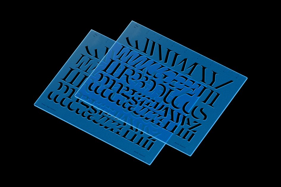
From here, the hand-stencilled letterforms and stencilled brass cuts of her inspiration were drawn on to create a custom drafting stencil place. Emily adds that this means: "The core shapes of the Etude typeface can be used to draw the full upper and lowercase Latin alphabet."
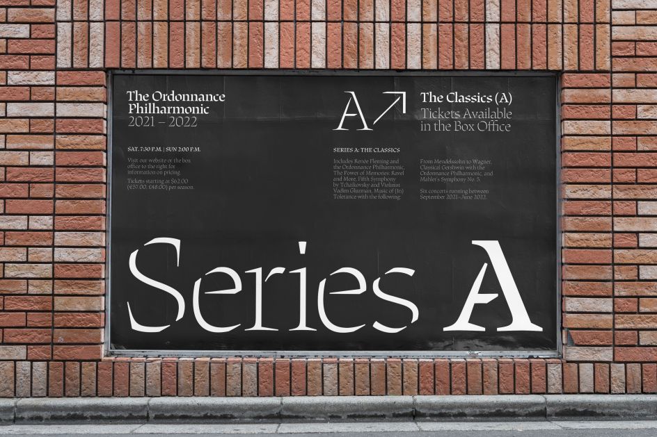
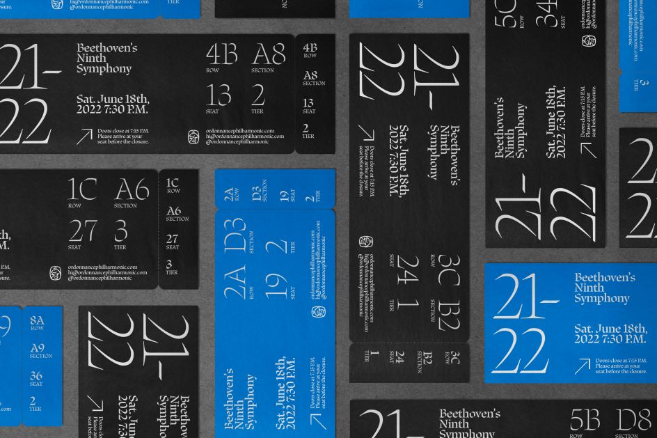
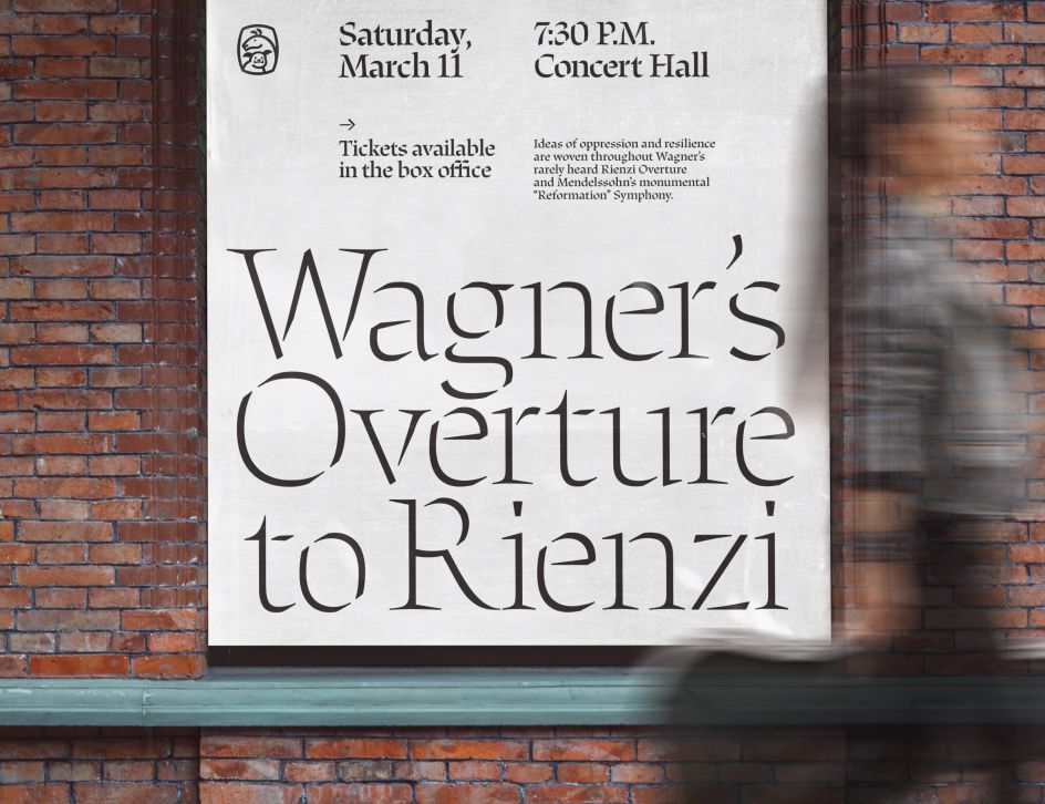
The result is an elegant, flowing typeface with plenty of chunky heft. This makes it versatile enough to suit a variety of uses beyond the ken of its inspiration points, although we're sure musicians especially will get a kick out of Etude's charms.
Etude is available to download and trial now as part of a desktop, web or app license from the Order website. And if that hasn't quenched your thirst for all things Etude and Order, then be sure to check out the foundry's new goods store. It contains a whole host of products such as caps, T-shirts and stencils decked out in eye-catching typefaces, including Etude. We've got our eyes on the Pastiche Shirt, complete with a striking interrobang.
Editor's Picks


Trending


Podcasts


Editor's Picks
Further Reading