A typeface made from music: Monotype launches Masqualero
Today, the lovely people at Monotype unveil what may be the first typeface directly inspired by a jazz record. Of course, people respond to music in a multitude of different ways, but there can’t be many who channel their appreciation for classic 20th-century jazz into font design.
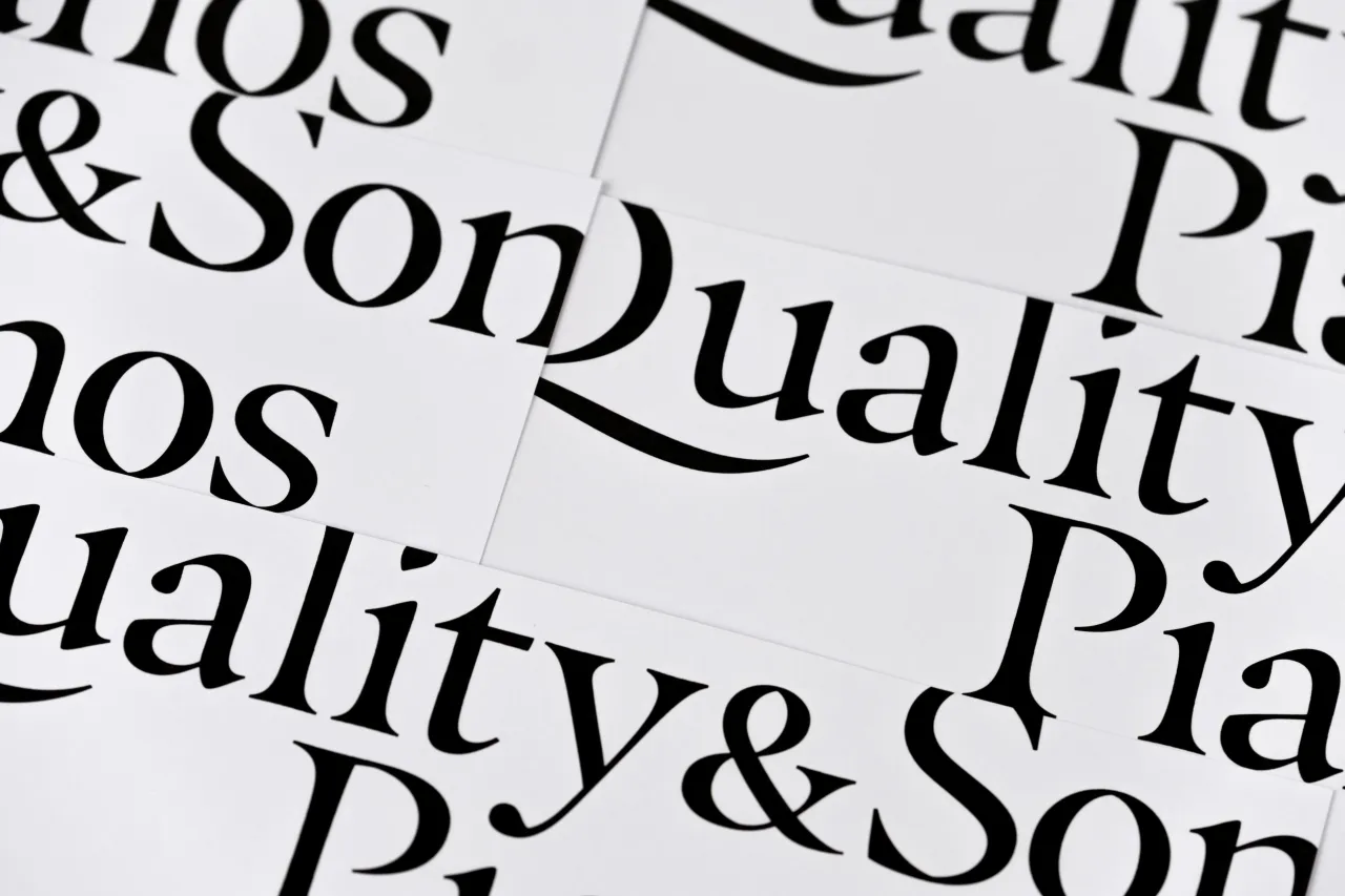
Nevertheless, Jim Ford of Monotype Studio has done precisely that, taking his admiration for Miles Davis’ seminal 1967 album Sorcerer – and the track ‘Masqualero’ in particular – and transforming its contrasts, contradictions and complexities into the bold but ambiguous letterforms of the Masqualero typeface.
"I like the name because it rolls off the tongue and it doesn’t mean anything," Ford explains. "It’s an abstract word that Wayne Shorter came up with when he was in the band, so it’s always been about that word and that song."
"There’s also a lot of details in the typeface that talk about Miles Davis’s career and his personality," he adds. "He was sharp-tongued and very opinionated, and I think he intimidated a lot of people."
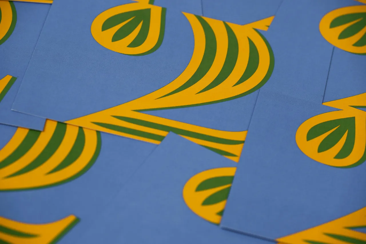
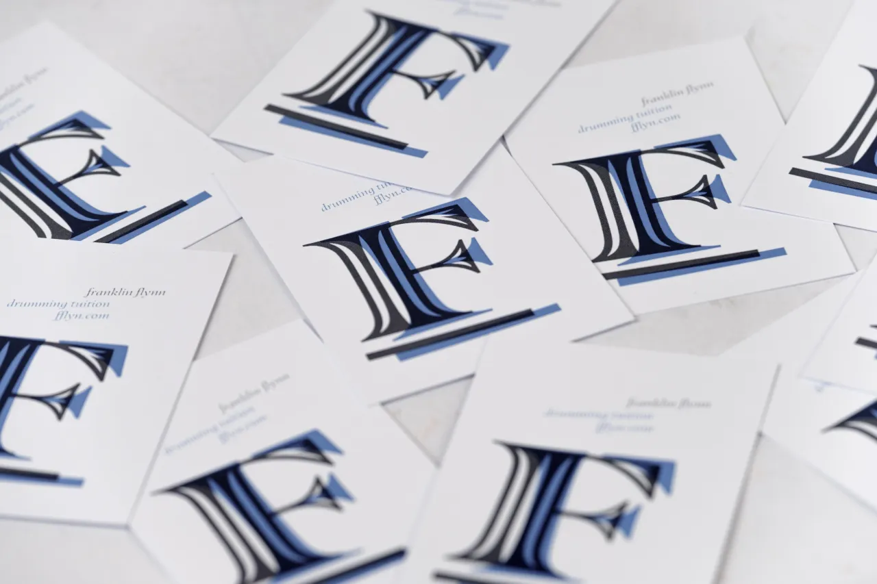
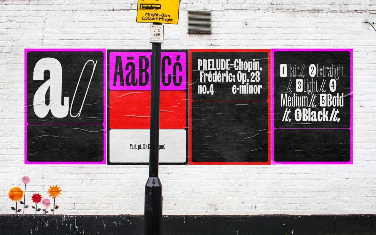
At the same time classical and innovative, warm and friendly or icily elegant, it’s a dual-natured typeface that can create entirely different effects by applying different weights. This makes it extremely versatile, as suited to luxury product packaging as body copy in a corporate report – anywhere that might benefit from a touch of timeless sophistication, undercut by a note of wildly inventive creativity.
"It has a lot of extra points that you wouldn’t see or think are there," elaborates the designer, who credits Matthew Carter’s work as a reference. "But that’s what really gives it clarity and that sparkle. It’s all sculpted, and each letter is unique from the others."
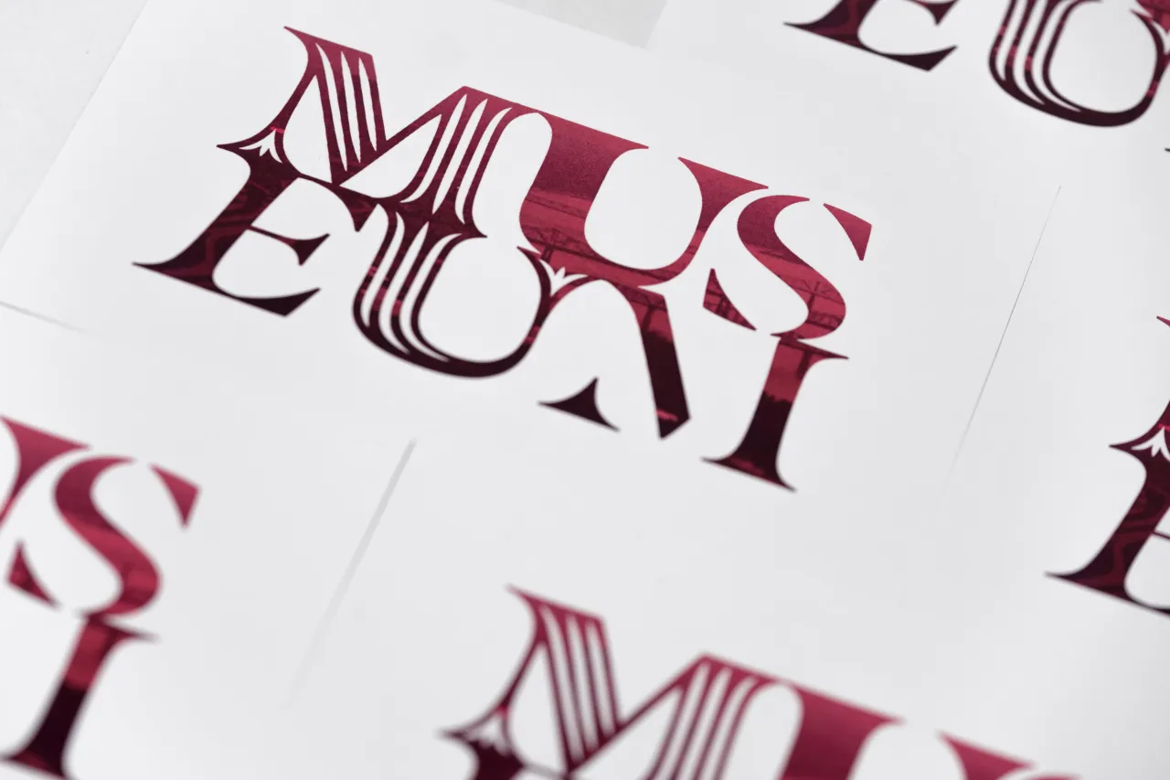
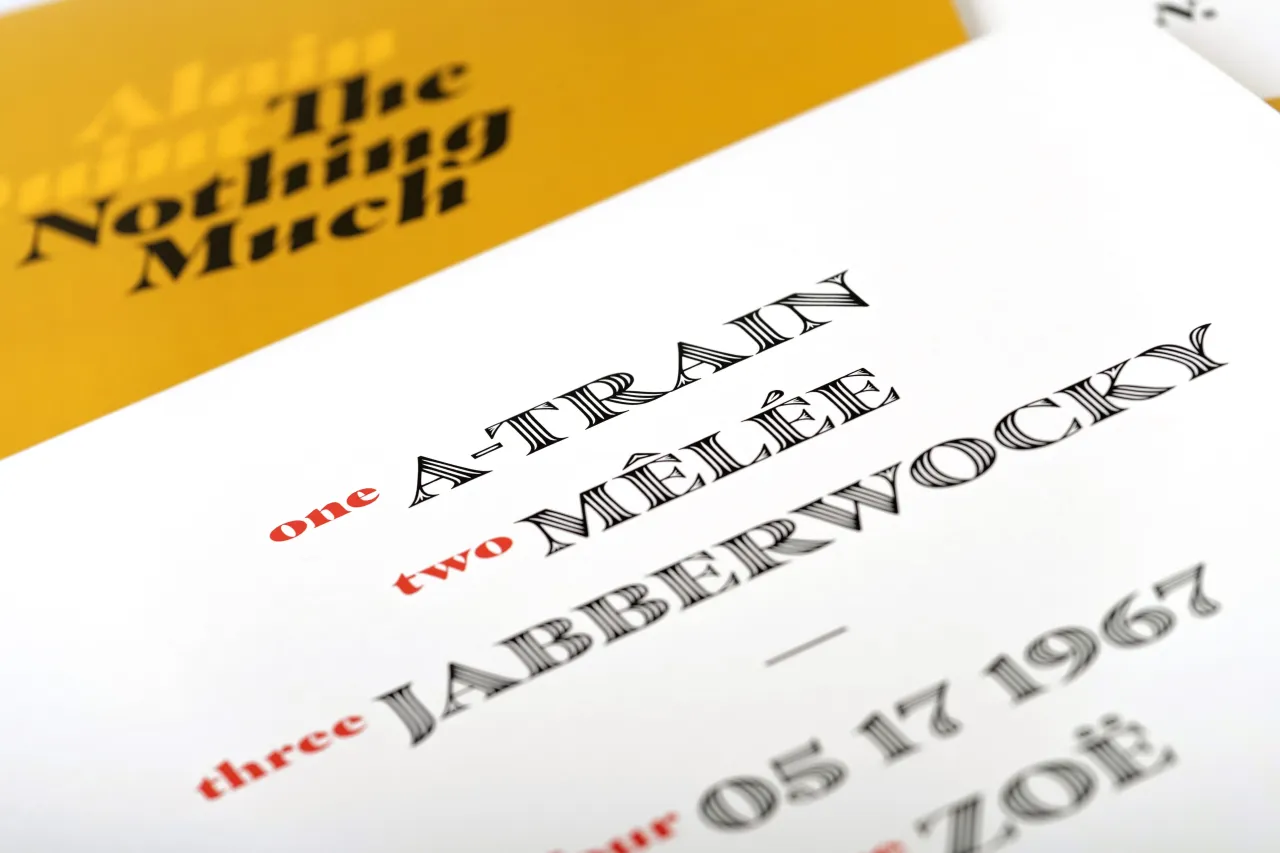
What about suggested typeface pairings? The versatility of the Masqualero typeface and its wide range of weights means that it pairs well with typefaces of various styles and designs, including the Quire Sans™, Kabel®, Antique Olive™, Charter® and Trade Gothic® typefaces.
Available to purchase through MyFonts.com is the complete six-weight family, including italics and the Stencil and Groove display weights. For further info on Monotype, visit monotype.com.
Editor's Picks





Trending






Latest Jobs
Senior Designer at Definition
Contract·London·£45k–£50k
Brand Copywriter at Origin
Full-time·Porthleven, Cornwall·£35k–£40k
Project Manager at A Practice for Everyday Life
Full-time·London·£37k-£46k
Art Director at The New York Times
Full-time·New York·$120k–$130k
Midweight Editor at Earworm
Full-time·Bristol·£28k-£32k
Senior Creative Lead at Random Studio
Full-time·Amsterdam / Paris·€90k-€110k




 using Obviously by Oh No Type Co., Art Director, Brand & Creative—Spotify](https://media.creativeboom.com/e140cc20-db14-429b-b265-64f190084daf/conversions/647a253986d9ff739b61d8421eebd46baca5cf40-medium.webp)