NB Studio creates an ever-changing brand for New York's revolutionary Vineyard Theatre
As part of Vineyard Theatre's 40th-anniversary celebrations, the Off-Broadway Theatre company has collaborated with NB Studio to create a new identity that reflects its status quo-defying productions.
Photographer: Bronwen Sharp
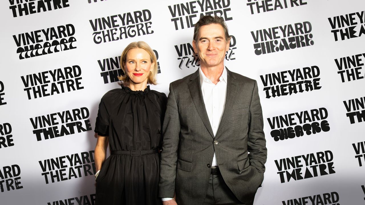
Since opening its doors in 1982, New York's Vineyard Theatre has made a name for itself as the home of boundary-pushing productions encouraging collaboration across various art forms. And to help bring this maverick energy to its branding, London's NB Studio has crafted a new identity whose logo never looks the same twice.
Created in close collaboration with Vineyard Theatre's Artistic Directors Douglas Aibel and Sarah Stern, NB Studio's rebrand also aims to position the theatre among New York City's most recognised cultural institutions. NB Design Director Reuben Alghali explains that this was achieved by authentically capturing the theatre's New York roots and commitment to community: "Every piece of type in the Vineyard brand has been designed by a New Yorker, and the ever-changing logo provides the future opportunity to collaborate with more local designers."
Photographer: Jorden Hollender
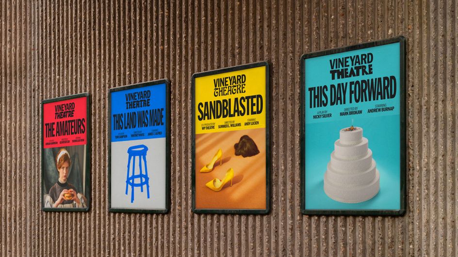
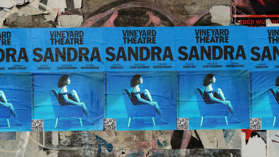
Vineyard strives to change theatre with every production, so it makes sense that the new brand mirrors this philosophy. It means everything from the colour scheme to the imagery, and the logo itself is never the same twice. Even a brand as wild as this one needs a degree of consistency to remain recognisable, though, so the word 'Vineyard' stays constant while 'Theatre' is reinvented for every show.
The master design for the new identity is rendered in boldly typographic black and white and use a responsive typeface that allows it to fit any given width to achieve maximum impact. Thanks to the use of simple grids and rules that govern the new visual system, these elements are designed to be both flexible and practical to adjust to the feel of each Vineyard show.
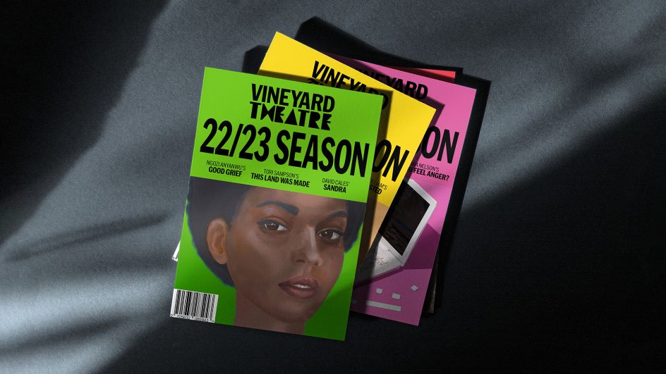
Meanwhile, the colours and art on the accompanying Vineyard brochures and website all reflect the tone and character of individual productions. This enables each new visual identity to evolve alongside the theatre while reflecting the voice of each new project and surprising audiences in the process.
Speaking to Creative Boom, NB Studio owner and Creative Director Nick Finney says that the conventional wisdom of a consistent brand does not make sense when being applied to an institution like Vineyard Theatre. "Our identity for Vineyard delights in breaking boundaries, just like the theatre it represents. Through close collaboration with New York designers and creators, we've built something fresh to set them apart from the pack. A robust geometry ensures that every encounter is recognisably 'Vineyard'."
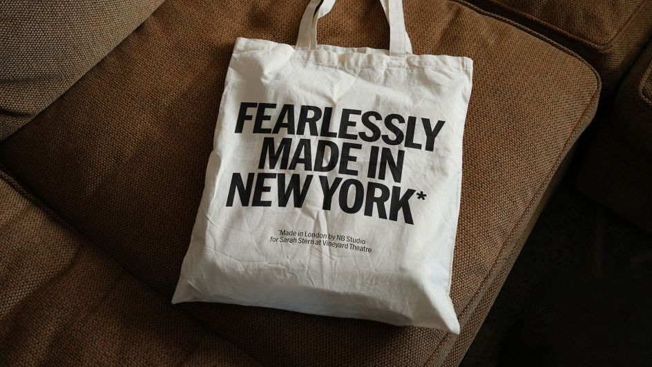
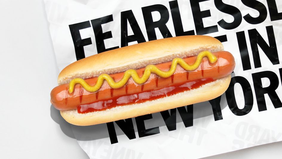
Meanwhile, Strategy Director Dan Radley adds that even though Vineyard Theatre has driven the development of revolutionary shows such as Avenue Q and How I Learned To Drive, it rarely receives the recognition it deserves. "The new strategy – Fearlessly Made In New York – shifts the emphasis to Vineyard as a place where daring art is cultivated. Making and makers take centre stage."
Due to its very nature, Vineyard Theatre's new identity relies on input from exceptional New York designers. It includes the likes of Pentagram NY Partner Eddie Opara, who was thrilled to get involved. "This simple and compelling design system created by NB has allowed designers like myself to be bespoke, expressive, cogitative and evocative, aligning to the ideals of the theatre," he reveals.
Based in New York and want to get involved with Vineyard's changing theatre logo? If so, NB Studio wants to hear from you. Contact them at [email protected] by 31 March 2023 for a chance to see your ideas treading the boards.
Editor's Picks


Trending


Podcasts


Editor's Picks
Further Reading