Smith & Diction rebrands Living Roots wine with flexible identity and playful storytelling
The US studio has created a modular visual system for Living Roots, merging heritage, geography and experimentation with a flexible "story symbol" and refreshed packaging.
Living Roots, a family-run winery with tasting rooms in New York's Finger Lakes and Australia's Adelaide Hills, has unveiled a new identity by Philadelphia-based studio Smith & Diction. The rebrand introduces a modular "story symbol", a refreshed label system, and even a grape-vine mascot, all designed to reflect the brand's cross-continental roots and experimental spirit.
According to Mike Smith, principal creative director at Smith & Diction, the brief arrived as Living Roots was preparing to open a new tasting room in the Finger Lakes.
"We had to pick all the typefaces before we knew what the full brand was going to be," he recalls. That unusual starting point shaped a system where typography, symbols and packaging are closely interlinked.
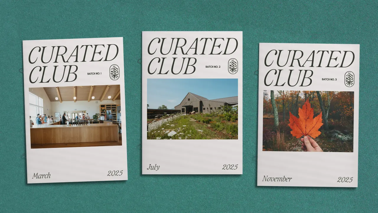
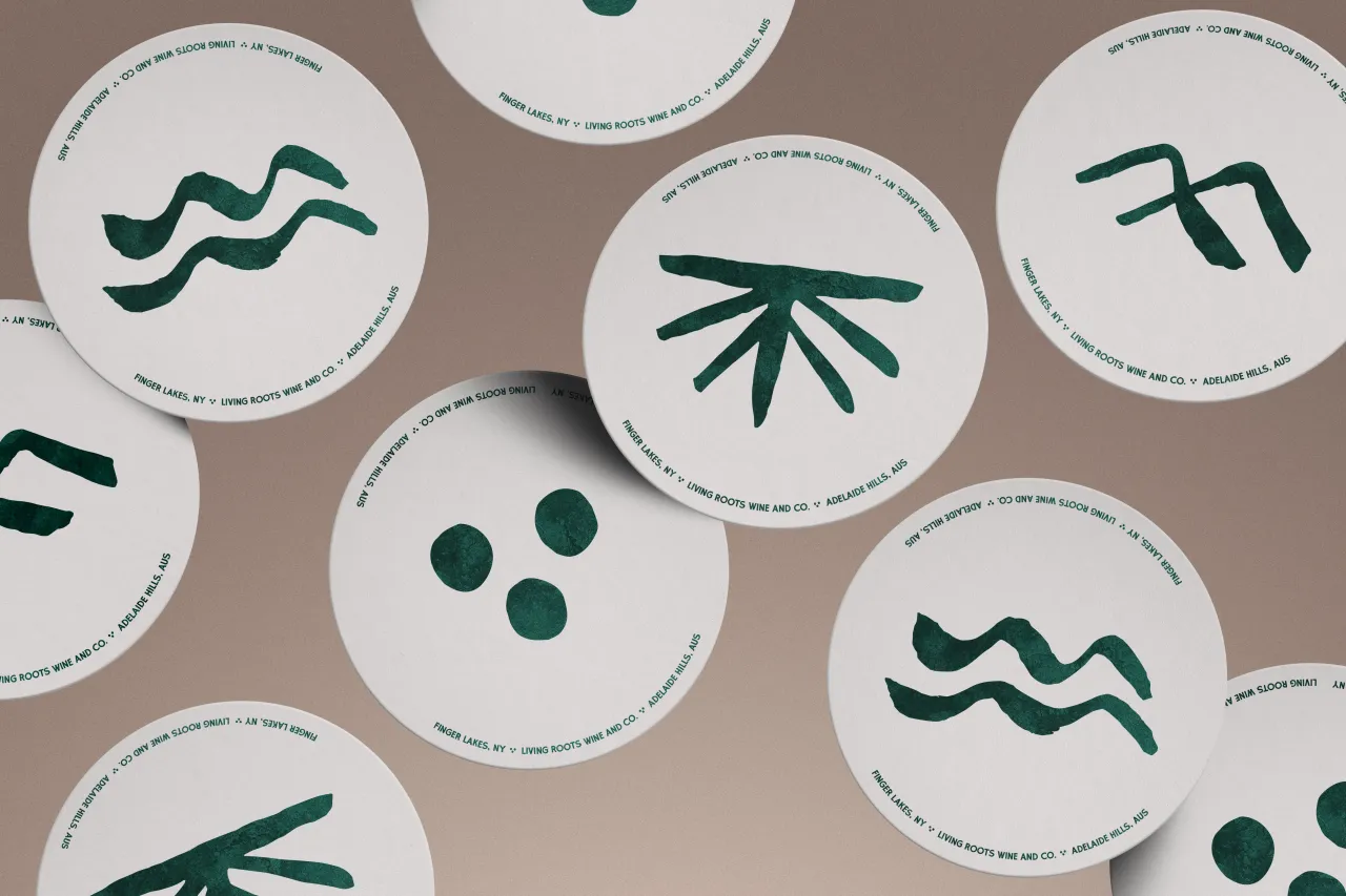
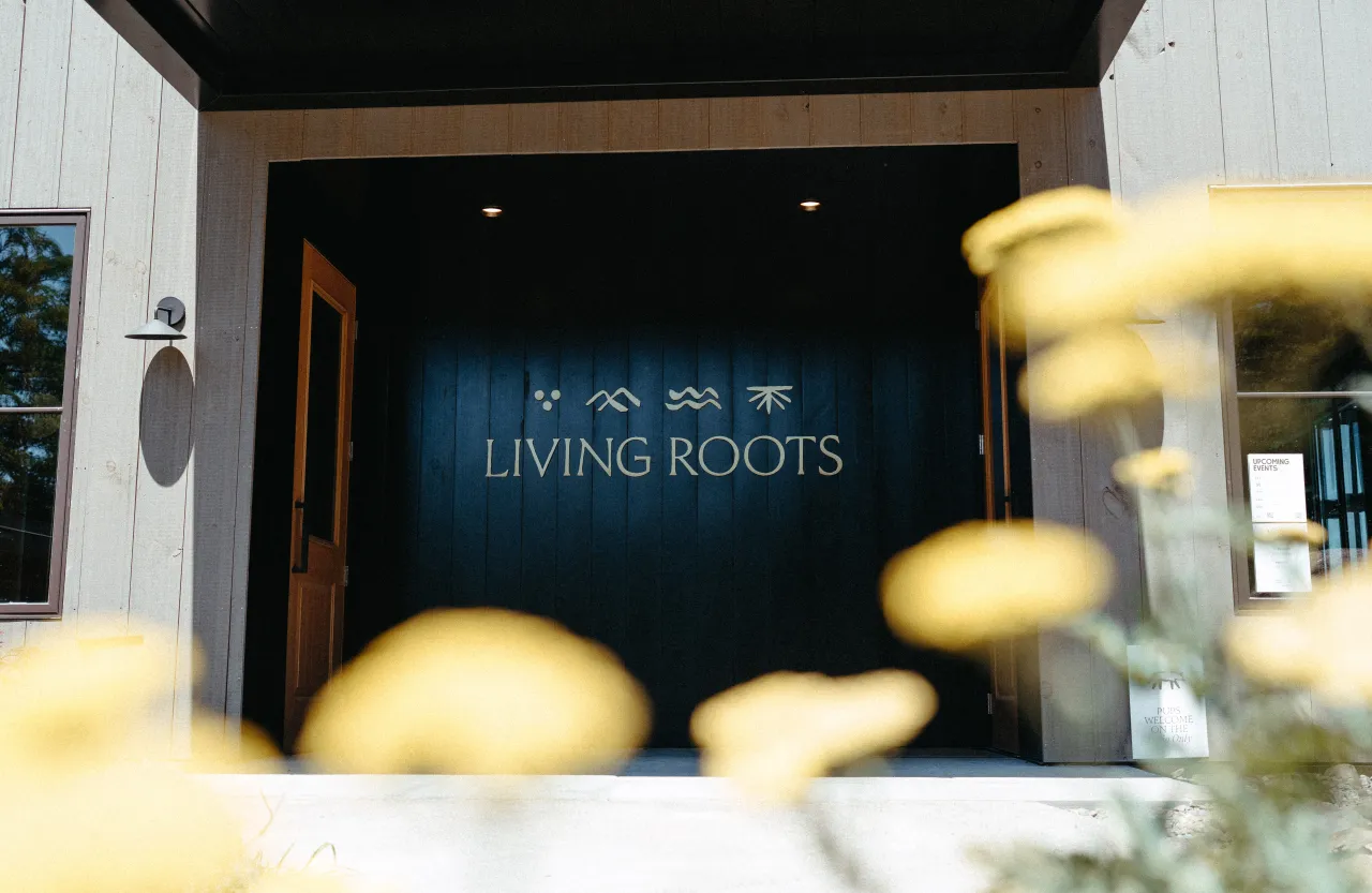
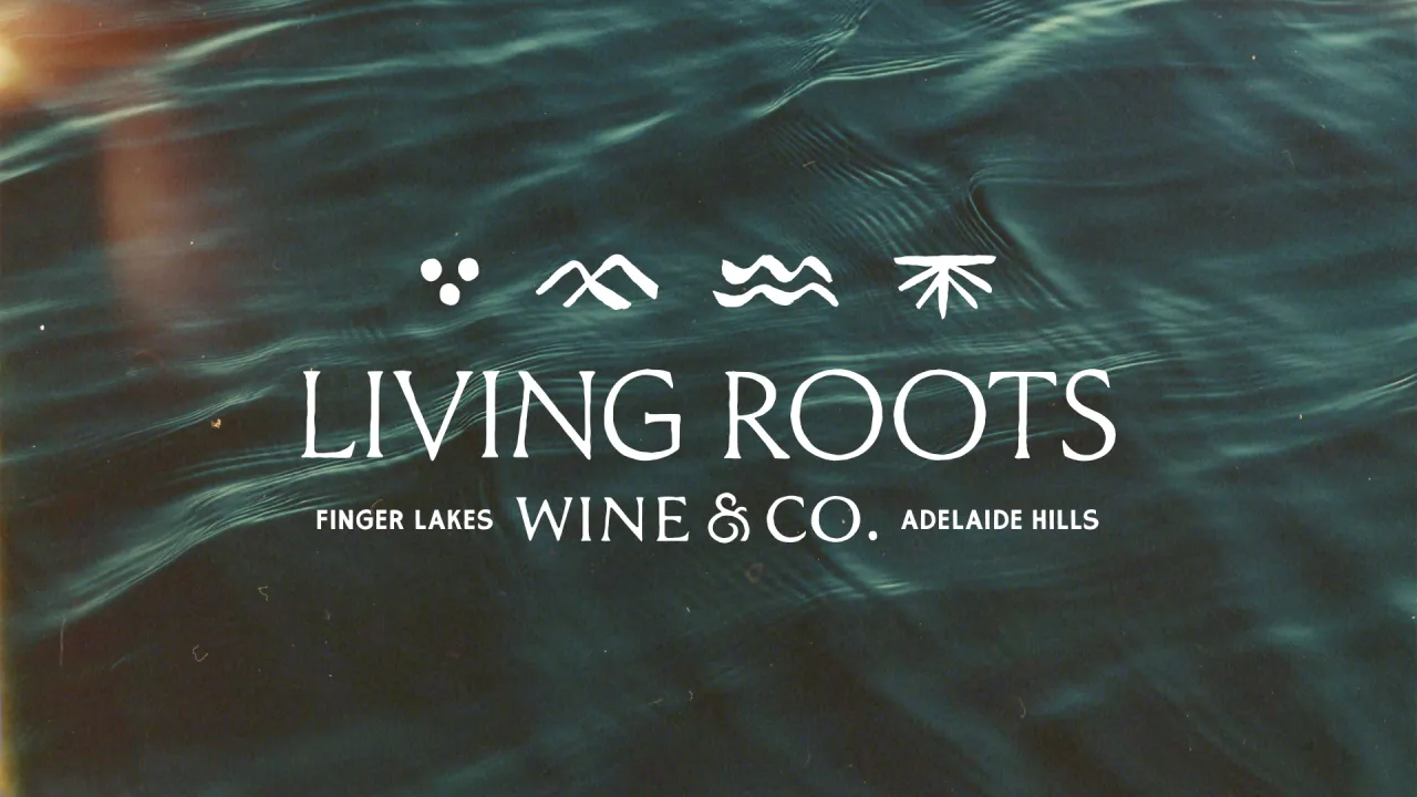
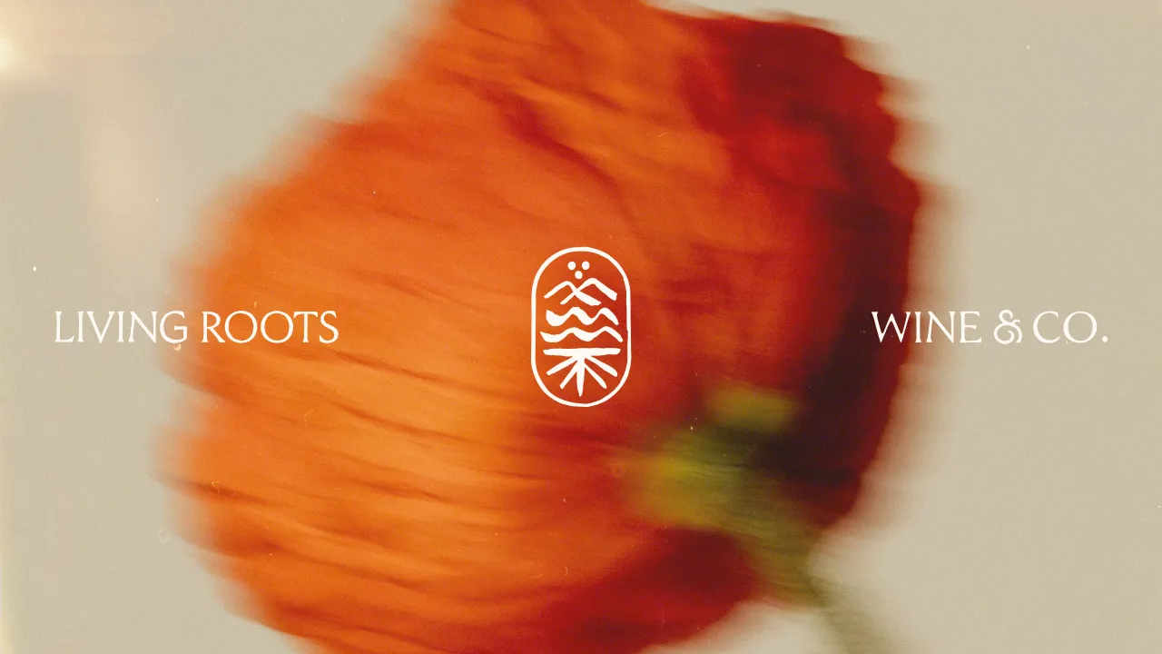
At the centre of the new identity is a logo that Smith & Diction describe as a "story symbol." Built from layered motifs that include water, roots, rocks, and the sun, it can be arranged horizontally, stacked vertically, or broken apart to suit different contexts. The approach enables flexibility across various applications while maintaining consistency.
The symbol also encodes geographical references, with one side representing the shale soils of the Finger Lakes and the other nodding to the clay soils of Adelaide Hills. It's basically symbol inception.
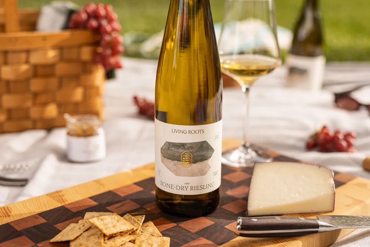
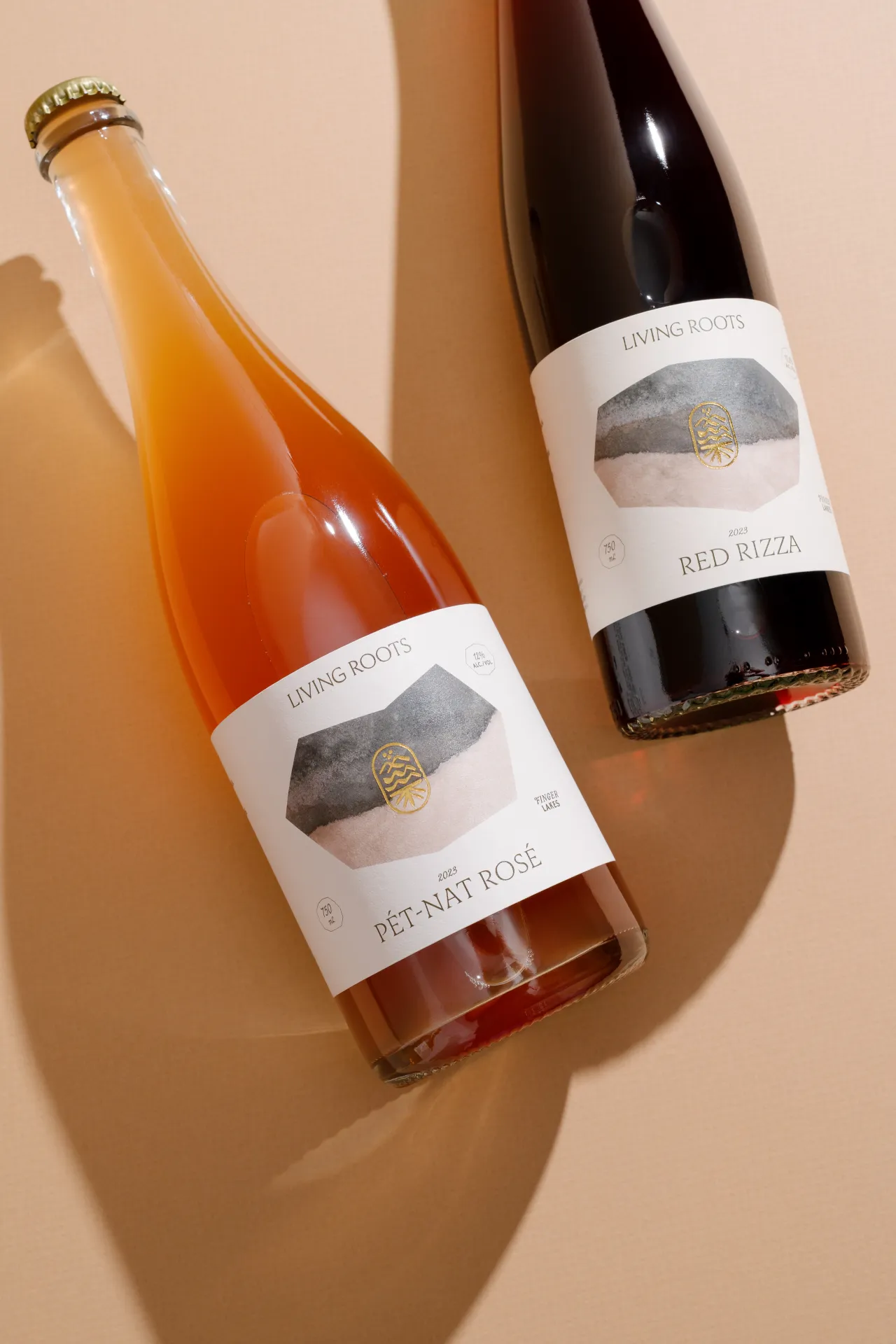
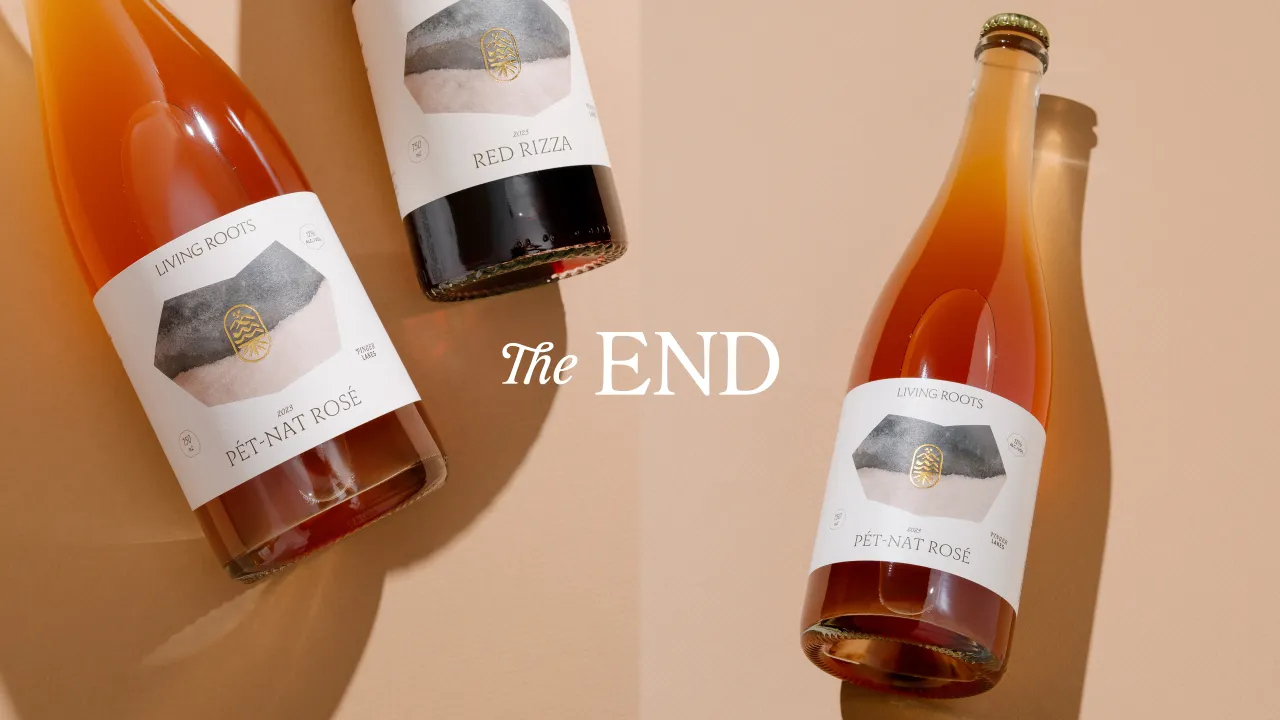
Smith & Diction also redesigned the wine labels, replacing the previous dark watercolour backdrops with lighter palettes and overlapping textures. Each variety now features a unique rock-shaped "window" containing its soil tone, ensuring differentiation at a glance.
Crucially, the redesign places wine names prominently on the front, addressing a hierarchy issue in the old labels. "Any second that people might need to turn your label to read the name is a dangerous game to play," Mike explains.
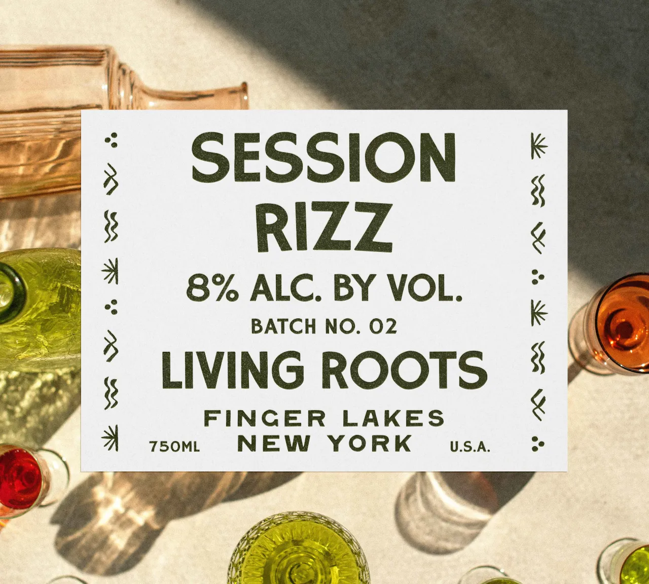
Typography was selected at the very beginning of the project, with three typefaces chosen to cater to different needs. Auroc brings modern refinement, Caliste adds elegance for detailed elements, and Rockhill Rough injects a rustic character, particularly for the more casual "session line" wines.
"I wouldn't recommend picking typefaces that early," Mike jokes, "but in this case, it worked beautifully."
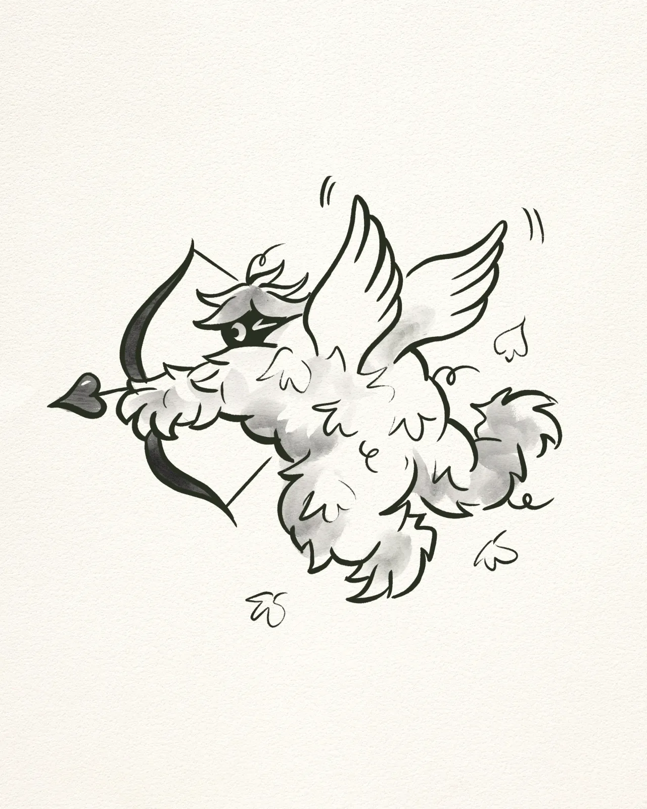
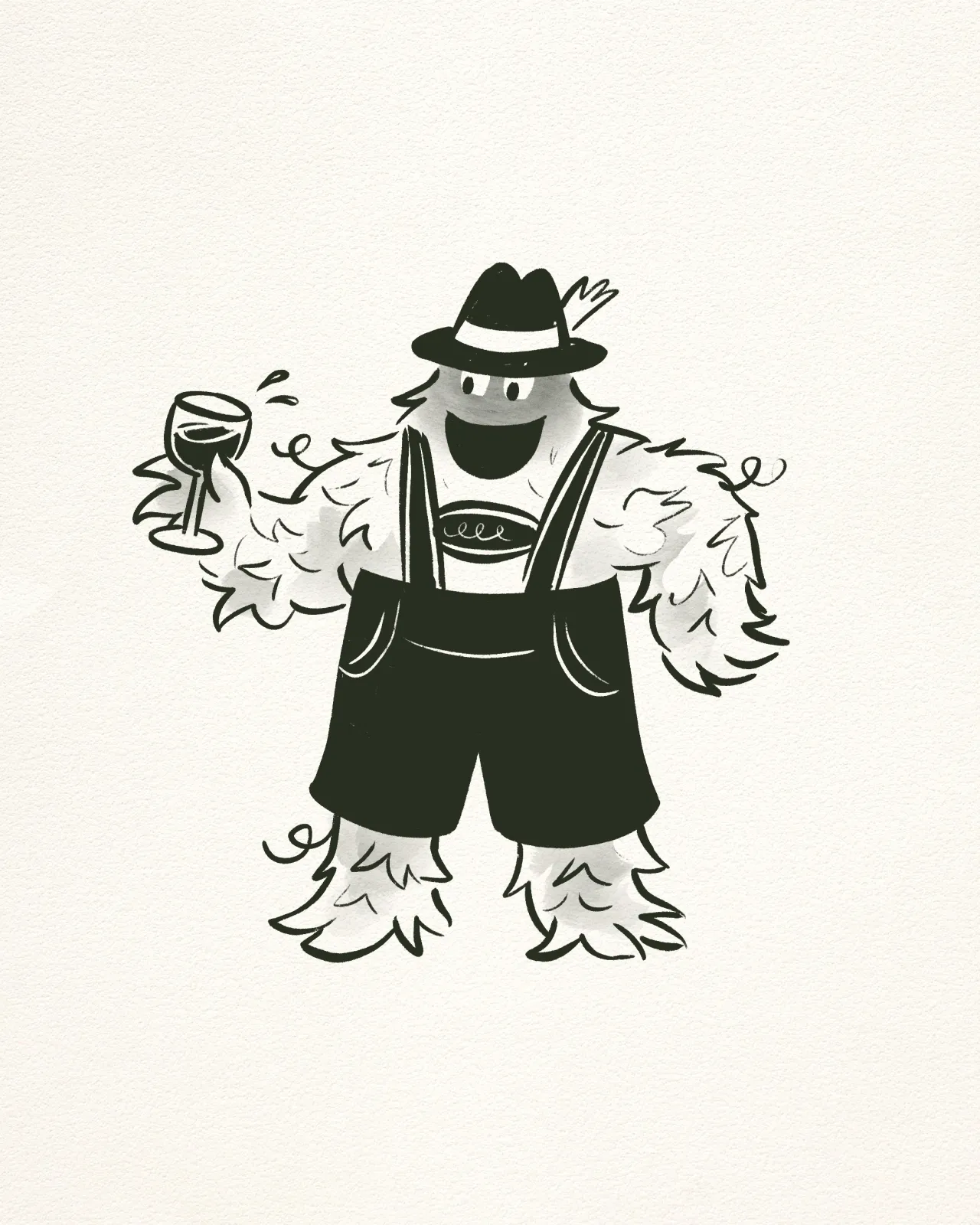
Adding a note of humour is Rooty, a grape-vine yeti designed as the brand mascot. Rooty appears across merchandise, colouring pages and tasting room materials, providing a playful foil to the more refined aspects of the identity.
Mike describes him as a character who "likes to run away with grapes and steal wine from the cellar."
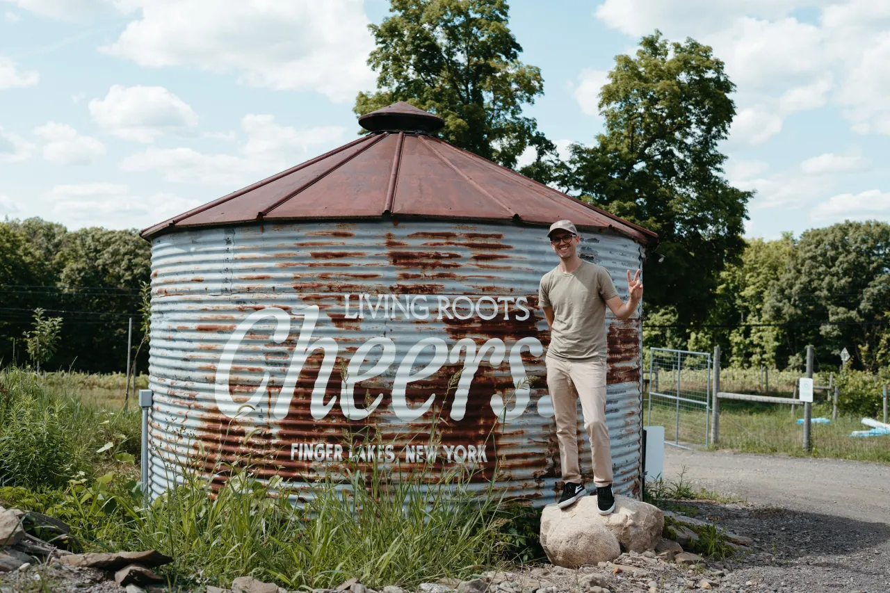
The rebrand also extends into the new tasting room overlooking Keuka Lake, which combines clean lines and large windows with softer, living-room-style zones. According to Mike, visitors responded warmly to the space: "Almost every single person said, 'Woooow, this is so stunning'."

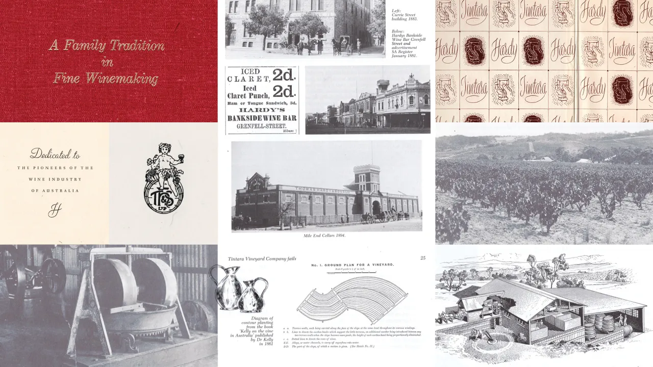
The project aimed to reflect Living Roots' unusual position as both deeply traditional and highly experimental. Seb Hardy, co-founder and a sixth-generation winemaker, is known for pushing boundaries while remaining rooted in his family's winemaking heritage.
"Seb's experimental stuff is still incredibly solid," Mike says. "He can break all the rules, because he knows which rules are important and which ones are just tradition."
The final system gives Living Roots a brand identity that is flexible, culturally specific and designed to evolve alongside the business.
Editor's Picks





Trending



Latest Jobs
Motion Designer at Figma
Full-time·New York·US$105,000 – US$183,000
Senior Designer at David&Goliath
Full-time·Los Angeles·$100,000 – $140,000
Designers / Copywriters / Art Directors / Creatives at Hatched
Full-time·London·£25,000 – £55,000
Director, Strategy at Interbrand
Full-time·New York·$160,000 – $210,000
Mid-Weight Creative Designer at British Heart Foundation
Full-time·London·£35,000 – £37,000
Multidisciplinary Designer at Formation Games
Full-time·London·£40,000 – £50,000