Design Bridge creates new corporate identity for The Vintry, an innovative co-working space
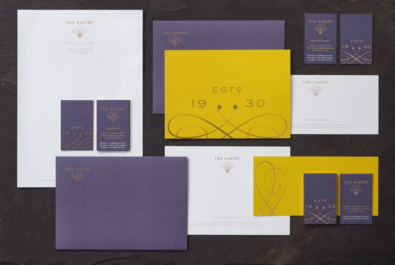
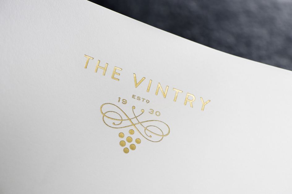
When looking at this branding by independent design agency Design Bridge, which it created for The Vintry: an innovative co-working space for The Coe Group of Companies, I'm immediately struck with feelings of luxury and elegance. This is fitting, as the Vintry houses The Coe Group’s premium wine & spirit agencies: Mangrove and Barwell & Jones.
Gary Nettleton, Design Director at Design Bridge said of the project: "The identity needed to position The Vintry as an innovative workspace and leading business resource for the drinks industry as well as express the creative, collaborative and entrepreneurial spirit they are trying to foster there. We felt an important part of this was tapping into the Coe family’s decades of experience and distinguished heritage in the industry to add weight and gravitas to the design, so we began by researching the pioneering founders of the business."
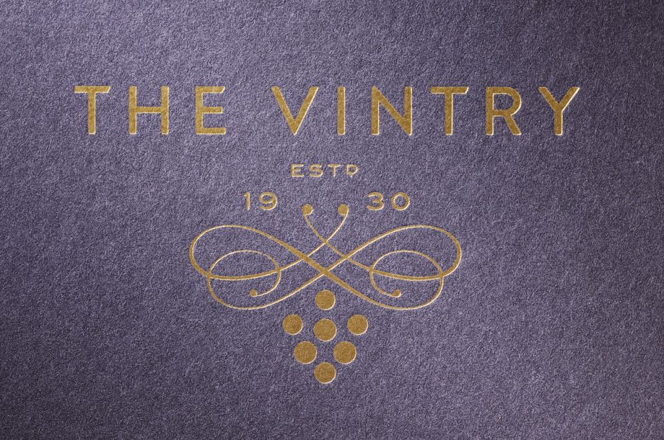
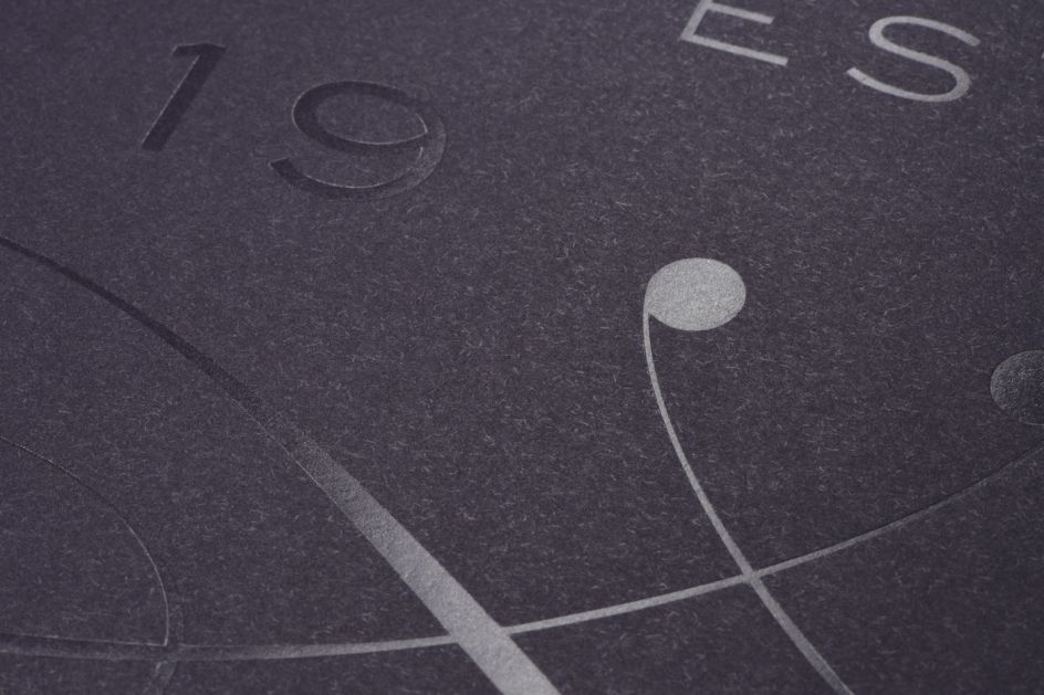
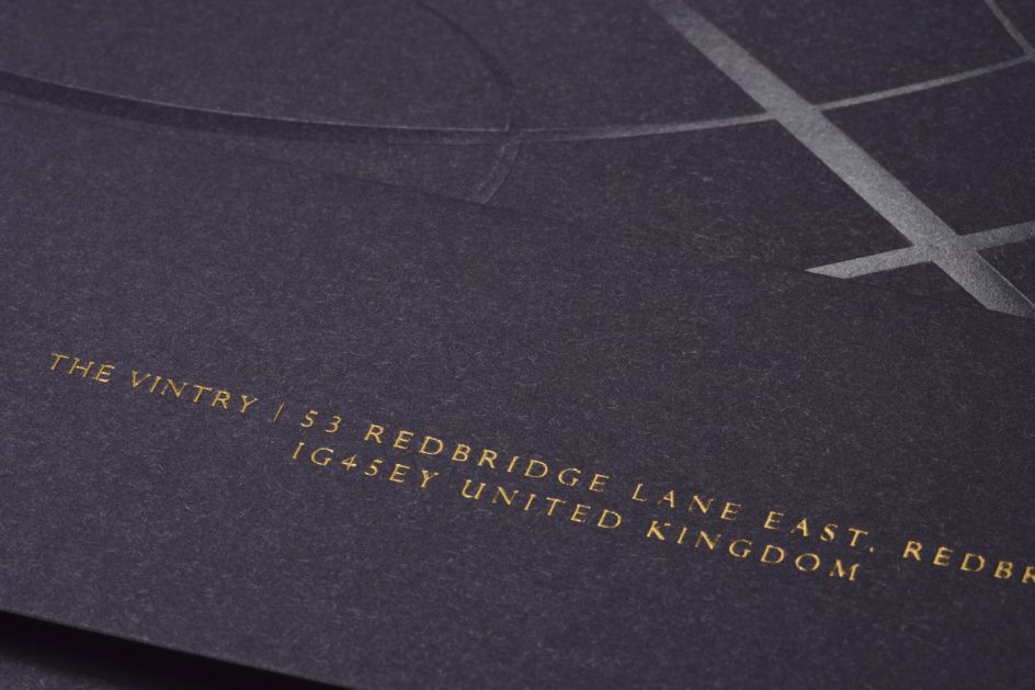
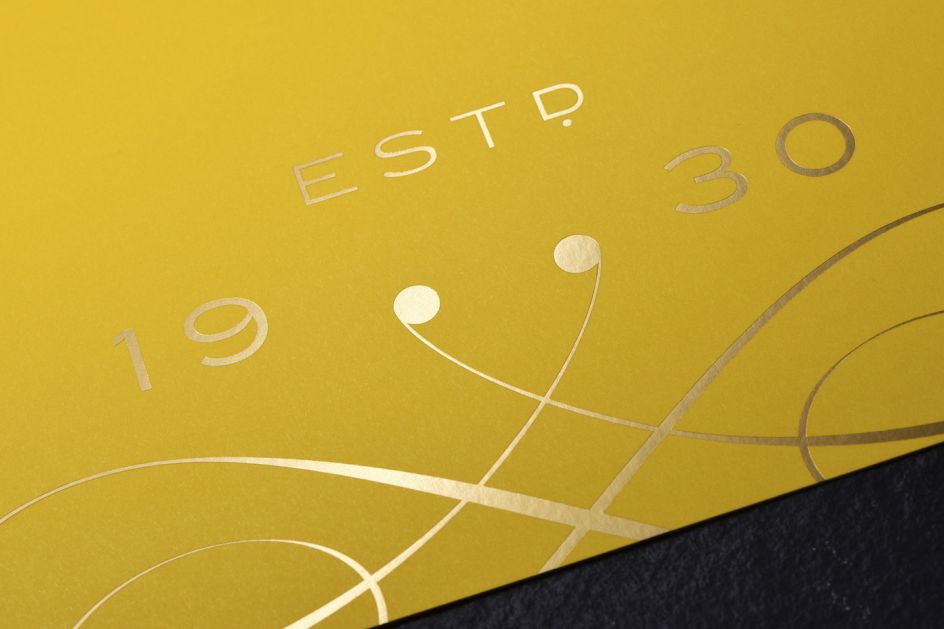
Design Bridge discovered the building that now houses The Vintry was a farm in the 1930s owned by Eric George Coe, founder of Coe Vintners, which became one of London's largest and oldest wine and spirits wholesalers. Eric George Coe started his business by converting his living quarters into an off-licence before going on to open several other commercial premises as his business took off. It was his second off-licence, opened in the 1970s at 243 Beehive Lane, Ilford, that really captured Design Bridge’s imagination.
Claire Parker, Executive Creative Director at Design Bridge added: "The address on Beehive Lane inspired our creative idea 'A hive of creativity’, referencing the pioneering spirit of the co-founder as he built his business from the ground up, and providing the perfect symbol to communicate The Vintry’s co-working environment: a busy hive of creative and productive people all working together."
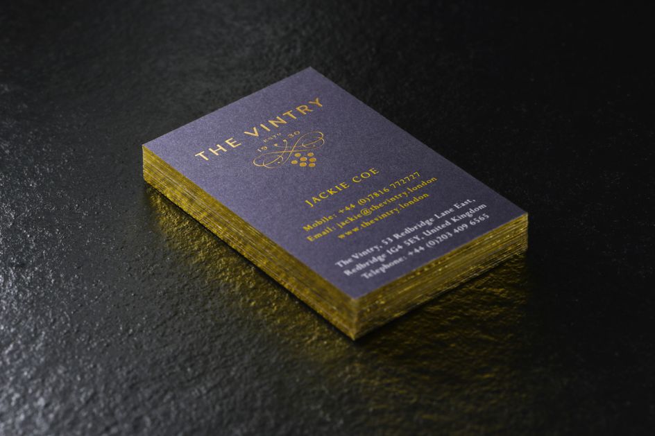
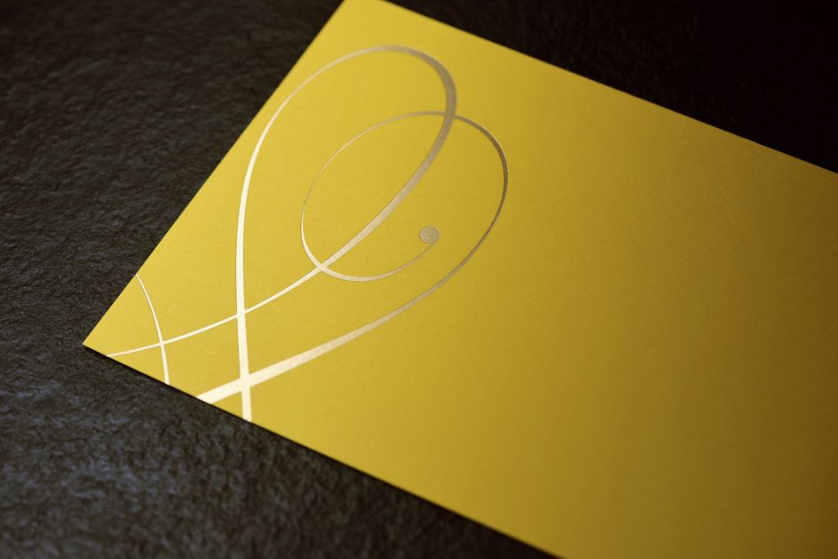
Design Bridge crafted a distinctive bee icon for the brand, using grapes to form the body and two elegantly curled vine tendrils for the wings that have a calligraphic quality reminiscent of traditional wine typography. The hand-drawn, uppercase sans serif lettering provides a contemporary, more business-like contrast to the classic flourishes of the bee icon. Together they communicate The Vintry’s ambition to combine leading business expertise with cutting-edge creativity.
This idea is reflected in the colour palette, which includes honey-coloured gold foil to denote quality, heritage and excellence, and ‘pops’ of yellow that capture the dynamism of The Vintry’s modern working environment. Design Bridge also developed a secondary colour palette inspired by the beauty of an English country garden in full bloom, the bee’s natural, daily working environment and the bright and vibrant energy of The Vintry. Discover more at designbridge.com.
Editor's Picks


Trending


Podcasts


Editor's Picks
Further Reading