Studio Moross spins a vibrant new identity for Glitterbox's 2025 season
Glitterbox's fresh global campaign is complete with five dance floor muses, punchy palettes and a rallying cry that it's all 'Made For The Dancefloor'.
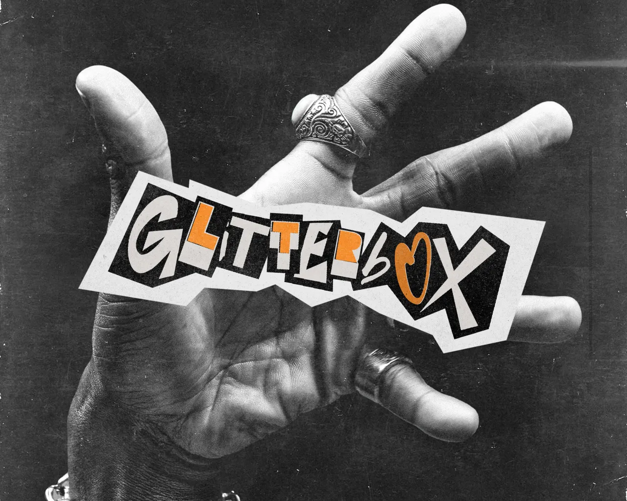
When Glitterbox burst onto Ibiza's club circuit in 2014, it promised the purest joys of disco, house and soul for everyone who could squeeze into the booth or shimmy under the mirror ball. Eleven years, countless jet-lagged after-parties and a devoted international following later, the label-cum-nightlife-phenomenon has called in London design outfit Studio Moross to tune up its visuals for 2025.
The studio, founded by designer and art director Aries Moross in 2012, knows a thing or two about spectacle. Their back catalogue includes neon-drenched tours for Kylie, stage design for the Spice Girls and global branding for MTV.
Yet, rather than tearing up Glitterbox's feather-boa rule book, the brief asked for a careful polish. In other words, turn up the colour and keep the soul.
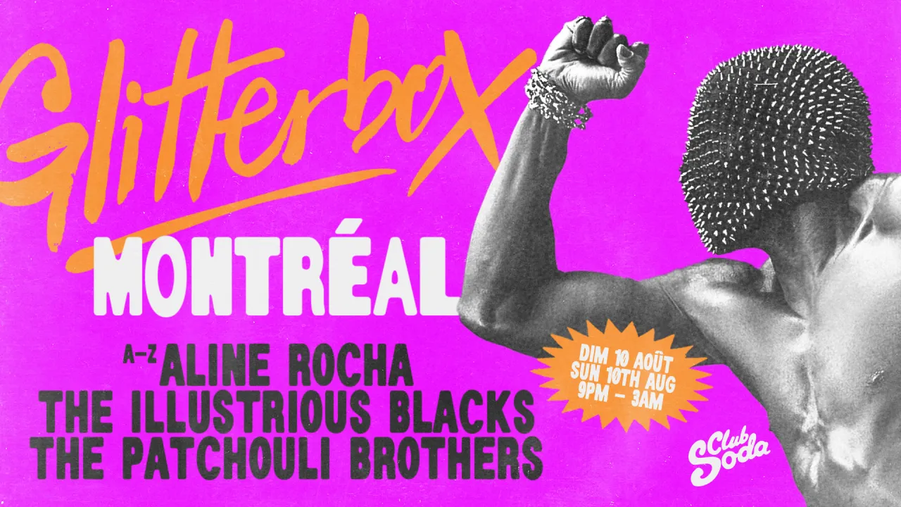
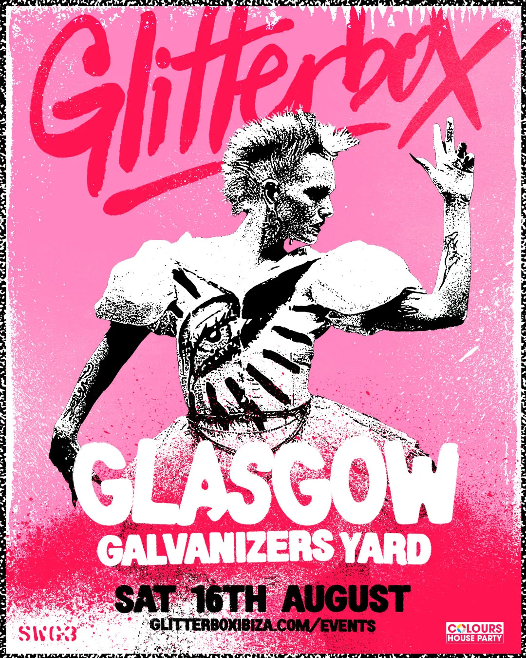
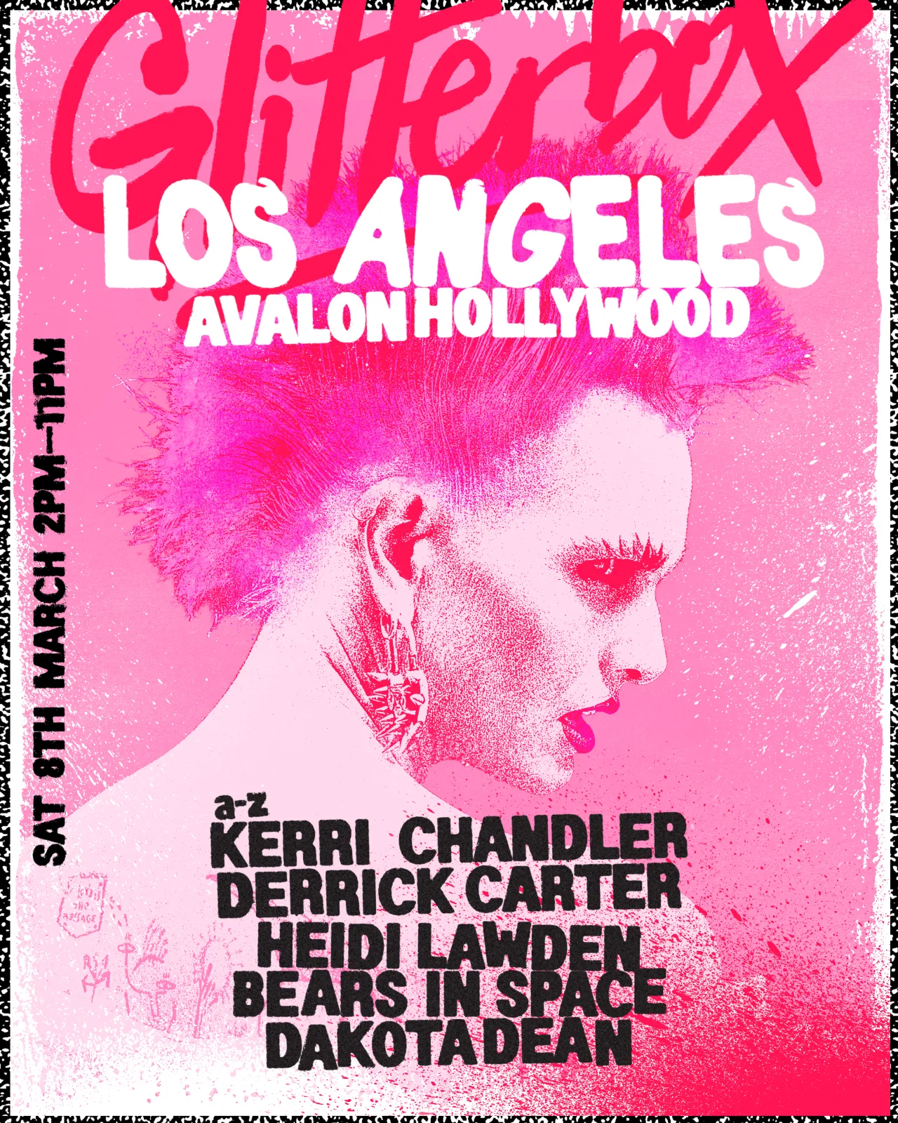
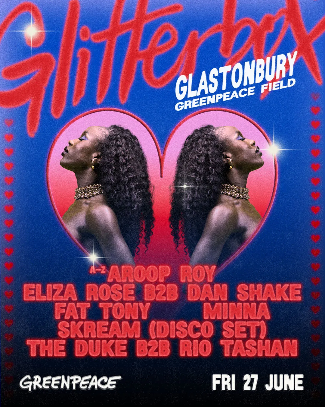
Studio Moross anchored the refresh around five archetypal "muses": The Waacker, The Pink Punk, The It Girl, The Lovers and Playa del Pole. Each one channels a familiar club-kid energy, instantly legible whether you've spent nights at Hï Ibiza or only watched Glitterbox sets on YouTube at 3 am. The campaign team, led by art director Fancy Shews and photographer Paul Perelka, captured the muses in a high-octane shoot.
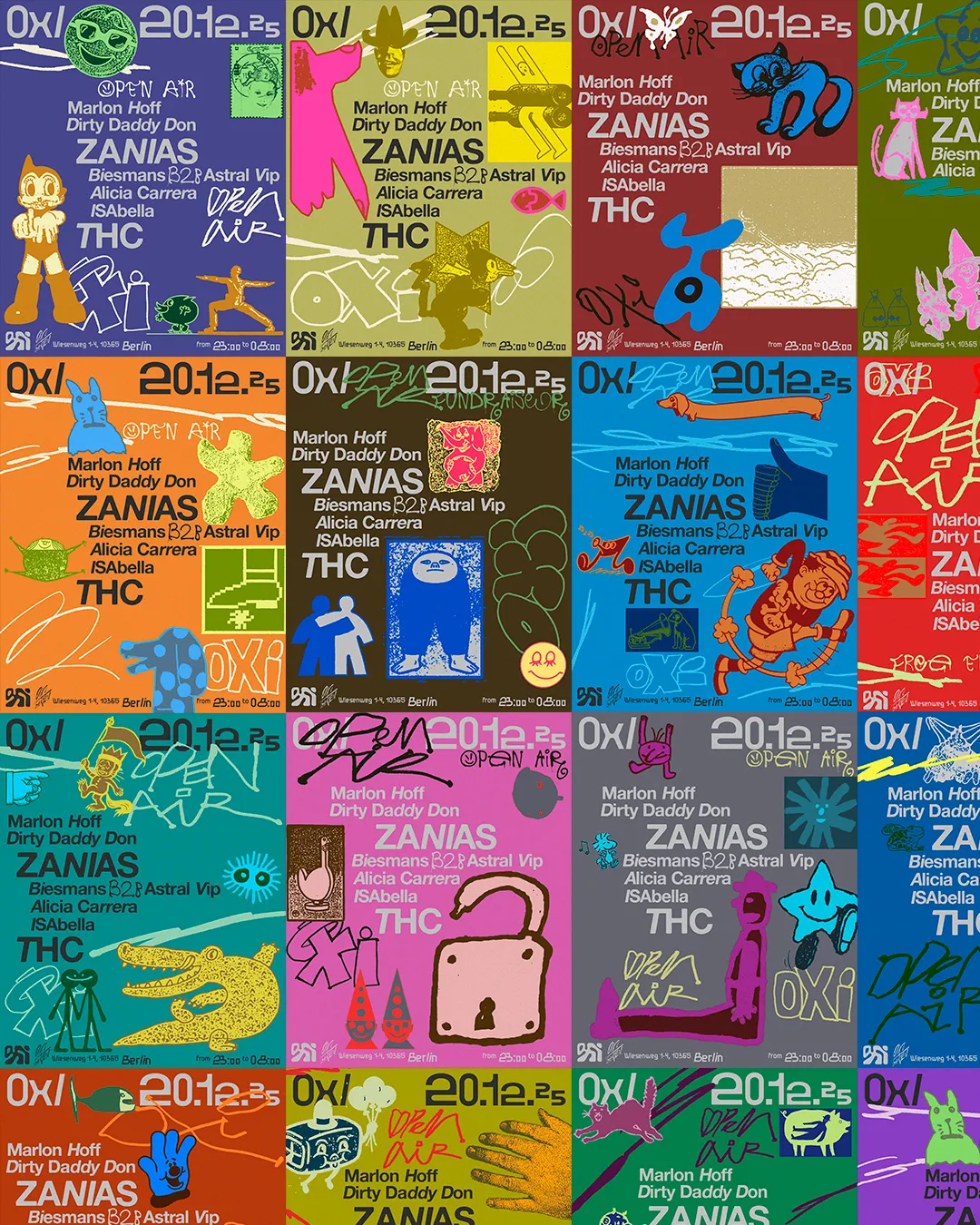
Instead of stamping the same logo onto every flyer, the studio assigned a distinct colour palette, graphic texture and Serial font weight (from Dum Dum Studio's gloriously distorted type family) to each persona. The result is a modular system that can flex across a year of tour posters, social stickers and nine-by-sixteen Reels without sinking into sameness.
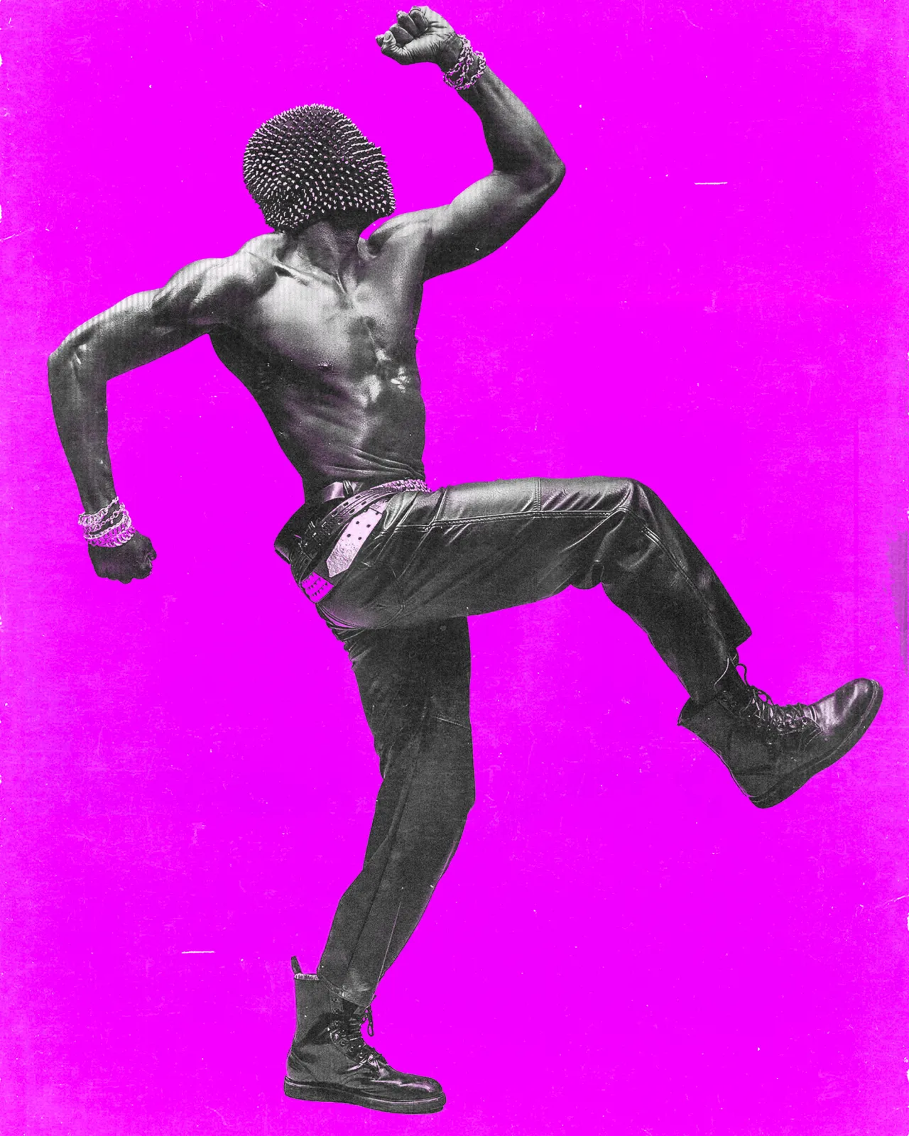
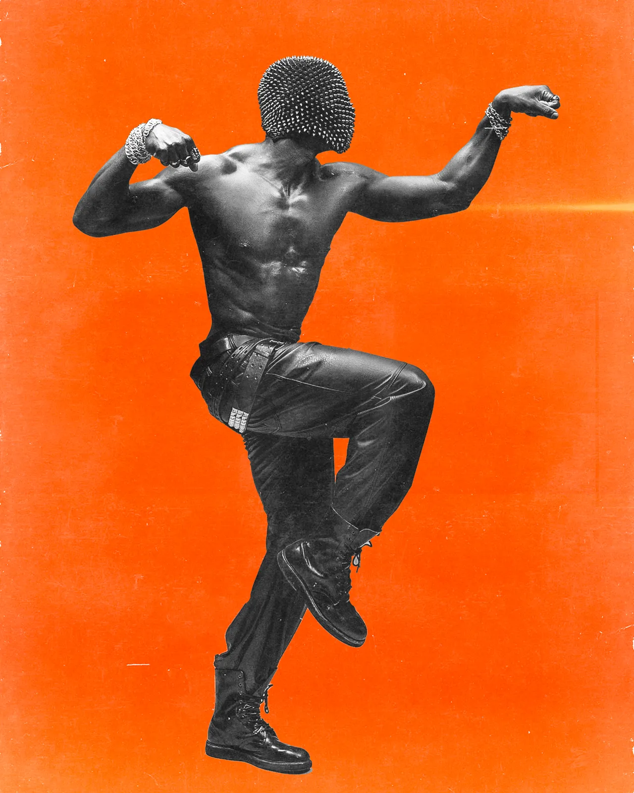
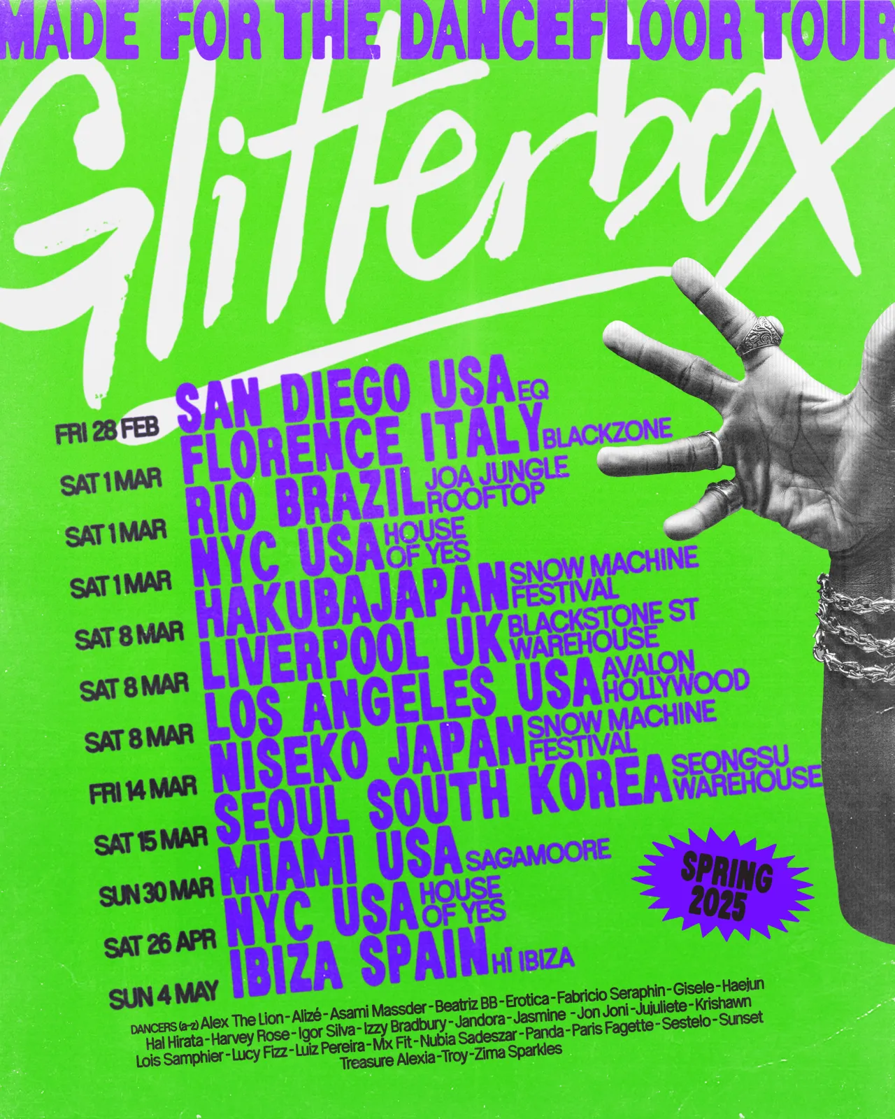
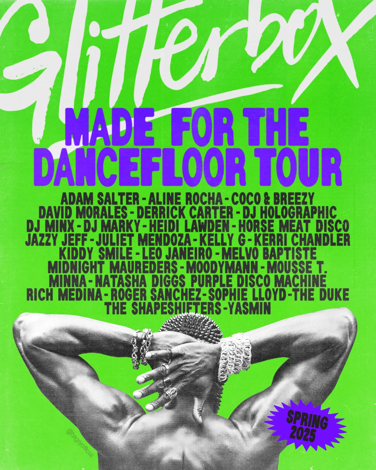
Threading the project together is a no-nonsense tagline: 'Made For The Dancefloor'. Simple, yes, but it doubles as a manifesto for Glitterbox's radically inclusive ethos.
In a club landscape still prone to VIP ropes and monochrome techno chic, the phrase is a friendly shove to get everyone moving – stilettos, Crocs, or mobility aids are all welcome.
Studio Moross amplifies that openness through motion graphics and short-form video, nudging Glitterbox beyond static print heritage and into TikTok-native territory. Expect looping animations where Serial's blurred weights shimmy in time with thumping hi-hats and LED banners at events that drench pavements in candyfloss pink long before the bass drops.
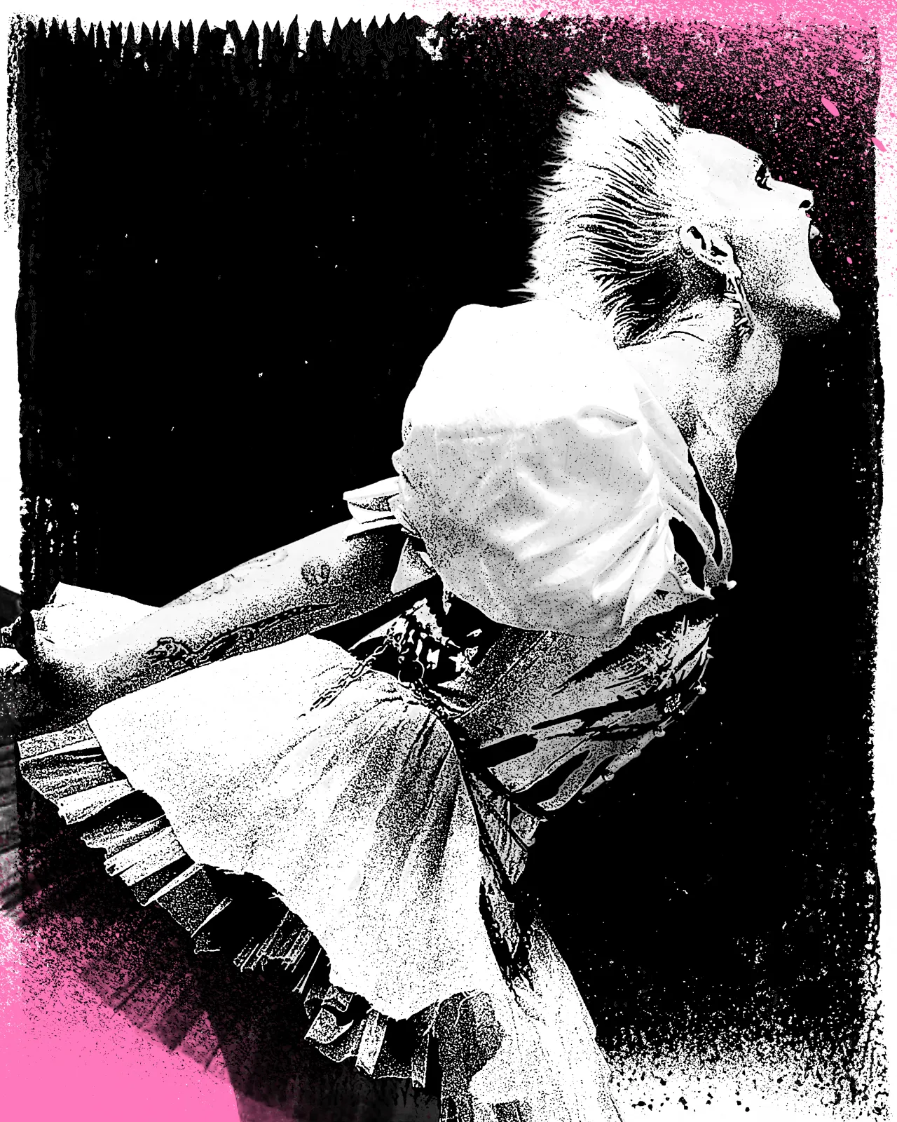
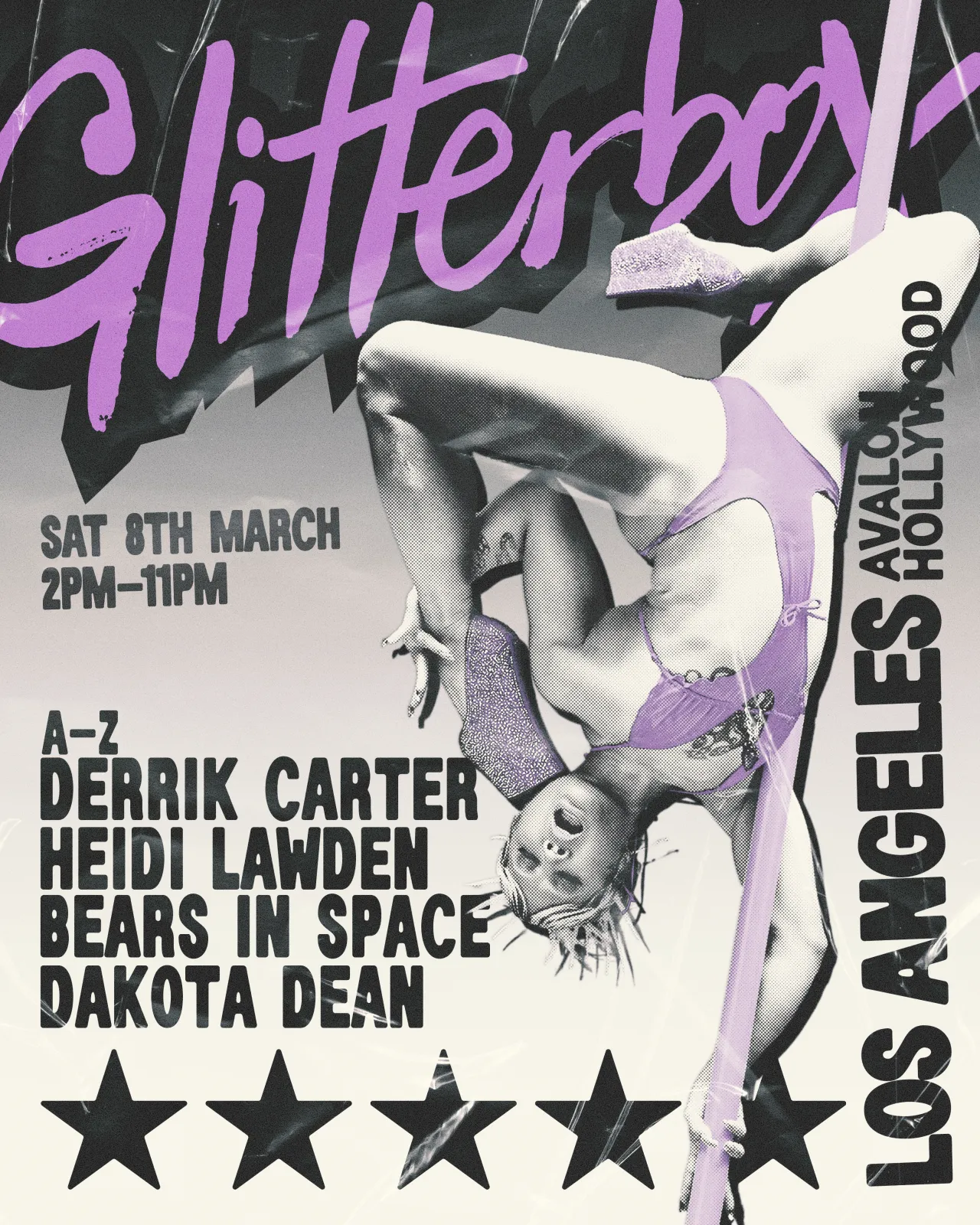
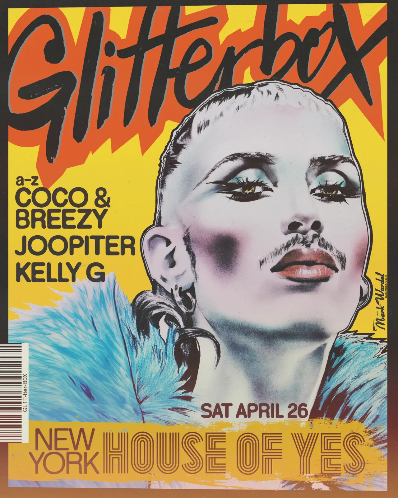
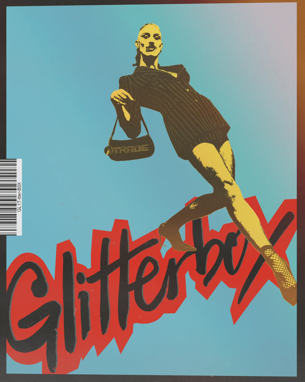
Of course, you can't talk about Glitterbox without mentioning Mark Wardel. The British illustrator's pop-infused portraits have been a visual signature since day one, and the refresh wisely keeps him centre-stage. Wardel's new series of bold, stylised heads pop up alongside the muses, providing a familiar anchor for long-time fans while slotting neatly into the updated type grid.
The logotype – that curling, fast-scribbled word-mark – survives intact too. Studio Moross treats it like a masthead, letting it ride shotgun on posters and merch while the supporting graphics riff wildly beneath.
Glitterbox never was a homebody, and the 2025 calendar is proof. The refreshed brand will debut at Glastonbury's Dance Village, storm NYC Pride, add sparkle to Brunch Electronik in Barcelona, light up Glasgow's Galvanizers Yard and round things off at London's cavernous Drumsheds. Each stop will showcase a different muse and palette, creating what Aries calls "visual buckets" that keep the year-long campaign feeling fresh without losing cohesion.
Behind the scenes, Studio Moross has produced an extensive toolkit – brand guides, motion templates, social overlays – so Glitterbox's in-house team can riff on the system as new gigs stack up. It's pragmatic design thinking: give the DJs and dancers their cues, then let them improvise.
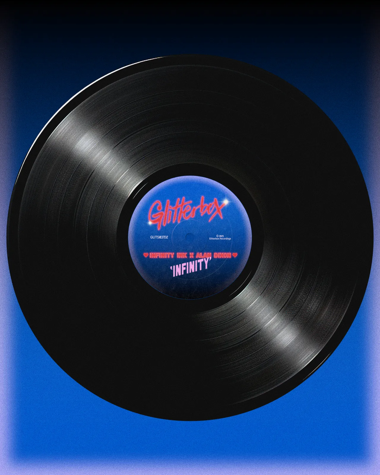
Glitterbox's success has always hinged on community. The parties are famous for mixing ages, genders, body types and dance styles with the abandon of a YouTube autoplay queue. The new identity amplifies that inclusivity visually, making space for difference rather than squeezing everything through a single stylistic funnel.
In sustainability circles, we talk about "longevity by adaptability" – building a system that can evolve and reduce the need for constant rebranding (and the inevitable waste of reprinting everything in sight).
There's also a subtle refusal to chase the current obsession with Brutalist minimalism. Neon gradients, distressed type and cheeky portraits might feel retro-camp to some, but they reject the greyscale anonymity that still clings to much of club culture. In short, colour is back on the menu, and it's ordering the house special.
Editor's Picks





Trending




Latest Jobs
Senior Designer at Code and Theory
Full-time·New York·$90,000 – $115,000
Producer, Marcom at Code and Theory
Full-time·New York·$75,000 – $90,000
Director, Brand at KQED
Full-time·San Francisco·$125,547 – $165,000
Designer (Digital, Brand & Localisation) at Journey
Contract·London·£45,000 – £62,500
Creative Artworker at Magpie Studio
Full-time·London·£34,000 – £40,000
Creative Director at Koto
Full-time·London·£95,000 – £130,000