There's a long tradition of designers being asked to "reflect the community" in their work. Usually, this means a mood board, a few vox pops and a palette inspired by the client's existing brand colours.
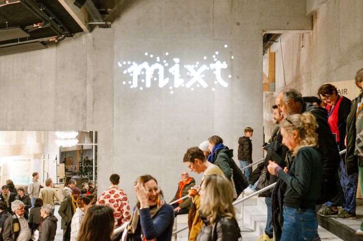
Uncommon, a global studio with offices in New York, London and Stockholm, took a rather different approach for this year's edition of the long-running design festival OFFF Barcelona. They invited members of the global creative community to casual mixer events in both cities, waited for everyone to relax and start talking, and then quietly swabbed the cups, doorknobs and shared surfaces for biological traces. Those traces were cultured in a lab. The resulting moulds served as the visual foundation for the entire campaign.
The punchline was saved for the festival's opening morning on 16 April, when Uncommon's Nils Leonard revealed the concept live on stage at Disseny Hub Barcelona. The crowd's reaction moved rapidly from laughter to genuine delight, which is the response you'd hope for when you tell a room full of designers they've unknowingly starred in a brand identity.
A living magic trick
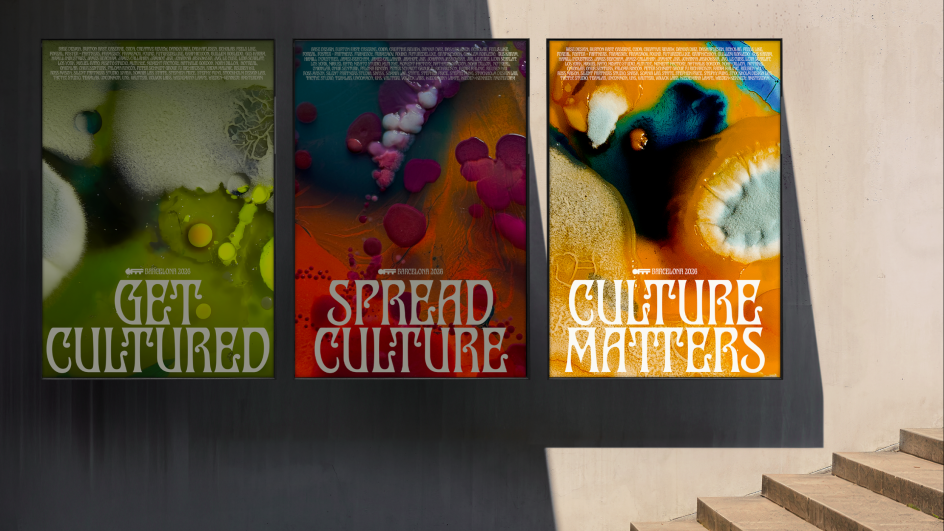
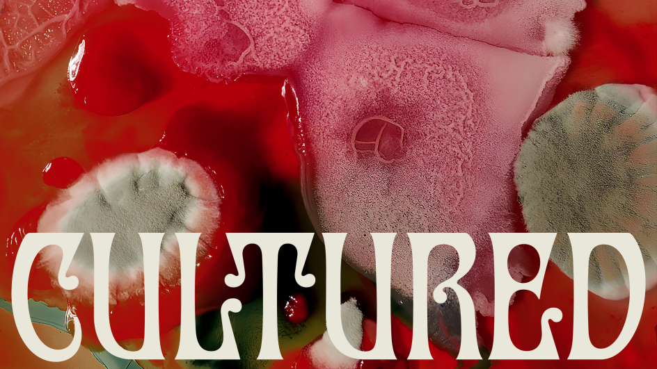
The campaign is called Cultured, a title that works on multiple levels. It nods to the petri dish, to the idea of creative culture as something grown rather than manufactured, and to the gentle joke that designers, of all people, consider themselves cultured.
The central proposition is that the creative industry is nothing but the people in it, and that its future is shaped by those who choose to participate. Even when they think they're just having a glass of wine and complaining about clients.
"For OFFF, the community has always been the core," explains Pep Salazar, director of OFFF Barcelona. "This collaboration with Uncommon makes that idea tangible. The campaign doesn't just speak to designers, it's literally built from them. It's a celebration of shared authorship and the power of gathering, exchanging and making together."
To deliver a library of bold textural imagery, Uncommon brought in the artist Dasha Plesen, known as the Mould Queen for her practice of using bacteria as a creative medium. The result is a visual system that feels genuinely alive: unpredictable, asymmetrical, organic and, crucially, not like anything you've seen at a design conference before.
Typography with a biological logic
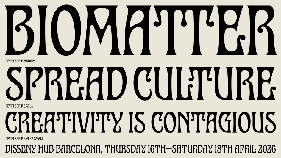
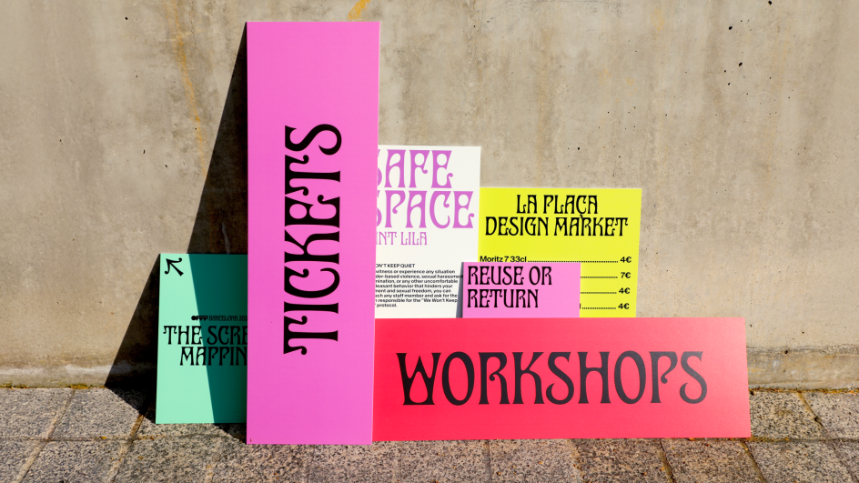
The identity is built around a custom typeface called Hyphae, developed specifically for the campaign and named after the thread-like structures that form fungal networks. The letterforms draw on two unlikely but surprisingly compatible sources: experimental biomorphic design and Modernisme, the Catalan architectural movement that gave Barcelona so much of its decorative vocabulary.
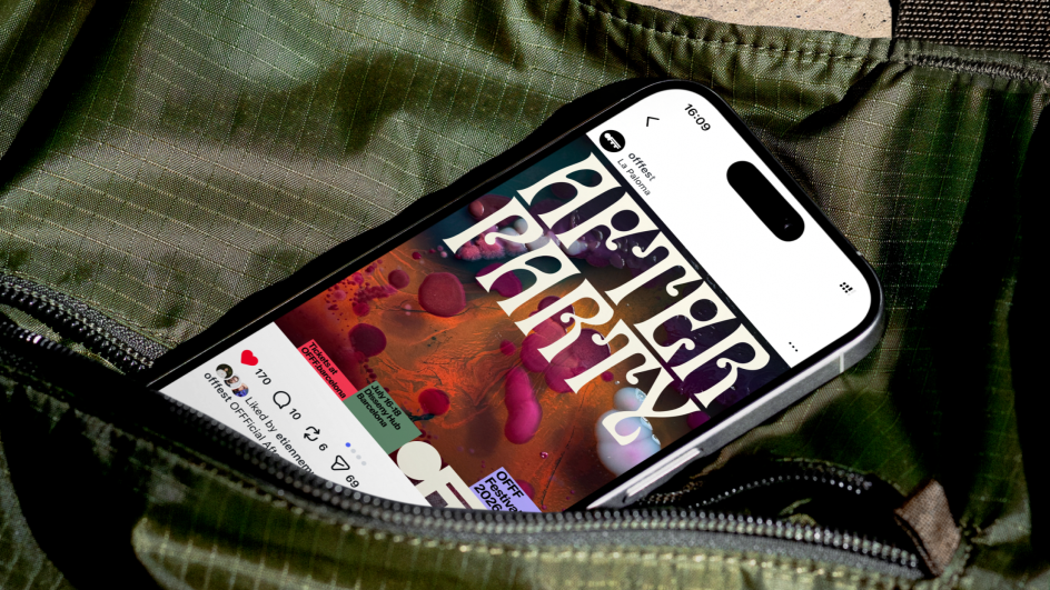
The typeface has the quality of something grown rather than drawn, with an organic movement and asymmetrical balance that mirror the living material it references. Across the festival's touchpoints, from printed posters to stage signage, wristbands, lanyards and social content, the system holds together with the kind of confidence that suggests the constraints were very clear from the start.
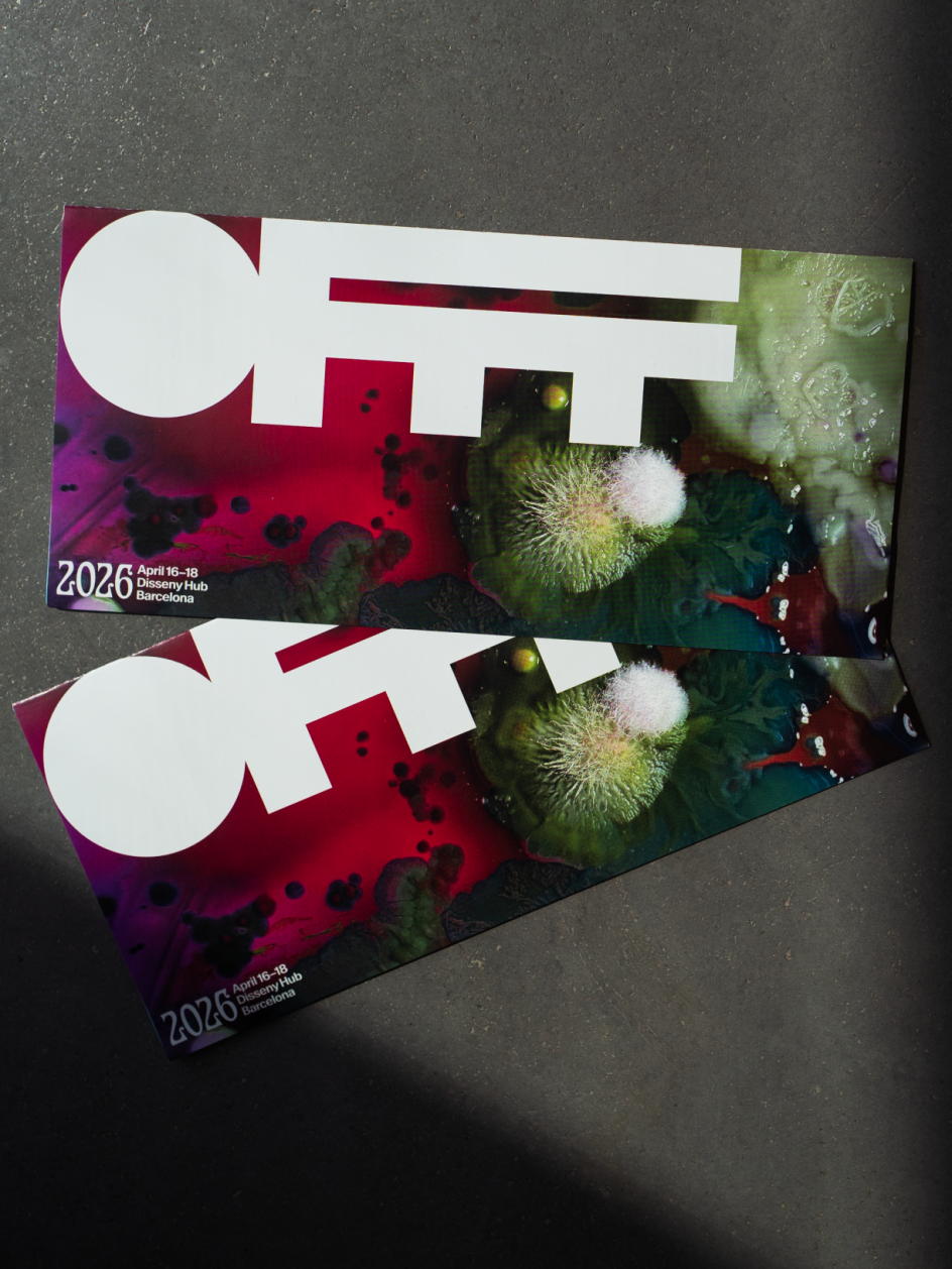
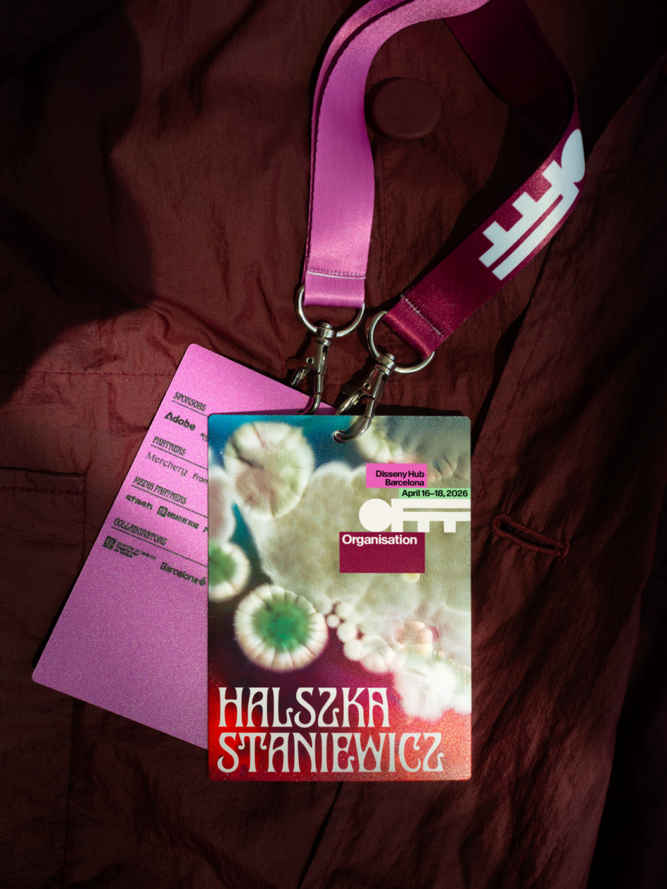
The colour approach draws from nature's boldest palette: deep reds, electric greens, vivid purples, and earthy ochres. It looks nothing like a standard conference identity, which is the entire point for a festival that's been running for 26 years and wants to keep things fresh.
Participation as strategy
Beyond the theatrical reveal, there's a serious idea at the heart of Cultured. The campaign was developed against a backdrop of widespread anxiety in the creative industry, with AI displacing roles, trend cycles accelerating, and the nagging sense that much of what gets made is converging on the same aesthetic solutions. In this context, the campaign's insistence that creativity is collective and grounded in real participation feels like more than just a clever concept; it has genuine meaning.
The strategic framework treats creativity as a living system: it begins with a spark, grows through shared input, and evolves through collaboration. Rather than presenting making as a solitary act of individual genius, it foregrounds the communal nature of the work.
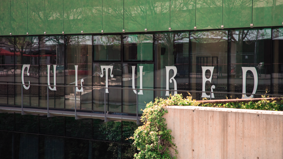
The rollout extended the idea into the city itself. The identity was projected onto the facade of Disseny Hub, where it was visible to the general public throughout the festival, not just the badge-wearing attendees inside. For a creative industry that occasionally forgets to address anyone outside its own bubble, it was a meaningful gesture.
What designers can learn from this
For creative professionals watching from a distance, the most instructive thing about Cultured isn't the mould, dramatic as that is. It's the discipline of the central question. Uncommon asked themselves what the community actually is, not metaphorically but physically, and then followed that question all the way to its logical conclusion.
The result is an identity with a genuine origin story, one that can be explained in a single sentence and that becomes more interesting the longer you think about it.
There's also something worth noting about the reveal strategy. Keeping the concept secret until the opening of the festival meant the audience experienced the work in the best possible order: first the aesthetic, then the meaning, then the delight of realising they were part of it. Most campaigns explain themselves upfront and leave nothing to discover. This one trusted its audience to be curious.
Editor's Picks


Trending


Podcasts


Editor's Picks
Further Reading