'The world is deserving of better design': Koto's Jowey Roden on his mission to make quality typefaces affordable
The global agency's co-founder explains why they're putting themselves on the line by launching their own font foundry, CcType.

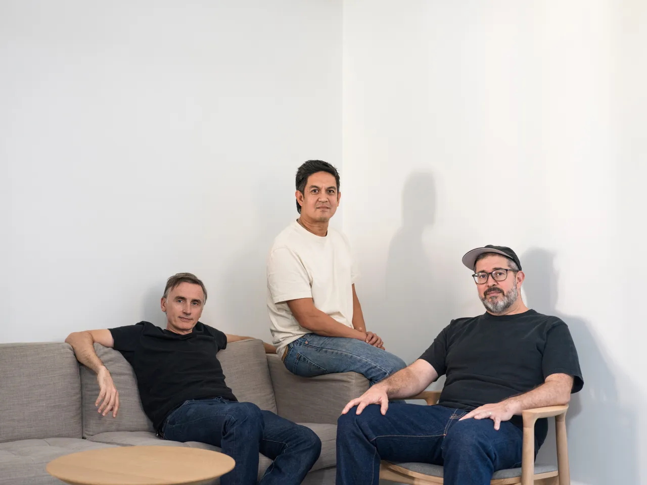
Jowey Roden
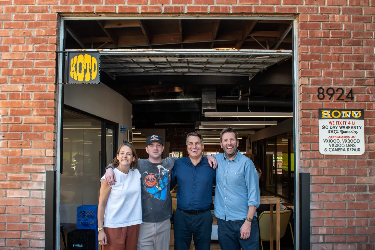
It's a little weird when you think about it. Creative studios spend their careers building things other people put their name on. You pour years of craft into a brand system or a typeface, and then it goes out into the world wearing someone else's logo. Koto has spent a decade doing exactly that for clients including Amazon, Google, Netflix and WhatsApp, and it's been very successful at it.
So its decision to launch CcType—a foundry that puts Koto's own thinking up for sale for the first time—is in many ways a creative risk. Why would an agency this established choose to put its own name on a product that lives or dies on whether people buy it or not?
The answer, it turns out, isn't really about type at all. It's about how Koto thinks about who gets access to its knowledge.
An agency on a mission
It isn't the first time Koto has addressed this issue. In early 2025, they launched Seasoned, a free learning hub aimed at students and emerging creatives who don't have an obvious route into the industry.
Seasoned is built around plain-speaking e-books that explain how branding actually works in practice. That's the kind of insider knowledge that's usually locked inside agencies, rather than shared with people trying to get in the door.

Sam Howard, creative director at Koto, told us at the time that the studio wanted to "demystify branding and make creative careers and the industry more transparent". Crucially, Seasoned was built to be low-commitment and free to access, in contrast to the mentorship schemes and elite programmes that already exist across the industry. You don't need to apply, qualify, or commit to anything. You just read it.
Now, when Jowey Roden—chief creative officer and co-founder at Koto—speaks about the launch of CcType, he has the same mission in mind.
"CcType is broadening the audience we can serve," he says. "We've made efforts with Seasoned to democratise our knowledge for students, and CcType looks to solve a similar challenge. How can we take our knowledge, taste, and experience from the last 10 years and make them available to more people at a lower cost? The world is deserving of better design, and we have a responsibility to deliver on that, even if it's in a minimal or marginal way."
Seasoned gave away Koto's knowledge for free, and CcType is the same instinct applied to a paid product, priced so that freelancers or small studios can actually afford it. A typeface with individual styles from £60 and no renewal fees isn't how a big agency normally prices its output. It instead reflects that Koto already thinks about access.
Launching with one typeface
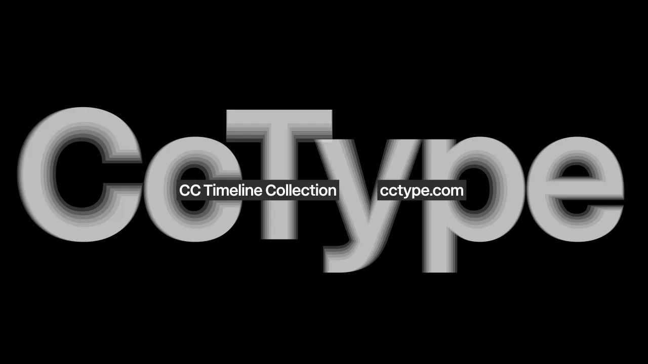
The other thing worth understanding is how deliberately Koto held itself back. It would have been easy to launch CcType with a big range of fonts to prove range and ambition straight away. Instead, it launched with one, CcTimeline. Why?
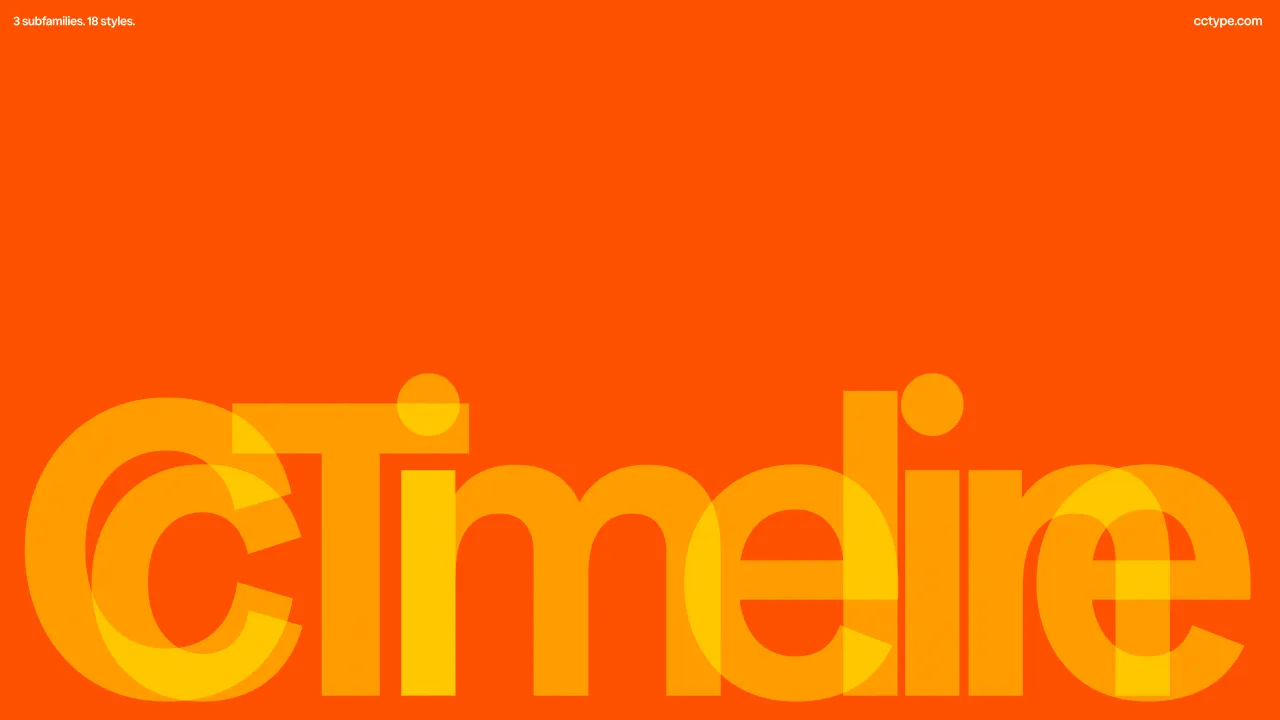
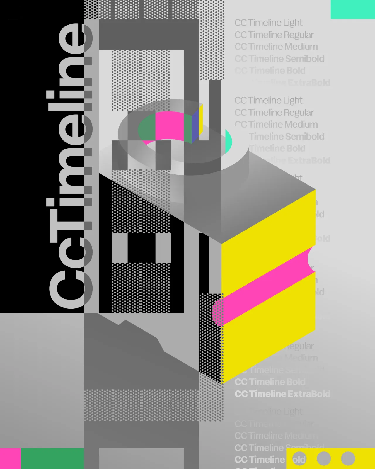
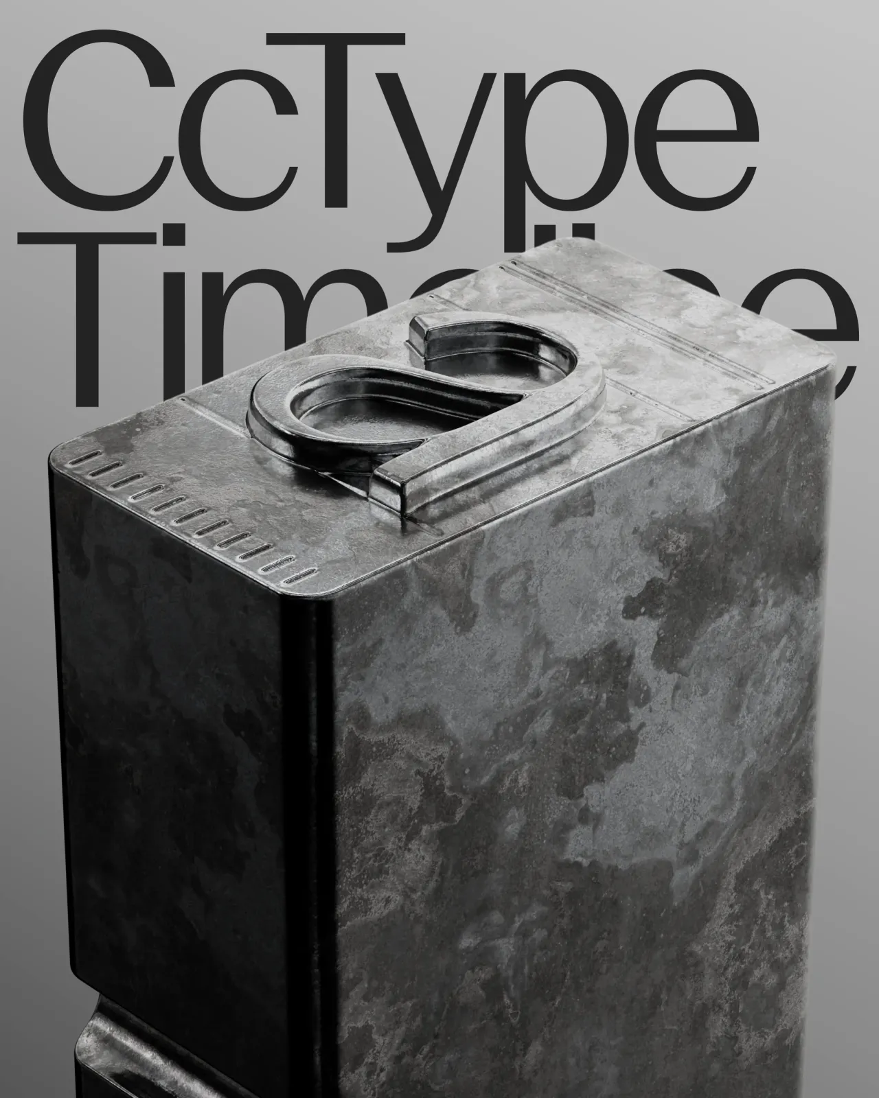
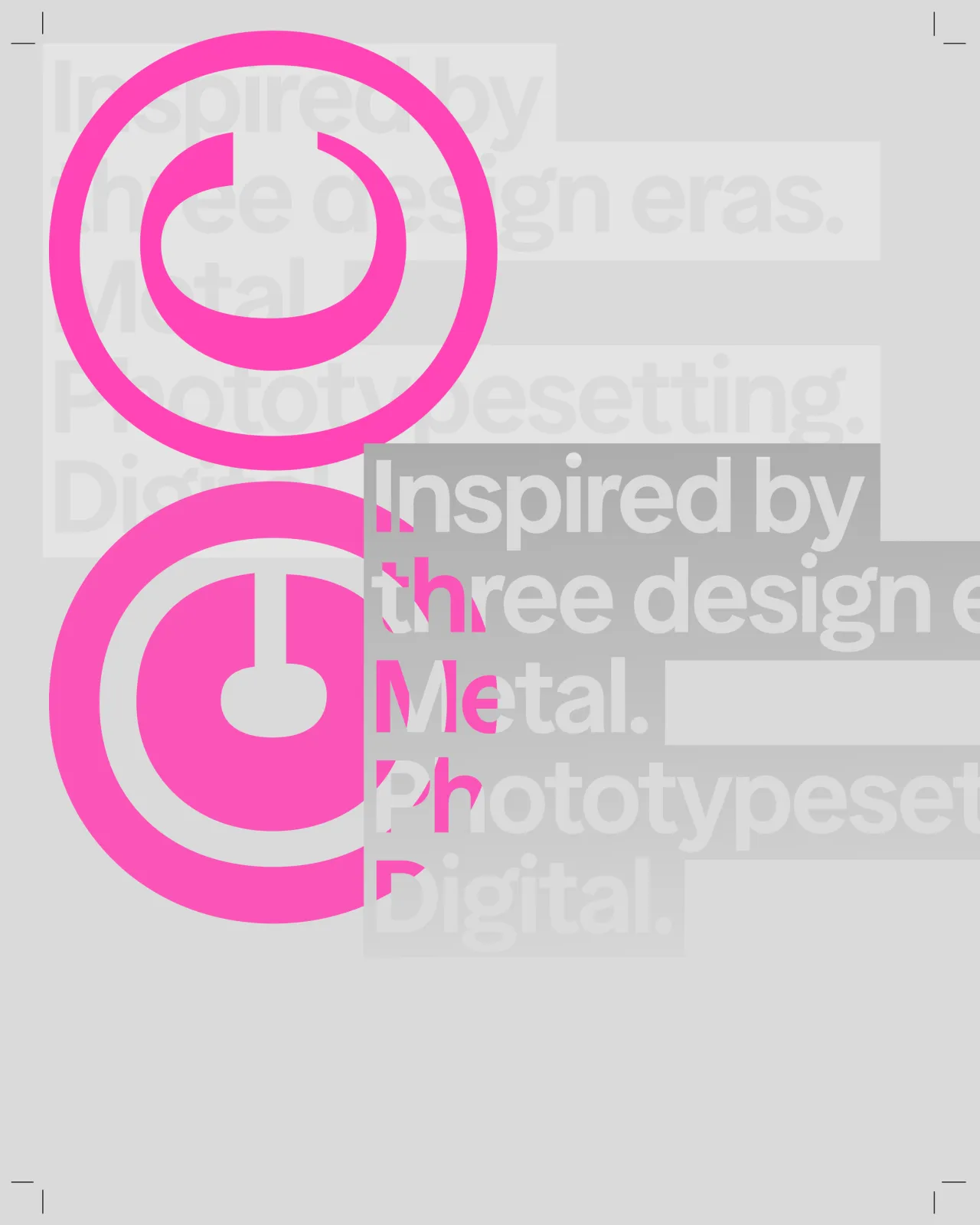
"This, simply put, was about approaching the project with a level of realism," says Jowey. "We asked ourselves, what was one thing we could do exceptionally well? Whilst we have a host of headline typefaces, experiments and works in progress, these didn't feel like the deeply refined and considered work we want to put into culture. We're approaching this project with a build-in public mentality."
That last phrase tells you a lot about what CcType actually is right now. Not a finished foundry with a full catalogue and a five-year plan, but a live experiment that Koto is running out in the open. Again, they do not seem afraid of taking risks.
The typeface came from giving work away
CcType, by the way, wasn't dreamt up in a strategy meeting. It grew out of something Koto had already done: releasing custom fonts it had built for clients, including Polkadot, Faculty, and Stack Overflow, through Google Fonts for free. The response told Koto something it hadn't gone looking for.
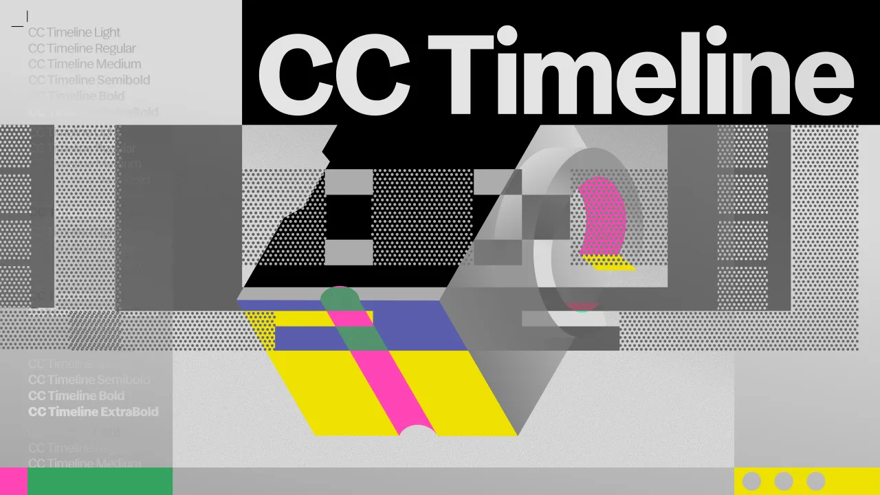
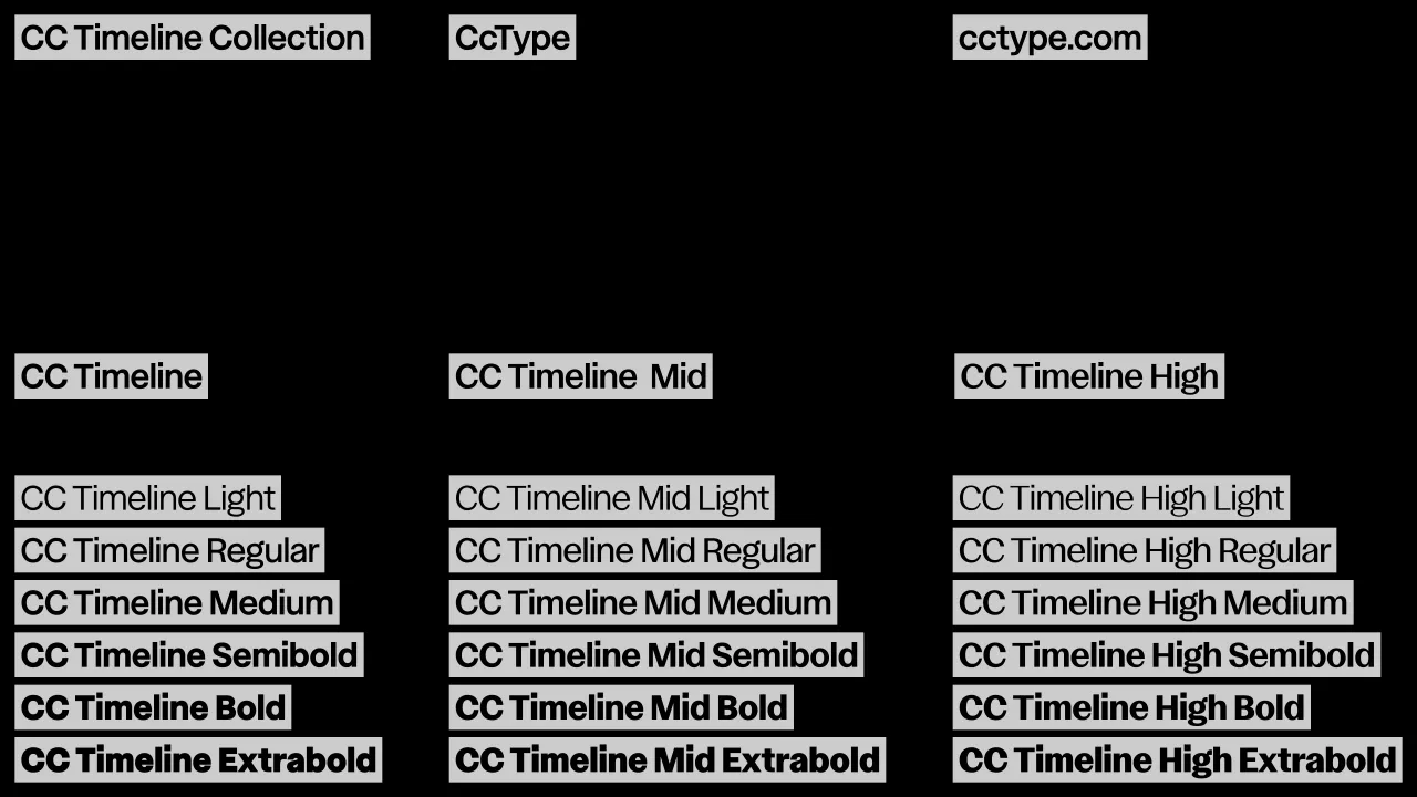
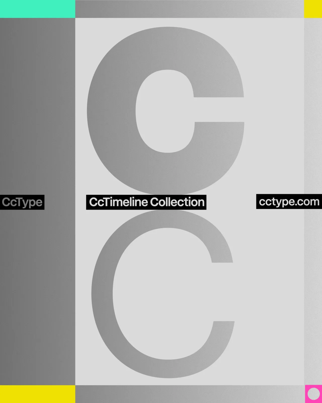
"Our typography work with clients is about making something unique and exclusive to them, a typeface that reflects their DNA and unique perspective as a brand," Jowey explains. "Polkadot and Stack Overflow chose to share their typefaces with a broader audience as it was true to their business ambitions.
"The response and usage of all of these typefaces within the Google Fonts ecosystem demonstrated a very strong demand, one that surprised us," he continues. When the market gives you a signal like this, the obvious answer is to follow it to its natural conclusion. We've got ambitions to continue to serve the creative community with further open-source projects in the future."
Giving work away for free taught Koto that there was an appetite for it. Charging for CcTimeline is simply the next step in the same line of thinking, not a change of direction.
What this means for the rest of us
The risk here is real. A big agency putting its own name on a product potentially means bad reviews, awkward comparisons and public scrutiny it wouldn't get from client work hidden behind an NDA. Jowey is honest about that tension, too.
"As creative businesses scale, headcounts grow, and clients are converted, retaining a culture of excellence often suffers," he said. "At Koto, we see every brief as an opportunity to produce our best work, to experiment and to learn, to see our craft not as a stationary standard but as a growing practice. CcType is one of many demonstrations of this attitude."
Whether CcType grows into a proper foundry or stays as a single, carefully made statement depends on how the market responds. But what's already clear is that this isn't a side project or a marketing exercise. It's the same instinct that built Seasoned, just with a price tag attached, and that makes it worth watching closely.
Editor's Picks




Trending



Latest Jobs
Staff Producer, Studio Central at DoorDash
Full-time·San Francisco·$176,800 – $260,000
Senior Social Media Manager at Whitney Museum of American Art
Full-time·New York·$95,000 – $100,000
Brand Designer at Langdock
Full-time·Berlin·€65,000 – €100,000
Senior Creative Artworker at Forward Associates
Full-time·London·£30,000 – £40,000
Brand Strategist at DNCO
Full-time·London·£45,000 – £60,000
Marketing Manager at University of Birmingham
Full-time·Birmingham·£36,636 – £46,049