Gina Guasch Studio's designs go beyond trends and are 'full of colour and life'
GGS, the queer creative studio founded in Barcelona in 2019, produces flyers, identities, and record labels made with energy, character and a clear point of view.
Some studios define themselves by the clients they attract, while Gina Guasch's studio, GGS, defines itself by something harder to fake. That is, a genuine point of view. Founded in Barcelona in 2019, the studio describes itself as "empathetic, odd and queer" – and the work lives up to all three.
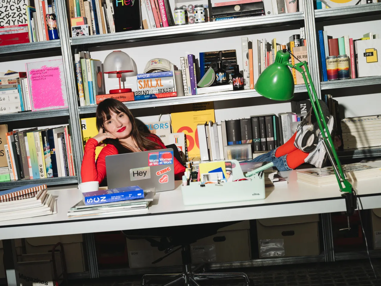
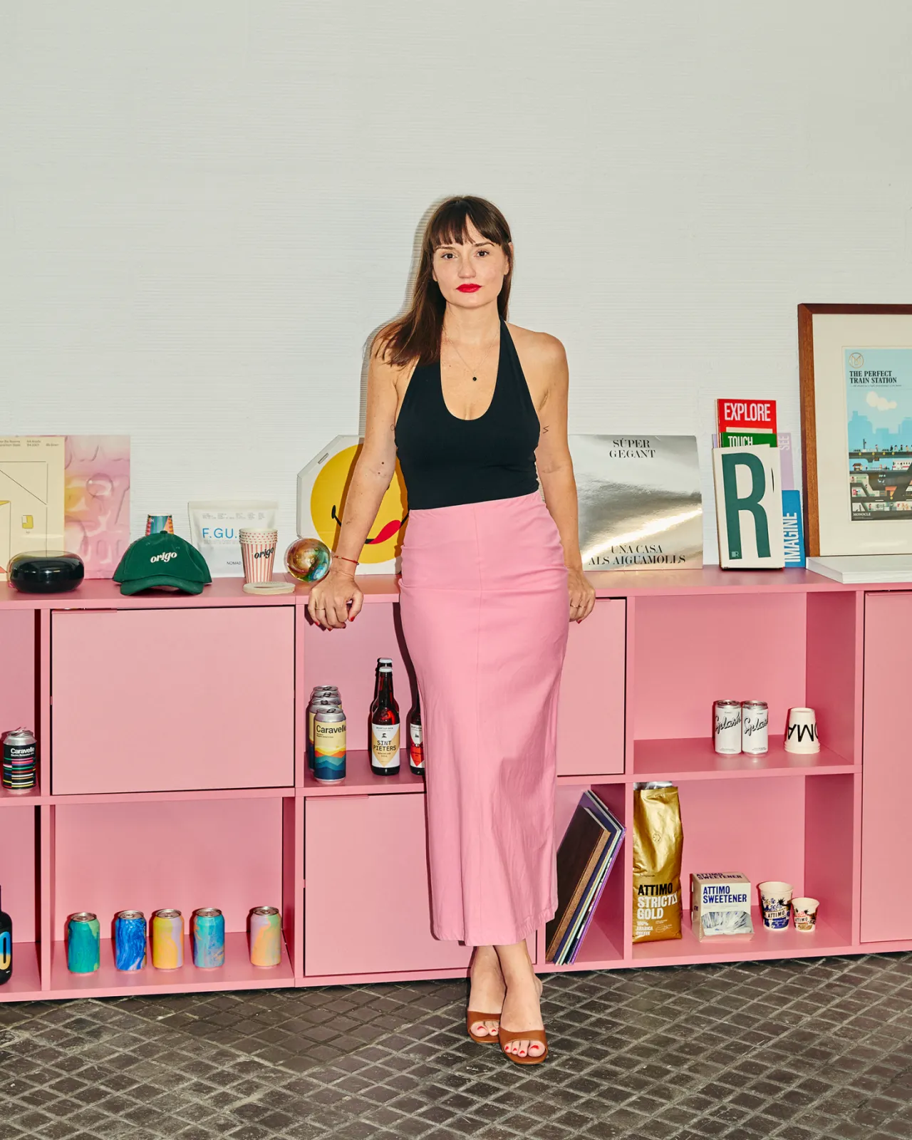
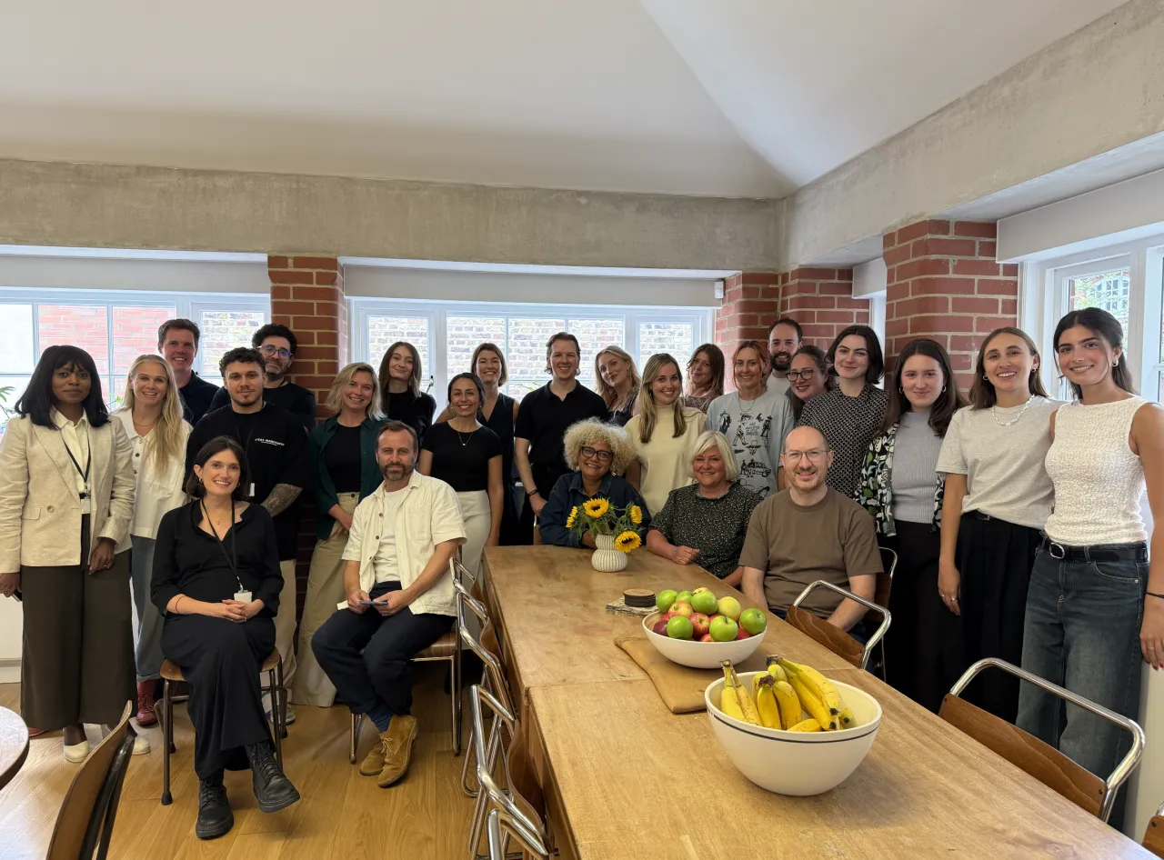
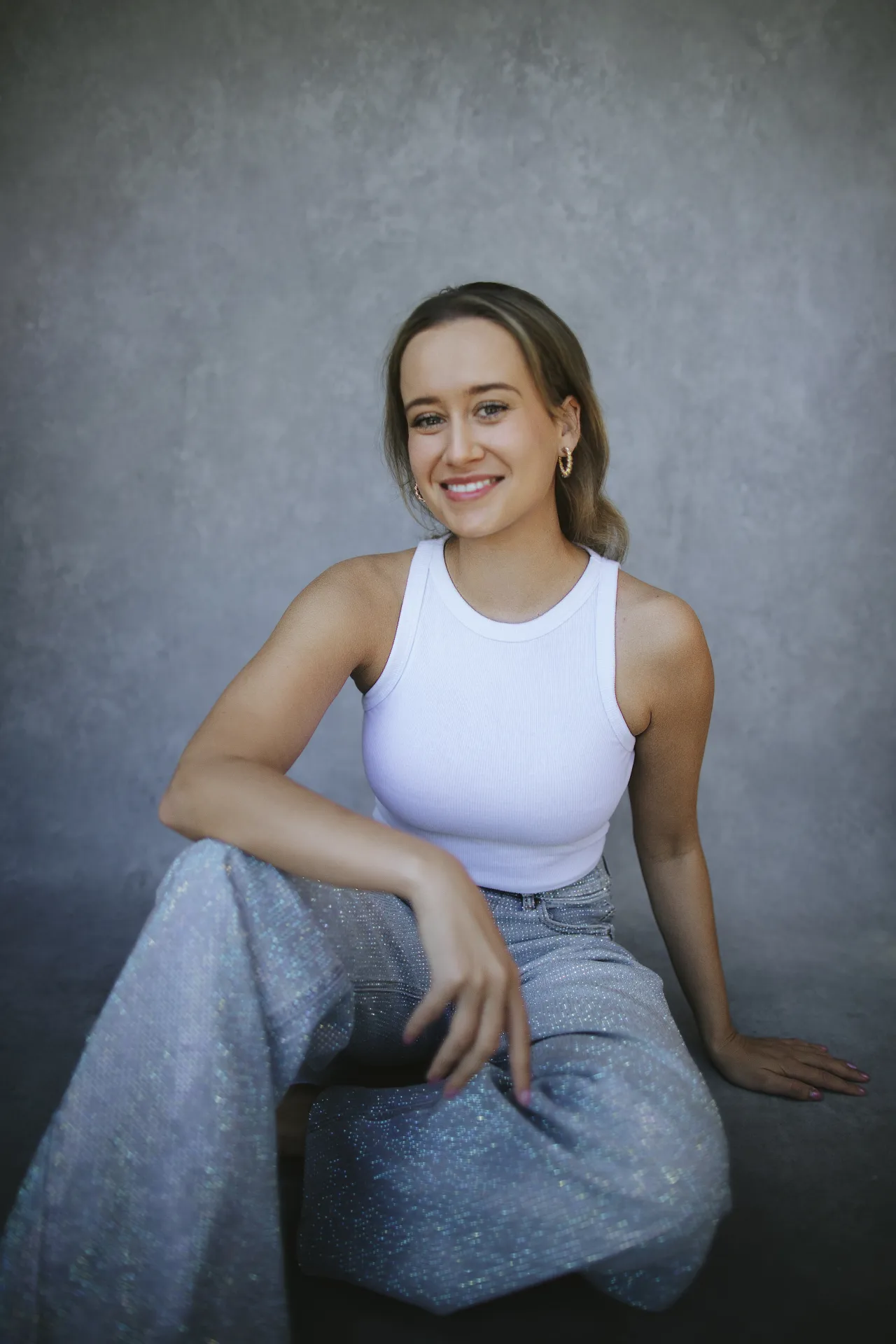
Gina grew up in Barcelona in a creative household, surrounded by art and critical thinking from an early age. After studying graphic design and working across different studios, they launched GGS with the specific intention of building something more inclusive, with a team drawn from the queer community and a feminist, ethical vision running through everything it does. Today, the studio is small, with Gina leading art direction and design, creative director Clara leading larger branding projects, and project manager Eloisa connecting the client and the studio.
A wider network of designers, developers and illustrators is brought in when the project calls for it. Their client list spans Nike, The New York Times, Sony Music, Boiler Room and The Face, alongside a rich roster of cultural, music and activist projects that sit much closer to the studio's heart.
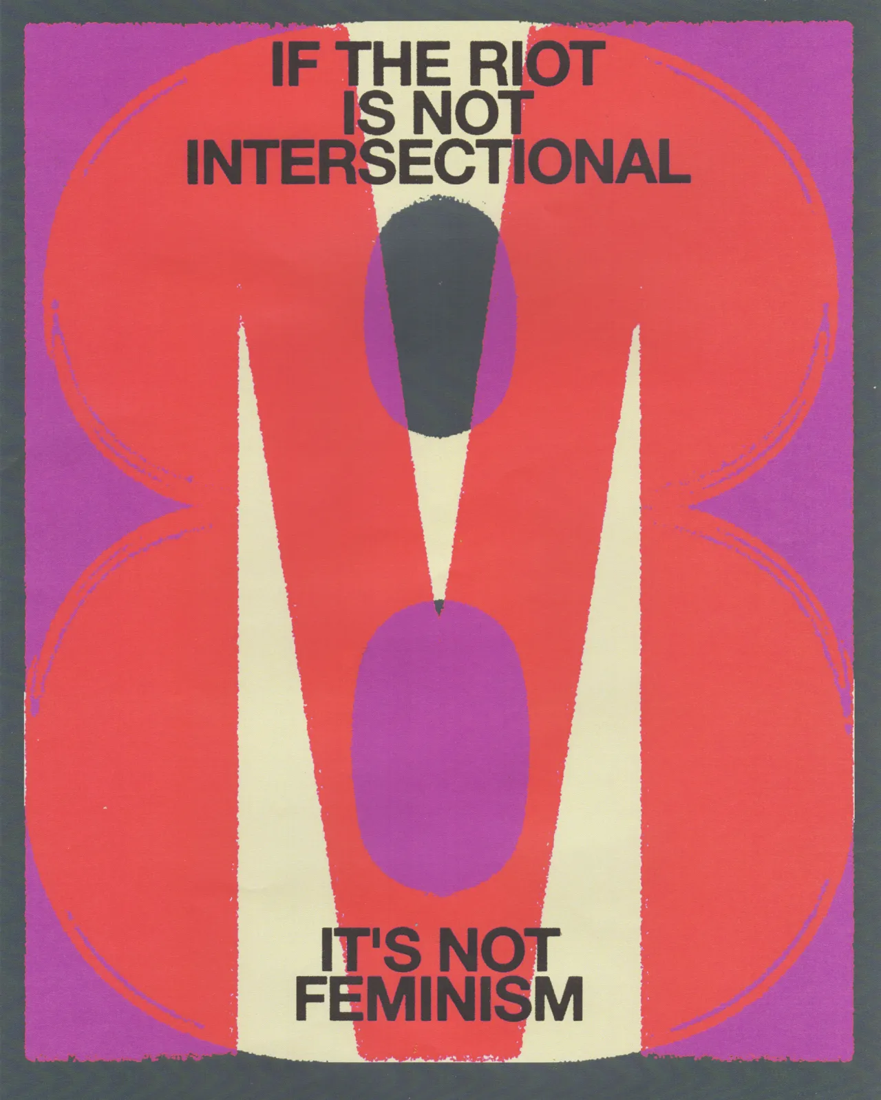
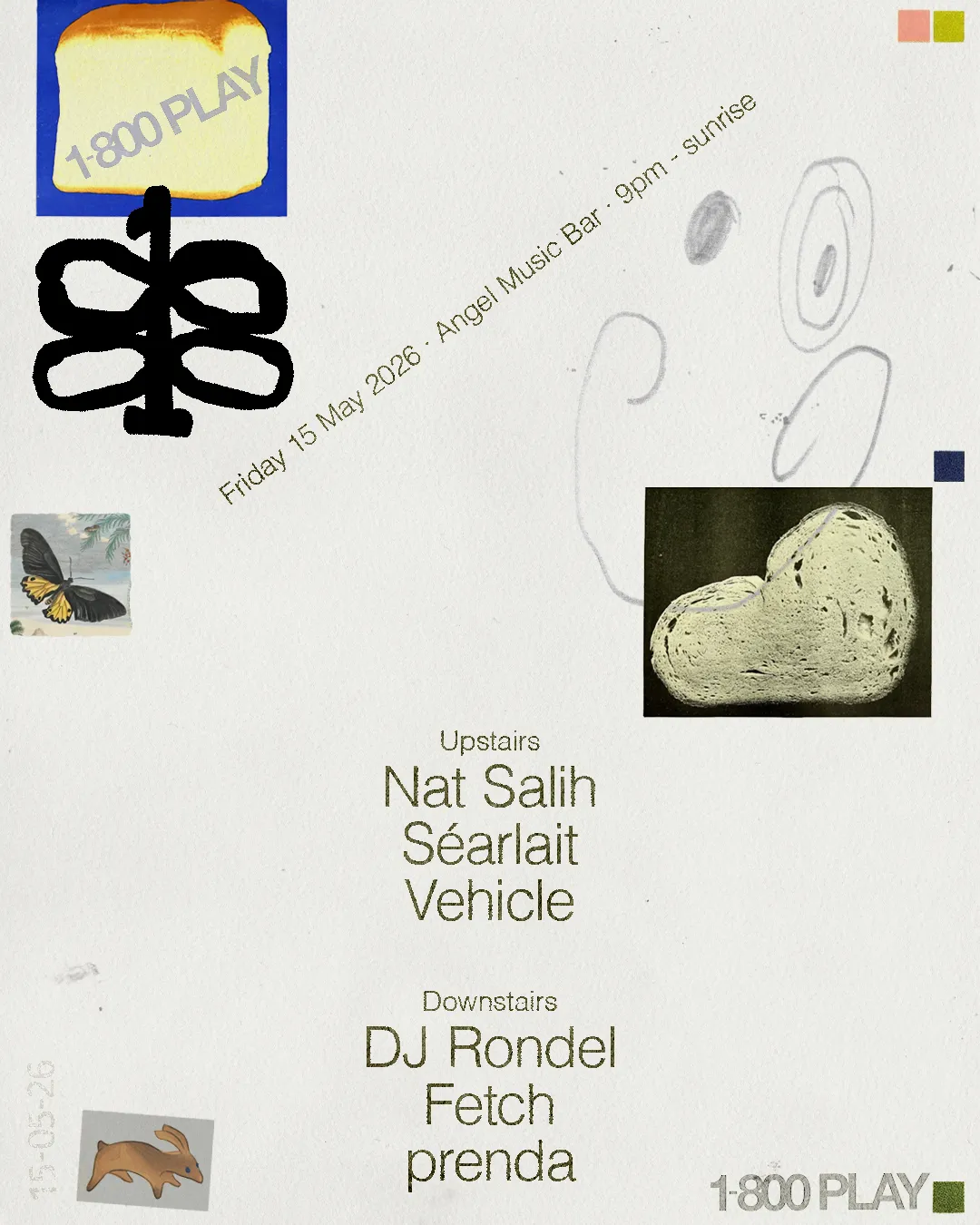
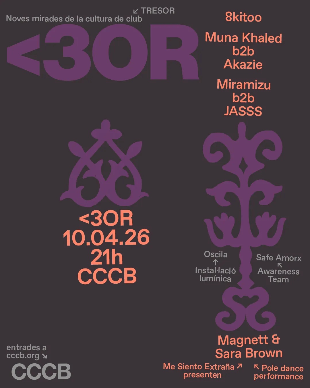
"I work closer to art, club culture and social contexts than to traditional commercial design," Gina says. "Through branding and fast formats like flyers or covers, I use an analogue, experimental and naive aesthetic, full of colour and life. The goal is to go beyond trends or surface aesthetics and move towards something more activist, critical and identity-driven."
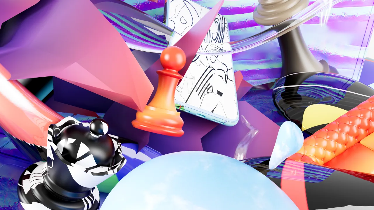
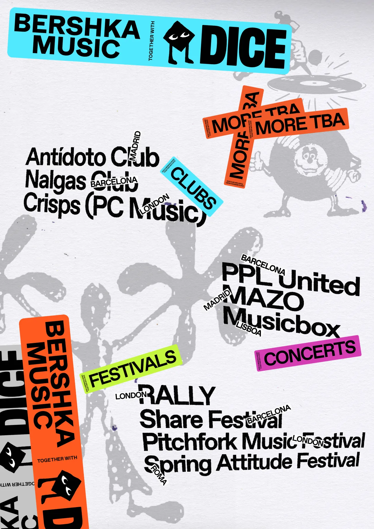
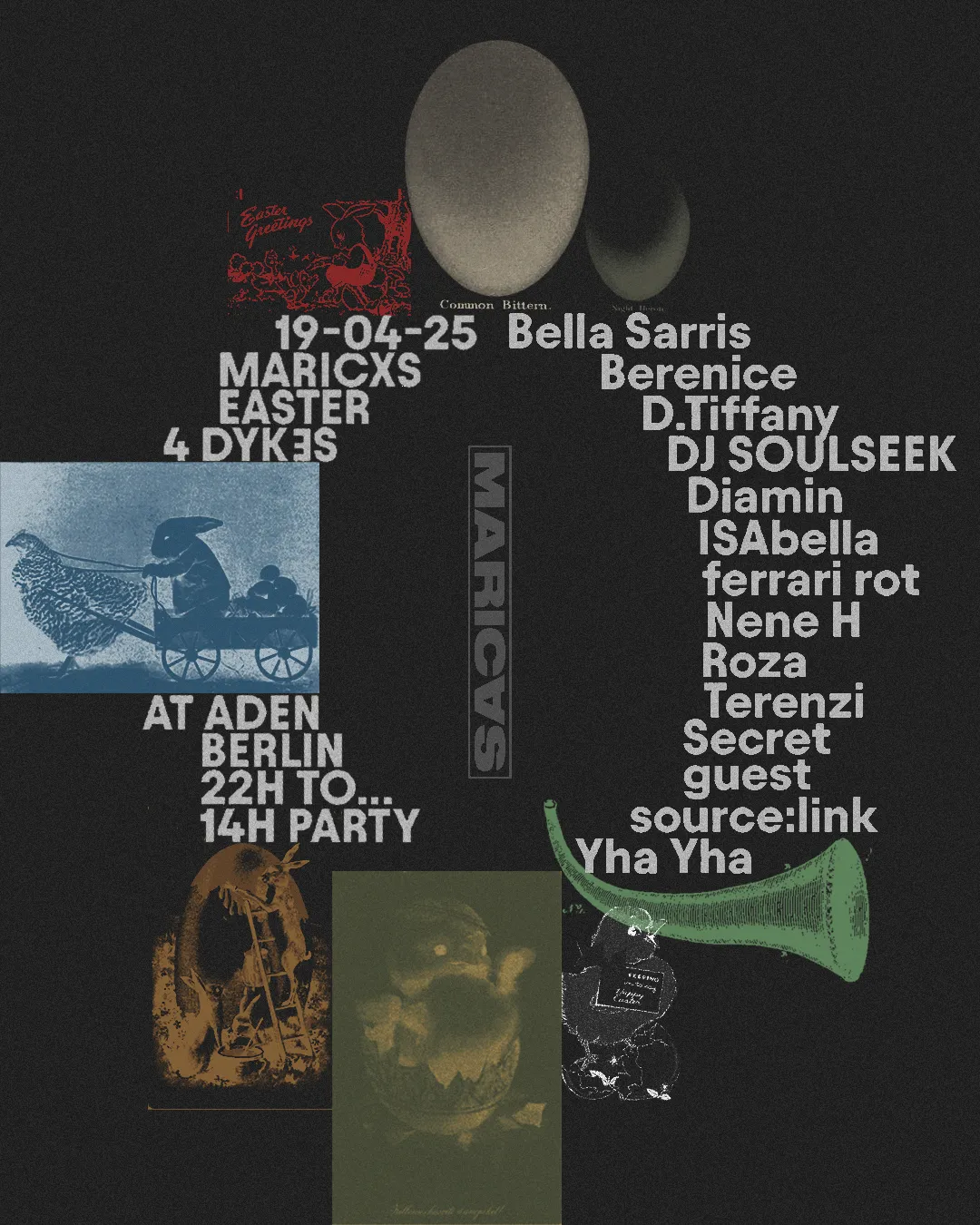
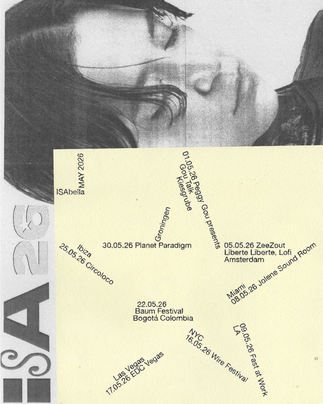
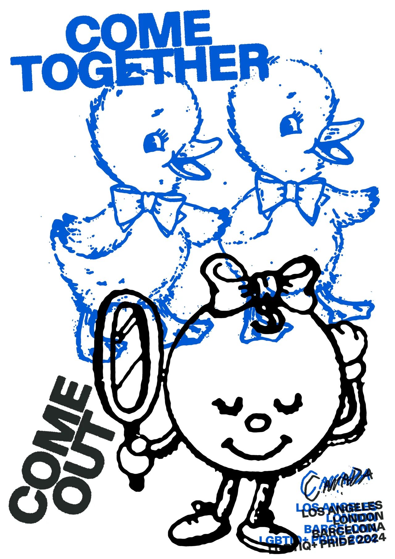
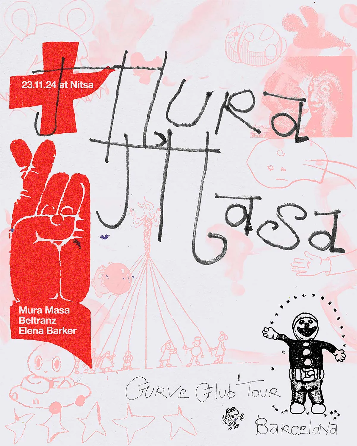
That comes through most viscerally in the flyers, which are among the most alive elements in the portfolio. Each one starts from a different place: the raw, hot-pink energy of an ISAbella party poster; the bold graphic density of the CCCB club night; the Bershka Music x DICE visual system, where a logo functions like a sticker and an entire expressive language grows outward from it.
Then there is MARICAS, the queer electronic music collective that Gina co-founded, whose flyers have repeatedly been flagged and removed on Instagram for going against its guidelines – a detail that tells you everything about the work's refusal to be palatable. "Each piece starts from a different approach," Gina says, "but all share the same intention: to build images with character that respond to the music and context, avoiding hegemonic or stereotypical solutions."
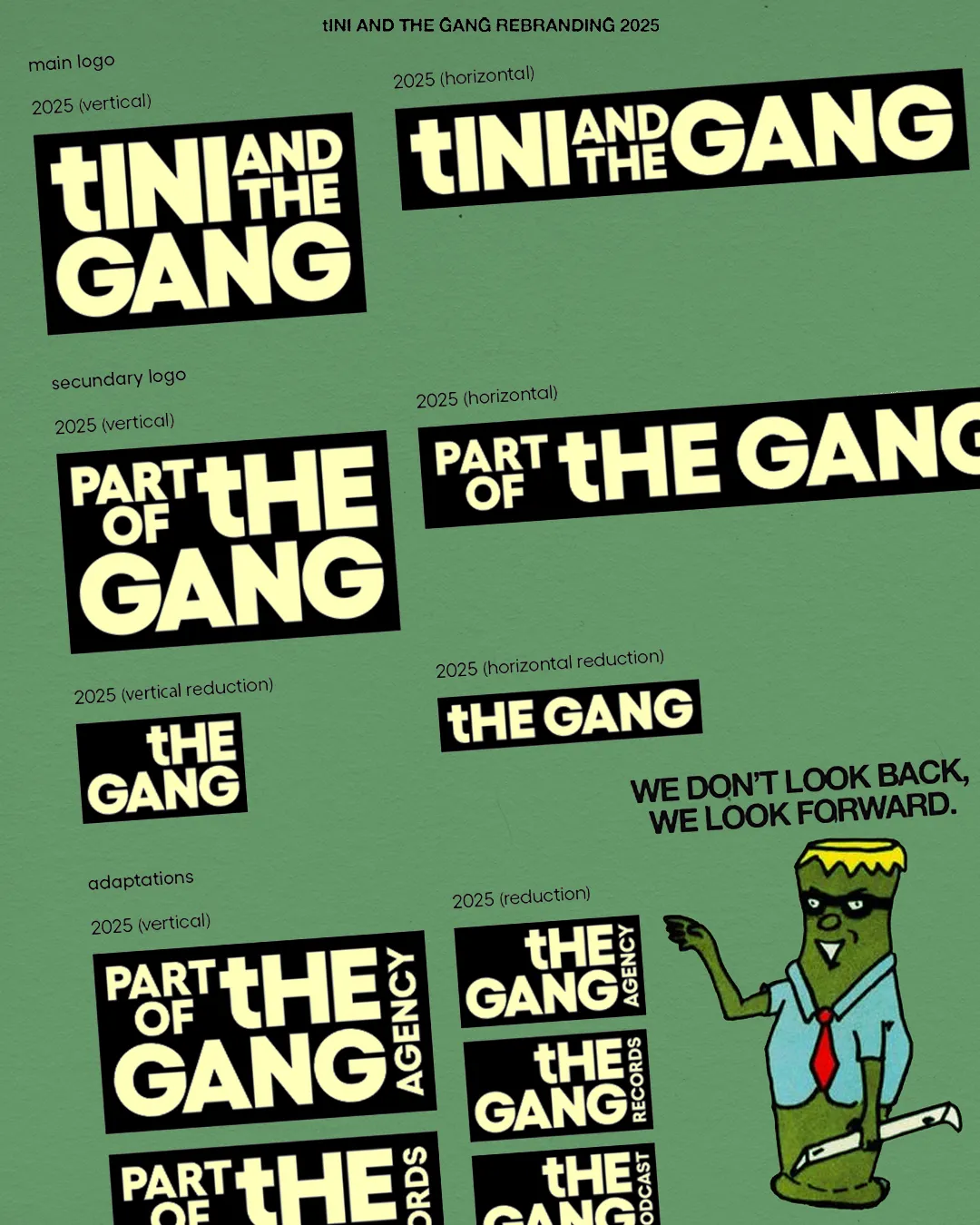
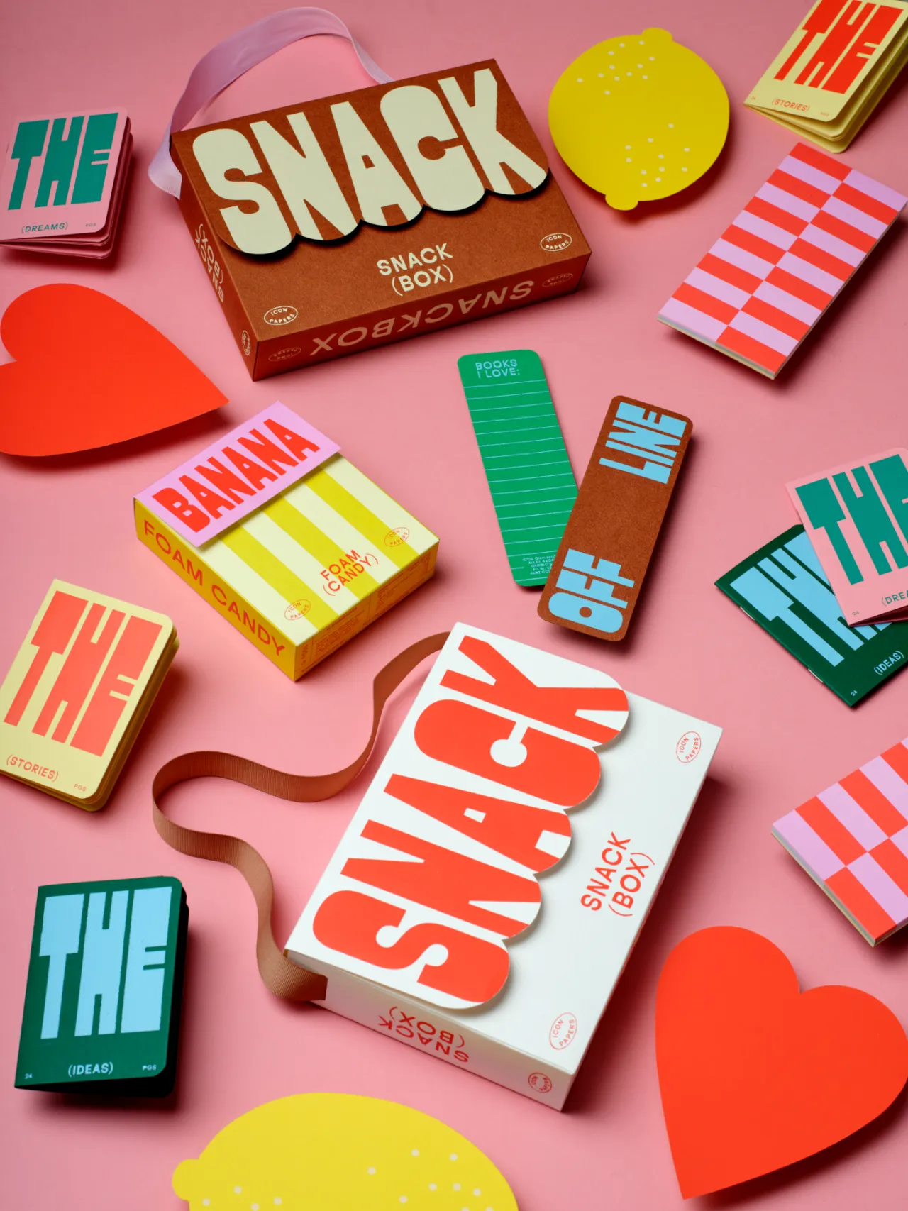
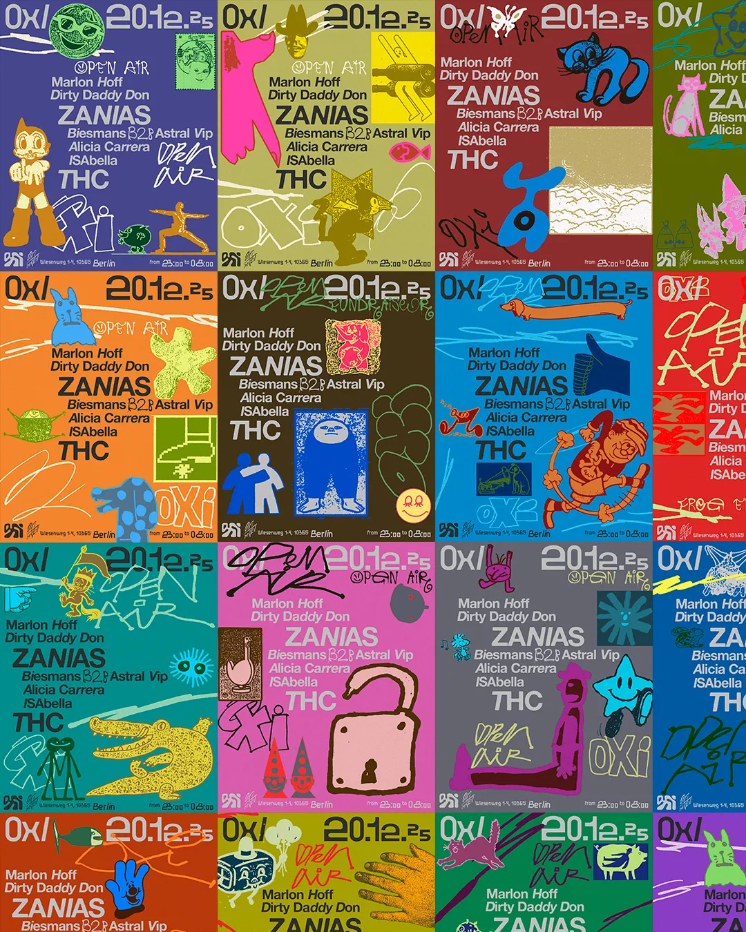
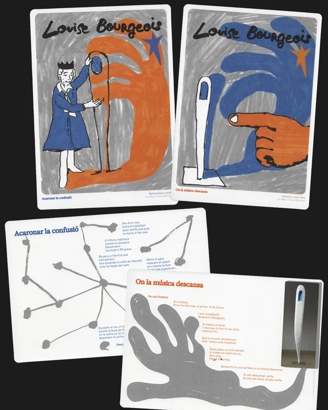
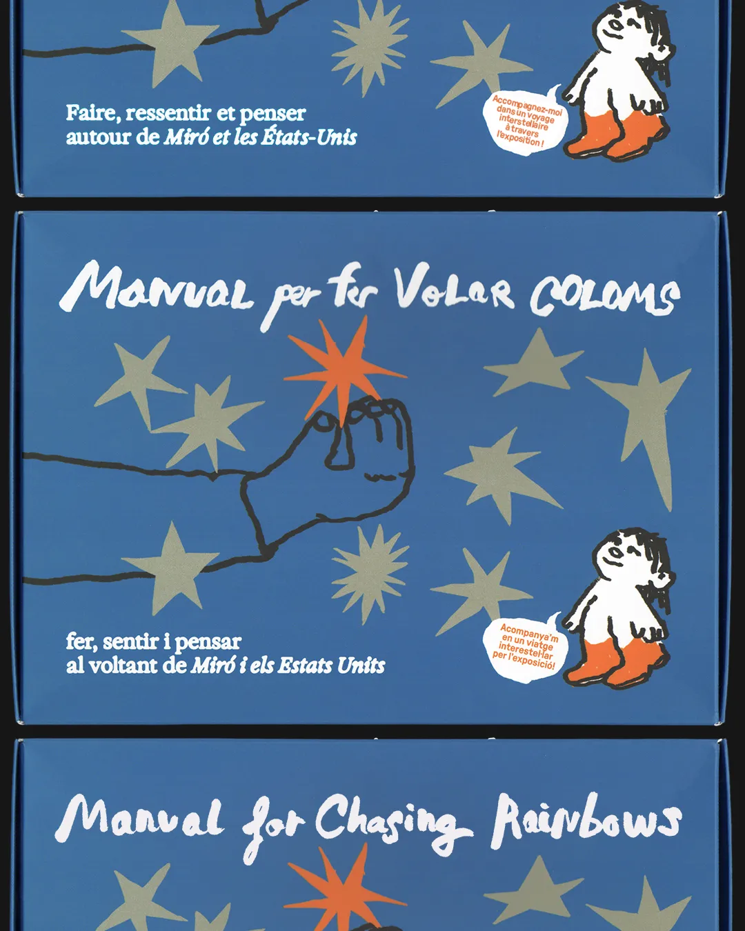
The branding projects show the same conviction while operating at a slower pace. SAPPHI, an identity for a queer dating app, uses fluid, movement-based forms to explore closeness and reciprocity between equals. OXI, a nightclub identity for a venue in Berlin, is built around the idea of plurality – a flexible system combining digital and analogue references, bold evolving colour and custom typography that shifts across the club's different spaces. Good Girl Snacks, a Gen Z snack brand blending Middle Eastern and American flavours, gets a character-driven universe built around friendship and community. And MIRO – a guide for a Miró Foundation exhibition – uses sketchy, naive illustration and hand-drawn lettering to make the work feel like a playful invitation.
Running the studio independently is, Gina says plainly, "very rewarding, but you're often in survival mode. It's hard to be financially stable and to compete with bigger studios or agencies. Still, we keep going thanks to the team, the emotional reward and seeing how we reach or exceed goals every year." Gina adds, "Being an openly queer studio helps us attract like-minded clients, which is great and very affirming. At the same time, it makes it harder to enter certain markets or work with certain clients who see us as too radical."
On where design is heading, Gina is direct: "I think it's becoming polarised – either more automatic and generic because of social media and short attention spans, or more author-driven, critical and rooted in context, as a response to the political moment we're living in. I clearly stand with the second path." Given everything GGS has built, that was never in any doubt.
Editor's Picks





Trending






Latest Jobs
Graphic & Motion Designer at The SHARP Agency
Full-time·Leeds·£26k–£33k
Design Director at Koto
Full-time·London·£72k-£90k
Senior Designer at Jubba
Full-time·London·£50k-£60k
Junior Project Coordinator at Colorido Studios
Full-time·Twickenham·£28k–£32k
Midweight Designer at All Purpose
Full-time·London·£30k–38k
Midweight Designer at Catalyst Creative
Full-time·London·£32k-£36k