Kit Studio crafts a vibrant identity for Raise the Roof, a music-led movement tackling youth homelessness
Blending grassroots music culture with purposeful design, Kit Studio's visual identity for Raise the Roof strikes a careful balance between celebration and social impact, amplifying Centrepoint's mission to end youth homelessness.
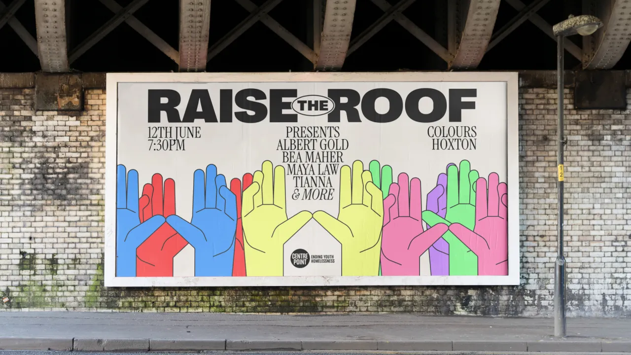
At first glance, Raise the Roof appears to be a new gig series with significant cultural influence, featuring live sets from emerging artists, dynamic visuals, and an upbeat energy designed for TikTok and Spotify. If you look again, you'll see a deeper mission behind the mosh pit.
Raise the Roof is a music-led movement spearheaded by youth homelessness charity Centrepoint, using performance and platform to raise awareness and funds for a growing crisis.
Tasked with creating the visual identity for the initiative, London-based Kit Studio approached the brief with the challenge of designing something that feels both joyful and urgent. Something that captures the energy of live music while acknowledging the reality of youth homelessness.
"The brief was to create an identity that works for both a high-energy music event and Centrepoint's mission," the studio explains. "We kept pushing to find a balance that truly encapsulated both aspects of the series – intimate performances with a powerful social purpose."
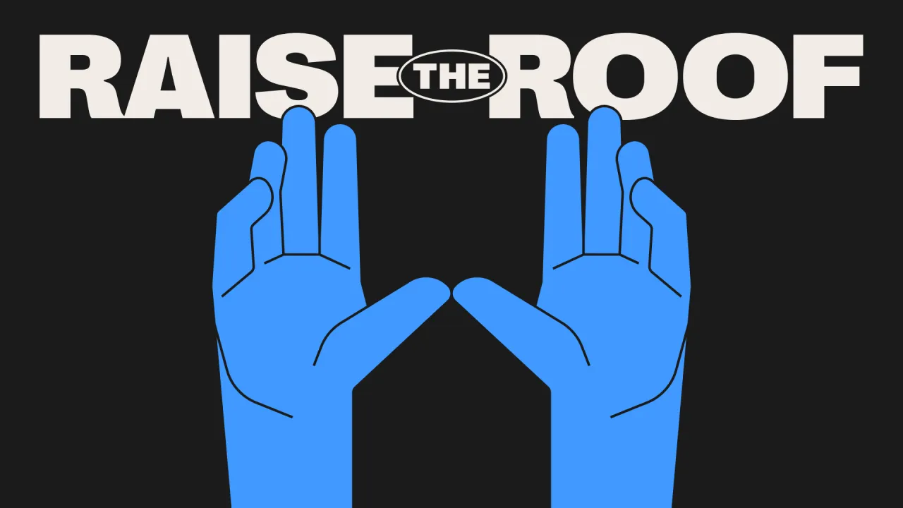
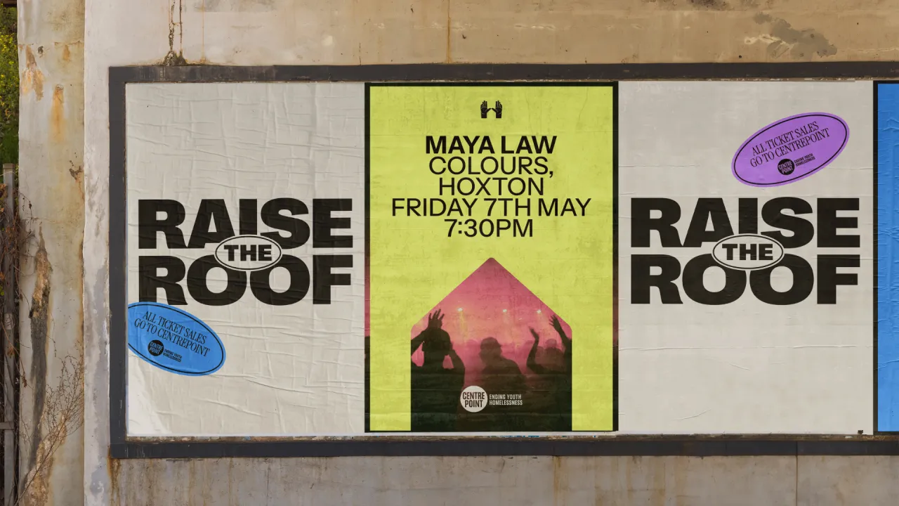
The result is a clean and immediate visual language that feels as comfortable on a gig poster as it does on an Instagram carousel. At its heart is a hand-raise symbol, a graphic nod to both audience participation and the act of reaching out. Cleverly embedded in the hand is the shape of a house, serving as a subtle yet meaningful cue tying the entire brand back to the issue of shelter and support.
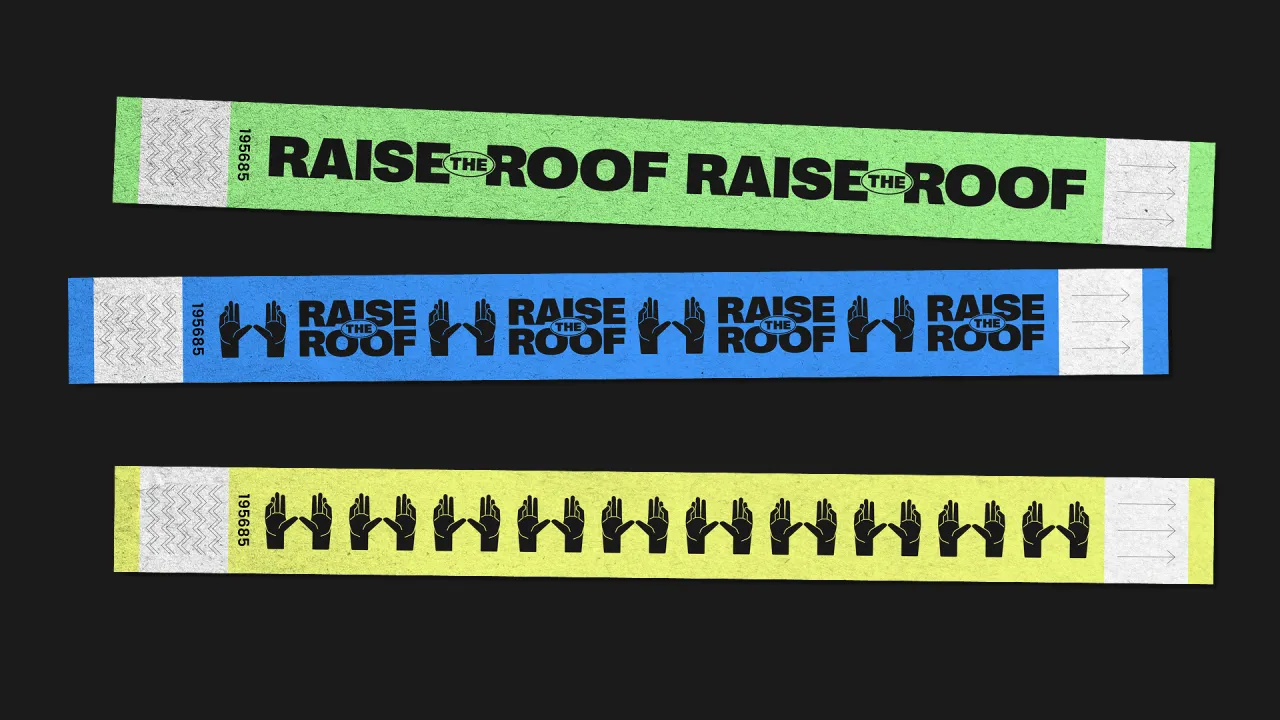
This central icon becomes the through-line across every touchpoint, from merchandise to social media assets. It's a mark that audiences can rally behind, with Kit consciously designing it to be "more than just a visual – something people could rally around."
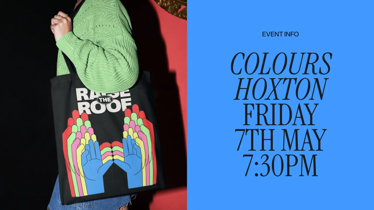
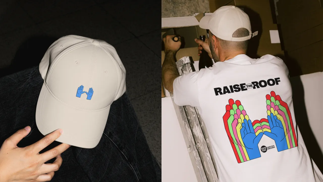
The colour palette is bright and optimistic, helping strike what the team call "a tone between celebration and confrontation." The aim wasn't to soften the issue but to create space for joy and solidarity within it.
"There's energy, but it's purposeful," they add. "We wanted the identity to thoughtfully symbolise the movement."
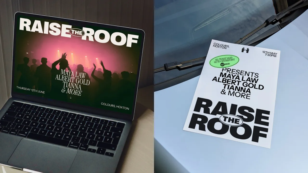
Visually, the identity draws inspiration from grassroots music culture – zines, screen-printed posters, and ephemeral flyers – reimagined for the digital age. There's an intentional simplicity to the system that makes it versatile and recognisable across multiple platforms, whether you're discovering it via a Spotify banner, a TikTok performance, or a poster pinned up in a community venue.
"Raise the Roof needed to feel native to the places people discover music now – but also rooted in a tradition of activism and physical presence," the studio notes. "We wanted it to carry a sense of immediacy and belonging, whether you saw it online or in real life."
That mix of cultural fluency and design restraint has already resonated. Though still early in the campaign, the identity has been embraced by artists and audiences alike, which is a promising sign that the message is landing. "Artists have embraced it, which says a lot," the team shares. "It's starting to connect."
For Kit Studio, the project was more than just a branding exercise. It represented a deeper belief in the potential of design as a tool for change. "This project is ambition in its most honest form," they say. "It's about taking creativity beyond aesthetics and using it to build something better."
That sense of purpose shaped every part of the process, from collaborative workshops with Centrepoint to early creative development. "The team were open and energised throughout," Kit recalls. "There was a shared sense that the identity could be something bigger than just the event branding – it could stand for a movement."
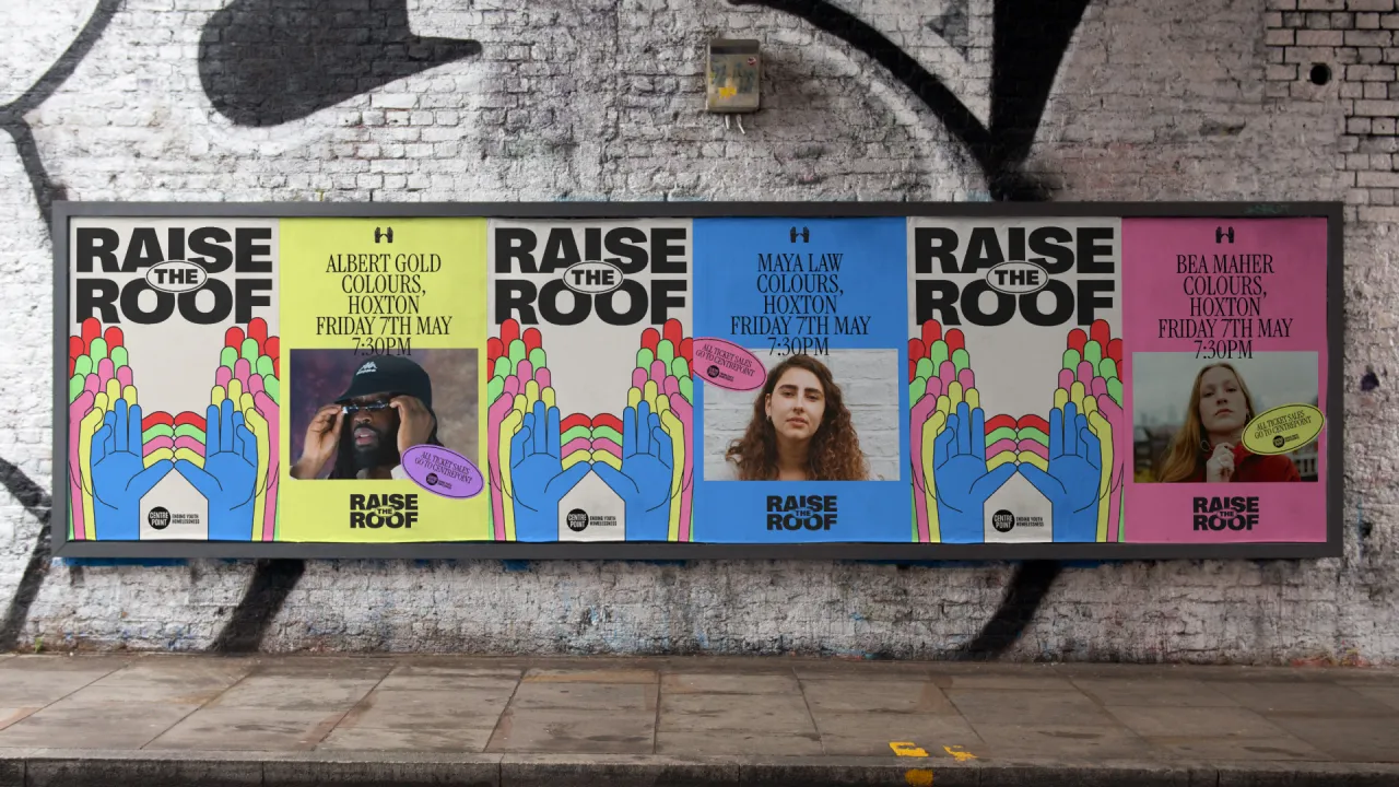
The studio is no stranger to thoughtful, impact-driven work, but Raise the Roof offered something different: the chance to combine emotional resonance with expressive creativity and to do so in a way that felt both culturally current and socially rooted.
"We're always looking for work that moves people," they explain. "Raise the Roof gave us space to stretch creatively while staying grounded in real stories and real outcomes."
As the campaign builds momentum, Kit hopes the identity will act as a visual shorthand for something more enduring. "We hope that it becomes a recognisable mark for something bigger than just a music event."
Editor's Picks





Trending






Latest Jobs
Creative Content Executive at Cognition
Full-time·Birmingham·£28k–£35k
Midweight Designer at All Purpose
Full-time·London·£30k–38k
Design Director at Koto
Full-time·London·£72k-£90k
Senior Copywriter at Human After All
Full-time·London·£48k–£66k
Account Director at How&How
Full-time·London·£73k-£79k
Graphic Designer at Crux Product Design
Full-time·Bristol·Up to £36k