Bw Gradual: A new geometric sans with plenty of edge
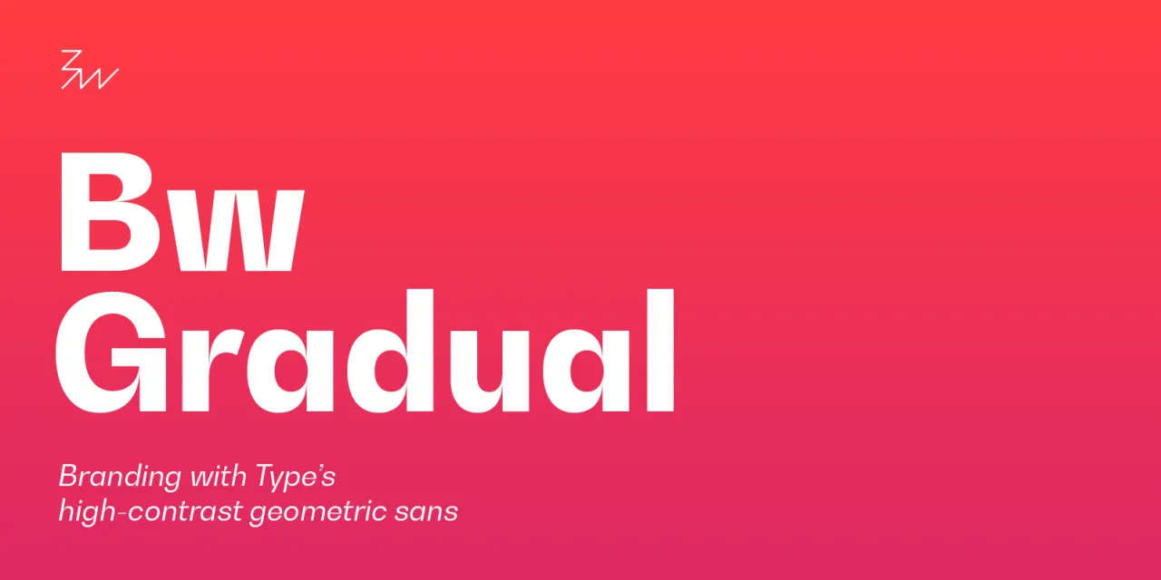
Seeking a geometric sans with a lot of contrast? Meet Bw Gradual, the edgy new typeface from Branding with Type.
All images courtesy of Branding with Type
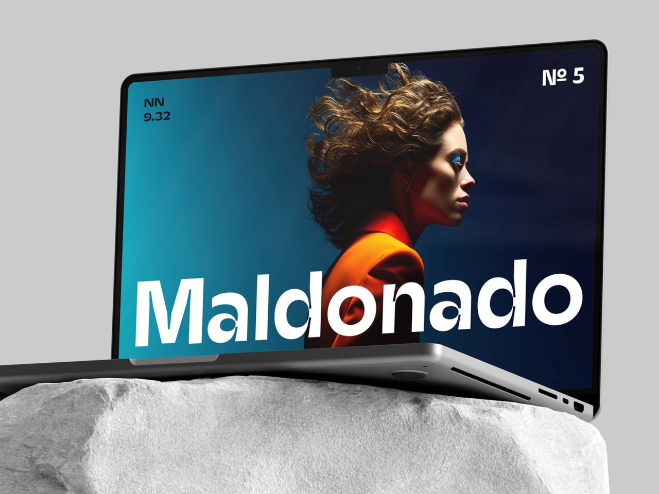
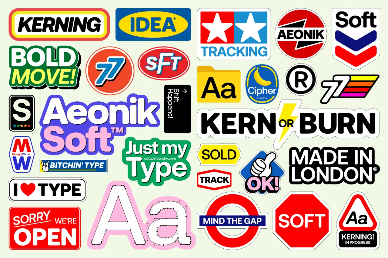
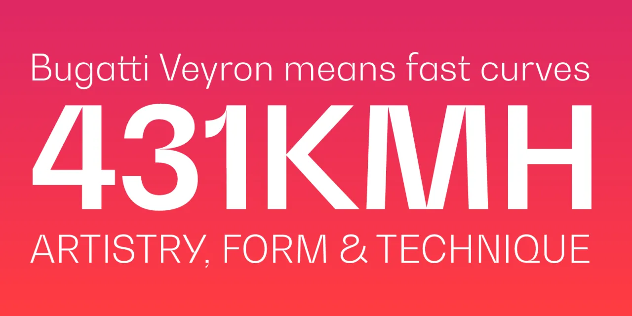
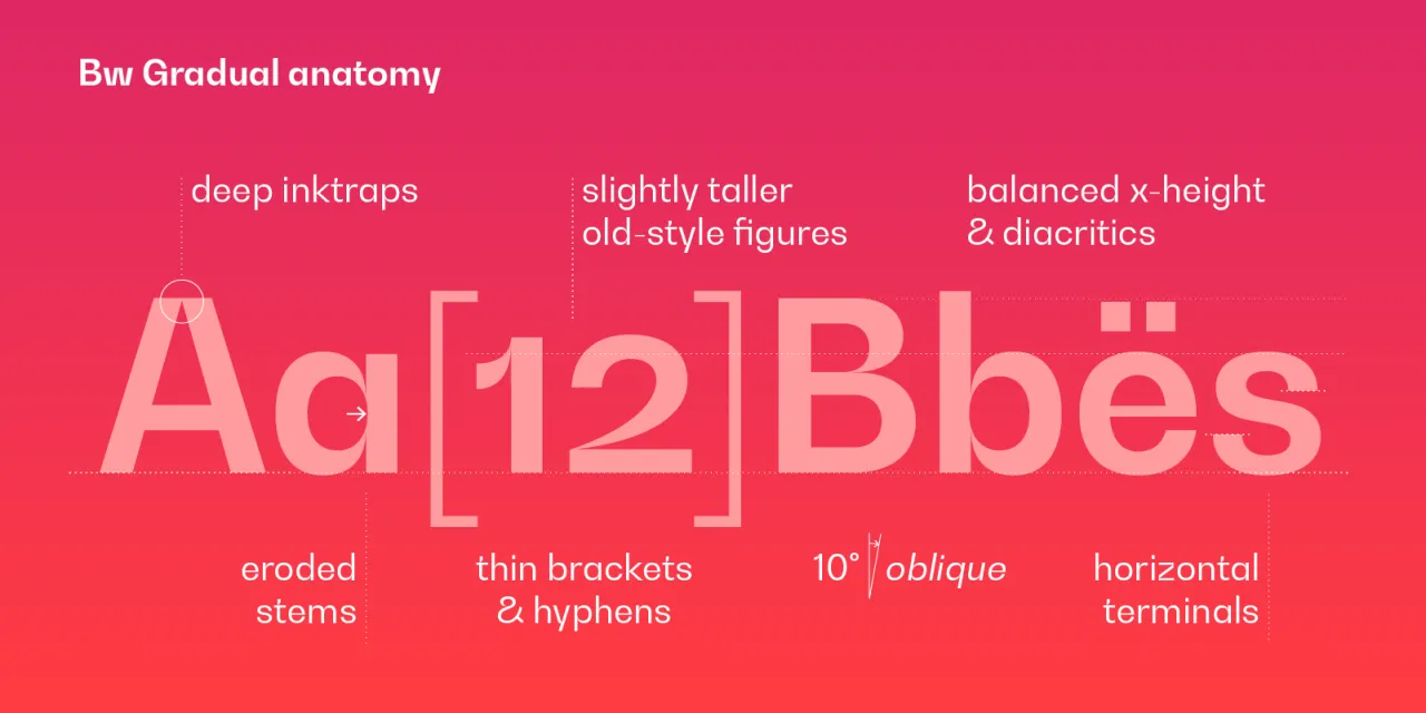
It summons the pragmatic essence of the geometric grotesque genre and pairs those beloved characteristics with the visual appeal of its very deep joins and eroded stems.
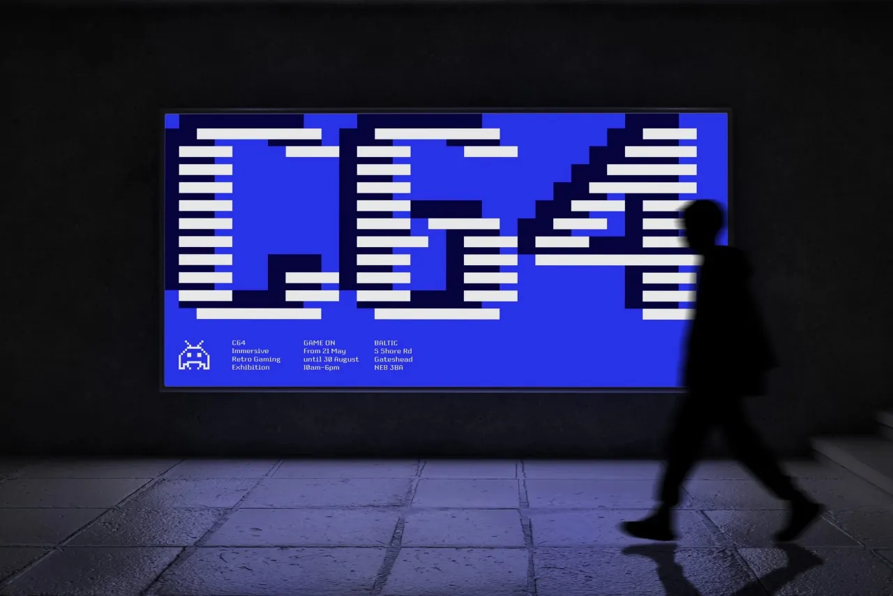
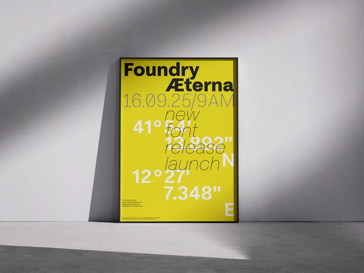
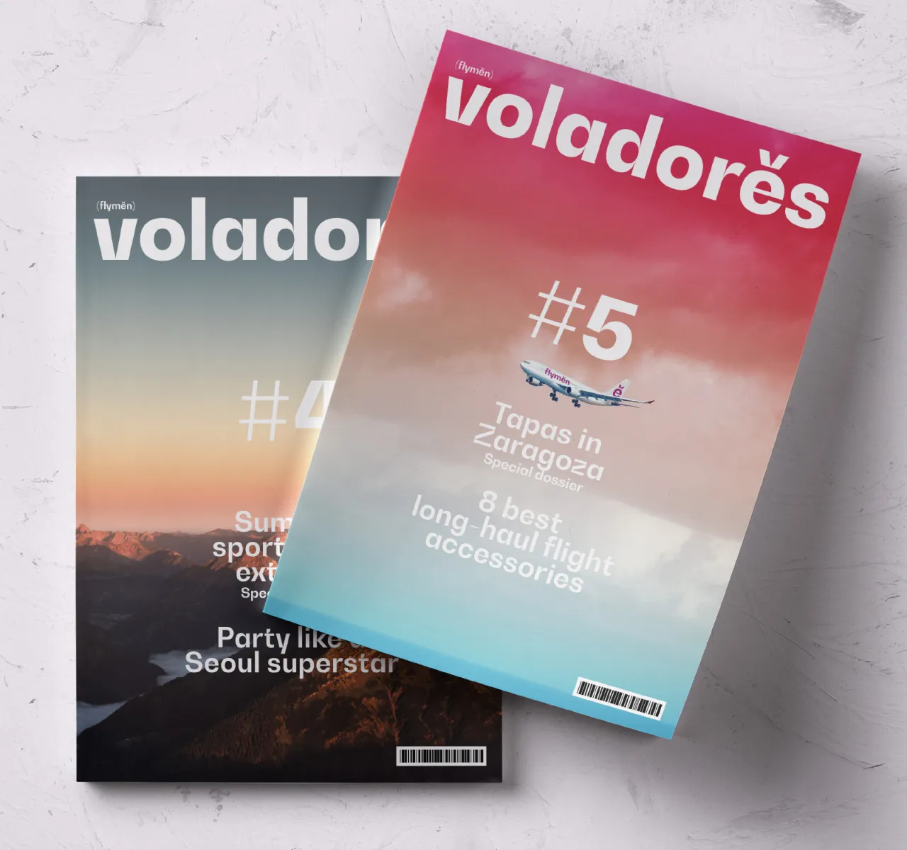
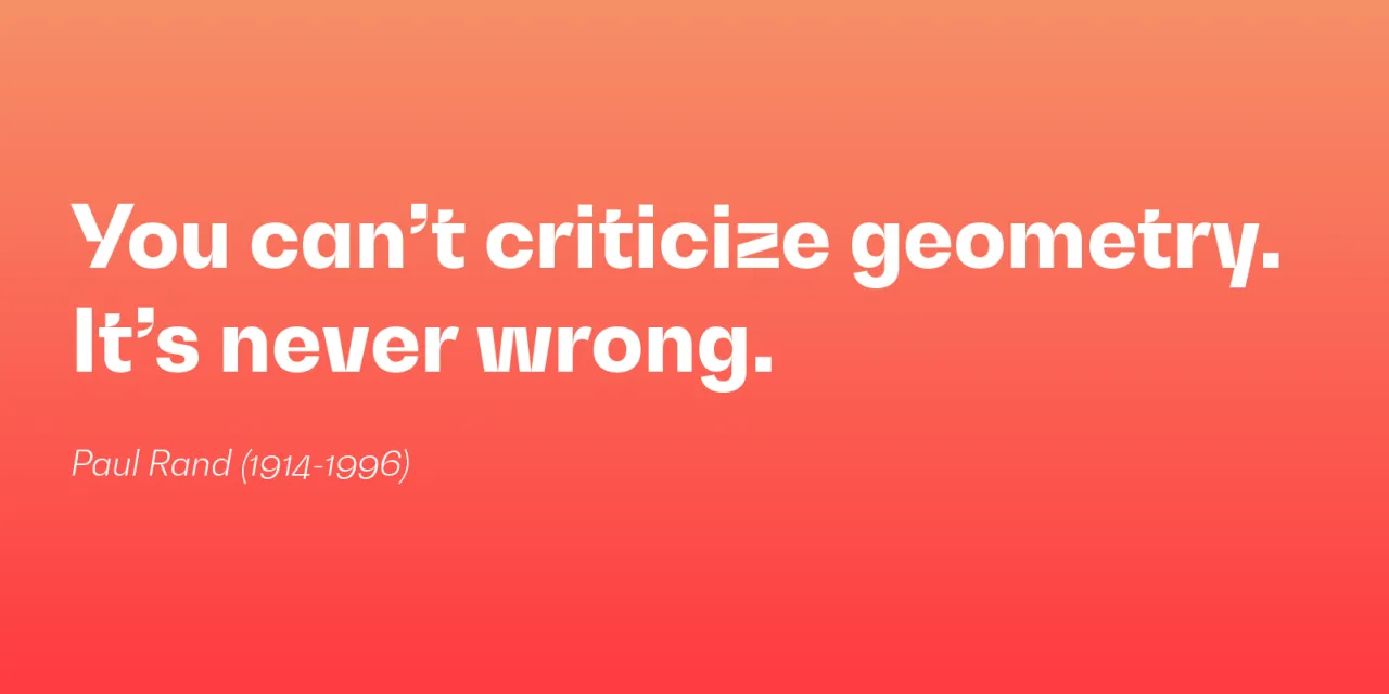
Pure shapes and fast curves gracefully coexist within the letterforms of this versatile font family, instantly capturing the viewer’s attention when used in large point on displays, signage, and advertising layouts.
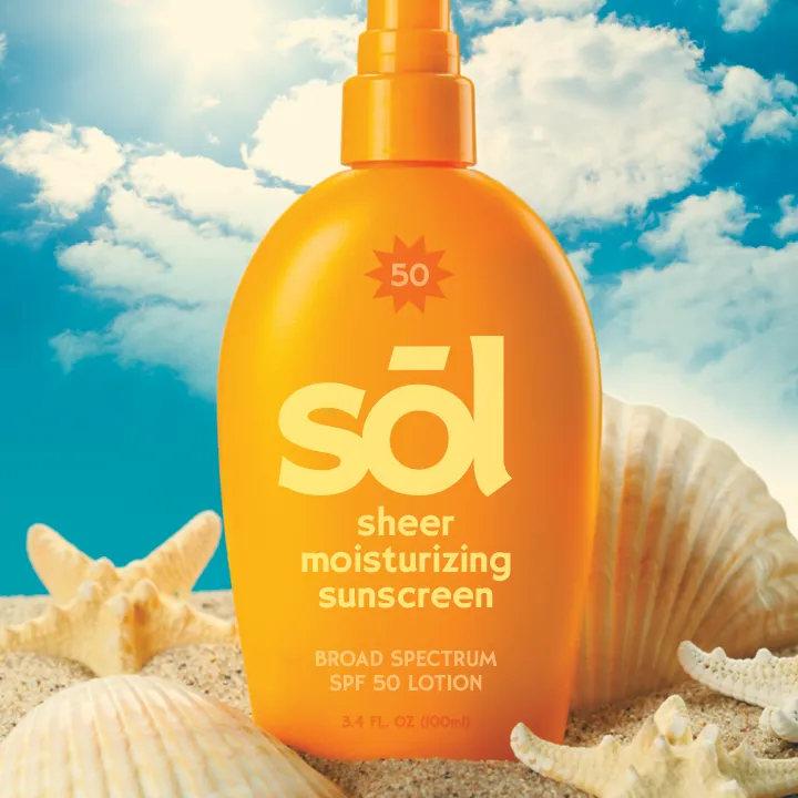
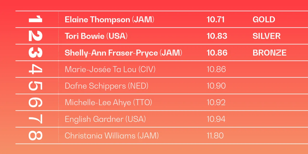
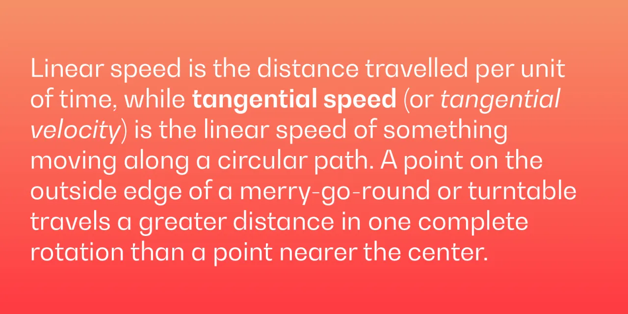
Designed for the utmost flexibility, Bw Gradual also delivers a very comfortable and pleasant reading experience when used as body copy, thanks to the deep joins acting as ink traps. Its clean legibility in smaller point presents a distinctive option for engaging editorials, web content, and mobile applications.
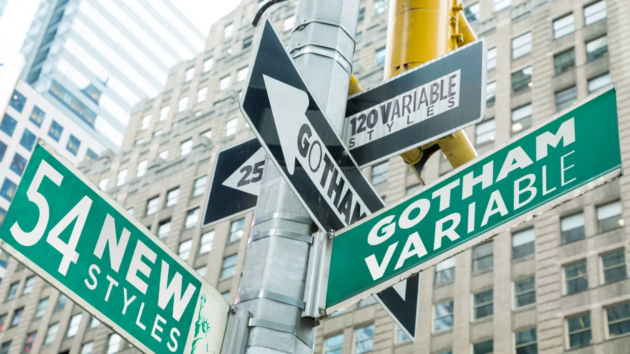
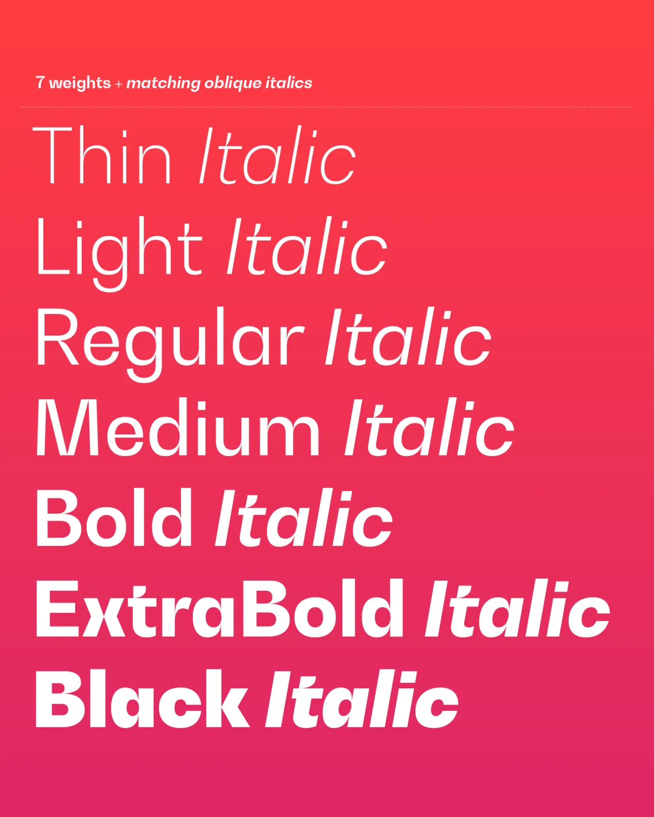
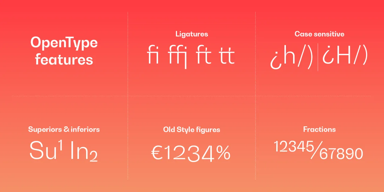
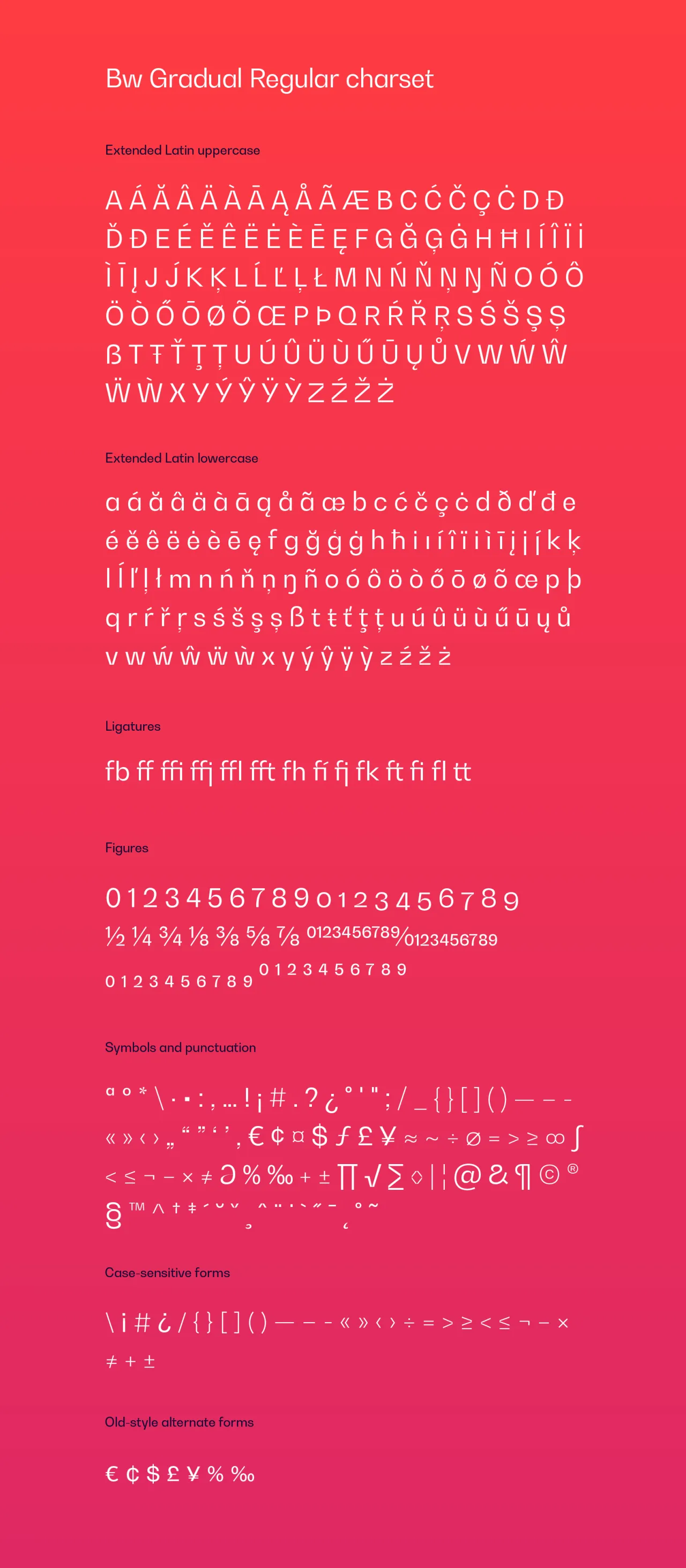
Designed by Alberto Romanos, Bw Gradual is available in seven weights from the delicate Thin to the robust Black with accompanying oblique italics, providing effortless design cohesion in corporate branding environments. It supports all European Latin languages and it includes many useful OpenType features like ligatures, old-style figures, and case-sensitive forms, among others, for greater design versatility.


Editor's Picks





Trending




Latest Jobs
Creative Content Executive at Cognition
Full-time·Birmingham·£28k–£35k
Senior Brand Designer at Analogue
Full-time·Leeds·£38k-£45k
Midweight Graphic Designer at We Are Your Friends
Full-time·London·£36k–£44k
Mid-Senior Designer at Something Familiar
Full-time·Bristol·£32k–£40k
Senior Front End Developer at Crown Creative
Full-time·Belfast·£50k–£60k
Designer at New Genre
Full-time·London·£36k–£48k