Innovative packaging design unites Coop brand across four markets
Swedish studio Bedow is helping the Nordic retailer reimagine 3,500 products across four countries, harmonising diverse market identities through clever use of a superellipse.
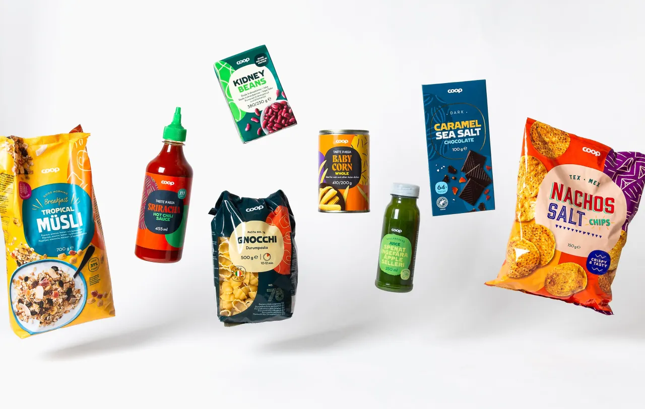
Not to be confused with the British retailer Co-op, Coop Trading is a Danish trading company owned by four Nordic consumer cooperatives. Recently, it decided to consolidate its presence across four Scandinavian markets, which required a comprehensive rebranding effort.
The project began in spring 2022 and is now coming to fruition as the first products featuring the new designs hit shelves in Sweden, Denmark, Norway and Finland. The work was carried out in partnership with Swedish design studio Bedow.
Founded in 2005, Bedow's work moves beyond what is often lazily categorised as Scandinavian style, bringing together moments of hand-drawn details, design craft and artfulness to create simple, thoughtful, practical design.
The challenge
The scale of this task was huge: over 3,500 products across four countries, each with its own unique brand identity, needed to be unified under a single cohesive design system.
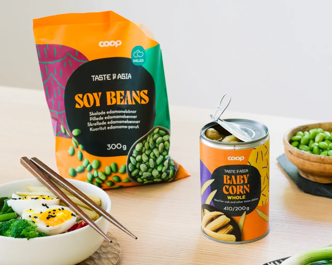
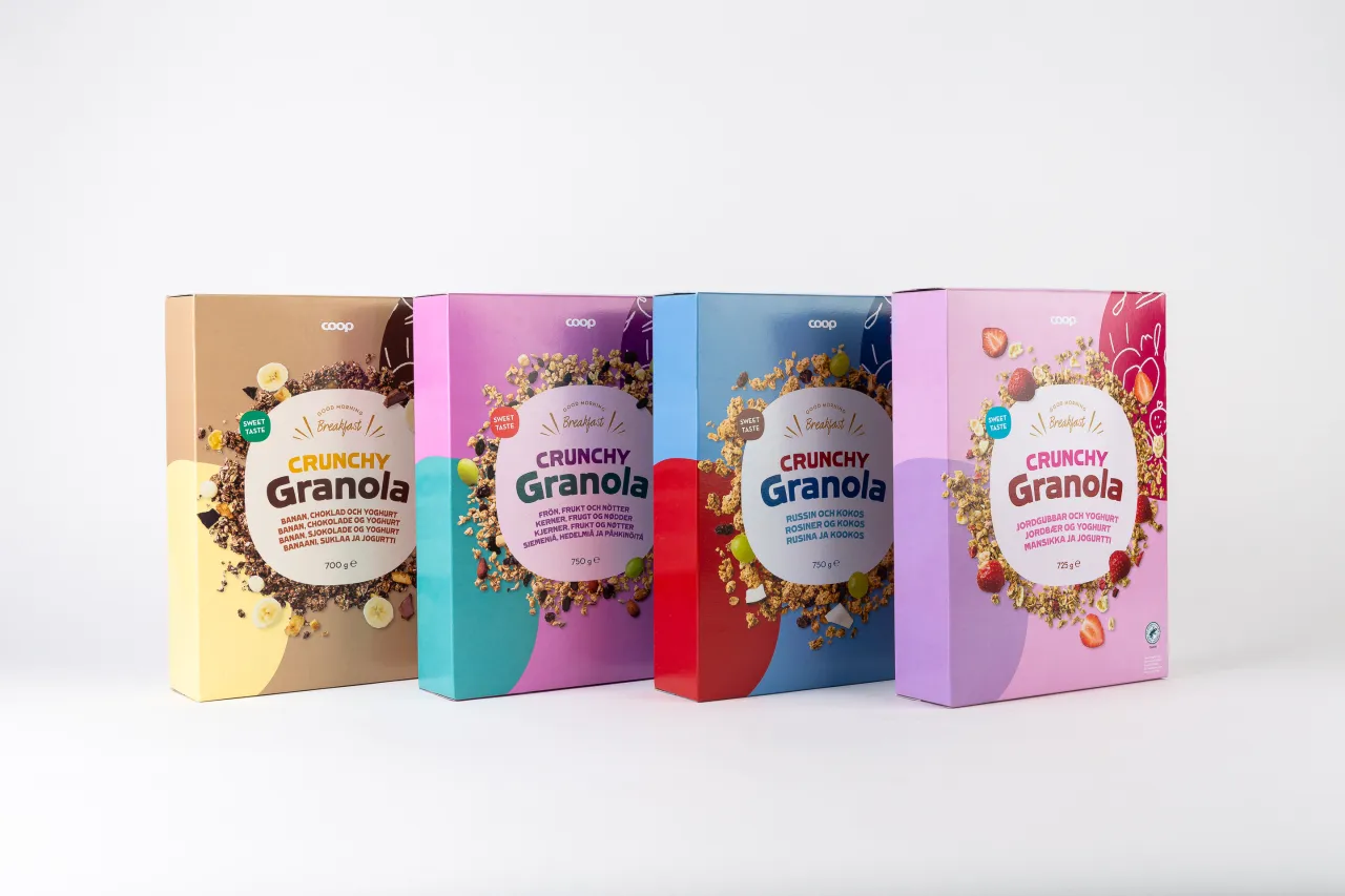
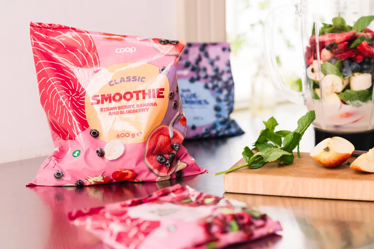
Until now, that brand identity has been very much fragmented. For instance, Coop's logo is used differently in the four countries, and in addition to the packaging design, part of the task was to find a way to handle the logo on the packaging.
Swedish Coop used a green circle with a white wordmark, Denmark and Norway used a red square with a white wordmark, and in Finland, the brand previously known as Rainbow used a blue square with rounded corners.
This meant that these three colours and shapes had to be avoided, and instead, a new way to apply the logo had to be presented.
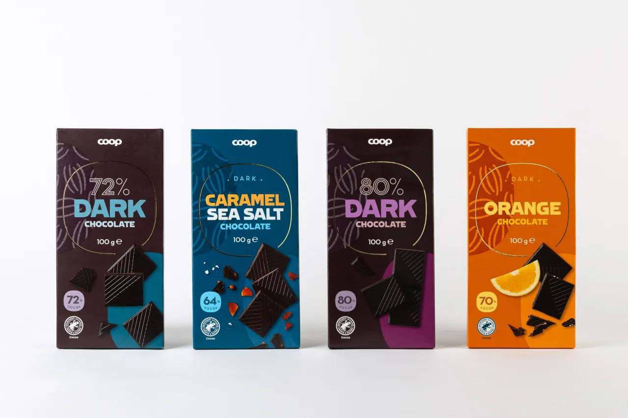
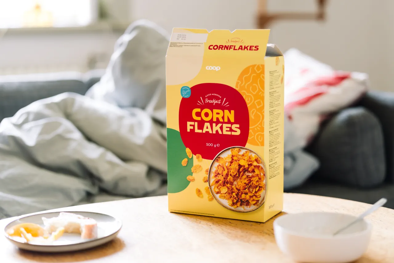
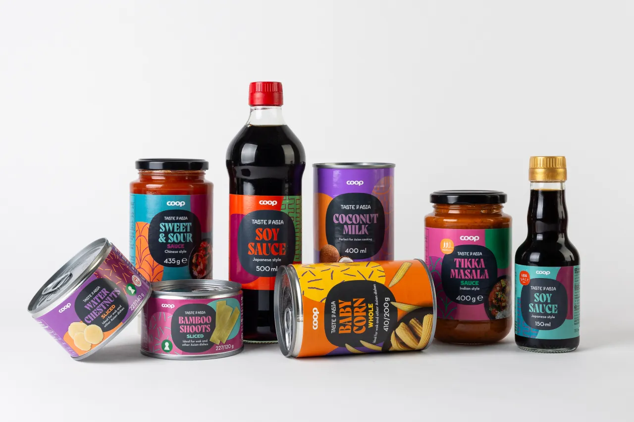
At the heart of the new design system is a clever use of the superellipse: a geometric shape conceived by mathematician Gabriel Lamé in the 19th century.
"The superellipse has been a frequently used shape over the years," explains Perniclas Bedow, creative director at Bedow. "But it has its own expression and isn't as generic as a square or circle. The best part is that its mathematical formula allows it to scale seamlessly without losing its integrity."
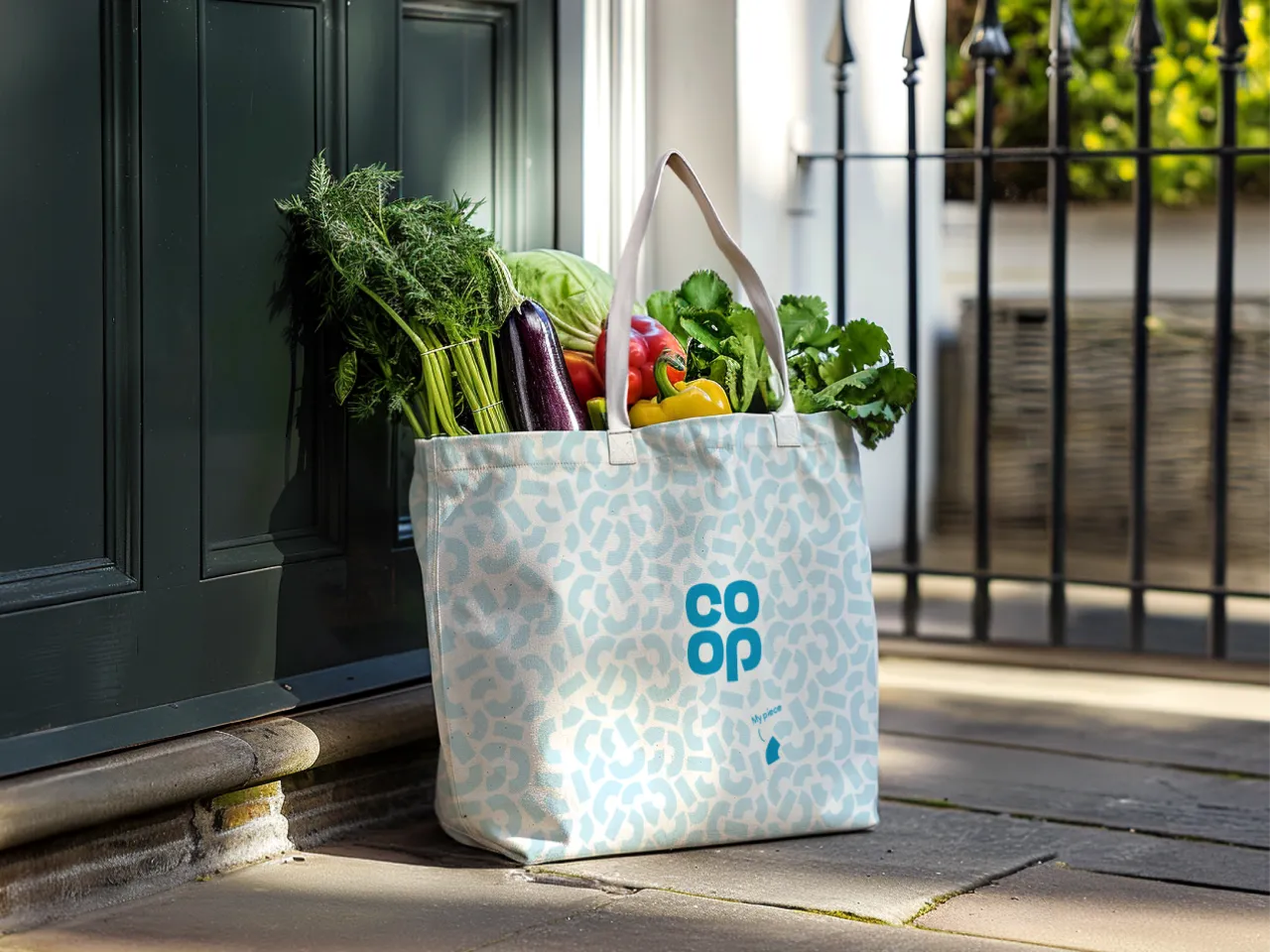
Bedow's designers created a shape based on the superellipse that they dubbed "the plate". This is elastic enough to be stretched in all directions while maintaining its geometric features, making it ideal for a packaging system that includes various shapes, formats and sizes across all four countries.
Flexible design system
A related challenge was finding a design system that can be recognised as Coop throughout the store but allows each category to stand independently and compete with the category leader.
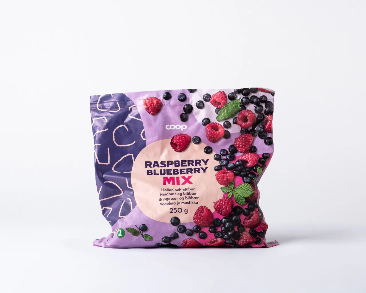
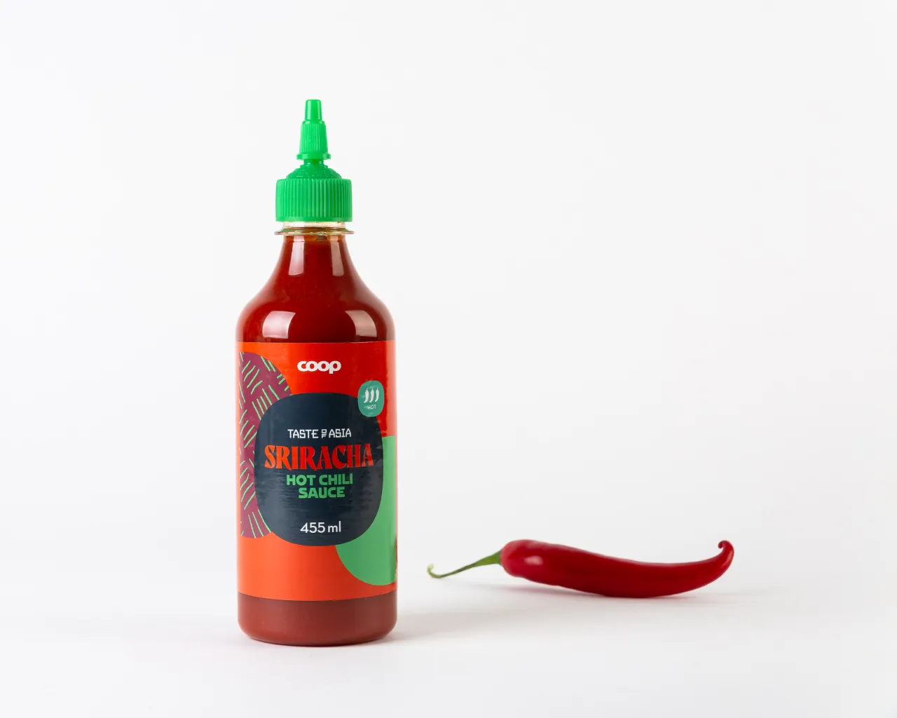
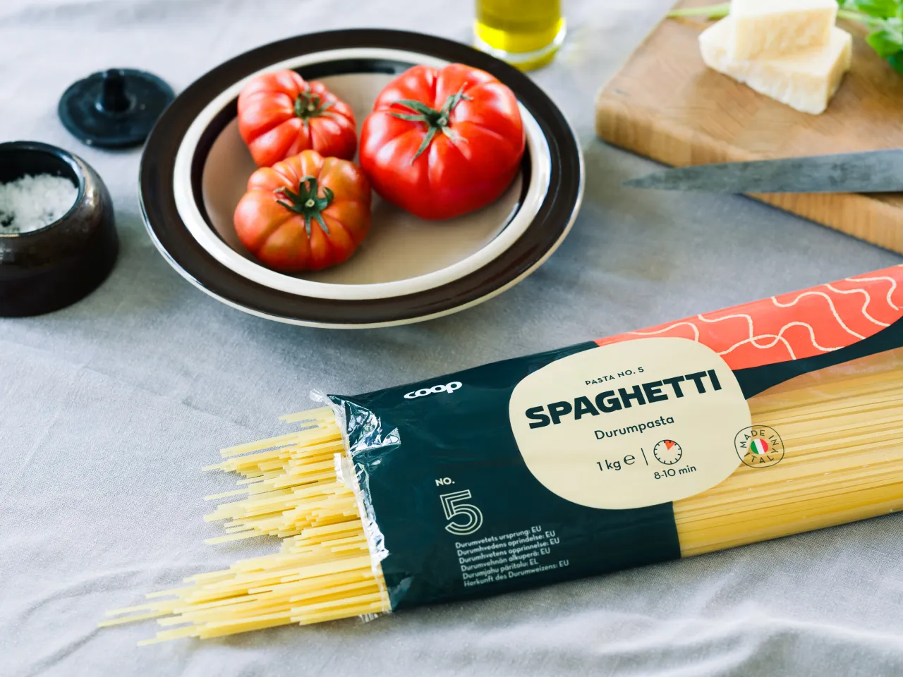
Bedow's solution incorporates a range of design elements, including colours, typography, illustrations, and photographs, to differentiate categories while maintaining a cohesive brand identity. As Perniclasputs it, "We've found a very good balance between horizontal and vertical design strategies."
Looking ahead
As intended, the new Coop brand unites all Nordic markets under a single private label to create a more inspiring everyday experience.
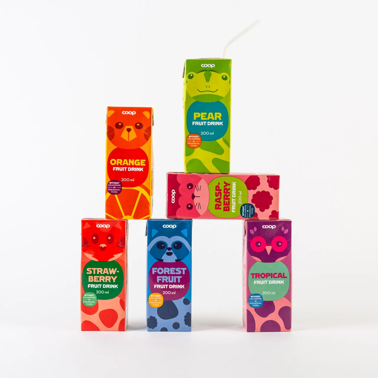
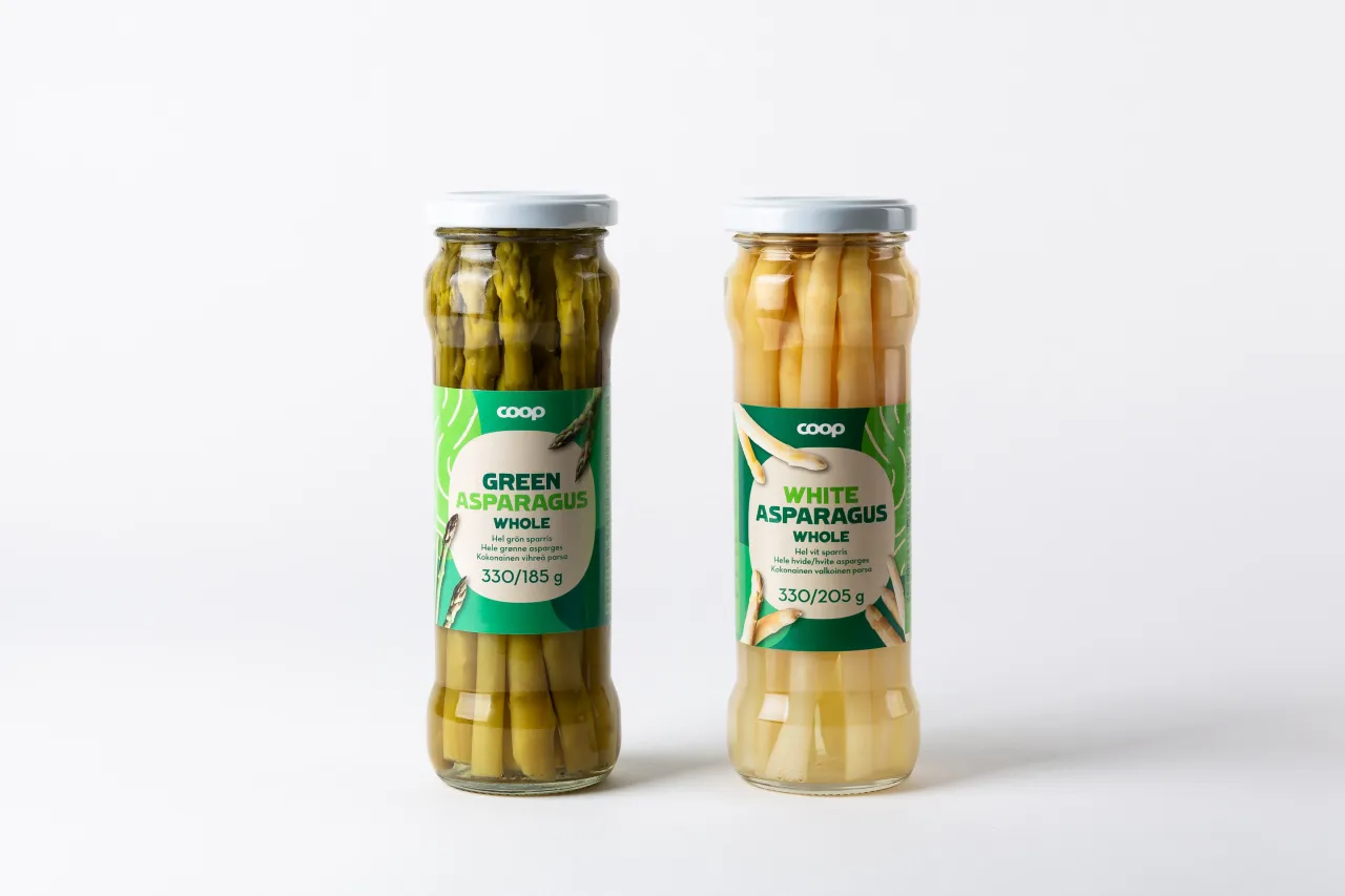
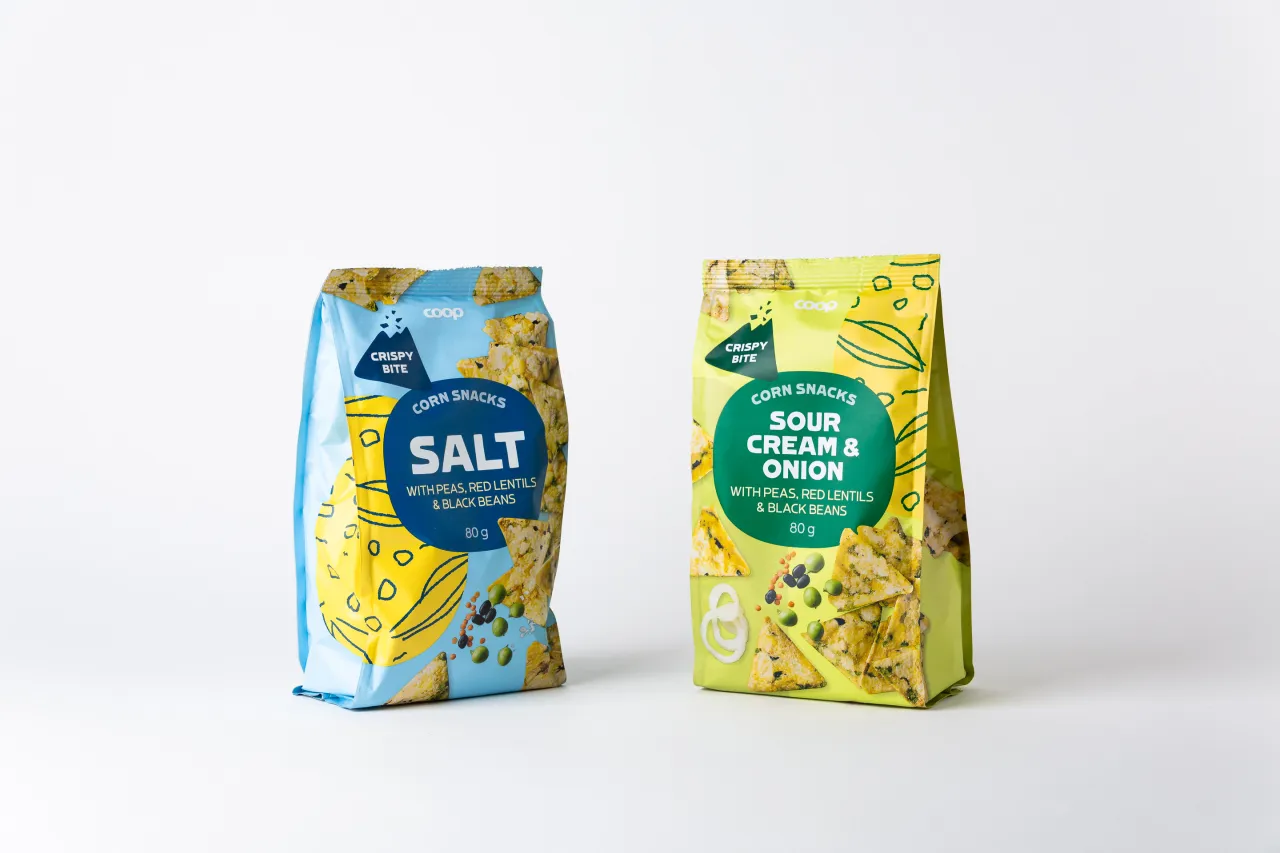
Thousands of products have found their home in a design system revolving around "the plate" as the primary content carrier throughout the packaging. These spread across four languages and a wide range of categories, from batteries to frozen fish to freshly squeezed juices. The result is a design system that can be as versatile as it is recognisable.
With approximately 1,400 units redesigned and a target of 1,700 by year's end, the project is progressing as planned. "We typically receive a brief each week and then deliver design and guidelines for five to ten units per category, which Coop Trading's design team then takes forward," explains Perniclas. "It's a fun and rewarding collaboration."
Editor's Picks





Trending






Latest Jobs
Midweight Graphic Designer at We Are Your Friends
Full-time·London·£36k–£44k
Senior Creative Lead at Random Studio
Full-time·Amsterdam / Paris·€90k-€110k
Midweight Full Stack Developer at Bureau for Visual Affairs
Full-time·London (Open to remote)·£35k–£50k
Senior 2D Motion Designer at Art&Graft
Full-time·London·£50k-£65k
Junior Project Coordinator at Colorido Studios
Full-time·Twickenham·£28k–£32k
Graphic & Motion Designer at The SHARP Agency
Full-time·Leeds·£26k–£33k