Co-op reveals new identity with reimagined logo reflecting member ownership
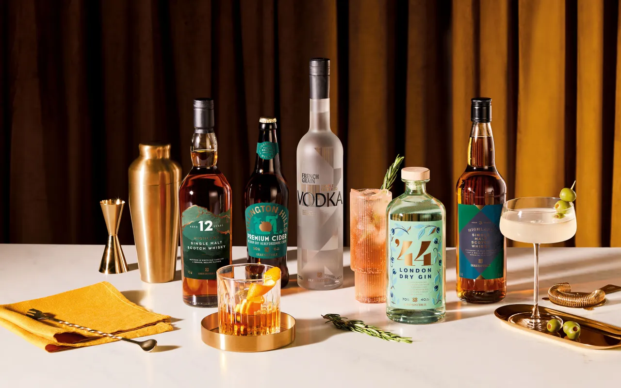
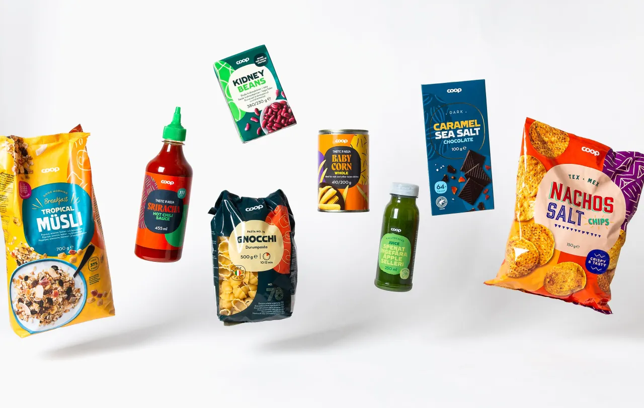
Design studio SomeOne is behind the refresh for the British supermarket chain, which was established in 1844 and today boasts 2,400 stores and over five million members. Central to the new branding are a deconstructed logo, bespoke typeface, and expressive icons.
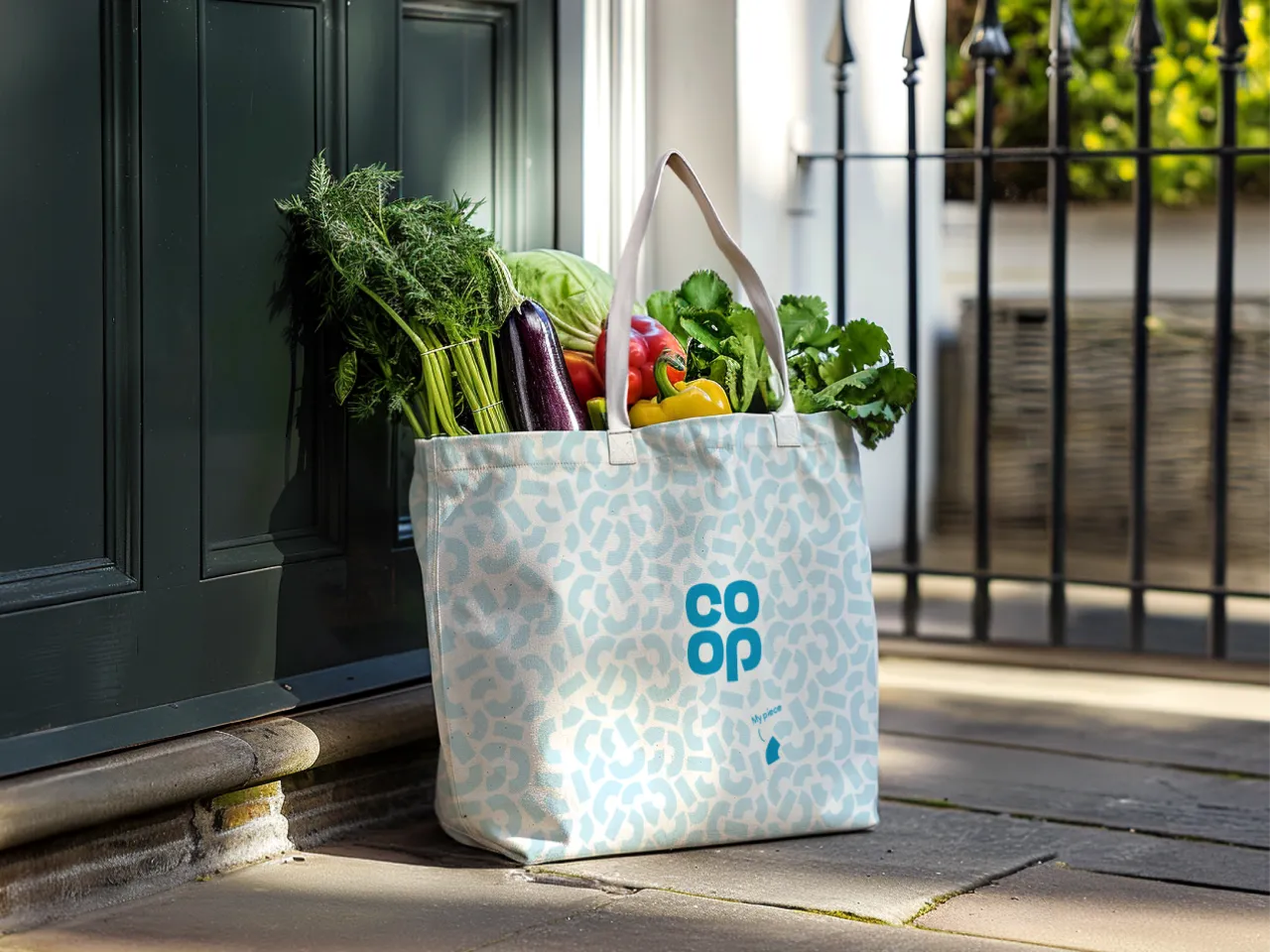
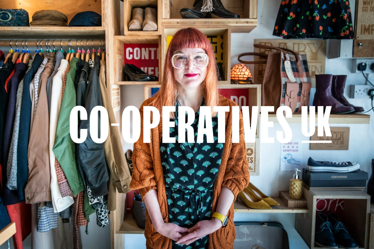
Co-op, the UK's pioneering consumer cooperative, and the world's first at that, has unveiled a refreshed identity that highlights its unique member-owned structure. Each member owns a share of £1, giving them the chance to have their say on how the cooperative is run. At its heart, the new identity features a reimagined logo, which has been broken down into distinctive shapes known as 'Membershapes', symbolising the individual ownership each member holds within the cooperative.
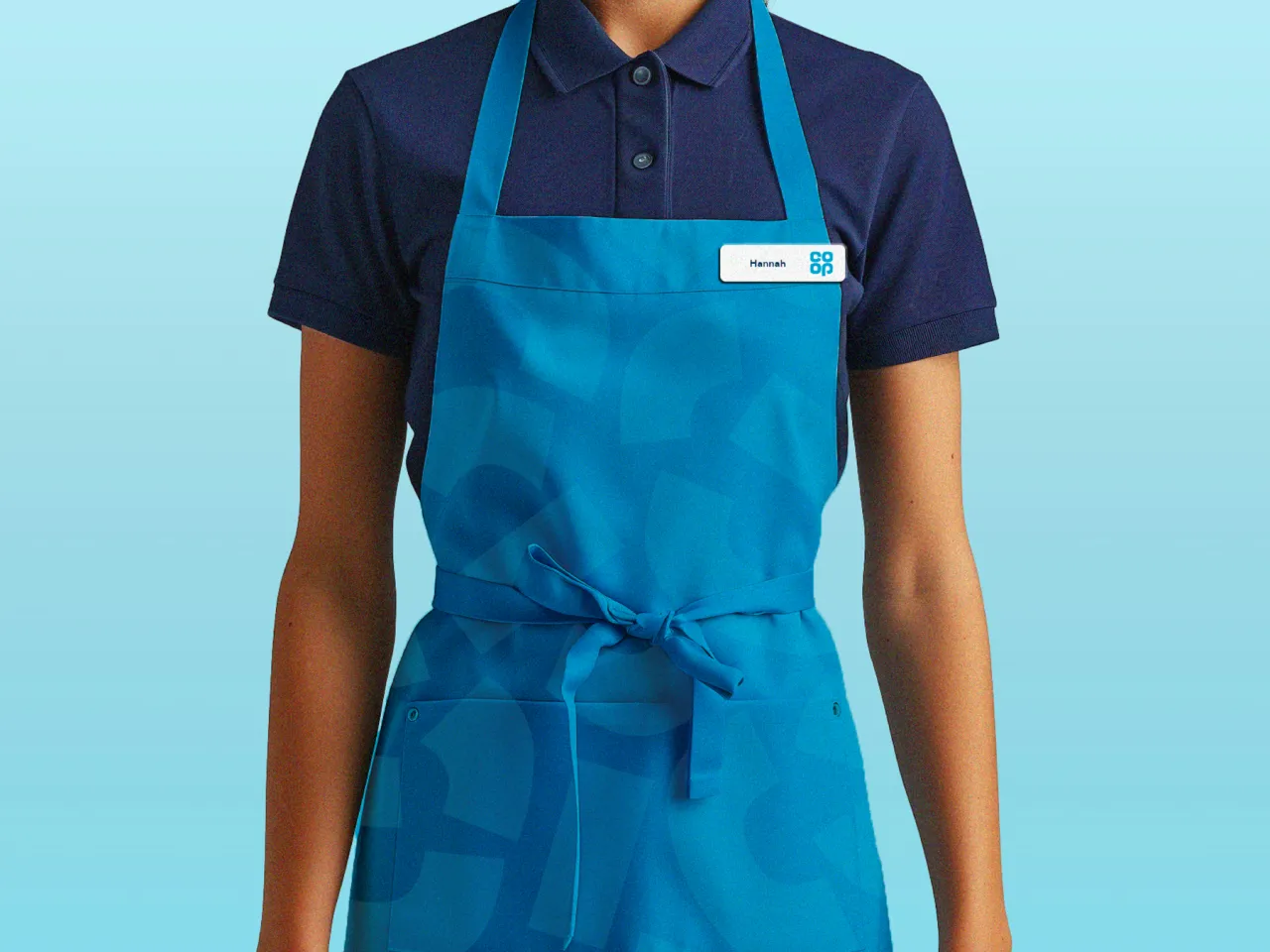
The work by London-based studio SomeOne is designed to reinforce the Co-op's commitment to its founding principles of honesty, openness, social responsibility, and community care. It has been rolled out to all parts of the business, including food, funeral care, insurance, and legal services.
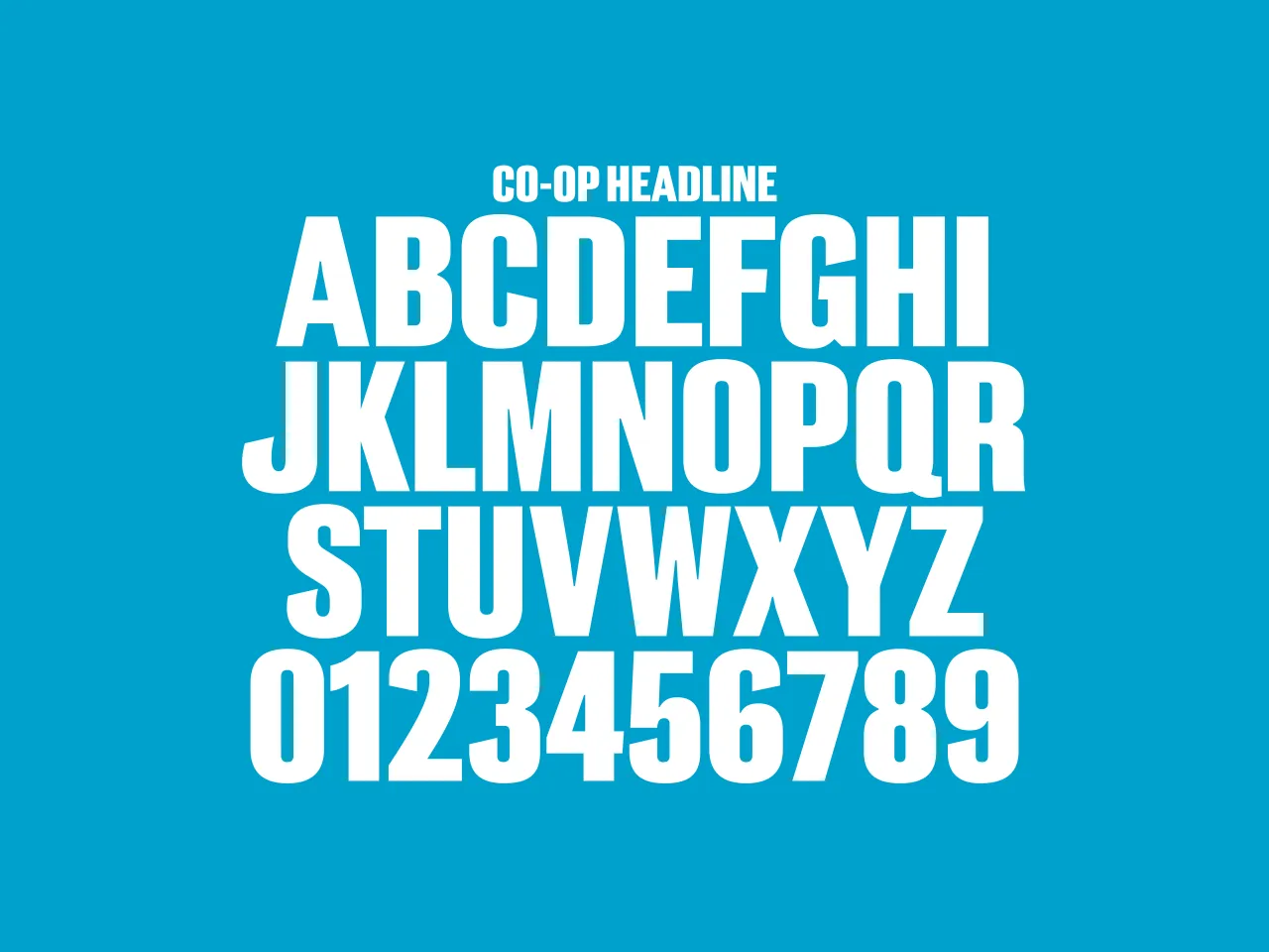
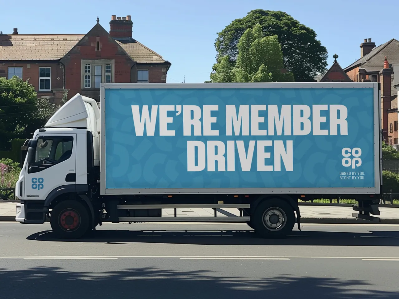
Alongside the updated logo is a bespoke typeface, Co-op Headline, designed to echo the curvature and cuts of the revamped Co-op symbol, which can be found in the 'c' and 'p'. Created in collaboration with F37, it was "born from the DNA" of the Co-op symbol, according to SomeOne. The idea is to add a bold and authentic touch to all communications.
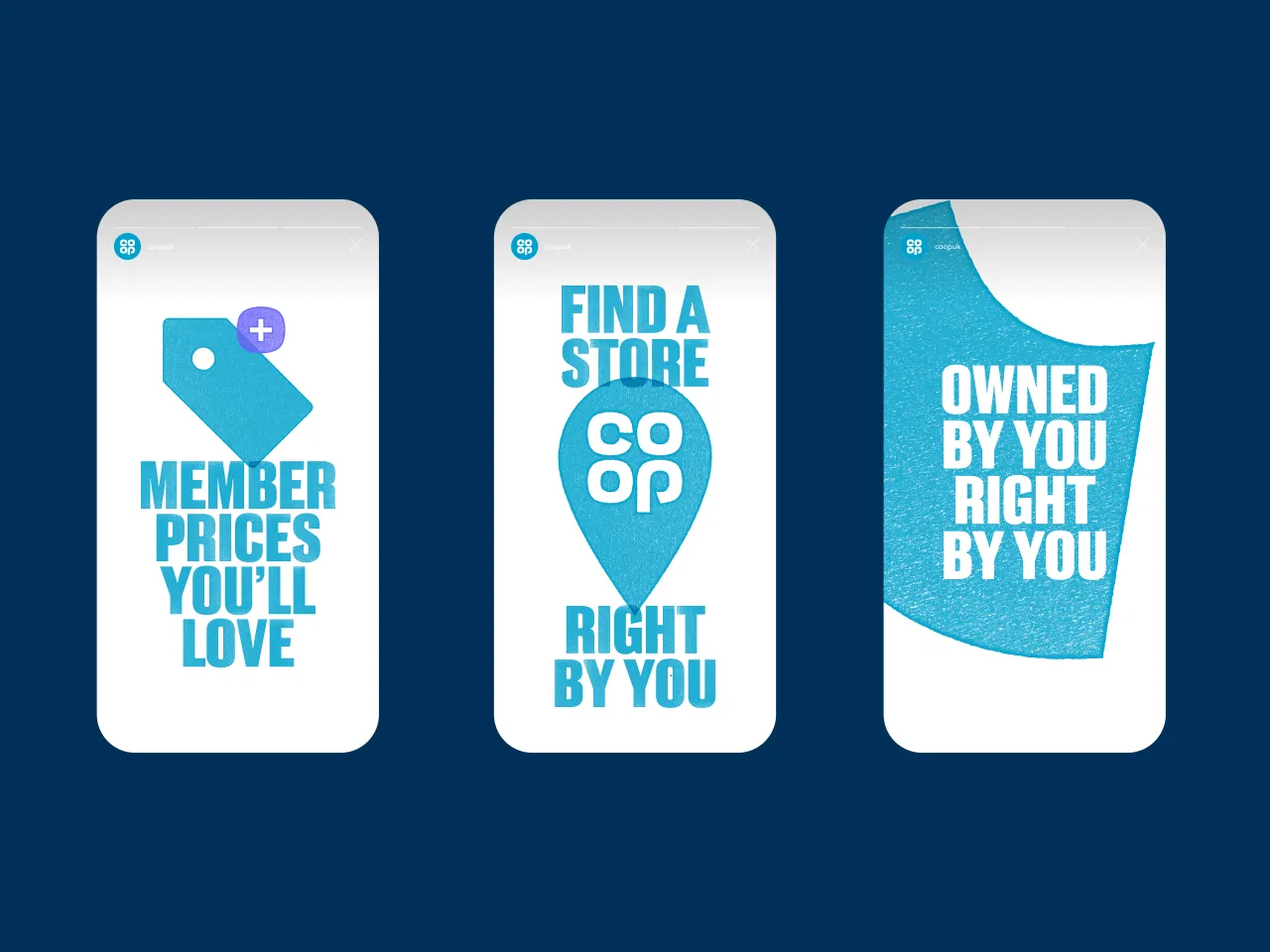
The new font is available in vector and textured versions. Why? So that the typeface could retain the detail of the ink-rolled texture created at St Brides Library in London. The intention was to mimic that of letterpress blocks for an overall more authentic and "activist-inspired" approach.
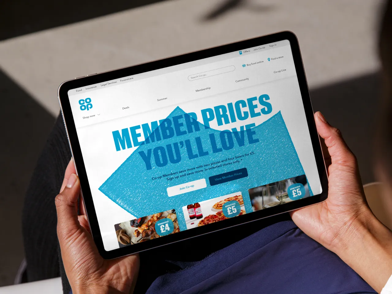
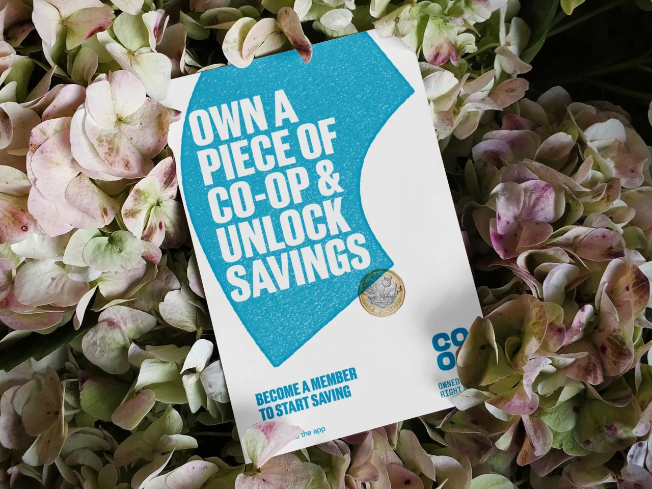
So why the overhaul? Gary Holt, founder and executive strategic director of SomeOne, said it was based on the results of a new survey: "It revealed that over 50% of consumers admitted that they didn't understand what it means when a business is a cooperative or a mutual. The new brand world looks to help address this by focusing on the idea that each individual member owns a piece of the cooperative, putting membership at the heart of everything Co-op does," he says.
That's why SomeOne broke up the Co-op symbol into five different pieces, rallying home the idea that this brand exists for its members. "Their role is to hero Co-op's individuality and bring its differentiating qualities to life," explains Shaun Turnbull, creative director. "It also has another role, a role to help the brand flex in multi-channel communications; this is something the brand has struggled with from what we heard when speaking with key stakeholders." These 'Membershapes', he says, can be used "as a window, a holding device, a pattern, a graphic device or a piece of storytelling".
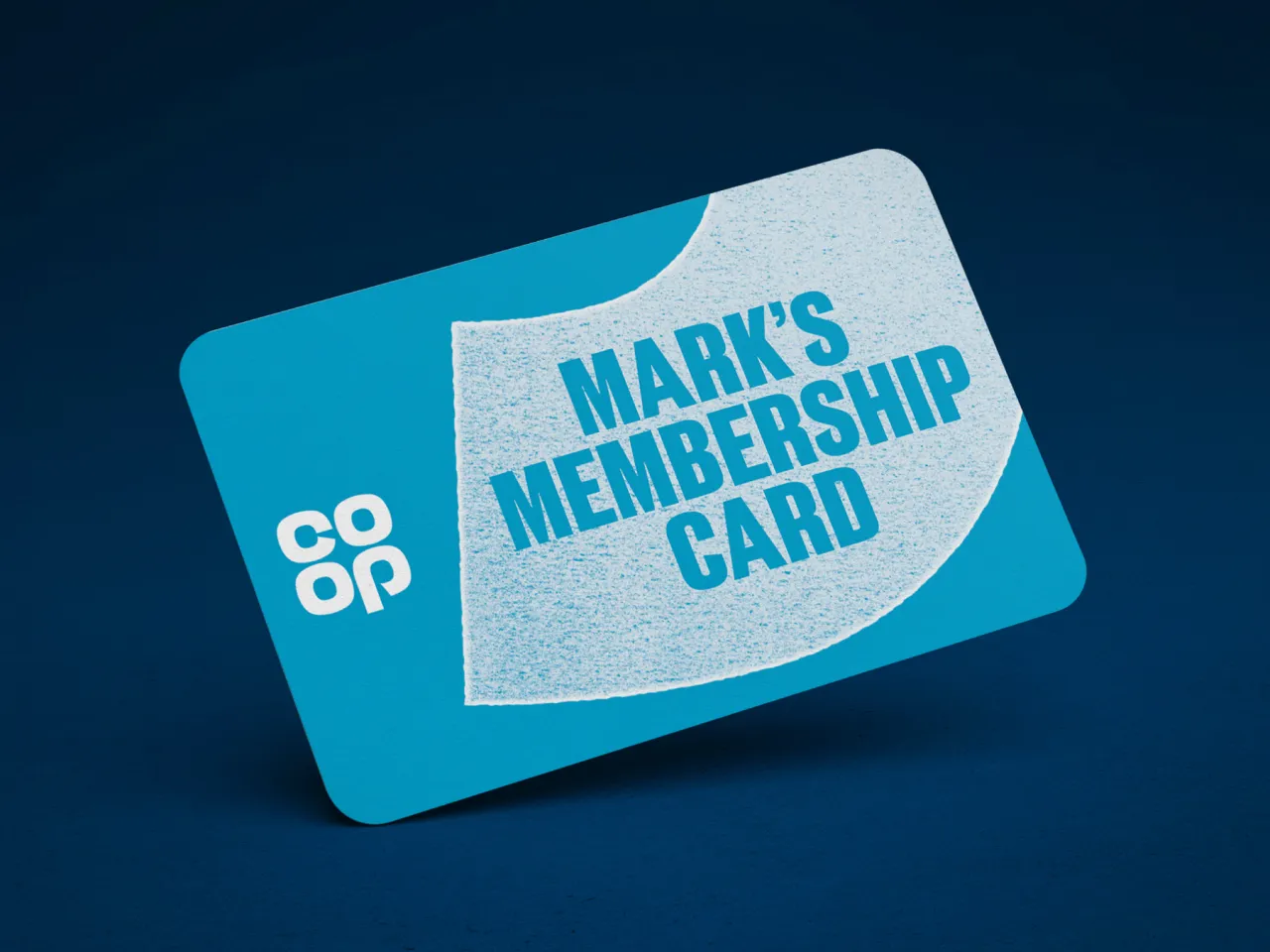
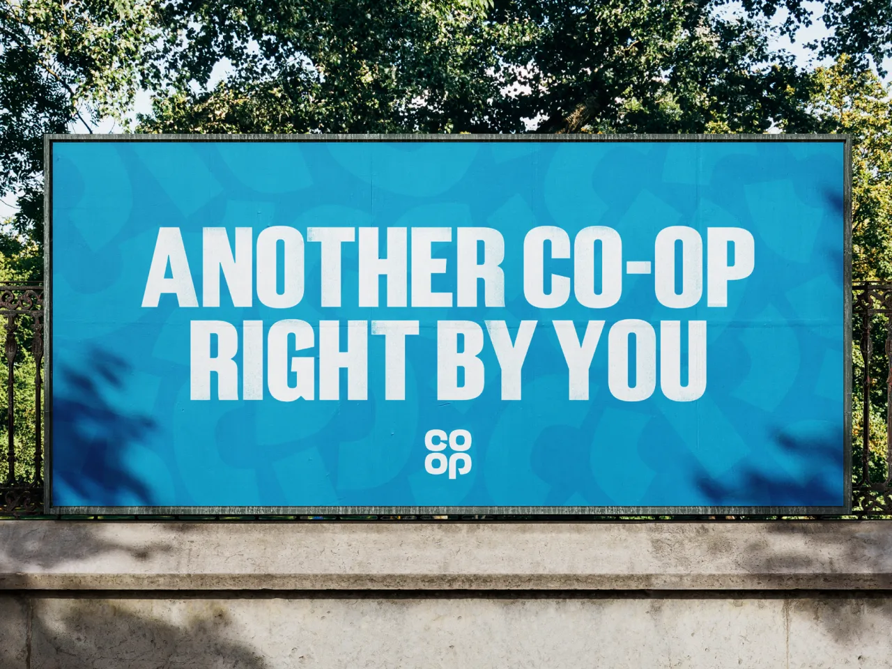
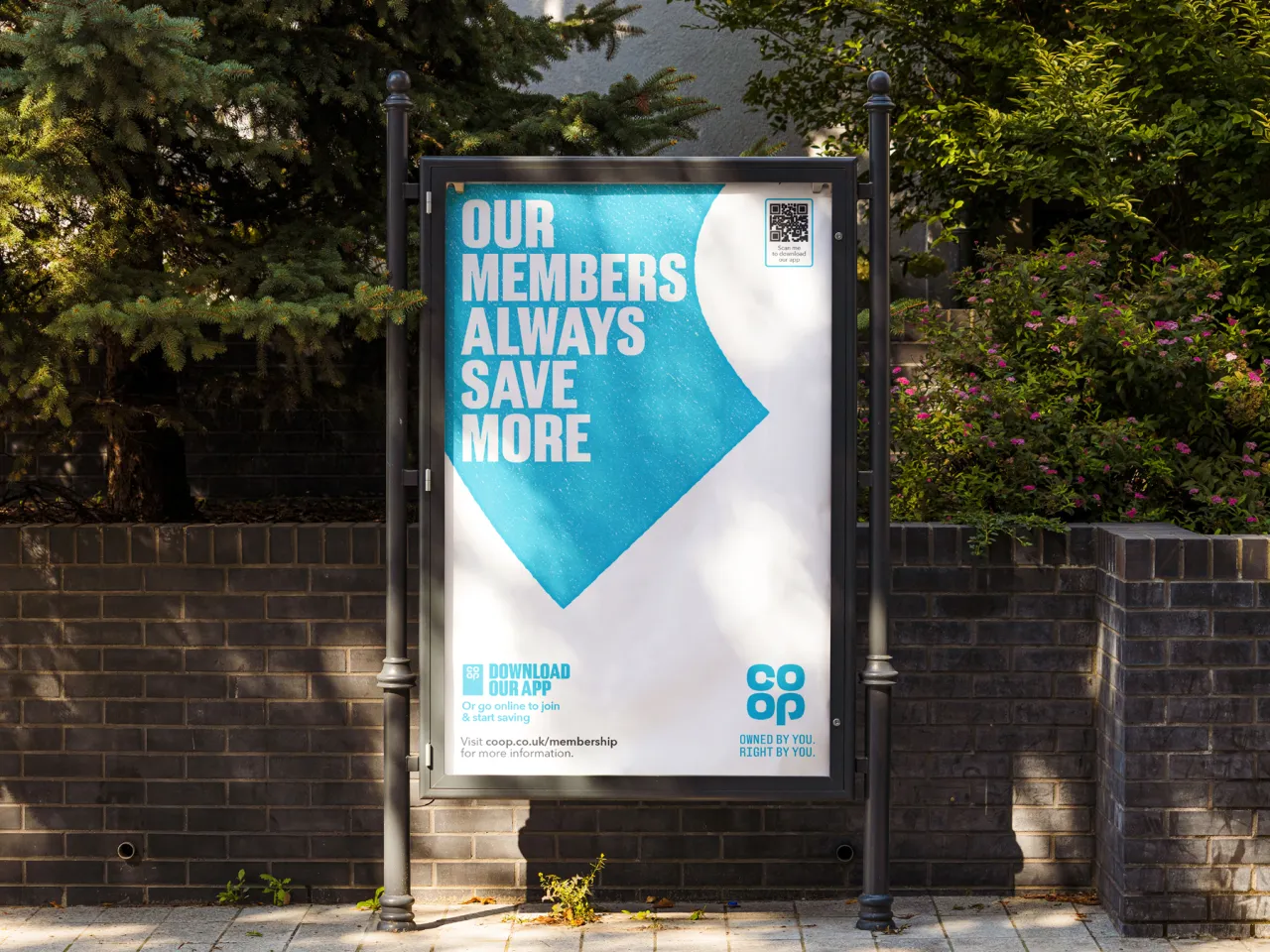
This fresh flexibility has also allowed all of Co-op's services to feel like one brand, from food to legal services, insurance, and funeral care. It's quite the contrast to what was there before, as each sub-brand looked like a separate business until now. It was certainly a bold move, and one that Shaun believes is quite revealing: "It says something of a brand, and their intentions – that it's prepared to break up its core brand asset – the logo, to be truly seen as a brand that does business differently," he says.
With ambitions to grow its membership base from five million to eight million by 2030, Co-op's new identity, which is being rolled out across all touchpoints this month, really hits home its dedication to its members and the broader community, staying true to the vision of the Rochdale Pioneers who founded the cooperative 180 years ago. "Our aim was to create an authentic, honest and tactile new Co-op – a brand for the people by the people," adds James Bell, a designer at SomeOne.
Editor's Picks





Trending



Latest Jobs
Senior Creative Lead at Random Studio
Full-time·Amsterdam / Paris·€90k-€110k
Graphic & Motion Designer at The SHARP Agency
Full-time·Leeds·£26k–£33k
Frontend Developer at Northern Artillery
Full-time·Leeds·£35k–£45k
Client Director at Koto
Full-time·Berlin·€70k-€85k
eCommerce Web Designer at on/Sight
Full-time·$75k–$95k
Art Director at SPOKE
Full-time·London·£55k-65k