'Don't try to understand it': Meet Cooot, the studio making branding feel wonderfully uncertain
The Zhengzhou-based branding studio builds visual identities that evoke a fleeting sensation of seeing something familiar you can't quite make sense of.
"I hope that when viewers see my work, they don't try to 'understand' it first," says Bai Mi, founder of Cooot studio. "Instead, they feel a subtle sense of uncertainty – something feels different, but they can't quite put their finger on it – and then quickly find a familiar foothold."
Cooot Studio was founded in 2020 and is based in Zhengzhou, in central China, offering branding, packaging and event design to clients worldwide. Its founder came up through animation before a growing interest in graphic design pulled the practice in a different direction.
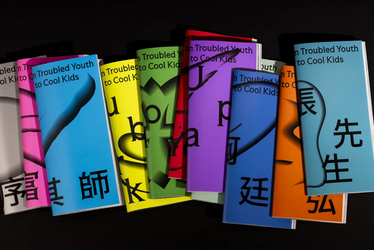
The work has since been picked up by BranD magazine, IdN, The Brand Identity and Dieline, with back-to-back recognition in 2022 and 2023, and is built around what the studio calls "breaking through within inertia". That means taking the habits and conventions of a visual category and pushing them just far enough to create something surprising, without losing the logic that makes the work legible.
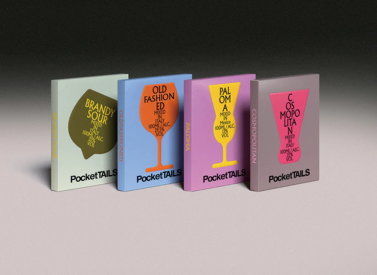
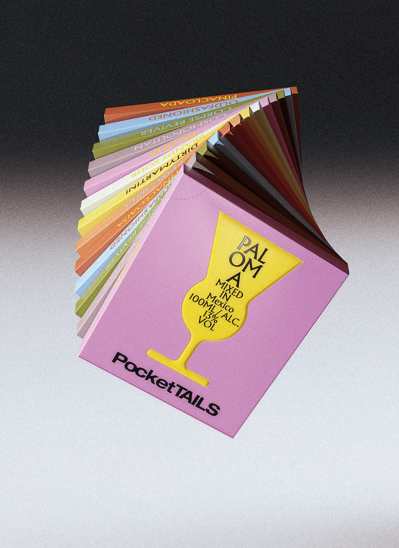
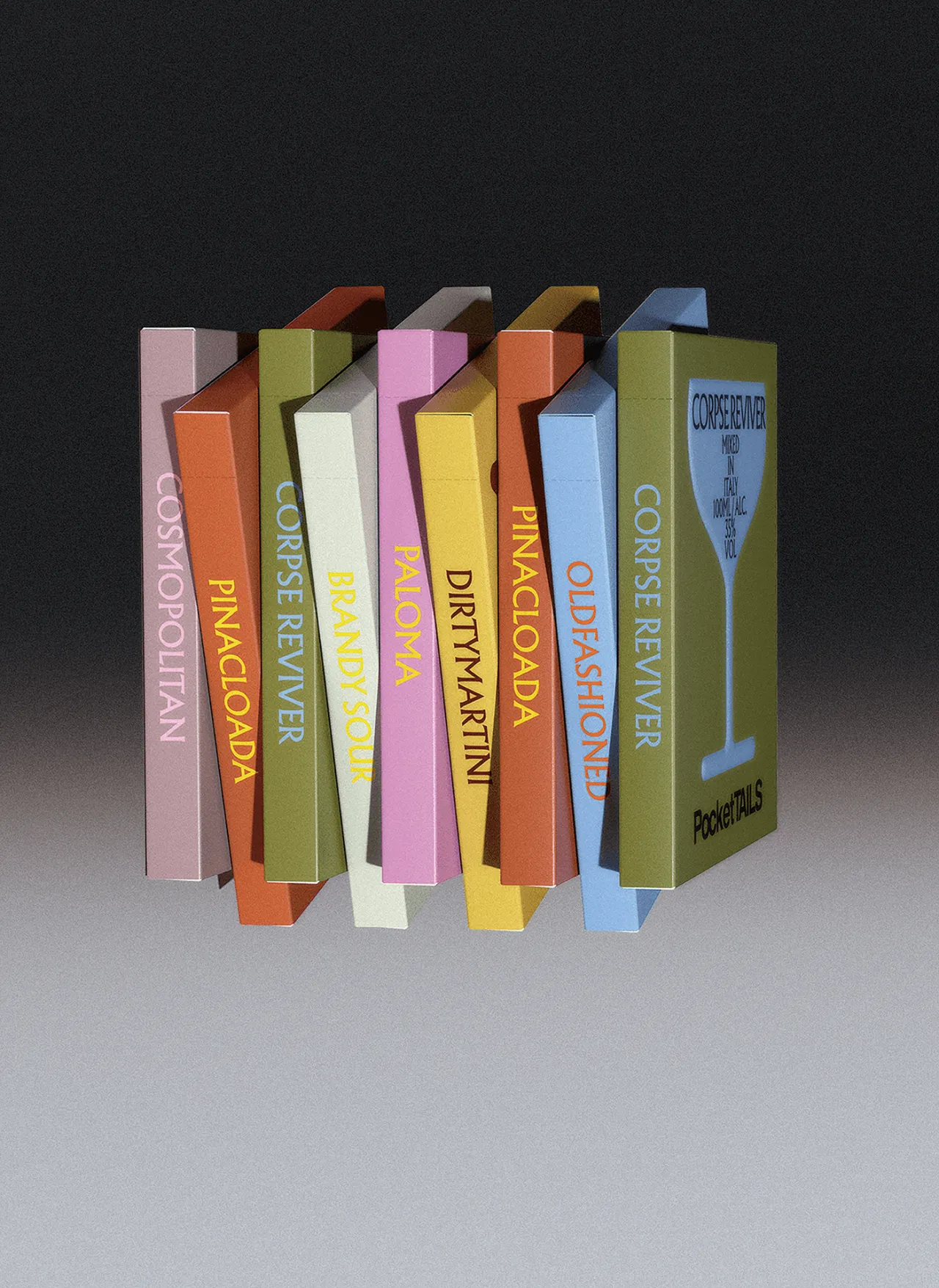
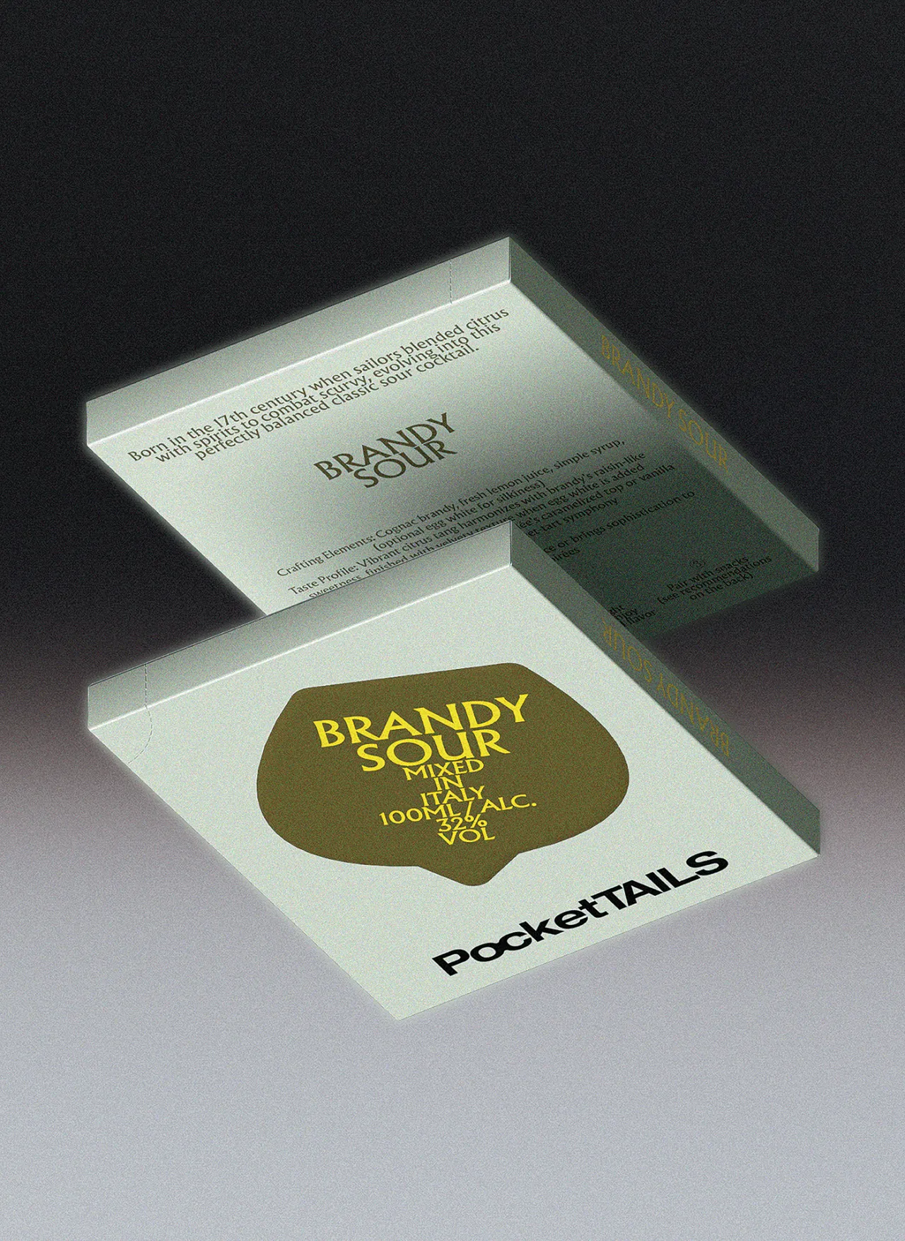
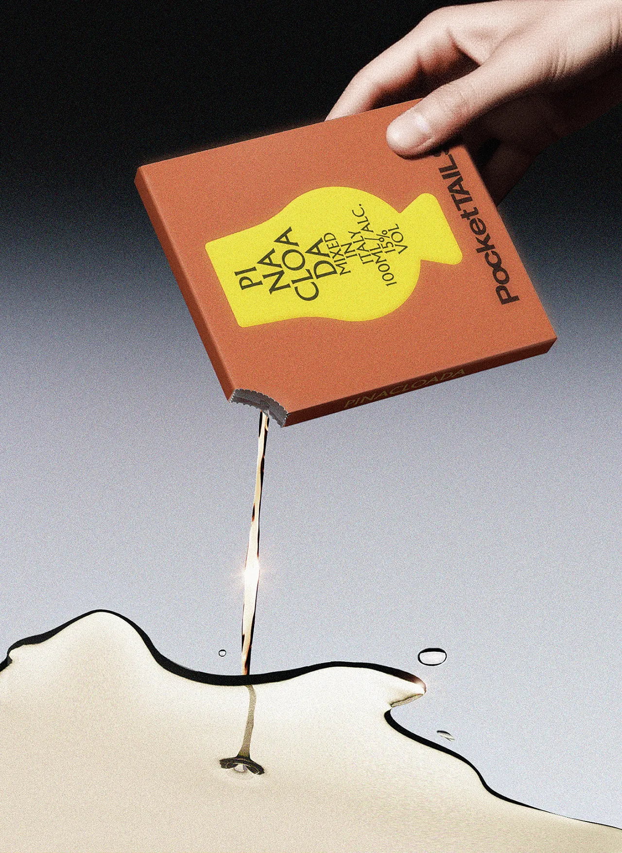
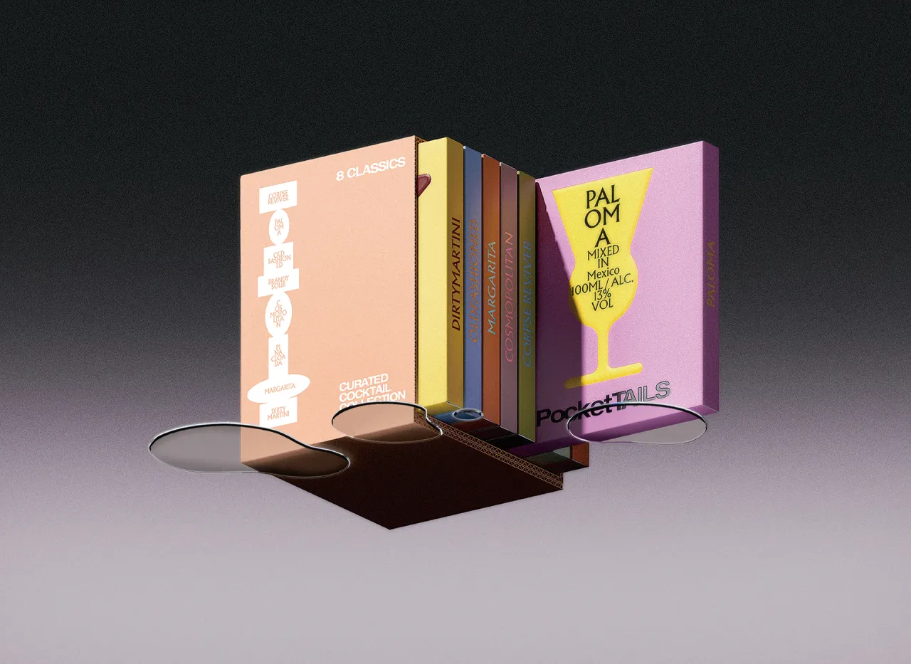
Two recent projects show how that works. First up is PocketTAILS, a cocktail recipe booklet series featuring compact, tactile publications, each named after a classic drink. The visual system is organised around glassware. Each title corresponds to a distinct glass form: the wide, shallow coupe of a Brandy Sour; the tall, narrow silhouette of a highball. The shapes are translated into a colour and graphic language that feels exceptionally fresh yet also like something from a mid-century bar menu. Spread open, the books fan out in a muted, considered colour palette of olive, terracotta, blush and sage.
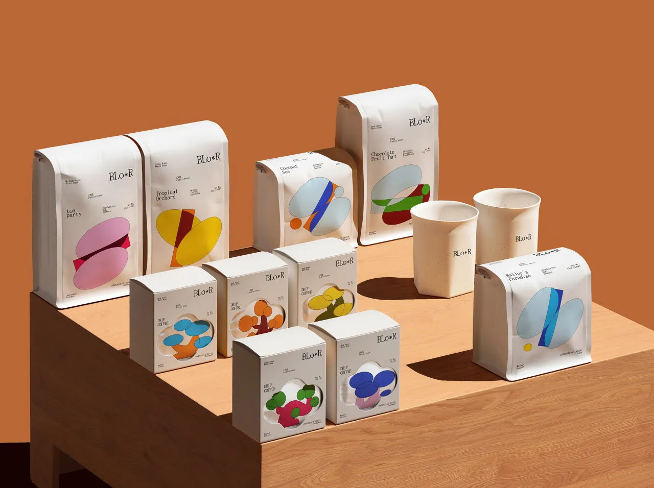
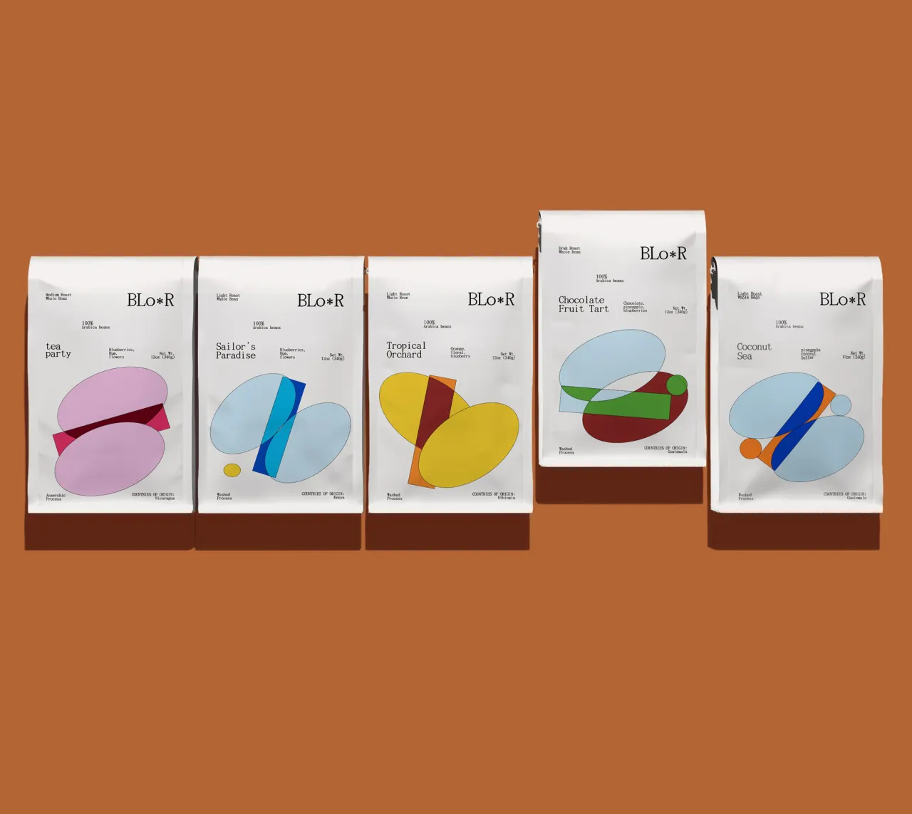
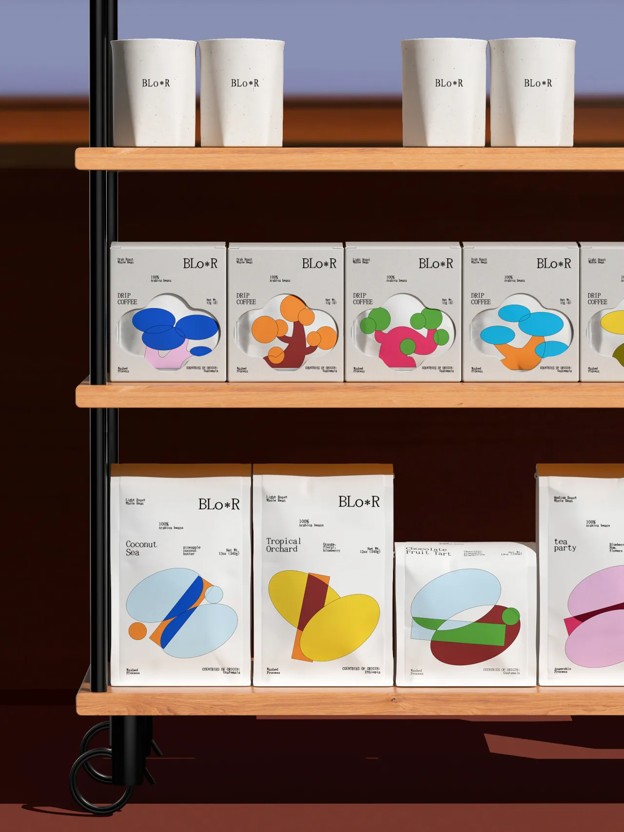
BLO*R is a coffee brand, and the starting point was the fruit before the bean. Coffee cherries – the red-skinned fruit from which coffee seeds are extracted – grow through distinct stages of colour, from green to yellow to deep red. Cooot extracted those shifting colour blocks as the graphic foundation of the whole identity, extending and reconfiguring them across packaging until the natural process of growth becomes a visual system. The result feels botanical and thoughtful, alive with colour but not chaotic.
"I aim to break inherent patterns within the inertia of habit," the studio explains, "and use that habitual awareness to restructure. The goal is to create, while breaking through, a feeling in the audience of something unfamiliar that quickly returns to a sense of familiarity – a brief sense of dislocation."
The creative process for Cooot is responsive and intuitive, meaning each project dictates its own logic. Inspiration comes from everyday moments, from films, markets and visual notes from the commercial world – the ordinary stuff that most design either mimics or reacts against. The studio is interested in neither.
The aim is to make work that makes the familiar strange for just long enough to earn a second look, then resolves into something that feels earned and inevitable. With this in mind, the studio plans to conduct more visual experiments across different media, and a small solo showcase is scheduled for later this year.
Editor's Picks





Trending






Latest Jobs
Junior Project Coordinator at Colorido Studios
Full-time·Twickenham·£28k–£32k
Senior Graphic Designer at MoMA Retail
Full-time·New York·$72k-$80k
Growth Strategist (Ecommerce) at Tribe
Full-time·Exeter / London·£50k + Bonuses
Account Manager at BUILDHOLLYWOOD
Full-time·London·£34k–£38k
Senior Digital Designer at 3800
Full-time·Sheffield·£40k-60k
Frontend Developer at Northern Artillery
Full-time·Leeds·£35k–£45k