Studio Blackburn crafts an identity that's deliberately 'not quite right' for Ventura Foreman
How did the London team turn an unconventional brief from a design and manufacturer studio specialising in quality workwear pieces for clients, including Paul Smith and Matches, into a triumphant new brand? We find out more.
It's not often you get a brief from a client that says, 'We want it to feel a little bit wrong' - the usual parameters normally focus on finding the perfect identity for the brand.
And that's exactly what Studio Blackburn has done for Woolwich-based design and manufacturing studios Ventura Foreman…by being just a little bit off and not turning the company into a brand.
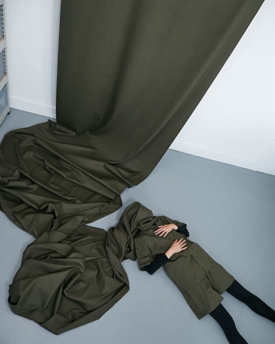
Confused? You won't be when you see the clean and simple visuals that tie Ventura Foreman's new identity back to the very fabric of the company's DIY aesthetic roots.
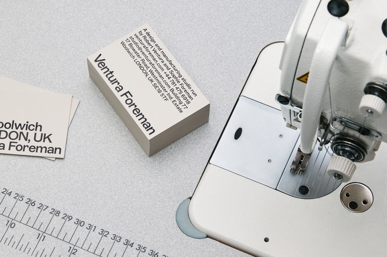
Ventura Foreman is the husband and wife partnership of Robert Ventura and Sophie Foreman, who specialise in workwear, all produced in-house for clients such as Paul Smith, Matches Fashion, Norman's Café, Nana O's and Michelin Star restaurant 'Trinity' in Clapham.
The founders at Ventura Foreman admitted that they were originally nervous about how the unconventional brief would be received. They explained: "It was essentially 'can you create an identity for us, without turning our company into a brand?'
"Our business has always been about authenticity, the products we make and that we make everything in our own studio. We're not trying to portray any other idea of what we are, apart from what it actually is, branding had always come second to us.
"Studio Blackburn completely understood this and managed tremendously to take the DIY aesthetic we had already built, augmenting and elevating it into something with a truly unique and authentic personality."
It all becomes much clearer when you see the visuals behind the campaign and the thinking behind every asset, right down to the utilitarian typeface – ABC Marfa Medium, designed by Dinamo.
Adam Moore, senior designer at Studio Blackburn, explained: "The brief gave us a lot of creative freedom but determined that we keep one crucial thing in mind, to create the perception that the brand is 'clean, simple and familiar but that something is not quite right.'
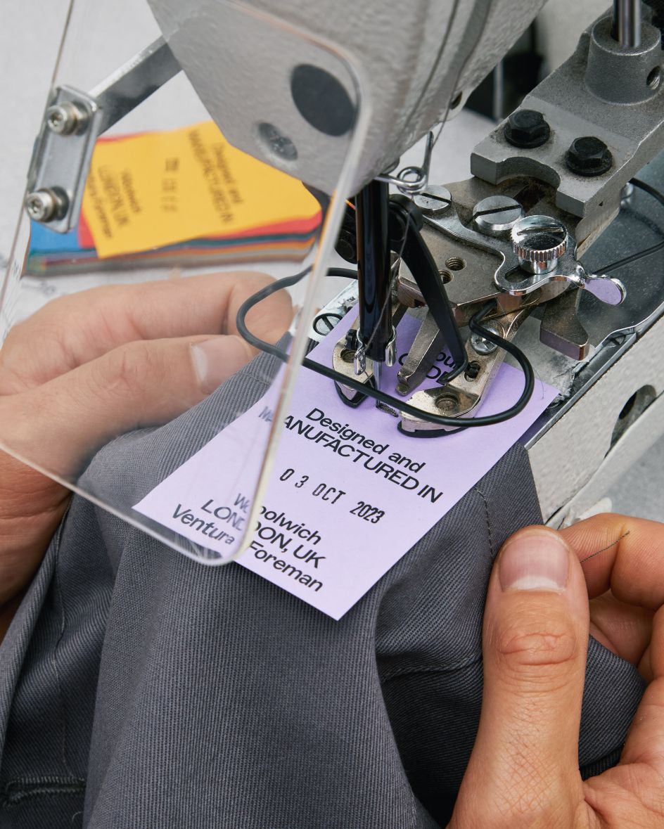
"This feeling of 'a little bit wrong' was applied to everything, from the typographic system for the logo to the way we attach a label."
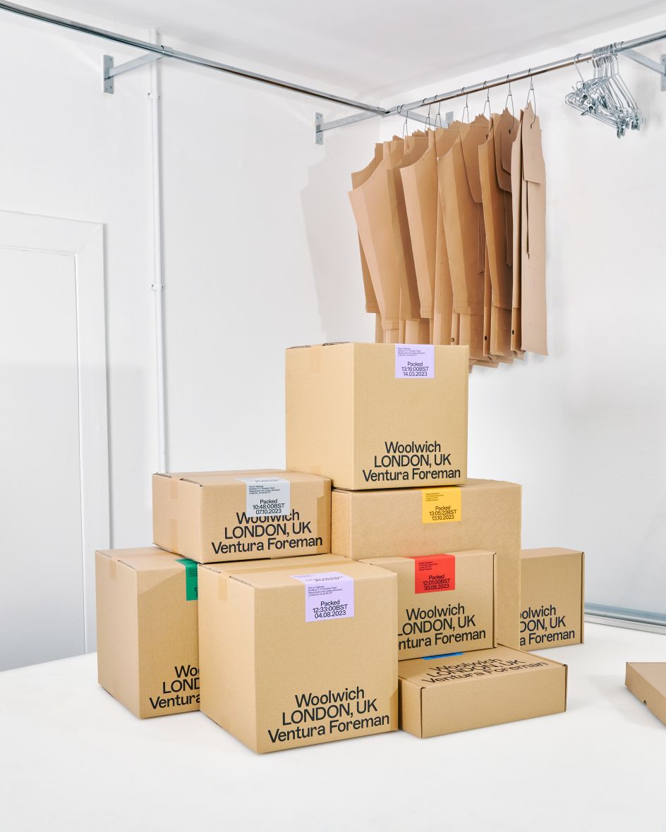
Crucial to Ventura Foreman's fabric as a business are the company's roots in the historically industrial area of Woolwich – a factor which led to Studio Blackburn making the client's London address a key component of the branding, on everything from labels to packaging.
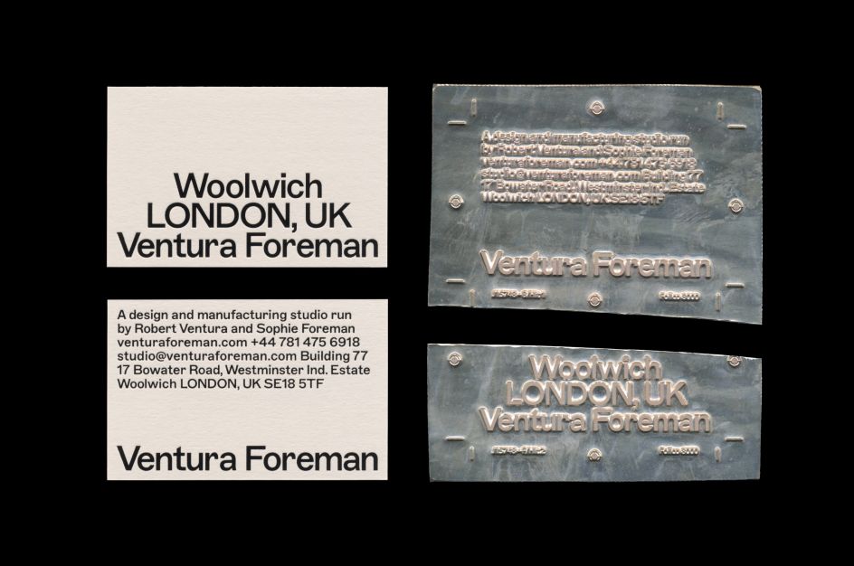
But another quirk of the brief was a lack of specified colours. This was also turned into a positive, as Adam outlines: "Unconventionally, the brand identity doesn't really have a colour palette; it uses paper stocks and colours chosen to pair with the clothes and based on the range of fabrics available. Hits of colour have been added as and when needed for print collateral, postage labels and other branded assets."
The finished project has created a clean, authentic and logical identity for a brand that doesn't really want to force its brand on anyone.
Will Cooper, midweight designer at Studio Blackburn, added: "Working closely with Ventura Foreman helped us to manufacture a brand that echoes that of the studio's ethos. To put it bluntly, all we did was add labour to materials and, in this case, a single-type style. By stripping the brand back to a single font, we unlocked its full potential within a unique typographic system."
Editor's Picks


Trending


Podcasts


Editor's Picks
Further Reading