JKR evolves KFC's entire identity around the bucket – welcome to the 'Bucketverse'
Jones Knowles Ritchie reworks every touchpoint, from a 3D logo and custom typefaces to a refreshed Colonel, as KFC's biggest brand evolution begins rolling out across more than 150 countries.
Chicken is having a moment. I only realised this recently at a Spanish airport, when I spotted a new Popeyes branch past security. On further investigation, it appears the brand is rapidly expanding its global footprint as it seeks to dominate the category. It's why an email from Jones Knowles Ritchie (JKR) made me smile this morning. It's just helped KFC evolve its entire identity, reminding us that few fast-food brands carry a kit of parts as distinctive as its own. The bucket, the stripes, the Colonel, and its strapline "Finger Lickin' Good" – each one is instantly recognisable, even out of context. Perhaps KFC wants to remind us that there is only one place to enjoy chicken.
That, in a nutshell, was the mission. JKR, the global branding agency behind the work, was not asked to start KFC over but to take it into what the brand calls its next chapter. It wanted to evolve, confidently, without losing brand loyalty.
The result is a full 360-degree evolution that runs from the design system and brand assets through to restaurant environments, packaging, digital platforms and tone of voice. JKR describes it not as a refreshed logo but as a "single, connected world" – one built entirely around KFC's most famous asset: the bucket.
"Our role was to help it evolve for the next chapter, in a way that only KFC could," says Sean Thomas, global executive creative director at JKR. The studio set about "building a world and experience that consumers could step into. We call it the Bucketverse."
The bucket is the unlock
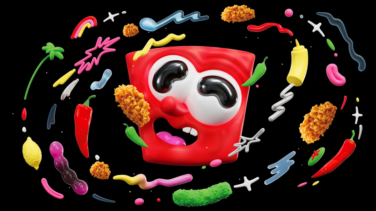
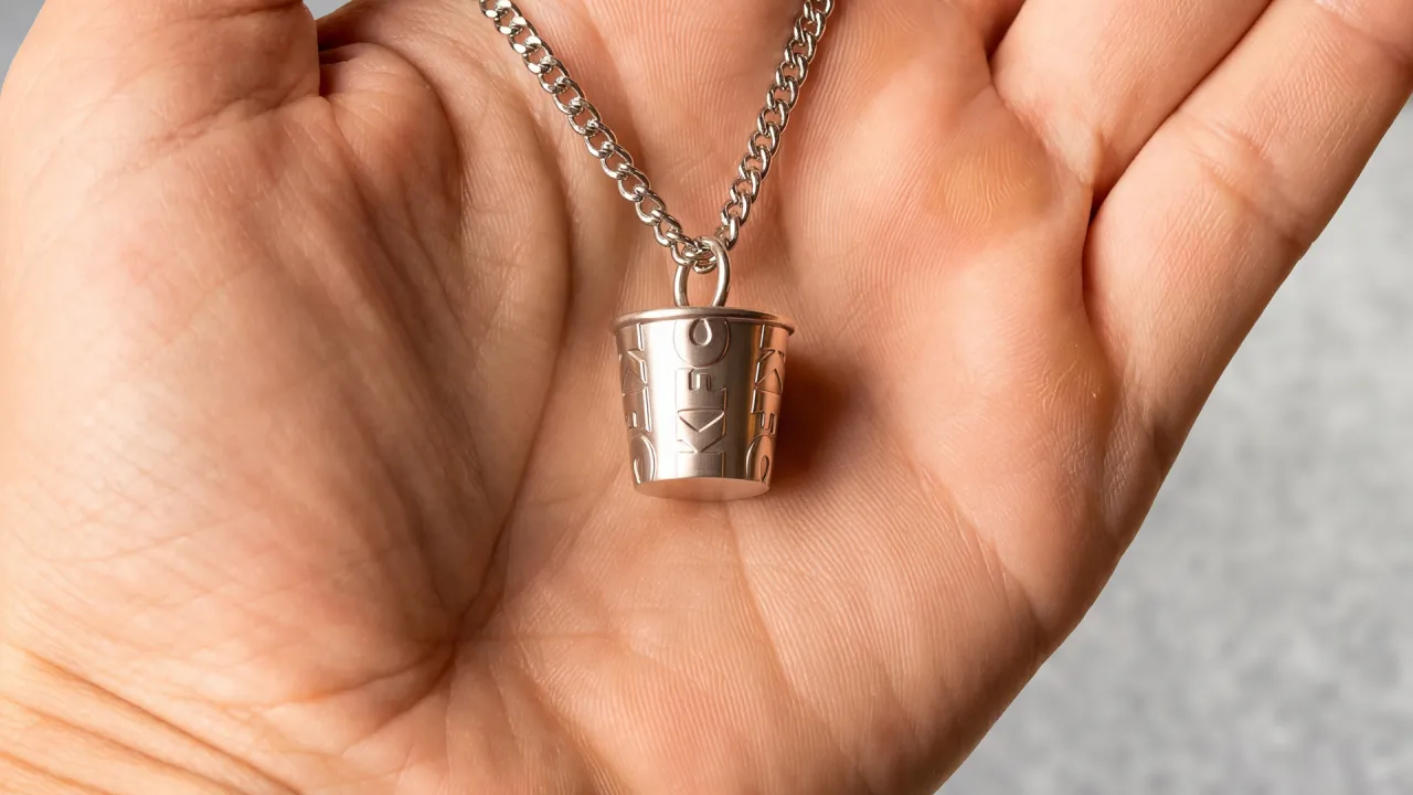
The bucket sits at the heart of everything. But JKR has redefined it as a central brand device, standardising its distinctive shape for a consistent global rollout and treating it as both a framing system and a storytelling one – an extension of the logo that can hold food, culture, energy, and just about anything in a single frame.
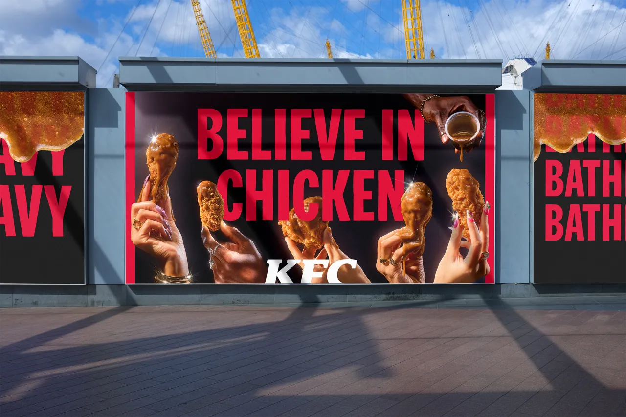
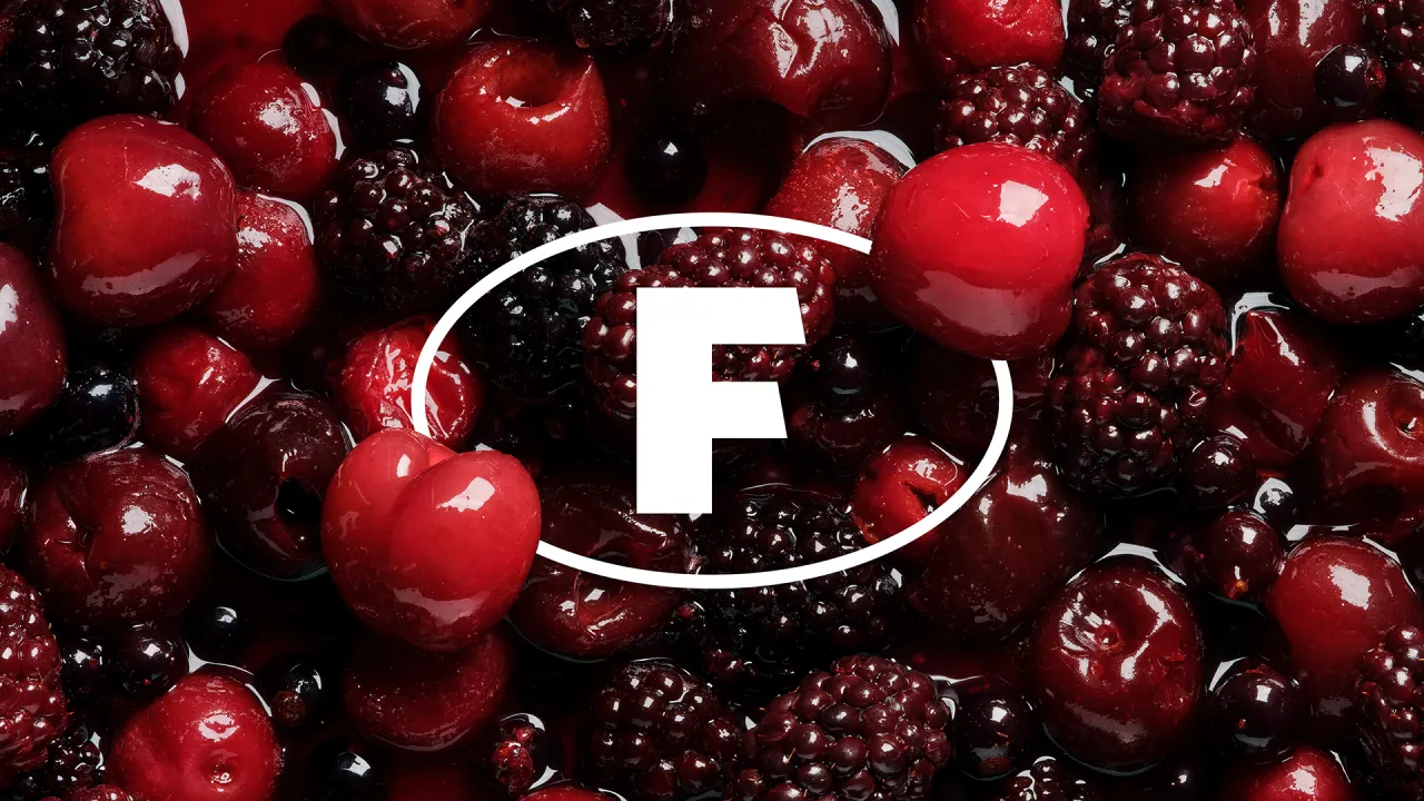
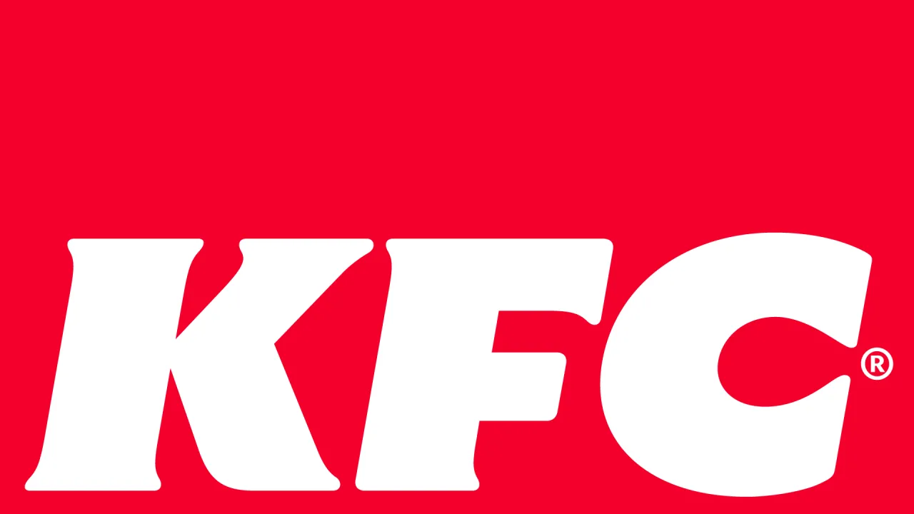
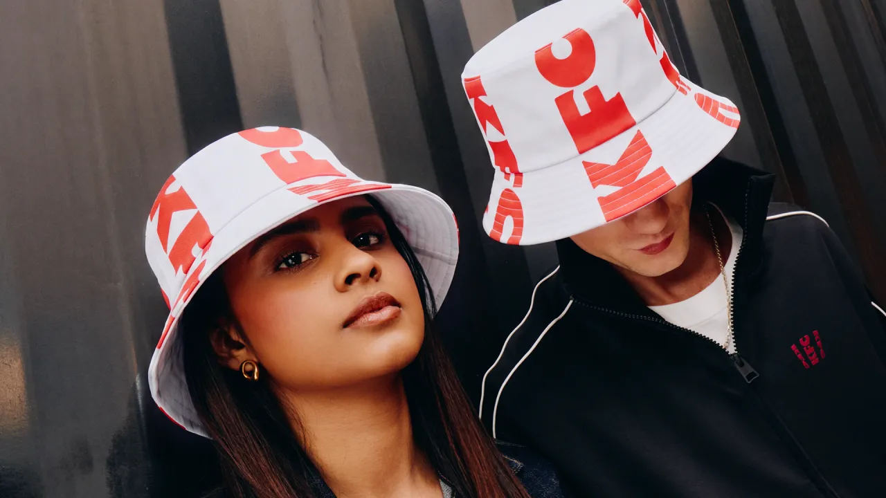
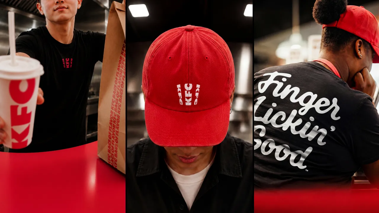
From there, the system spreads out. The logo becomes a three-dimensional asset rather than a flat mark; the lettermark is stripped back to a cleaner, more legible shorthand; and the stripes, once only a background texture, are reworked into an expressive, type-based asset that does much more of the storytelling. The core red, white and black palette, meanwhile, stays put for instant recognition. And it's joined by a secondary system called Herbs and Spices – a nod to the original recipe – for moments that need a bit more oomph.
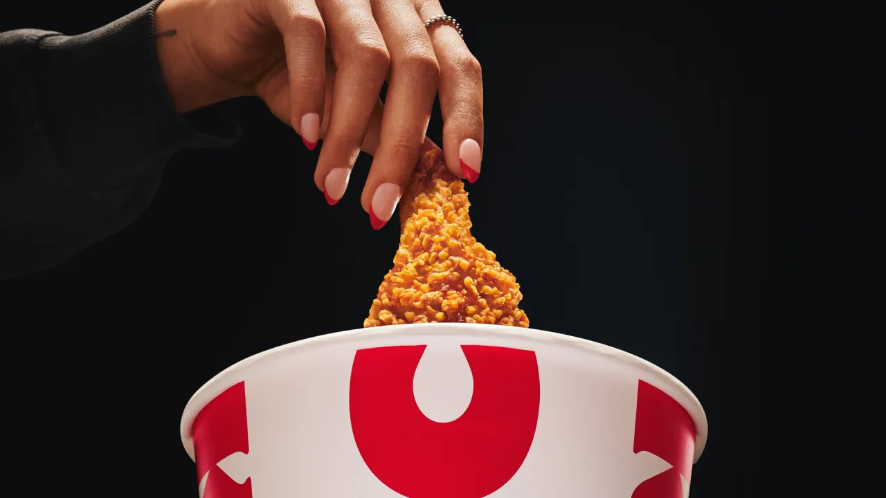
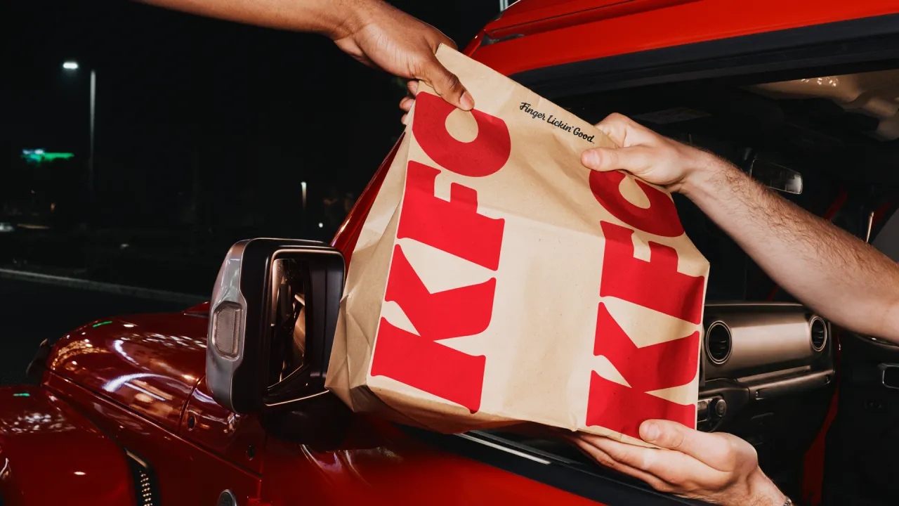
Typography-wise, KFC now has its own custom-built type system, Kentucky Fried Serif (well, they had to call it that) and Kentucky Fried Sans. Genius. It's drawn from the lettermark and developed in partnership with StudioDRAMA. 'Finger Lickin' Good', meanwhile, is reframed from a tagline into what JKR calls "a standard of behaviour" – a global brand asset rather than a sign-off. Lettering artist Tobias Hall crafted the mark itself.
A gentler Colonel
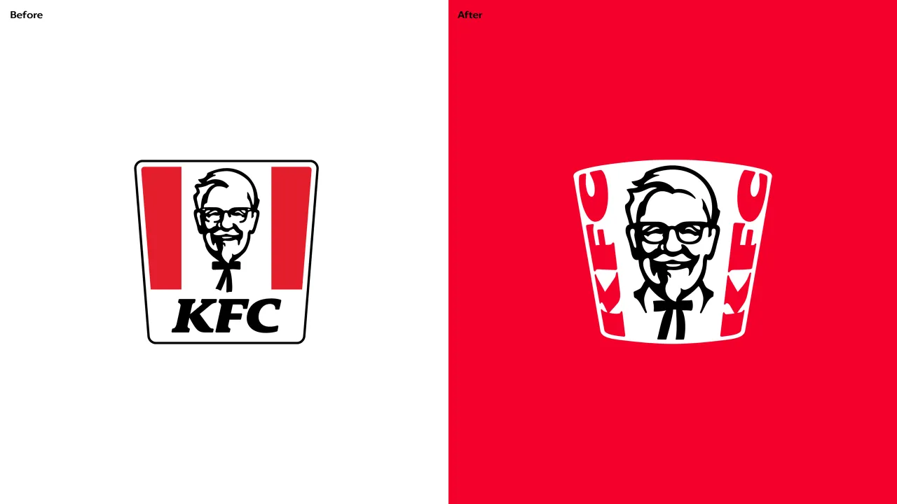
Then there's the famous Colonel. Looking at the 'before' and 'after' icon, you can spot the difference, but it's incredibly subtle. Not surprising, given that it's the brand's most sacred asset and therefore needs to be handled with care. It's enough to keep any designer awake at night, worrying about getting it wrong.
JKR smashed it, though. The Colonel takes on a clearer, more purposeful role in the new 3D logo and has – dare I say it – a more welcoming expression, along with grounding elements. Despite the tweaks, the agency has preserved his character and legacy. And a new system of stamps carries his spirit throughout, leaning into the brand's heritage and craft.
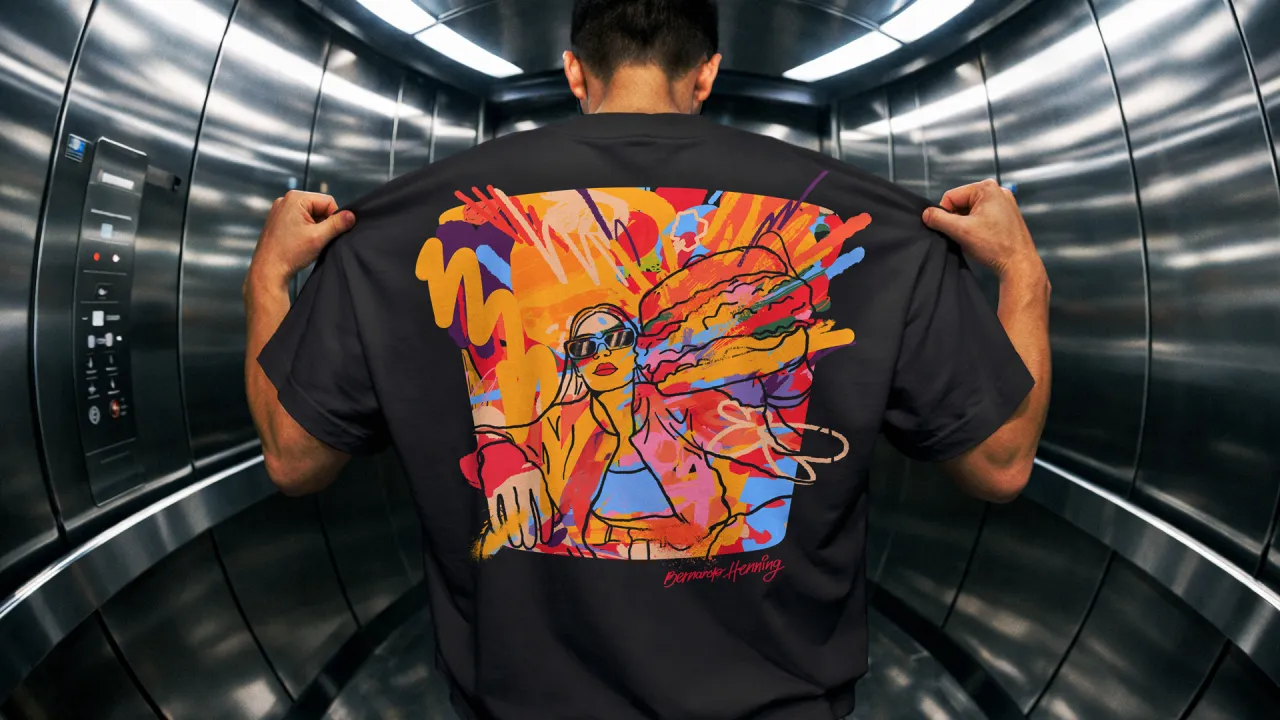
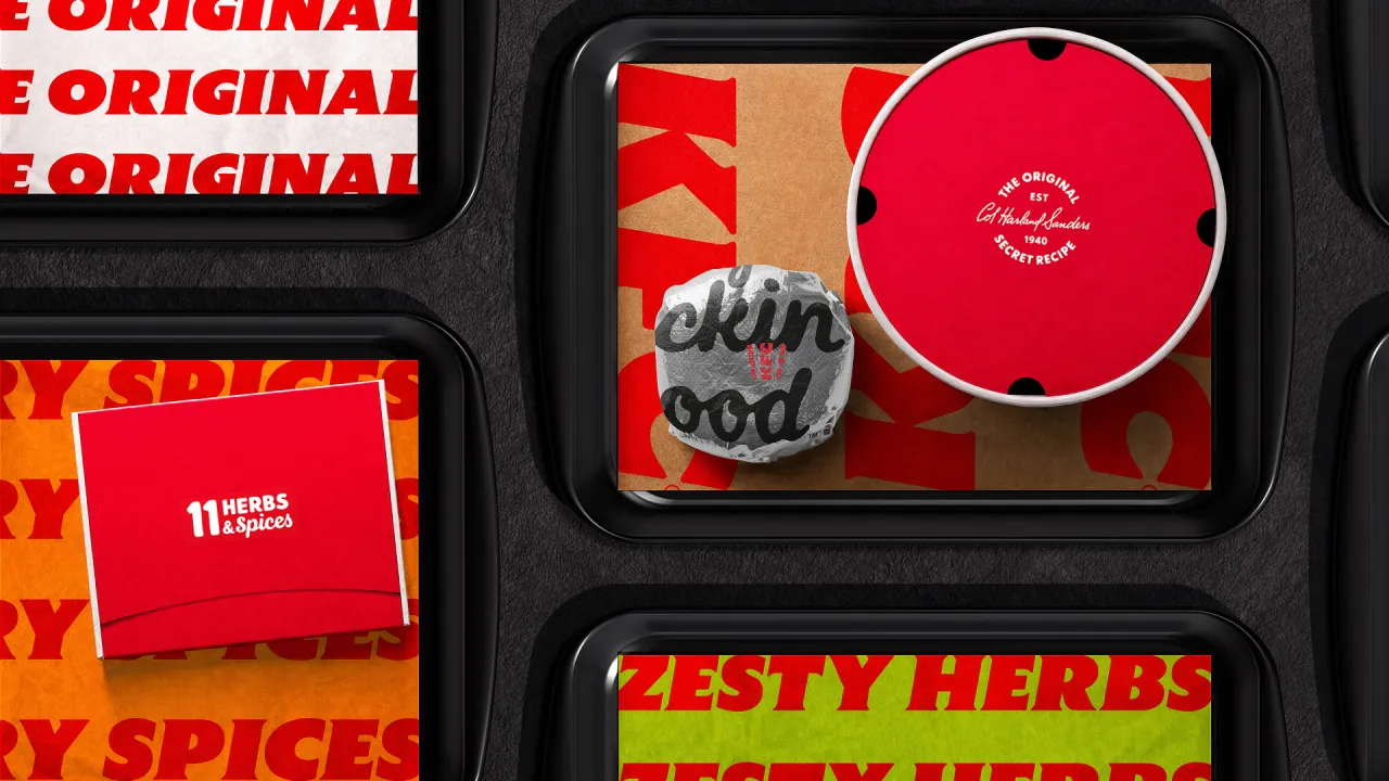
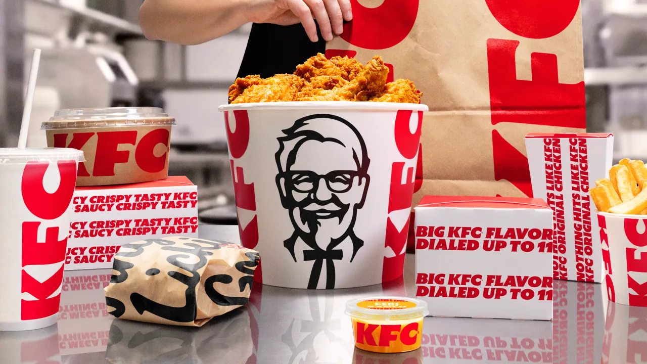
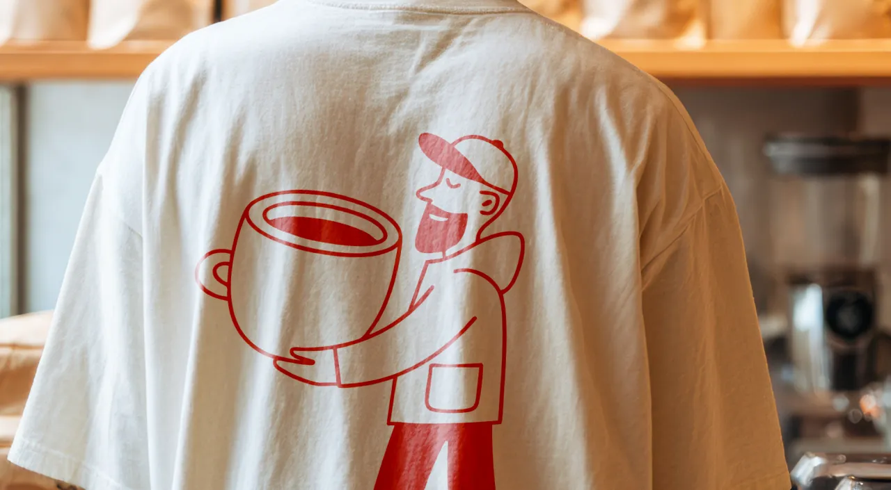
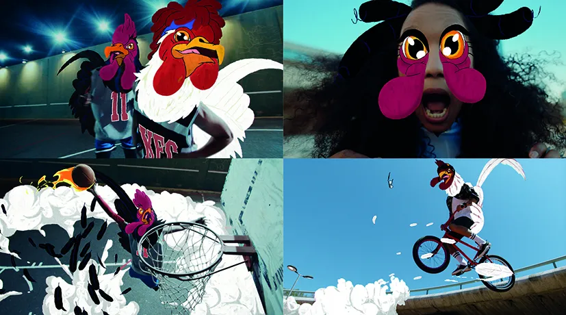
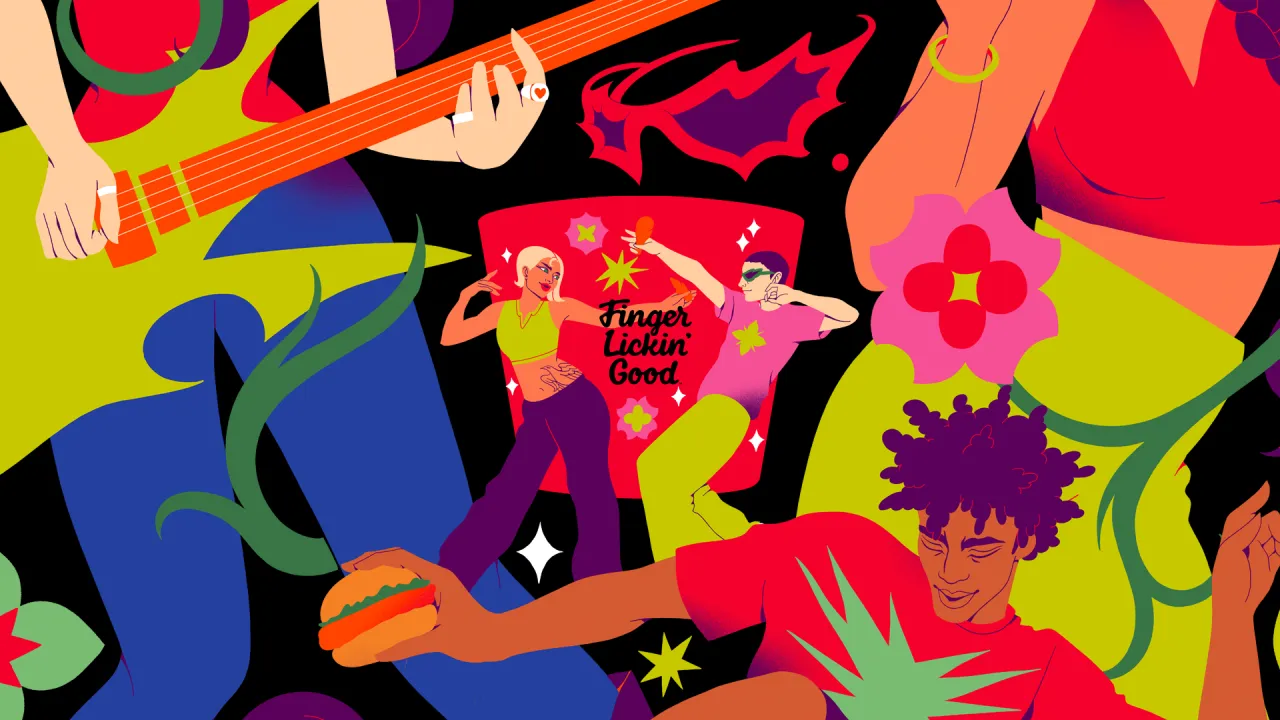
Accompanying illustration and photography help KFC to feel human and global. The illustration system was built with a roster of international artists – Bernardo Henning in Buenos Aires, Eva Cremers in Amsterdam, UV-朱 in Xiamen, Belén Díaz Guerra in Lima and Boomrangg in Mumbai. While lifestyle photography came from Reece James Morrison, and food photography from Frankie Turner. Film music was created with Antfood.
From QSR to 'QXR'
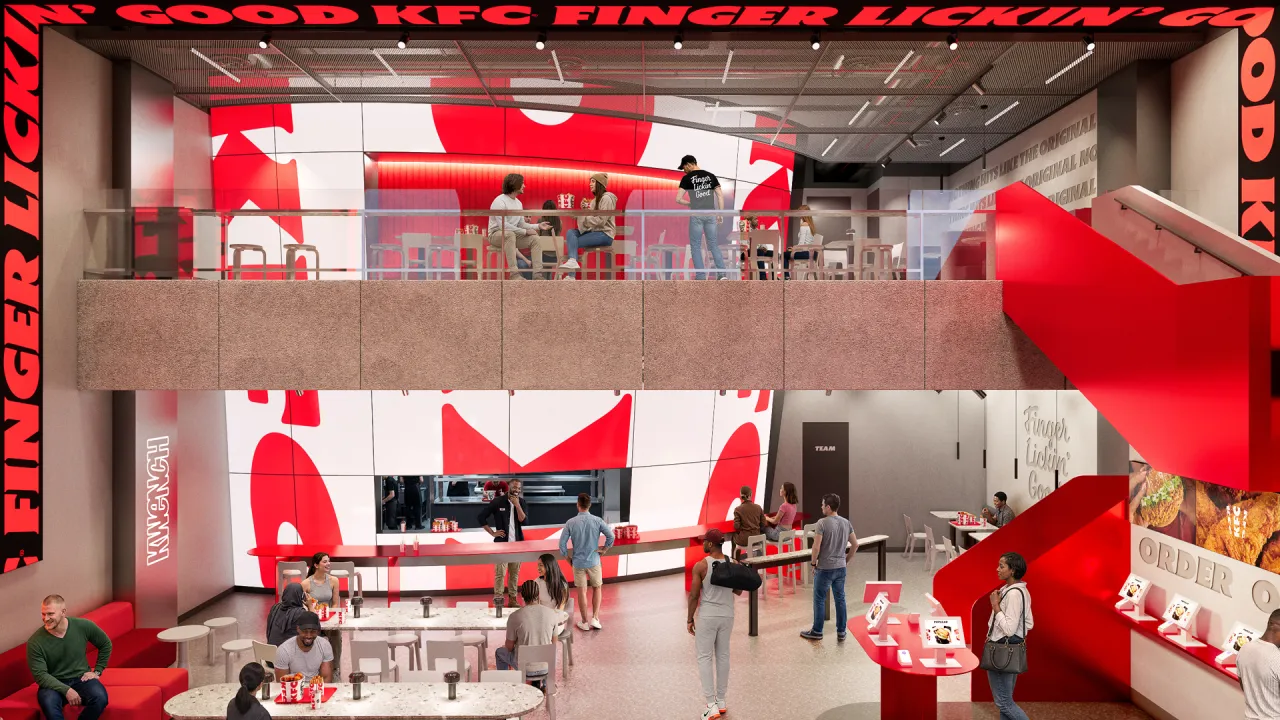
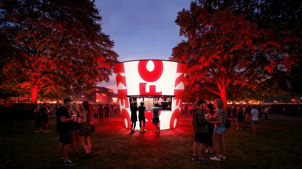
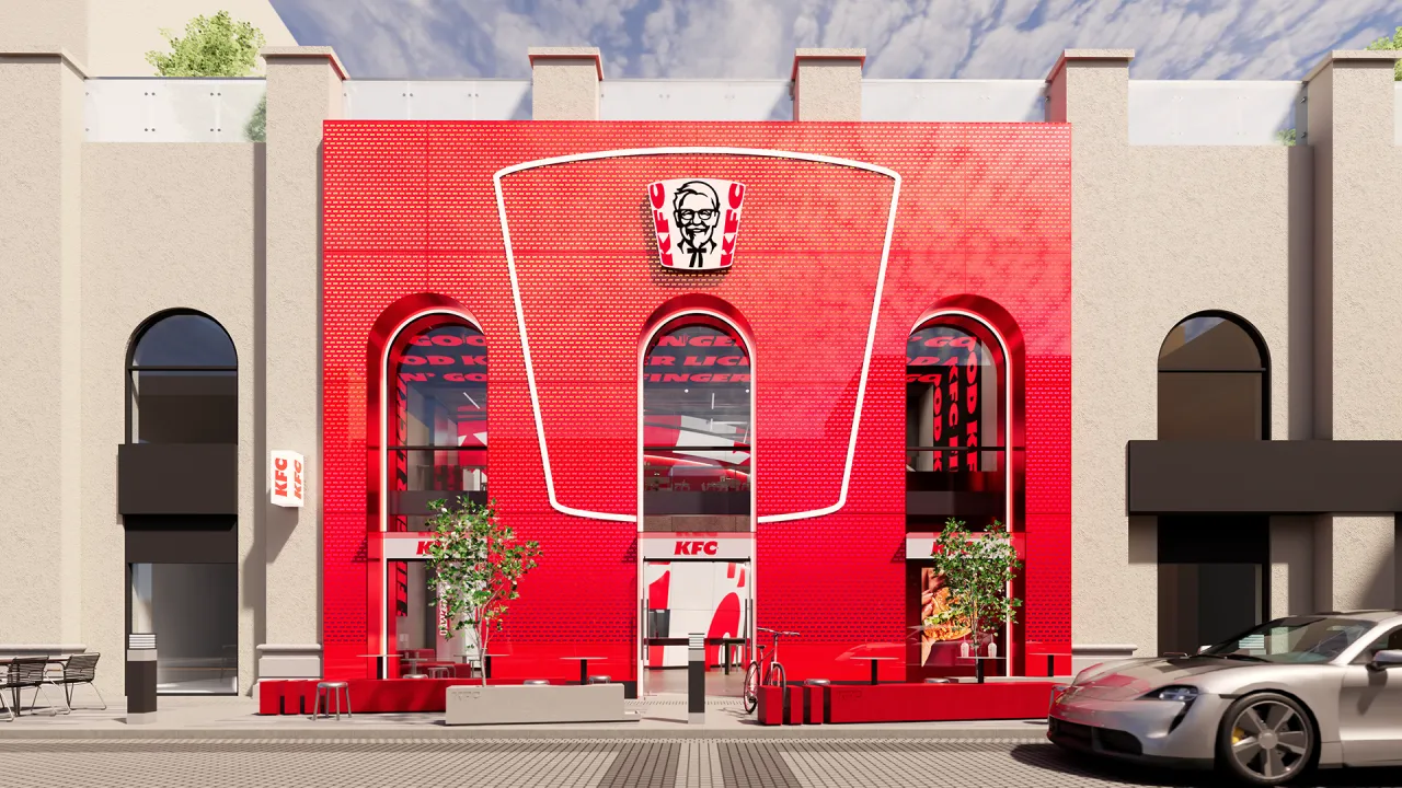
The bigger ambition is experiential. And this is where the new identity gets exciting. The bucket becomes a giant fixture in restaurants, pop-ups, and other retail spaces. It literally swamps each space. JKR frames the work as a category shift – from quick-service restaurants to what it calls 'QXR', or quick experience restaurants. "Nothing hits like KFC, and that sentiment doesn't stop at the chicken," says Matt Michaluk, executive creative director for experience at JKR. He describes it as "a disruptive category shift" and "a brand turning experience-led distinctiveness up to 11".
For Tosh Hall, JKR's global chief creative officer, it comes back to category leadership. "Every category has its leader. When you close your eyes and think about that category, you think of one, maybe two brands," he says. "When you think chicken, you should think KFC. Our job was to make sure the leader of the category was showing up like one."
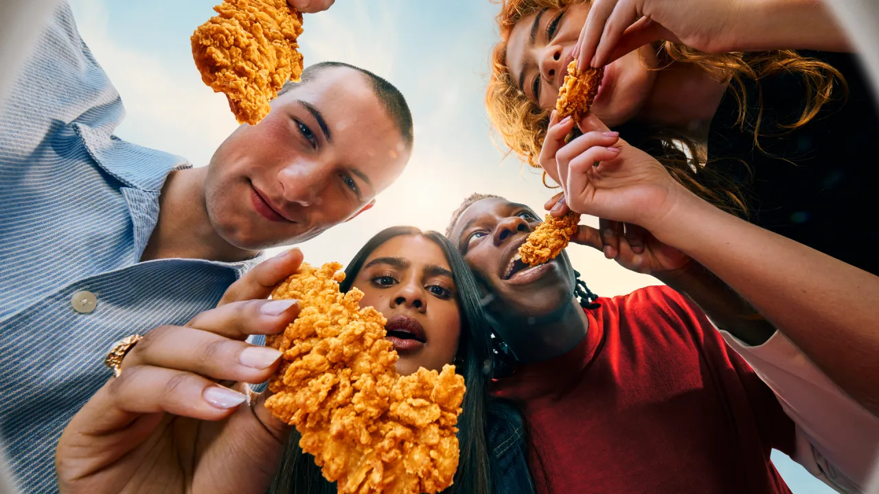
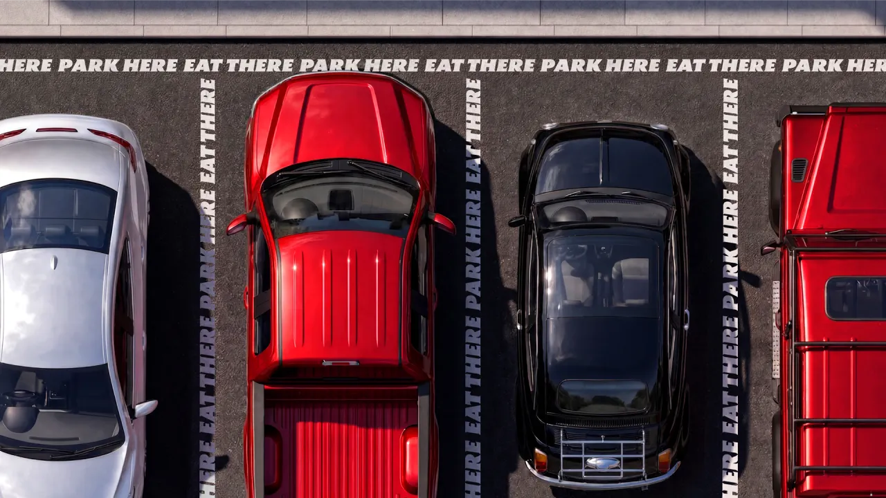
The rollout has already begun. It starts this month in the UK and Ireland. Expect new Tenders, nine new sauces and refreshed branding across communications and digital touchpoints. It will then expand to Australia and the US in the coming weeks, with more markets following through 2026.
The new-look restaurants arrive from the summer, led by an open-concept space in McKinney, Texas, expected in late summer, and a two-storey, fully immersive restaurant in Dubai opening in the autumn.
Whether the wider world warms to the 'Bucketverse' and 'QXR' language remains to be seen. But as a piece of brand thinking, it's a confident, carefully judged evolution of one of the most recognisable identities on the high street, and a reminder of how much mileage there still is in a really good bucket.
Editor's Picks





Trending






Latest Jobs
Brand Copywriter at Origin
Full-time·Porthleven, Cornwall·£35k–£40k
Digital and Marketing Manager at Manchester Art Gallery
Contract·Manchester·£38,126 pro rata
Midweight Designer at Catalyst Creative
Full-time·London·£32k-£36k
Talent Agent & Producer at The Jacky Winter Group
Full-time·Los Angeles·$70k-$85k
Senior 3D Motion Designer at Art&Graft
Full-time·London·£50k-£65k
Client Partner at Halo
Full-time·Bristol·£30k–£36k