Pragun Agarwal's identity for his own design festival begins with a slice of toast
For his final thesis at the Maryland Institute College of Art in Baltimore, Pragun Agarwal organised an international festival to celebrate designers from Asia and the Middle East living in America.
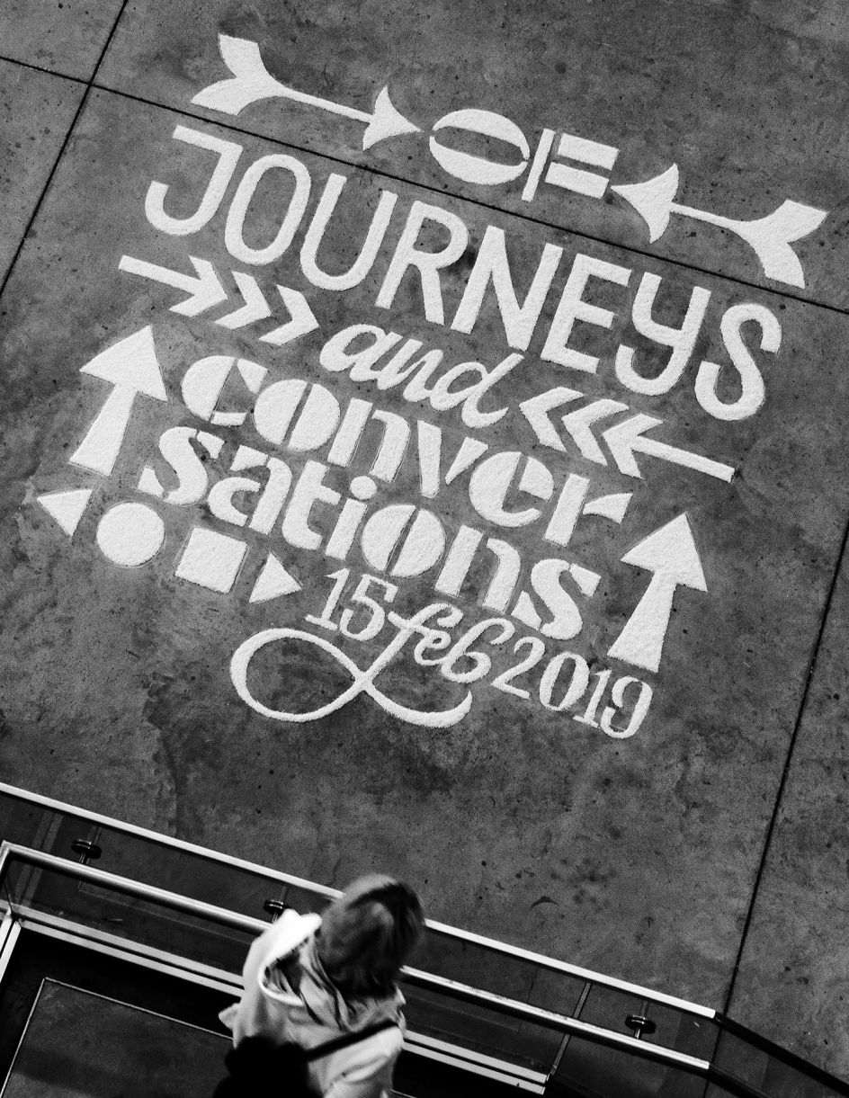
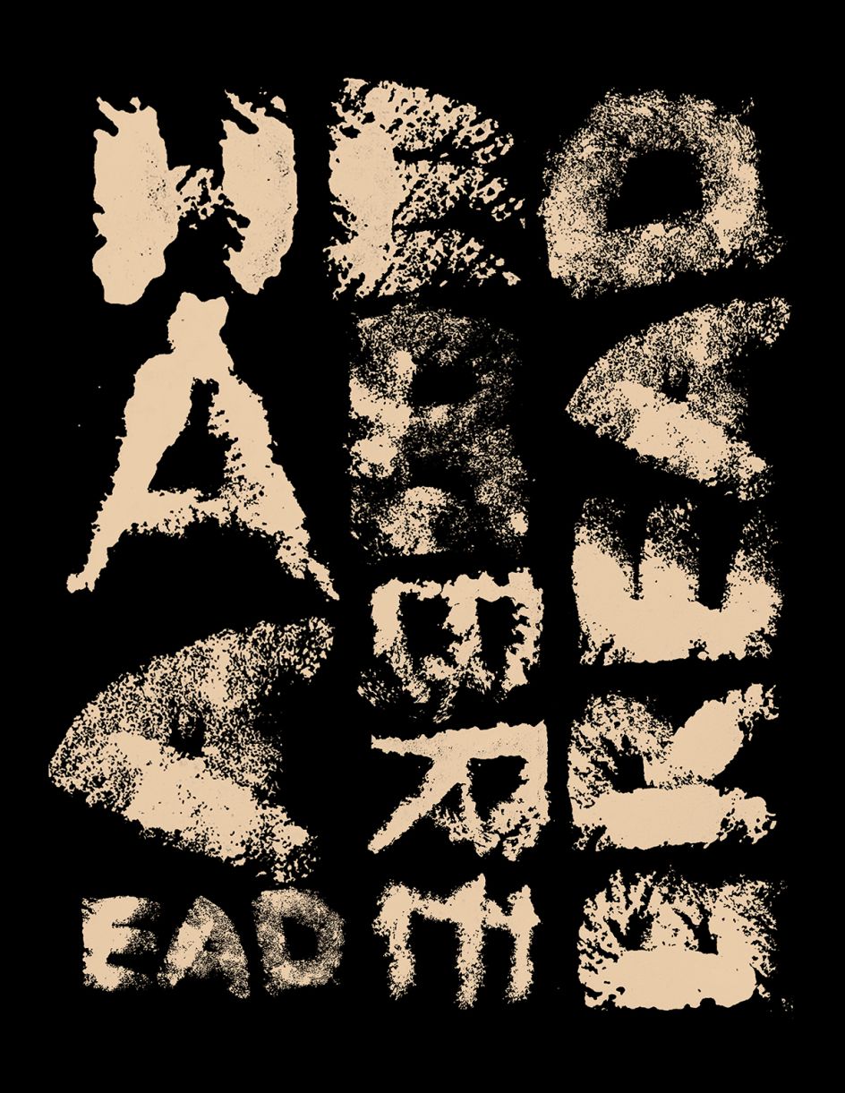
Entitled Toast, Pragun created an initial buzz around his planned event, taking inspiration from his home country, India and an ancient art form called Rangoli where patterns are made on the ground using rice, sand or flower petals. "Different members of the family come together to create this artwork on auspicious days such as Diwali," explains Pragun. "I used this medium and combined it with typography to create a promotional installation for my thesis."
He adds: "By looking at this traditional art form through a contemporary lens, I have tried to adapt it to a different context while it still retains the original intention of marking a celebration. Based on a grid I sketched with chalk, my college friends came together to fill in the outlines with rice as a collaborative exercise."
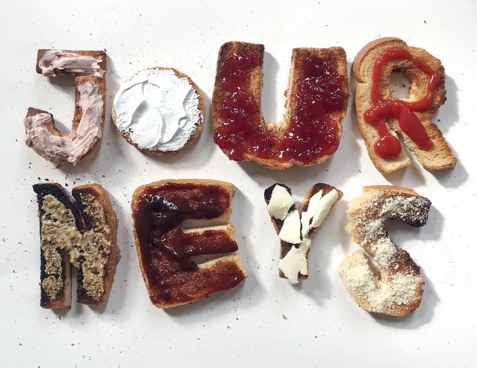
For the festival's brand identity, Pragun's first approach to interpreting 'Toast' was very literal and didn't quite work out. "I carved out letterforms from toast and applied various condiments to spell out the word 'Journeys'. Even though this was visually engaging, this approach was limited and not diverse enough for an identity system and its applications."
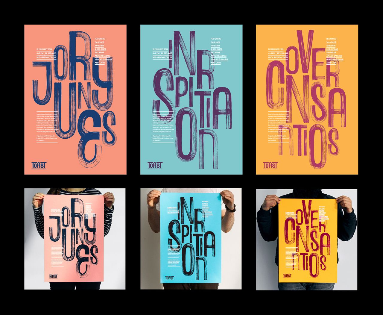
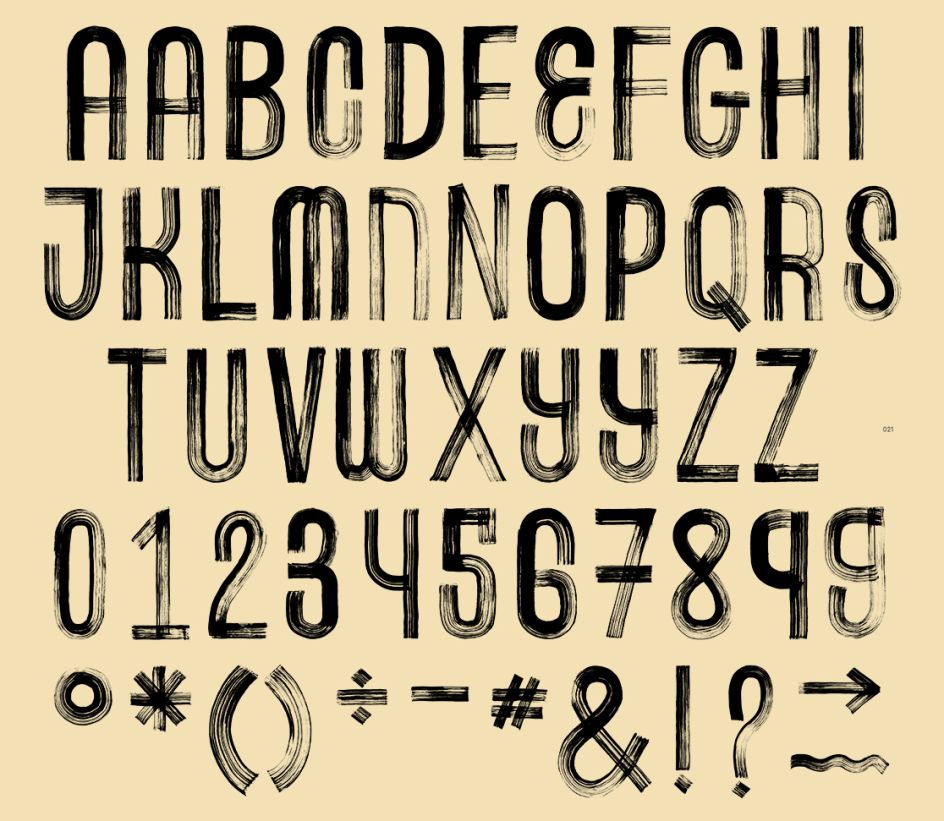
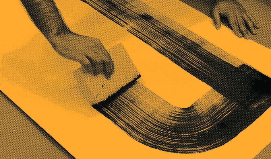
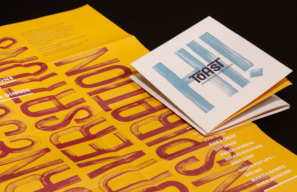
But instead of going back to the drawing board, Pragun used the toast as a tool, dipping it into ink and drawing letterforms with it. "This experiment prompted me to use foam brushes and ink to mimic the same aesthetic that I was able to craft while drawing with the toast. The letterforms I was able to make through this process reflected a path that was unique and reflected the idea of a journey. I went ahead to create a display typeface using this tool that ultimately became the core element across all my brand applications.
"I scanned each character, cleaned and tweaked them digitally and then finally vectorised them so that they could be used on large-scale applications seamlessly. As this was a hand-drawn typeface, I was able to create contextual alternates for several characters. This was an efficient tool to break the monotony and still retain the genuineness that comes from hand-crafting letterforms."
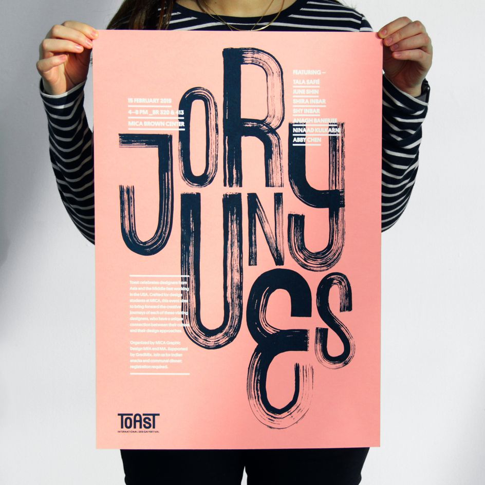
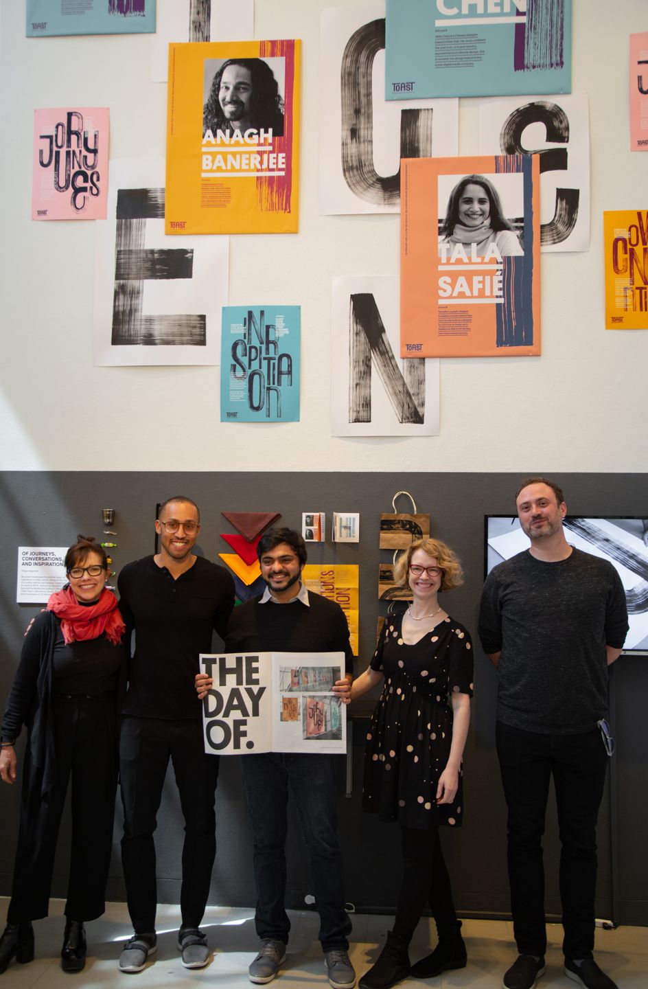
Pragun then created screen-printed posters which showcased the words 'Journeys', 'Inspiration' and 'Conversations' as the central visual element. He also created a set of speaker posters that highlighted the crops of the handmade typeface as a background element.
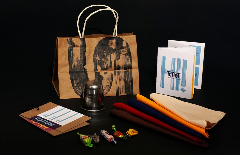
For the event itself, Pragun designed a gift pack for attendees. Enclosed in a paper bag featuring a handmade brushstroke, they got an ID card, an aluminium glass as a memento, sweets sourced from three different countries, the event schedule and a coloured handkerchief. "I put together a hundred of these bags. These items live on even after the event, in people’s houses and memories. Each element was carefully planned and created by me to give the attendee an insight into different materials, textures, cultures, and contexts."
To find out more about Pragun Agarwal, visit pragunagarwal.com.
Editor's Picks


Trending


Podcasts


Editor's Picks
Further Reading