How Letters Come Alive: Atelier AAAAA's identity for Mixt
A Paris studio's identity for a new Nantes arts venue is built entirely from a grain of pollen. We find out more.
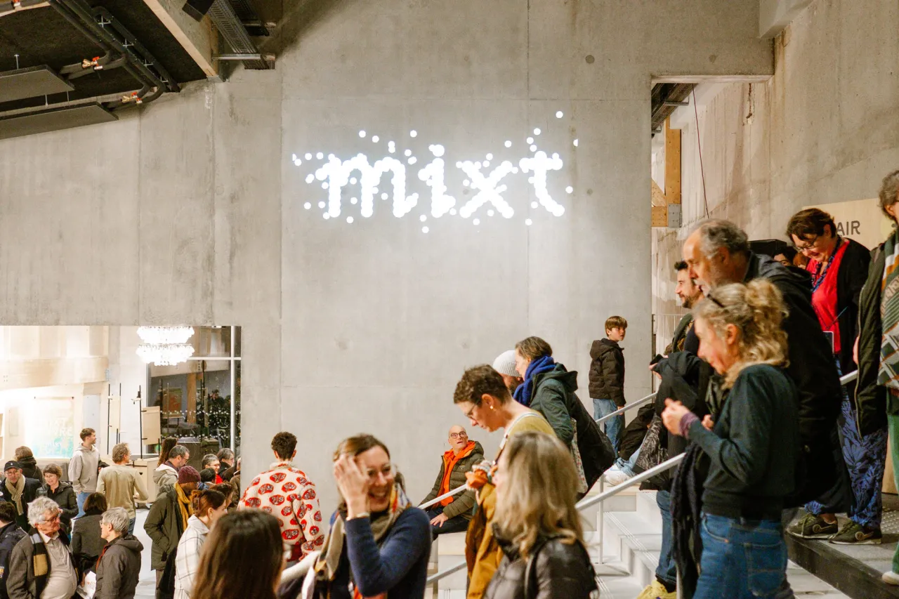
Paris studio Atelier AAAAA has created the identity for Mixt, a brand-new multidisciplinary performing arts venue in Nantes, and it grows from something as small as a grain of pollen. I feel like sneezing just thinking about it.
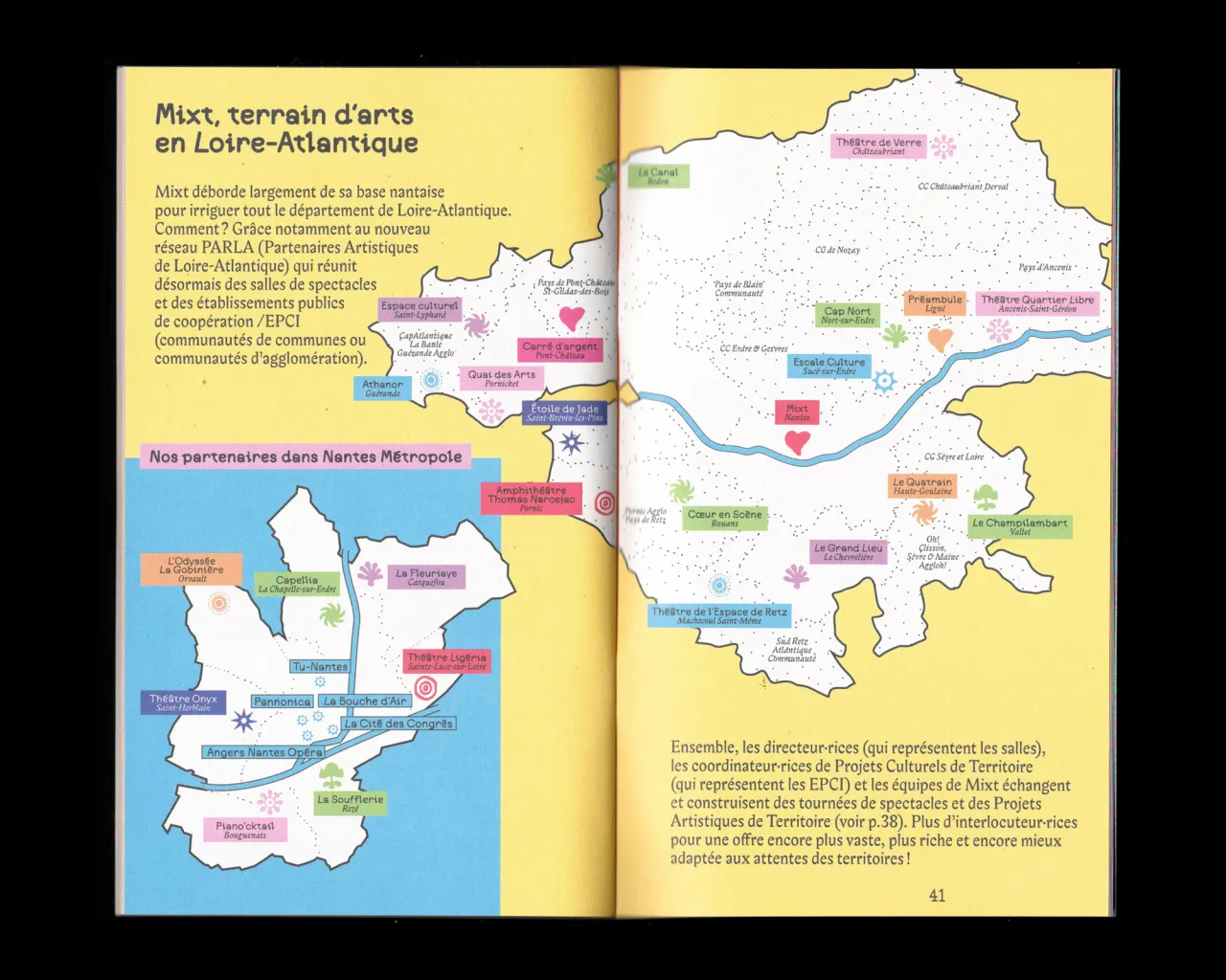
Mixt puts on events in its various performance halls and studios, but it also goes out to the wider community across the Loire-Atlantique region. It's this spreading of art and culture beyond its physical building that inspired the theme behind the identity. Something about the cosmos and when you look at it through a microscope, everything is composed of particles.
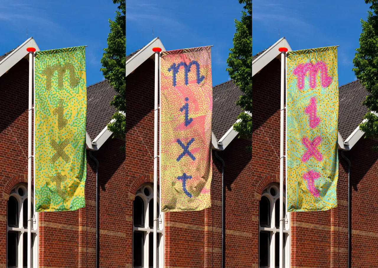
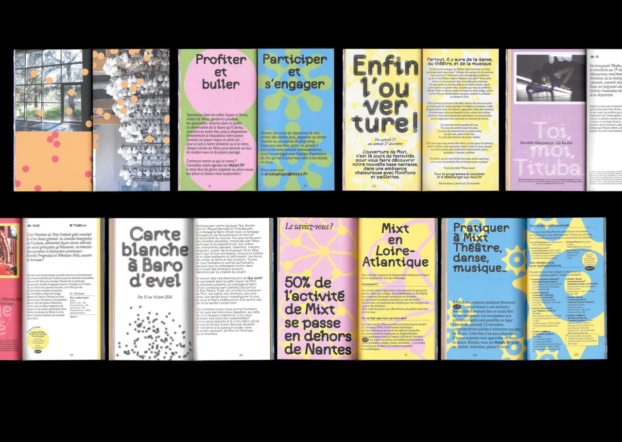
As such, AAAAA introduced Pollen, a custom typeface made in collaboration with type designer Anne-Dauphine Borione. Far from conventional, each character is constructed from modular shapes with small repeated units that cluster together to form letterforms. The inspiration was microscopic photography of pollen grains, with their incredible variety of surface textures and structures.
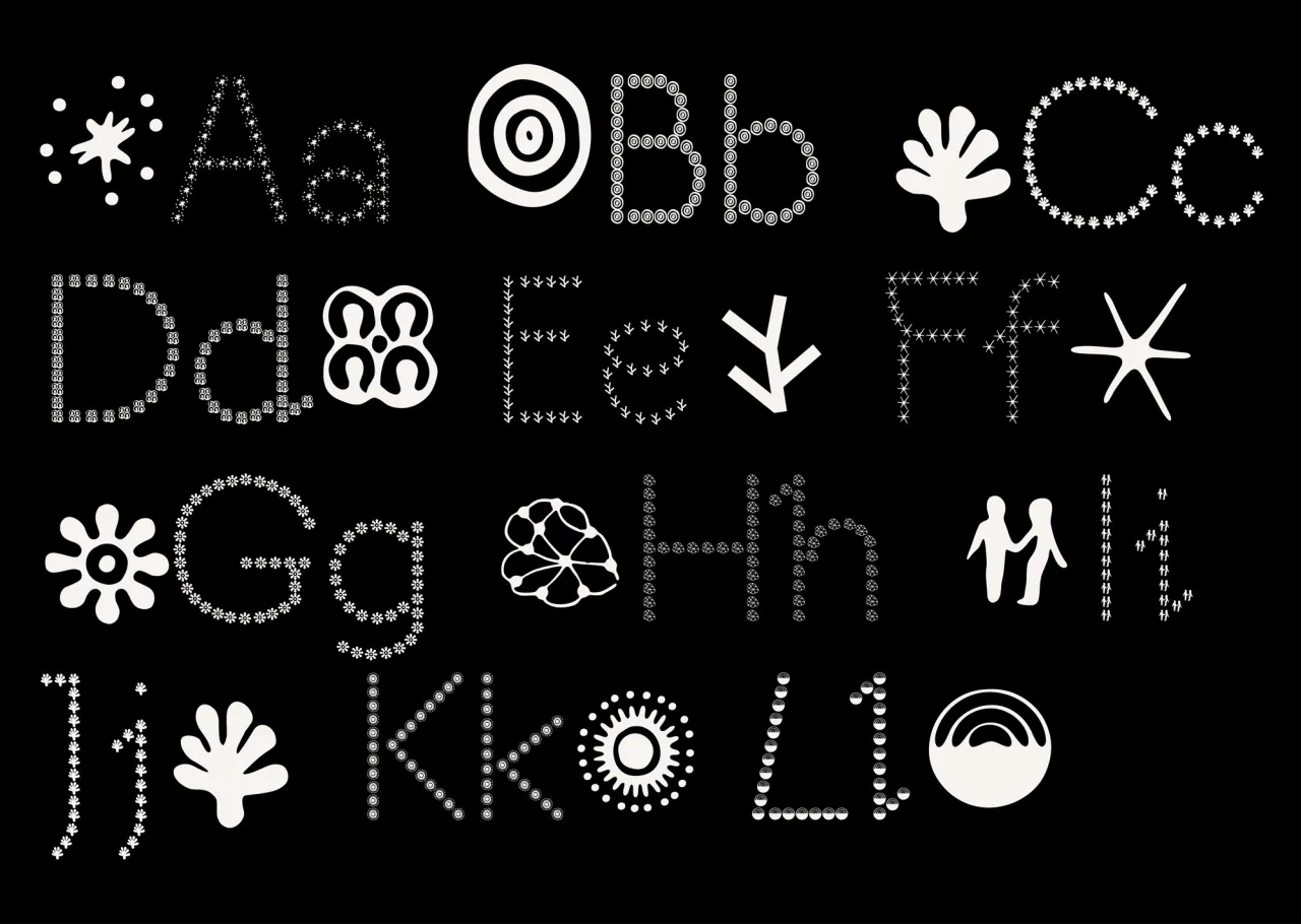
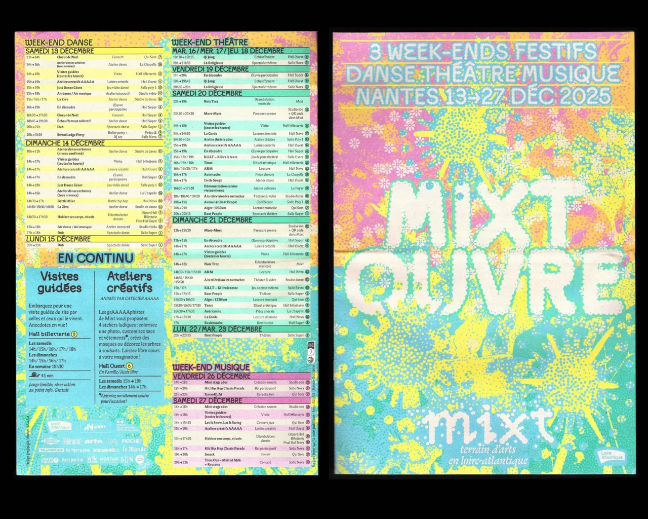
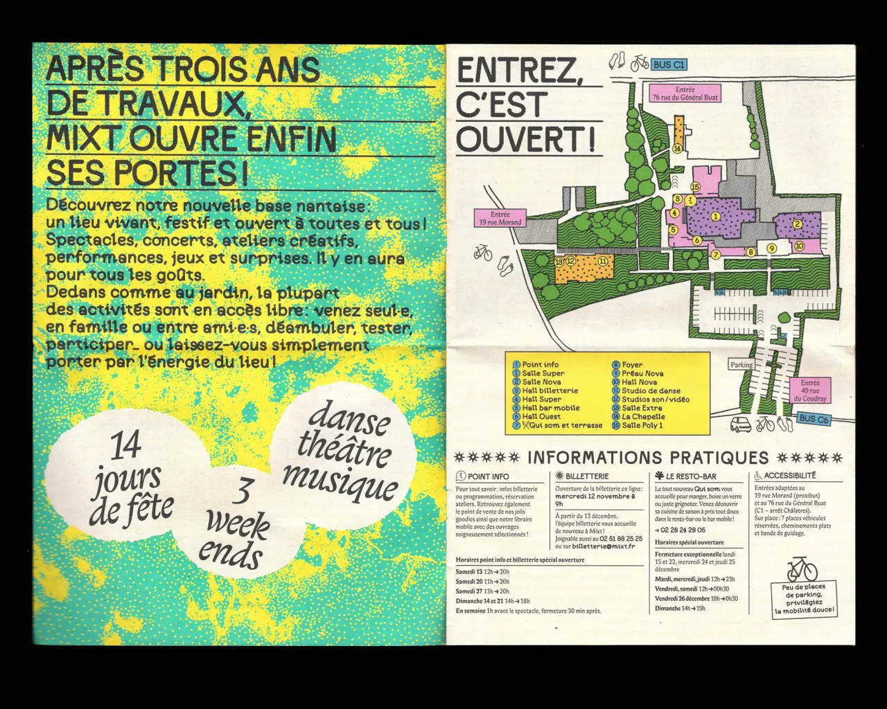
The modules themselves can be swapped, which means the typeface can shift its personality depending on the event or season it represents.
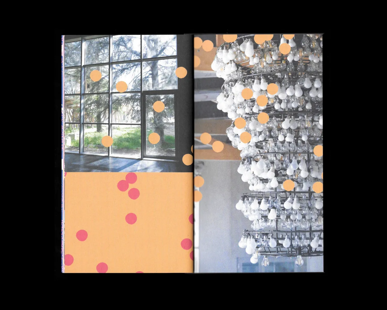
Alongside the typeface, AAAAA developed a second visual language, which they call Vibration. Working from photographs and other image sources, they apply a "raster processing technique" that transforms conventional imagery into dense, organic tapestries: plant-like surfaces full of detail and coloured in Mixt's vivid pop palette.
Just like any art venue, the brand is properly tested when it has to cope with a constantly changing programme of events. We're talking posters and brochures, and digital assets. They needed to hand something over so that the Mixt team could create their own materials.
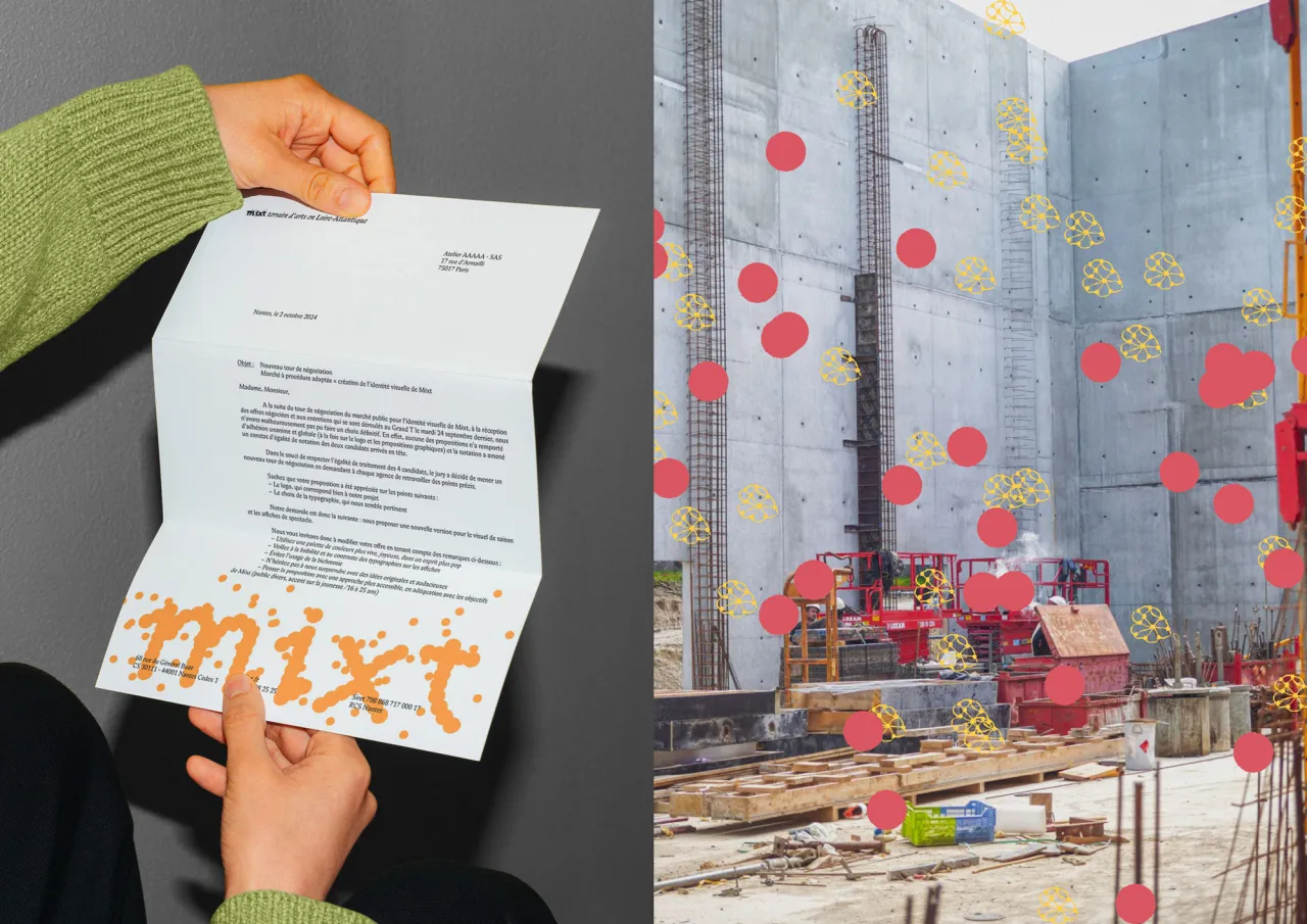
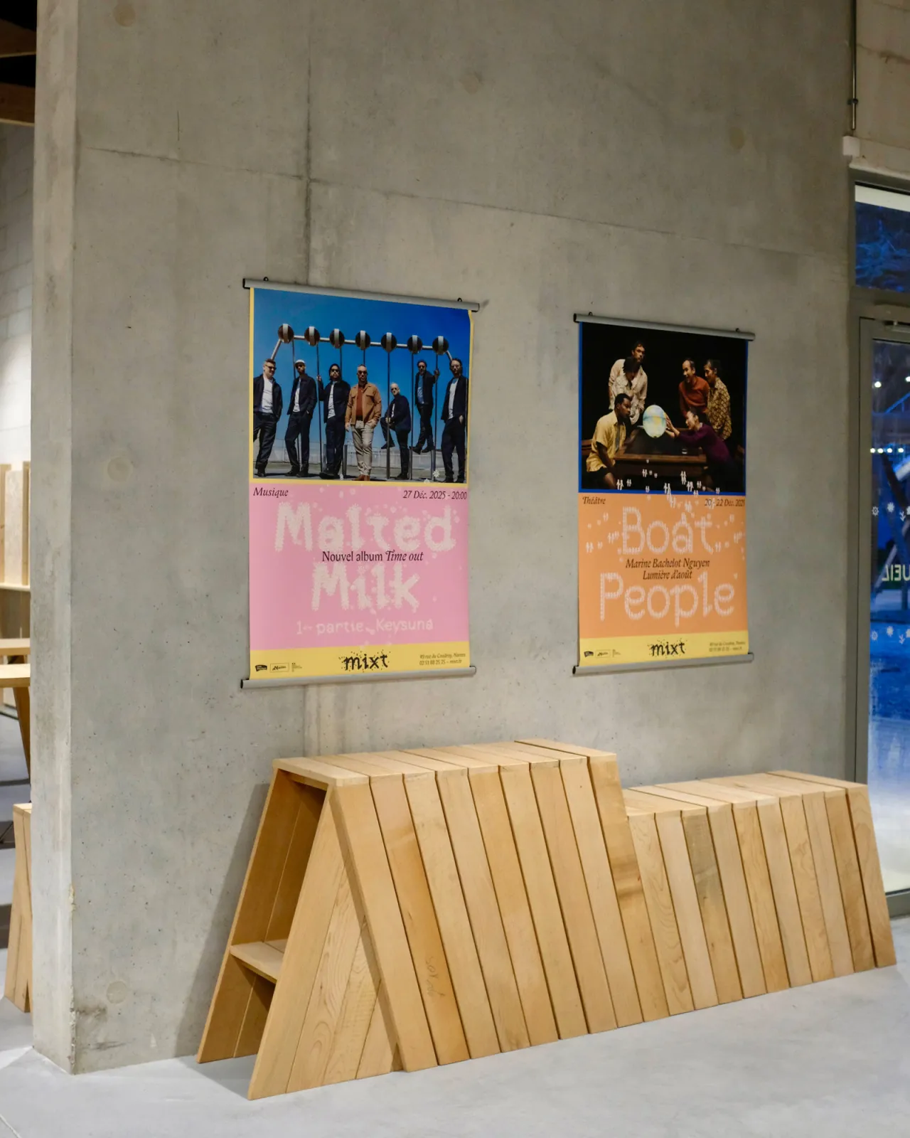
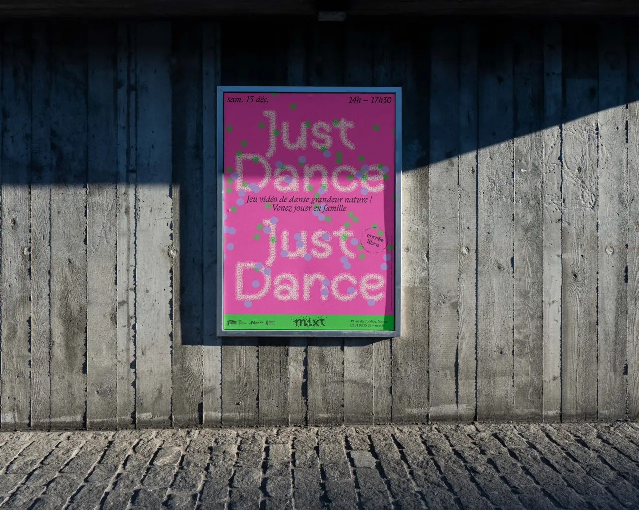
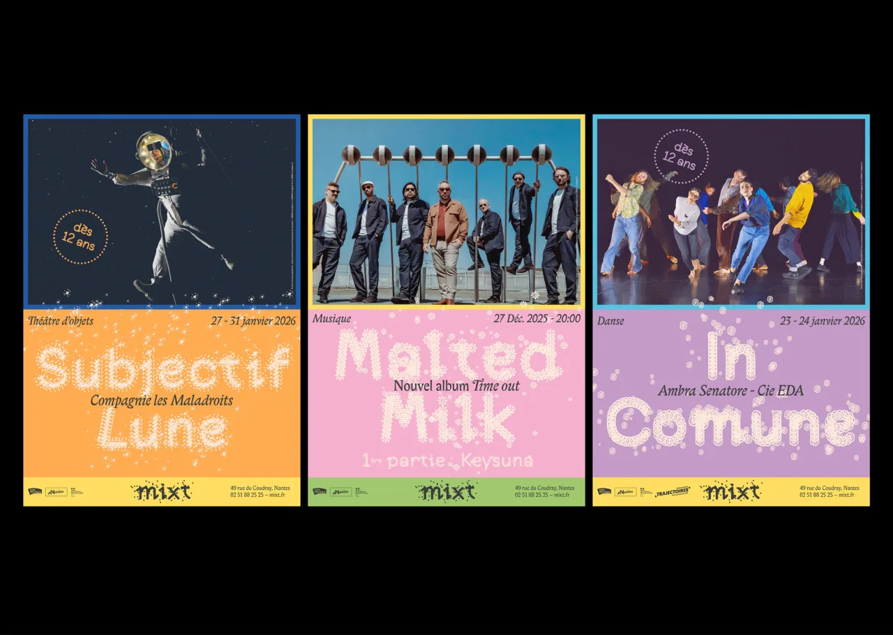
That's why AAAAA made everything modular on every level. For example, posters are built on block compositions that can be easily swapped around. These also rely on typography and colour rather than performance photography, which could end up being costly for an independent arts venue. And the colour palette is restricted to three hues, giving enough distinctive between events without any overwhelm.
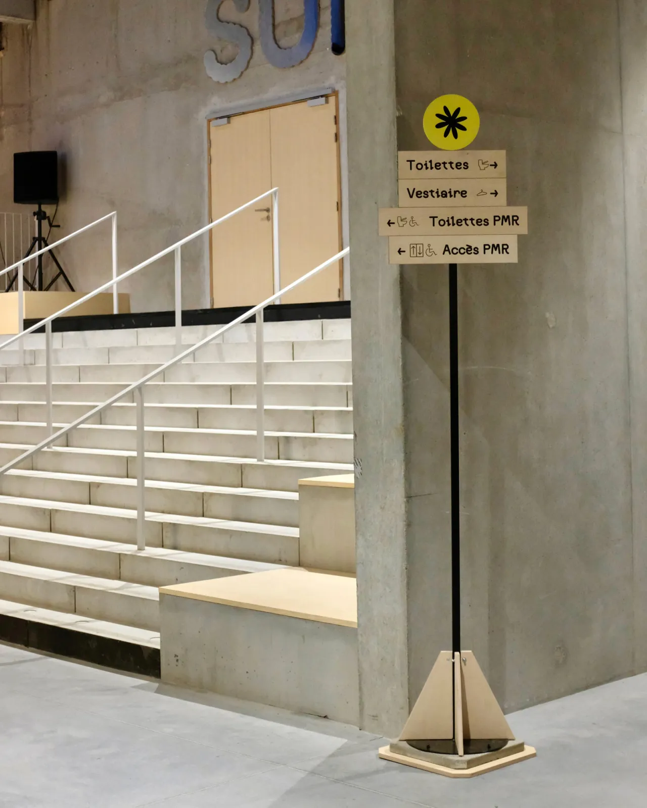
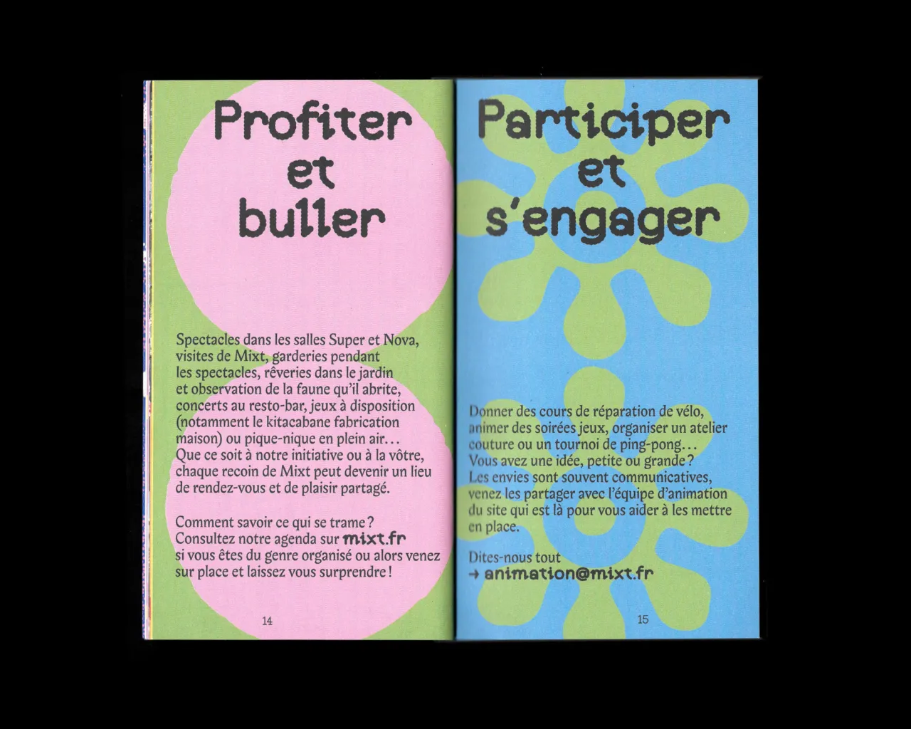
The brochures follow the same logic but adds textures for different times of year – warmer palettes for autumn programming, cooler tones for winter, creating a range of effects across the seasons. Finally, wayfinding throughout the building brings the whole thing together on glass surfaces.
Editor's Picks





Trending
Latest Jobs
Senior Account Manager at Consider
Full-time·London·£42,500
Senior Designer at Creative Spark
Full-time·Manchester·£35k-£50k
Multidisciplinary Designer at Formation Games
Full-time·London·£40k–£50k
Lead Digital Designer at Together
Full-time·£55k–£75k
Senior Operations Manager at BIG Partnership
Full-time·Glasgow·£45k–£50k
Agent & Producer at The Jacky Winter Group
Full-time·London·£35k–£40k