Gretel brands the Noma team's new burger restaurant, POPL
New York-based design and branding studio Gretel has created the brand identity for burger restaurant POPL.
POPL was created by the team behind the acclaimed Copenhagen restaurant Noma and opened on 3 December in Christianshavn, Copenhagen. The name was inspired by Noma's summer burger season earlier in the year; and according to Gretel, centres around the idea of creating a sense of community.
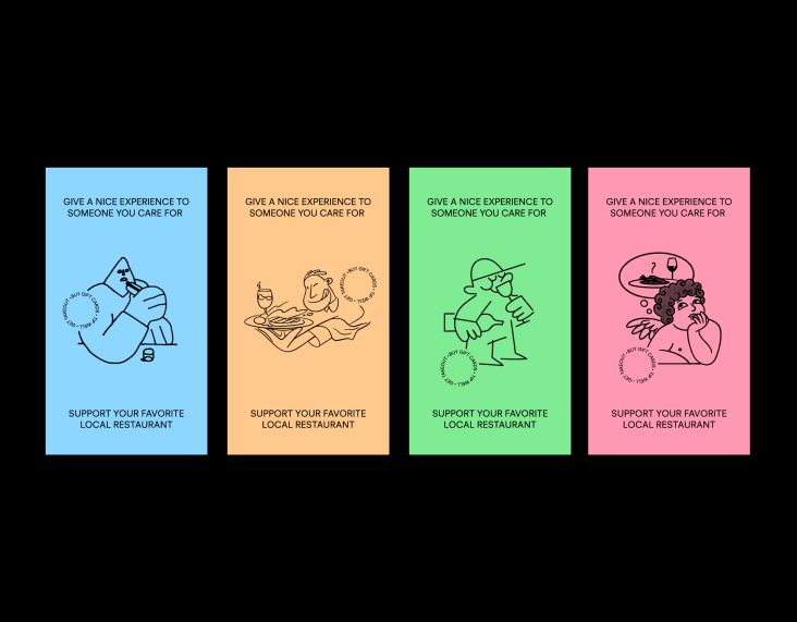
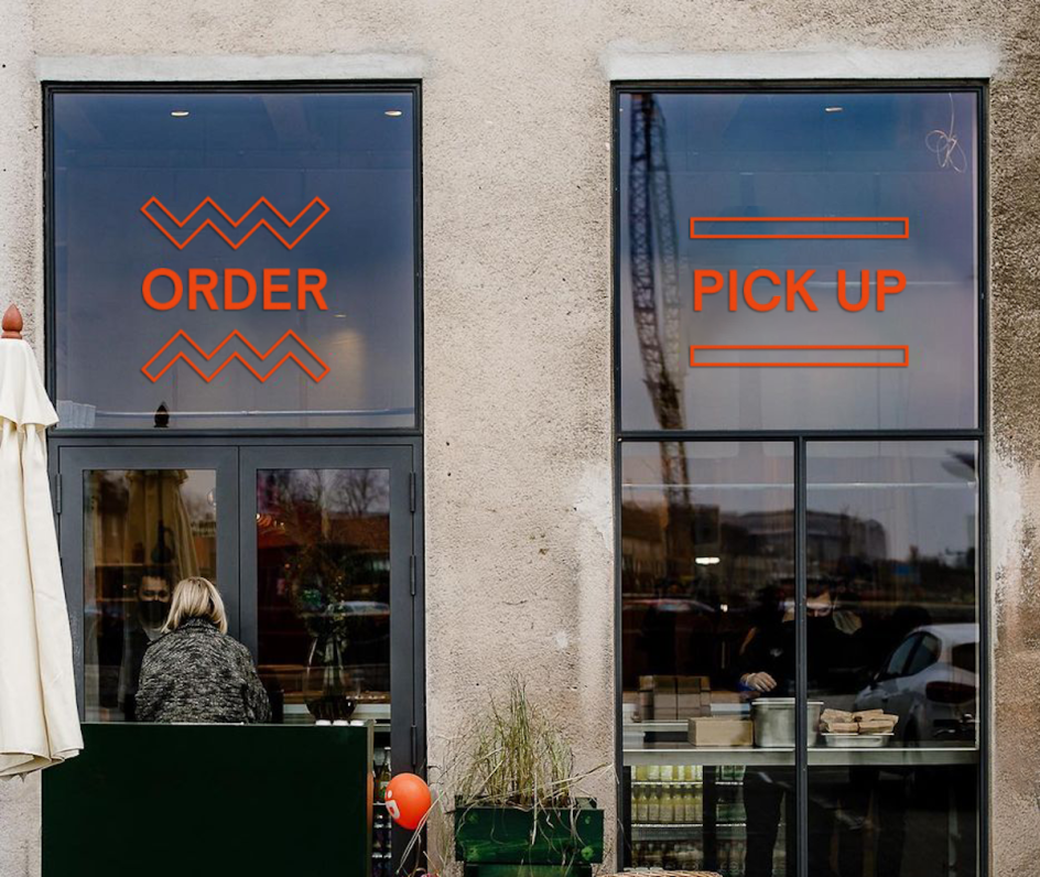
Gretel worked with the noma team to turn their concept into a brand, advising on strategy, naming and visual identity. The idea behind the design was to communicate a playful, inclusive attitude; with graphics inspired by the burgers' shapes.
The menu is deliberately pared back and simple. Gretel head of design Dylan Mulvaney says: "Like the restaurant's menu, the brand invites everyone to the table for a familiar but forward-thinking experience."
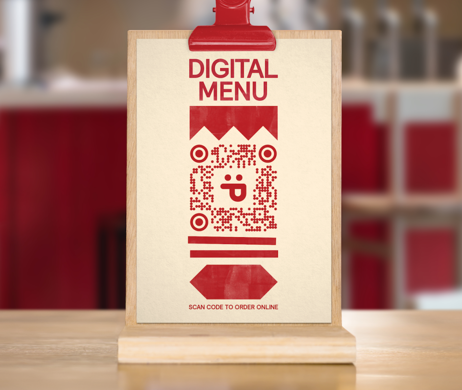
In the face of the hospitality industry's challenges during the Covid-19 pandemic, the brand was deliberately designed to be adaptable and resilient to unexpected change. It is currently open for takeaway or for guests to eat by the nearby Copenhagen Harbour, and it hopes to offer dine-in service in early 2021.
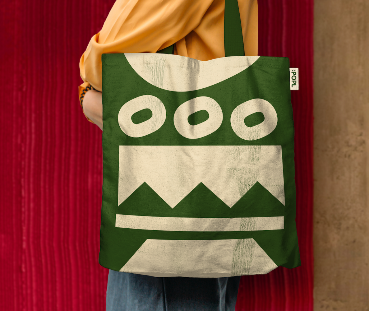
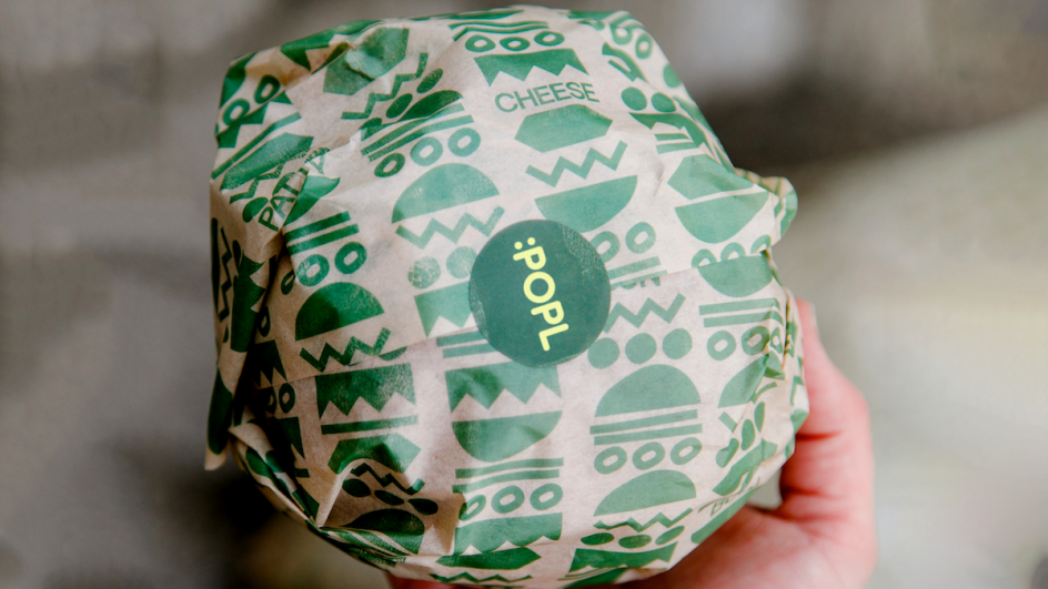
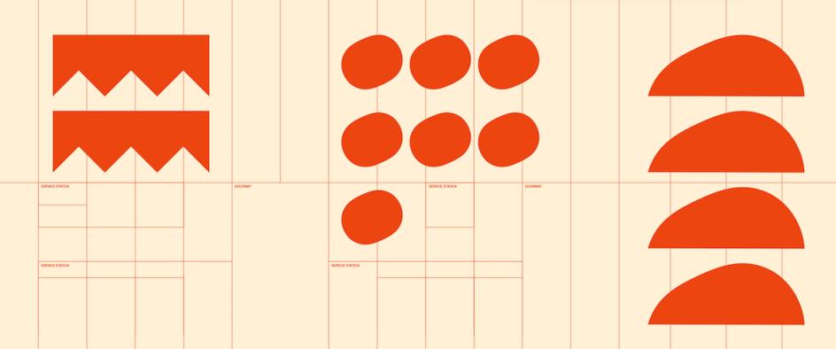
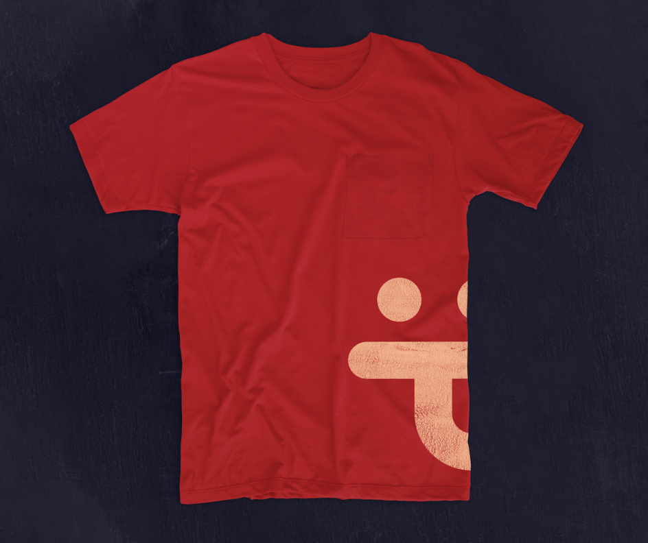
"Like the burger itself, POPL is a combination of playful ingredients," says Mulvaney. "The burger's ingredients inspired a library of geometric, graphic forms. The burger's format inspired the signature behaviour: stacking. This meaningful and memorable behaviour drives layout and movement. The graphic forms, type, and image can stack on their own or be mixed. The system allows for variation and expression while being consistently recognisable."
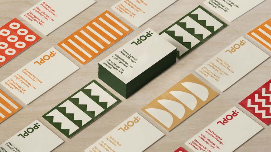
Gretel combined these elements into a rounded monoline wordmark that stacks vertically, rather than creating a separate logomark. Within that wordmark is a hidden symbol that acts as a shorthand for POPL, as well as forming an emoji that aims to convey the "sense of fun, excitement, and happiness they create," says Gretel.
"A neatly stacked version of the wordmark is used when something more formal or minimal is needed," says Mulvaney. "A loosely stacked wordmark, which reacts to different canvases and positions, is used in more expressive applications."
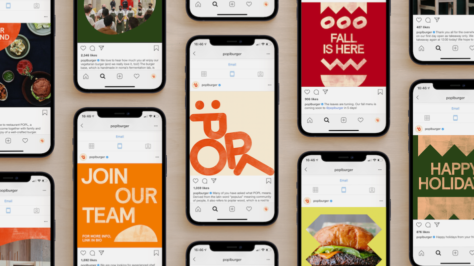
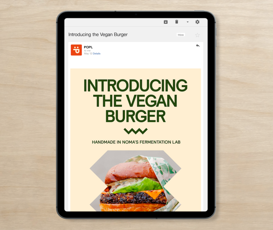
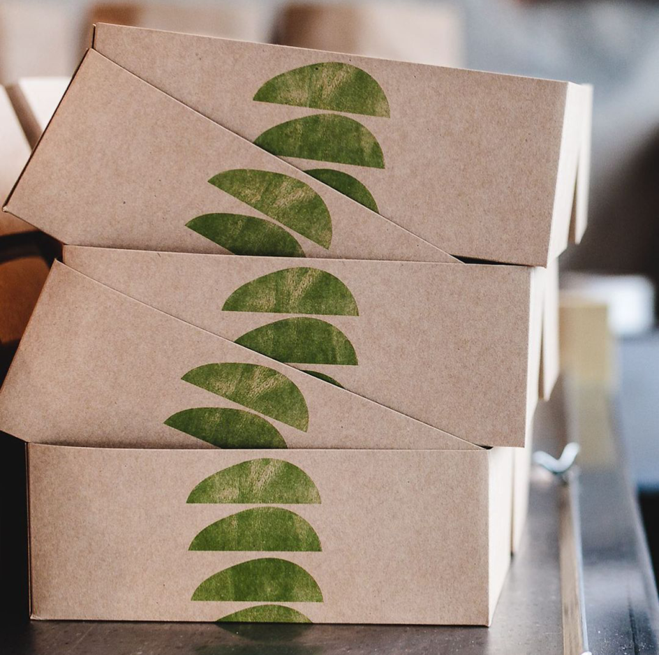
The new branding is used across everything, including the website and social media platforms, printed and digital menus, uniforms, sustainable takeaway packaging and branded merchandise.
The project is the third collaboration in an ongoing relationship between Gretel and the group behind noma. The teams most recently worked together in the 2018 opening of Hart Bakery.
Editor's Picks


Trending


Podcasts


Editor's Picks
Further Reading