New York design studio Gretel mimics movement in dance company rebrand
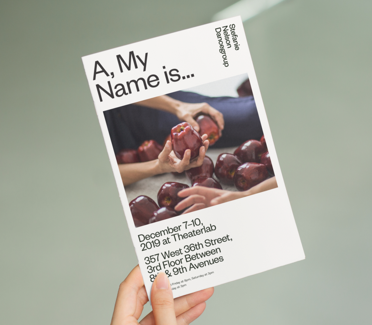
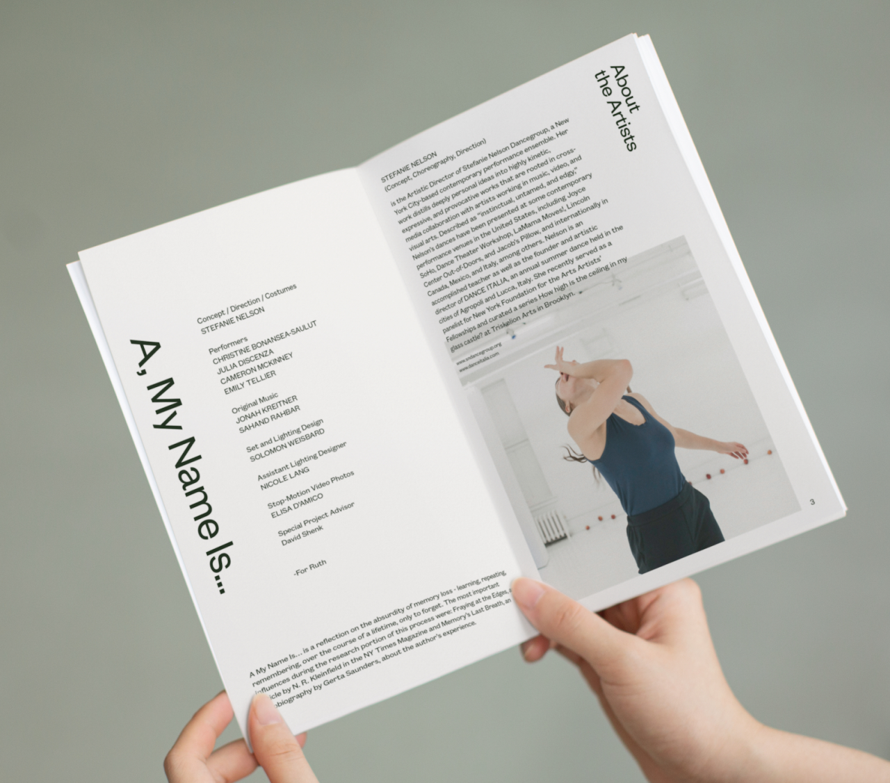
New York creative studio Gretel has unveiled its rebrand for the Stefanie Nelson Dancegroup in advance of its 20th anniversary. The identity features a new design language that captures the unique movement style of its dancers.
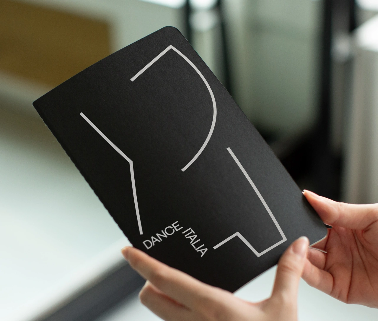
It's fresh but classic, flexible but singular, and offers a brilliant blueprint for how a cultural organisation's work can be translated into smart, adaptable design and branding systems.
SND reached out to Gretel in 2019, looking to increase its presence in the NYC art world and more clearly connect the dots between itself and its highly successful sub-brand for the dance program, Dance Italia. Gretel, known for its work for global brands including Vice, Netflix, and Nike, was brought in to provide strategy and design consultancy.
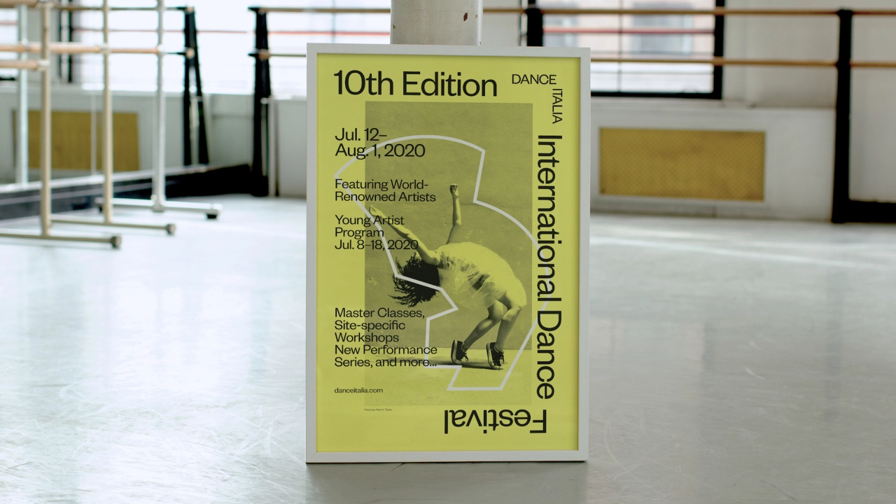
Gretel founder Greg Hahn says: "Whether designing for a cultural institution or a global tech brand, we’re always looking for work that’s unique, beautiful, and above all, true to whoever we’re designing for. Even for a smaller client like SND, we provide valuable insights into the way their business is operating, the way they present themselves to the world, the way they speak, on top of providing a unique identity."
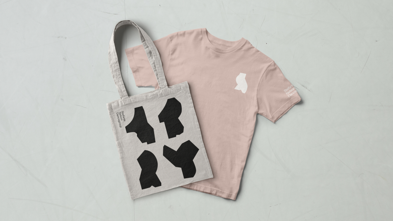
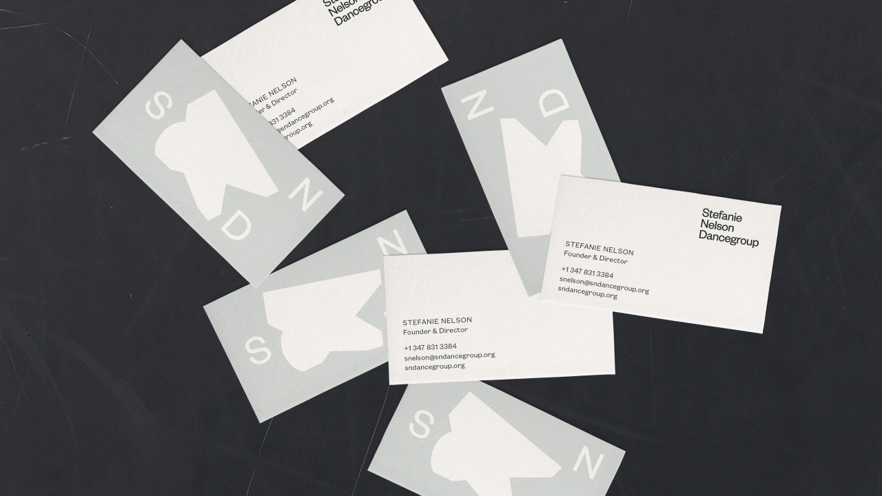
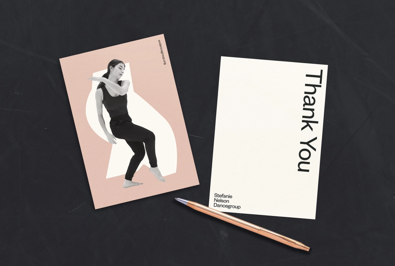
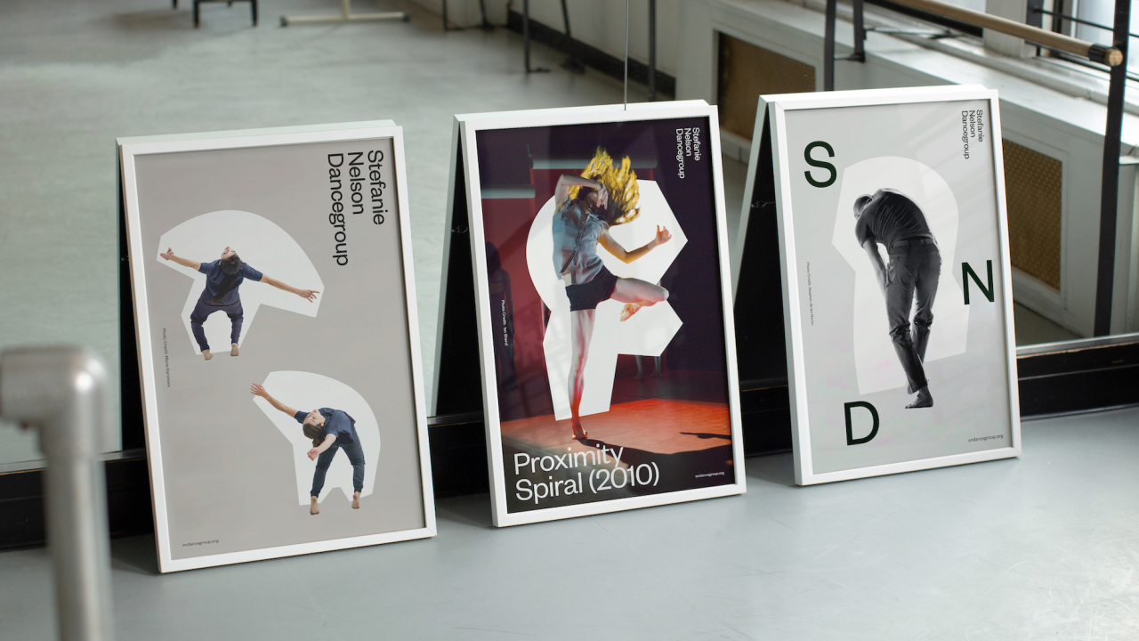
To form the backbone of the brand, Gretel designed a library of abstracted graphic forms based on SND's expansive collection of archival performance photography.
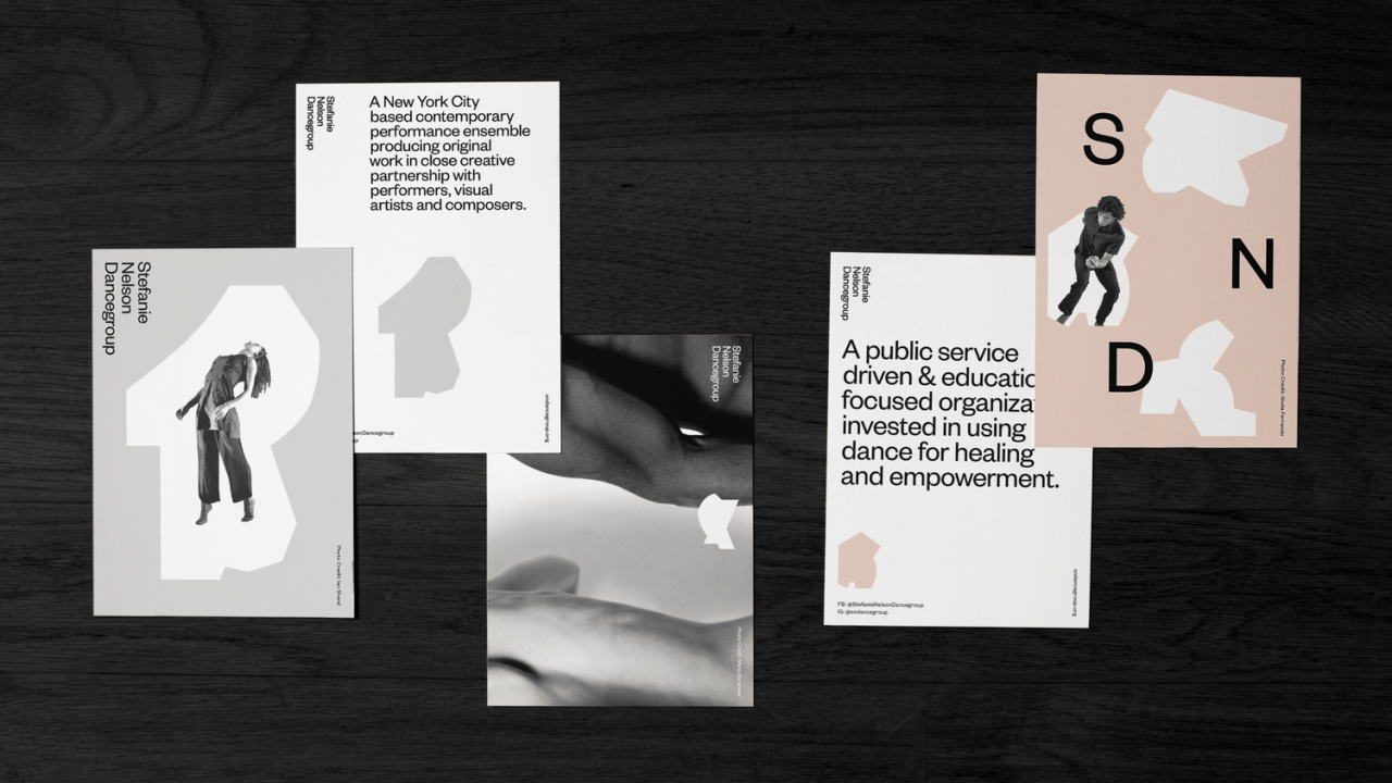
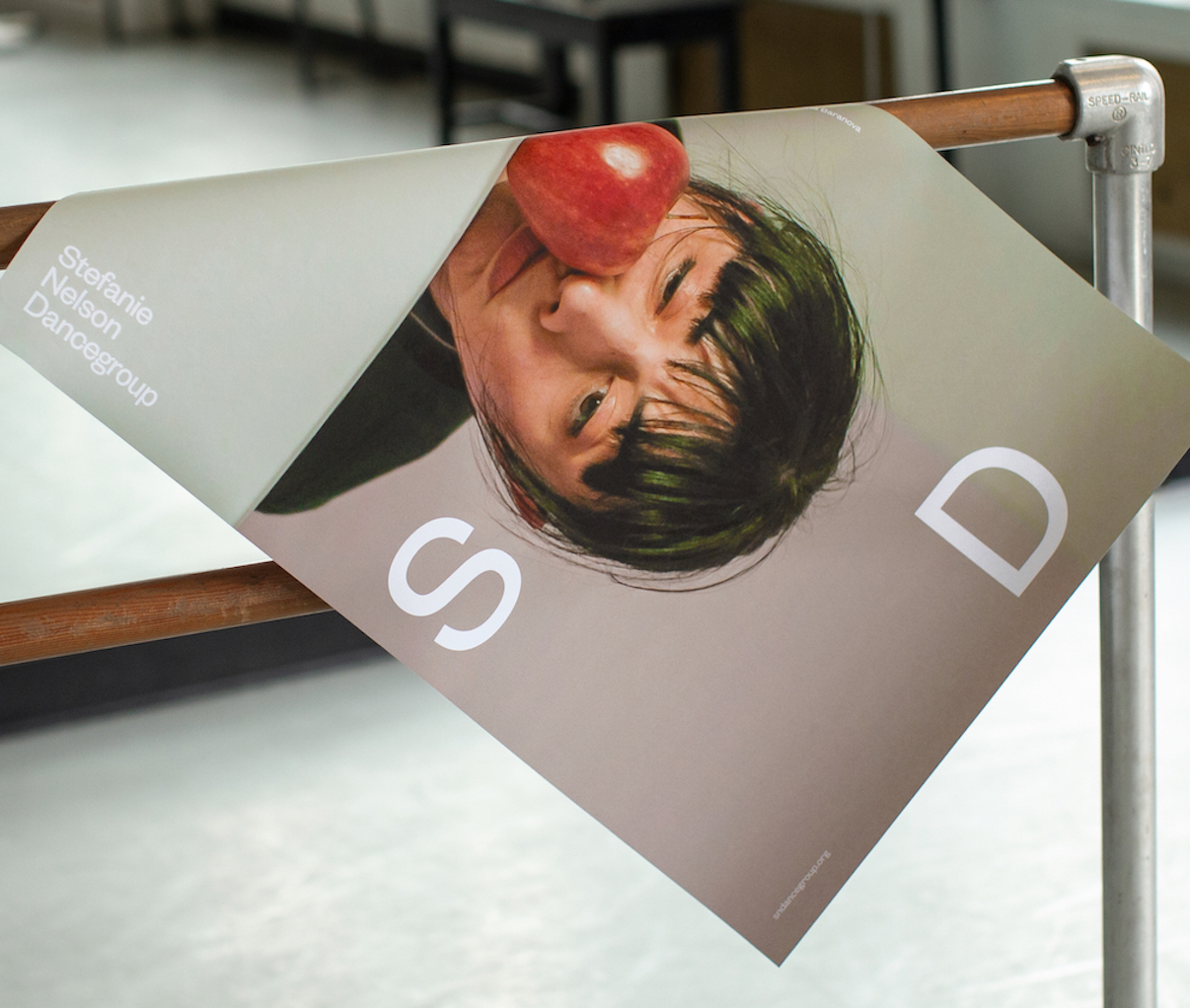
Hahn adds: "We were drawn to the tension between elegance and awkwardness in Stefanie’s work: Quiet meditations and explosive movements. Symmetry and asymmetry. Hard and soft forms. Even in still photography, you could sense all of this."
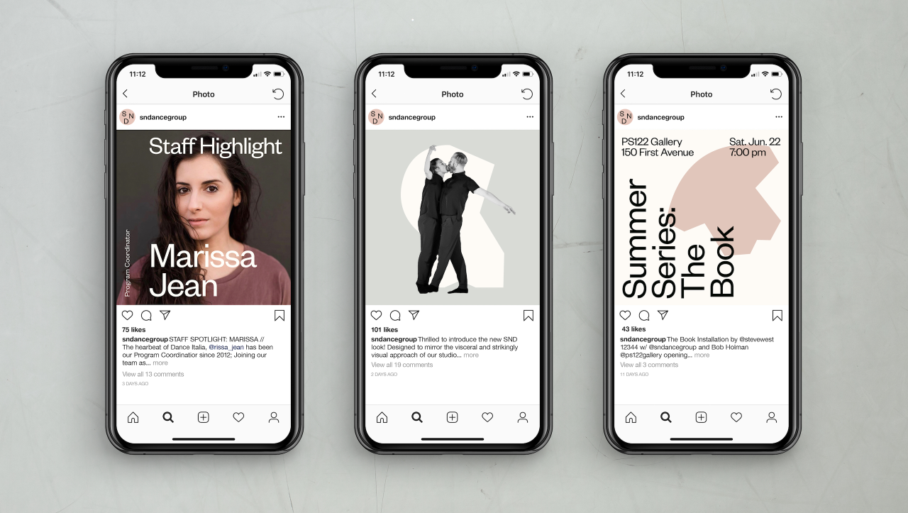
Using a combination of hard and soft lines which echo the dancers' movements, Gretel created a language of shapes as the basis of the flexible but firmly-rooted identity. "The shapes can work to supplement or enhance a photo," says Hahn, "and on their own, they become a language of glyphs, unique because they’re based on SND performers."
"The goal for this project was to mimic movement and dance through the design in a way that is personal and specific to SND," says Elaan Bourn, Gretel's design lead on the SND project. "By creating a graphic library of forms that represent and abstract the edgy, contemporary and energetic nature of Stefanie’s pieces, we were able to visualise the spirit of the rebrand."
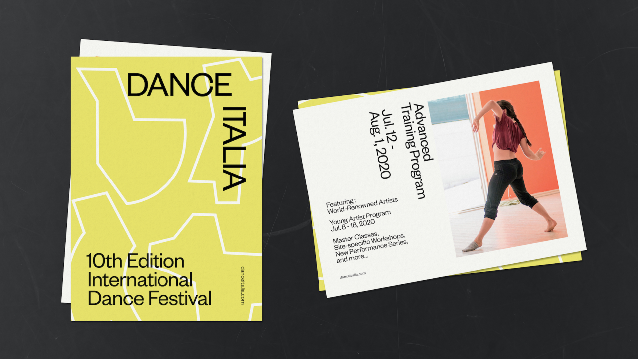
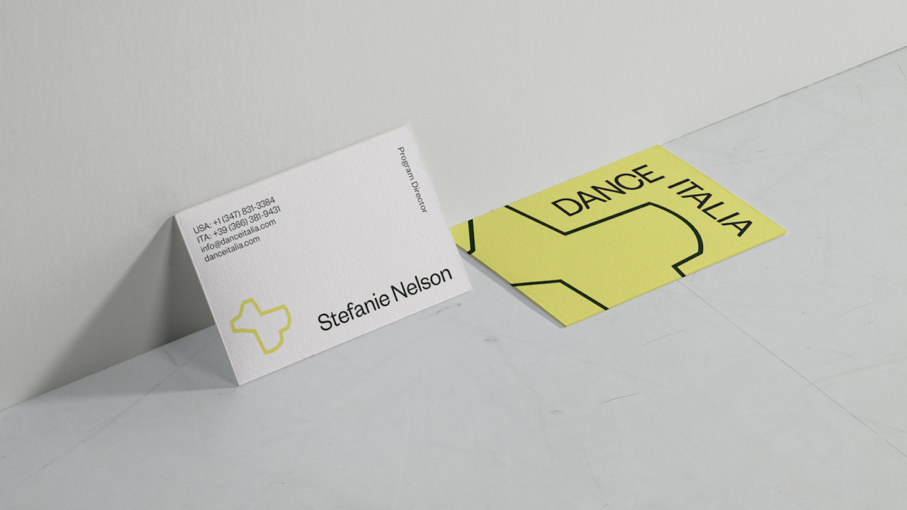
How did Gretel link the two? "From the beginning, we were conscious of how to create a secondary language for Dance Italia, with a different tone of voice, but which shares DNA with SND," Hahn continues. "We wanted to make sure that all of the layers of this brand could work on their own as well as harmoniously."
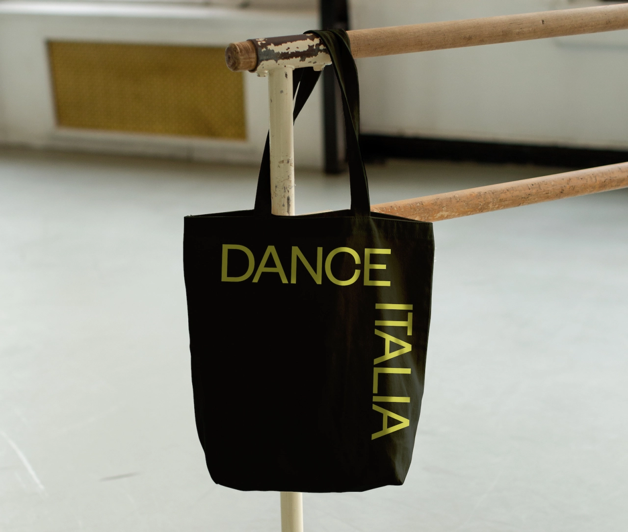
To achieve this, Gretel played with negative space and colour to link SND and Dance Italia together while keeping them separate. A muted pastel, solid form execution of SND allowed for more sophisticated, refined visuals for the parent company. Outline forms with a vibrant yellow allowed for more playful compositions that helped mimic the spirit of the educational program of Dance Italia.
The rebrand of the Stefanie Nelson Dancegroup and Dance Italia will be rolled out in the coming months across digital touchpoints and all publicity materials.
Editor's Picks





Trending



Latest Jobs
Senior Operations Manager at BIG Partnership
Full-time·Glasgow·£45k–£50k
Head of design at Cog Design
Full-time·London·£55K
Midweight Graphic Designer at We Are Your Friends
Full-time·London·£36k–£44k
Creative Project Manager at Analogue
Full-time·Leeds·£28k–£35k
Client Success & Growth Director at Revolution Growth
Full-time·Manchester·£60k-£70k
Paid Media Executive at Munro Agency
Full-time·Glasgow·From £27,000