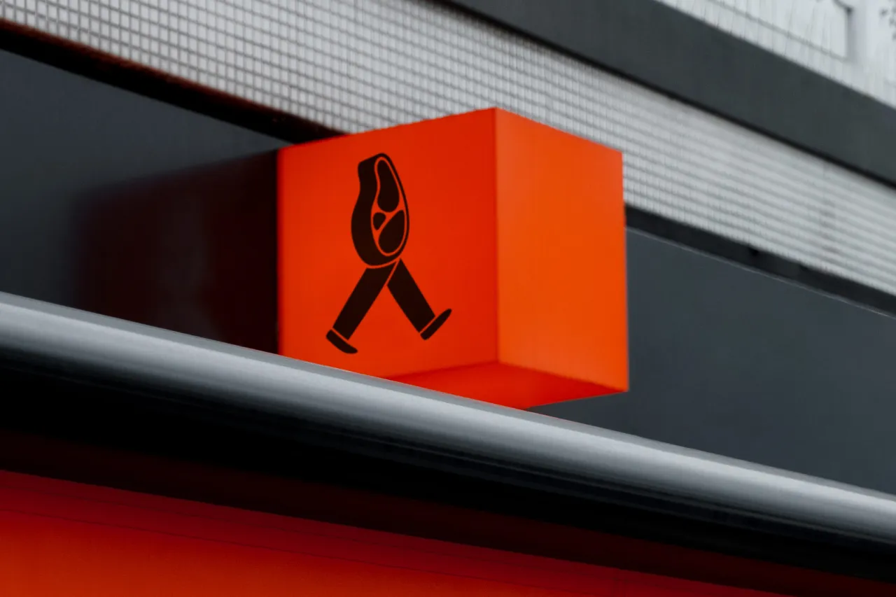
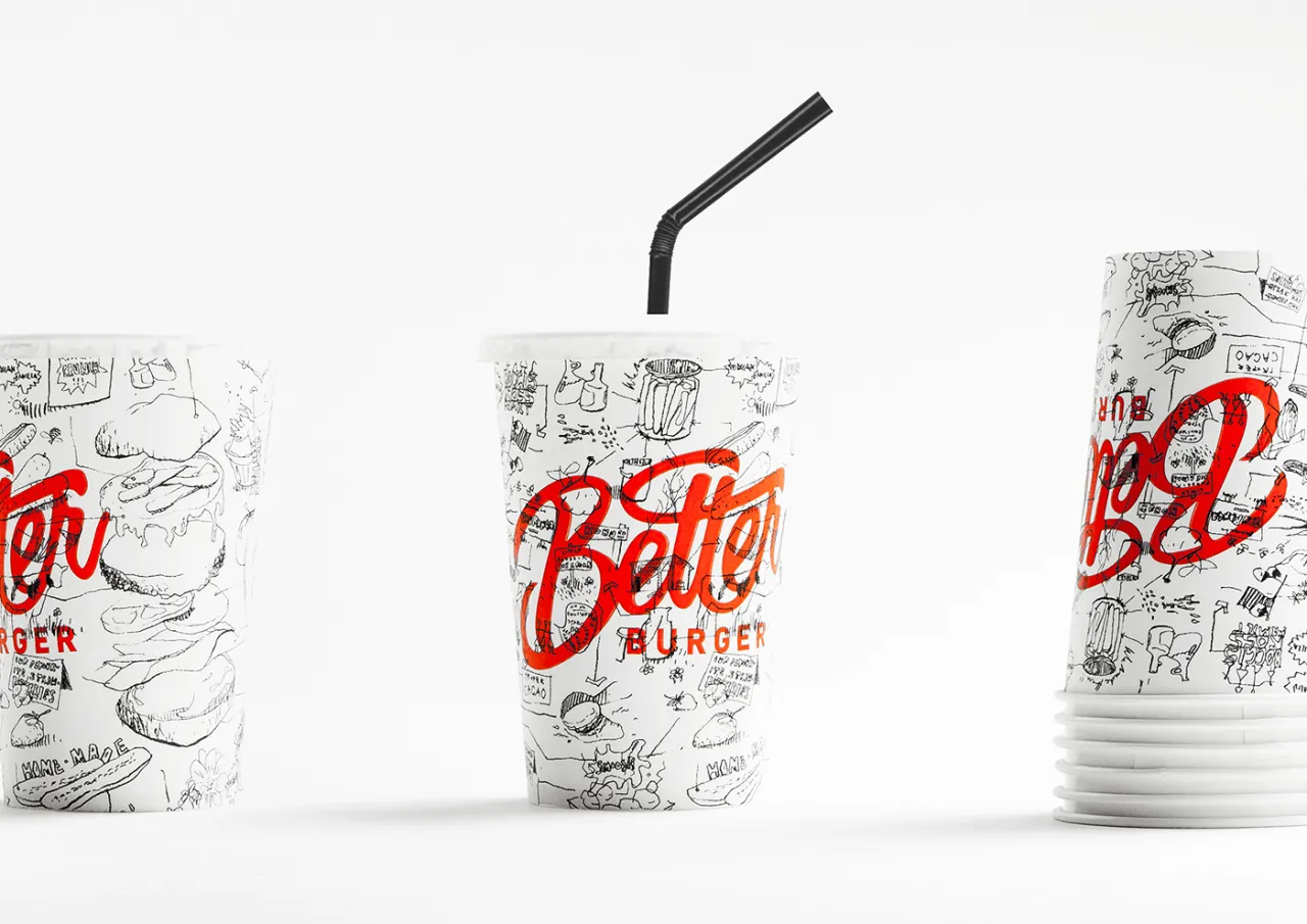
Freytag Anderson's bold, confident and minimalist identity for a no-nonsense BURGER
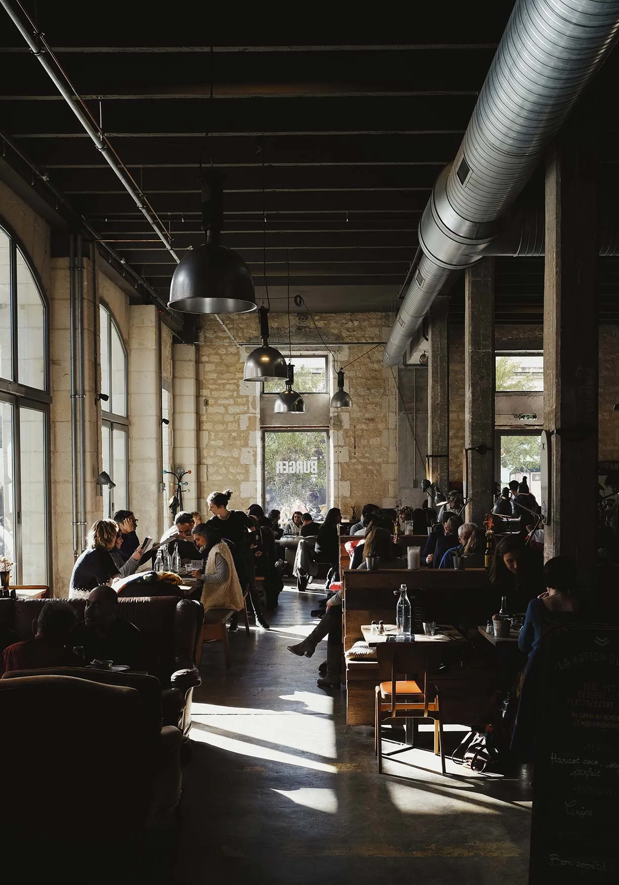
With confident lettering and tongue-in-cheek copy, Freytag Anderson has created a nimble, topical brand for BURGER, a no-nonsense eatery based in Edinburgh.
Casual dining has boomed in recent years with a dizzying amount of burger chains and restaurants opening in every major city of the UK. BURGER's offering, therefore, is simple: they make great burgers. But with plenty of competitors offering the same, Freytag Anderson was appointed to clear away the clutter and bring resilience to the brand.
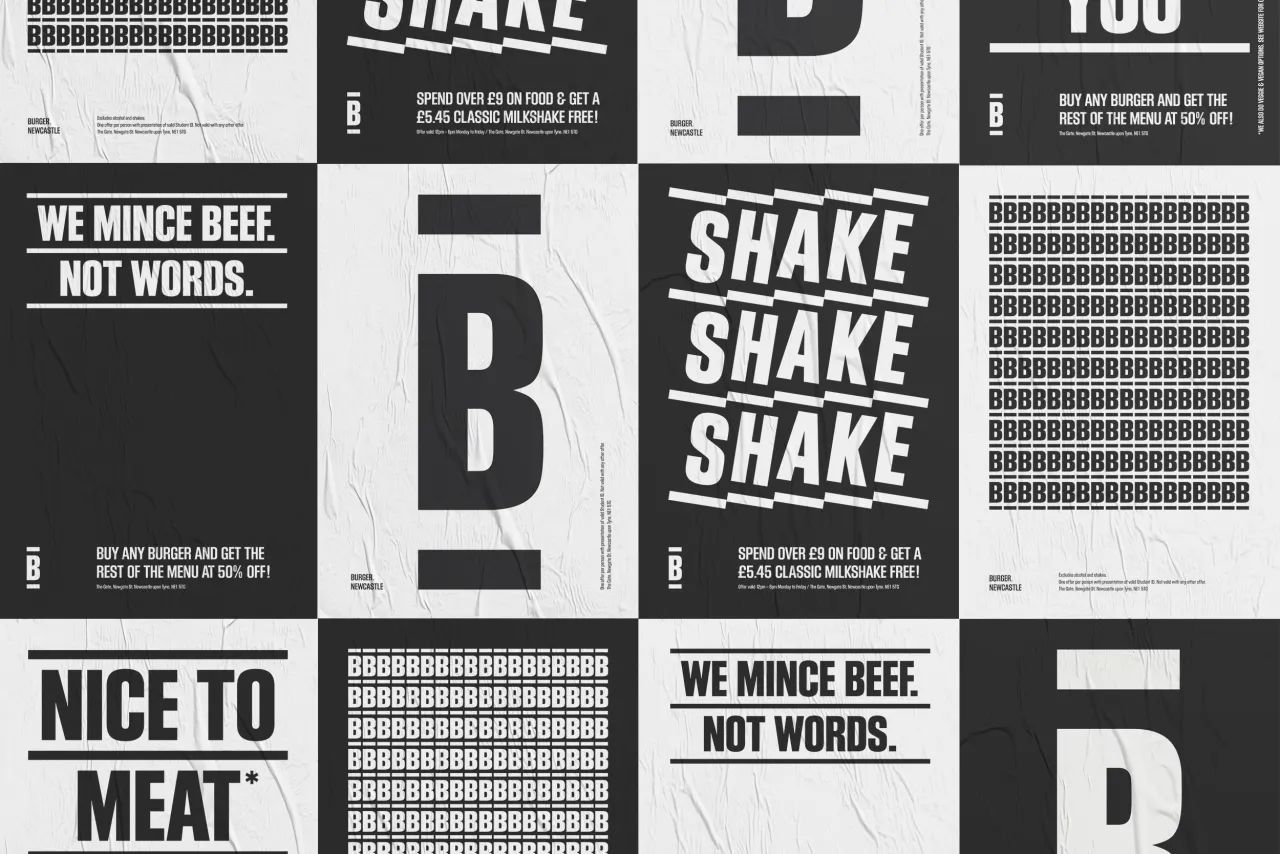
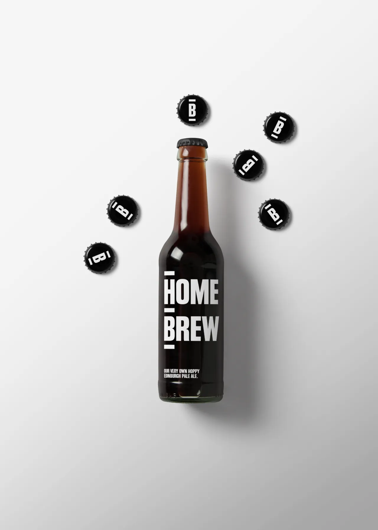
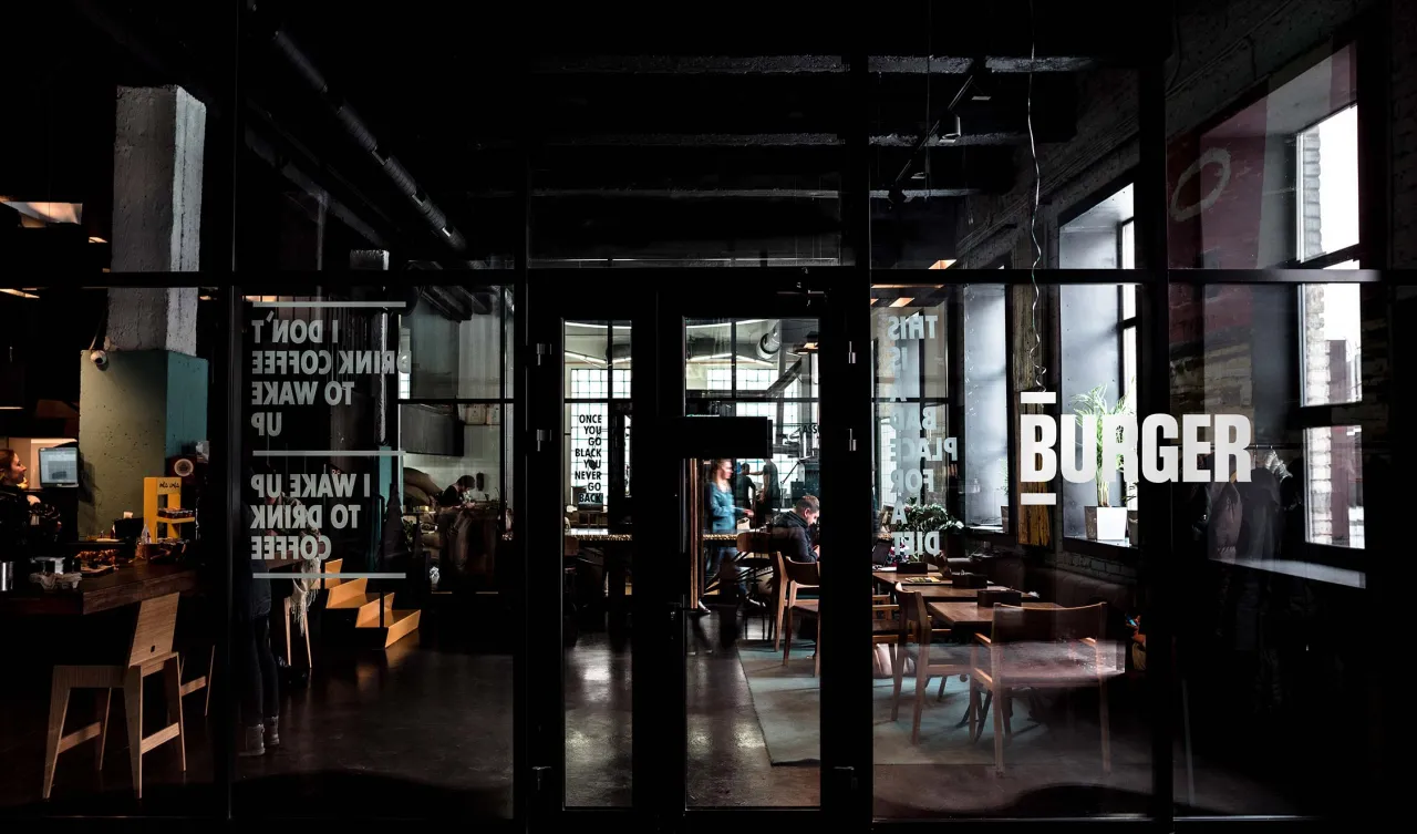
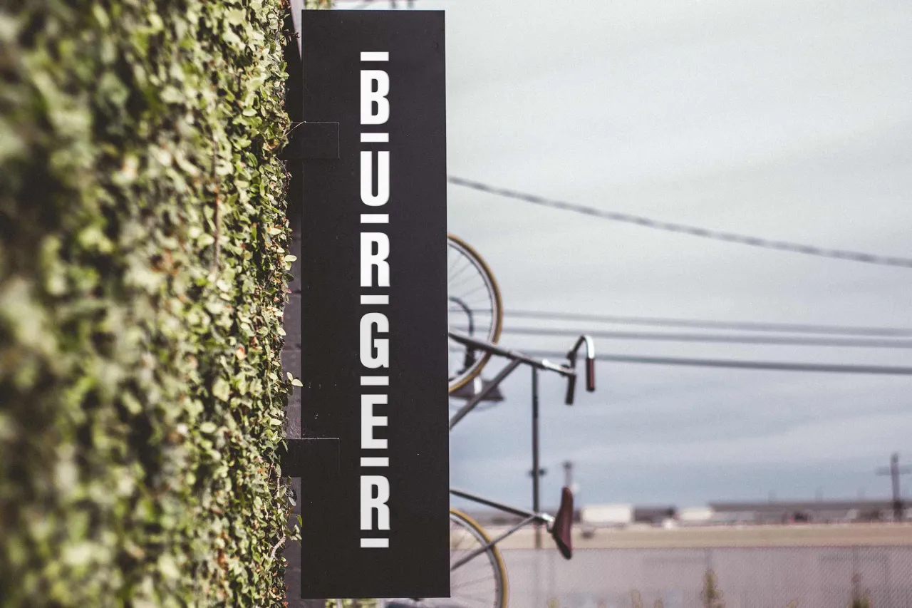
Leading unapologetically with "BURGER", the Glasgow design studio creates a sense of ownership over the word in a packed marketplace. The name calls for straightforwardness and brand development began with some stripped-back typography. Block Gothic was chosen as its font with lettering stacked neatly into a three-line "burger" format and headline copy distilled to fit. This encompasses everything from menu specials to promotional offers, seasonal taglines and messages for daily passers-by.
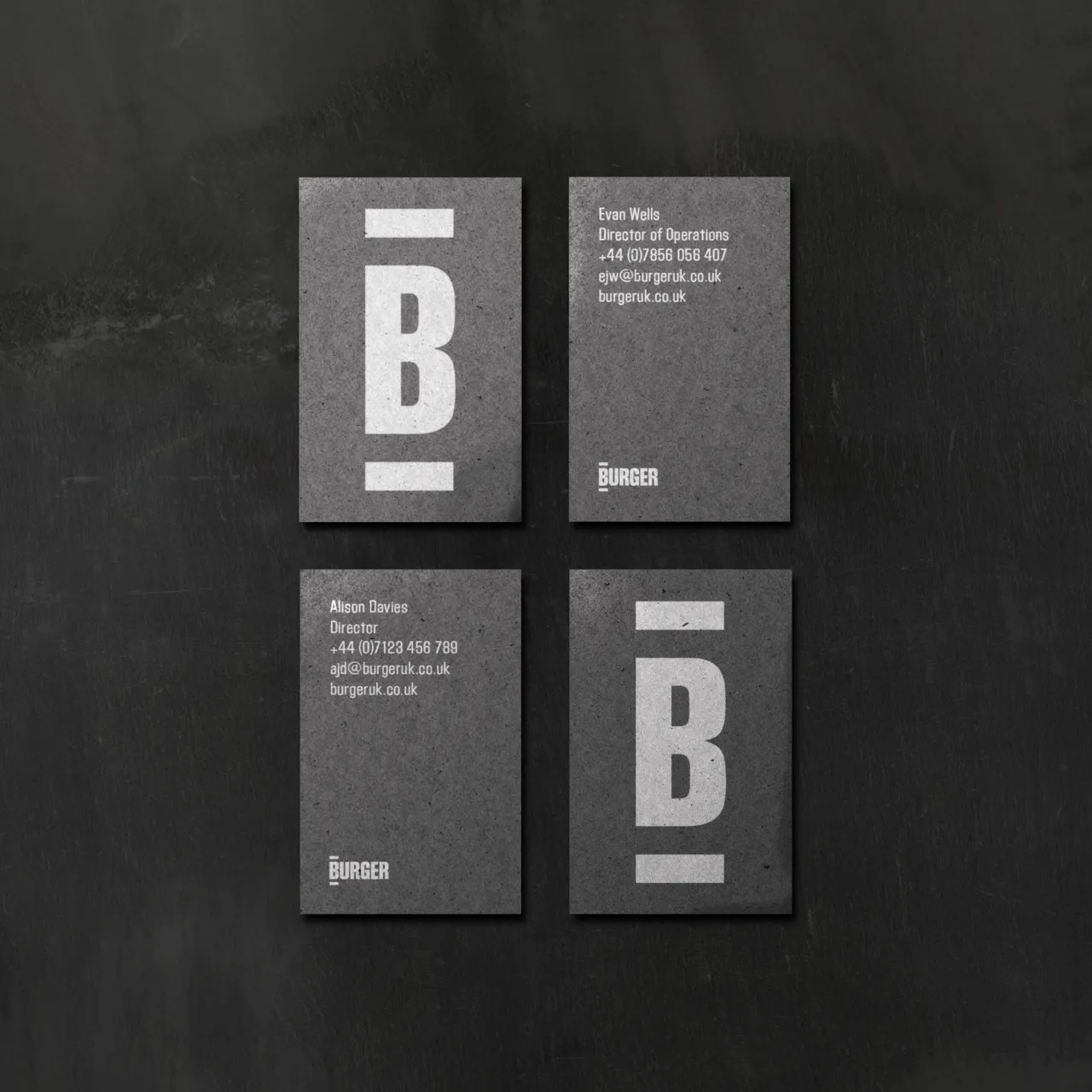
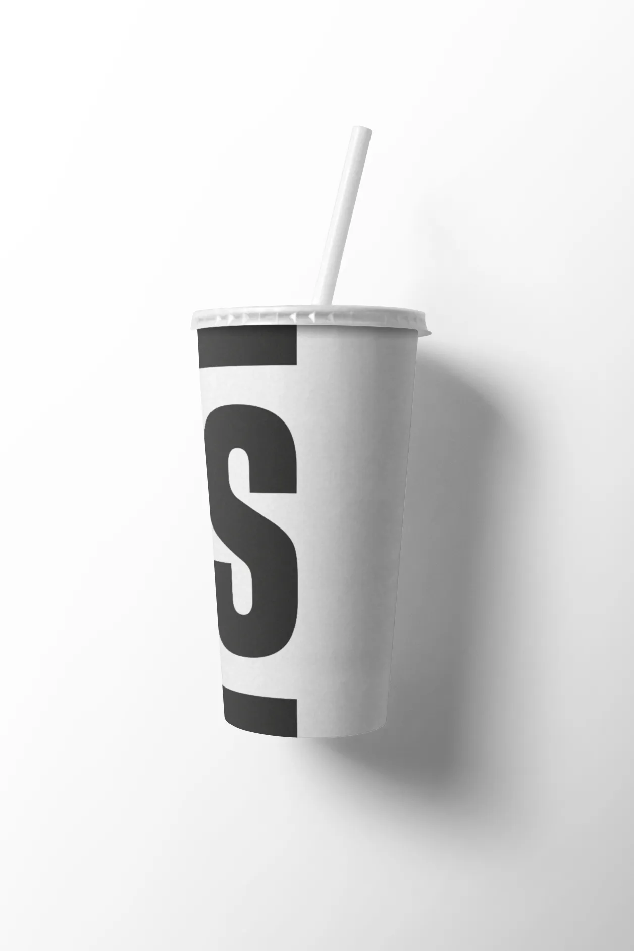
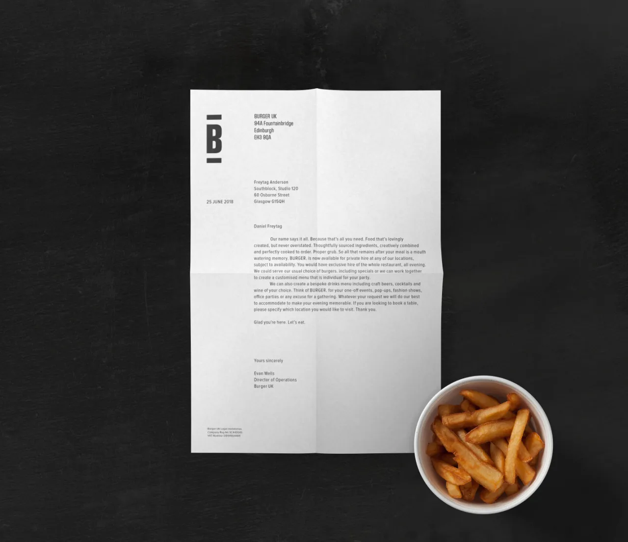
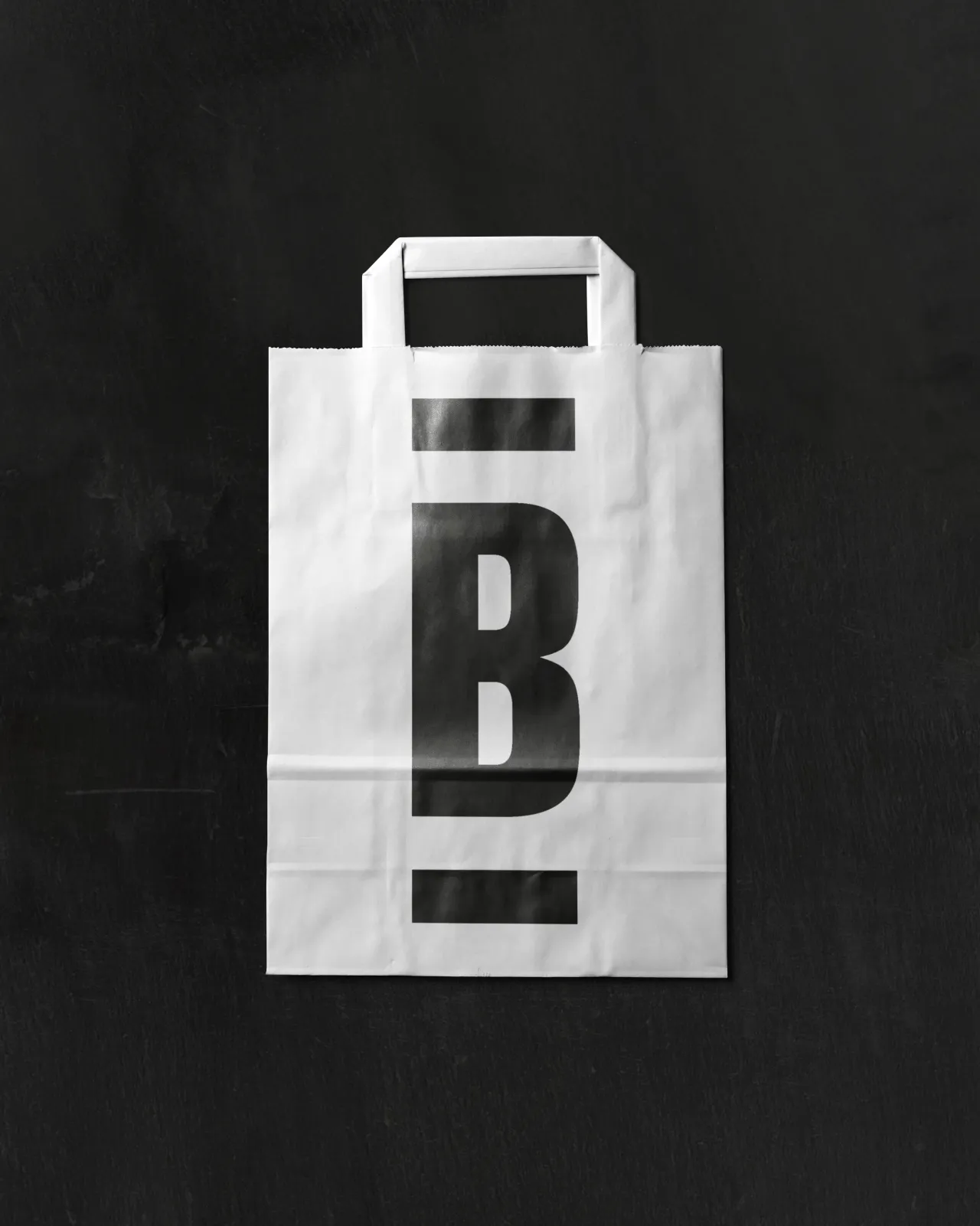
"With origins in woodblock printing, the Block Gothic font had the robustly crafted qualities we needed," explains Greig Anderson, one of the studio's founders. "From this lettering, we assembled a word-mark which, with sandwiching bars, condenses to a plain and confident 'bun'. Expanded horizontally or vertically in a monochrome palette, its simplicity lets the name do the talking."
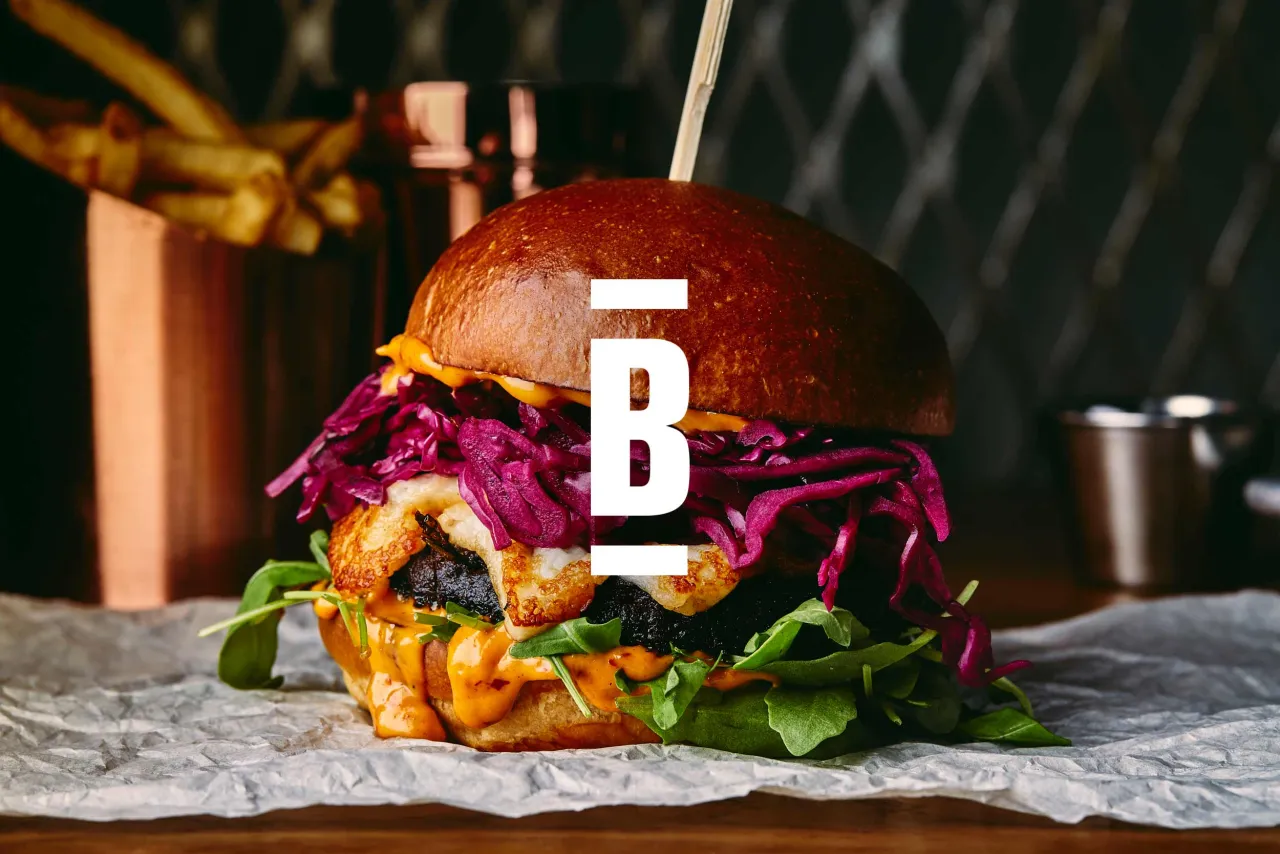
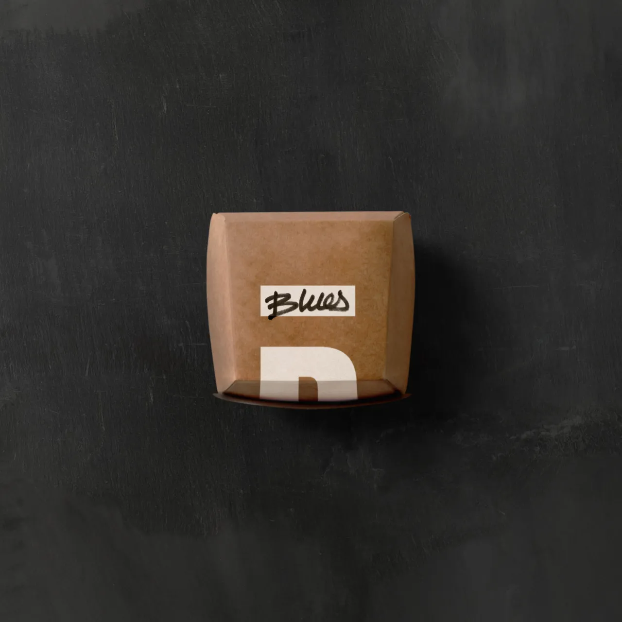
The bold typography is the backbone of the highly flexible identity system. Black or white inks on textured papers feel unpretentious, yet surprisingly refined. Bright oversaturated photography – sparingly used – communicates the intense, messy pleasure of a good burger. And the copy prevents the brand from feeling too austere.

Editor's Picks





Trending




Latest Jobs
Junior Project Coordinator at Colorido Studios
Full-time·Twickenham·£28k–£32k
Design Director, Opinion at The New York Times
Full-time·New York·$160k–$180k
Creative Social Content Producer at Bompas & Parr
Contract·London·£32k–£40k
Senior Creative Lead at Random Studio
Full-time·Amsterdam / Paris·€90k-€110k
Senior Operations Manager at BIG Partnership
Full-time·Glasgow·£45k–£50k
Creative Project Manager at Analogue
Full-time·Leeds·£28k–£35k