Land of Plenty sharpens design for revamped Truffle Burger
Many people have a weak spot for a hearty burger, and implementing a rough but drool-worthy design into Truffle Burger's updated brand offering was very much an intentional move.
Truffles are the world's most expensive natural food, so claims the online menu on Truffle Burger's website. Yet it's a lux ingredient that features across each dish the brand offers.
To highlight the former street food market seller's USP and handling of the popularly-misunderstood ingredient, the team enlisted London brand and design consultancy studio Land of Plenty to create a raw but refined new look for the brand to help it stand out in an already-saturated burger market.
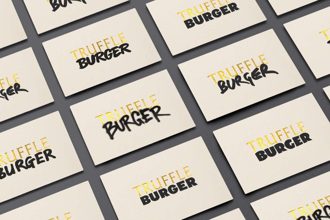
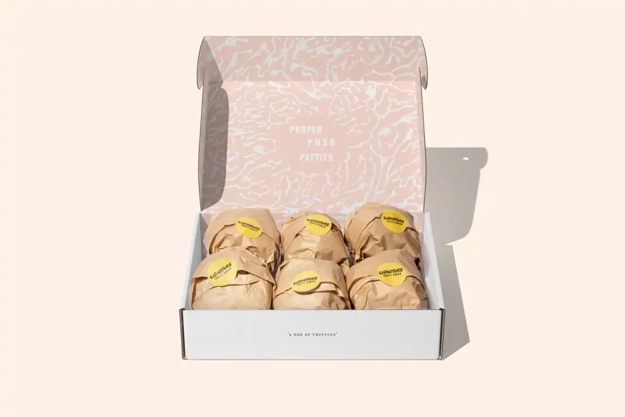
The result birthed the brand's updated name, Truffle Burger, as well as a new logo system comprised of an elegant typeset gold Truffle paired with a variety of hand-rendered and meatier-looking Burger typefaces. It also featured a tight colour palette defined by the two truffle varieties – black and white – and contained a pattern carved straight from the inner core of the truffle itself.
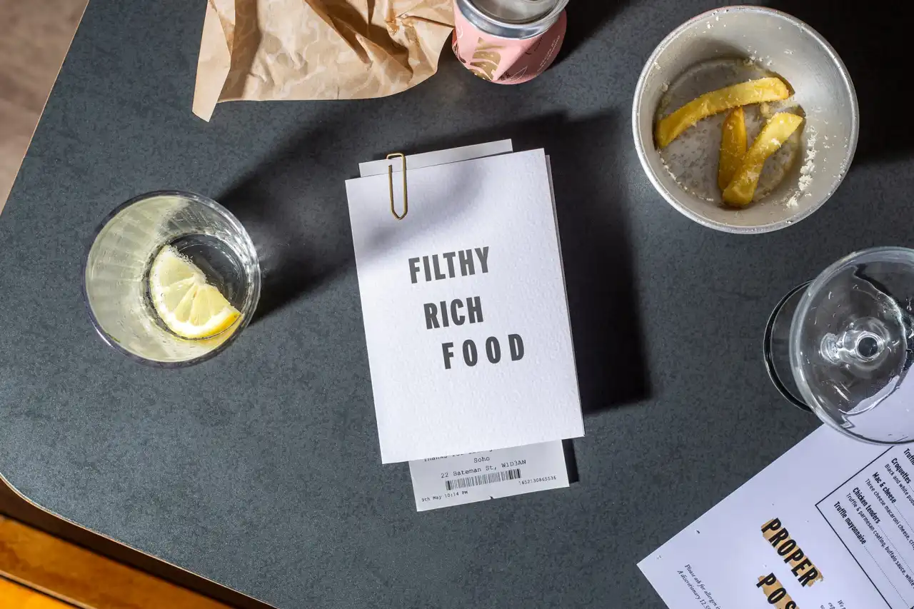
Land of Plenty helped build the brand from the ground up, rolling out a strategic approach that redefined its DNA to later inform its proposition, positioning and key messaging. This contributed to realising the brand's creative direction and finessing its visual identity – which fuses mouth-watering food shots with urban toughness.
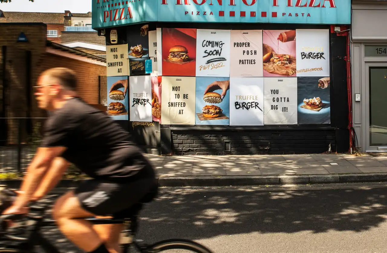
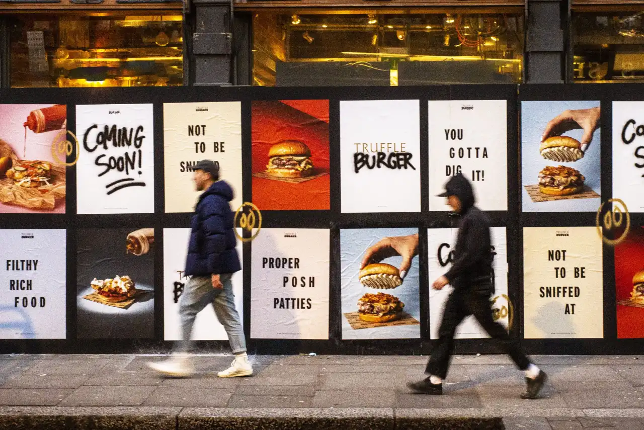
The team also created a new website for the brand, playing around with lo-fi-luxury elements, as well as a series of fly posters that uses glossy food shots and opulent gold foiled details set against spray-painted signs and pictured down street alleys – which brought a sense of street cool to the brand's offering.
The language was also a vital component in the brand's messaging. A playful menu was drawn up – with 'A Finer Diner' becoming the guiding principle to direct the reader and get them hungry to continue reading ahead of ordering.
Truffle Burger started as a street food market stall, with its founder Tom Bickers working in some of London's best kitchens and inspired him to serve up truffle-inspired dishes.
Editor's Picks





Trending






Latest Jobs
Design Director at Koto
Full-time·London·£72k-£90k
Midweight Designer at Catalyst Creative
Full-time·London·£32k-£36k
Senior Copywriter at Human After All
Full-time·London·£48k–£66k
Account Manager at BUILDHOLLYWOOD
Full-time·London·£34k–£38k
Graphic Designer at Crux Product Design
Full-time·Bristol·Up to £36k
Account Director at How&How
Full-time·London·£73k-£79k