David Barath's striking, Bauhaus-esque designs for new Fedrigoni book
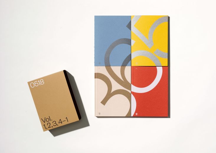
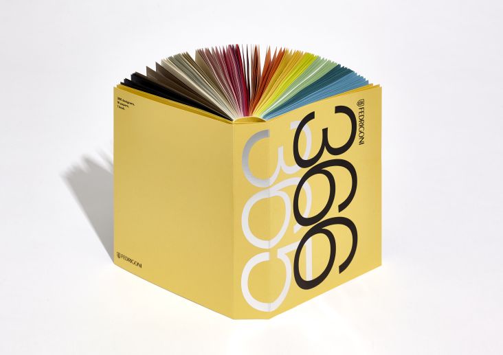
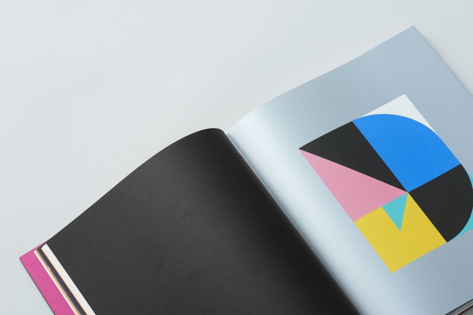
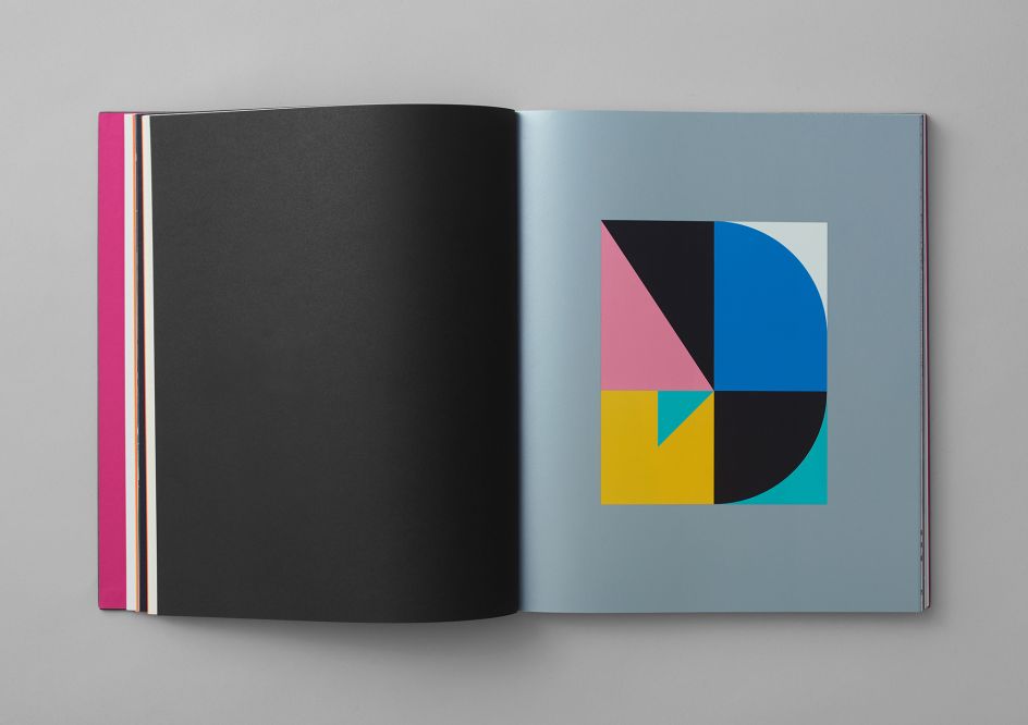
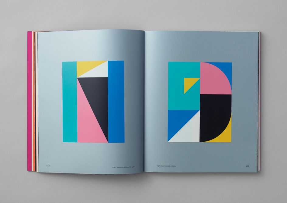
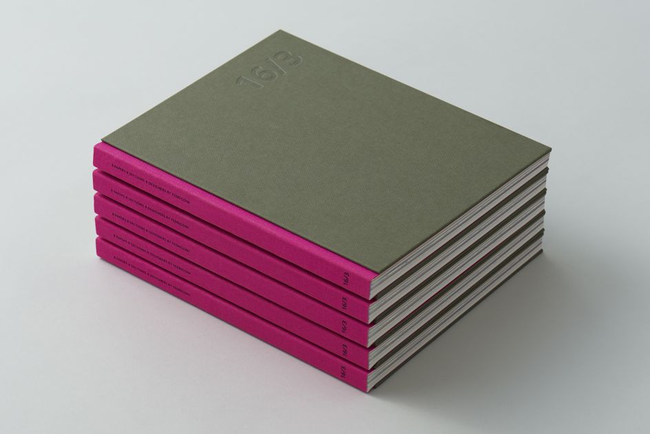
Graphic designer and art director David Barath was one of eight creatives recently tasked with creating designs for a book from the Italian paper producer, Fedrigoni.
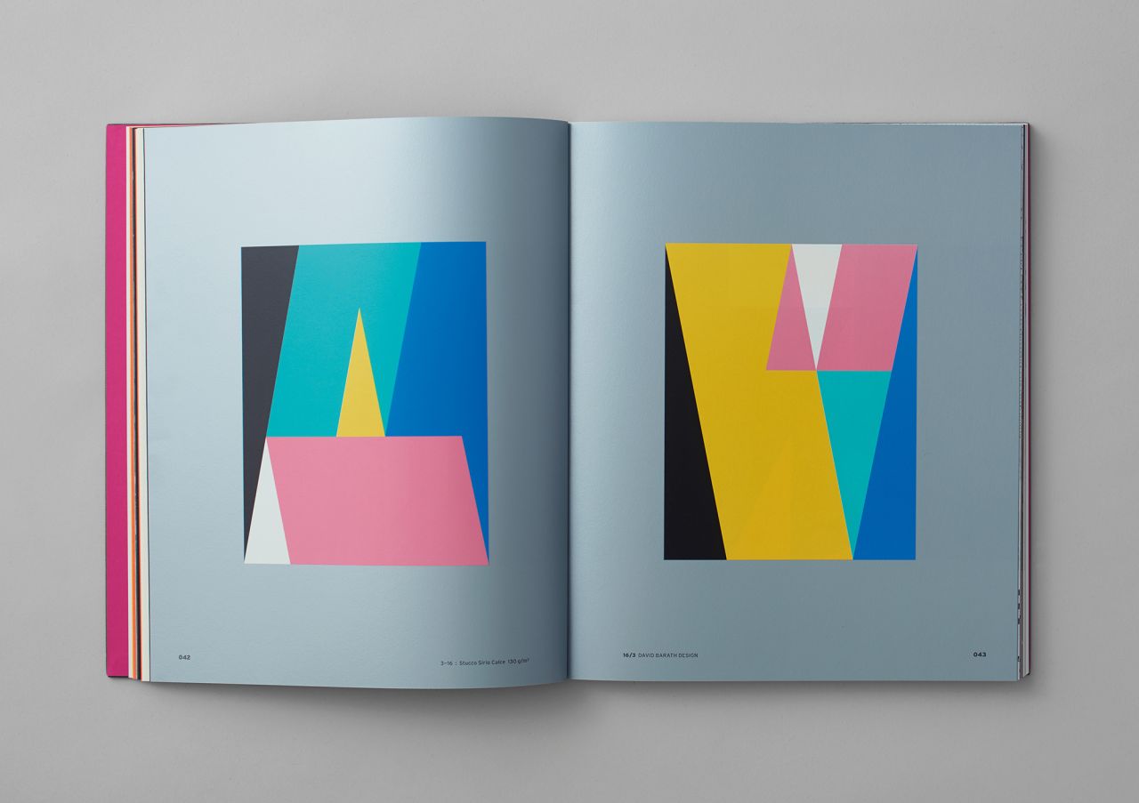
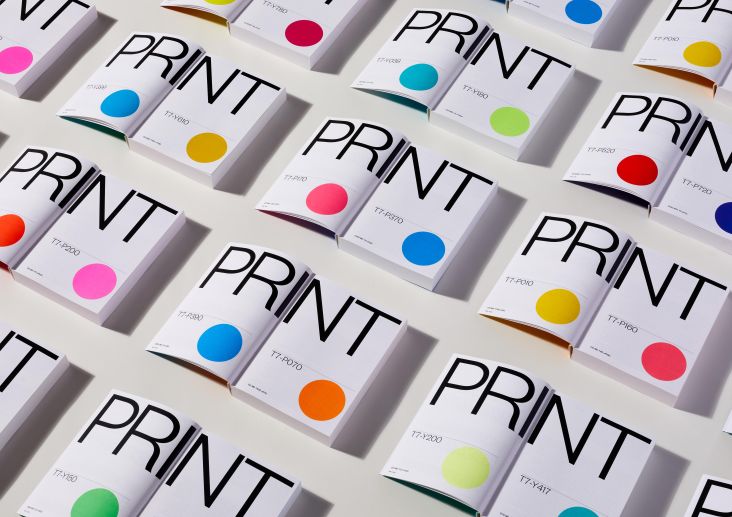
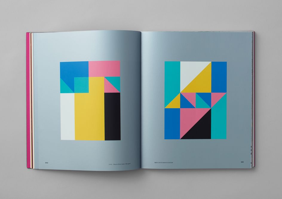
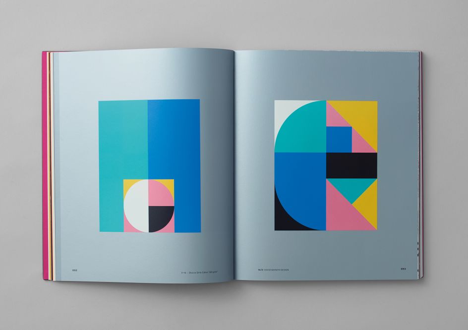
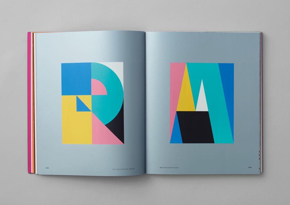
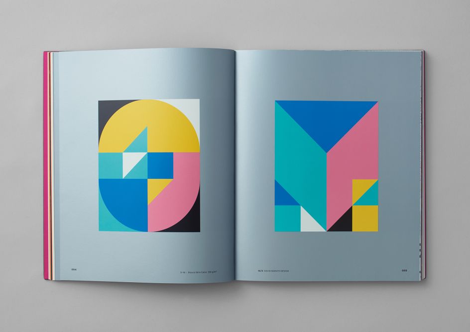
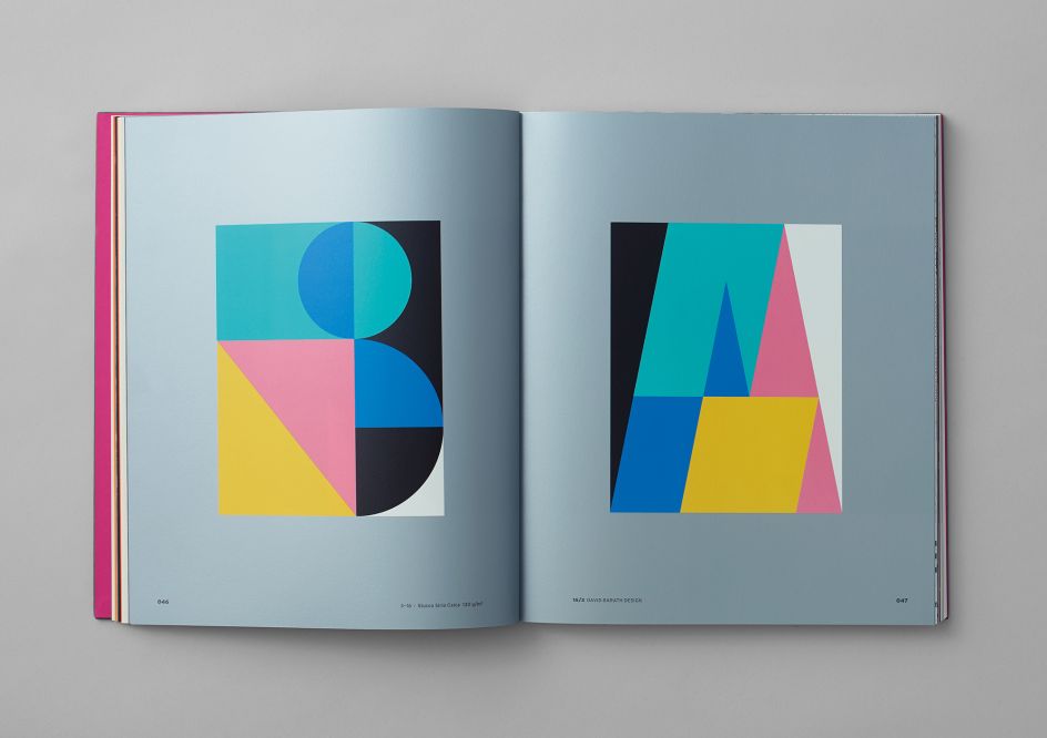
Each designer was given 15 pages of a specific paper to work with, using six Pantone colours. Barath's paper was Fedrigoni Stucco Sirio Calce 130g, a thick stock with a silky smooth surface.
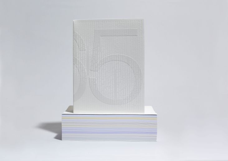
"This being an art project and me being specialised in branding, I decided to use these pages for my personal branding," Barath explains. Each of his graphic, bold pieces takes the form of a typographic poster artwork from the 15 letters of his website address.
His designs are incredibly simple, but also incredibly striking; with Bauhaus-like forms in bright blue, pink, teal and yellow. The book itself was designed by Thomas Manss & Company.
Editor's Picks


Trending


Podcasts


Editor's Picks
Further Reading