Pentagram designs a new global identity for Fedrigoni
Pentagram is behind a new brand identity for Fedrigoni. Known and loved by the design community far and wide, the global paper company was established in Italy in 1888 and is probably best known for its fine paper with its products used for everything from printing, publishing and labels to bookbinding and packaging.
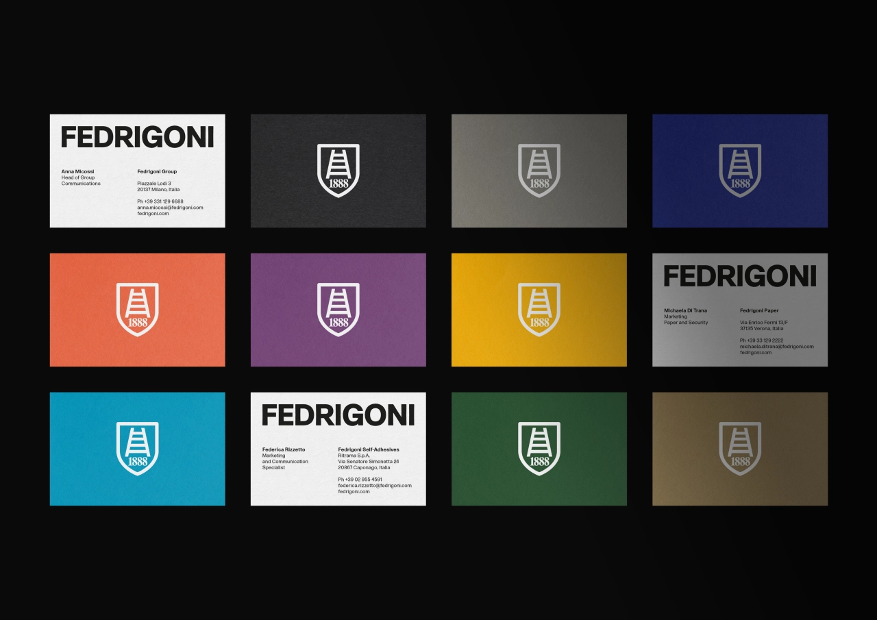
Led by Pentagram Partner Harry Pearce, the design team was asked to create a global identity that would "rationalise" its current sub-brands (including recently acquired brands such as Ritrama) and create a new identity for the self-adhesives division.
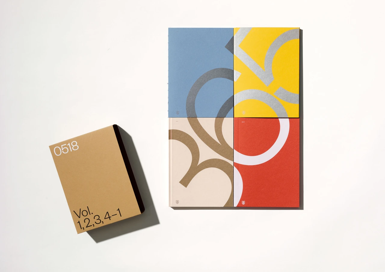
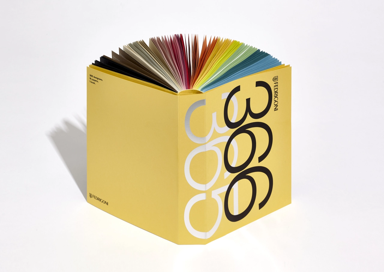
The news comes on the back of Fedrigoni's recently released 'Paper Box', a sculptural and "highly collectable" sample box designed by London studio Graphic Thought Facility (GTF). The minimal approach features the word 'Fedrigoni' in upper case, set in GTF's carefully redrawn version of Italian designer Aldo Novarese's 1968 font Forma.
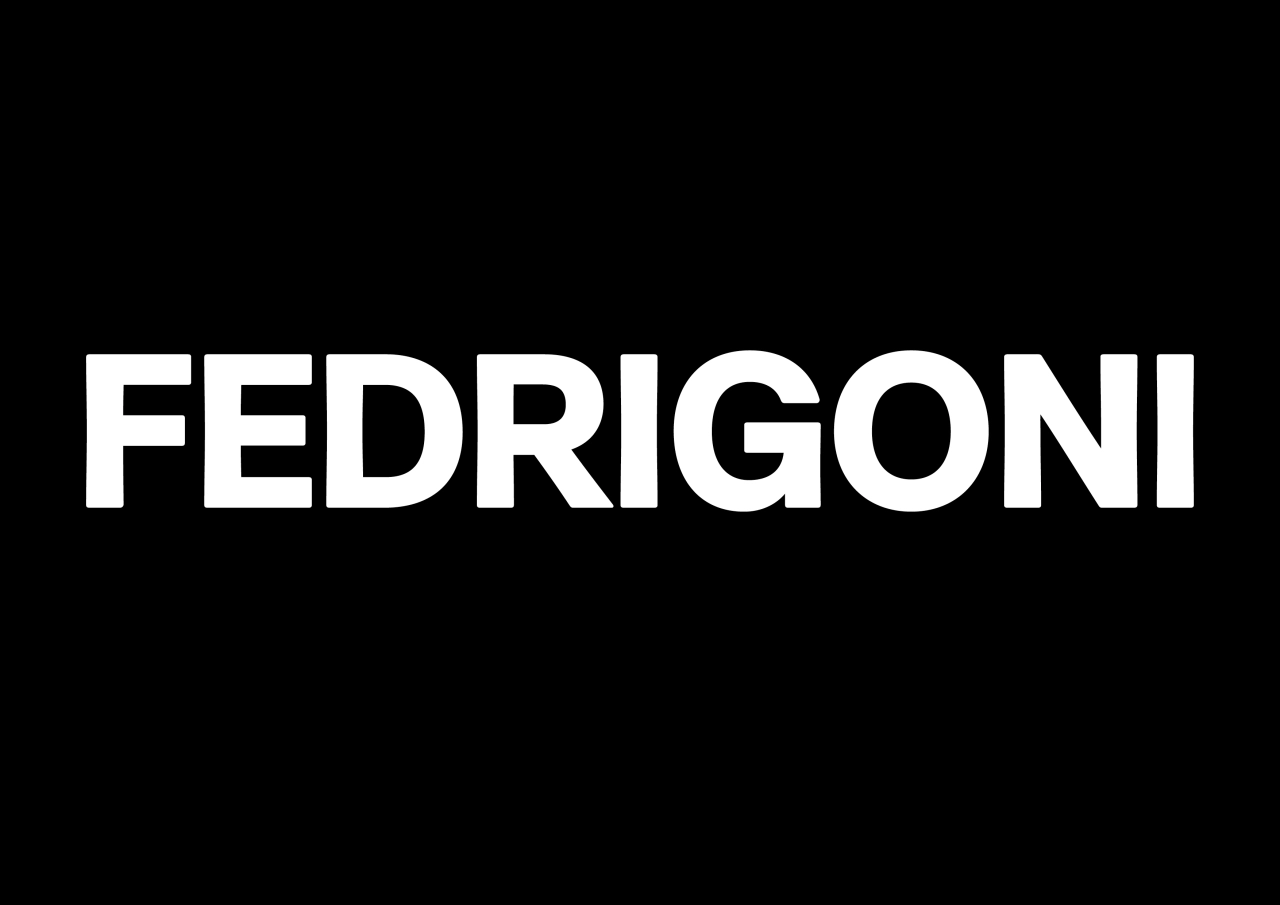
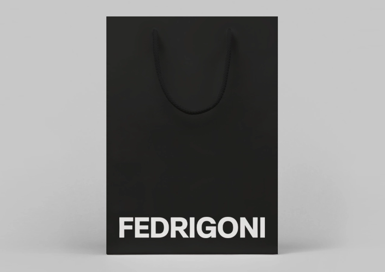
"Although it explored other approaches, the design team recognised the impact of GTF's confident application of Fedrigoni's wordmark in Forma and saw its potential to represent the Fedrigoni brand as a whole," explains Pentagram. Subsequently, Pentagram decided to change the existing Fedrigoni logotype (set in the French typeface Peignot) to a redrawn version using Forma. "This perfectly signifies Fedrigoni's new global identity: strong, bold and confident, and celebrating its strong Italian heritage," adds the London agency.
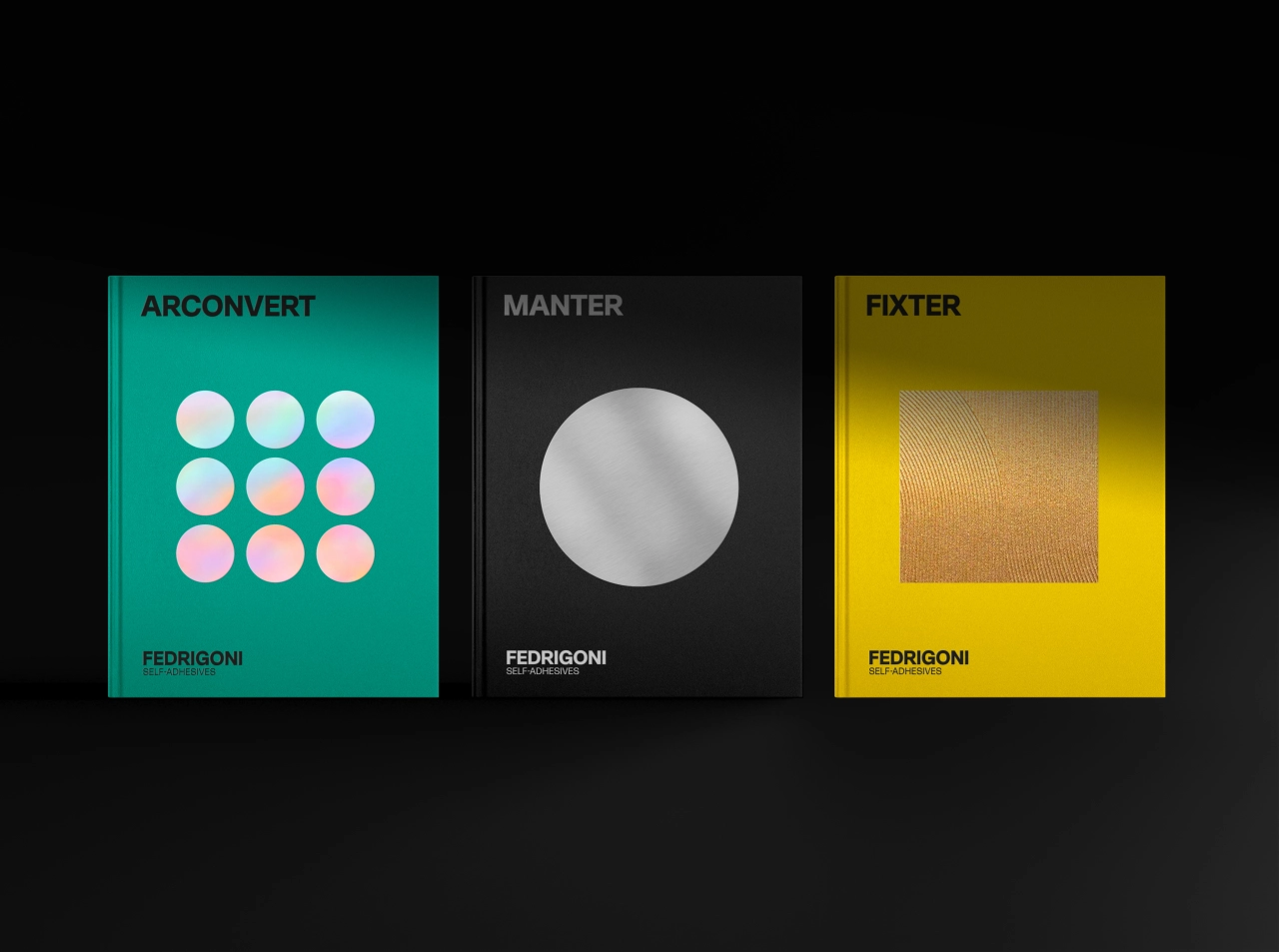
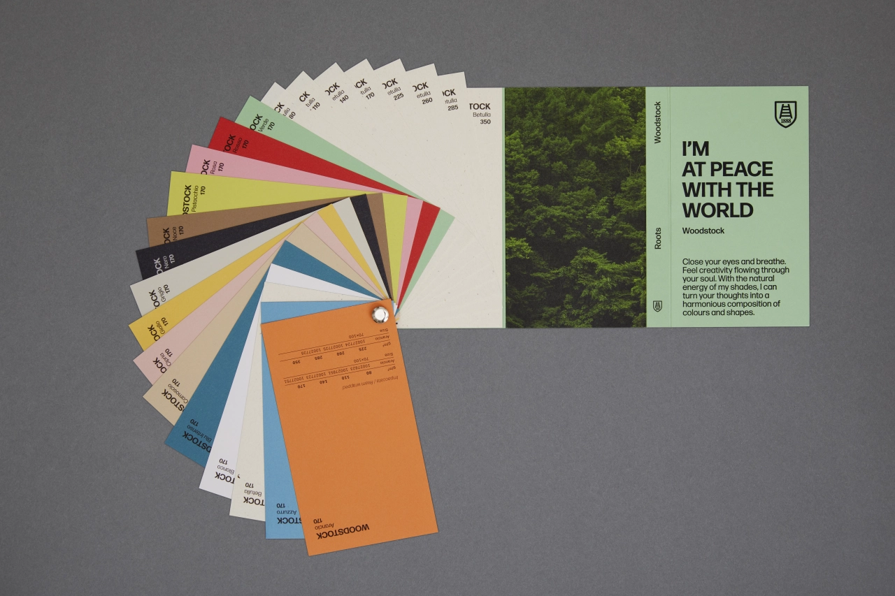
Pentagram worked with strategist Federico Gaggio to align Fedrigoni's brand architecture, which now encompasses the main Fedrigoni Group brand, its Paper and Self-Adhesive Units, and Distribution. While certain sub-brands (such as the much-loved Fabriano brand) retain their original identity, the brands which form part of the self-adhesives division share the same design language as the main Fedrigoni brand.
Simon Pilkington from Fedrigoni says: "Our ladder icon, a symbol of the city of Verona, represents our dedication to helping creatives across the world maximise and elevate their work. Retaining this important symbol, we tasked Pentagram with building a unified global image for the Fedrigoni Group, and creating a distinctive and recognisable brand for UK and international audiences alike."
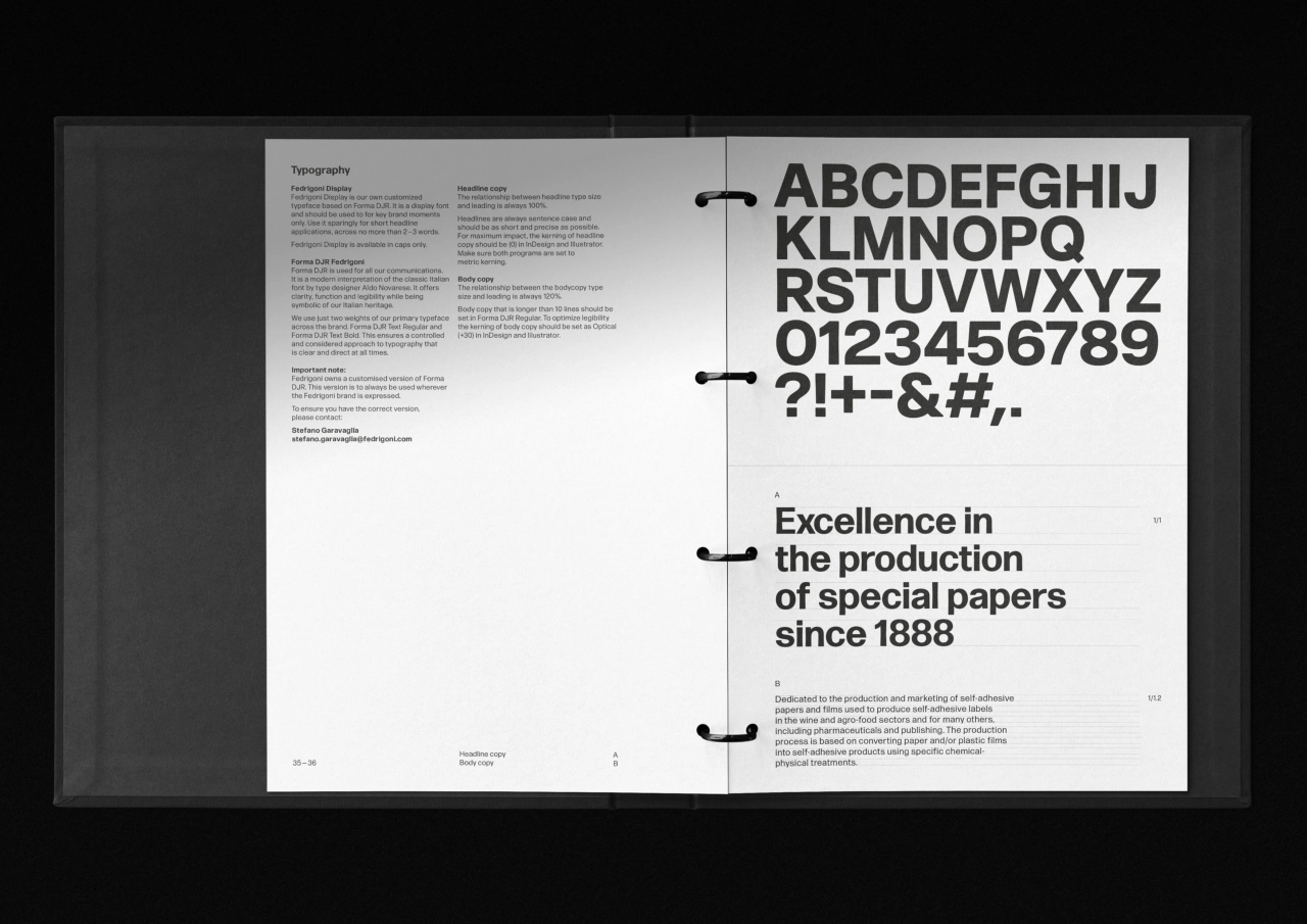
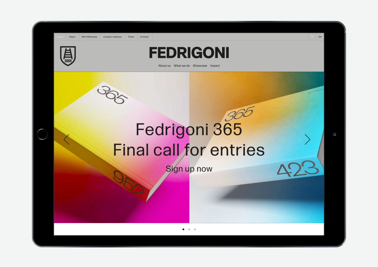
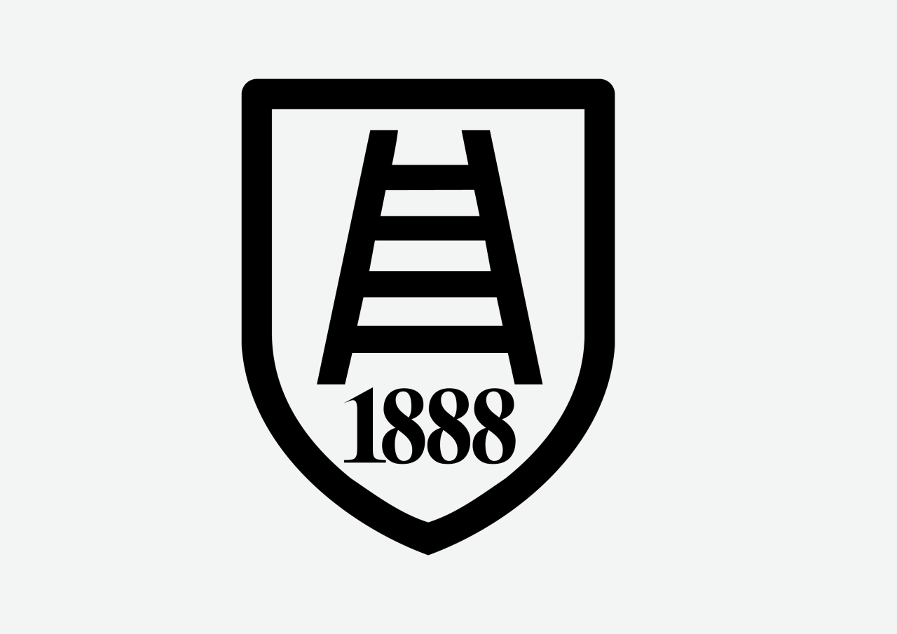
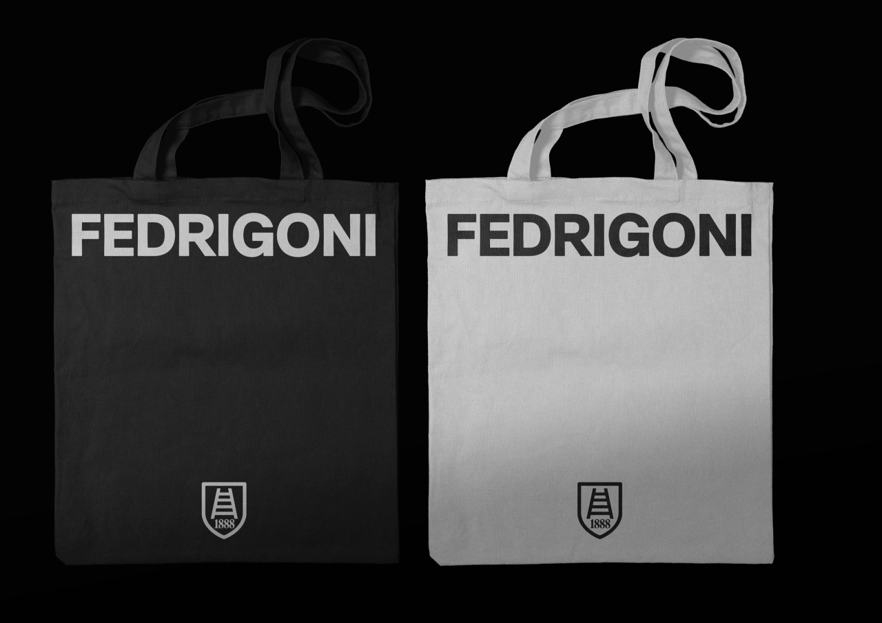
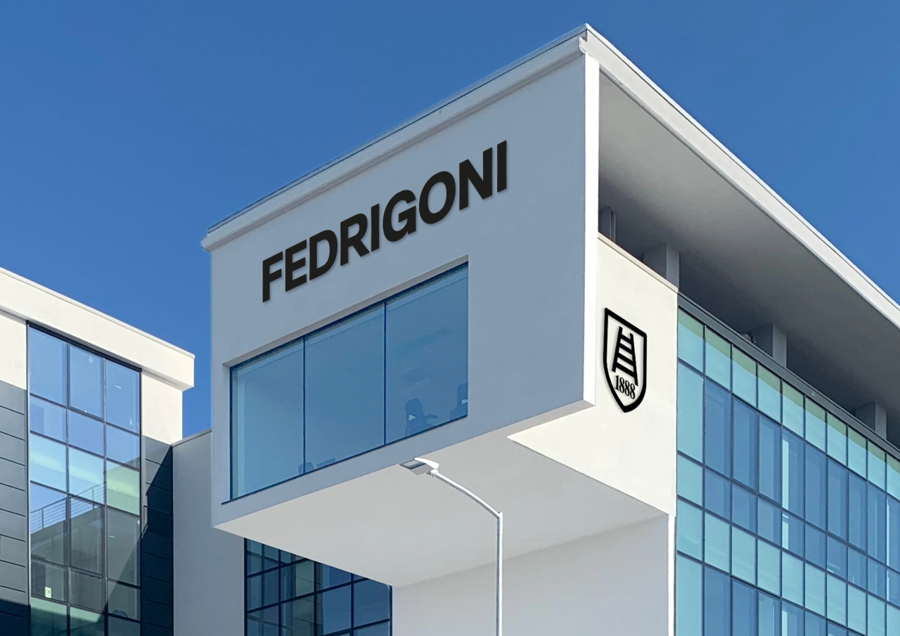
At the centre of the refreshed identity, a new wordmark has been designed to be as "flexible and adaptable as possible" for its many different applications. Sitting alongside the wordmark is a refined version of Fedrigoni's shield, featuring the traditional ladder motif and the date the company was founded. "The wordmark and shield can be used alone or combined, as well as alongside the name of the division," says Pentagram.
The design team also introduced a custom version of Forma DJR by David Jonathan Ross as the main typeface. As a modern interpretation of Aldo Novarese's Forma, it is used in two weights, Text Regular and Text Bold. "It complements the wordmark, offering clarity, function and legibility while referencing the rich Italian craftsmanship at Fedrigoni's roots," Pentagram continues.
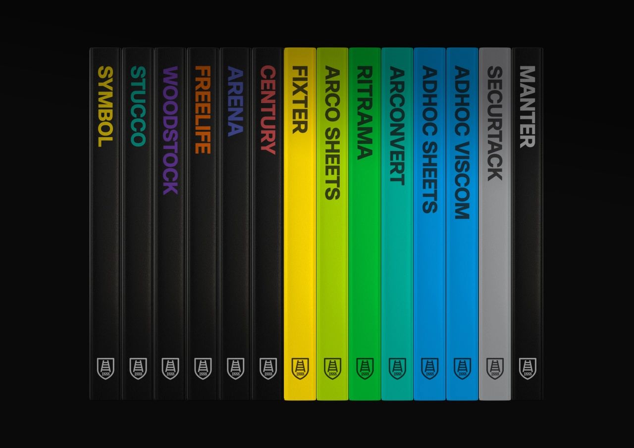
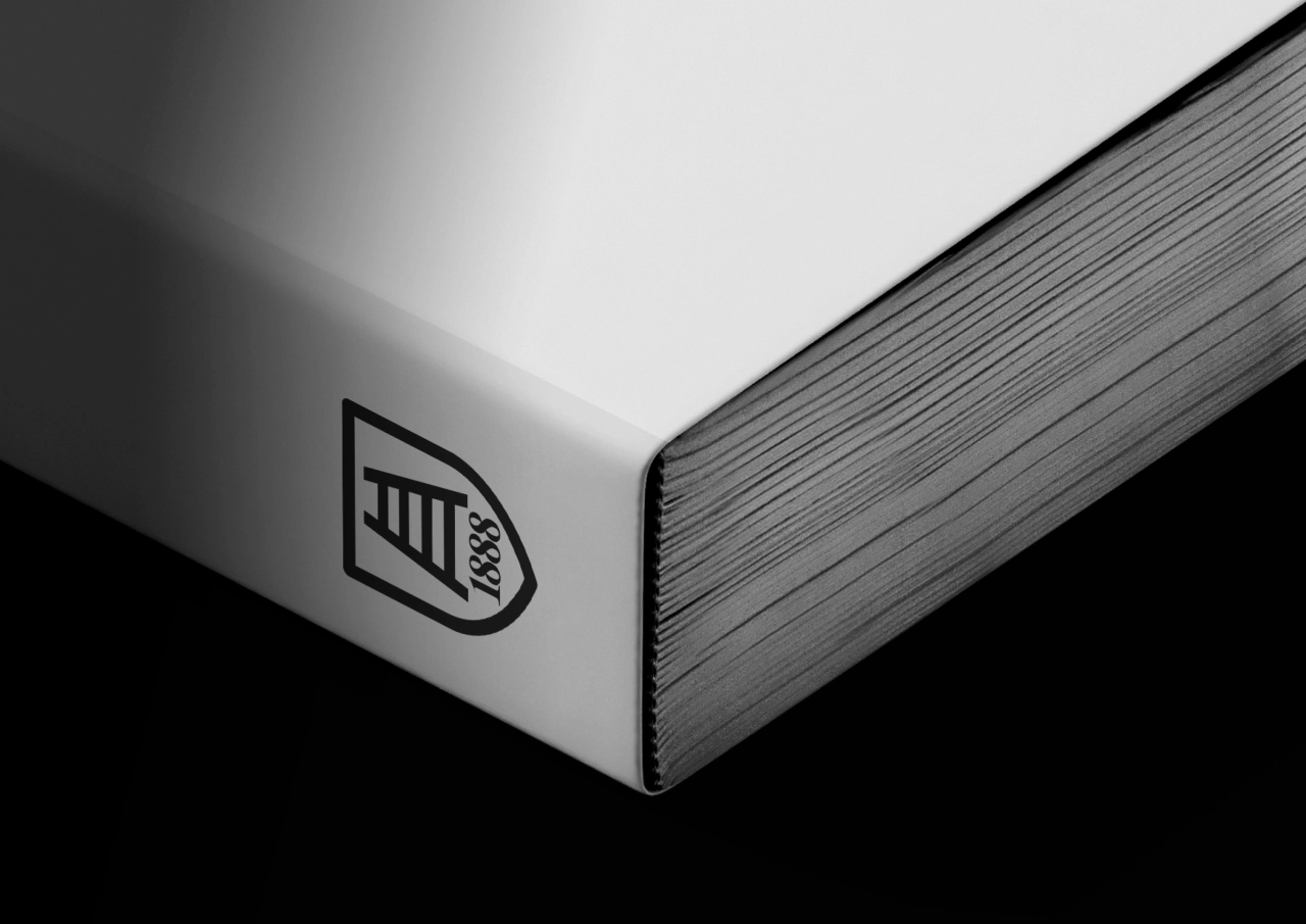
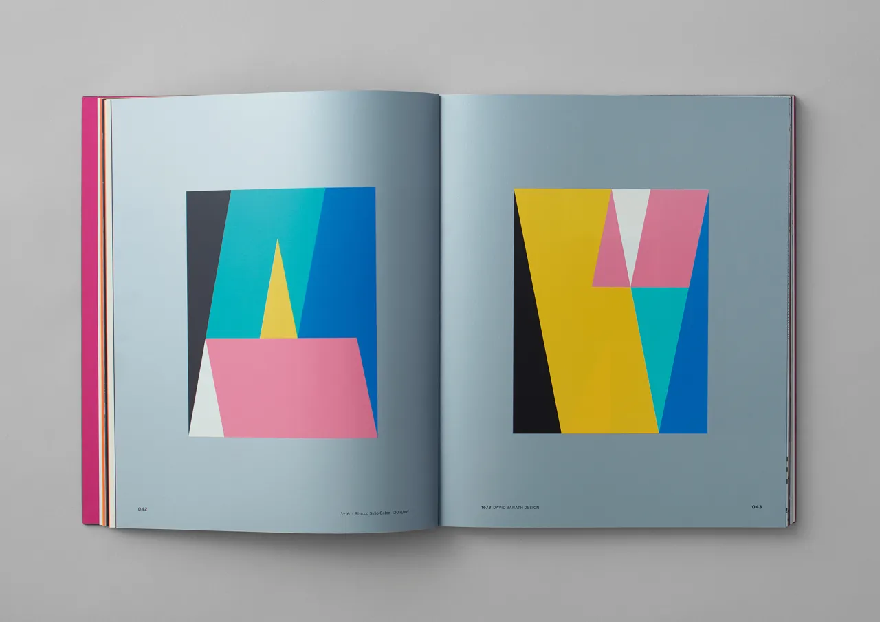
The new identity is primarily monochrome, with a black and white palette supported by a suite of cool greys. The idea is that it acts as a framework to showcase "the world of colour" that Fedrigoni inhabits and allows Fedrigoni's products, content and imagery to remain centre stage. While the main identity is monochrome, the self-adhesive product brands such as Arconvert and Ritrama each have a unique colour assigned to them. When it comes to product photography, there's rich, saturated colour, dynamic composition and bold use of light and shadow.
Harry Pearce adds: "Fedrigoni has always embodied quality, craftsmanship and creative excellence. We created this striking new identity to reaffirm the paper company's global presence and its commitment to design and creativity, referencing its rich Italian heritage while looking firmly to the future."
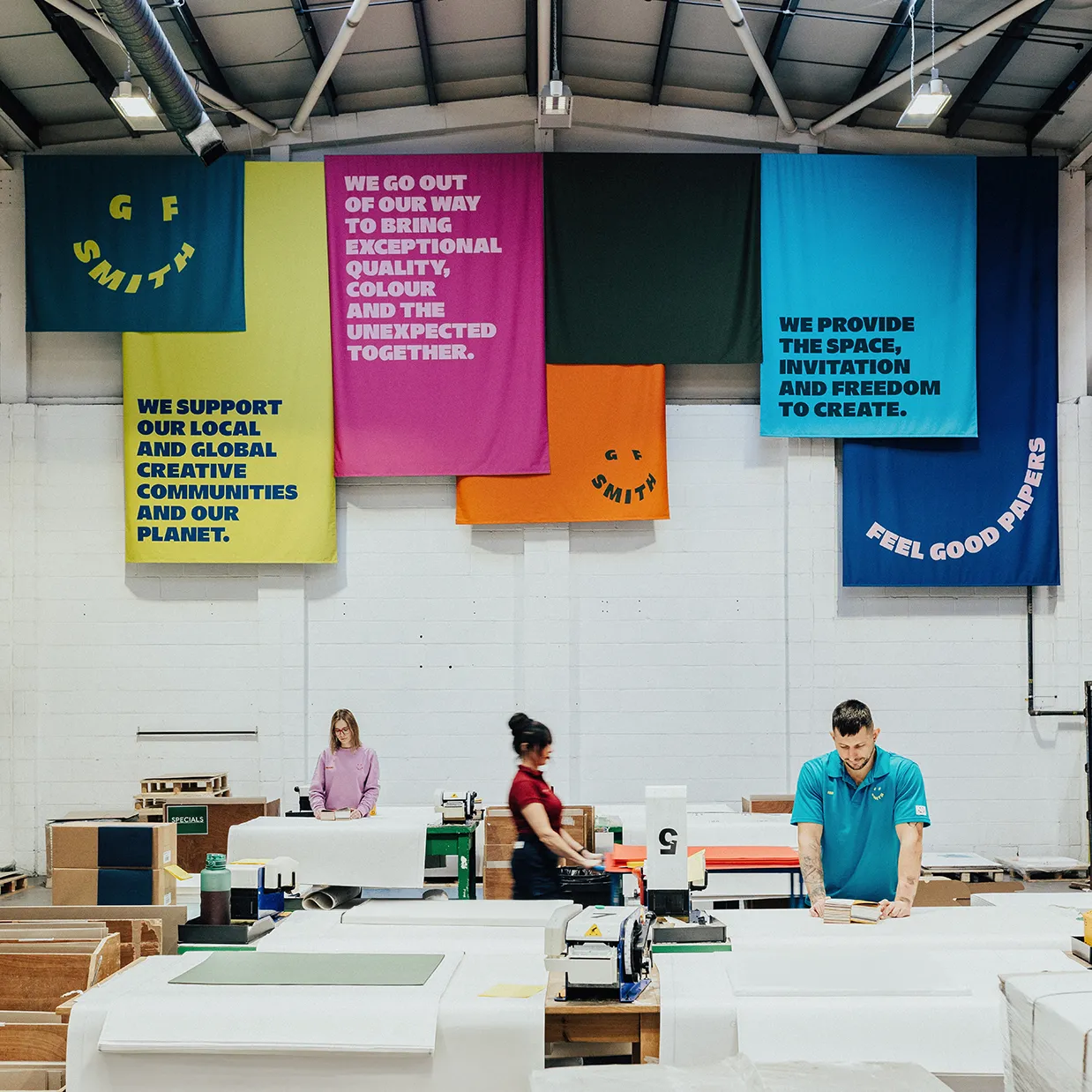
The new Fedrigoni identity is designed to work seamlessly across a wide range of applications, from social icons and business cards to building signage and the lorries which transport the paper to customers around the world.
Editor's Picks





Trending






Latest Jobs
Senior Creative Lead at Random Studio
Full-time·Amsterdam / Paris·€90k-€110k
Midweight Graphic Designer at We Are Your Friends
Full-time·London·£36k–£44k
Senior Brand Designer at Analogue
Full-time·Leeds·£38k-£45k
Creative Social Content Producer at Bompas & Parr
Contract·London·£32k–£40k
Senior Digital Designer at Red Antler
Full-time·New York·$95k-$130k
Creative Director at Koto
Full-time·London·£95k-£130k