A new brand identity for Austrian design studio Bruch
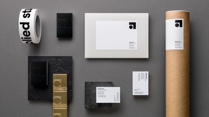
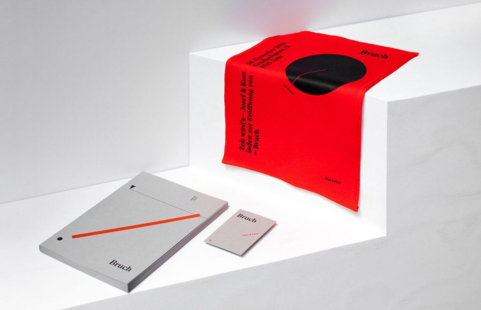
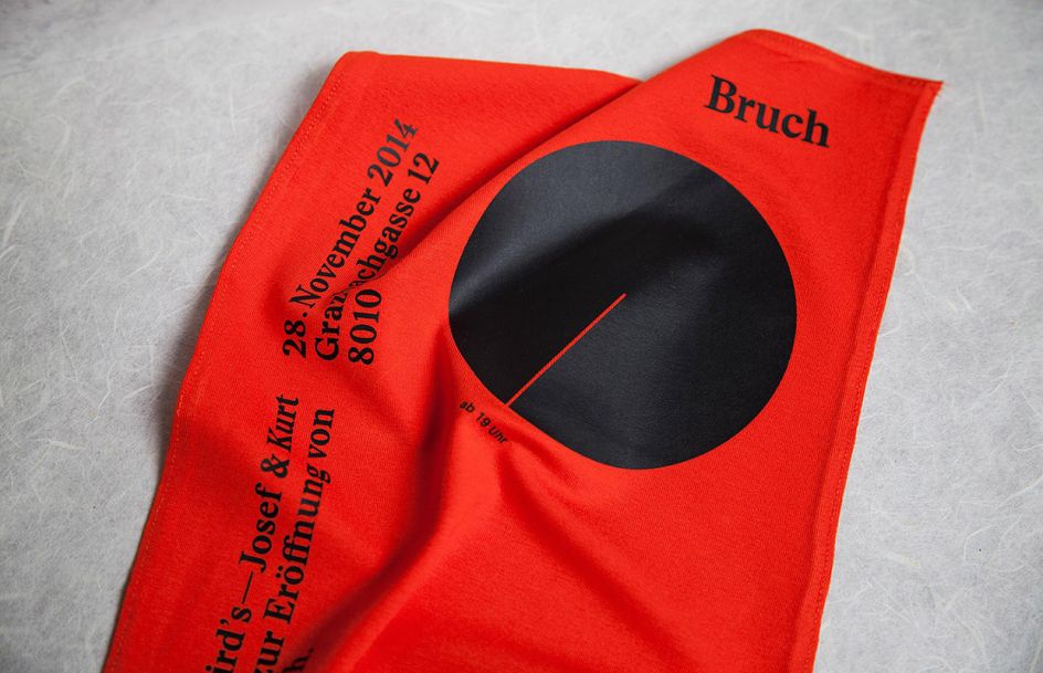
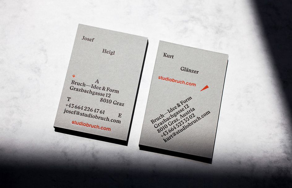
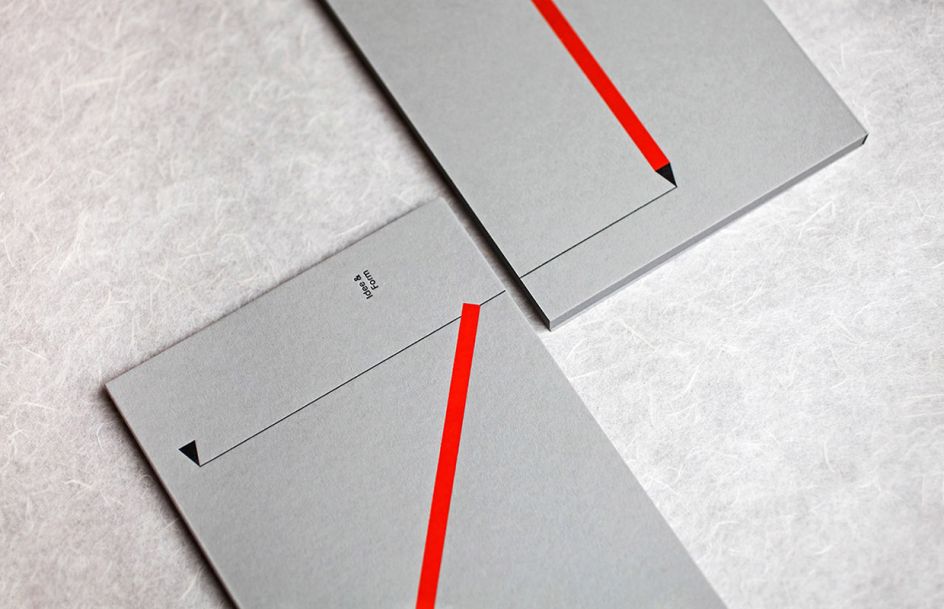
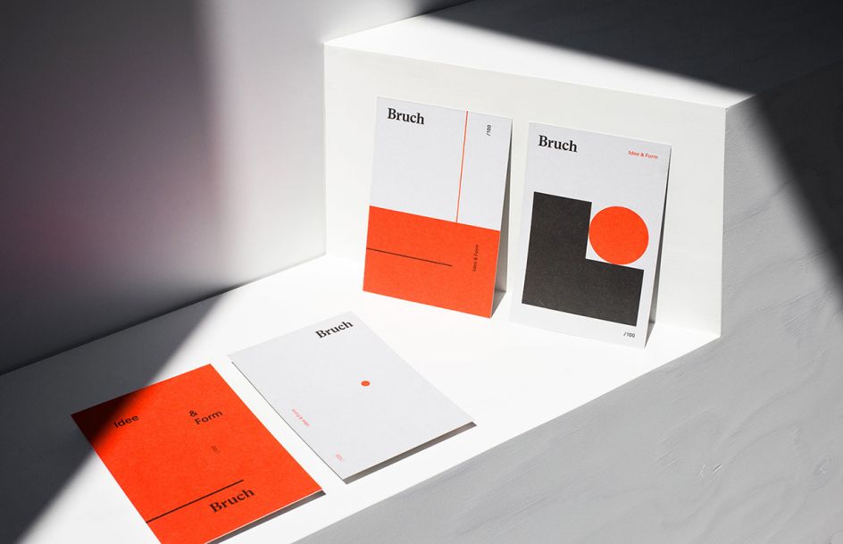
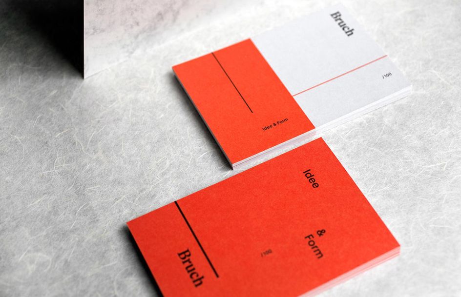
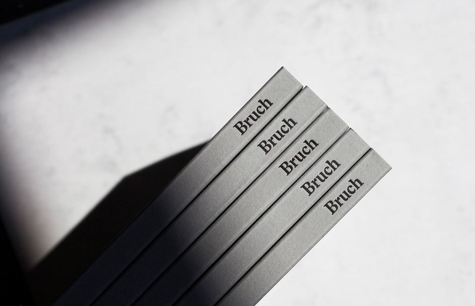
When Austrian graphic design studio Bruch wanted to create its own branding, it decided to take reference from its own name and tagline "Idee&Form" – arranging defined shapes, colour and typography in accordance to an idea and to subtly communicate the somewhat harsh name "Bruch" – which means "rupture" in German.
Written By: Katy Cowan
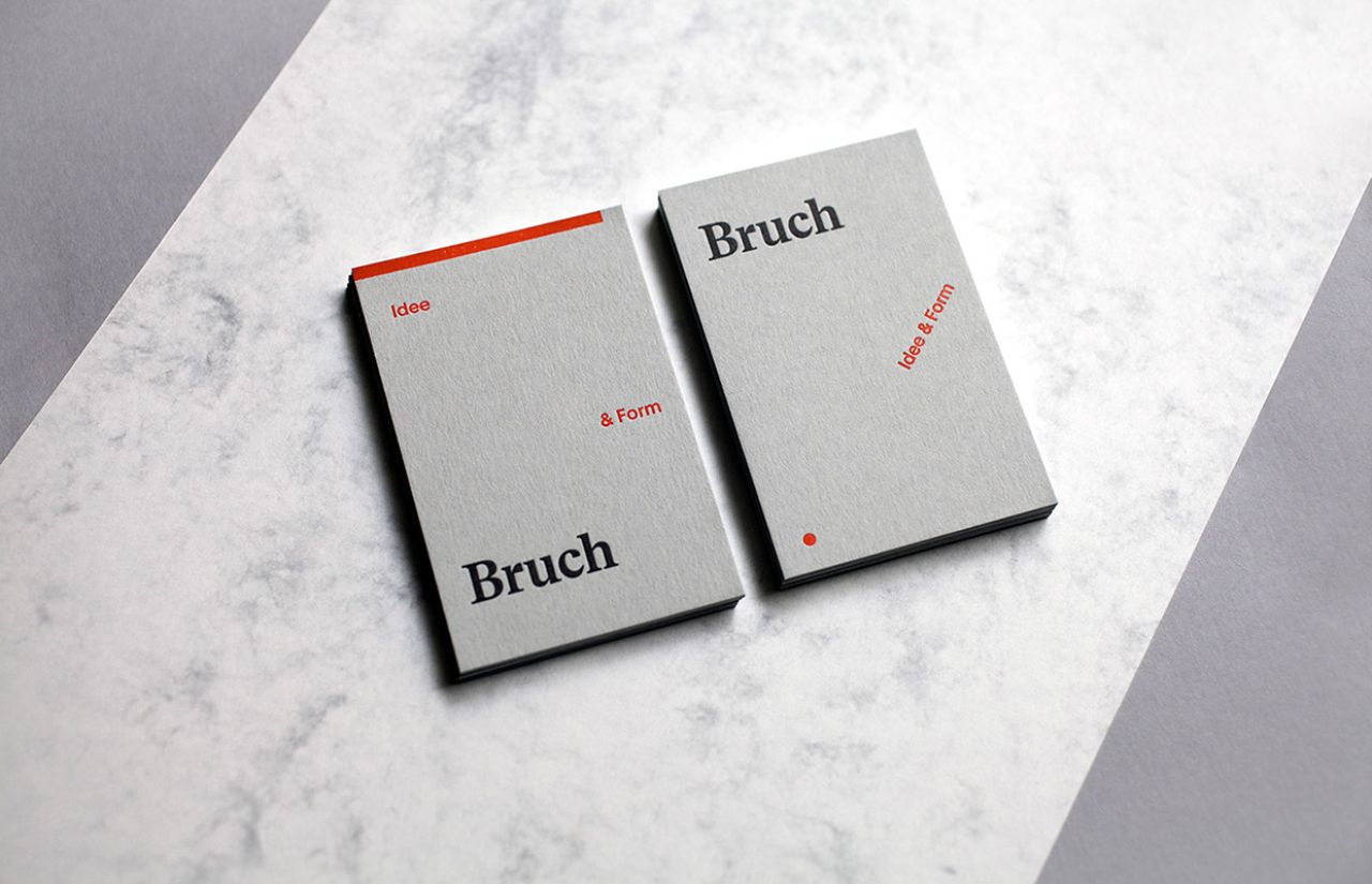
The vivid and changeable arrangements are also a reference to the studio's client projects—as each aims to be treated as individual. For more information about Bruch – who focus on branding, typography, editorial design and package design – visit Studiobruch.com.
Editor's Picks


Trending


](https://www.creativeboom.com/upload/articles/90/908fdb6378db1e95d12595416f54e6336d5e80b8_732.jpg)
Podcasts


Editor's Picks
Further Reading