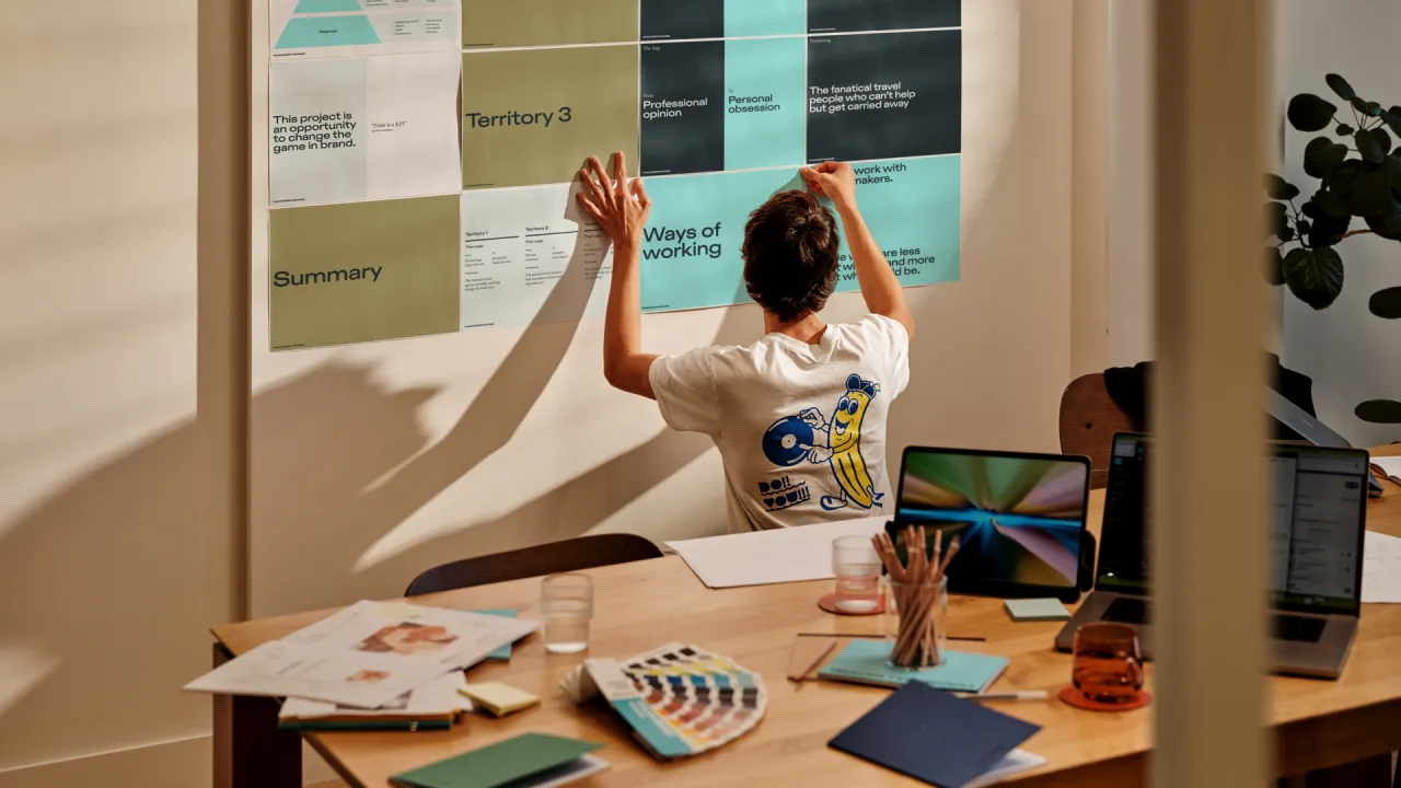
Dutch design agency From Form's new identity is a cinephile's dream
Rotterdam-based film and design studio From Form has unveiled its new cinema-inspired brand identity, aiming to demonstrate the breadth of its projects across film, design, animation and photography.
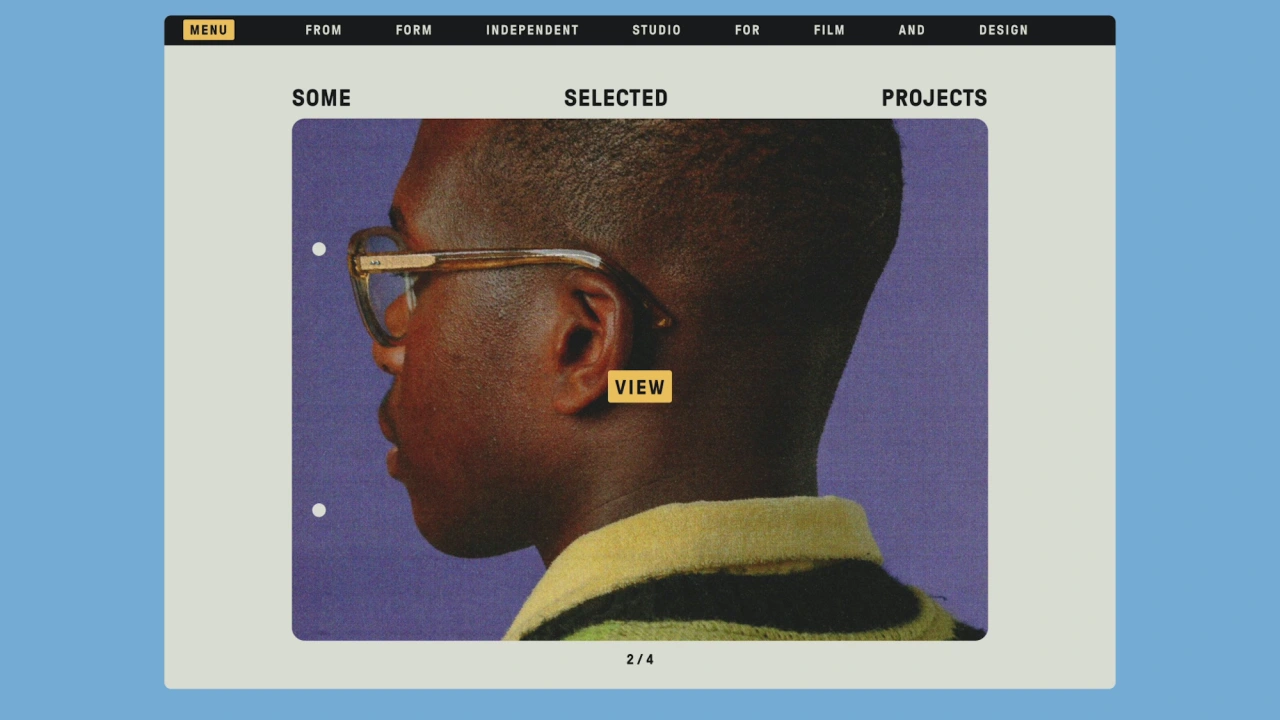
From Form was founded in 2013 by married couple Ashley Govers and Jurjen Versteeg “to offer a playful and cinematic approach to film and design,” says the duo. Govers and Versteeg add that From Form “places a strong focus on art direction and carefully arranged colours and compositions… with the outcome often reflecting their appreciation for the analogue and imperfect”.
The studio works across both commercial and self-initiated projects across short films, campaigns, commercials, film titles, graphic design, photography and animation. Its client list includes the likes of Ace & Tate, Skoda, Amsterdam Museum Night, and OFFF Festival.
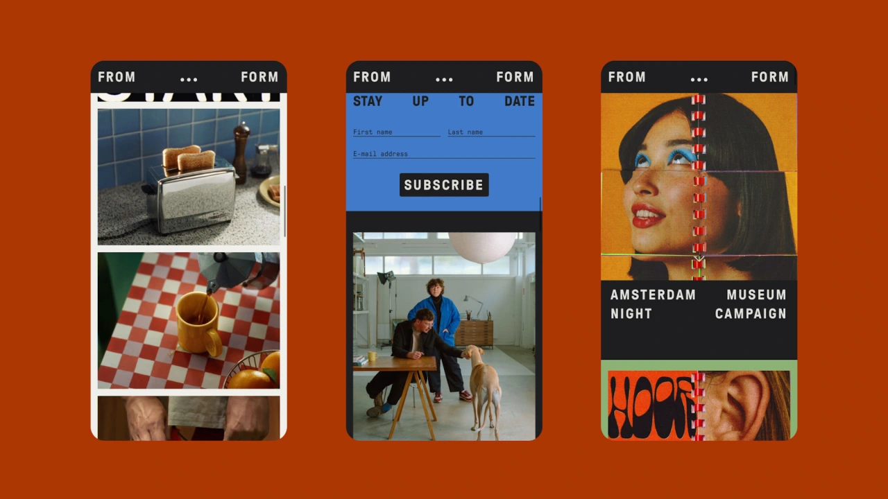
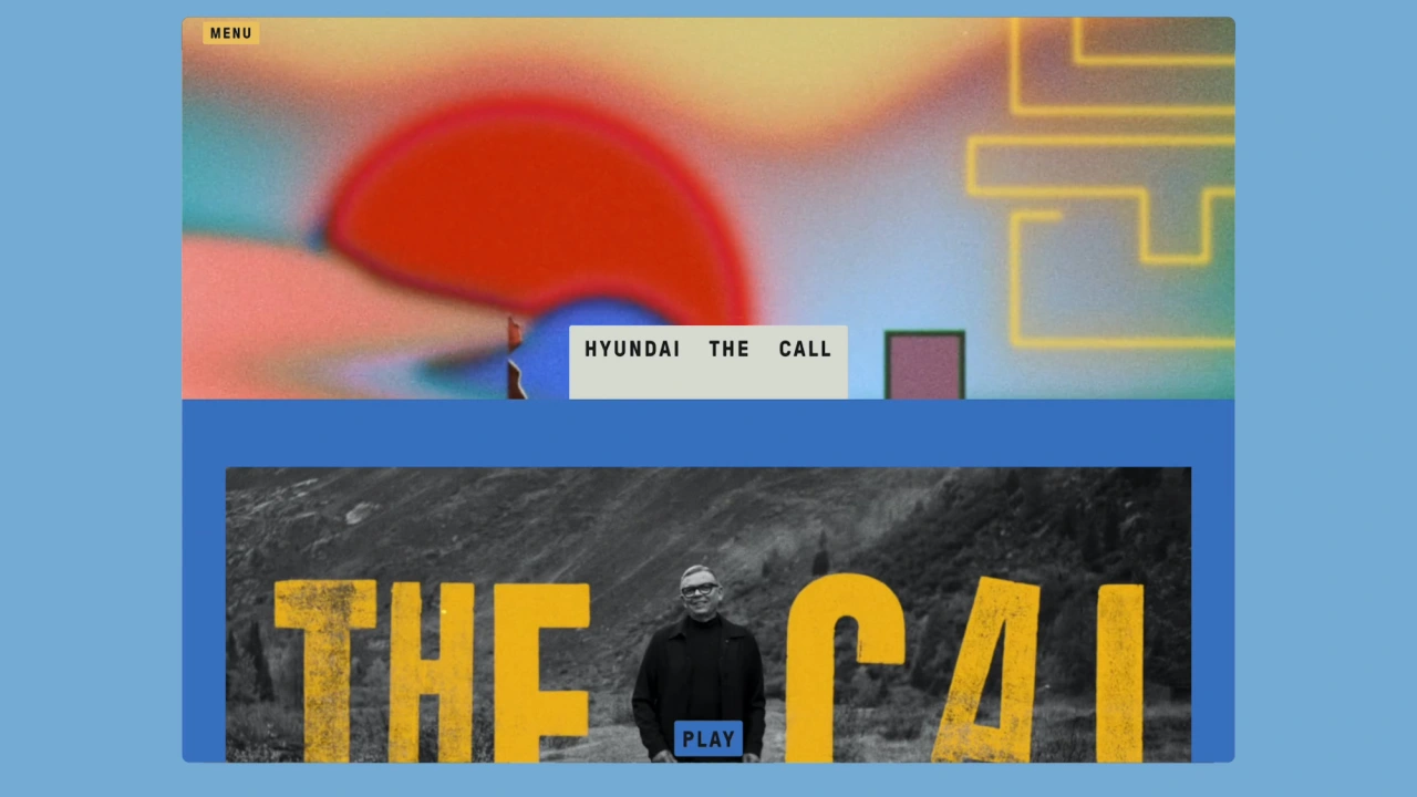
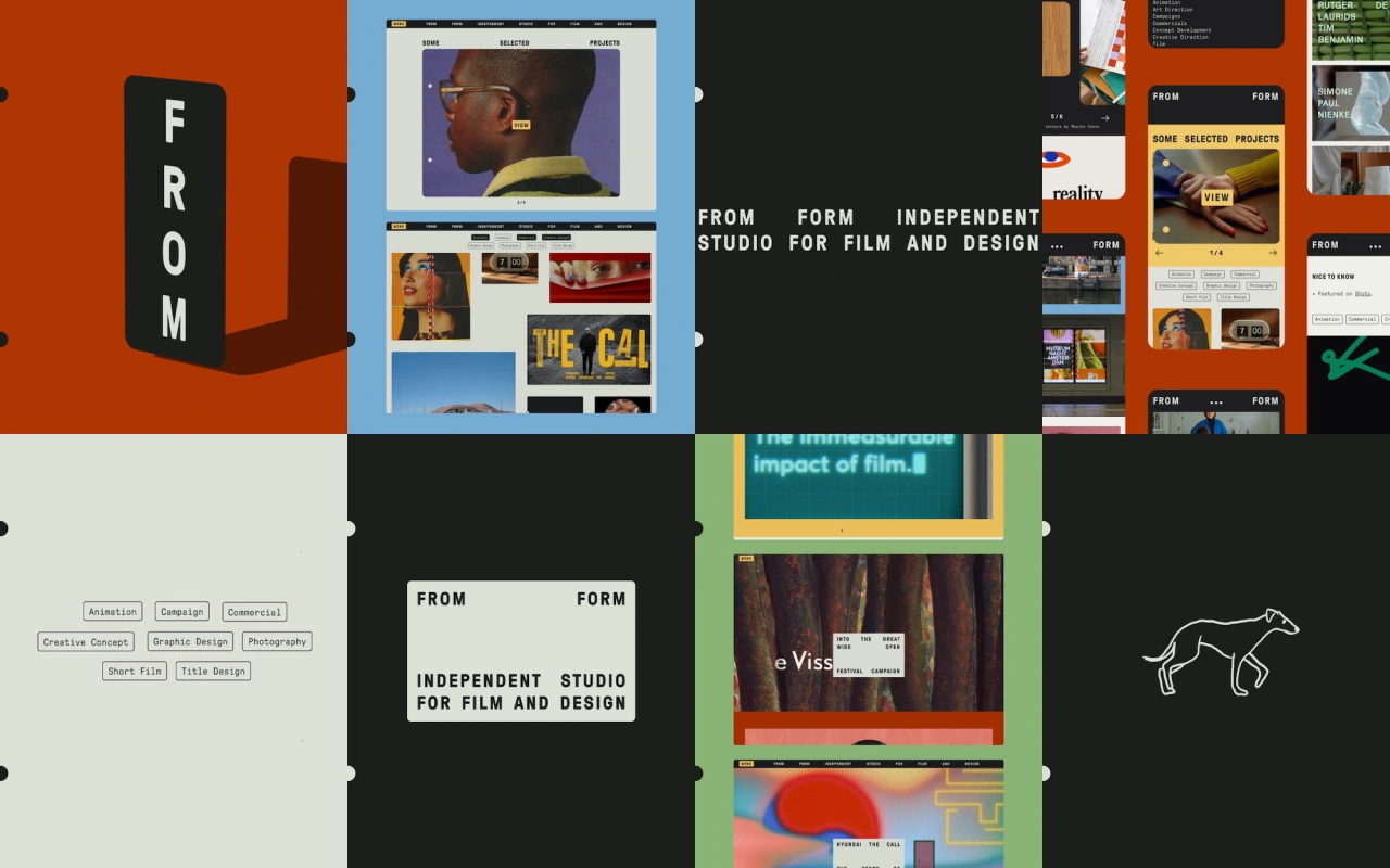
The new identity marks From Form’s tenth anniversary, and captures its “love of colour, film typography, and nostalgic aesthetics”, according to the studio. The revamped look and redesigned website draws inspiration from 1960s and 70s film titles – namely those used in French New Wave directors like Agnes Varda and Jean-Luc Godard’s movies.
According to From Form, such titles exemplify “an art form where the worlds of cinema and analogue design meet”. The studio’s film-title obsession is largely thanks to the way the typography is slightly off-kilter, with subtle imperfections in the letterforms’ spacing and sizing thanks to the nuances of their analogue design process.
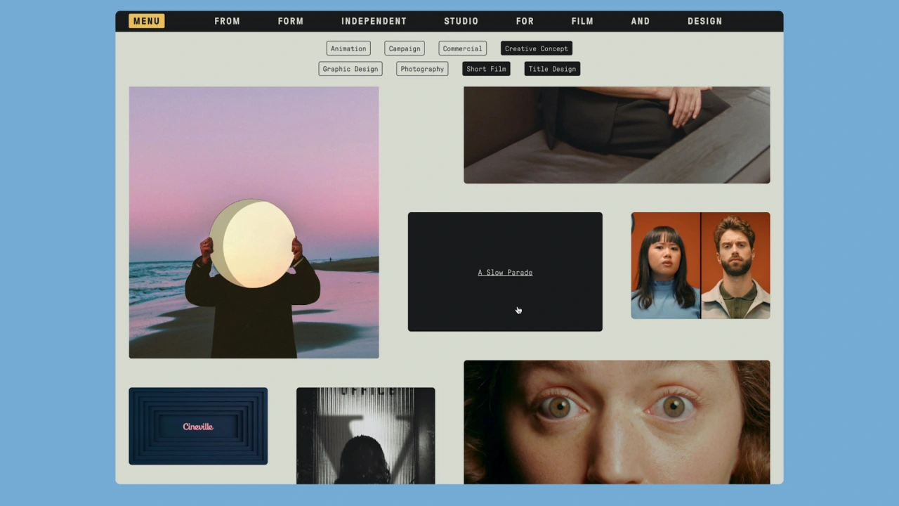
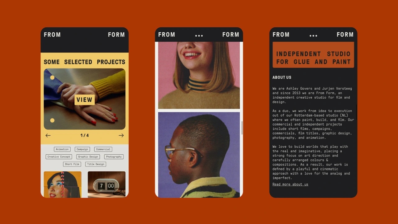
Other key reference points include printed materials from the same era, such as booklets, magazines, and manuals. Printed materials associated with Bolex cameras from the 1960s and 70s proved particularly inspirational, with From Form looking to old Bolex manuals and the Bolex Reporter, the brand’s very pwn magazine, which was published from 1950 until 1974.
The new branding is peppered with visual references to analogue design processes, such as the use of shapes with rounded corners to mask images as a nod to looking through a camera viewfinder. Elsewhere, the monospaced fonts reference vintage typewriters.
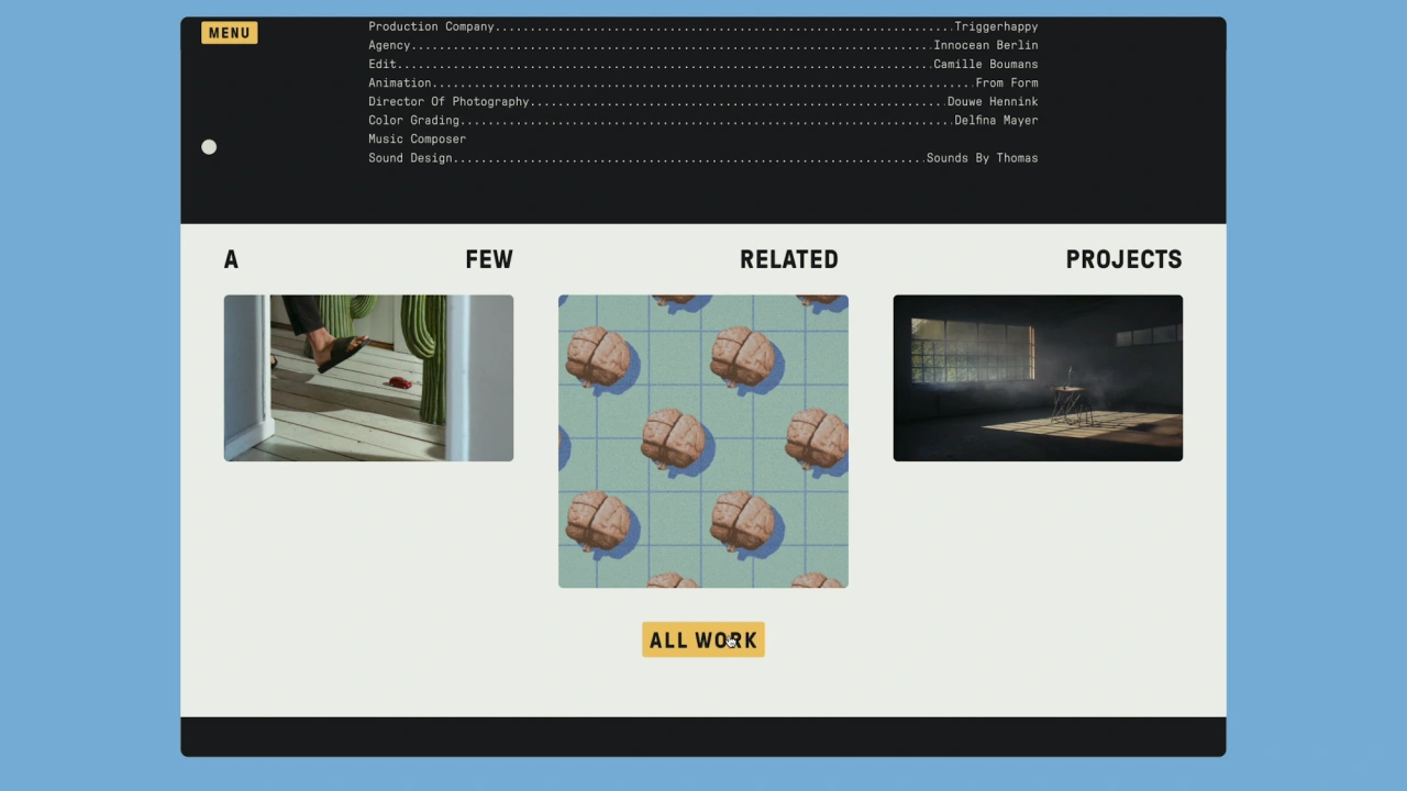
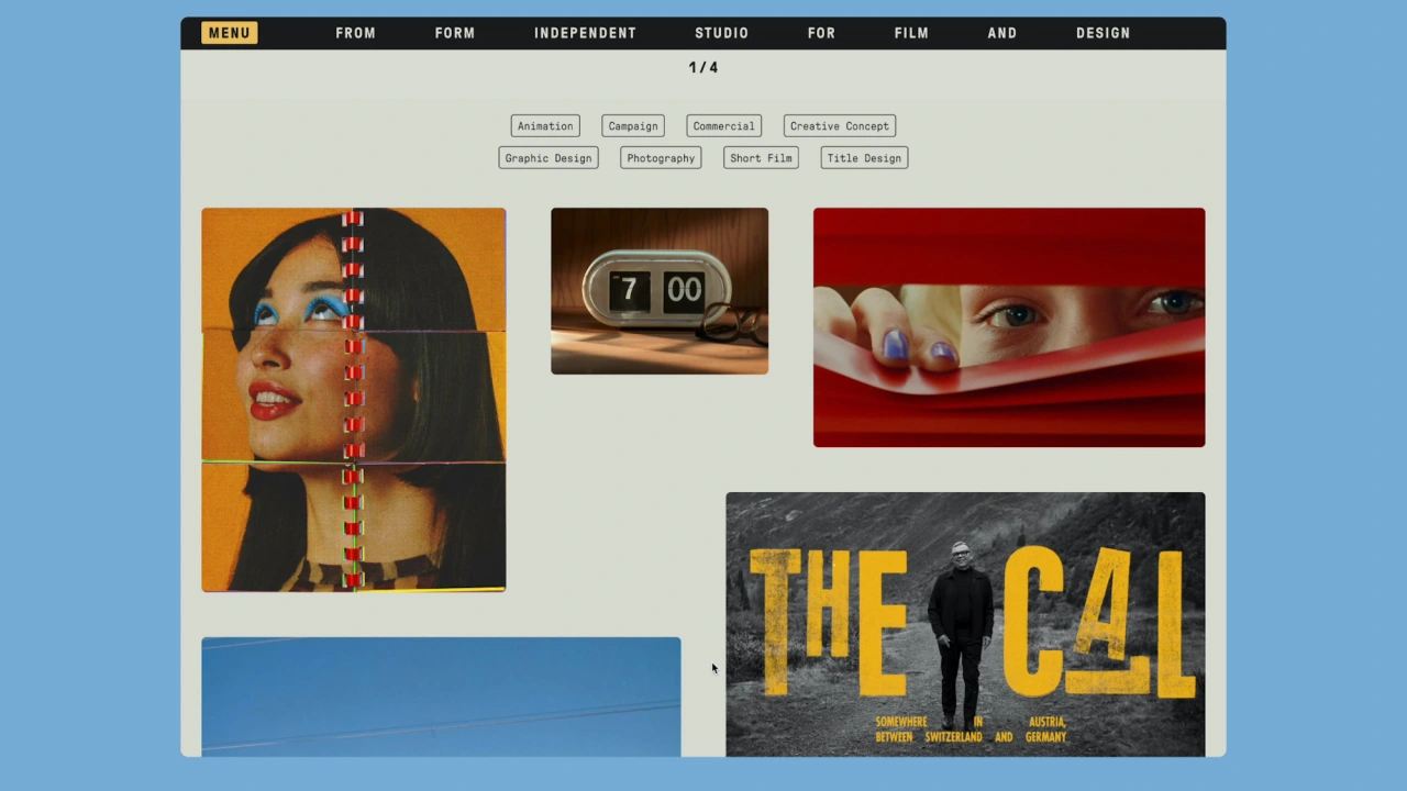
“The use of analogue techniques is essential in our projects as well as the textures and imperfections that come with it,” says Govers, From Form creative director and co-founder. “We wanted to create an identity that showcased our love for the analogue and embraced the patina of time.”
Creative director and co-founder Versteeg adds, "We knew we wanted an identity that would not get in the way of our work, which already has an outspoken visual style, but would remain intact and, better yet, elevates the work."
Editor's Picks





Trending






Latest Jobs
Client Partner at Halo
Full-time·Bristol·£30k–£36k
Talent Agent & Producer at The Jacky Winter Group
Full-time·Los Angeles·$70k-$85k
Brand Strategist at DNCO
Full-time·London·£45k-£60k
Art Director at The New York Times
Full-time·New York·$120k–$130k
Brand Designer, Product Launches at Figma
Full-time·New York·$127k–$269k
Midweight Designer at All Purpose
Full-time·London·£30k–38k