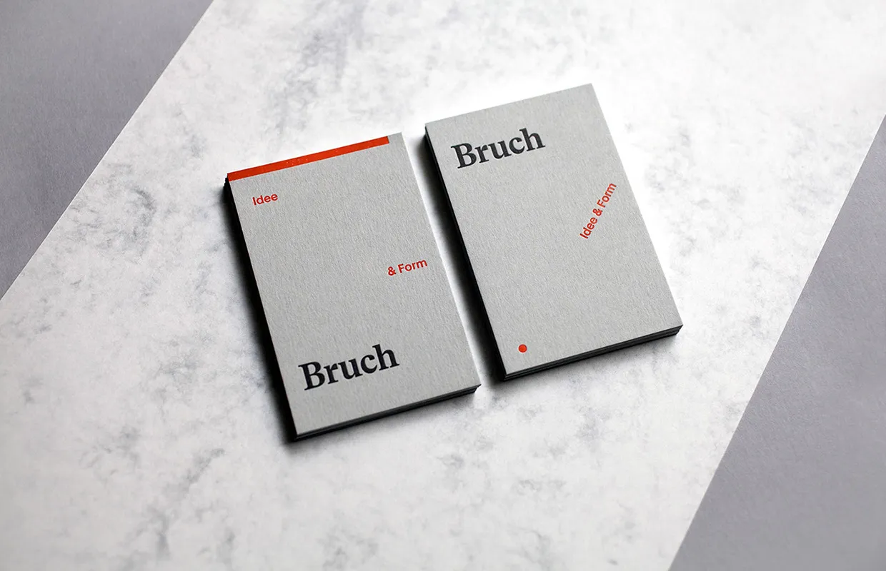
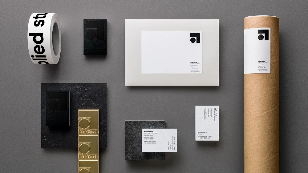
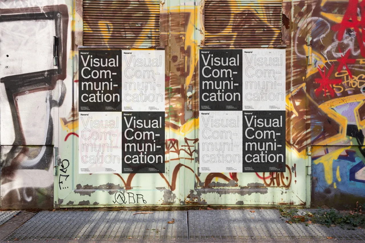
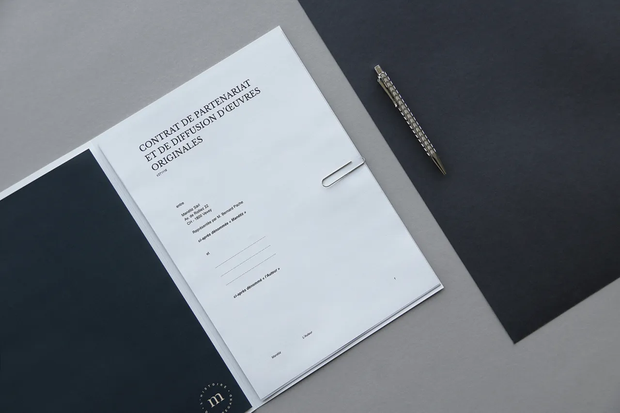
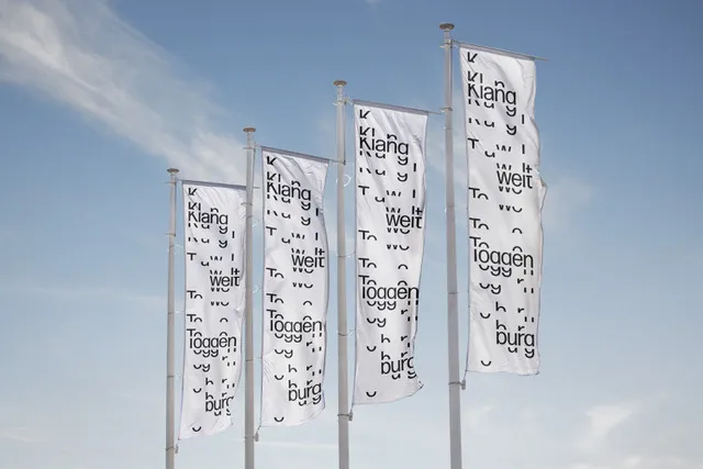
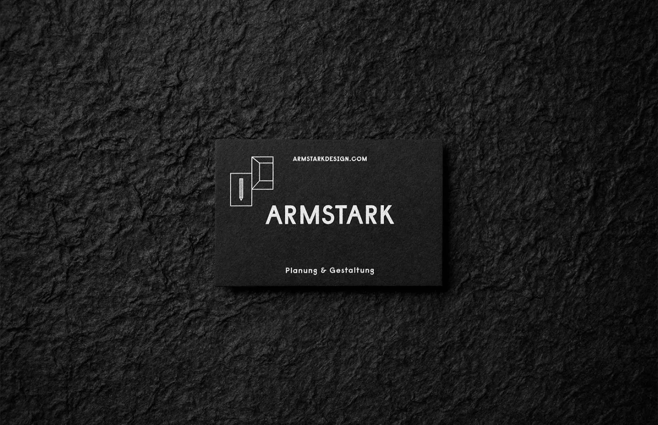
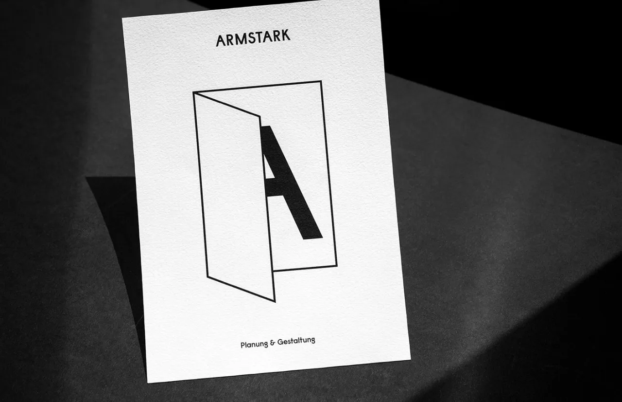
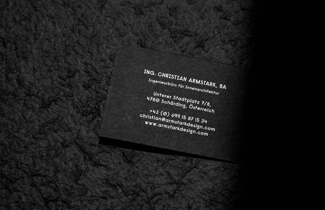
Clean and crisp monochrome identity for Armstark by Austria's Bruch–Idee&Form
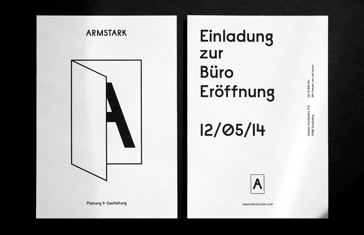
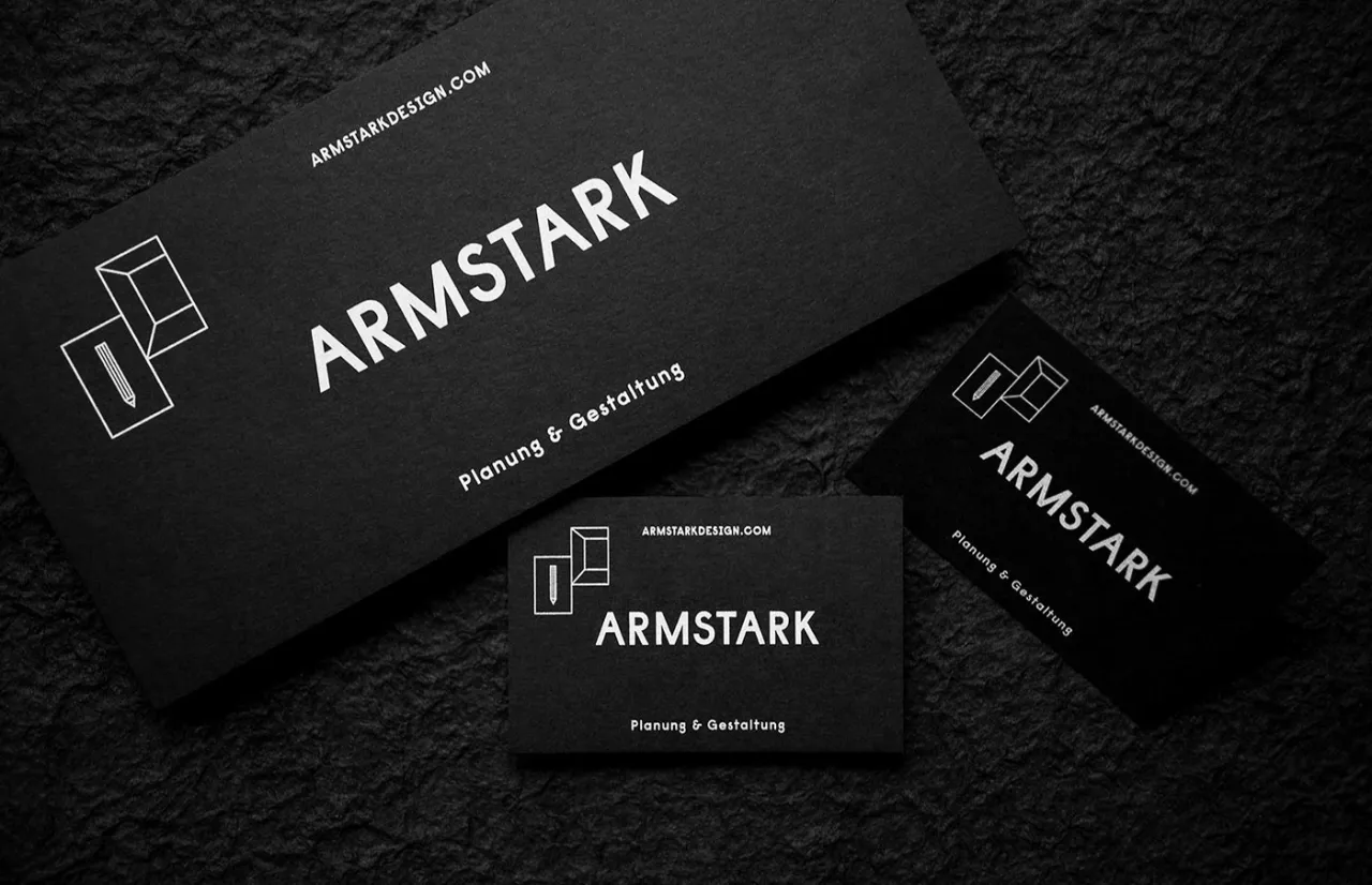
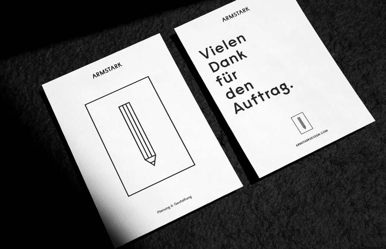
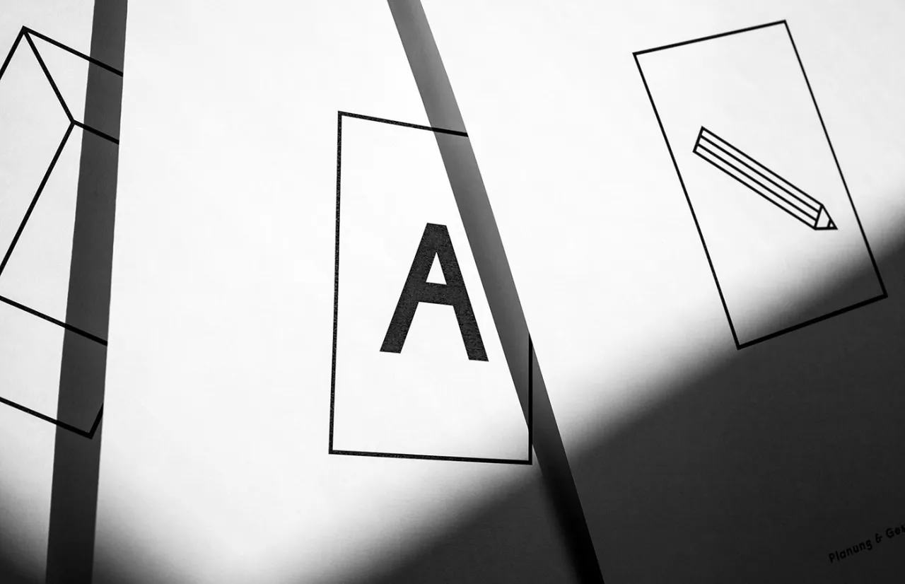
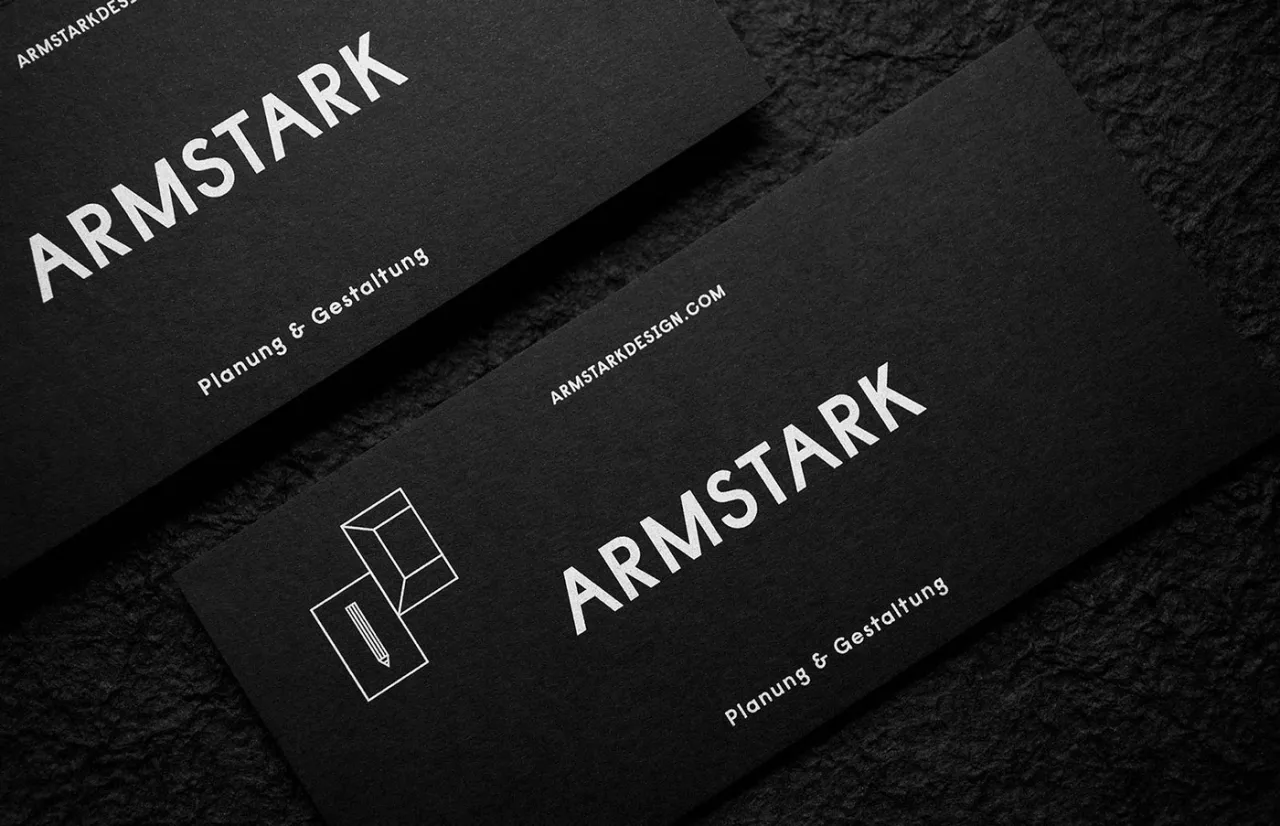
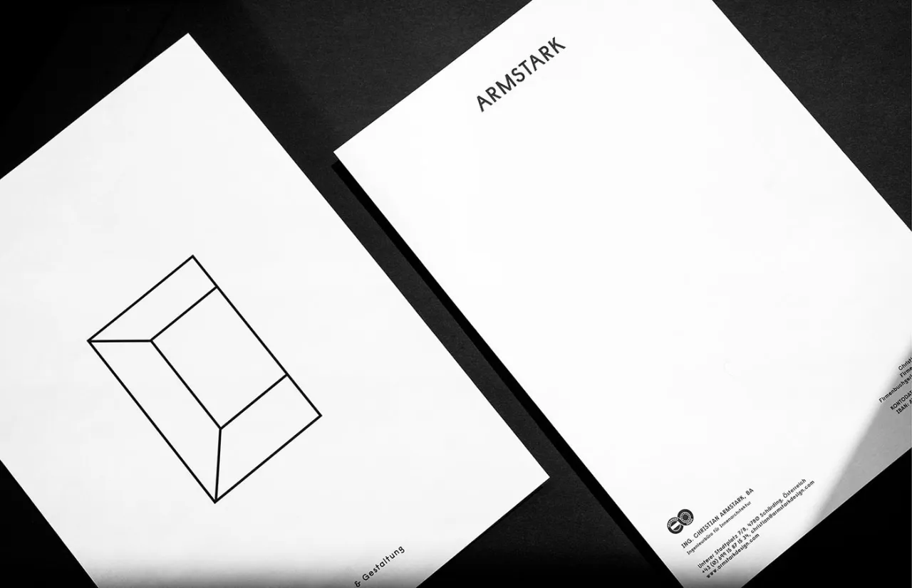
Austrian design studio Bruch—Idee&Form recently created a new brand identity for engineering office Armstark. With the tagline "planning and creation" as the starting basis for the new visual language, Kurt Glänzer and Josef Heigl used simple and memorable symbols help to communicate the company's range of activity. In the meantime, the black and white colour palette gives a high contrast and clarity without being too dominant in combination with the engineering firm's own portfolio.
Written By: Katy Cowan
Editor's Picks





Trending






Latest Jobs
Senior Designer at Definition
Contract·London·£45k–£50k
Client Director at Koto
Full-time·Berlin·€70k-€85k
Paid Media Executive at Munro Agency
Full-time·Glasgow·From £27,000
Brand Designer at Adfin
Full-time·London·£30k–£50k
Brand Designer, Product Launches at Figma
Full-time·New York·$127k–$269k
Senior Designer at Jubba
Full-time·London·£50k-£60k